Hahnemuehle Torchon Paper Review
Shortly before last Christmas, I received a greeting card saying that it was printed on Hahnemuehle Torchon paper. I really liked the texture and feel of the paper, as well as the photo printed on it, and I realized that though I knew of its existence, this isn’t a paper I had tested or reviewed yet. So I got hold of a box of Torchon and did my usual with it. Hahnemuehle Torchon paper
I’ll jump to the end right here and tell you that I think this is really a fine product. If you like printing on matte paper and want colour and detail that jump off the page, this one is for you. That said, there are two matters I’ll dispose of quickly before moving on to the “meat” of the review. Firstly, this paper is a bit stiffer than quite a few other matte offerings, so I had to give it a bit of a shove into my printer’s paper feed to get it going. Secondly, for those using an Epson SC-P5000, like I am, the Hahnemuehle profile for this paper/printer is being revised just now, release time is uncertain, so I won’t comment on their current profile. I made my own custom profile for testing and reviewing this paper, so I’ll be discussing how this one performs.
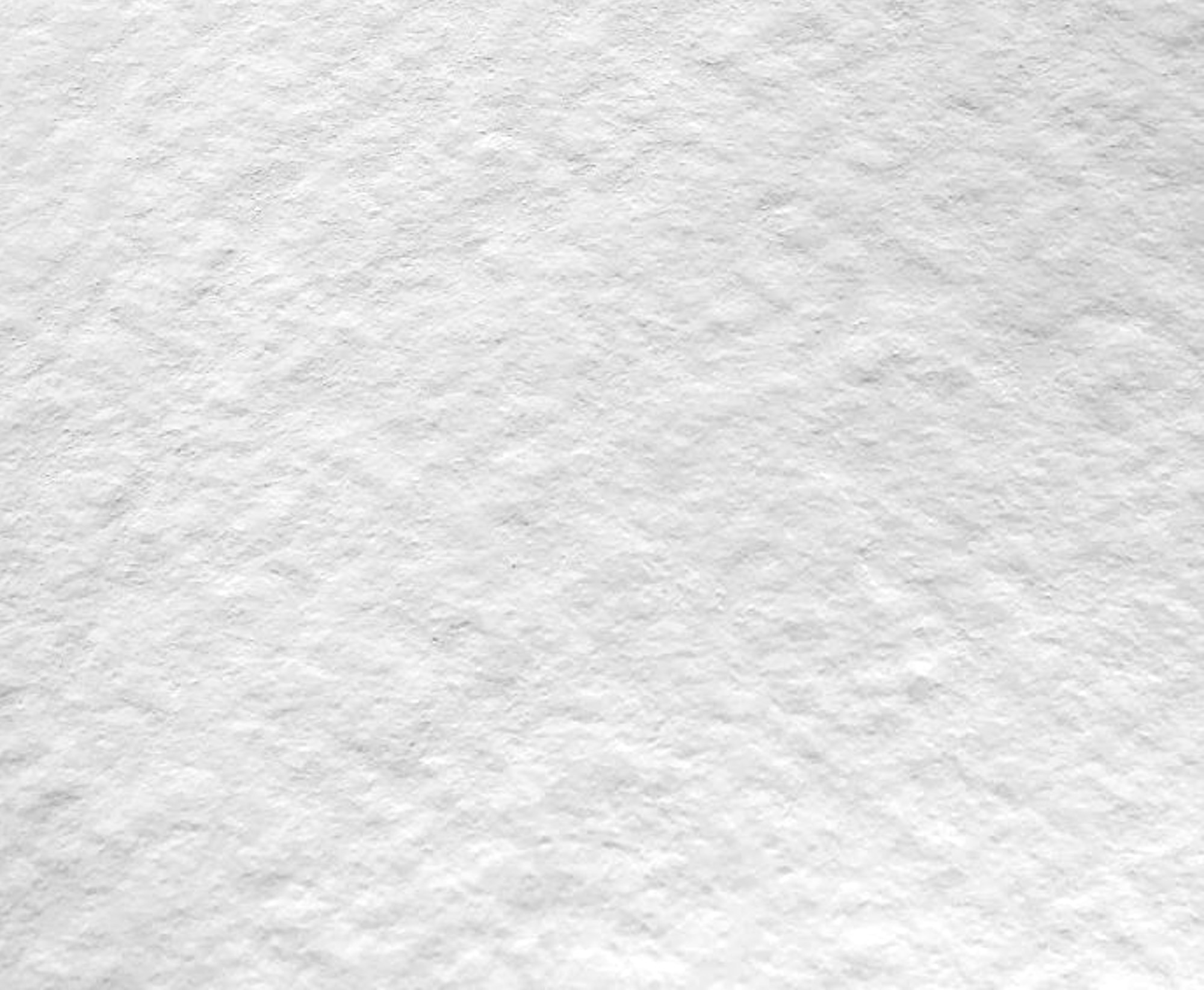
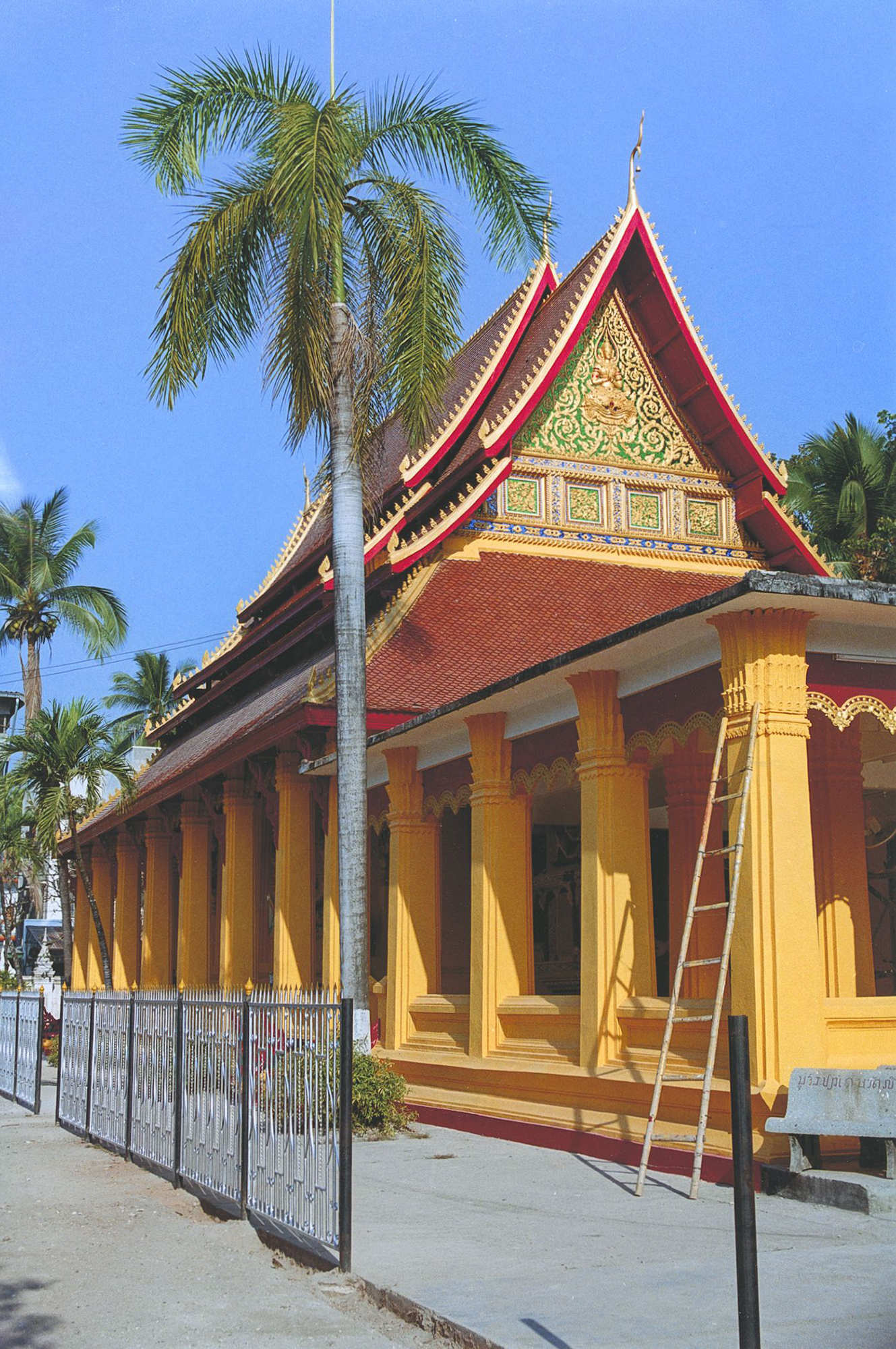
The paper is a member of Hahnemuehle’s “Fine Art Textured” collection. The substrate is alpha-cellulose, acid, and lignan free. Its weight is 285 gsm. The term “Torchon” comes from the French, meaning “coarse structure”, which gives the photos printed on it a three-dimensional impression. Available sizes are listed on the Hahnemuehle website. The paper is 0.5mm thick and has 96% brightness. Hahnemuhle describes it as a “bright white” paper, and it does have moderate OBA content (Figure 2). I tried to capture the texture in Figure 1, which is difficult to do exactly. I “grazed” it with side-lighting and set the tone a bit grey to bring it out here somewhat more than it may show in reality. It has a nice “artsy” look and feel.
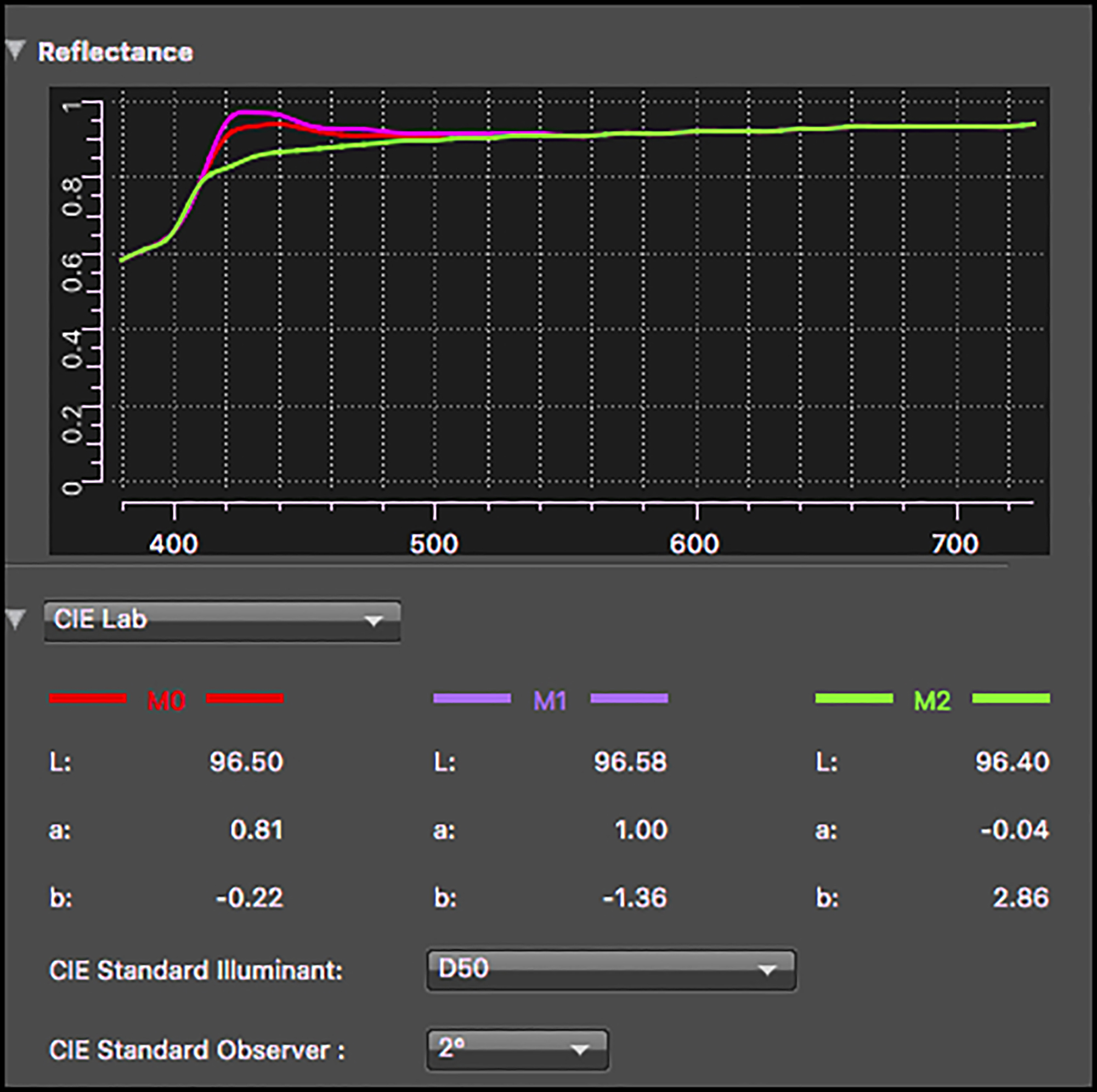
We can see from the Paper White reading in i1Profiler (Figure 2) the Magenta curve spike in the 400nm area of the spectral range, which is usually evidence of OBA presence (papers with no OBA content do not show this spike). This extent of spikiness is “moderate” – there are much worse.
Turning to the profiling and profile testing, the Media Type for this paper in an Epson professional printer is Epson Velvet Fine Art.
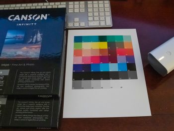
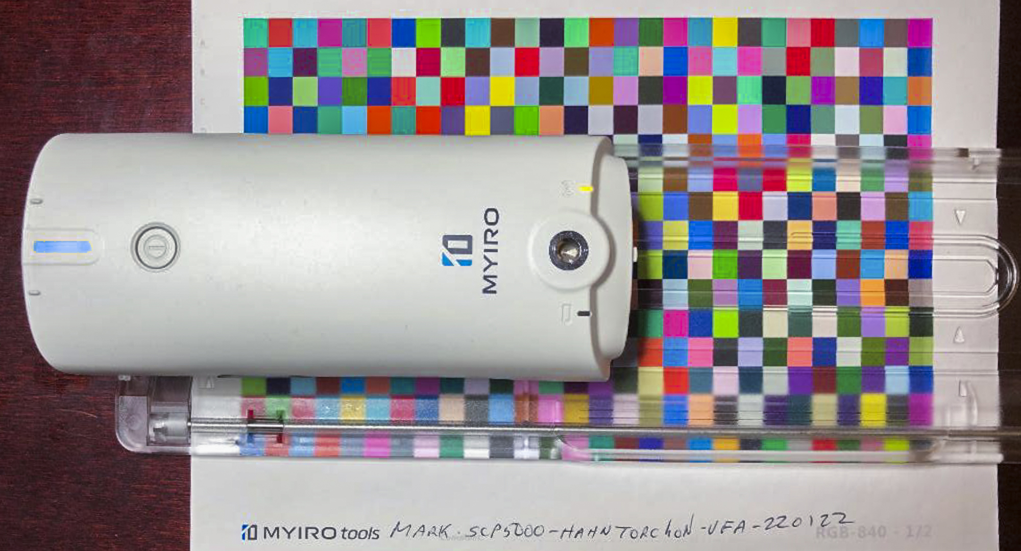
I created my custom profile using the Konica-Minolta MYIRO spectrophotometer and MYIRO tools software (Figure 3); their 840-patch profiling target is more than adequate to generate very high-quality profiles, quickly and easily.
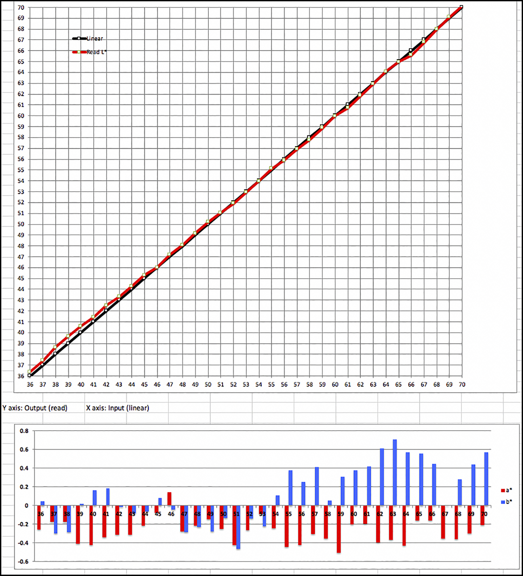
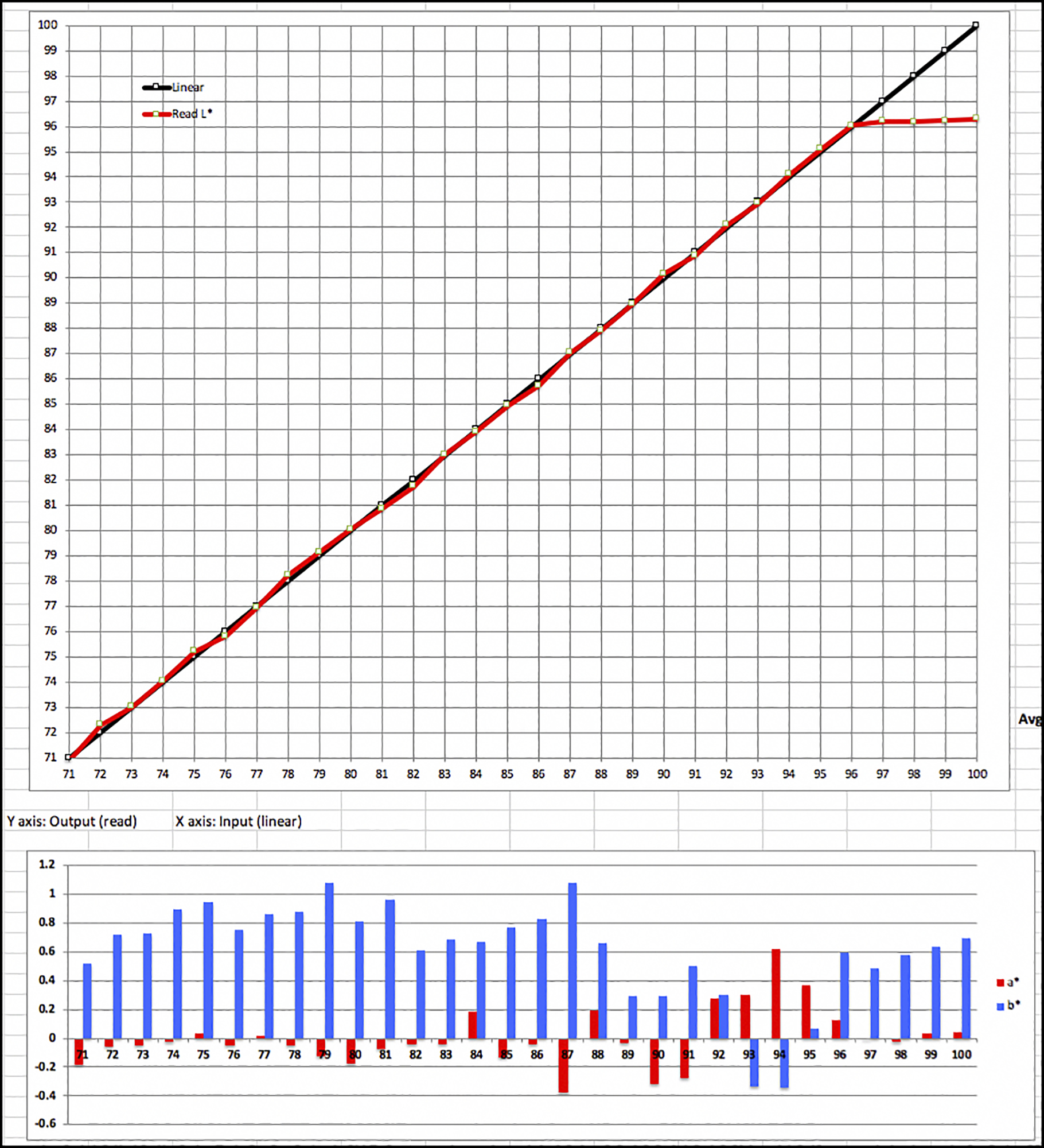
The profile characteristics read from ColorThink Pro (Figure 4) show a healthy gamut for a matte paper at over 600,000; the Black Point is rather typical of matte papers in the data, but the Black appearance in a print is richer than this data would indicate (more on that below).

Figures 5 and 6 show the profile volume and shape from top and bottom.

Figure 7 shows the data summary from testing this profile using my standard suite of targets and Excel-based analysis.
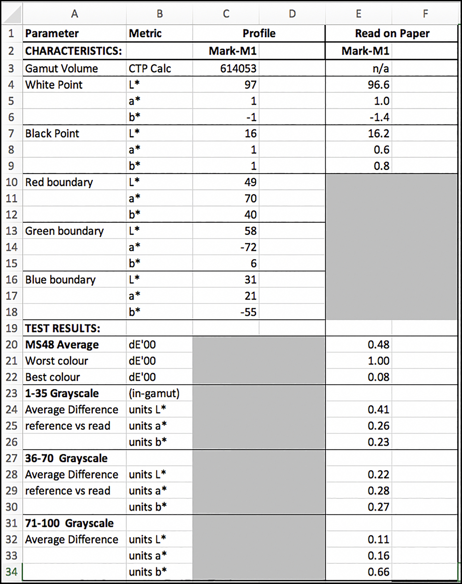
The Key Data Points:
- Good gamut volume for a matte paper, as mentioned above;
- Typical Black Point for a matte paper;
- Bright White Point;
- Good enough neutrality in the Black and White points;
- Profile accuracy with respect to the reference values in the test target is to a high standard: (average 0.48, worst colour 1.0)
- The accuracy of the gray scale is outstanding, portending very good results for B&W printing on this paper.
Figures 8 through 12 provide detailed information underlying the summary in Figure 7. The manner of interpreting these graphs is explained in several of my previous articles on this type of analysis.
Worth noting are the low dE(2000) values for all the colours, and the excellent Lightness and neutrality of the gray scale for all L* values within the paper’s gamut.
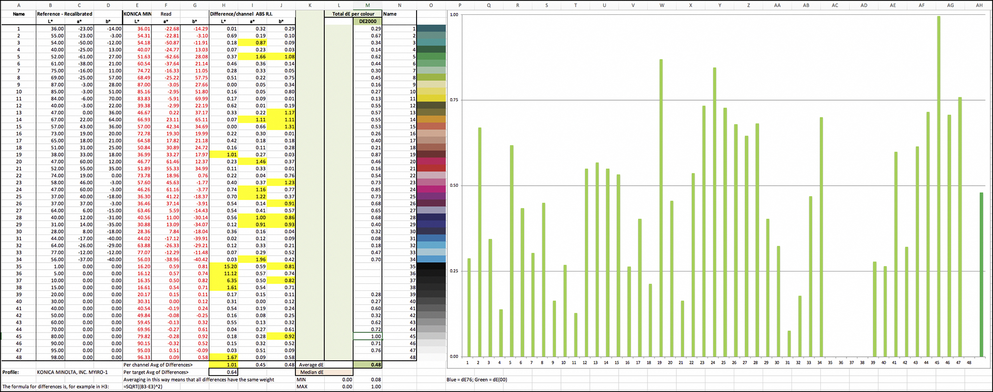
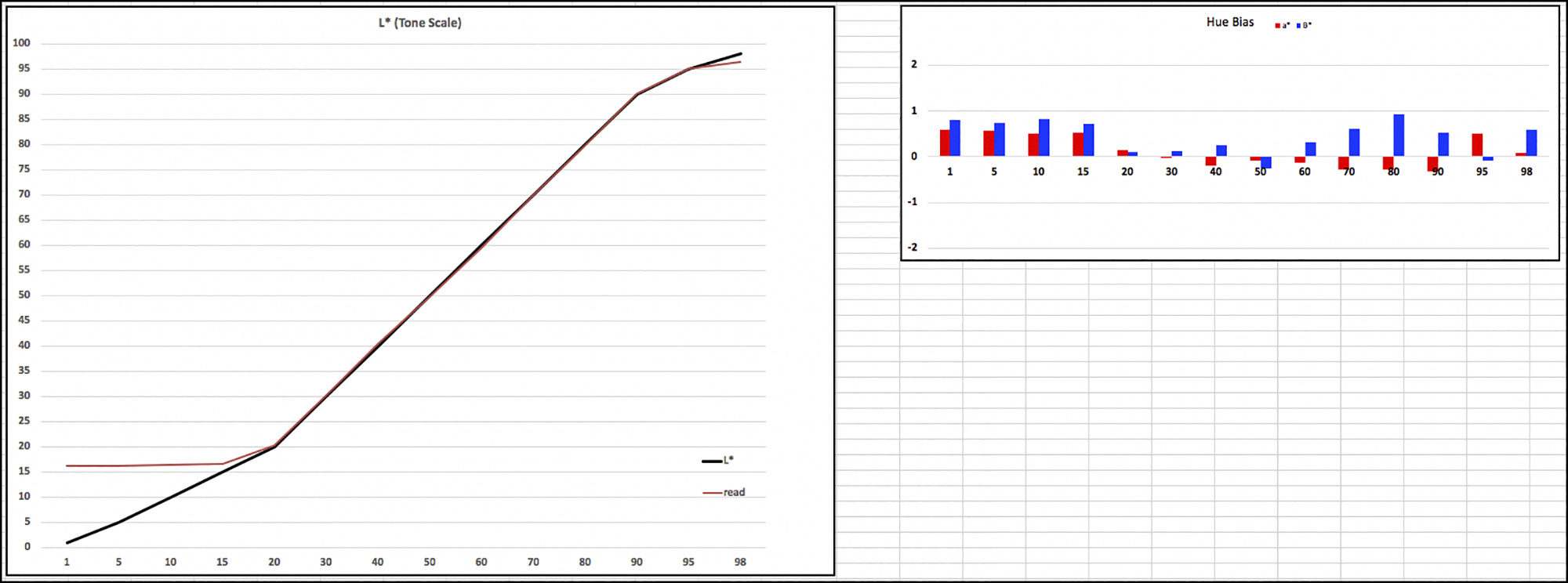
Blue and Red bars within +/-1 indicate good neutrality.)

All of the foregoing analysis would predict excellent results from printing with this paper, and sure enough, that is indeed the case, as seen from the following “real world” photographs, firstly standard printer test pages and secondly prints of photos made in the field.
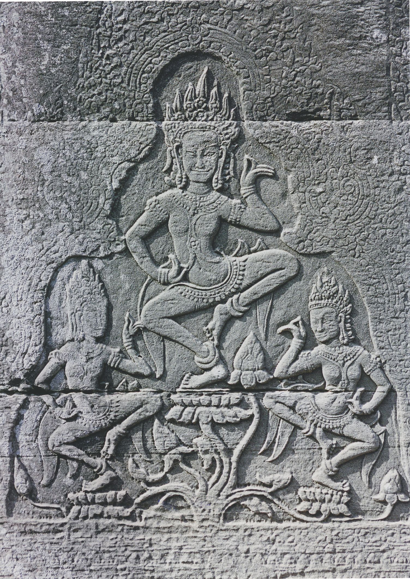
I made all of these prints on Torchon US Letter-size sheets in the Epson SC-P5000 printer with the custom profile, ProPhoto colour space, Relative Colorimetric Rendering Intent with Black Point Compensation, printed from Photoshop. Figures 13, 14 and 15 of the printer test pages are printed “as is” – no editing adjustments. Figures 16 and 17 are photos I made in East Asia in 2004 using Fuji Reala Superia colour negative film (discontinued) in a Nikon N-70 camera with Nikkor lenses, then very recently converted to positives with Negative Lab Pro and edited using the set-up and procedures described in my January 13th 2022 article on this website: “Digitizing Negatives with a Camera – Revisited”. I scanned all of these prints in my Epson V850 scanner using SilverFast 8 and a custom profile made with basICColor Input software; no adjustments were made in scanning. The results you see in the following figures are, I believe, as close to the appearance of the prints as they can be.

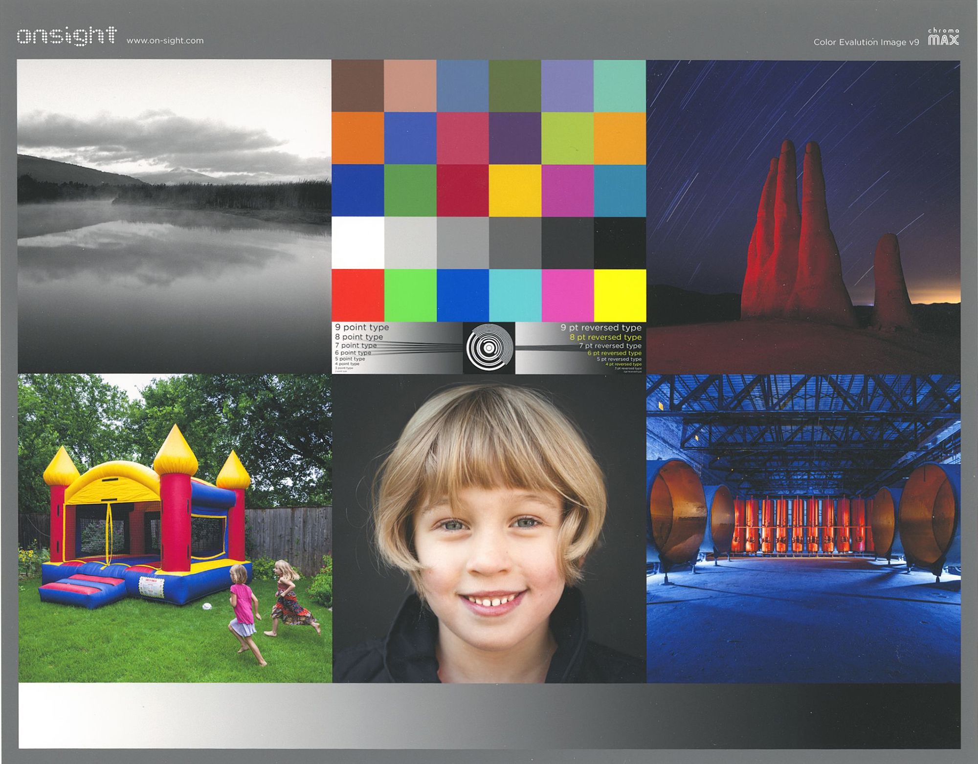

The key takeaways from the examination of these photos are:
- The rendition of detail is really excellent, notwithstanding the designed coarseness of the paper texture;
- Where vibrant colours matter, they really “pop” off the page, in a way that is unusual for matte papers;
- Gray scale neutrality is very well preserved;
- Tonal separation in the deep shade areas is very good, especially for a matte paper;
- Correlatively, the Blacks look richer than usual for a matte paper with Black Point of L*16.
Conclusion: If you like “artsy” matte papers, this is one you definitely want to try. I think you’ll like it.
Mark D Segal
March 2022.
Toronto, ON
Mark has been making photographs for the past seven decades and started adopting a digital workflow in 1999 first with scanning film, then going fully digital in 2004. He has worked with a considerable range of software, equipment, materials and techniques over the years, accumulated substantial experience as an author, educator and communicator in several fields, was a frequent contributor to the Luminous-Landscape website and now contributes frequently with in-depth articles on the PhotoPXL website. Mark has contributed over 75 articles to the two websites up to Q1-2024, with a particular emphasis on printers and papers, given his view that a photograph printed on paper remains the epitome of fine photography, as it has been from soon after the medium was invented and started gaining momentum in the 1830s/1840s. Mark developed a particular interest in film scanning and authored the ebook “Scanning Workflows with SilverFast 8, SilverFast HDR, Adobe Photoshop Lightroom and Adobe Photoshop” (please check our Store for availability). In his “other life” (the one that pays for the photography), Mark is a retiree from the World Bank Group and was a consultant in electric power development.