Digitizing Negatives with a Camera – Revisited
Digitizing Negatives with a Camera: Revisited
Introduction:
My previous article about this subject co-authored with Todd Shaner and published on Luminous-Landscape.com, explored alternative techniques for processing colour negatives photographed with a camera (mirrorless or DSLR). This article delves more into the technical aspects of set-up and capture, with a major focus on my workflow and findings using Negative Lab Pro (NLP – Figure 1) for converting digital negatives to positives. As well, I have substantially revised my whole set-up and workflow since the “LuLa” article.
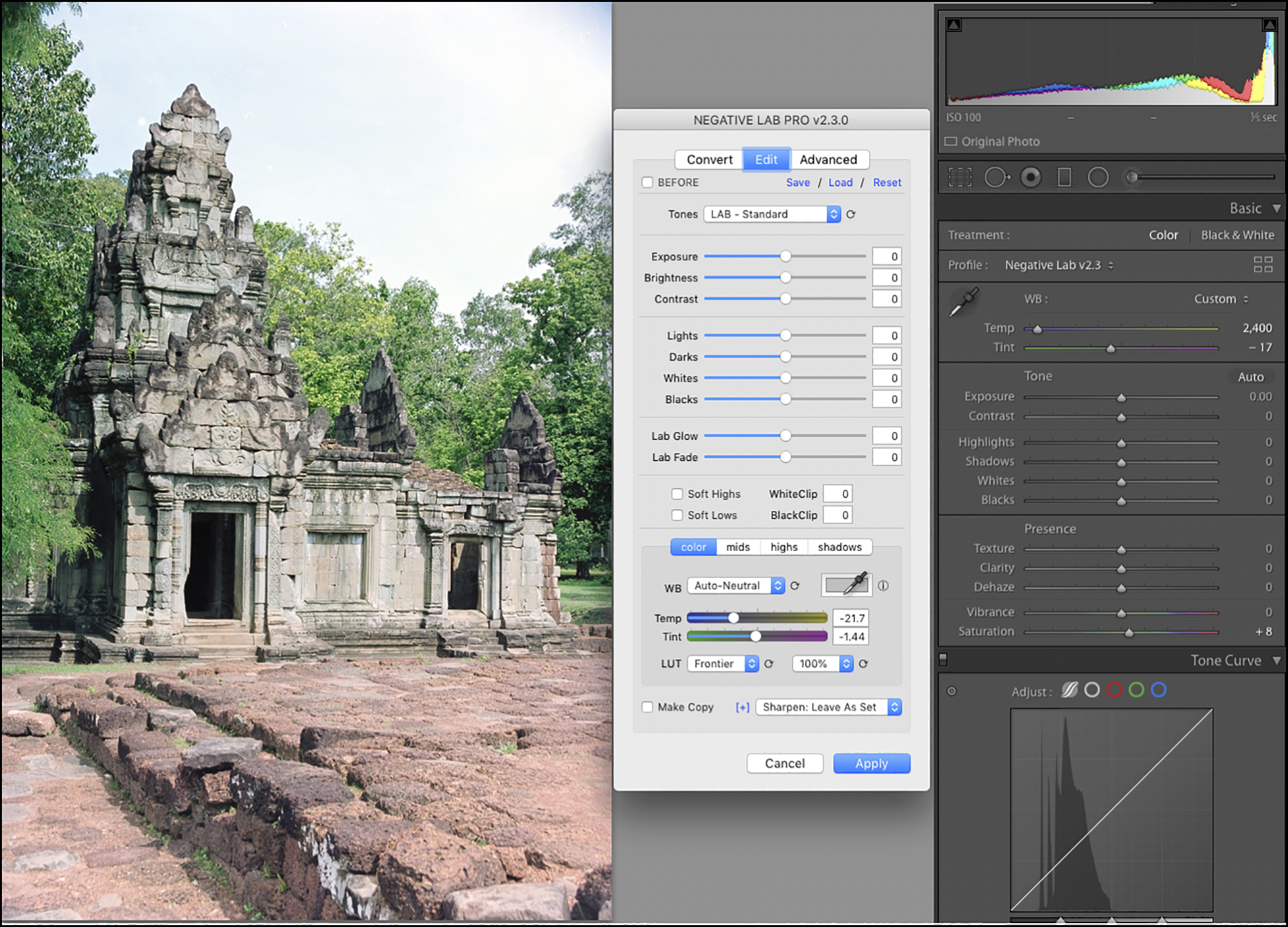
(The full work-up of this photo is laid-out in Annex 2)
Primary factors I take into account for processing negatives are the inherent photographic properties of resolution, perceived sharpness, quality of tonal gradation, and credibility of colour rendition.
Notice I did not say “accuracy” of colour rendition, because for the negatives I am converting there is no such thing. The photographs were made decades ago, and I have no precise recollection of scene accuracy and certainly no measurements, but the photographs bring back memories of the subject and I can tell whether the digital renditions of the colours I’m obtaining are credible and pleasing. The usual telltale items in making such assessments would be, for example, the colours of foliage, skies, objects that are supposed to be gray or near-gray and skin tones.
I’ll begin this article with brief remarks about these photographic properties, to be explored in more depth further on.
In the digital context, apparent resolution depends on the number of pixels per inch, and on seeing differences of tone or colour between adjacent pixels (Figure 2).
Perceived sharpness of a digitally converted negative, a property combining resolution and contrast, partly depends on the film chemistry and its processing, the quality of lenses and focus for both the original analog capture and the digital capture of the film, the parallelism and flatness of field of the digitizing set-up and the extent of magnification from negative to print.
The quality of tonal gradation and colour depends on the correctness of the analog film exposure and the digital exposure of the film media. “Colour” in this context includes grayscale (“Black and White” – B&W). Also important is the quality of the materials used: the film back in the days, and now the equipment and applications we use for digitizing the film and editing the photos.
When we talk of image quality, recall that the context is photographing colour or B&W negatives, which have unique characteristics and limitations inherent to film technology. That said, these negatives can embed very good colour, much fine detail and a well-defined tonal range from deep shadows to bright highlights, so the medium is not to be under-estimated, especially as it is the essential starting point from which all else discussed here flows.
Discussion:
I’ll carry this discussion in the following order of considerations:
(a) equipment and equipment set-up;
(b) resolution and magnification;
(c) digitizing procedure and related software, including linear dimensions, negative reversal, colour management, photo editing, sharpening, grain mitigation and clean-up;
(d) concluding observations
(a) Equipment and Equipment Set-Up
There are five components to the set-up (unlike a scanner which makes life easy by having everything all preconfigured in one box): (i) camera, (ii) the lighting, film carrier and leveling arrangement, (iii) the camera stand, (iv) a laptop computer and (v) focusing accessories (Figure 3).
Figure 3 Legend:
- Raise/lower/clamp assembly
- Arca-Swiss Cube (not necessary with #11 available)
- Stackshot motor and rail assembly (to raise and lower the camera)
- BalPro bellows adjustment rail (to change magnification)
- Camera/bellows/lens assembly
- Tether cable – a camera to computer
- Imacon film holder (knock-off) bottom portion of film carrier (top stripped off)
- Museum glass sits on top of the negative strip
- Guide tape on film carrier for placing negative strip
- Kaiser Slim Plano LED light tablet
- Leveling platform
- Stackshot controller
The set-up described here is one combination of countless options. Everyone has their own budget, needs, and preferences and there is all manner of equipment combinations to deal with them. My set-up is one, amongst others, that addresses technical requirements for high-resolution, quality photographic captures capable of high magnification.
Dimensions and resolution: So let’s start with the camera. We recommend what kind of camera specs for this work? It depends largely on the ultimate size of prints one may contemplate making from the digitized media. If remote control of exposure and live-view capability on a computer screen are wanted, which I recommend, the camera should be capable of tethering to a computer, accompanied by enabling software.
Whatever media size one is digitizing, the sensor dimensions and pixel count determine the largest linear dimensions and resolution capable of being obtained from the capture at any given PPI rendition and, setting aside resampling and photo-stitching, are always the same regardless the size of the media being photographed. The user-desired linear dimensions and resolution of the end product determine the required camera specifications. In other words, the bigger one wants to print the higher the sensor specs one should consider.
Let’s put some numbers to it. Because I wish to retain the possibility of producing large prints (i.e. 13×19 inch and above) at high resolution, I’m using a Sony a7R IV having 60 MP of resolution, being 9504 x 6336 pixels on a 36x24mm sensor, providing resolution at the sensor (i.e. before considering the performance of the lens and imaging system) of 264 pixels per mm, which is 6705 PPI (264 ppmm x 25.4mm/inch); this exceeds all desktop film scanners except for the discontinued $25,000 Imacon/Flextight models, but more about that below.
My Epson SC-P5000 printer, uses an input resolution (to the printer) of 360PPI, specified for most photographic purposes, hence my output resolution to that printer should be 360PPI. Without resampling, at 360PPI, each inch of image pixels at the sensor yields 18.6 inches of printed output (6705/360). A 36 x 24 mm sensor is just about 1.4 inches x 0.95 inches. Hence the maximum print size at 360 PPI without resampling and using all available pixels is 26 x 17.7 inches [i.e. 18.6 scaled by factors of 1.4 and 0.95]. High quality prints larger than this may be obtained by accepting initial PPI resolution down to say 240 PPI, yielding prints scaled up to about 39 x 26.6 inches, then resampled to 360 for printing. Anyone who’s prospective print size requirements are much less than these would not need a 60MP camera – less will do. For print requirements larger than these, the set-up I describe in this article allows for that by photo-stitching as described later.
Sharpness
To achieve optimal perceived sharpness, the media needs to lie flat, it needs to be parallel to the image sensor and fine focusing needs to be feasible. Anyone whose technical requirements include corner to corner, edge to edge sharpness needs to use a high quality, flat-field macro or copy lens specifically designed for macro-photography with enough coverage of the sensor dimensions to avoid obvious vignetting. One can (and should) consult the MTF curves for the lens to get an idea of performance. For macro/copy work one generally uses a macro/copy lens at its maximum aperture, so focus tolerances are very tight.
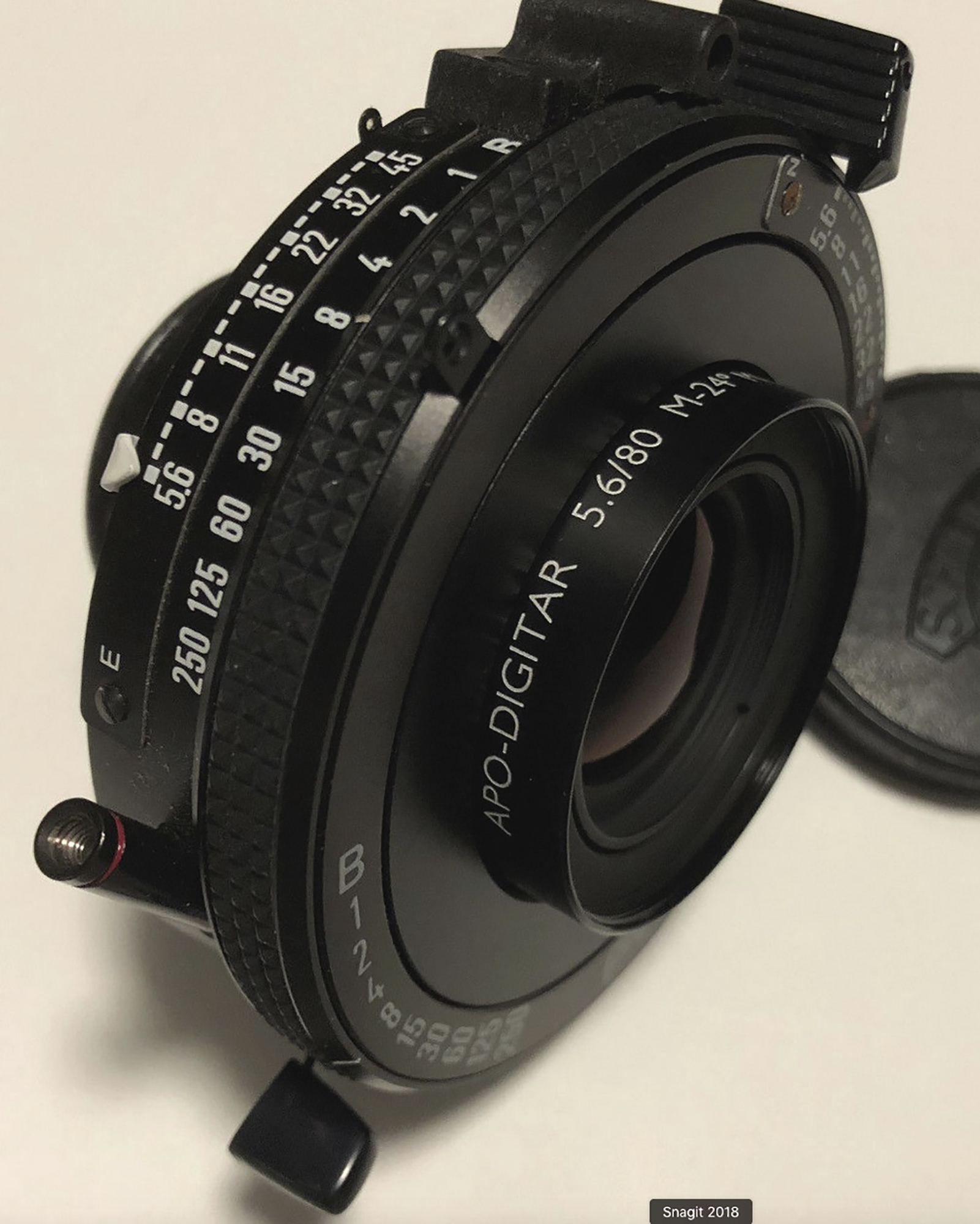
I am using an 80mm f/5.6 Schneider Apo-Digitar macro lens (Figure 4) mounted on a Novoflex BALPRO bellows, which holds the camera on top and the lens on the bottom in a vertical capture set-up. Nowadays these lenses are usually available only on the resale market. I’ve tested the performance of this lens on media ranging from 35mm film to 3 ¼ x 4 ¼“ film and it’s fine. It’s not the only lens that will serve the purpose very well, but it’s a particularly fine one.
To assure adequate flatness of the media, I place the film on the base of an Imacon-style film carrier (bought from an overseas supplier) which sits on a light-tablet and I cover the film with a piece of Tru Vue Museum Glass. The glass is perfectly clear, weighs enough to suppress moderate media curvature and does not cause Newton rings.
To assure fine focus I use a Stackshot which can electrically move the camera assembly by as little as one micron at a time, though at least 2 microns normally suffices. Recall, a micron is 1 1/1000th of a millimeter – really tiny. (Figure 5)
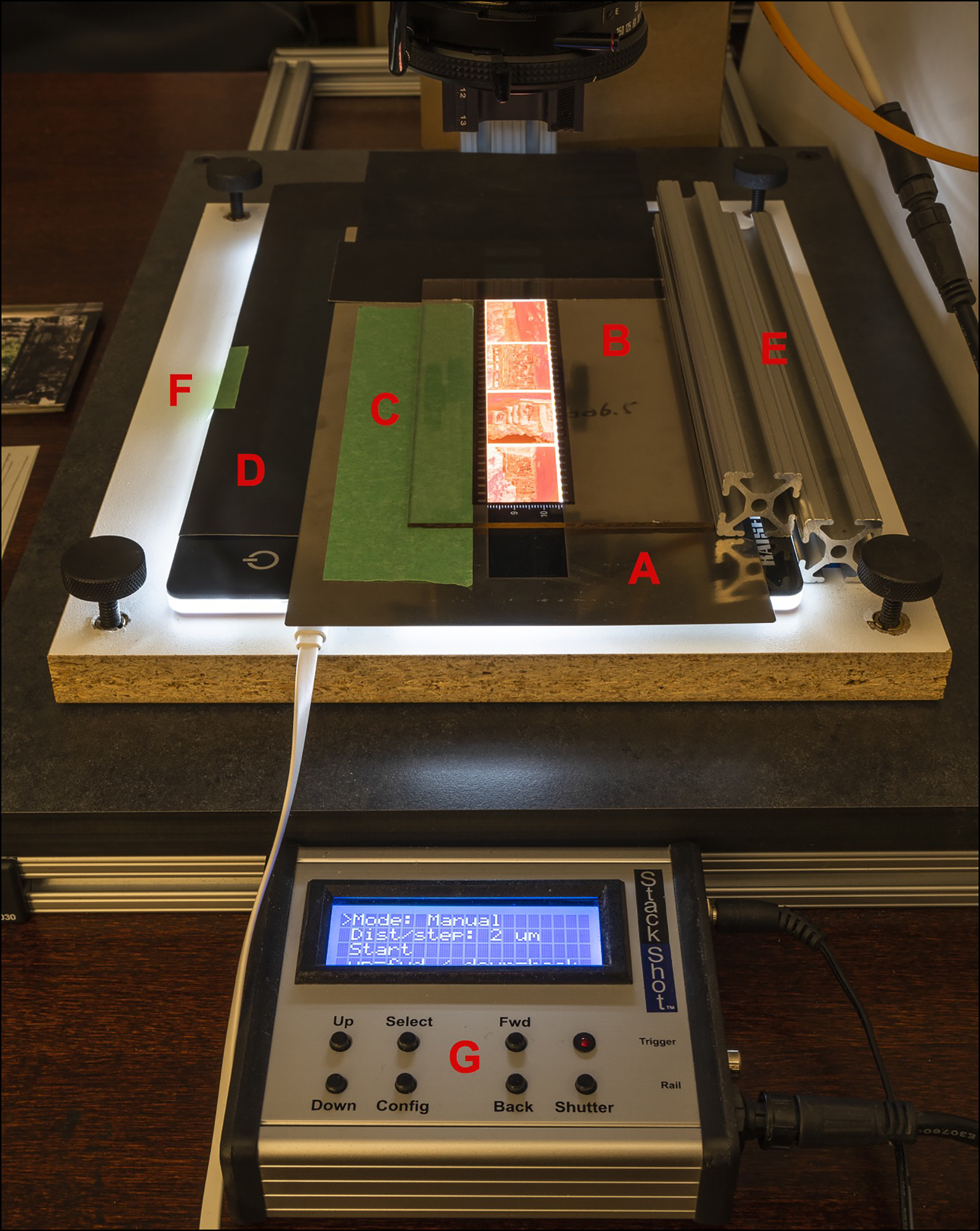
Figure 5 Legend:
- Imacon knock-off 35mm carrier bottom (the magnetic black top is removed)
- Museum Glass (to hold the film flat)
- Guide tape for negative placement on carrier
- Kaiser Plano light tablet
- Slide rails (80/20 extrusions) for perfectly straight negative transport
- Levelling platform (to assure a parallel sensor-media arrangement)
- Stackshot focus controller (moves the camera/bellows assembly up and down).
For the most part, the extent of bellows extension between the lens and the sensor determines the extent of media magnification, while the movement of the camera altering the distance between the lens and the media determines the focus, and to a much lesser extent affecting magnification.
The sensor plane and the media plane need to be absolutely parallel because the depth-of-field with such macro-photography is just about nil. The three tools I have on hand for meeting this requirement are the Versalab “Parallel” Laser Alignment Tool, a Zig-Align mirror, and a custom-made leveling platform. Essentially, one needs two items for leveling: one to make the adjustments and the other to measure the results.
The Versalab (Figure 6) is a box that shines a laser beam off a piece of glass mounted to the imaging plane (the glass has a white paper backing); the laser reflects back to the box, and the system is level when the beam coincides with a center-spot on the box.
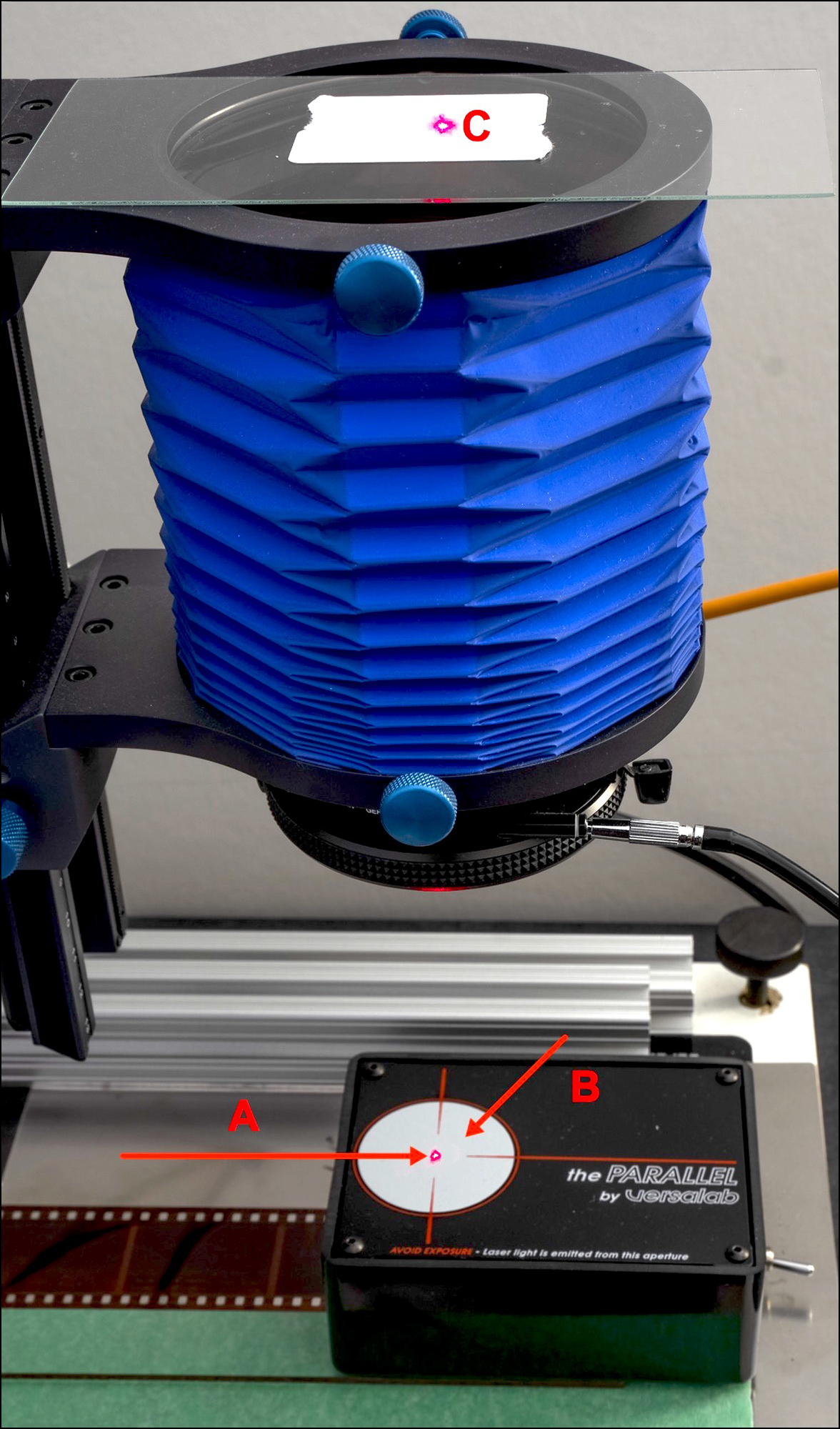
Figure 6 Legend:
- A. The beam projects onto “C” (glass on top of bellows with paper light stop pasted on top) which reflects back to the gray circle on top of the black box. If the beam projected back converges with the beam that went up, the system is well-aligned, as this one is.
- B. If the system were not well-aligned, the beam projected back would end-up somewhere else in the gray circle; then one adjusts the camera angles or the leveling platform until they converge.
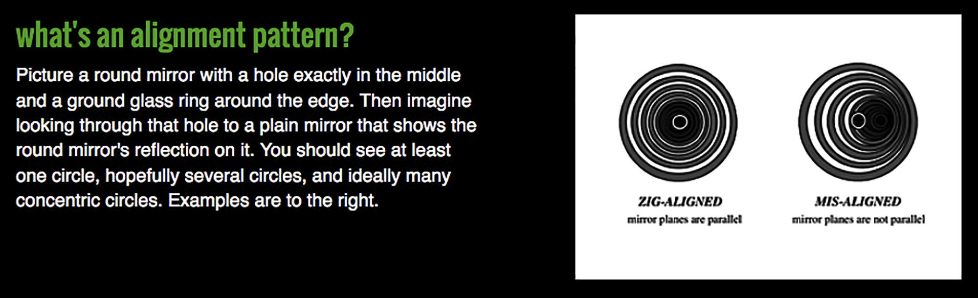
The Zig-Align is a mirror with a hole in the middle that one mounts on the lens facing a mirror placed on the film plane. The system is level when one sees a symmetrical series of concentric circles in the viewfinder (Figure 7, from the Zig-Align website).
The Zig-Align may be more accurate at short distances than the Versalab, for which greatest accuracy seems to be attainable with the camera several feet from the base.
The leveling platform is a “do-it-yourself” 3/4″ thick panel with 1/4-20 threaded brass inserts in the corners to accept leveling screws allowing one to adjust the level of the base at the four points to be completely parallel to the sensor plane (Figures 3 or 5). The parallelism can be measured with a Versalab or a Zig-Align.
With all of this, one needs nothing else to achieve parallel planes; but only because I have one and its convenient to use, I mount the camera assembly onto the copy stand using an Arca-Swiss Cube (Figure 3, item 2), which provides for independently controllable three-way alignment adjustments. It’s a very expensive item which I would not recommend using for this purpose unless you have one. A good quality and much less expensive ball-head would be usable as well.
The camera, bellows and Stackshot need to be mounted on a robust copy-stand. I commissioned a custom stand with the PennAir Corporation (York, PA). A team of three (good friend Christopher Campbell, Mr. Dave Wallace of Penn Air Corporation, and myself) designed it. It is made from components supplied by 80/20 Inc. (aluminium extrusions, baseboard made of Trespa phenolic material, tough plastic bearings, brakes, screws, nuts, bolts) (Figure 3). This copy stand is rock-solid, easily supports the load it is carrying, and costs less than half of what a similarly well-designed, robust commercial product would cost. It is delivered CKD and the customer assembles it.
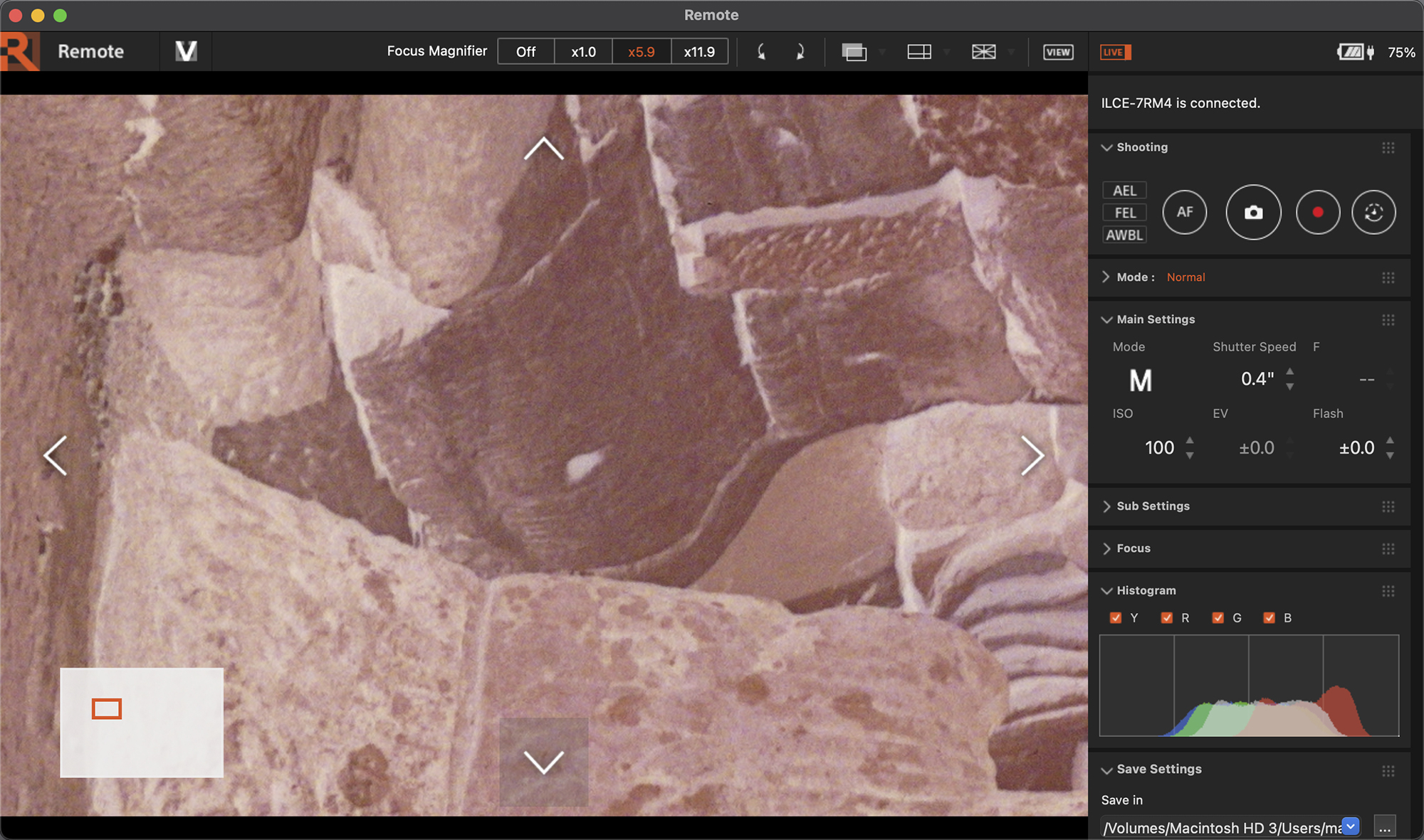
The final element here is that one needs to be able to see when the media is sharply focused. So, the camera is tethered to a 2020 13” M1 MacBook Pro equipped with a Retina display, using Sony’s Imaging Edge Remote software (Figure 8) for adjusting exposure, viewing focus and triggering the exposure from the computer. The Retina laptop screen has fine enough resolution for determining focus. The feedback between the camera and the computer is nearly immediate (USB-C tethering cable), as necessary for an efficient workflow.
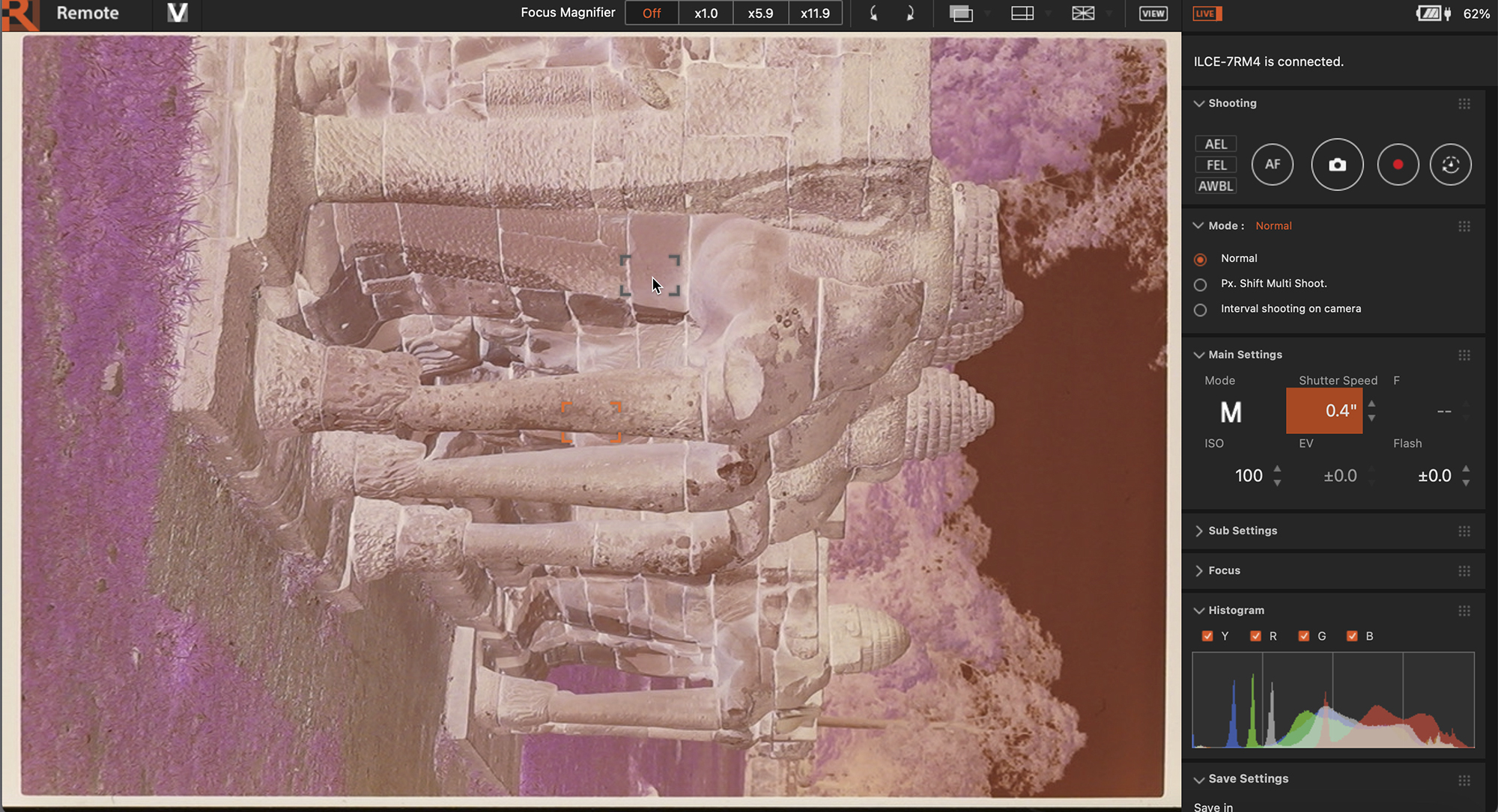
The Sony Remote software allows media magnification of 5.9x and 11.0x using an a7Riv camera. I find 11x over-magnifies the film making focusing more difficult, but the 5.9x level provides reliable visual evidence of fine focus. (Figure 9) I find the best way of focusing is to concentrate on a small area that has the most obvious fine edge distinctions (edge contrast) and make sure those are clear and sharp – in a way – contrast detection with the human eye, much as happens at the optometrist when we read the eye chart for determining a glasses prescription.
Capture One provides a nifty Focus Meter tool which is supposed to do this electronically to a high degree of precision. It works well with recent model Phase One cameras, but I didn’t find it particularly useful in the context of my set-up for reasons I don’t know (lots of jitter, and the bars forming the focusing box never closed as they should have to indicate optimum focus).
Variable magnification ratios: people who need variable rates of media magnification (to handle different film sizes, cropping image sections, etc.) would find it most advantageous to use a bellows, as mentioned above. The Novoflex BALPRO (Figure 3, item 5) is a precise and robust tool for this purpose.
Lighting: the media needs to be backlit using a light table that provides even illumination that is not too spiky. The film and the light source need to be in the same plane. There are some expensive light-tables on the market with high-end specifications, but I found the Kaiser Slimline Plano LED opalescent light panel specified at 5000K colour temperature to perform satisfactorily and it’s not expensive. Actually, the camera measured the light as 5100K, and I set this as the camera White Balance (WB) for digitizing the negatives. The WB makes no difference to the raw data, but it affects the appearance of the preview and is recorded in the image meta-data. For converting and processing the image, the determinative WB happens in Lightroom and Negative Lab Pro (NLP) discussed further below. Stray light from the light source must be masked-off.
Avoidance of vibration during media capture is essential. Given the sensor’s high resolution and the high degree of magnification that these captures will require, the mildest vibration impairs sharpness. Here’s why: the width of the sensor pixels for this camera is 3.79 microns (and similar for many other cameras), which is less than 4/1000s of a millimeter. Hence, the smallest amount of vibration results in motion blur. Sony advises to not use the camera’s image stabilizers (“Steady Shot”) when mounted on a tripod or copy stand. The best ways to avoid vibrations are to use a solid copy stand sitting in a vibration-free environment and to make the captures with a remote control – either from a computer or with a camera-specific remote-control device. Sorbothane pads can also absorb vibrations in a copy set-up.
Now that I’ve defined the basic hardware components and their role in quality capture, I turn to a more detailed discussion of the technical factors underlying the digitization of analog media.
(b) Magnification and Resolution
One of the more important concerns about digitizing film is the extent to which the media can be magnified while maintaining acceptable perceived sharpness. There is a vast technical literature on this subject of which I am only scratching the surface here, in order to provide a very general and simplified explanation of the key factors underlying the results we should expect from digitizing negatives.
Resolution is a property defining the ability of an imaging system to separate image detail; it is capable of numeric specification described below, while sharpness is a more encompassing concept combining objective and subjective factors including how well focused the subject is on the media, the extent of macro and micro-edge contrast in the subject matter (discussed in relation to Figure 2), imaging system resolution and the proper usage of that system. All of this comes into play when approaching the digitization of negatives.
Different concepts and conventions are used between film and digital to measure resolution. While resolution in the film context and for lenses is often measured in terms of “line pairs per millimeter” (lp/mm), for digital resolution a more common metric is “pixels per inch” (PPI). Since the subject matter of this article involves both film and digital, I use both and point out how they are related.
A “line pair” as deployed in a resolution measurement target is a black line beside a white line (Figure 10).
A line pair is said to be resolved only if one can clearly distinguish between the black and white lines. A pixel is different: it is a “picture element” having a single brightness/colour value derived from a photosite on the sensor (think of it as “one line” in terms of brightness value). It requires two pixels to form a line-pair. One pixel can be distinguished from the next only if the two have different brightness or colour values (Figure 2).
The arithmetic conversion between lp/mm and PPI is: < lp/mm X 50.8 = PPI >; e.g. 50 lp/mm = 2540 PPI. The 50.8 comes from the fact that there 25.4 mm per inch and 2 lines in a line pair, whereas a pixel is its own unique “line” (Figure 10). This formula looks simple and logical enough, but whether it perceptually and physically works that way in practice as light rays pass through the imaging system to the sensor is less straightforward.
Judgment is exercised in assessing whether a line pair is resolved because the degree of acceptable distinction between black and white lines as the photographed lp/mm changes is partly judgmental. This means that a statistical measure is subtended partly on a judgment call and is, therefore, less “objective” (especially regarding consistency) than its numerical clarity may suggest, but for guidance and especially comparison between samples it’s indicative.
The detail resolution of a digitally converted negative is finer the higher the lp/mm a digitizing system can resolve, this depending on the film chemistry, on the resolving ability of the whole imaging system (equipment and processing) used to make the negative, and that of the camera system used to digitize the negative. The resolution limit of the digitized negative image will be the lesser of the film imaging system resolution or the digitizing system resolution.
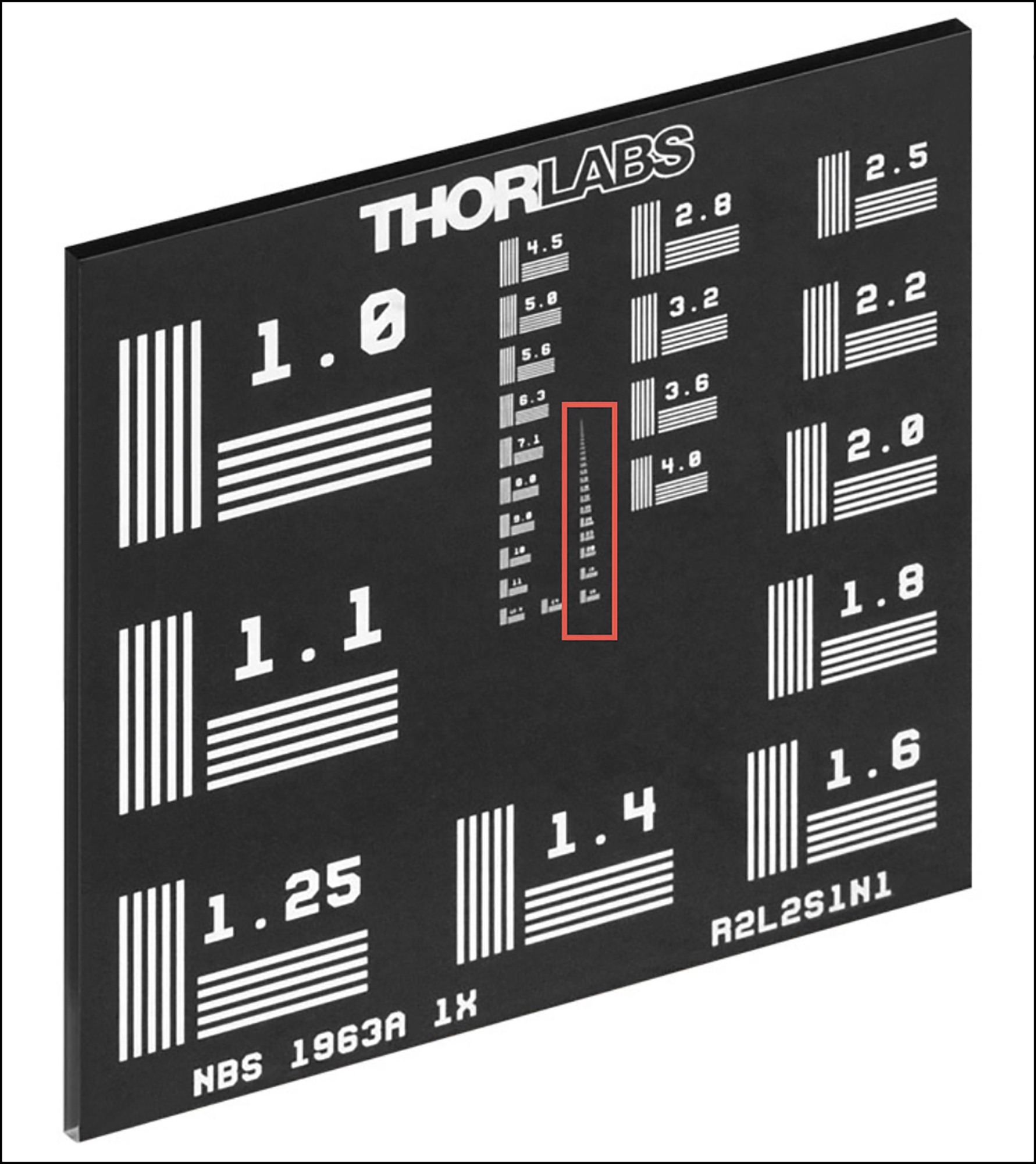
A film-based version of the USAF-1951 resolution target is widely used for measuring the lp/mm resolution of imaging systems, but a Thorlabs negative resolution target (Figure 11) is more useful for assessing very high resolution from backlit media. Unlike the USAF target, it is not made from film; rather, it is etched into glass. According to Thorlabs, “We use contact photolithography with a mask aligner to define the pattern on the glass substrate. Once the pattern is defined, we chemically etch the substrates and clean them in a class 100 cleanroom.” In Figure 11, I placed a red rectangle around the strip in the target whose upper portion is of interest to a high-resolution digitizing set-up (range of 16 to 225 lp/mm from bottom to top of that highlighted strip).
With this background in mind, the most relevant resolution questions are about (i) the resolution of human visual perception (ii) resolution of the film one is digitizing, and (iii) the resolving capability of the analog and digital imaging systems.
(i) I’ll first comment on the question of the resolution limits of human vision. We can then compare this estimate with the resolution of magnified output from the imaging system digitizing the negatives, the key matter of interest being how human visual resolution compares with that which the imaging system delivers. Radically parsing a complex and diverse literature on the subject of the ability of the human visual systems to resolve detail, the range of estimates I found is from 6 lp/mm to 10 lp/mm, with a cluster of them suggesting 6~ 7 lp/mm, based on a normal, healthy human eye being able to discern 1 minute of arc under optimal contrast and lighting at about one foot from the object (further from the object, resolving power declines). Hence, if we were to adopt, say, 7 lp/mm and multiply that by 50.8 for conversion to a PPI metric, the benchmark for human visual perception would be 355 PPI which is very close to Epson’s 360 PPI input resolution to its printing system. (The Epson printing system generates ink droplets much finer than this for reproducing those pixels on paper.)
Turning to (ii), the resolution of the media, this is basic, but insufficient to know in isolation. The film is part of an imaging system including camera, lens and other factors which affect the resolution of the image on film. As well, two imaging systems are at play: the camera and lens used to make the photo on film, then that used for digitizing the film. It is the resolution of the imaging chain as a whole that is of ultimate practical interest, but to understand where critical or determinative limits set in, we need to know the resolution capability of the components.
So, starting with the colour negative film, let us take two examples of fine grain negative film. The resolution of Fuji Reala Superia, ASA 100, according to Fuji, is either 63 lp/mm or 125 lp/mm, depending on the contrast ratio of the chart used to measure it. Kodak VR100 has a “native” resolution of 100 lp/mm (cf. T.J. Vitale, Film Grain, Resolution and Fundamental Film Particles, Version 24, 2009). I don’t know exactly how these measurements were made, nor have I sighted discussion of their validity, so for want of better I adopt them “as is” – caveat emptor.
Resolution drops from there, as we turn to item (iii) – the imaging system. Image formation issues for the lens include the fact that the light from the subject needs to pass through glass and air losing some “pointedness” along the way (measurable in terms of “point spread function”); also affecting image formation are choice of aperture, lens aberrations such as coma, astigmatism, flare, dispersion, element alignment; and for the camera/film – issues such as focus, flatness of field, lens/film alignment, vibration/movement, dirt, film development imperfections, film storage conditions and perhaps more.
Vitale’s calculations based on Fuji methodology for determining the resolution of imaging systems suggests that Kodak VR100 colour negative film, which started at 100 lp/mm for the film alone, achieves an imaging system maximum resolution of 67 lp/mm. He did not provide a similar calculation for the same imaging system using Fuji Reala Superia colour negative film (of particular interest to me), but this data for Kodak VR100 would suggest the Fuji Reala Superia data (125 lp/mm high contrast estimate for the film alone) could be reduced by at least one-third, bringing the high-contrast estimate for a high-quality imaging system based on this film to about 82 lp/mm for the photo on film, which arithmetically would equate to a bit over 4000 PPI. (It is perhaps not coincidental that the optical resolution of the Nikon 5000 film scanner is 4000 PPI.) This takes us as far as I can go determining usable resolution obtainable from colour negative film combined with a very good film-based imaging system.
This result implies that as we progress into digitization, we need not be concerned about achieving anything better than 4000 PPI because the media cannot support better. However, I am not jumping to this conclusion because the resolution estimate for the analog system is just that – an estimate – it could be wrong by an indeterminate amount, so the best assurance of maximum achievable resolution is to out-resolve that estimate in the digitization stage as much as feasible.
The next step is to understand the apparent (as opposed to physical) resolution of the digitization set-up, discussed above. I’ll first spend a moment on this distinction between physical and apparent resolution. The physical resolution for this camera is 6705 PPI (discussed in Section (a)) based only on sensor photosites per inch. The apparent resolution is the PPI that the whole imaging system can render, taking into account the many factors that can degrade resolution on the way from the film, through the lens to the sensor. We measure apparent resolution, because that is what matters to viewing photographs.
For this, I capture an image of the Thorlabs target set-up exactly as I would digitize a piece of film, and it indicates an apparent resolution that I estimated to be a comfortable 144 lp/mm, or 7315 PPI (Figure 12, 100% screen grab). I could make a case for 161, but one set of three bars is starting to become just a bit indistinct, so I’ll settle for 144. At this level of resolving power whether it is 144 or 161 or something in-between is immaterial relative to the much lower resolution of the negatives being photographed.
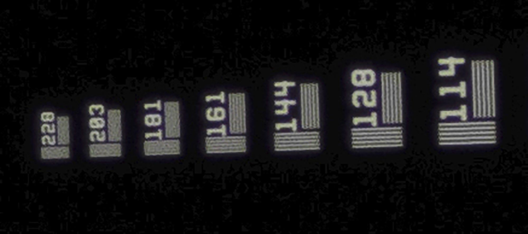
Interestingly, this visible resolution estimate of 7315 PPI exceeds the sensor’s physical pixel count of 6705 PPI; however the step below 144, which is 128 – equivalent to 6451 PPI, falls slightly below the sensor pixel count.
So now we know that my imaging system’s apparent resolution will not be the binding constraint on overall perception of image detail – it will be the media/subject matter being digitized.
It is perhaps of interest to compare the test result for the Sony a7R IV/Schneider macro system with that for a top-of-line $25,000 Imacon scanner, which though rated at 8000 PPI sensor resolution, as an imaging system tested with a USAF target, it resolves at about 5800 PPI. If the Imacon were tested with the Thorlabs target the result may be somewhat better, but it may not be possible to do this because an Imacon scanner requires flexible media and a Thorlabs target is not flexible; all said and done the camera system I’m using probably out-resolves all desktop film scanners. I don’t have experience with drum scanners and scanning backs to know how they would compare with this camera system if tested in the same manner, but it could be of academic interest to know.
So much for (a vastly simplified) treatment of the resolution/sharpness of the imaging systems. But now enters the question of magnification, because of course, once the media is digitized into an image the size of the camera sensor, it isn’t really usable yet – it’s too small. It needs to be magnified to the linear dimensions intended for the end-product, so absent re-sampling, the in-going resolution will be diluted in inverse proportion to the increase of output linear dimensions.
For example, let us take the 6705 PPI of my Sony a7R IV system and call it the input resolution. If we magnify that inch by 18.625x, we have a linear dimension of 18.625 inches, and the resulting enlarged image has an output resolution of 360 PPI (6705/18.625). This kind of magnification happens in the image processing application (e.g. Lightroom), not at the copy stand.
Magnification at the copy stand is another matter, and it can be used to greatly expand the linear dimensions of a high-resolution file. This is where the use of a bellows (or extension tubes) becomes necessary. My starting point is a camera sensor measuring 24x36mm and film media measuring 24x36mm, so a frame-filling capture of the media represents a magnification of 1.0x (i.e. no magnification). Normally this is ample with the 60MP camera, because it produces 9704 x 6336 pixels, allowing me to make app. 27 x 17.6-inch prints at 360 PPI from a high-resolution capture (9704/360 or 6336/360).
In selecting a magnification, there is another important consideration: at some point, magnification becomes counter-productive because it makes the limits of the media resolution more obvious, “loosening” detail rather than “tightening” it. When that starts to occur, we are into “empty magnification” – i.e. magnification which reveals more fuzziness rather than enhances the perception of detail at a given viewing distance. (As the image is more magnified, viewing distance should be increased to preserve the appearance of sharpness.)
But let’s say, regardless, we wish to make much larger prints at high resolution (of the digital end of the chain) without resampling. We can do that by increasing the magnification ratio between media and sensor on the copy stand (by extending the bellows) and then photographing the media in sections which are then Photo-merged in Lightroom. I’ve done this enough to know that it works very well. So, I’ll provide an example.
Referring to the diagram (Figure 13), the conceptually easiest approach is to rotate the camera by 90 degrees relative to the media (very easily done with the BALPRO) so that the wide dimension of the sensor captures the narrow dimension of the media, then magnify the media on the sensor so that the 0.94 inch dimension of the film image fills the 1.4 inch dimension of the sensor, as shown by the relationship between the black and red lines in Figure 13, the black rectangle standing for the camera sensor and the red the film. To create this fill, the magnification ratio will be 1.4/0.94 = c.1.5. Having magnified the media by 1.5x, the full length of the media now stretches from 1.4 inches to 2.1 inches (1.4 x 1.5). But the short dimension of the image sensor is 0.94 inches, which we filled with the first exposure, so we need to slide the media down enough to make another capture of 0.94 inches, making sure to allow for some overlap (say 0.2 inches) with the previous exposure for merging. This will not be sufficient because 0.94+0.94-0.2 = 1.68 inches, leaving a final 0.42 inches of media plus overlap to be covered. So, a total of three captures.
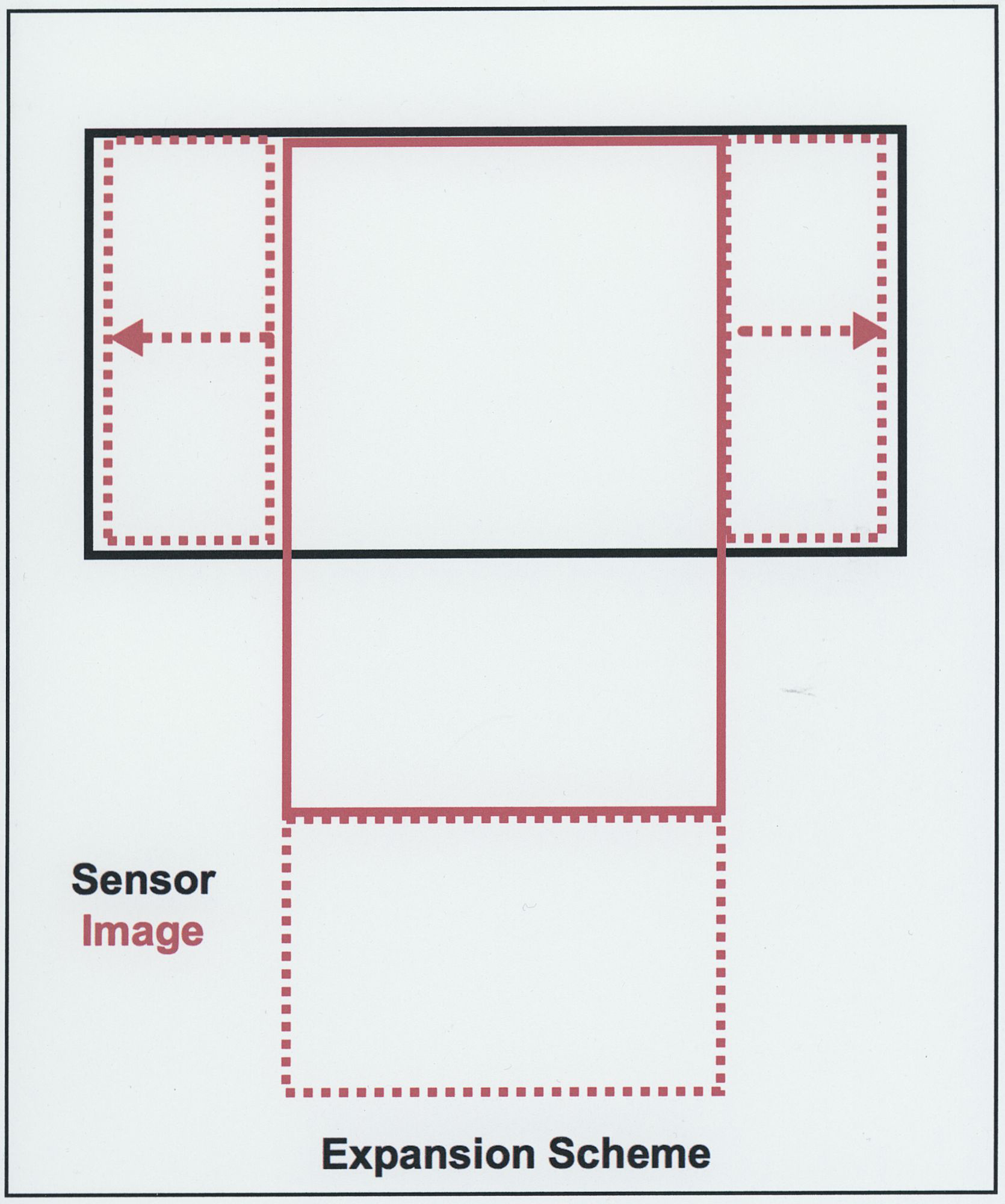
Having done this, we’ve substantially increased the number of original pixels interpreting the film without inventing any data by resampling. The final capture, once the three captures are merged would produce a final image file that has maximum pixel dimensions of 1.5 x (9705 by 6336) = c.14557 x 9504 pixels if the image filled the whole frame. If this file were to be printed at 360PPI output resolution, the linear dimensions without resampling would be 40.4 x 26.4 inches.
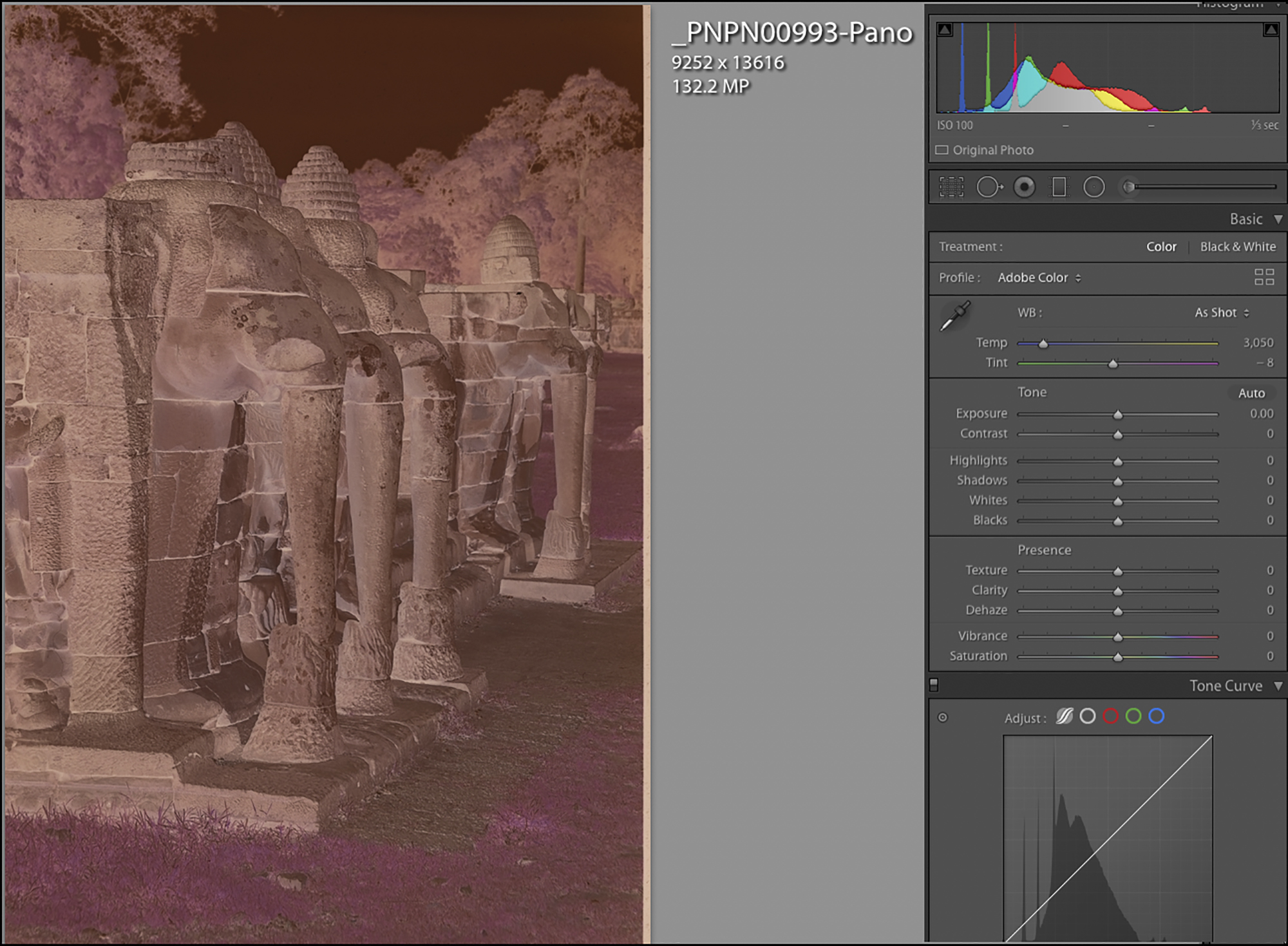
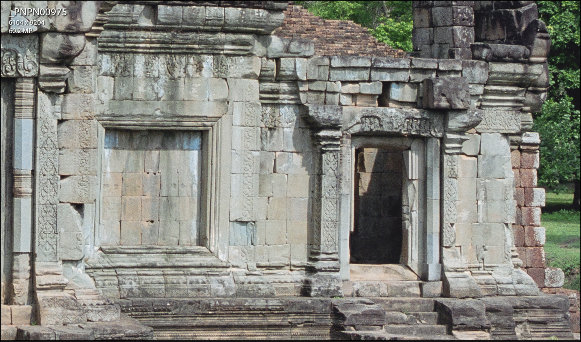
I performed a test of this expansion strategy using the negative of the stone elephants which I photographed at Angkor Wat in 2004 (Figure 14). I stopped short of completely filling the frame because I needed a bit of margin for white balancing in preparation for conversion from negative to positive in NLP. So my photo in Figure 14 emerged at 9252 x 13616 pixels, allowing for linear dimensions at 360 PPI of 25.7 x 37.8 inches from one 35mm negative. If the rendition were conducted at 240PPI instead of 360, the resulting linear dimensions would be 38.6 x 56.7 inches, then sent to an Epson printer at a resampled value of 360PPI, or a Canon printer at 300 PPI. One merges the negative captures, not the converted positives, to make sure nothing creeps in to create inconsistent merged sections.
One would only do this when such extra-large size prints are needed. The set-up with a bellows provides for considerable flexibility and latitude of magnification on the copy stand, which combined with Lightroom’s very capable panorama stitching algorithm, facilitates making huge prints of originals that may or may not deserve the full extent of conceivable magnification.
-
c) Digitizing Procedure and Related Software
The context of my workflow is to retain the image processing pipeline in the raw file format as far as high-quality image processing in Lightroom allows. This minimizes traffic between applications and minimizes storage. I know the argument that “storage is cheap”, but each raw file from this camera is 123MB. If that needs to be converted to TIFF or PSD it emerges at about 375MB before any layers. A lot to work with and store for one photograph. Sometimes conversion and editing in TIFF format is necessary, but I’m finding more often it is not.
My workflow and software boils down to three steps and three applications:
- Capture the media using Sony’s Remote Desktop application and transfer it to Lightroom.
- Convert the capture from negative to positive using Negative Lab Pro (NLP).
- Refine the positive conversion in Lightroom (Lr), and only if necessary, convert to TIFF for further work in Lr or Photoshop.
Sony Remote Desktop:
In this context it’s useful for four functions: (i) viewing a magnification of the media on the computer display (Figures 8 and 9), (ii) adjusting the exposure both by viewing the histogram (Figure 8) and examining the screen image, (iii) triggering the capture without touching the camera and (iv) transferring the image to a bespoke folder in the hard-drive from where Lr picks it up.
For those negatives whose luminance range exceeds the ends of the histogram, from Sony Remote Desktop we can extend dynamic range by making two exposures, one exposed correctly for shadows and the other for highlights, then blending the captured negative exposures in Lightroom using Lightroom’s Photomerge>HDR tool, which produces a “well behaved” histogram, and a more manageable positive for refinement in NLP and Lightroom. I’ll demo an example of this process after presenting the basic workflows in NLP.
My digitizing set-up is far enough away from the main desktop computer to warrant a dedicated laptop of its own with its inbuilt hi-res Retina display, but I prefer to do all the image editing from the main computer. In this case, Sony Remote on the laptop and Lr on the main computer are configured to transfer the file over an internal WIFI network from Sony Remote on the laptop to an Lr Watched Folder in the main desktop computer, with an Lr Collection sourced from that Watched Folder such that once the capture is made from the laptop running Sony Remote, it automatically (and quickly) opens into the specified Lr Collection on the main computer. So the image travels non-stop from the camera to an Lr Collection.
Negative Lab Pro (NLP)
NLP is a plug-in to Lightroom (Lr) specifically written to convert negatives into positives. Two of its greatest advantages are that it allows for editing the converted files while remaining in raw format and it is non-destructive – i.e. everything done with it is reversible without damage. It’s been available for about three years and has improved steadily with each new version, to the point that if one follows the instructions carefully, one obtains a pretty decent conversion “out of the box”, and it allows for further image editing both within NLP and afterward in Lr. So, the immediate questions are: (i) what NLP does on its own and (ii) what editing remains feasible/useful in Lr after finishing in NLP – especially important to discuss because once a file has been treated in NLP, its further management in Lr is unconventional, unless one renders the converted photo into TIFF or JPEG format as discussed below.
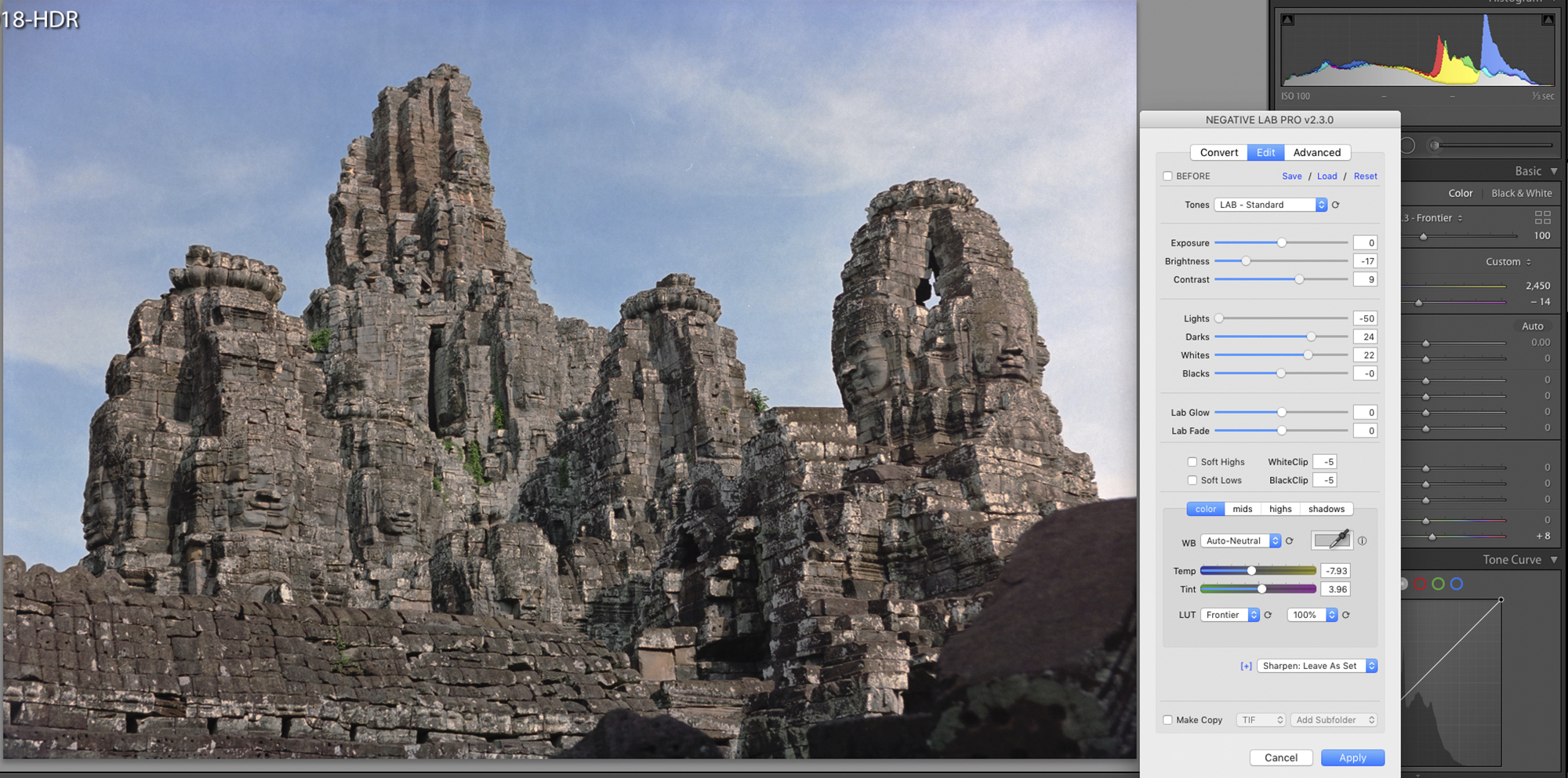
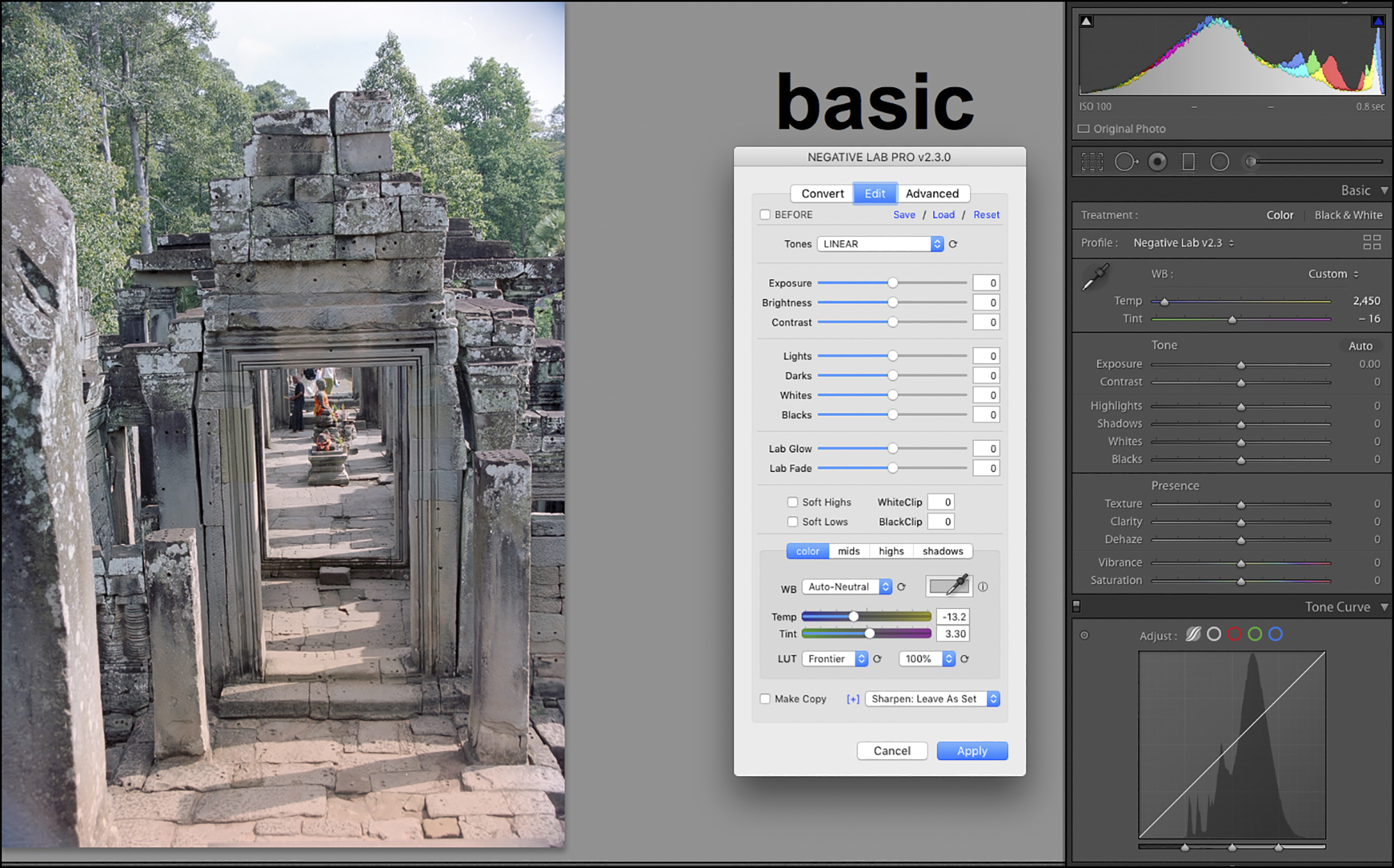
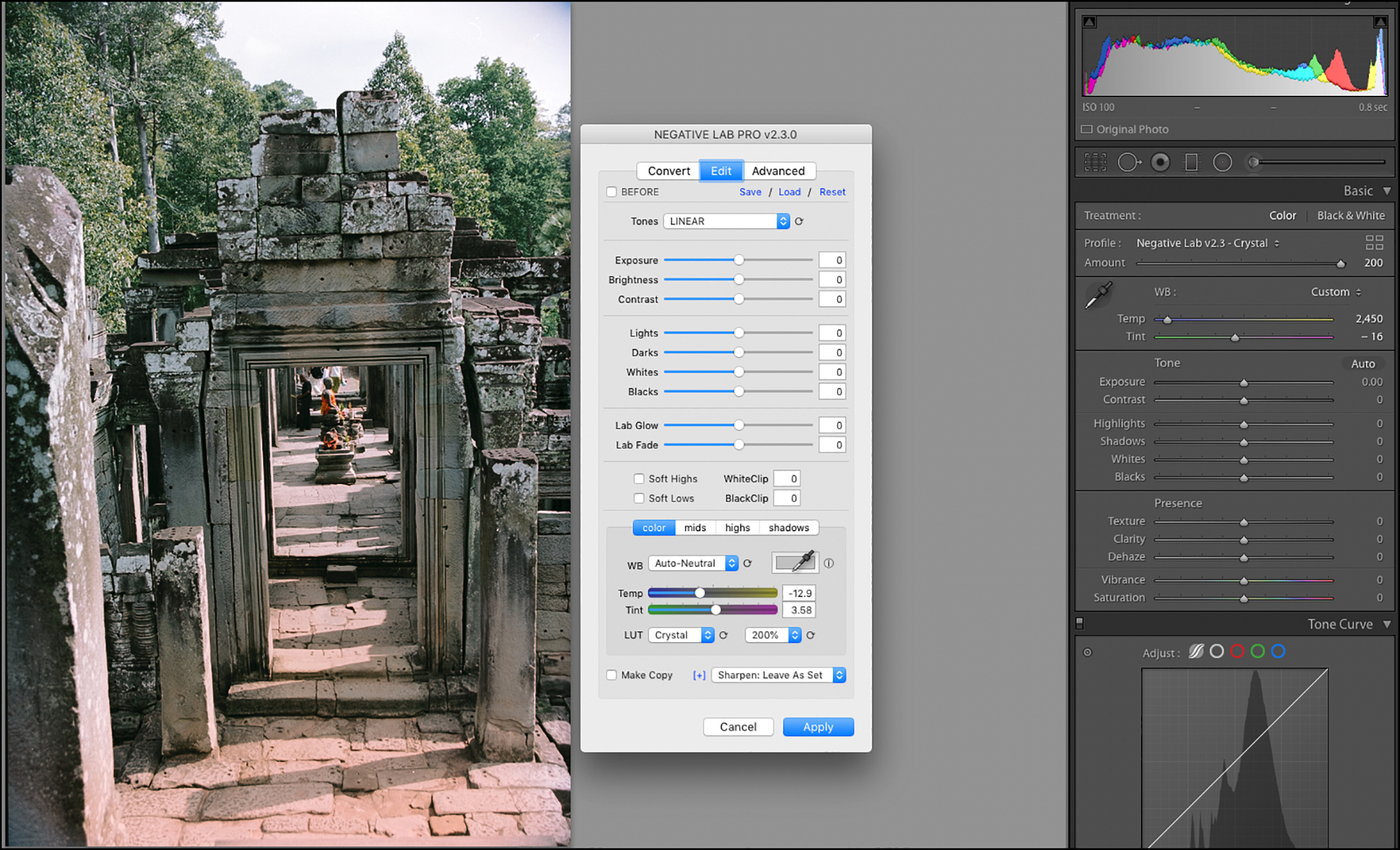
Let’s begin with question (i), working here with NLP, MacOS version 2.3. We’ve captured the negative using Sony Remote Desktop (Figures 8 and 15) and are now ready to process it in NLP.
(I also provide another work-up of a more colourful photo (Figure 1) in Annex 2.) For present purposes, I wanted a photo likely to challenge the application with a subtle range around neutrality and somewhat tricky tonal range.)
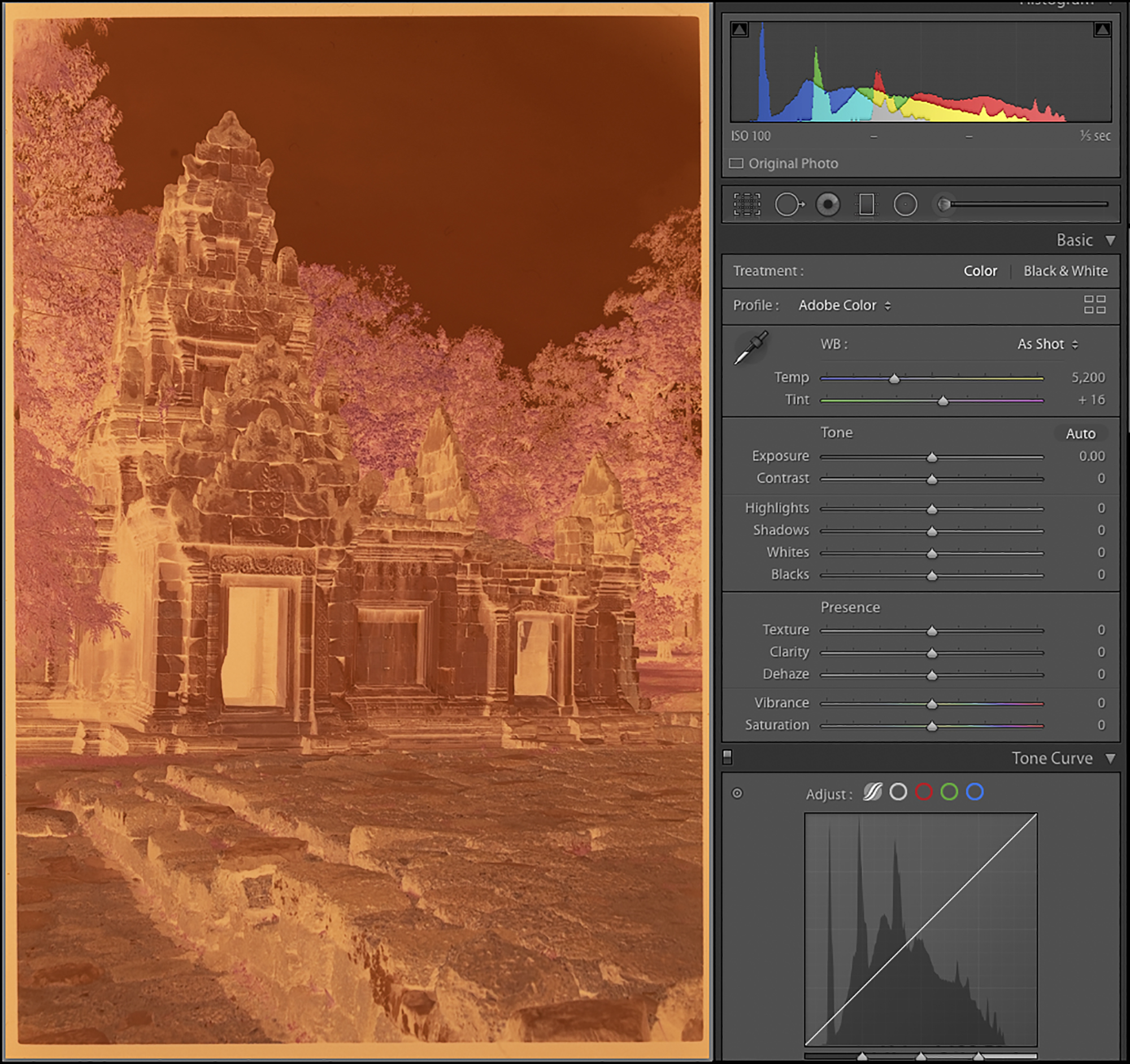
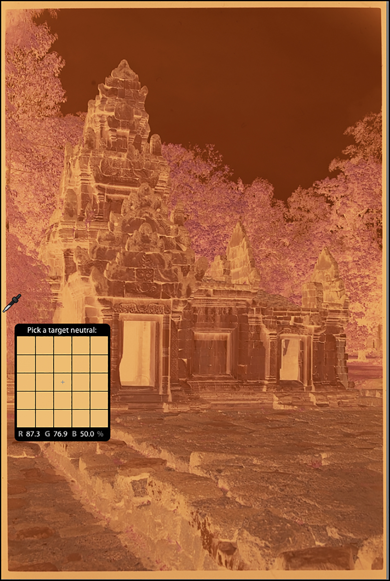
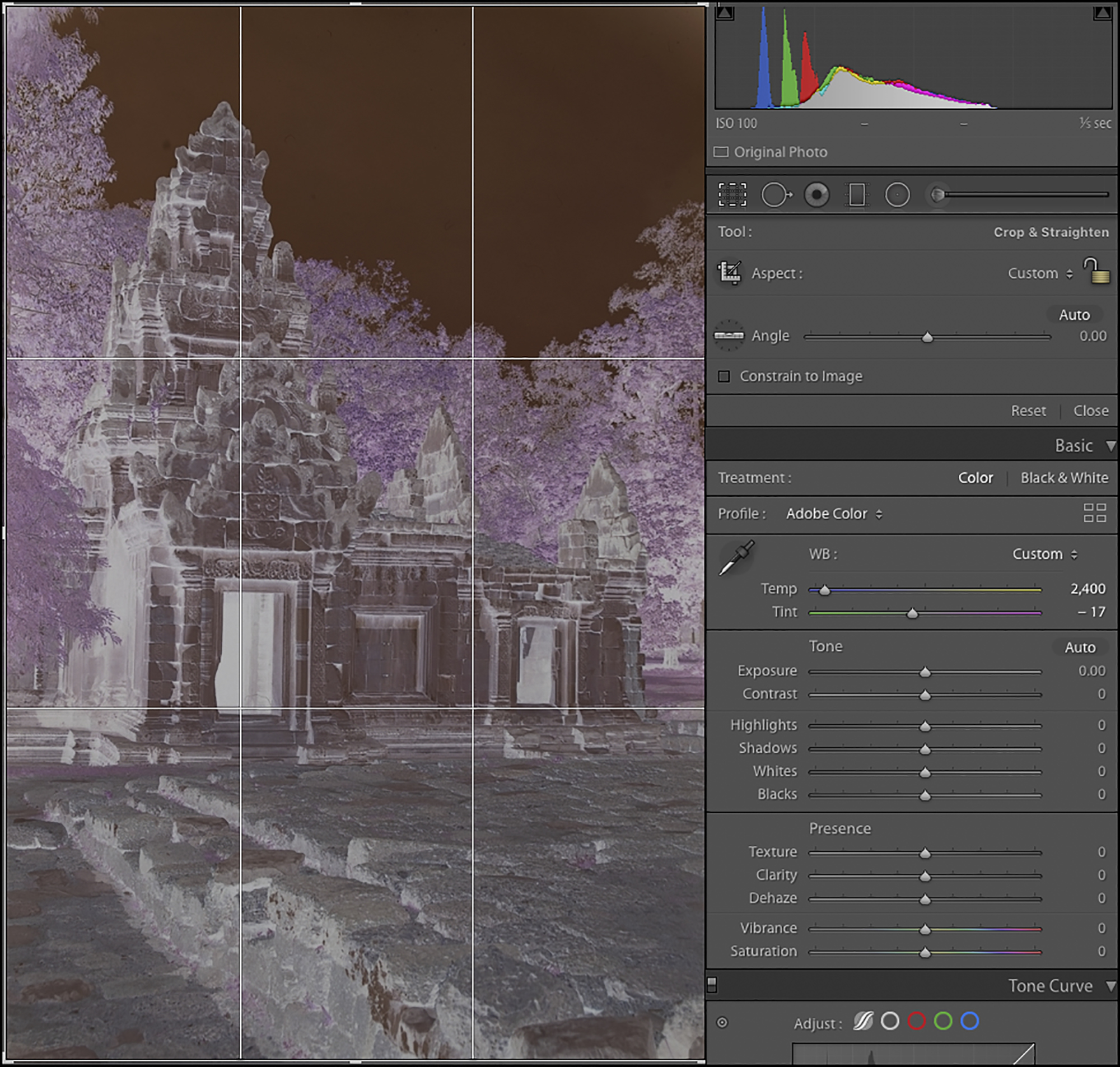
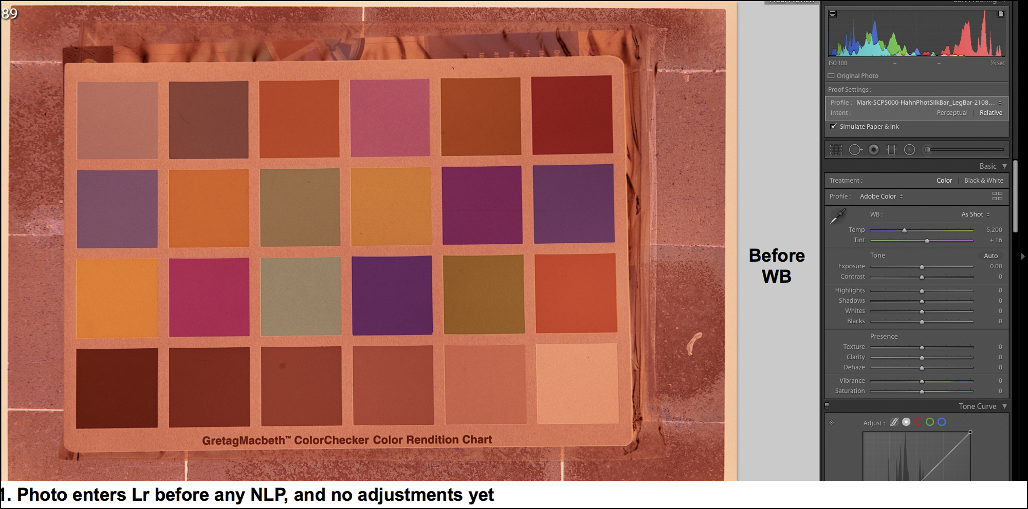
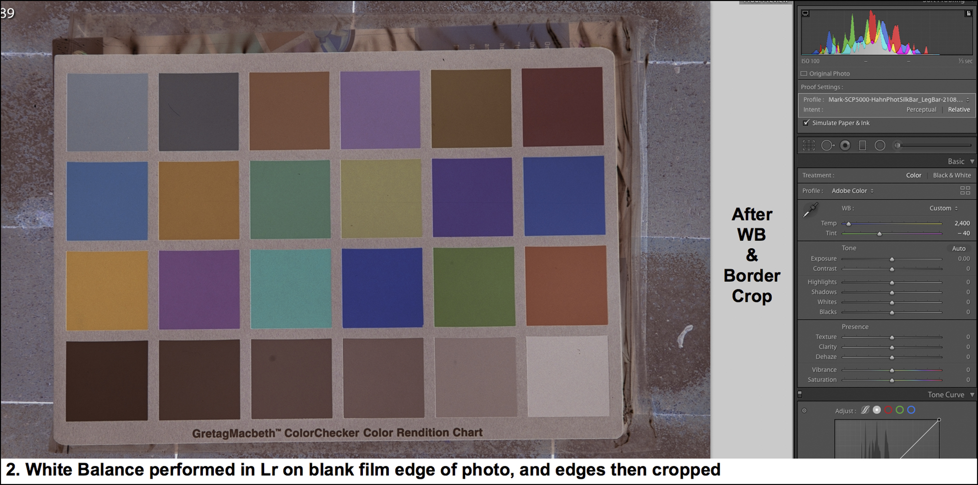
Once the photo is captured and opened in Lr, one does two things with it: (i) neutralize the negative’s orange mask by clicking the Lr eyedropper on a transparent edge of the film (Figure 16), and (ii) unless a pure Black point is needed, crop away all the edges so that only the photographic image remains to be converted (Figures 17 and 18). These steps are necessary for optimal colour rendition and ease of subsequent editing.
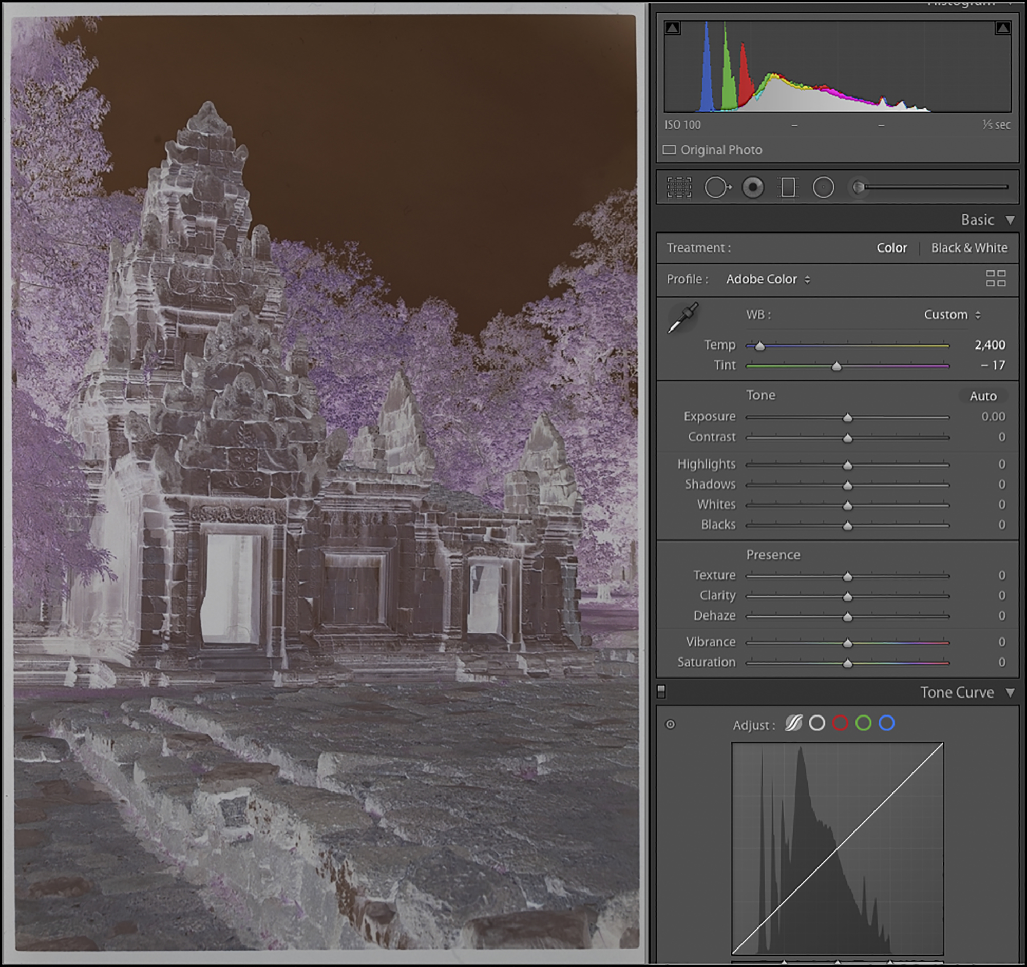
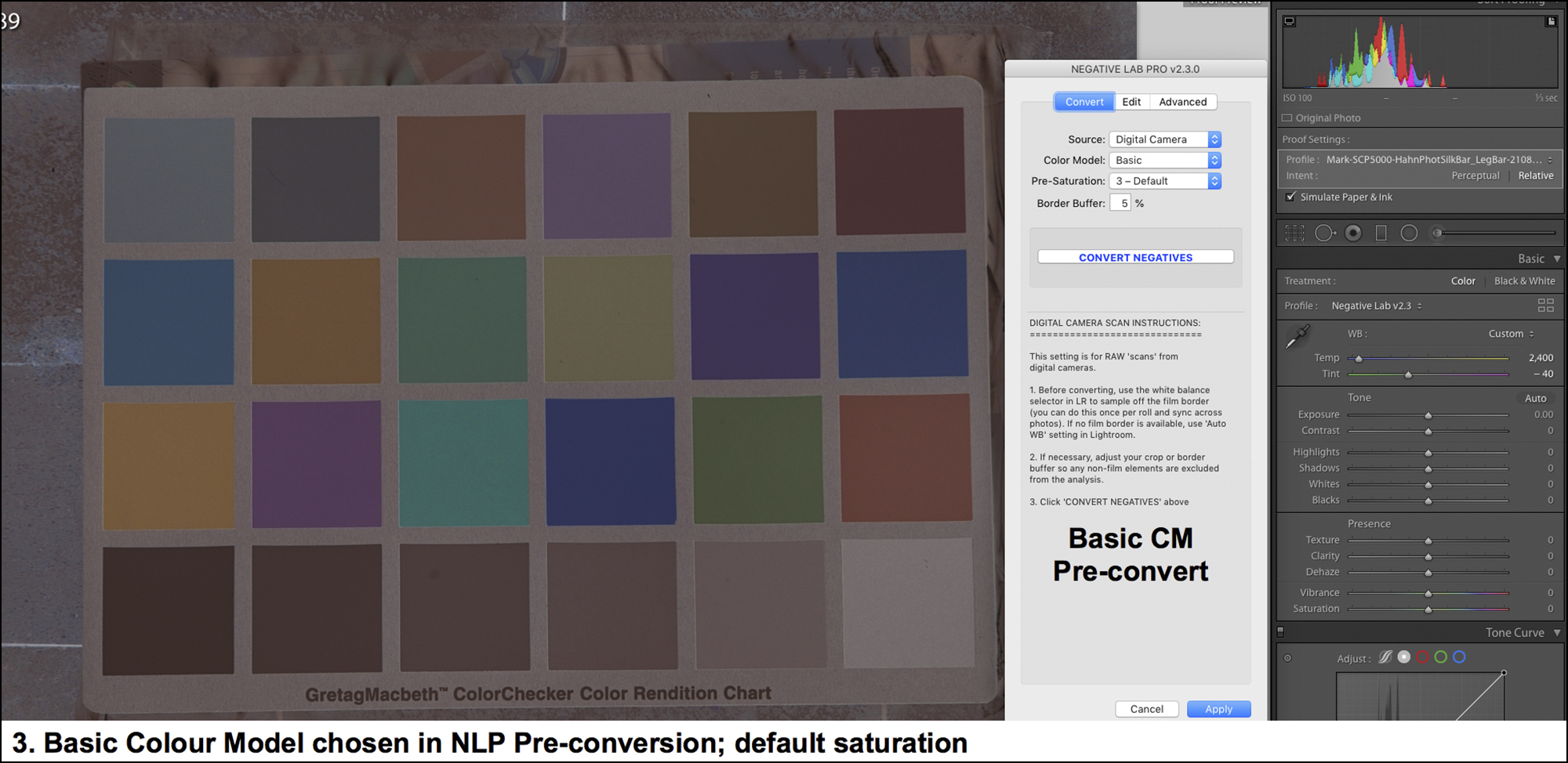
Once done, commission NLP by pressing CTL-N. Under the hood, NLP installs its own linear profile, custom-made for the relevant camera model, as the Lightroom “*dcp” profile. NLP has a two-step processing sequence: “Convert” and “Edit”. Firstly, the NLP “Convert” screen appears. Select the Color Model (Figure 19). There are 5 choices shown in the figure. It is best not to use “None” because that scrubs the LUT options in the Edit phase, and these can be useful. B&W is for Black and White conversion and is the essential choice for making only a grayscale version of a negative, whether colour or B&W. There remain three choices: Basic, Frontier or Noritsu. Frontier and Noritsu are meant to emulate the character of those commercial scanners. “Basic” is intended to produce more accurate colour, accuracy here meaning only in relation to the colours in the negative, not the scene.
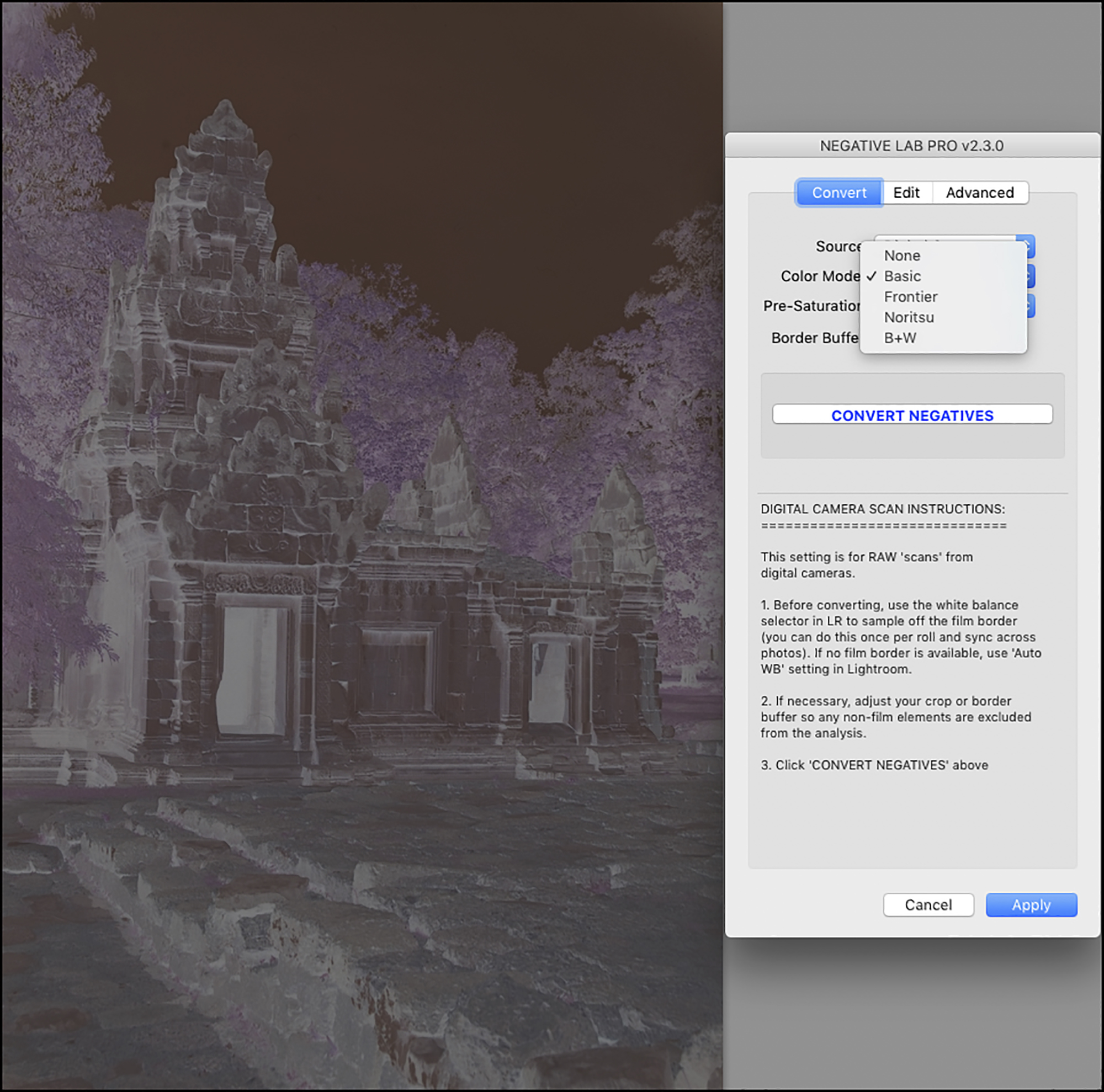
I’ll state my personal bias here: I’m not interested in emulating any particular “look” from the film era. I treat these options in NLP as vehicles for getting the photo to look the way I want it to look; hence the choice of options can vary from photo to photo, whatever I think works best. The impact of a selection is not immediately apparent because the negative isn’t converted to a positive yet, so this exercise can be recursive. To change the Color Model after converting the negative, it is necessary to unconvert, change the Color Model option and reconvert, all doable within NLP. Normally I use Basic, as it is intended for colour accuracy (vis a vis the film colours), but Frontier or Noritsu can be helpful to “juice it up” a bit.
The next choice one makes here is the Pre-Saturation level (Figure 20).
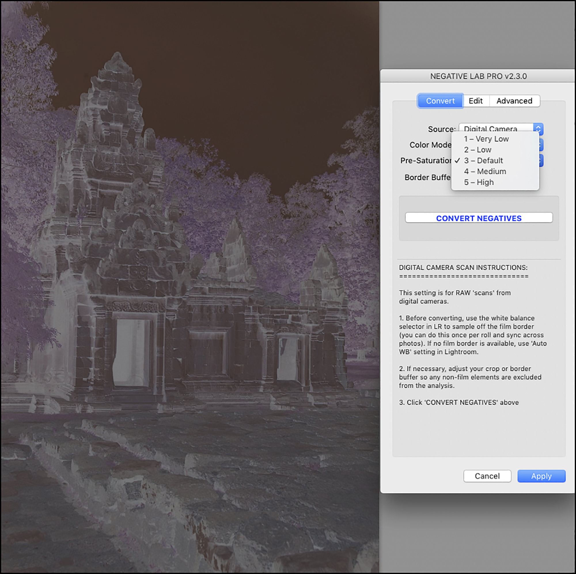
I’m finding (my taste) that NLP’s conversions can be a bit under-saturated, so I normally set this to 5-High. It moves the Lr Saturation slider to +8, so the effect is modest but often useful.
“Border Buffer” lets us specify the percentage of space around the image itself to be excluded from the conversion analysis. I leave the border buffer at the default 5%. According to the NLP Guide: ”Generally you will want to exclude the film border from the analysis, but in low contrast scenes or scenes without a true black point, it can be helpful to include for reference.” Having made these choices, one clicks on “Convert Negative” and a positive rendition of the negative appears (Figure 21) along with the Edit menu in NLP.
At any point in the editing process one may go into the Advanced menu and configure the settings one wants for Positive Copies (Figure 22, bottom portion of the NLP panel), just in case one wants to have a TIFF or JPEG positive copy of the converted raw file.
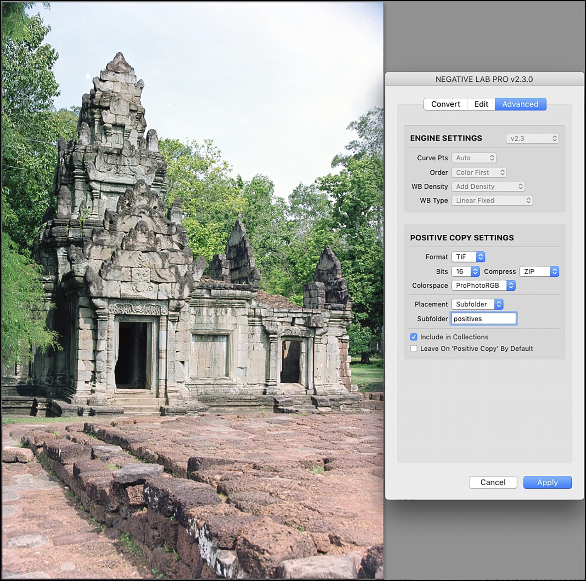
Positive copies produce fully rendered pixel-based photos within Lr. They use a lot more storage space than the raw files do, but they allow for normal, conventional Lr editing, and for various photos may provide for improved editing results. That said, I’m finding more often than not that one can achieve fully satisfactory results remaining within the raw file format using the tools in NLP and Lr, and I’ll show how; but the ways in which one uses the Lr tools are unusual and some don’t perform very well on an NLP raw conversion. I get into this further on.
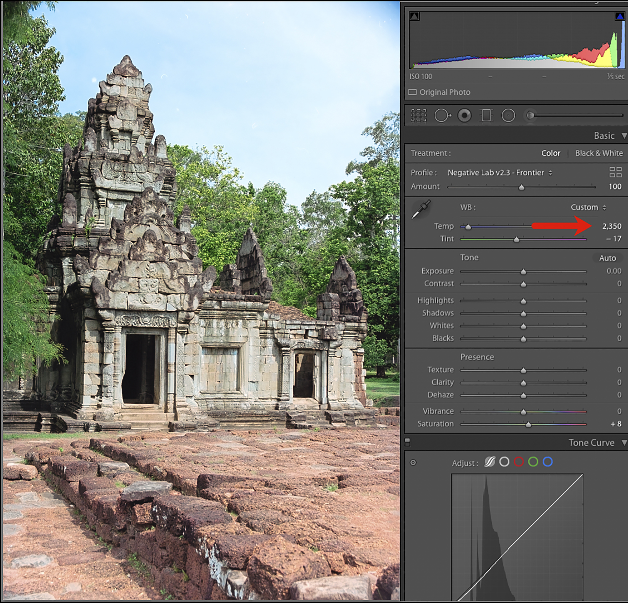
The first thing to do is to examine the conversion, which is usually quite good, and determine the priorities for further editing. For my demo photo here, you’ll notice from both the Lr histogram and just looking at the sky that the highlights are too bright and the sky correspondingly flat. The photo could also do with some added contrast and saturation. My choice of Color Model in making the conversion was “Basic” (initially preferring “accuracy” relative to the film colours). I prefer starting flatter and building the photo’s tone and colour to (my) taste; part of that build-up could be an iteration of these other Color Models, after I see what Basic does.
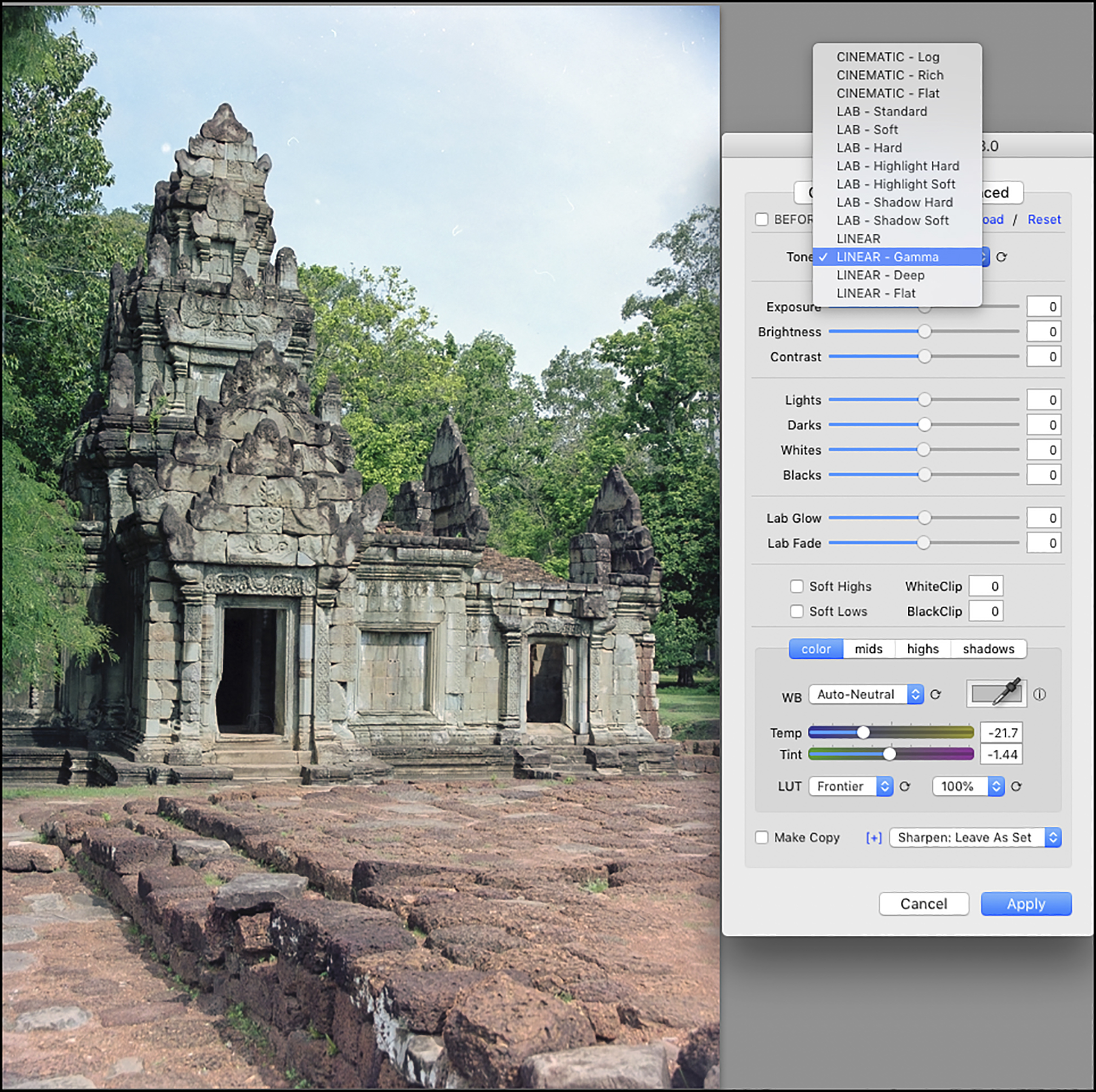
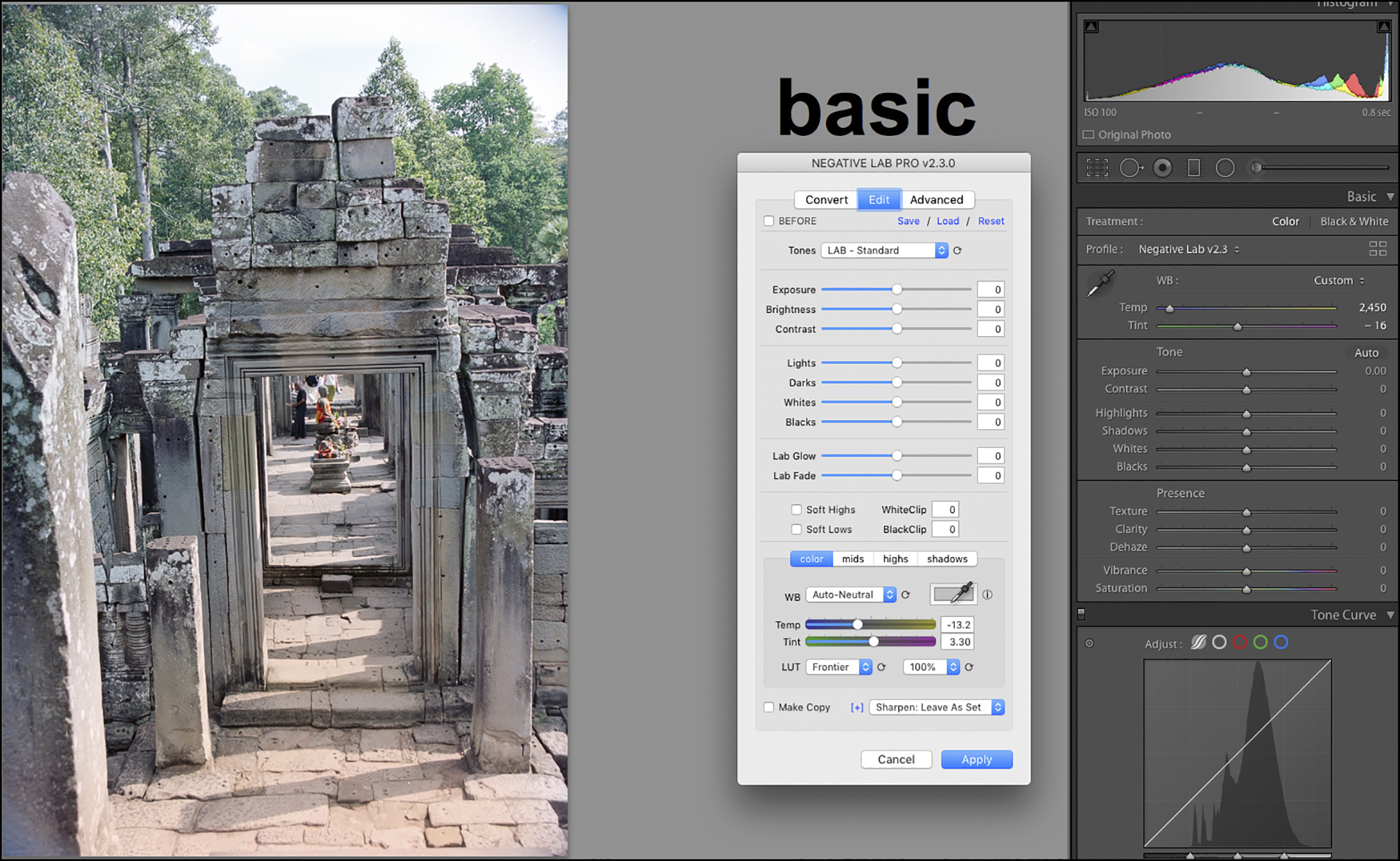
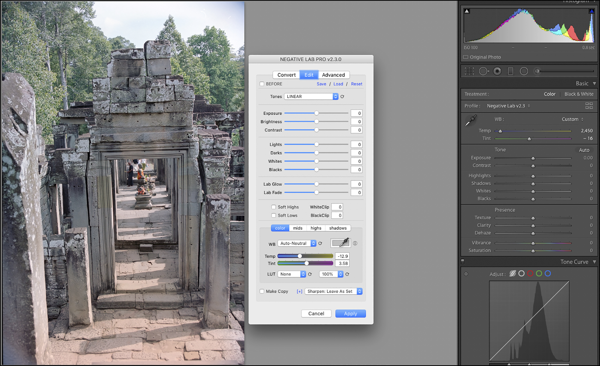
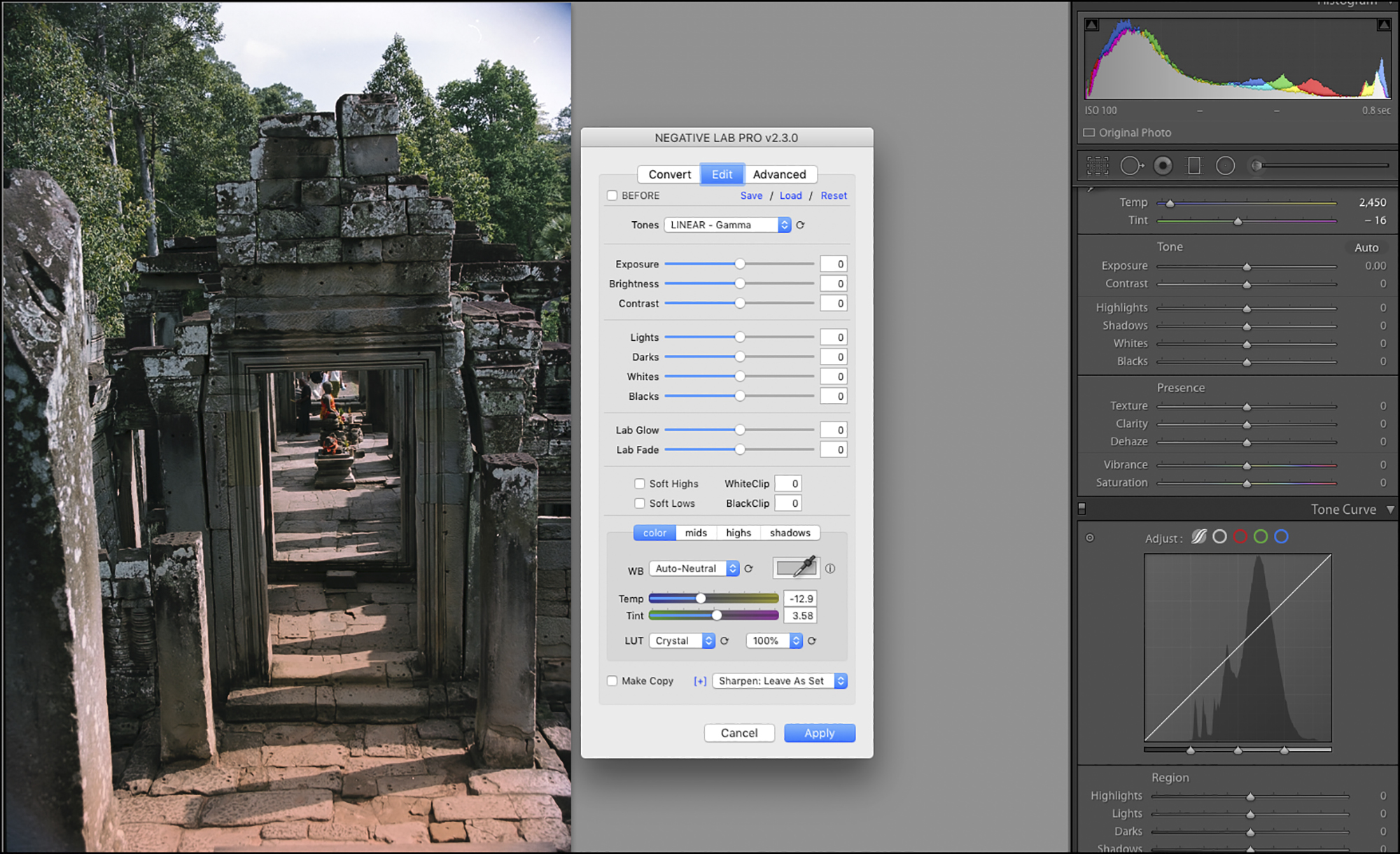
Reverting to the Edit panel, the tools are well laid out allowing the user to create convenient workflows. Starting at the top, select the Tones setting (Figure 23). There’s no hard and fast rule for selecting one over another – it should all depend on what provides the most satisfactory appearance for the image at hand. In this case I selected Linear Gamma because it provided a measure of improved contrast and saturation (compare Figures 22 and 23). We can scroll through all the choices and instantly see their effect on image appearance.
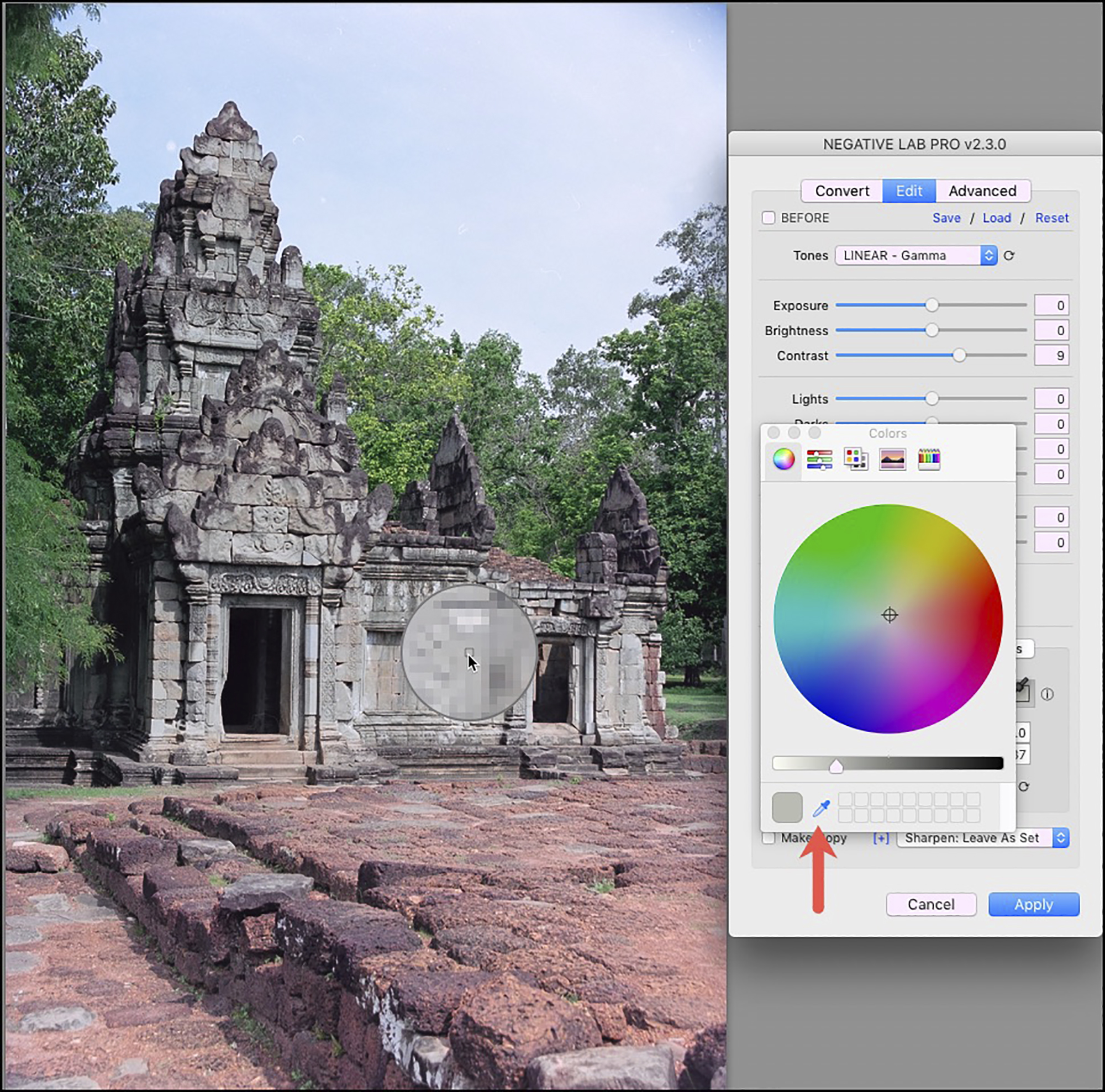
I then skip down to the White Balance (WB) because along with the Tones setting, these two tools have the most global impact on image appearance – the other tools are targeted at more specific issues. NLP in fact provides several options for refining the WB given its importance. It’s useful to start by scrolling the WB presets (Figure 24).
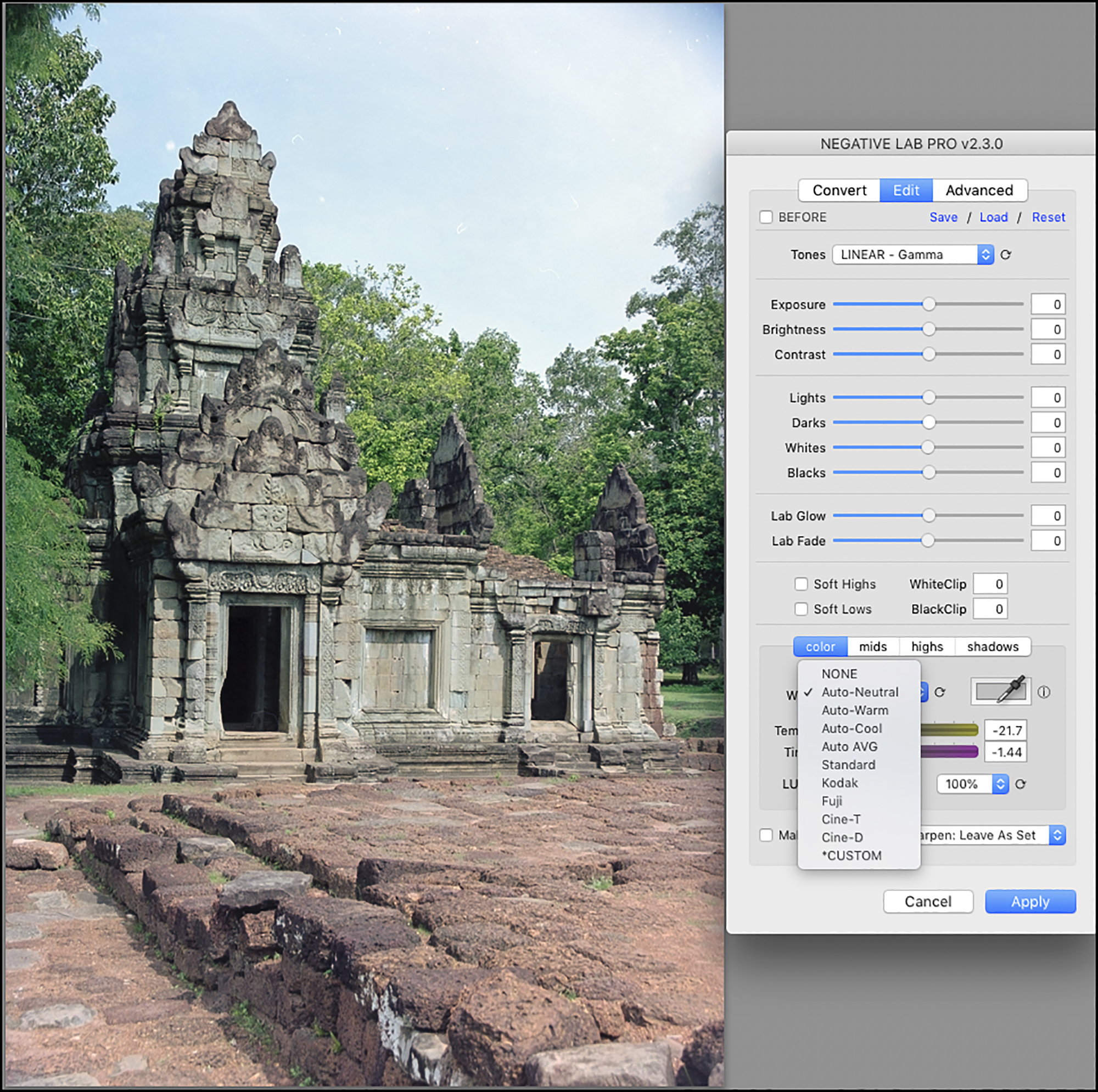
Normally I use the “Auto-Neutral” preset because the application is good at analyzing the photo and determining an appropriate overall WB. If I don’t like this or any of the other presets, there are three options for manual white-balancing. One can use the Temp and Tint sliders for global adjustment. One can adjust color balance separately in the midtones, highlights and shadows, or use a color picker (Figure 25) for selecting a neutral gray point within the photo and white balancing against that parameter – but to do this successfully it is necessary to know whether the selected point is truly neutral gray, and this is often less obvious than one may presume. In Figure 25, despite that the whole immediate region looks gray, in technical reality there is subtle variance which easily throws off the selection of true gray point, as it did in this instance, so I didn’t use it.
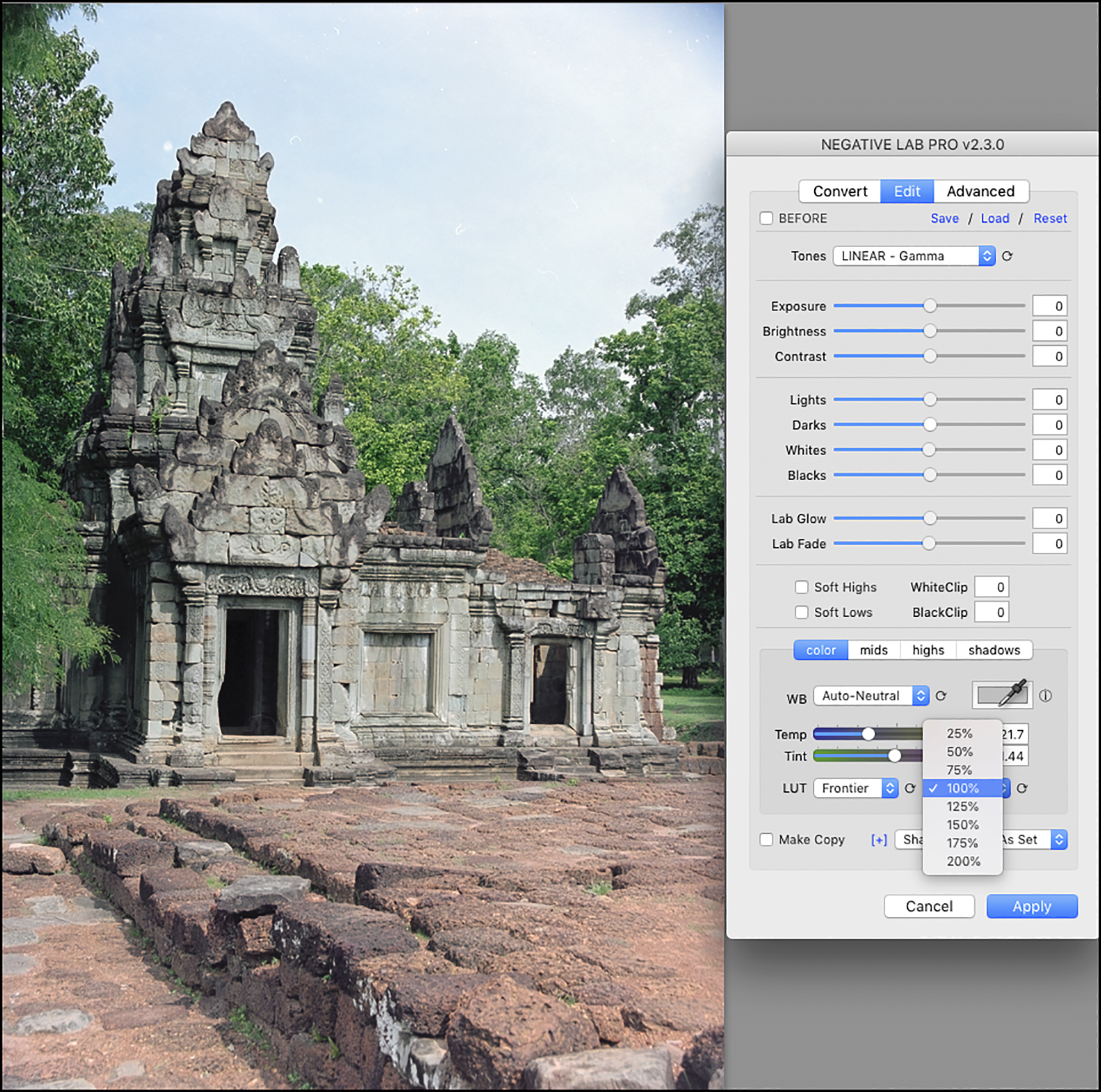
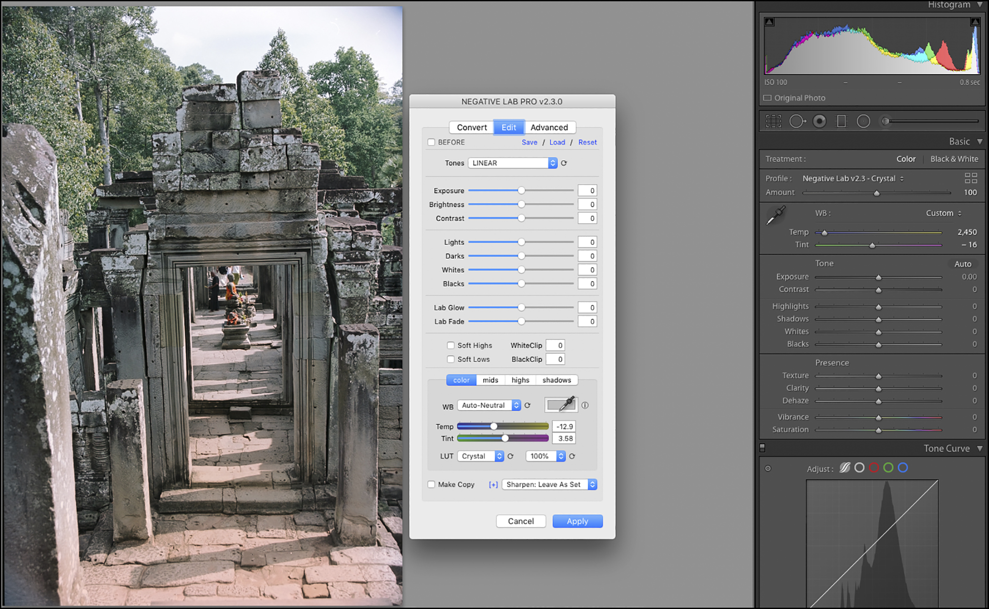
Then below the WB options, there is the choice of LUT (Figure 26).

More often than not I leave this at Natural, again aiming for colour accuracy relative to the film colours; but, depending on the photo sometimes the added “juice” from the Frontier, Crystal or Pakon presets can be helpful. I wouldn’t choose any of them because of their intended relationships to the looks produced by those scanners, but simply depending on whether a preset adds value to my intentions for the photo at hand. We can also select the intensity of the effect for any of these presets except None (Figure 27).
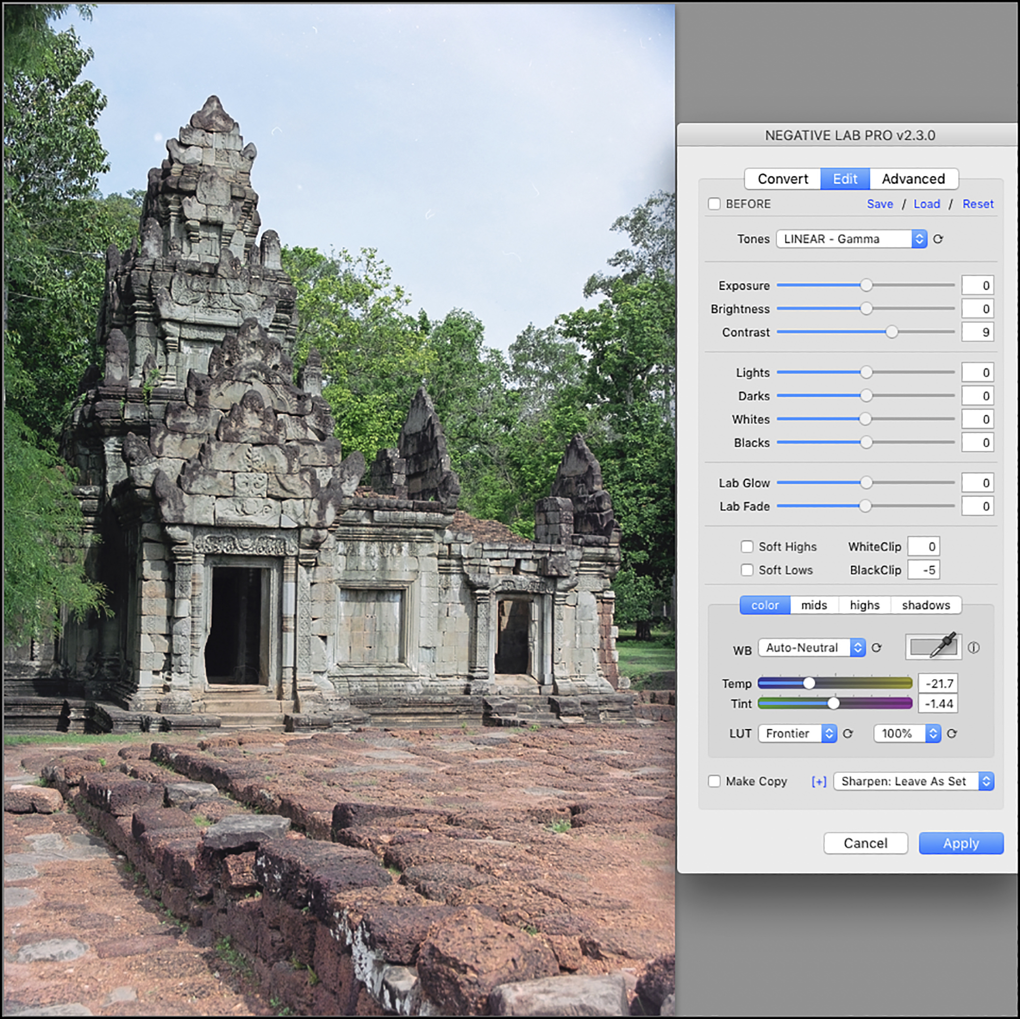
It’s now time to look at the individual tone adjustment tools. Having made all these other selections, I examine the photo to see what else needs attention. It could still use more contrast, so I bumped Contrast up to 9 (Figure 28). Having done that, there was a bit of Black clipping which I adjusted away by setting “BlackClip” at -5 – all the while watching the effect of the adjustments in Lr’s histogram, which responds to any adjustments made in NLP.
By now, I’m generally satisfied with the appearance of this photo except for the sky. Further adjustments of the remaining tone editing tools in this panel were not helpful because once the sky looked better the rest of the photo looked worse. So it turned out that for such local editing I would need to use Lr’s local editing tools. Which leads us into question (ii), using Lr on NLP-converted photos. Just before going there, I should mention that in general NLP’s tone and contrast editing tools can work very well on many photos; therefore, one should exhaust them before moving on to further editing in Lr.
Although Lr is the host application for NLP, for technical reasons relating to the order of Lr’s processing pipeline, Lr’s editing tools do not work on an NLP-converted file as you would normally expect. They work on the original negative, not the converted positive. As a result, the tone and colour controls in Lr operate in reverse on NLP-converted raw files, and some tools can introduce colour shifts. The only way to avoid those inconveniences and have all of Lr’s tools operate normally is to work on a positive TIFF or JPEG copy of the converted file, as mentioned above.
However, a number of Lr’s tone and colour tools work fine on the raw files as long as one gets accustomed to the idea of tweaking in the opposite direction one normally would for achieving the desired result. I’ll get into the ones that work well using them this way, as well as the ones to avoid using any which way. For the most part I can remain within the Lr raw format and achieve my objectives for the photo, but sometimes it is necessary to convert to TIFF and continue working within Lr or Photoshop on the TIFF.
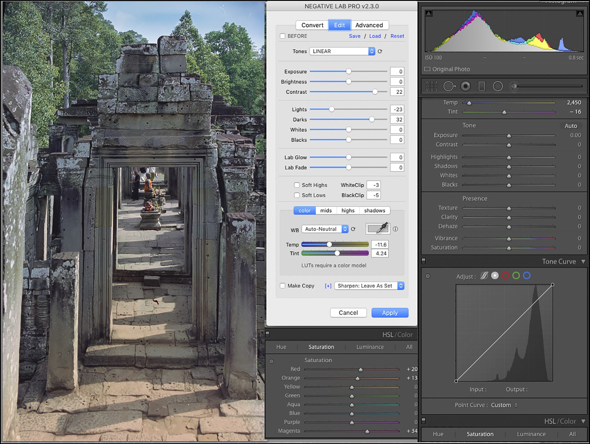
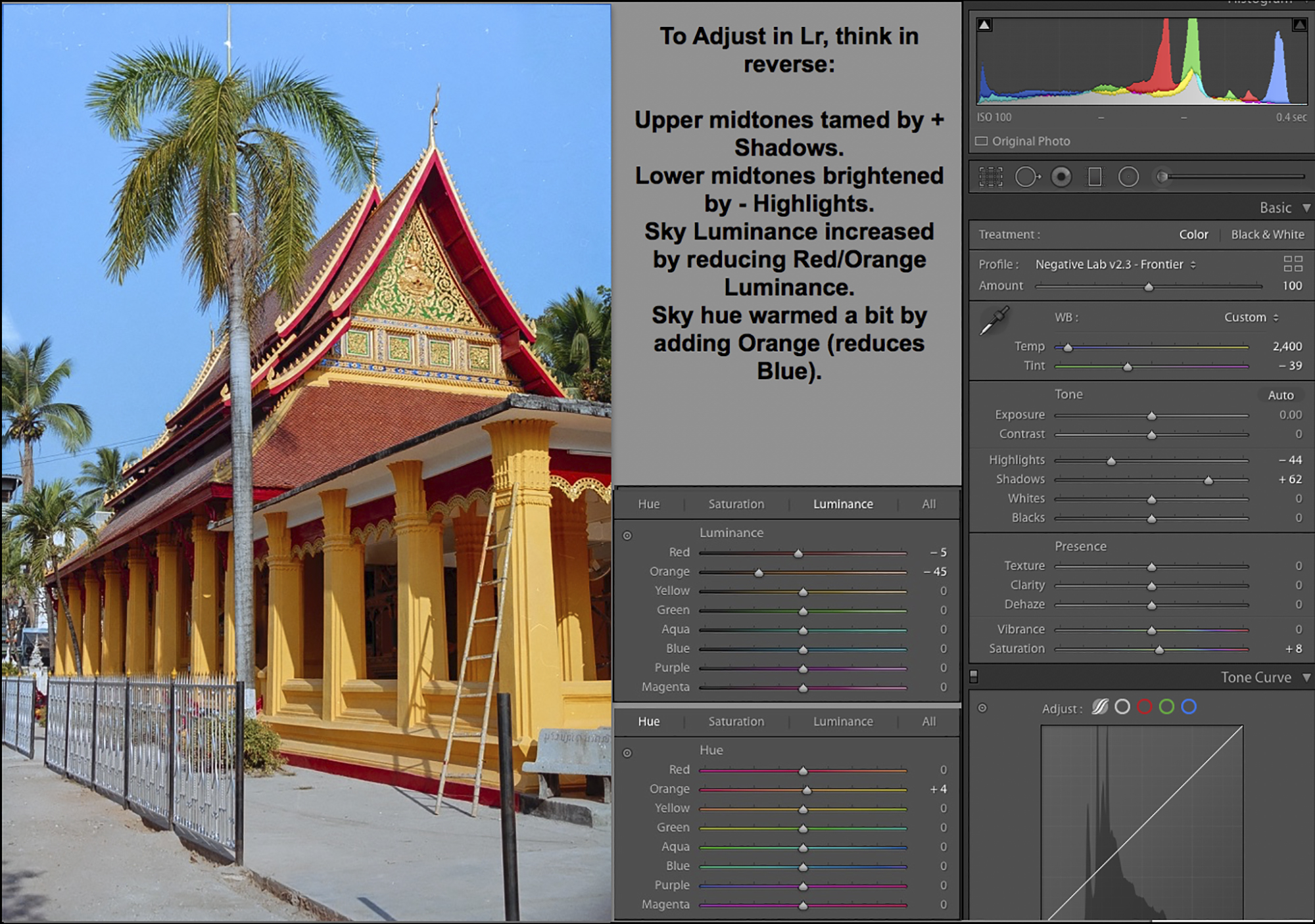
The first adjustment I wanted to make in Lr was to strengthen the sky. So using the Targeted Adjustment Tool (TAT) in the HSL Saturation and Lightness panels, Lr chose to operate mainly on Orange, which produces the intended effect (because according to Lr, orange is the opponent colour to this hue of blue). With the Saturation panel active, moving the TAT upward increases saturation of blue; with the Lightness panel active, moving the TAT upward darkens the blue (Figure 29).
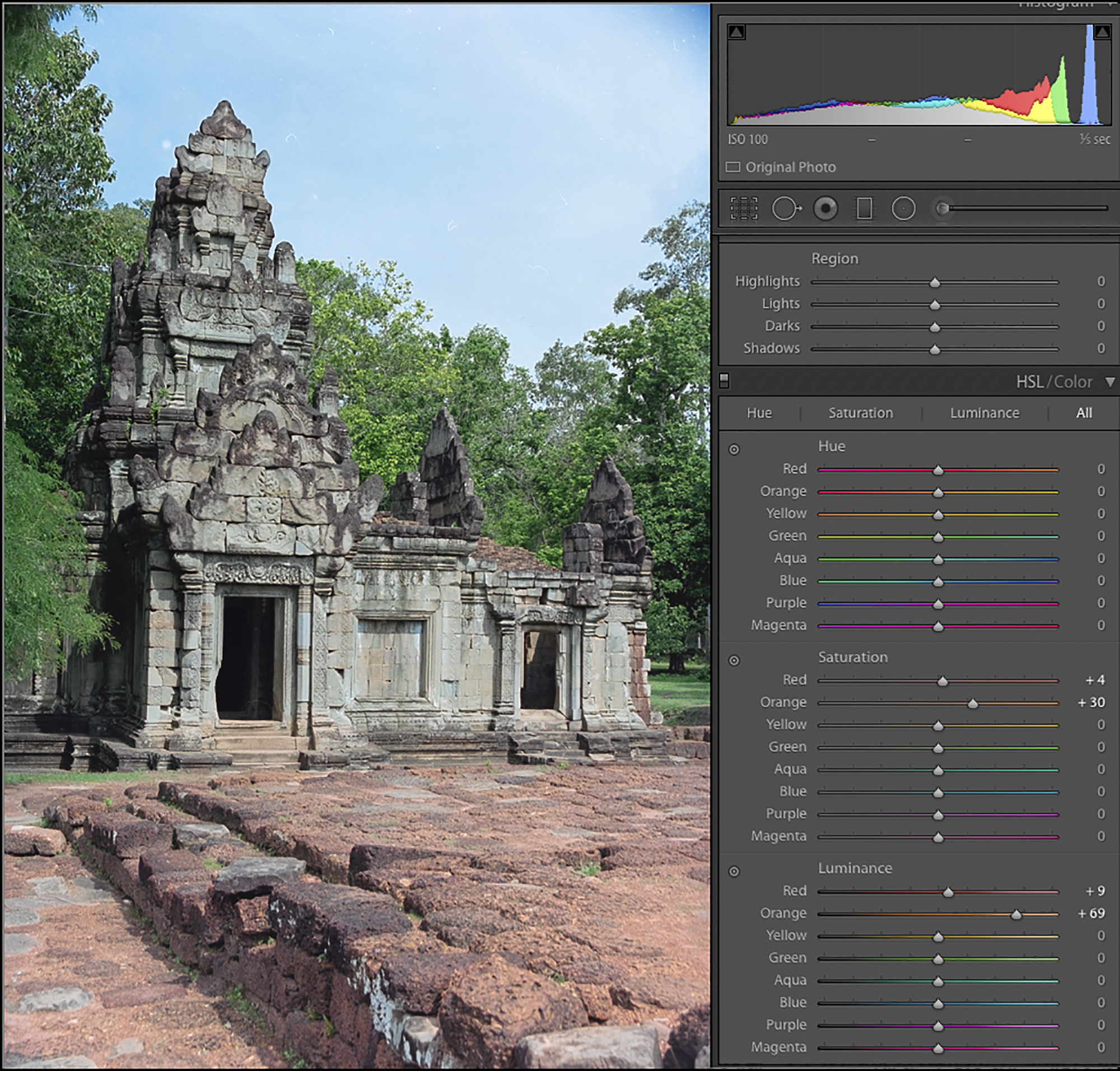
Having done this, I decided I wanted to warm-up the whole photo just a bit. I did this by moving the Temp slider just 50 points cooler, from 2400 to 2350 (Figure 30). I found this just enough to optimize colour overall (Compare with Figure 29).
To use the main tone controls in the Basic panel, also think in opposites. For example, to modify Highlights go to the Shadows slider, to brighten one darkens and to darken one brightens. To modify Blacks operate Whites, and vice-versa. Likewise, one operates the tone curve in reverse as well. However, the Tone Curve does have a TAT which makes it more convenient to use with these files provided you remember that upward movement darkens, and downward movement lightens, contrary to normal expectations. The important point is that these controls are usable and produce the desired results, just not in the usual way. LR’s various filters, effects, transforms, and lens correction tools also work well with NLP-converted photos.
The following controls are much less satisfactory to use on NLP-converted raw files. Lr’s Contrast control quickly over-brightens the whole photo when increasing contrast, and decreasing it makes the photo overly dull quite fast. Likewise, the Clarity and Dehaze controls do not produce the kind of changes we are accustomed to seeing in a normal digital file. Vibrance and Saturation both produce undesirable colour shifts, differing in either direction. I tend not to use any of these Lr controls on an NLP-converted file. It would be great to have saturation-related controls within NLP’s Edit panel, used before editing anything directly in Lr, but that will need to await a future NLP version.
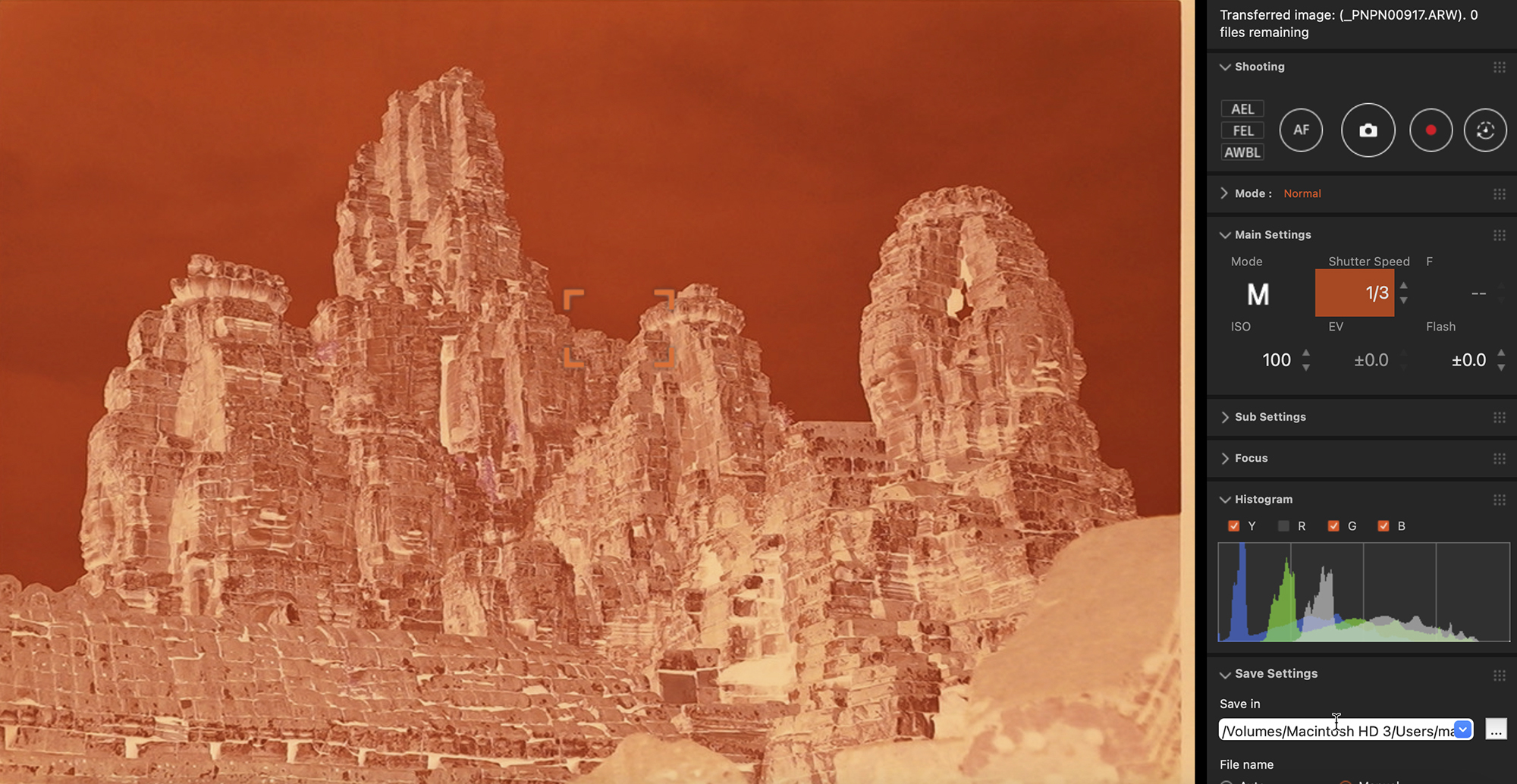
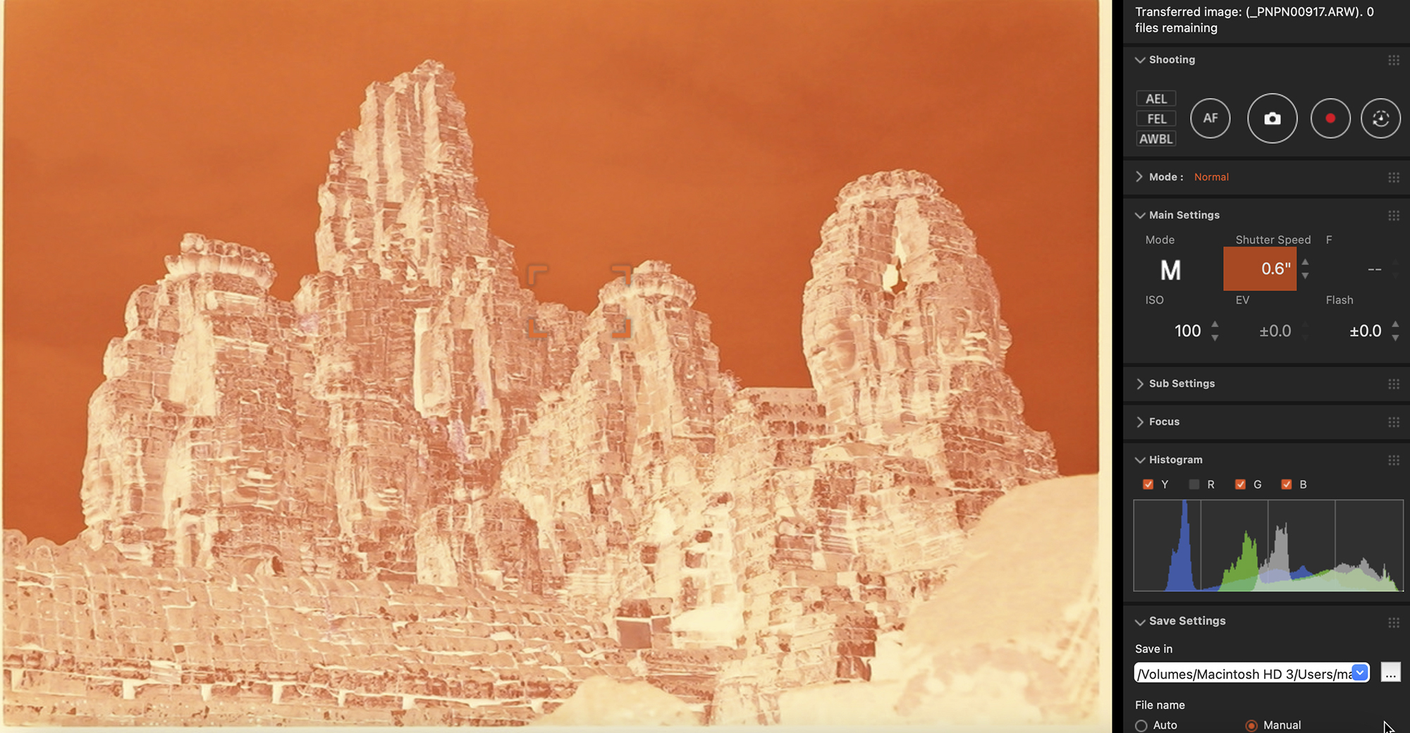
I mentioned further above the possible advantage of doing an HDR merge of two captures of the same negative, one for the highlights and the other for the shadows. I’m providing here an example of just such a merger, done to optimize the tonality of both the building and the sky.
For this photo, without implementing this dual-exposure, either the building would come out too dark if the sky were optimized, or the sky would come out too light if the building were optimized. A single compromise exposure would produce moderate shadow and highlight clipping.
Not wanting to fiddle with the after-effects of compromised exposure, I opted for one exposure(in the Sony Remote capture application) that is about correct for the building (Figure 31) and another that is about correct for the sky (Figure 32), then merged the captured negatives (Figure 33) using Lr’s HDR Merge tool.
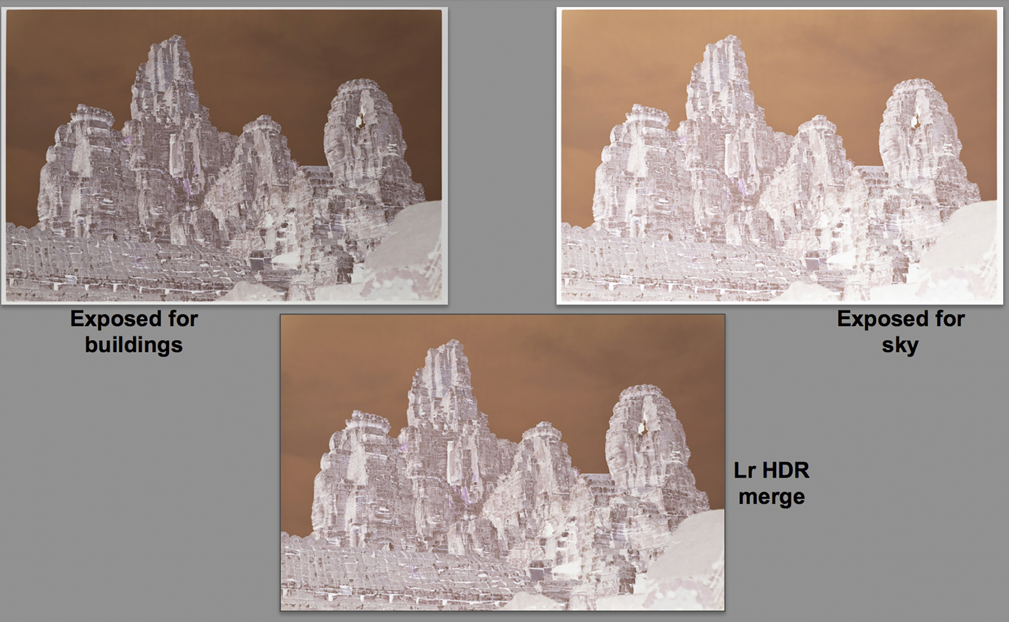
I then neutralized the orange mask from the HDR-merged negative, cropped-out the image borders and converted to positive using NLP; then I made a few further tonal adjustments in the NLP edit menu. The result is a credible, in-gamut blend all-round of this early-morning photo (Figure 34, including a view of the NLP tone edits).
Before leaving the subject of HDR-merged negatives, I’d like to highlight the capabilities in Lr and NLP for processing B&W negatives. In 1963 I traveled around Europe with a 3 ¼ x 4 ¼ Graflex camera, tripod, Ilford FP4 sheet films, film carriers, black cloth etc. and made a number of cityscape photos. When I returned to Canada, I developed the negatives in Agfa Rodinal and made 11×14 enlargements of the better ones using Ilford papers and a Beseler enlarger equipped with a Schneider Componon lens. Over 58 years later, I still have both the negatives and the enlargements, all in very decent condition. So, it was going to be fun and interesting to compare the results of processing these negatives digitally now, versus the analog results I obtained in my 1960s darkroom.
The sample I chose for demonstration here is a photo of one side of the Cathedral of Strasbourg. It has lots of stunning detail and extremes of tone values, which makes it a good candidate for showing the usefulness of a B&W tone merge in Lr and conversion in NLP. Here are the steps and the final result.
(1) Make two exposures of the media in Sony Remote, one for the highlights/midtones and the other for the shadows (Figures 35 and 36).
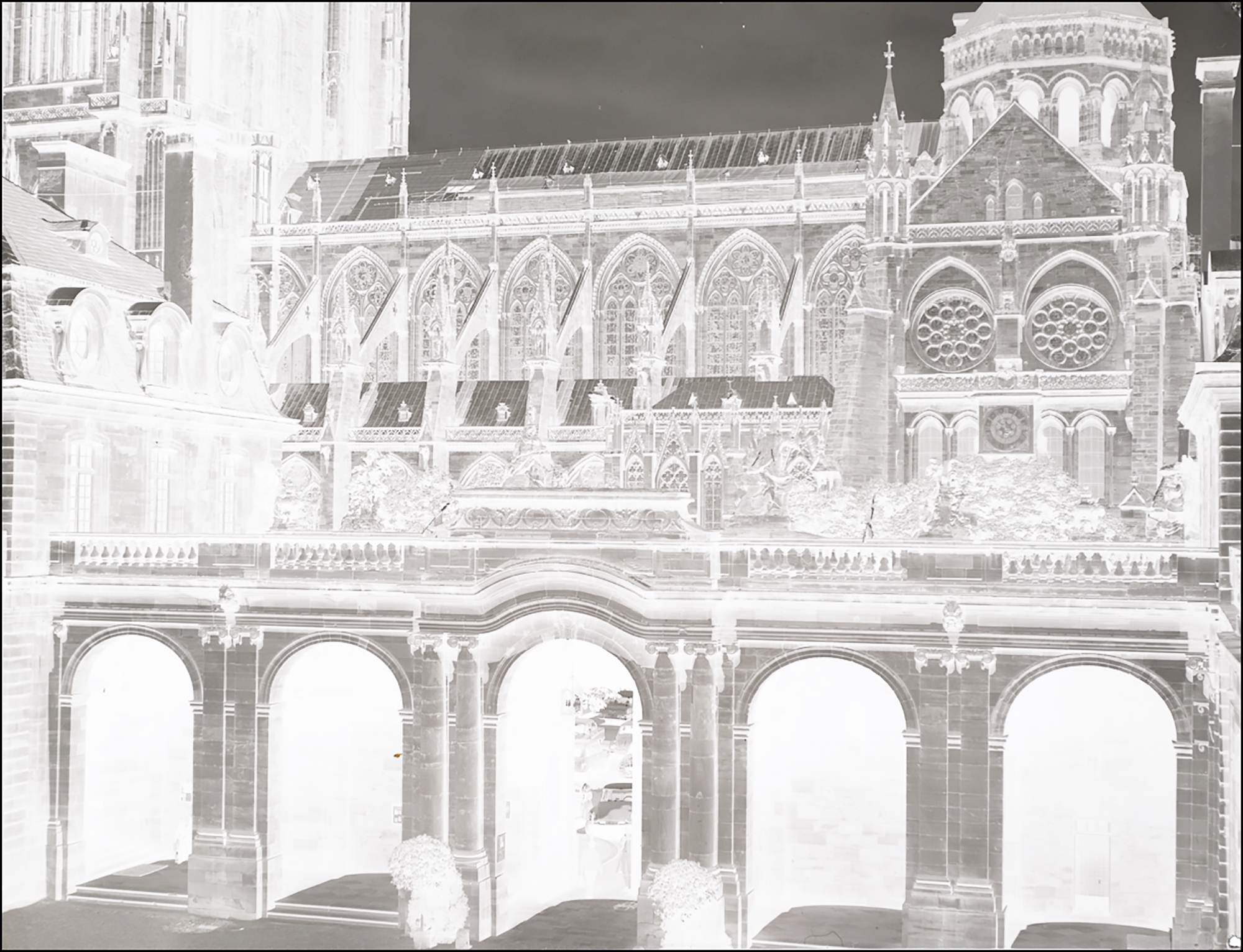
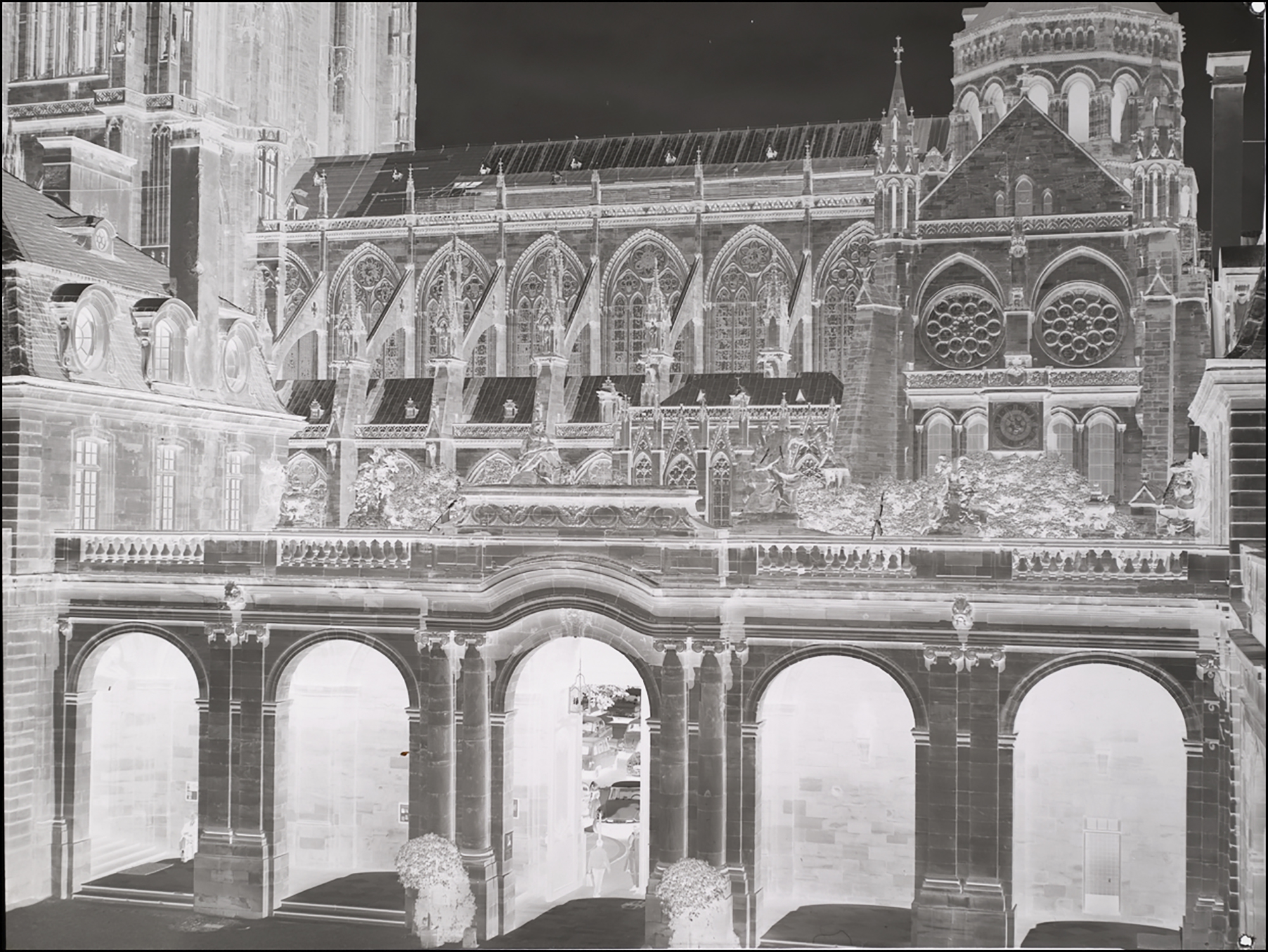
(2) In Lr, merge the two exposures using Photo Merge>HDR. (Figure 37).
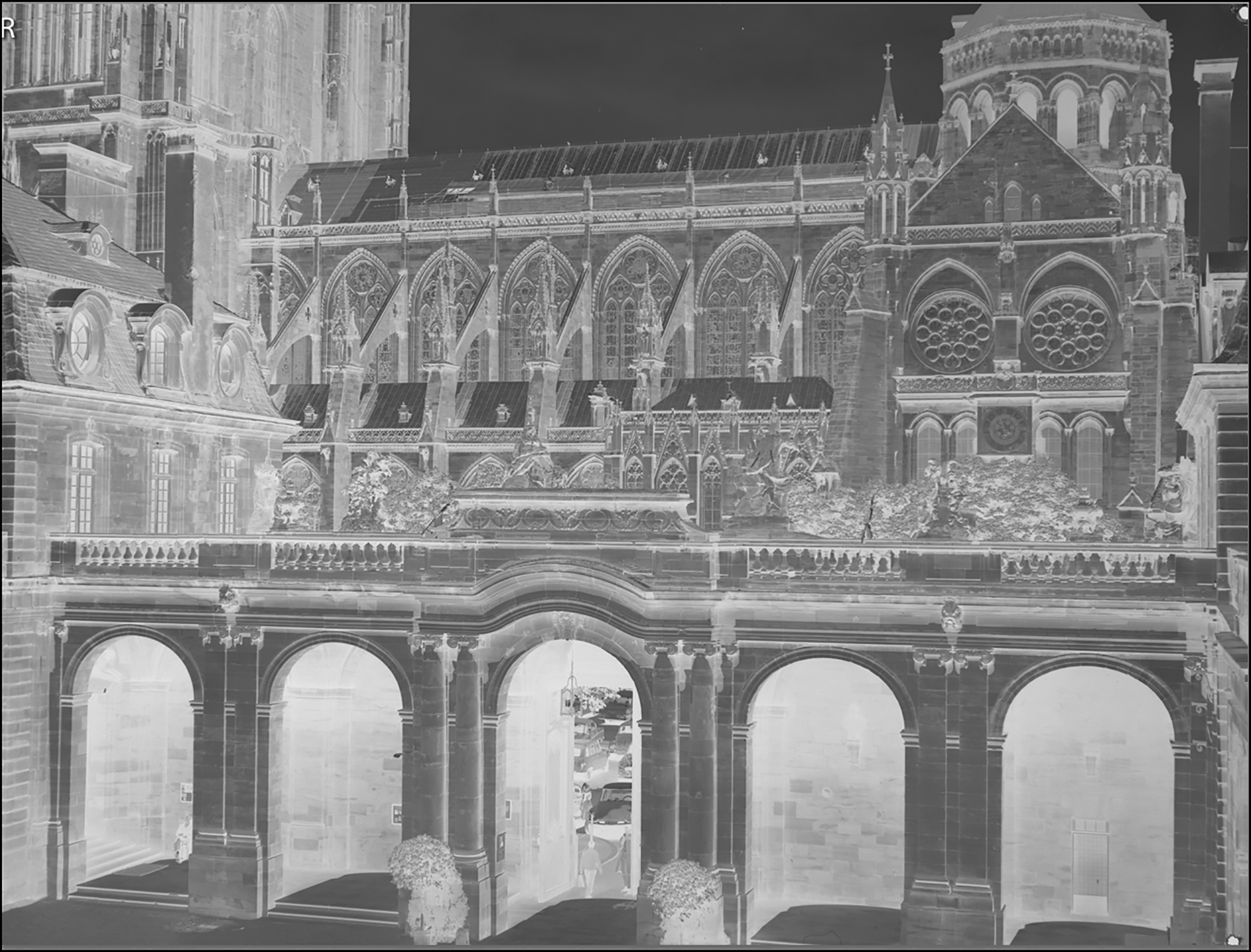
(3) In NLP select the B&W color model and convert the negative (Figure 38). Make appropriate tonal adjustments as shown.
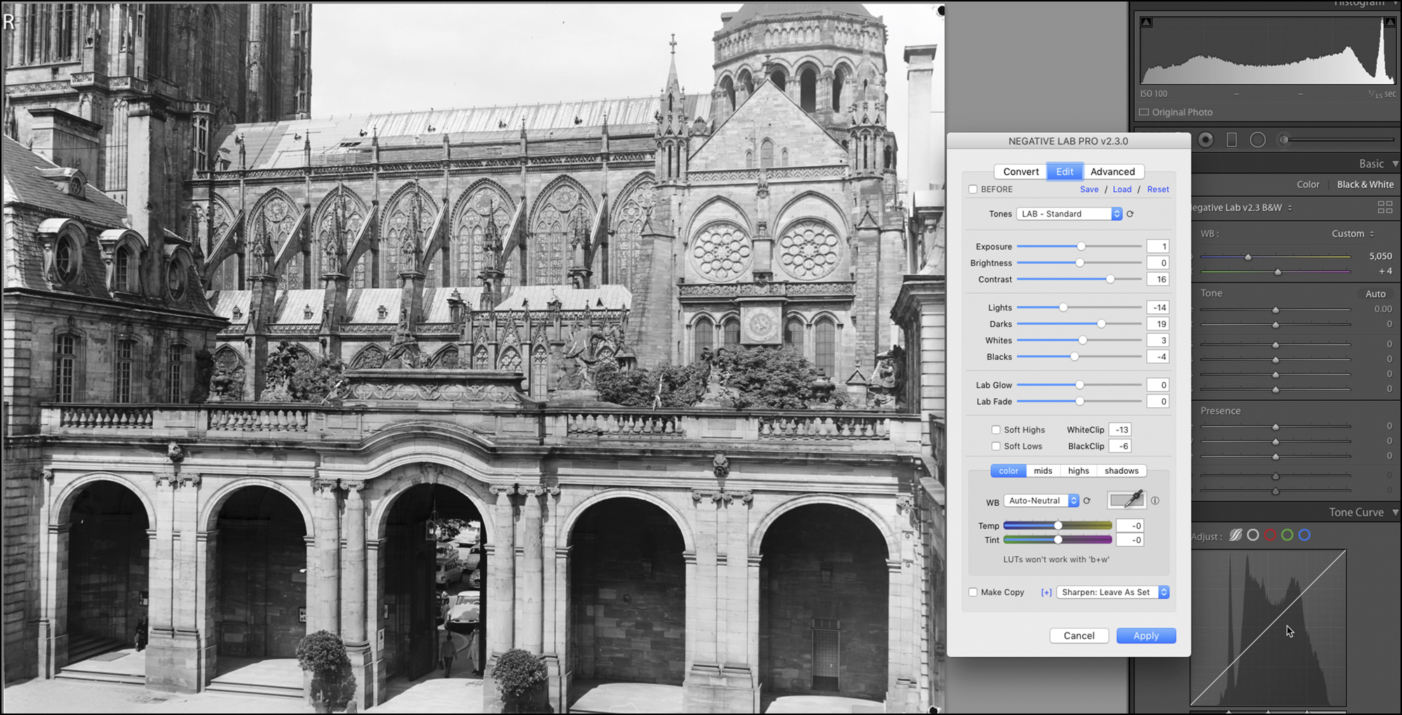
(4) Apply the NLP edits, open into Lr and make further tone adjustments as indicated in the right-side panel of the Lr interface (Figure 39). The “Tones” setting shown in Figure 38 is “LAB-Standard”. Using “LineaR+Gamma” instead produces a rendition closer to the look of some silver-gelatin B&W photo papers of yesteryear.
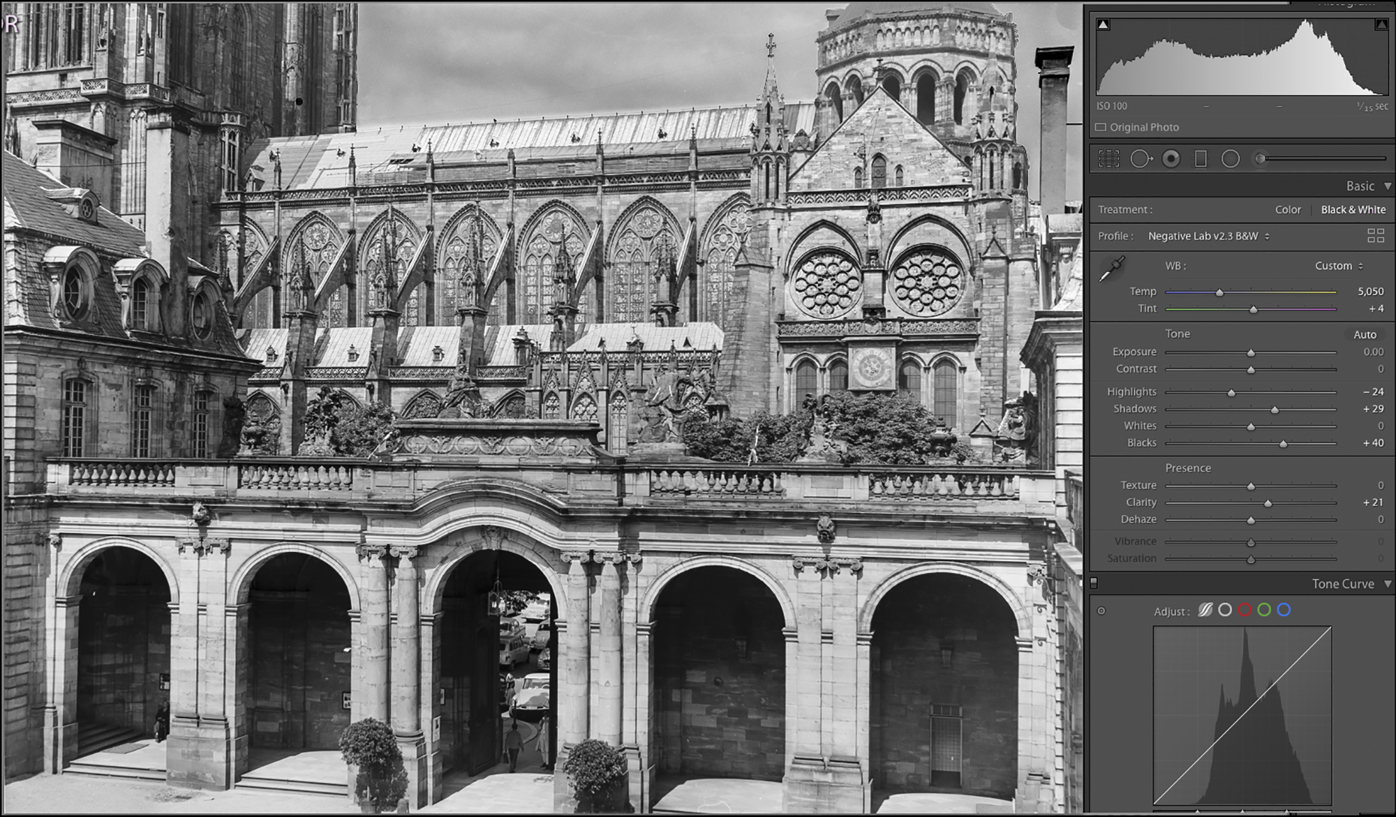
Notice how I brought out the cloud detail in the sky and an appropriate part of the shadow detail in the arches, while preserving a good range of mid-tones for the rest of the building façade. The HDR blend made this a much easier task than trying to work with a single capture.
Comparing the 1963 enlargement with the 2021 digital conversion, image size about the same, the rendition of highlight and shadow detail is superior for the digital conversion, and the latter is ever so slightly sharper. This is the result of the control most of us can much more easily and accurately exercise over tonality in a digital workflow compared with exposing and developing a darkroom print, as well as the use of the digitally adapted Schneider lens for photographing the negative. I should mention by the way, those 58-year-old enlargements nonetheless retain a character of their own and I still like them.
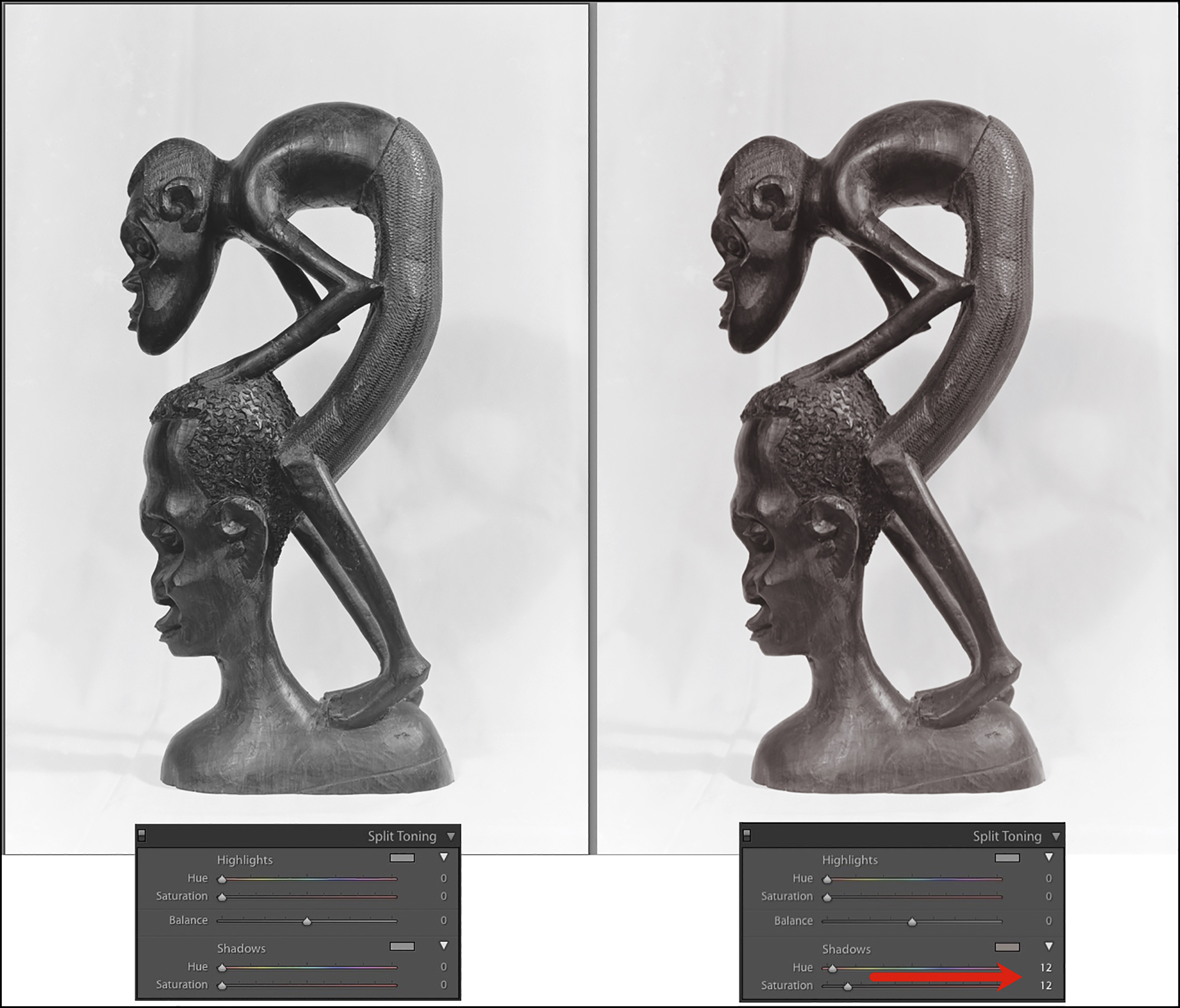
The B&W conversions can also be toned using Lr’s split toning panel (Figure 40, a camera capture of a 2 ¼ x 3 ¼ B&W negative shot with a Graflex on Ilford FP4 developed in Agfa Rodinal, 1971).
(d) Sharpening, Grain Mitigation and Clean-up.
Digital sharpening is a process that slightly exaggerates the micro-contrast of edges in the image, and that slight bit of increased edge contrast is what makes the detail look sharper. Correspondingly, the word to the wise about focusing the image at the capture stage is to look for an area in the negative where the fine-edge contrast is quite visible and focus it. Don’t try to focus the dye-clouds, a.k.a. “grain”; (this bit of advice from T.J. Vitale, which in practice works well).
Lr’s sharpening tools do the job. I find that for most photos, applying Medium capture sharpening and the Print module’s in-built print sharpening produce an unobtrusive and credible level of sharpening; above all, I avoid aggressive sharpening that looks so obvious and artificial. Figures 41 and 42 are a magnified small section of the photo in Figure 30 before and after sharpening in Lr. Notice how the detail in the carved stonework is slightly more pronounced in the sharpened compared with the unsharpened versions. The effect is subtle but present, and moderately more so in the print which receives a standard dose of output sharpening in the print module.

Mitigating grain (in colour negatives actually dye-clouds) is a bit more involved. So let’s start with a bit of photographic philosophy that I know will annoy film aficionados, but regardless: I always looked upon film “grain” as a technical limitation of the media which can sometimes be used to artistic effect, but is more often than not an interference with photographic image quality that one tried to mitigate. However, the visibility of these dye clouds is often exaggerated when the photo is magnified on a computer display compared with how they appear in prints; that is, for example, skies can look smoother on paper than magnified on a computer display. As well, visibility depends very much on the subject matter. For example, it is often sufficient when digitizing fine-grain film to mitigate apparent dye clouds in the sky and in skin tones, leaving the remainder of the photo intact.
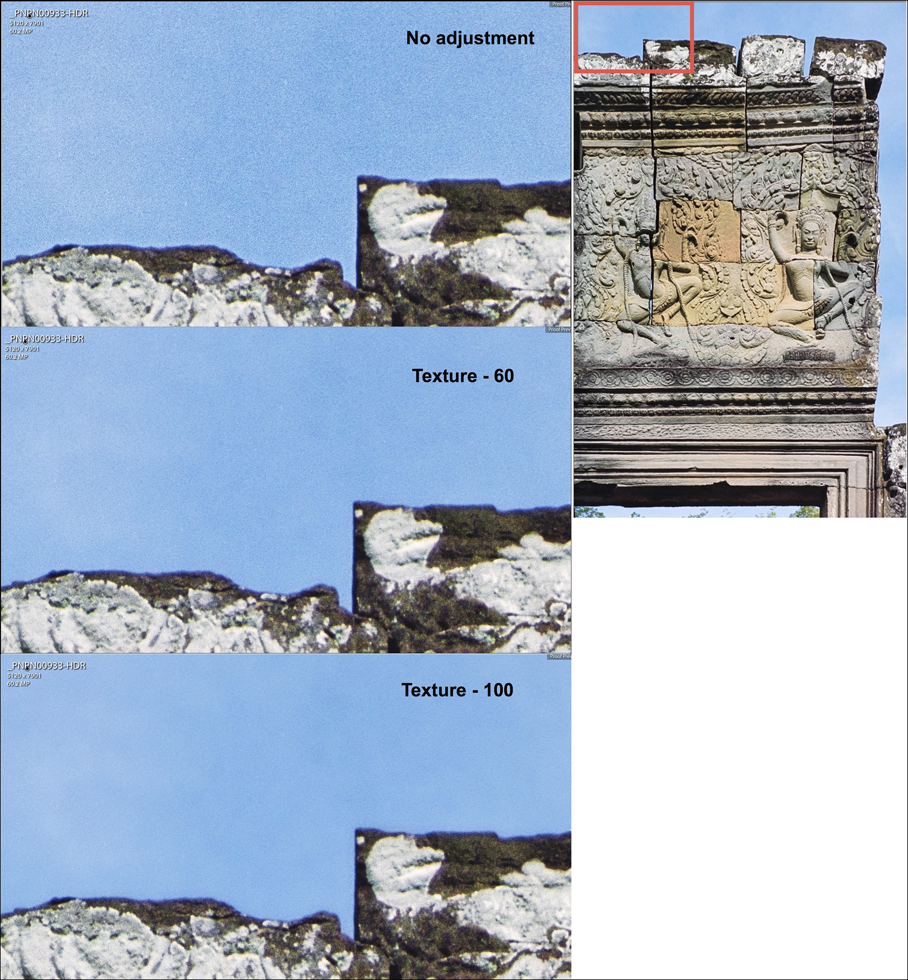
None of the digital noise mitigation apps are designed to smooth dye clouds in film, and when they do there can be some loss of fine detail. The “noise” of analog dye clouds doesn’t have the same patterns as the noise from a camera sensor. Therefore, when one selects a particular application for reducing apparent “grain” in a converted negative, one is essentially looking for the app that does the least harm to fine detail while smothering the visibility of dye clouds. Staying within the Lr raw workflow, there are two options for mitigating the appearance of dye clouds: (i) Lr’s noise reduction tool, which works quite well, and (ii) applying negative Texture, which also works well on areas without fine detail (figure 43). Both can be used on the same area, starting with the Noise tool, then if more is needed applying negative Texture. It can be appropriate to work on masked areas needing different or no “grain” mitigation treatment. Venturing into a TIFF format, since many years ago I found that Neat Image works best, though Topaz Denoise and Noiseware are also good.
For cleaning-up the photos, I find the most effective strategy is to have as little as possible to clean in the first place. Anti-static cloth, Rocket blower, Datavac Electric Duster are all effective tools for removing dust. Film cleaner may be needed for stubborn dirt. The remaining defects would be scratches or embedded forms of deterioration. For these, the Lightroom healing/cloning tool is useful. It works best when the image is magnified on the display and the smallest feasible brush size is used. These are raw workflow options.
If converting to TIFF, it then becomes possible to use the SilverFast SRDx application. The strategy of this application is that firstly it detects defects to be removed, and then it removes them. So the key to success here is achieving a correct distinction between defects and image detail. It is somewhat finicky to get the settings right for doing that, but once the right balance is found, there is no faster way of dealing with this problem, so it is particularly recommended for people needing to clean-up large archives of dirty negatives. It also allows for masking the areas to be treated, which is good strategy for those situations where the application simply can’t adequately differentiate between high density detail and defects.
Finally, though I did not test it, I should mention that NLP provides for batch processing within a raw workflow, including synchronizing conversions between two frames.
(e) Summing-Up:
(1) Materials: computer, copy stand, camera, macro lens, light table, film carriers, leveling tools.
(2) Applications: Lr, NLP, (and possibly Photoshop, Neat Image, SRDx).
(3) Process procedure:
(a) photograph the negative, using multiple exposures as appropriate;
(b) import the photo to Lr and use the WB tool, then crop away the margins;
(c) commission NLP, select conversion settings and convert;
(d) edit the conversion in NLP, then if necessary in Lr, then if necessary as TIFF in Photoshop or other.
(e) Mitigate grain and clean-up defects.
Using good equipment and applications it is possible to fully displace all desktop scanners and scanning applications and achieve higher quality results with a digital camera. These procedures also provide for more options/flexibility and more convenience than scanner-based processes, though they will not necessarily be less time-consuming, and depending on the details of the set-up not necessarily inexpensive.
Mark D Segal
Imaging91.com
January 2022
© Christopher Campbell has been a very helpful friend recommending and helping with some of the tools I’ve featured in this article – thanks Christopher.
Annex 1
Selected Negative Lab Pro Settings Effects
The ColorChecker is familiar enough for readers to easily grasp the different effects of various settings. This is an aged ColorChecker so I wouldn’t rely on it for doing statistical colour accuracy exercises, but it’s good enough for indicative purposes.
This is a ColorChecker photographed in mid-day light outdoors, Nikon camera, Fuji Reala Superia negative film.
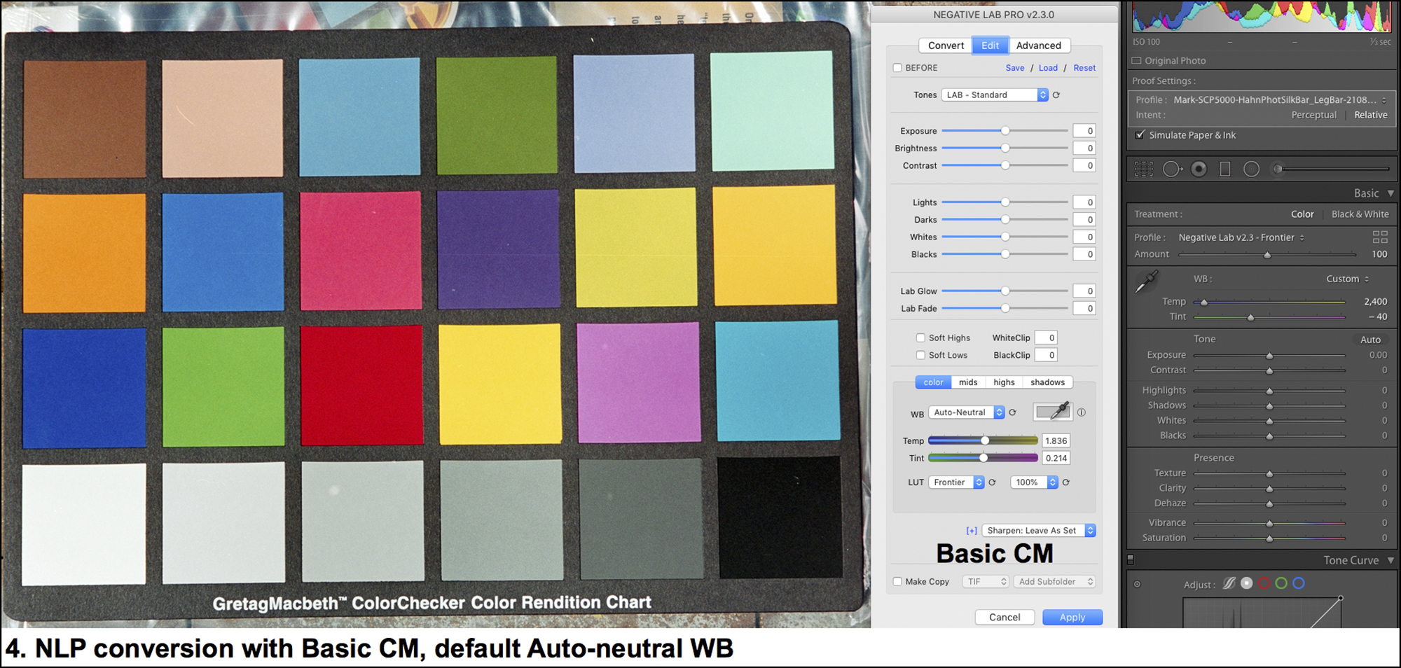
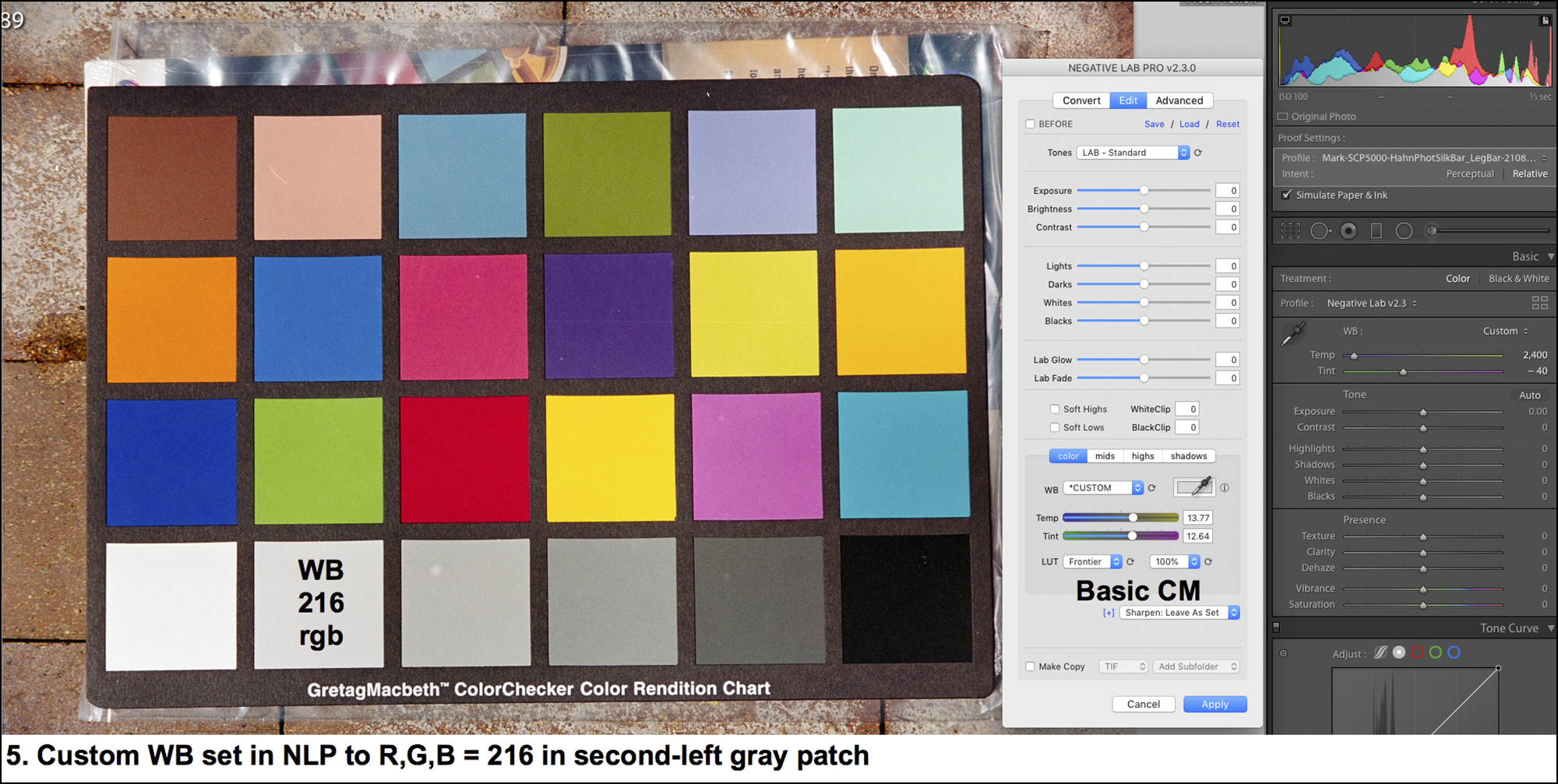
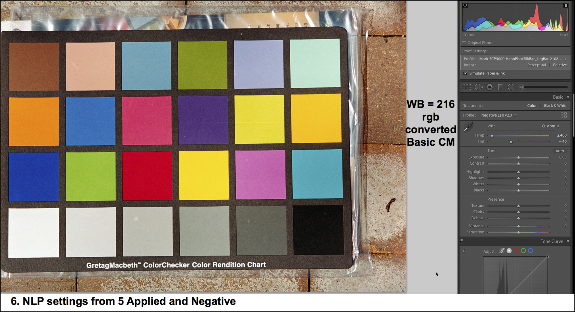
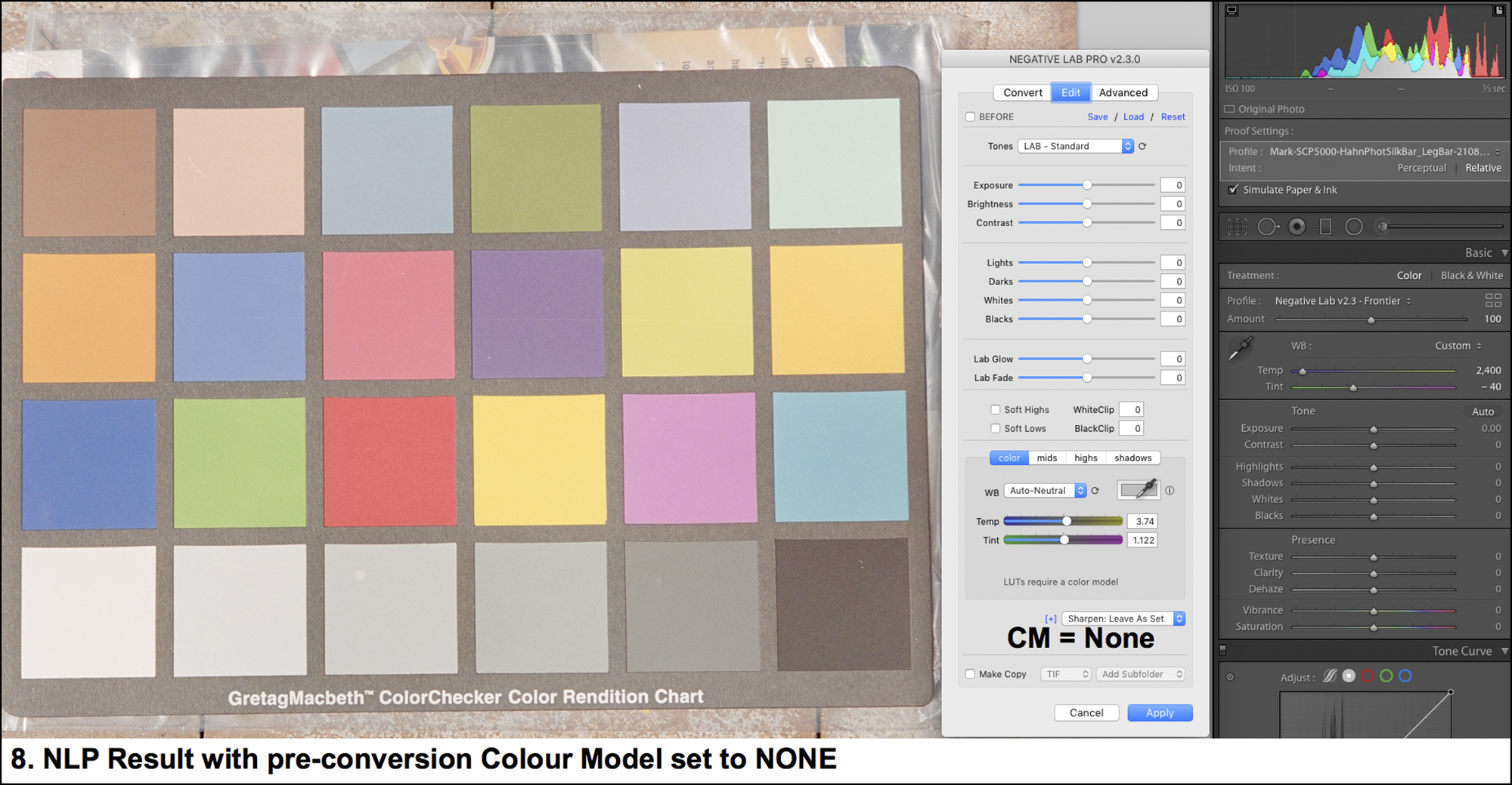
Let us turn to a real photo: The following are samples of different settings for choice of Color Model, Tones and LUT. There are far too many conceivable combinations to cover them all, but from working with the application I think I have selected enough to provide some insight into the impact on results from some of the more important available choices. I purposely selected a difficult photo for this demonstration.
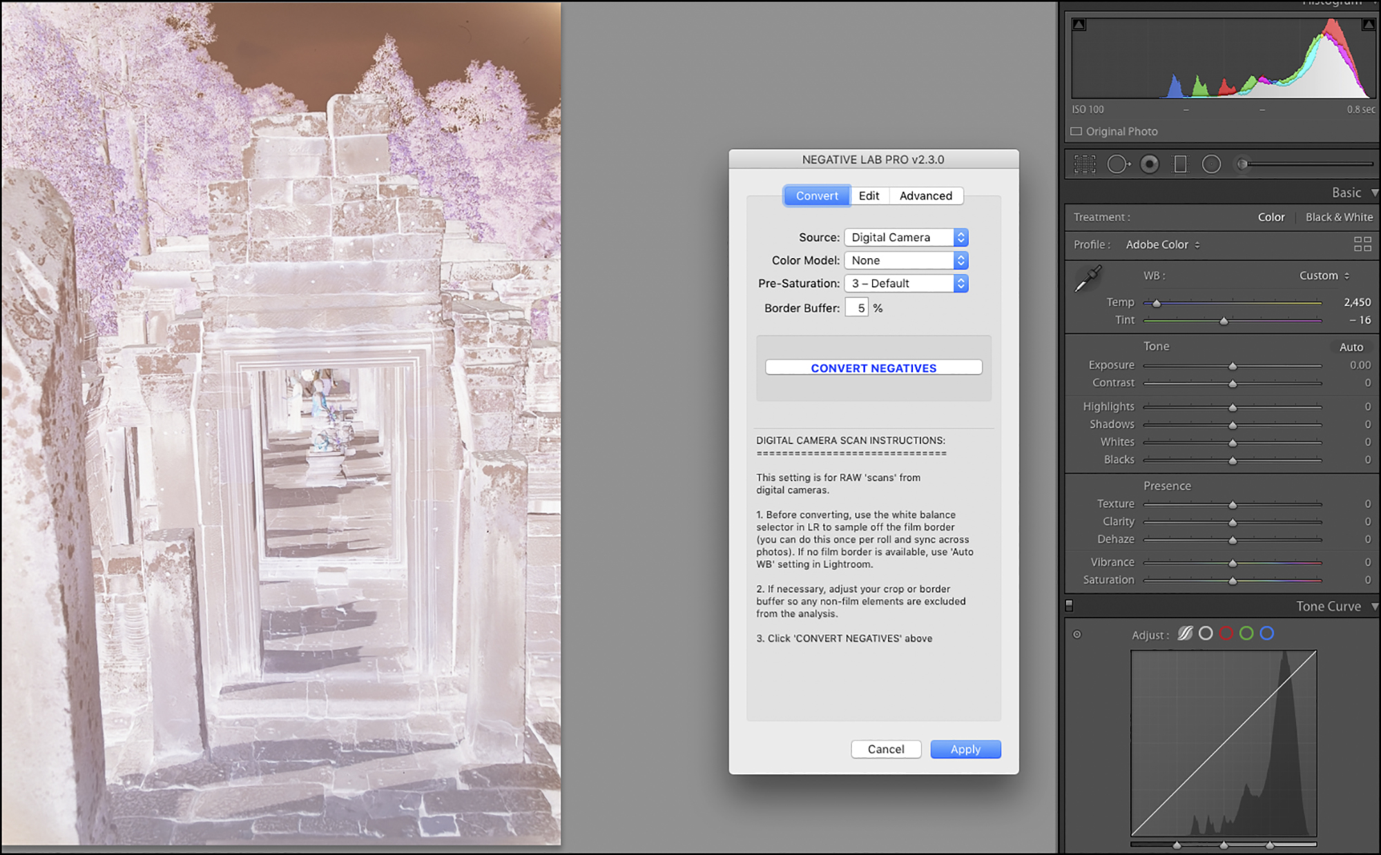
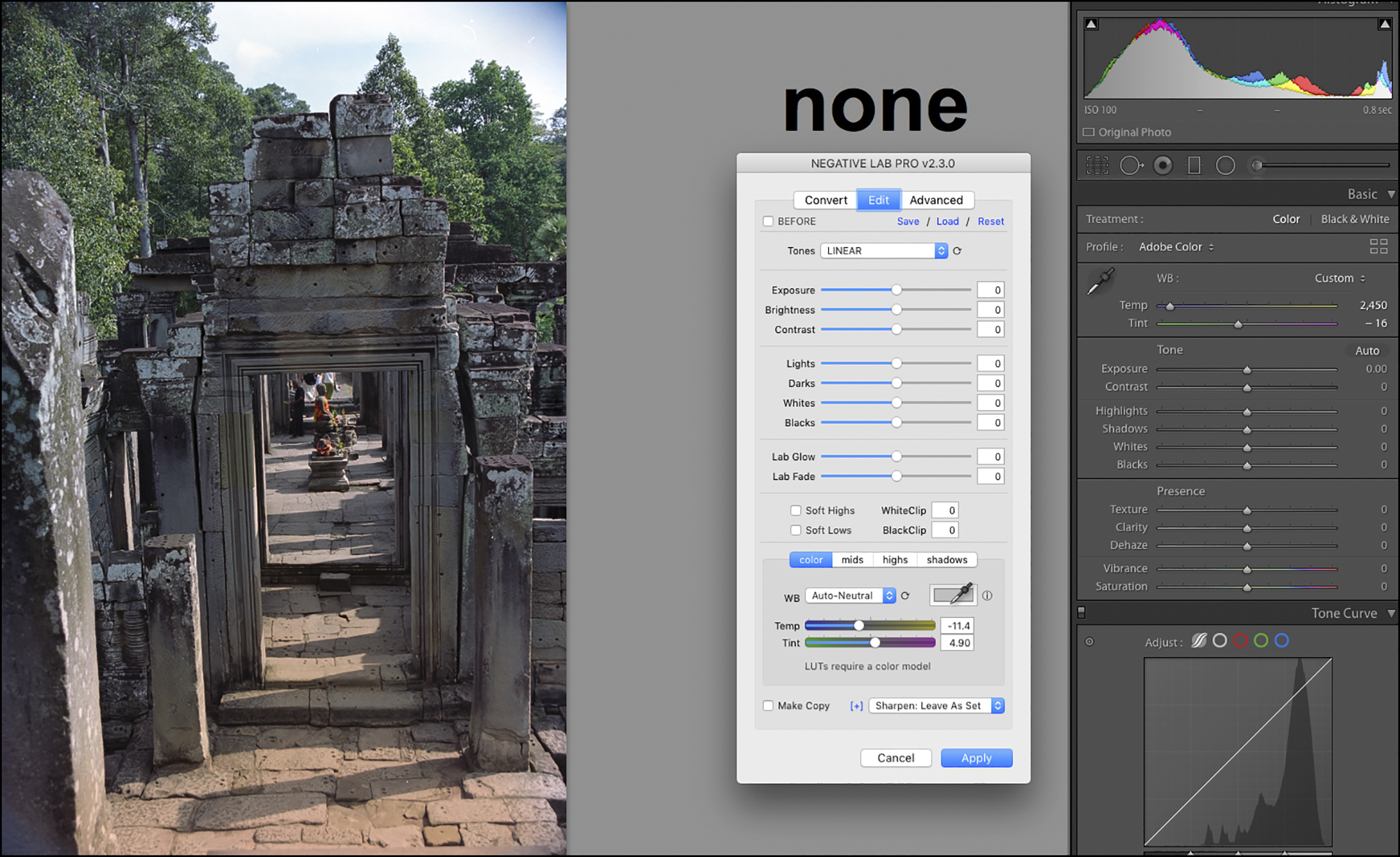
Notice LUT options are disabled because Color Model is “NONE”.
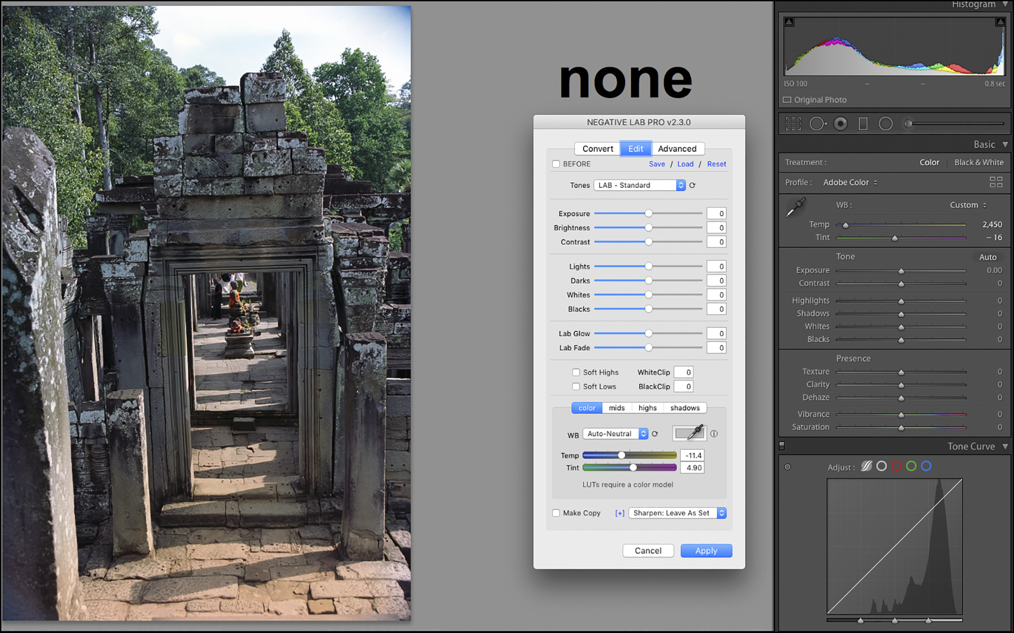
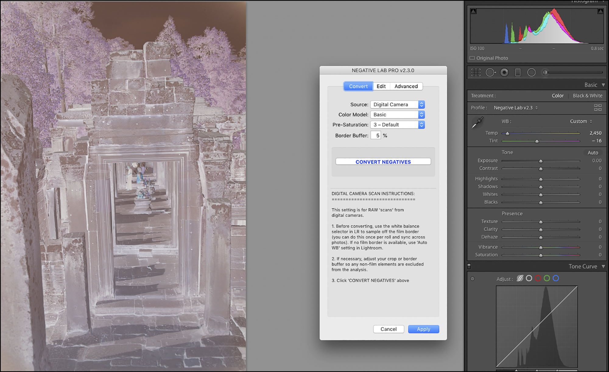
In NLP, Color Model is NONE, Tone is LINEAR; Lights are darkened to bring out sky colour, Darks are lightened for the stonework (just enough to preserve the realism that the front-facing wall/doorway is in shadow because the sun is coming from the upper right), Contrast is increased, these settings Applied, then in Lightroom Sky saturation is increased by increasing reds and orange in the Saturation Panel and adding a graduated filter brightening Shadows (which reduces upper mid-tones). Foliage saturation is increased by increasing Magenta (remember tones and colours work in reverse because Lr works on the negative, not the conversion) and finally, using Upright to correct perspective. I’ve said nothing about further adjusting White Balance because I think NLP handled that well out of the box.
One could go on and on with these. There are 3 Color Models plus 1 that eliminates choice of LUT presets, 14 Tones presets, 5 LUT presets and 8 LUT strength options for each of the LUT presets. So multiplying 3x14x5x8, the total number of possible combinations from those sets is 1680, plus the 14 Tone options that still remain possible after setting the Color Model at NONE, bringing the total to 1694 combinations of Color Models, Tones and LUTs, before considering the impacts of the choices in the “Advanced” menu (See Annex 3) on any of those 1694 option sets. Clearly, this is a rich application that can keep one busy testing very many configurations before landing on a few that respond to one’s needs for most photos. One wonders in the final analysis whether it would have been preferable to have just one set of basic controls capable of creating any set of effects one wants. That I suppose is a matter of taste and technical considerations; but given that Nate Johnson went to great lengths creating it all, and it works, my recommendation is to experiment and use it as you see fit. (BTW, I should add for potential new users: there is a free trial version of the application available from the Negative Lab Pro website,
Annex 2
Worked Example – Colourful
I made this photo of a temple in Vientiane Laos in 2003. It was a bright sunny day and the temple had just been cleaned and painted. I liked the lines and the colours, and as it turns out, it has a nice combination of Red, Green, Blue and Yellow that it serves us well for evaluating the performance of an application such as NLP. What’s more, the tonality is less complex than in the previous examples. So let’s go.
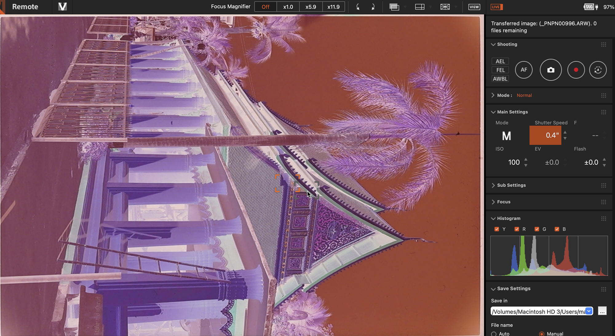
Notice at 0.4 seconds exposure the histogram is in pretty good shape.
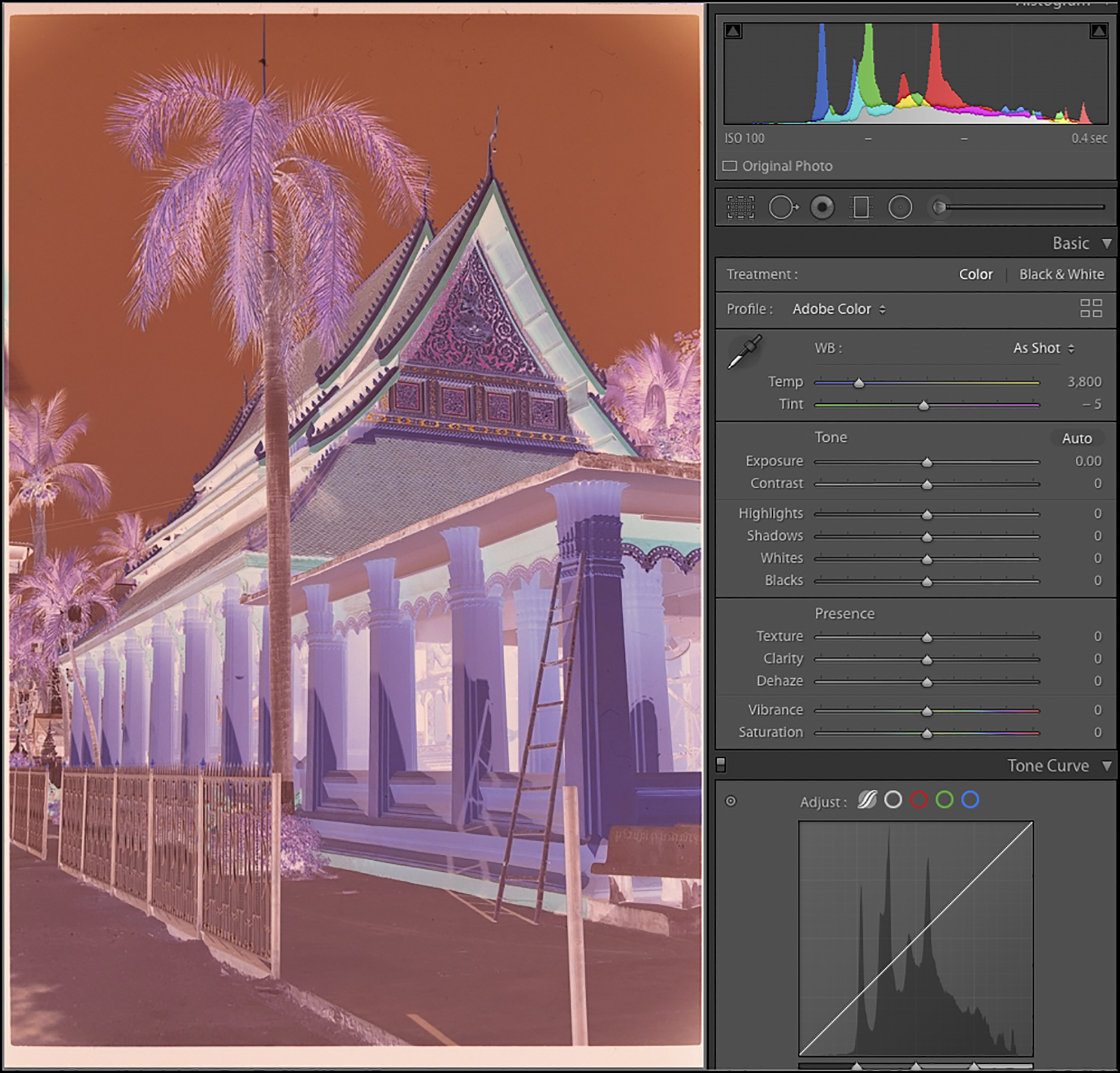
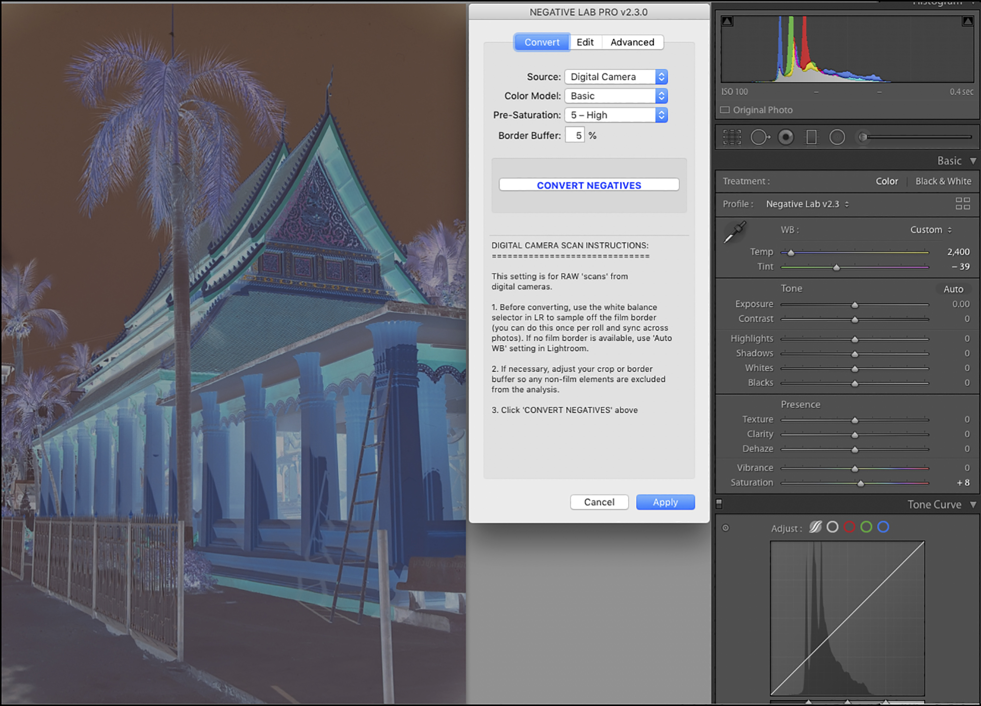
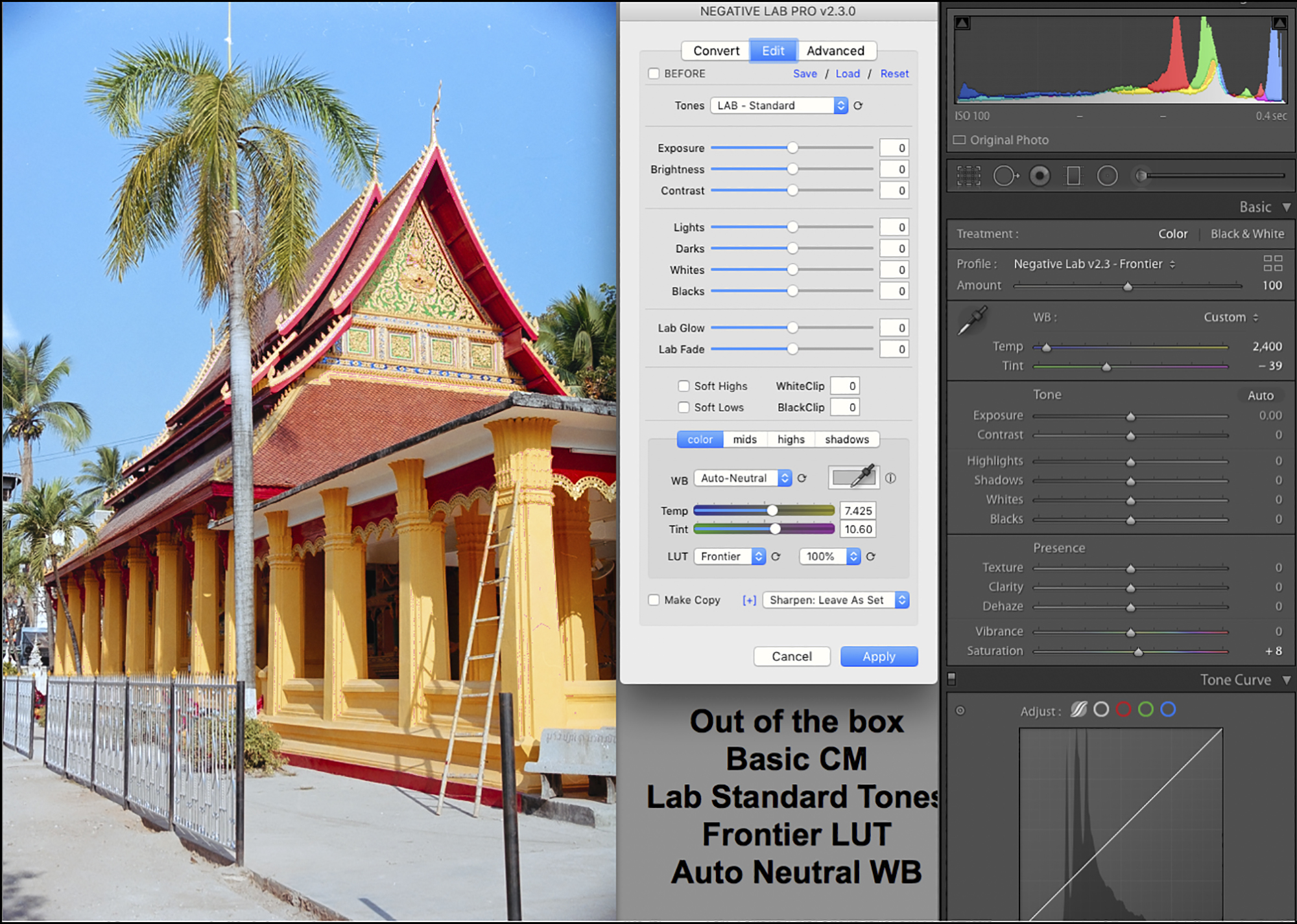
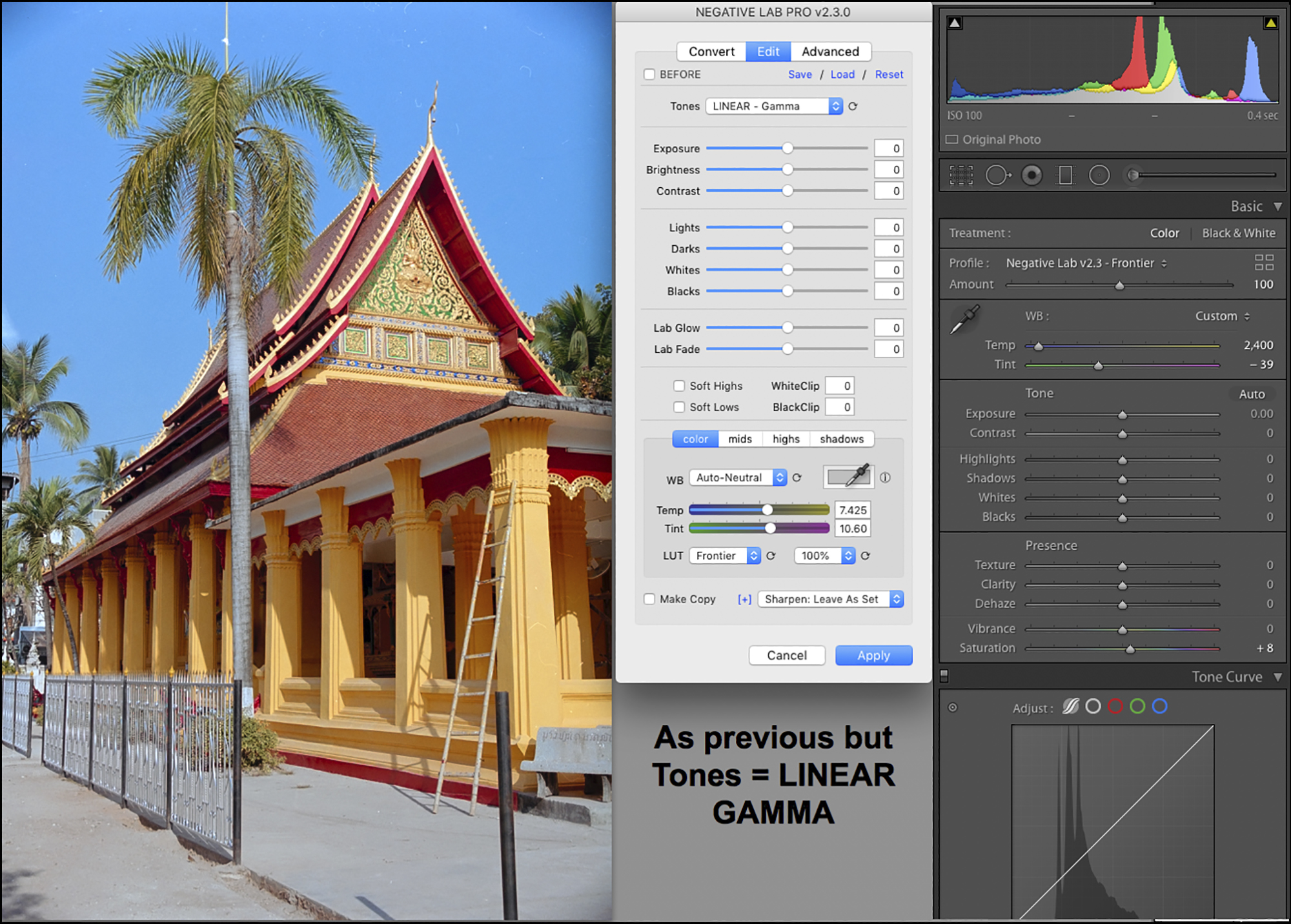
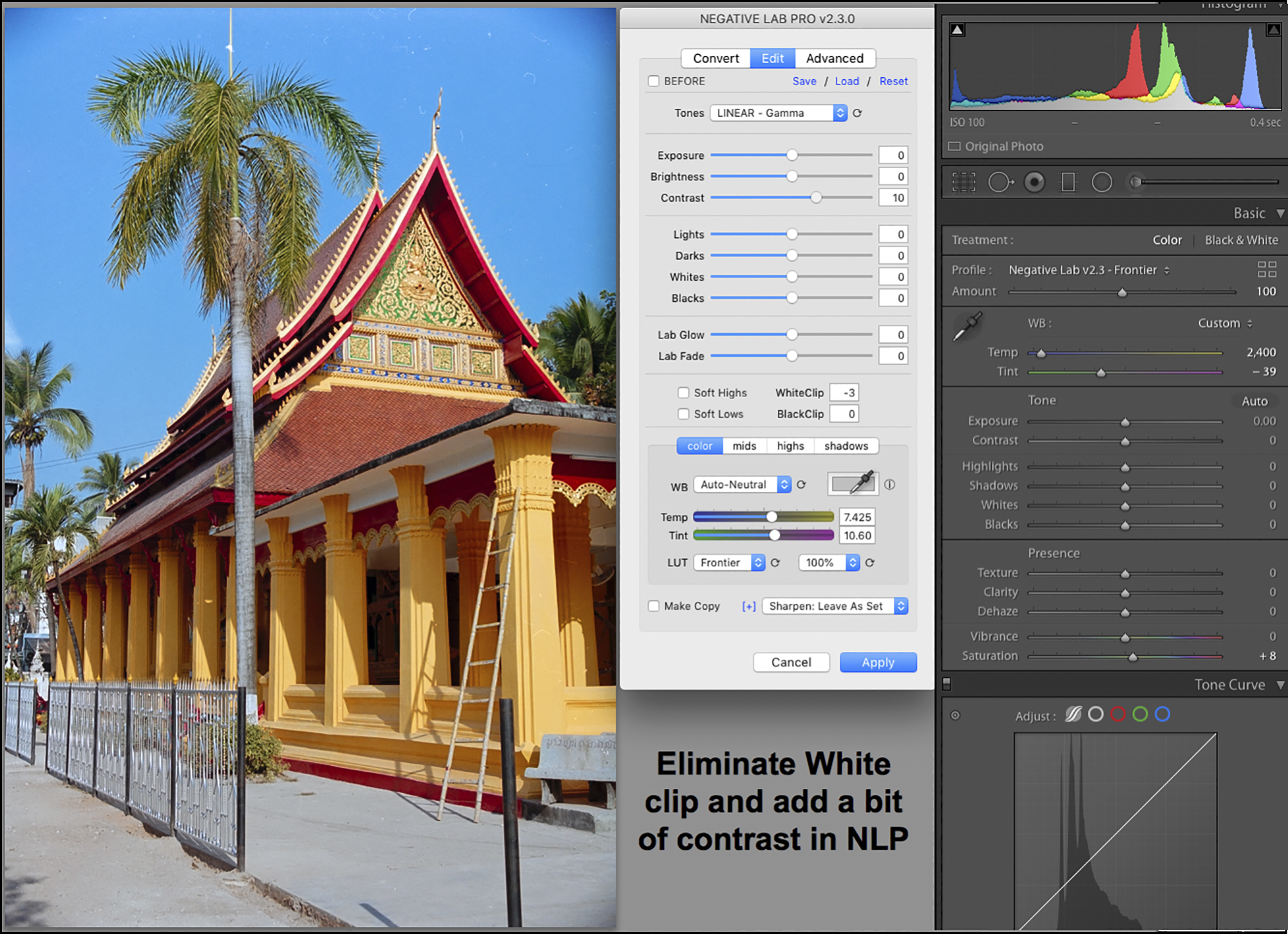

Figure V8. I applied those edits, and the photo opens in Lr alone. Note the quality of the Auto White Balance. Colours are OK, and the gray sidewalk is as neutral as one can expect.
If I were to print this photo, I would mitigate “grain” in the sky and clean-up some defects that careful dusting of the negative didn’t resolve.
Annex 3. The Advanced Options
This is communicated by Nate Johnson, from his January 2022 update of the application manual, provided here for reader convenience.
ENGINE SETTINGS (new in v2.3)
The new “Advanced Engine Settings” allows you to fine-tune the way the internal engine is working. This makes it easier to match previous versions of Negative Lab Pro or find the engine settings that work best for your particular needs. Think of it like “Process Versions” in Lightroom, but with the ability to fine-tune each of the components that go into making a process version.
ENGINE VERSION DROPDOWN
Select from predefined engine configurations. The default is currently v2.3, but you can also access the engines from v2.2 and v2.1 and earlier.
CURVE POINTS
Most of the adjustments in Negative Lab Pro happen by making specific adjustments to Lightroom’s R/G/B tone curves. The “curve points” option controls the number of points Negative Lab Pro uses when making these adjustments. While a higher number of points can make adjustments more precise, it can impact the smoothness of those adjustments.
- Auto(default) – automatically sets the number of curve points based on the negative. This should result in a good balance of smoothness and precision.
- Smooth– sets 4 control points, which will result in very smooth tonality with responsive adjustments, but limited editing range.
- Precise– sets up to 14 control points, which will allow for lots of editing range, but in some cases, you may start to see visible posterization.
- Manual– allows you to manually set the number of control points anywhere between 2 and 14 points. Note that if you go below 4 points on the curve, some of the editing controls will have no effect.
ORDER
Sets the order of the engine rendering pipeline.
- Colors First(recommended) – calculates color changes first, so that color balance remains stable as you edit tonality.
- Tones First(historic) – calculates tonal changes first, which can cause color balance to shift as you edit tonality. There isn’t really a good reason to do this, other than trying to match the behavior of Negative Lab Pro v2.1 and earlier.
WB DENSITY
This controls the impact of White Balance adjustments on the tonality of your image. (You may not notice any difference here if you do not have a high color balance correction.)
- Add Density– Adding yellow or magenta to the color balance will make the image slightly darker (similar to print).
- Neutral Density– The overall tonality will not be impacted by changes to white balance (easiest for editing).
- Subtract Density– Adding yellow or magenta will make the image slightly brighter (similar to Lightroom’s white balance).
WB TYPE
This sets the algorithm used for how the white balance control works on the tone curve. You may find that some methodologies work better on certain types of films or for certain scenes. (You may not notice any difference here if you do not have a high color balance correction.)
- Linear Fixed(default) – Changes to the white balance are evenly distributed across the full tonal range of the image, with the exception of the black point and white point (which remain fixed).
- Linear Dynamic– Same as above, except it also changes the color balance at the white point and black point.
- Midtone Weighted– Changes to the white balance are most pronounced in the midtones of the image.
- Highlight Weighted– Changes to the white balance are most pronounced in the highlights of the image.
- Shadow Weighted– Changes to the white balance are most pronounced in the shadows of the image.
My limited testing of these options indicates that the defaults are generally satisfactory.
Finally, Nate advised that within the Edit tab there are two new features in Version 2.3 that are now documented:
Lab Glow: Lab Glow compresses tonality in the highlights (or if you use a negative value, it expands tonality in the highlights). Increasing Lab Glow will give the appearance of smoother highlights with less visible detail.
Lab Fade: Lab Fade compresses the tonality of the shadows – so you will see smoother shadows with less visible detail and no pure black. And again, using a negative value for Lab Fade will do the opposite – expand the tonality in the shadows.
Mark Segal
January 2022
Toronto, ON
Mark has been making photographs for the past seven decades and started adopting a digital workflow in 1999 first with scanning film, then going fully digital in 2004. He has worked with a considerable range of software, equipment, materials and techniques over the years, accumulated substantial experience as an author, educator and communicator in several fields, was a frequent contributor to the Luminous-Landscape website and now contributes frequently with in-depth articles on the PhotoPXL website. Mark has contributed over 75 articles to the two websites up to Q1-2024, with a particular emphasis on printers and papers, given his view that a photograph printed on paper remains the epitome of fine photography, as it has been from soon after the medium was invented and started gaining momentum in the 1830s/1840s. Mark developed a particular interest in film scanning and authored the ebook “Scanning Workflows with SilverFast 8, SilverFast HDR, Adobe Photoshop Lightroom and Adobe Photoshop” (please check our Store for availability). In his “other life” (the one that pays for the photography), Mark is a retiree from the World Bank Group and was a consultant in electric power development.