Paint the City Black – How and Why I Became a Publisher
Introduction
With the profusion of new technologies and new ways of doing business, book publishing has been diversified and democratized over the past decade or so. It is no longer necessary to undergo the arduous and expensive processes of working through agents, publishers, layout/design/pre-press services, marketers, and distributors to get a good-looking book to market. There are more direct, cheaper ways of getting our stories out, and new industries and resources have emerged to facilitate exactly that. A traditional retail book pricing guideline of 6x the printing cost no longer necessarily applies to these new approaches. It can be done on lower overheads with fewer resources than previously possible.
There are essentially two major technological options for printing and publishing photographic books: (1) “Print on Demand”, generally using digital presses such as the HP Indigo and Xerox Iridesse, and (2) offset lithography, e.g. Heidelberg presses. There are several flavors of offset I mention further on.
A key distinguishing characteristic between digital press and offset is the relationship between scale and cost (Figure 1).
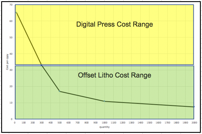
Printers I’ve discussed this with generally indicate that a volume of 300 copies is the point at which offset and digital press bear about the same unit cost per book. And none of them would accept an offset job for less than 300 copies. Digital presses are suitable for one-off print-on-demand orders or small-print runs. Beyond 300 copies, using an offset press, unit cost decreases markedly the larger the press run and, depending on the volume would considerably out-compete a digital press. In both cases one pays up-front for the total order placed at any one time, which of course introduces investment risk.
Hence the least-risk approach is ordering a single print-on-demand copy from a digital press when an order comes in. The provider pays and sells at the same time, but it tends to be expensive for the highest quality options the printer offers. The business gets riskier once one needs to invest up-front the full cost of a quantity press run. The digital press allows for risk management from one copy upward. The offset press increasingly mitigates unit cost exposure the larger the press run, but the more total up-front cash one invests the larger the exposure to market risk.
This means that one of the most basic decisions a would-be publisher needs to make is about prospective market size and tolerable risk. How much up-front cash is one prepared to sink into a print run and hope to earn it back through the required quantity sold?
The most basic commercial risk is whether the subject matter is likely to excite enough potential customers to make it worthwhile and whether the creator of the book has or can develop the necessary “reach” into the market. If one were quite uncertain about the potential market, it leans toward print-on-demand, but with adequate confidence in selling upwards of 300 copies, an offset solution generally seems preferable. Of course price influences the sales volume quite apart from public interest in the subject matter, so all these variables work inter-actively in the decisions one makes about a publication strategy.
Those remarks set the context for the story about how the book “Paint the City Black” (PTCB) and an associated publishing venture came into being – the decisions made along the way, the actions that needed to be taken, the work done and the outcomes.
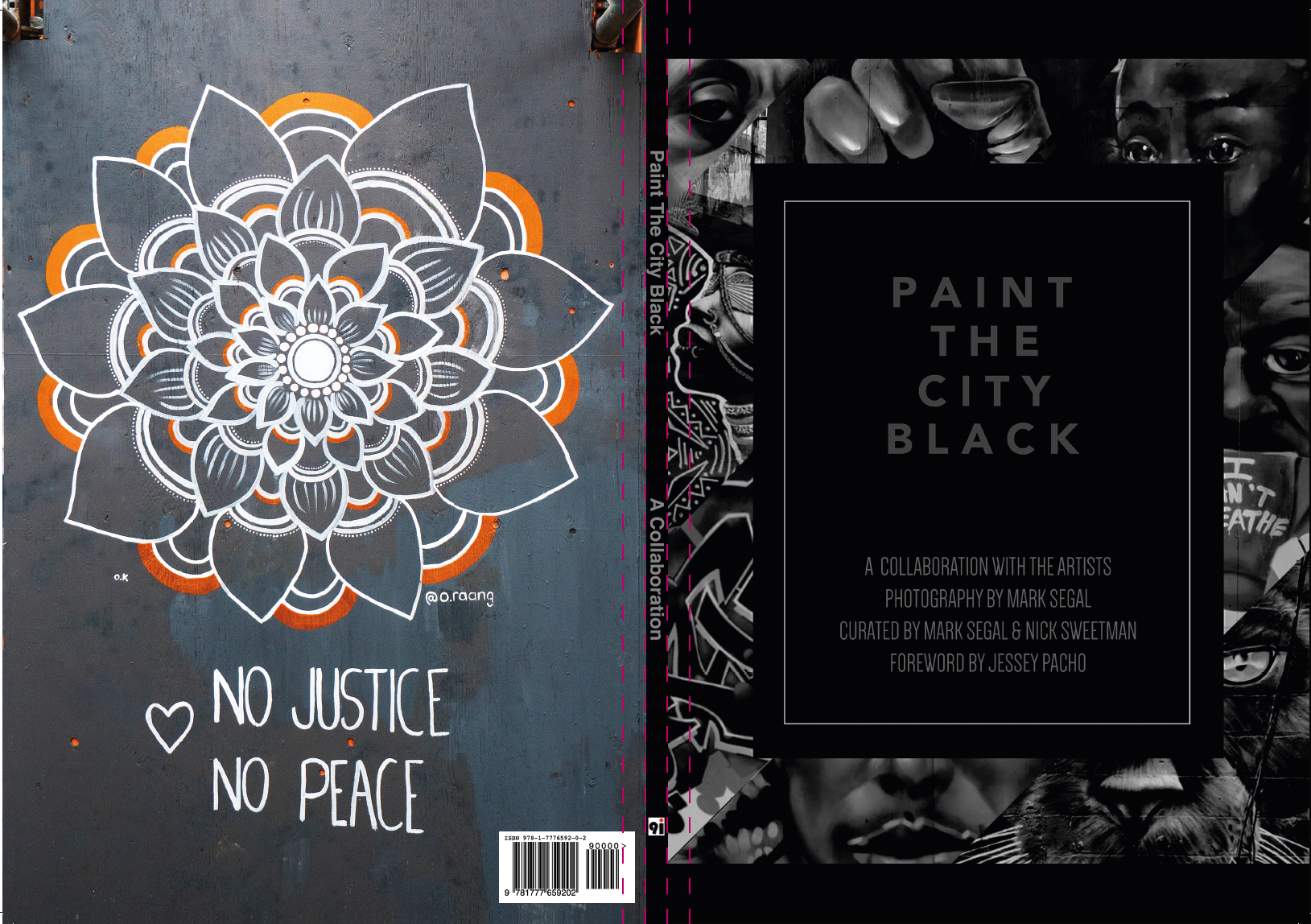
Front Cover Design: Blaze Wiradharma; Back Cover: Opola Karim
Motivation:
I much admire high-quality street/mural art, especially that which conveys important social messages in graphically compelling ways. So I got into marrying my interest in street art with my life-long passion for photography and a firm belief in the need for social justice in our ethnically diverse communities. This project responds to all of that.
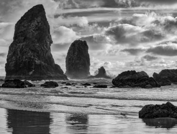
I grew to admire and respect how our better artists are socially and culturally aware people who often portray if not foretell social conditions in the works they create. Sadly, art on exterior walls is ephemeral – good as it may be, it gets weather-beaten, defaced, and destroyed over time. To preserve the most important works our artists create is the calling of high-quality mural art photography. There is much more to this than pointing a phone at a wall and pressing the exposure button, but that will be the subject of another article. Suffice to say for present purposes that the hallmark of high-quality street art photography is to capture in compelling printed photographs the nuances of tone, color, line, and form the artists put into their work. Printing on an inkjet printer with ultra-wide gamut inks and papers is one thing; getting these same photographs to look just about as good from an offset press with its more limited gamut is quite another, and I’ll be talking about that below.
I’ve been photographing lots of walls in various countries. As I live in Toronto the local scene is of greatest interest, most accessible, and most importantly, I believe a lot of world-class art is created here. We have superb artists in this community. Street art is nurtured in Toronto by the efforts of the artists themselves, the Street Art Toronto program of the City government, and other community arts organizations.
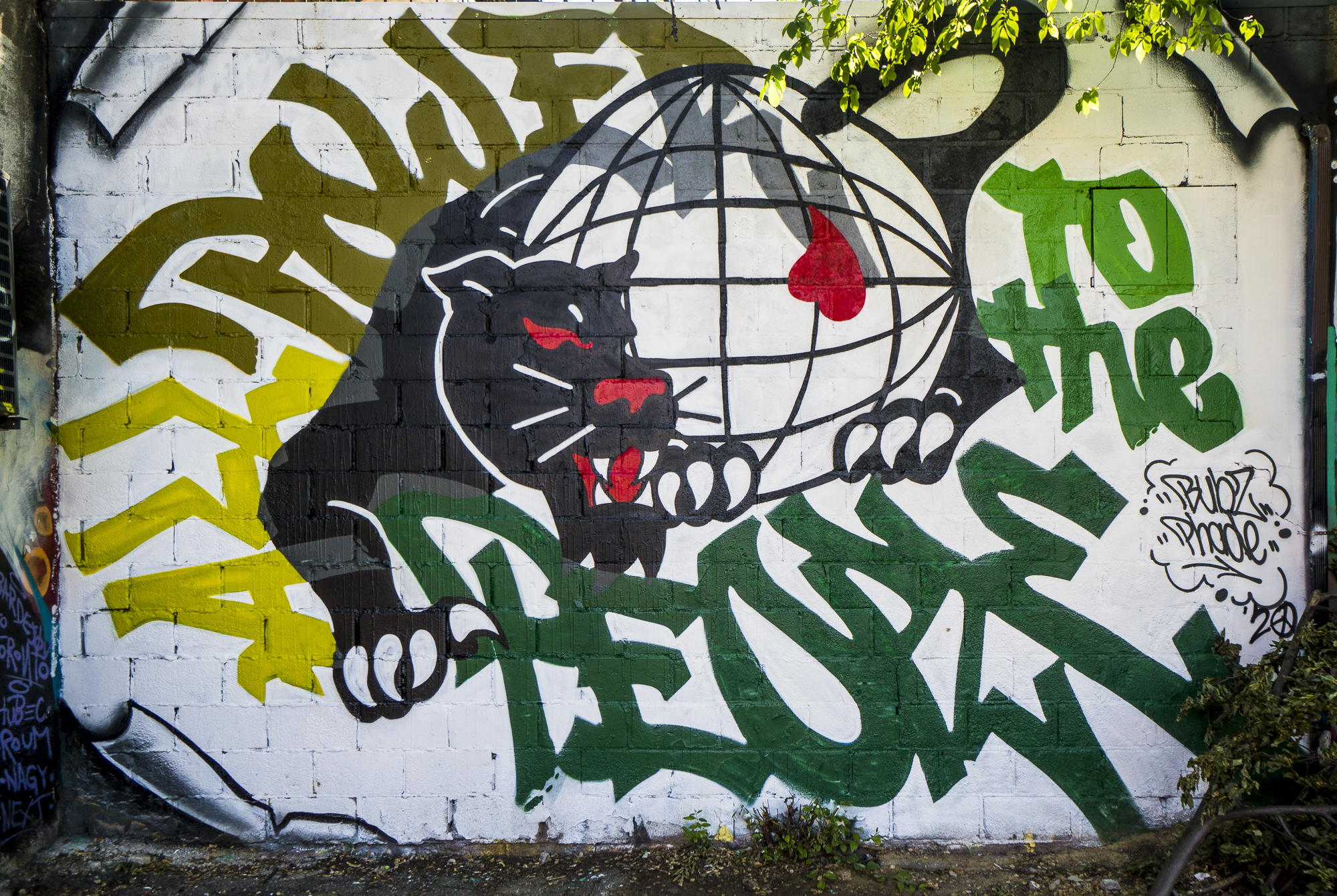
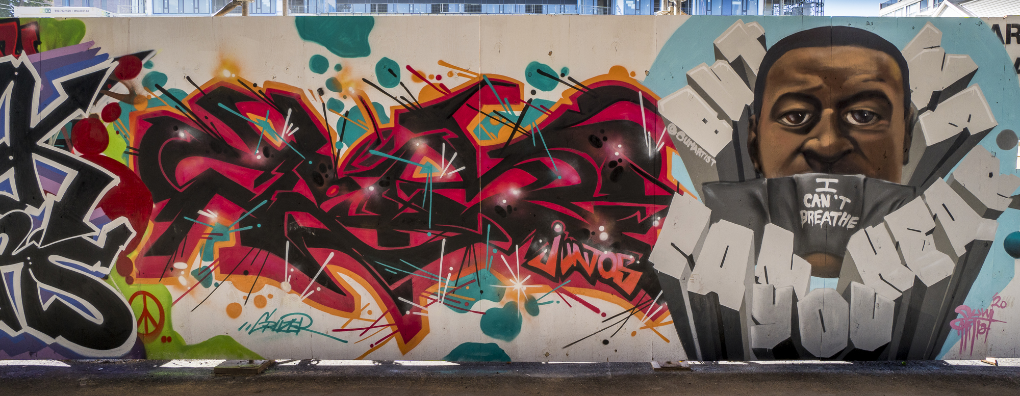
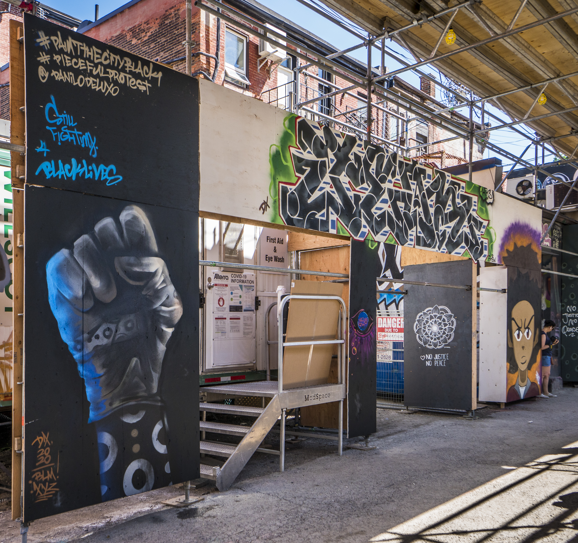
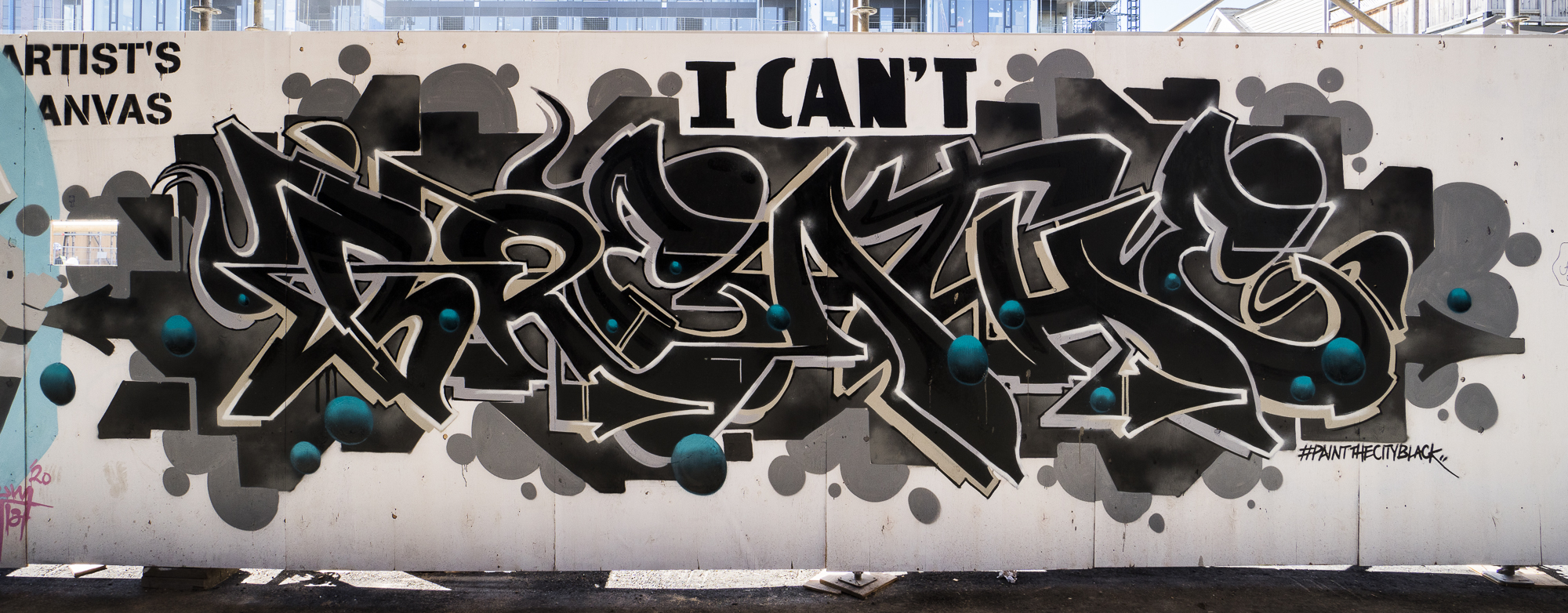
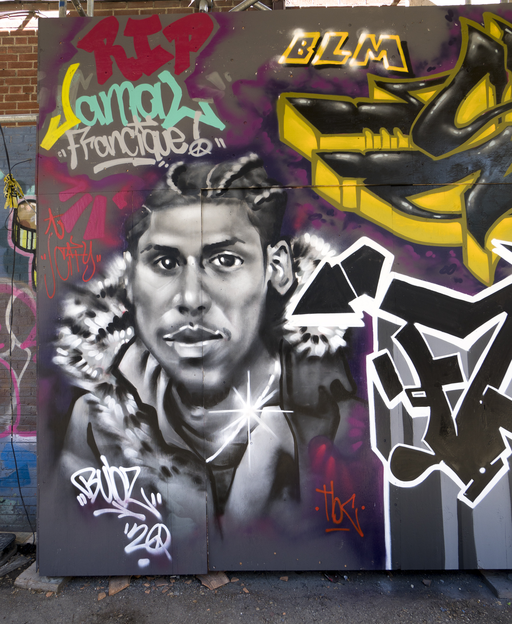
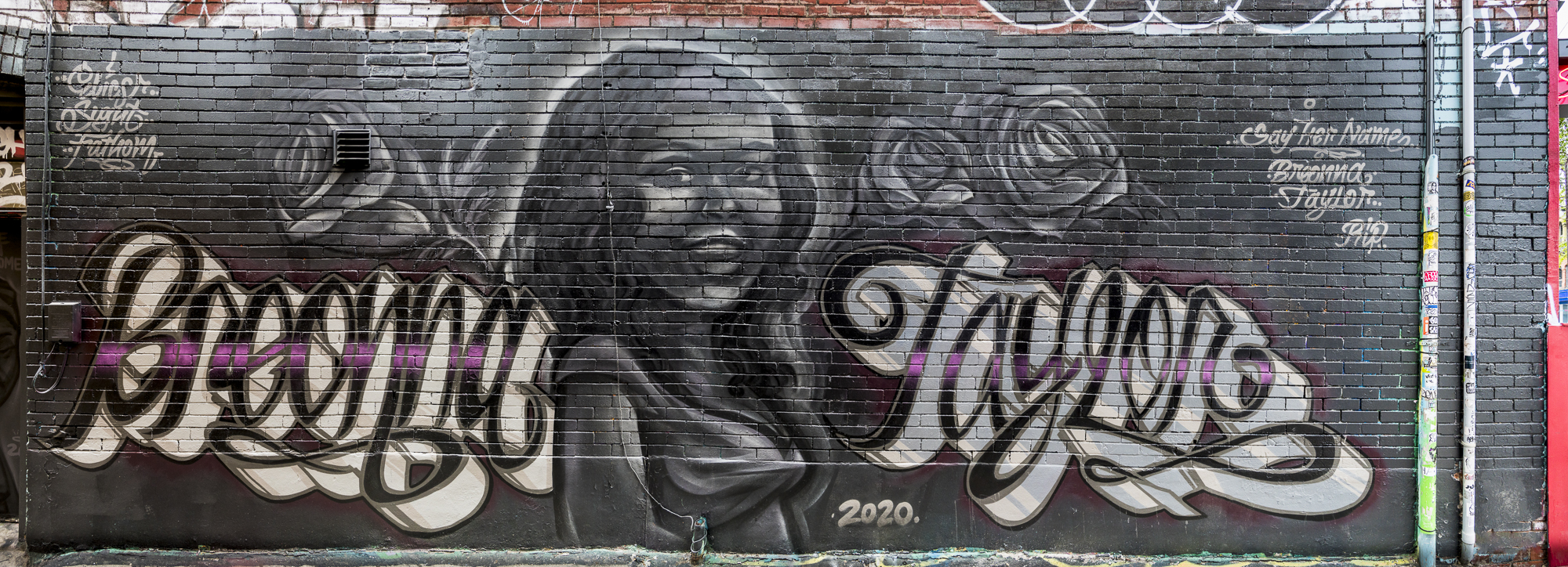
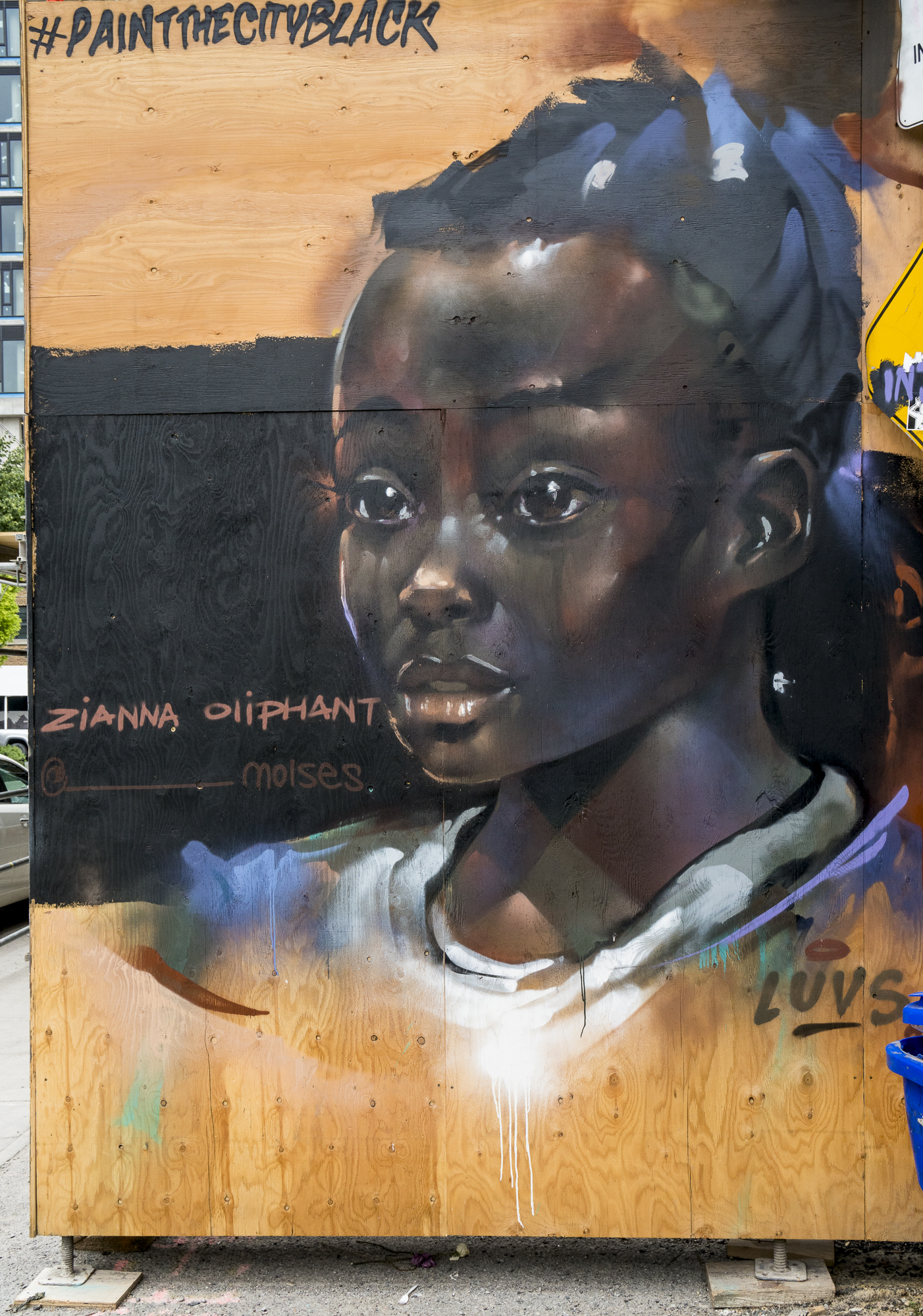
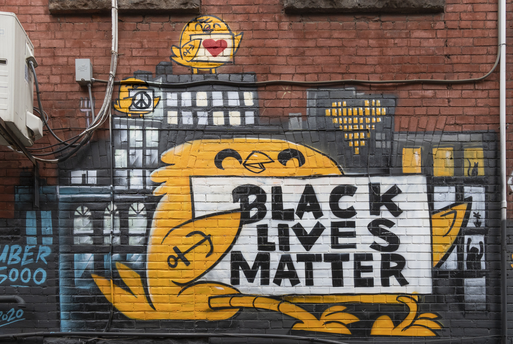
The subject of this book arose from a tragedy. On May 25th 2020 the Minneapolis Police murdered George Floyd. International reactions to this outrage were swift and expressive. In Toronto, over the weekend of June 6, 2020, a group of more than 40 street artists converged on Graffiti Alley in downtown Toronto and held what they called a “Paint the City Black” event, to make the point that Black Lives Matter and to commemorate people in both the US and Canada who gave their lives to this cause.
It was totally fitting and within character that an event of this kind would occur in Toronto. Toronto is one of the most polyglot, ethnically diverse cities in the world. The organizers of this event and the group of painters who participated in it reflect this ethnic diversity, in this case of course, with a major presence of Black artists. The event was spontaneous, unchoreographed, from the heart and authentic in every which way. The artists gave it their own time and resources – there was no sponsorship, no outsider influence.
The day after they finished these paintings, I went down to Graffiti Alley with my camera and photographed every mural. I selected, processed, and printed the photos.
When I saw the collection so completed, I brought it to my good friend Nick Sweetman, one of the event’s managers and a foremost mural artist in Toronto. Socially aware and committed, Nick also has a keen understanding of the symbiosis between street art and the photography of street art, and I, as a photographer of street art, understand that the photography is “derivative” art based on the original works. So we have a shared understanding about the basics of this symbiosis.
Arising out of a discussion between us, we thought it would be a good idea to somehow make a book of these photos available to the general public, to both commemorate the event and disseminate awareness of not only the event, but in a more important generic sense, the cause – because racism didn’t start or stop with the George Floyd tragedy; it is an on-going endemic issue all over the world, including Toronto, in numerous different guises. We know that where these works were painted, damage and over-painting happens all the time, so we thought that this graphical expression about an unfortunately timeless issue deserved to be memorialized and propagated in a way that only a book of photographs could really do in an enduring manner.
Process:
So we started thinking about how to do this. We had to conceptualize it from the bottom-up, because there are precious few – if any – relevant precedents here. Many factors and decisions are involved, so just in case you have it mind doing such a book project yourselves, here are the key ones that need to be dealt-with. Some of it is weighty, some of it looks trivial, but all of it needs to be handled and handled correctly, so I’ll touch upon all of it, in varying depth, depending:
(1) The “buy-in” of all the artists who participated in the event. This is the “sine qua non” – the most critically important requirement for producing such a book. I would not publish a volume featuring other peoples’ art unless they agreed to be included. It is art in the street for public edification, but that doesn’t obviate the courtesy and moral obligation of securing the creators’ approval of its use where propagation is involved.
(2) Audience: for whom are we producing this book?
(3) How many copies can we expect to sell to that audience?
(4) What price do we think appropriate relative to the number of copies we intend to sell?
(5) What format publication fits within our intended pricing? E.G. page size, number of pages, binding (softcover, hardcover).
(6) What will the marketing strategy be?
(7) What quality print job do we want?
(8) How much will the print job cost?
(9) What are the financial implications of alternative print volume and suppliers, in terms of profit, loss, break-even and risk?
(10) How do we canvas for printers and how many should we contact, where? What kind of relationship do we need with the printer?
(11) Designing the book.
(12) Preparing the book for production.
(13) Creation of the publisher and publisher’s imprint.
(14) Logo and Trademark.
(15) Obtaining an ISBN number.
(16) Obtaining a barcode.
(17) The sales website including promotional material and fulfillment mechanism including payment and shipping options.
(18) Packaging materials.
As you can see, there’s more to this than ordering a book from Blurb once one gets into commercial scale publication, even if it’s small-scale by the norms of this industry. I’ll briefly discuss how I approached each of these items.
There are basically two ways of approaching all these tasks: (1) farm them out to specialists and just make sure it all comes together at the end of the processes, or (2) do most of it yourself. If you have the time and want to seriously save on costs, (2) is the way to go, so I made the time and glad I did, because now I know it from first-hand experience. For future larger-scale projects and with adequate sponsorship, it would probably be better to farm some of it out.
(1) Buy-in: My colleague Nick Sweetman has the vital contacts in the community, so he undertook coordinating with all the artists, discussing the book project with them one-by-one and securing their commitment. Over the many months this went on, the character of the project was successively refined. We made it a non-profit undertaking by committing to donate any net profits to The NIA Centre for the Arts , of course with their concurrence. It’s an honor for us to be associated with them in this way and a not-for-profit character of this project best suits the underlying subject of the book.
(2) Audience: We expected the audience to be anyone in the local and international street art communities, and all others who enjoy street art, and may be interested in buying a book commemorating a unique social and artistic undertaking focused on a subject of great societal importance.
(3) Sales: We figured the minimum up-take could be about 100 copies just based on the number of people we thought we could count on, with that number leveraged several-fold perhaps into 500 or so. We had little basis to substantiate this estimate, but 500 copies made it viable for offset, quite a bit less expensive than digital press, and seemed within reach. So we settled on a press run of 500 copies. An important consideration was also to constrain the risk of large numbers of unsold copies, not only for financial reasons, but also to minimize waste. More about this below.
(4) Price: The book was not to to be large, we were uncertain of the market, there is little track record of such books being produced and sold in Toronto, so we wanted to keep the price no greater than C$ 29.95 plus shipping. Again, no corroborating data base from which to anchor this pricing parameter, but based on the size of the book, the target market and the prices of art books in general, it just “felt right” (i.e. not an obstacle to purchase).
(5) Book format: Given the number of photos and the target price point, we decided on a modest but nonetheless adequate 7 x 10-inch format, soft cover and 76 pages, which would all fit with the printers’ normal sheet sizes and page set-up for offset printing. For double-page spreads, this does allow for the reproduction of panoramic photos up to 14 inches wide and 10 inches tall. More about panoramas below.
(6) Marketing Strategy: To keep costs and price down, we would avoid agents, other middlemen, wholesalers, distributors, and retailers; rather the book would be promoted over Instagram, by word of mouth, and sold directly from the publisher’s website. Nick had the major developmental role for marketing up to the point of the publisher’s website, given his extensive connections in the community and following on Instagram. I as the publisher looked after developing the website and the fulfillment mechanism. I found Go-Daddy provides a very basic vehicle for these tasks – more about this in item 17 below. Roshni Wijayasinha, one of the participating artists (Figure 8), runs a marketing company (Prosh Marketing https://proshmarketing.com/) and she kindly handled the publicity for the one extremely limited outdoor book launch event we could hold in June 2021.

As well, just a reminder of the public health context – we were doing all this in the middle of a pandemic lock-down, hence there could be no indoor launch parties, where without doubt we would have sold many copies in one evening. Even going outdoors to make the photos in that environment was on the fringe of the permissible and the whole atmosphere of closed-up shops and empty streets in the core of downtown was eerie. Toronto traffic was never easier to navigate because there was none – I never thought I would live to see the day this could happen; it took a pandemic, sad to say.
(7) Quality: Only the best, no compromises. Why? The theme of this book is blackness – lots of black paint (Figure 7), and street art is generally full of contrast and vibrant colour, so we needed as much gamut as the press conditions and paper could deliver. As well, colour management had to be spot-on so that the printed photos would be as faithful a rendition of the paintings as feasible. This was a huge focus of the whole production effort and steered us away from low-budget print jobs. It paid-off, as we received much commendation for the quality of the product, including from people with considerable knowledge of colour and colour management.

(8) Cost of Printing: I wanted to constrain the printing cost to about half the targeted selling price. It was ambitious by the usual standards of the book trade to combine low pricing with higher-end printing cost, which was unavoidable when producing a combination of small volume (by industry standards) and high quality.
(9) Financial Projections: I put together a compact financial analysis model (Figure 8) allowing us to understand the relationships between prices, costs, quantities sold, and break-even points at different size print runs.
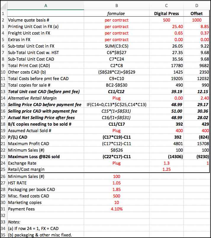
Costs include printing costs and other miscellaneous costs for small-budget promotion, packing materials, transaction fees, and the like. Based on these costs and an assumed percentage margin above costs, it generates a required retail price and shows the break-even volume of sales – i.e. the number of copies that need to be sold for full cost recovery to occur. As well, it provides a risk analysis showing profits or losses for alternative sales assumptions. I provide here prototypes for 500 copies by digital press and 1000 by offset. The model analyzed the following questions for press runs of 300, 500, and 1000 copies, and was set-up to analyze all the quotes we received from the RFP process:
(a) Does the digital press solution compete against offset at the 300-copy level?
(b) Based on the size of the press run, what is the minimum selling price and retail margin one could contemplate charging, after allowing provision for cost recovery when less than 100% of the copies are sold?
(c) Based on (b) what is the minimum number of copies that need to be sold for cost recovery with no profit?
(d) What is the maximum profit achievable if almost all copies were sold?
(e) What is the profit or loss if an intermediate number of copies were sold?
(f) What is the loss if only 100 copies were sold (our most pessimistic sales projection)?
I looked at 300 copies from offset in respect of question (a) only. The 300-copy option was dropped from offset consideration for the remainder of the questions because it was unattractive.
Question (a): Competitiveness of Digital Press: With a number of printers, by 300 copies one has achieved the maximum discount offered relative to the single print-on-demand price. So it makes no difference to unit cost whatever the quantity ordered in the range I’m considering; above 300 copies offset printing is less expensive than the digital press per copy printed and the unit cost declines rapidly as the size of the print run is increased. This happens because there is a high ratio of fixed to variable cost in the offset lithography industry. In Figure 6 compare row 9 columns C and D to see how much cheaper per copy a 1000-copy offset press run is compared with the digital press run from 300 copies upward.
Question (b) Minimum Selling Price: Based on the desire to maintain a selling price no higher than CAD 29.95, the model allows one to derive the retail margin over cost, or to assume a retail margin and calculate the resulting retail price. Looking at rows 15 and 16, a $C30 retail price is highly feasible for the offset option and impossible with the digital option.
Question (c) Break-even sales volume: At each copy volume level (e.g. 500, 1,000), the model indicates a break-even sales volume (row 18). This includes some margin over printing cost for various other expenses. At the 1000-copy level, the break-even sales volume increases relative to that of smaller print volumes, but not by many copies, because of considerably lower unit cost (rows 13, 14, 15). There are however other risk considerations at 1000 copies discussed below.
Question (d) Maximum Achievable Profit: The model calculates the maximum profit assuming most copies sell (row 21); it would be much higher of course at 1000 copies than at 500 because of more sales and lower unit cost – but that presumes most copies are sold at full retail revenue
Question (e) Sale of intermediate quantities: for each print run level one specifies (row 19), the model calculates what profit or loss would be incurred; for any given sales assumption, the 1000-copy print-run loss could well be higher than at the 500-copy level (row 20). This is an early indication of possible exposure from printing far more copies than sell.
Question (e) Sale of 100 copies: This is the real stress test. We figured it highly unlikely that we would sell less than 100, because we could almost count those from amongst the most prospective clientele we know; but we had to look at the implications of there being no further interest in the book. So the model calculates “maximum exposure” (row 23) based on a 100-copy sales floor. Interestingly, at the 500-copy print run the maximum loss level is higher, because unit cost is so much higher than that of the 1000-copy offset run. But, at the 1000 copy level, if this were to happen, there would be nothing to do with 900 books. Not illustrated here, for a 500-copy offset run which is much cheaper than the similar digital run, the maximum loss is greater printing 1000 copies than 500 copies.
The bottom line turned out to be that the risk-reward profile is more balanced in light of market uncertainty at the 500-copy level and that is why we selected this volume print run. As well, we absolutely abhorred the thought of potentially wasting a very large amount of material. I know that seasoned publishing enterprises would laugh at the scale of this thinking, but it has to be remembered that one is starting small in a little-known market environment for a niche product in the middle of a pandemic without deep-pocket financial backing.
The main takeaway for readers of this section is that having a decent financial model that allows one to quantify various risk scenarios and see their financial implications is really a major assist to rational decision making about several important factors.
(10) Printers: There are many printers all over the world, which makes choosing one a challenge. In short, the selection procedure was as follows:
– establish short-listing criteria,
– search for about a dozen potentially promising candidates,
– send out requests for proposals (“RFP”s),
– evaluate the responses, and
– make a decision.
Having been collecting books on painting, graphic arts and photography for the better part of 65 years, I had some insight into who does what kinds of print production and what to expect. As well, having attended several seminars and done my reading about pre-press preparations and standards for offset printing, I was able to converse somewhat knowledgeably with the printers about the key technical parameters affecting print quality. All that helped. But I still sought recommendations, researched printers over the Internet and as a result of that research issued about a dozen RFPs.
A few words about the selection criteria:
– product quality;
– reputation;
– the quality of customer service and support (this is REALLY vital);
– ease and promptness of communication (also vital);
– willingness to take on small print runs and treat them seriously (also vital);
– shipping logistics;
– turn-around time from ordering to delivery; and finally
– cost (including for exchange rates as appropriate).
Note that I put the cost at the bottom of the list. This is intentional because quite frankly up to a certain point costs are passed on in prices, but if you don’t have the other factors working in your favor you can be “dead in the water”.
I finally selected Hemlock Printers in Vancouver BC, Canada because they are one of the finest printers on the continent, and they more than responded to the selection criteria. Importantly, given that all this work was happening during the COVID pandemic with numerous supply-chain disruptions, especially to international shipping, after due consideration of alternatives I decided it would be preferable to keep the work in Canada.
Hemlock was not the cheapest (nor the most expensive) responding to the RFP, but top quality and great service need to be paid for – and with respect to both the working relationship and the outcome, it was good value for money. Genoud Arts graphiques S.A. in Mont-sur-Lausanne, Switzerland was an equal contender in all respects other than for cost (mainly because Swiss Francs are costly in Canadian dollars) and my concerns about inter-continental shipping.
One of the more specialized aspects of offset printing that I initially thought could be important is that there are several flavors of CMYK: Conventional 4-color offset versus “Expanded CMYK”, which includes a number of options for expanding color gamut beyond ISO 12647-2 GRACol or FOGRA 55 color spaces. Here is a good reference paper on this subject,
[Decoder: GRACol: General Requirements for Applications in Commercial Offset Lithography; FOGRA, the German industry version: Forschungsgesellschaft Für Druck-und Reproduktionstechnik (Eng. Research Society for Print and Reproduction Technology)].
Because I thought that our murals were strong graphic art rich in saturated color (for example, Figures 9 or 6), I figured that an Expanded CMYK printing solution would be appropriate (Figure 10), so I generated a lot of discussion with several of the finest printing houses on this subject.
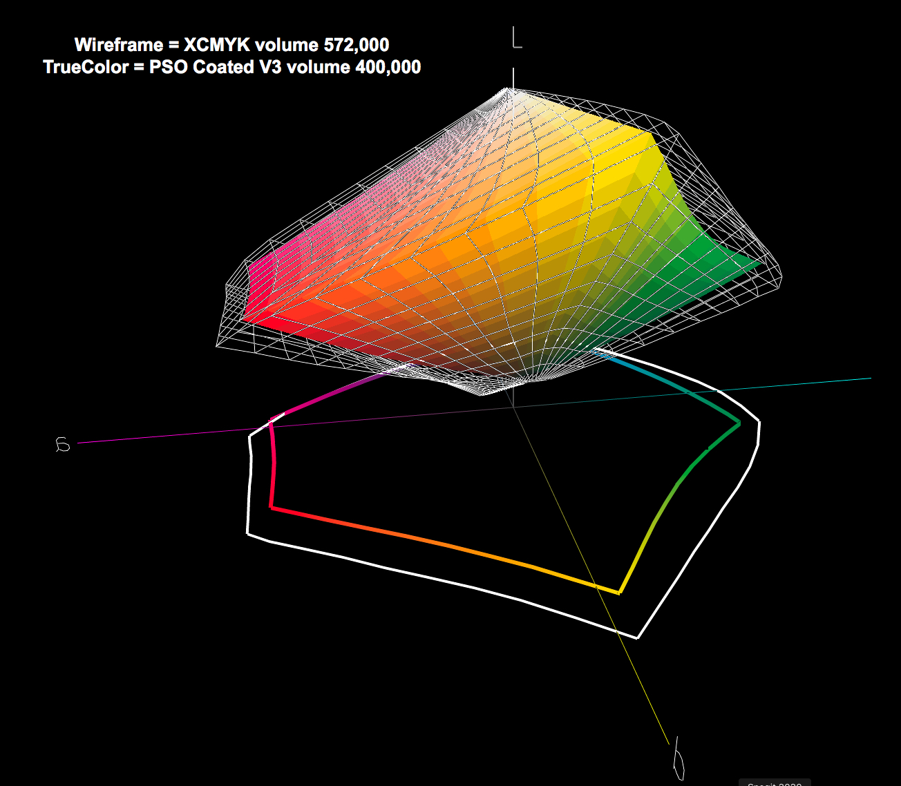
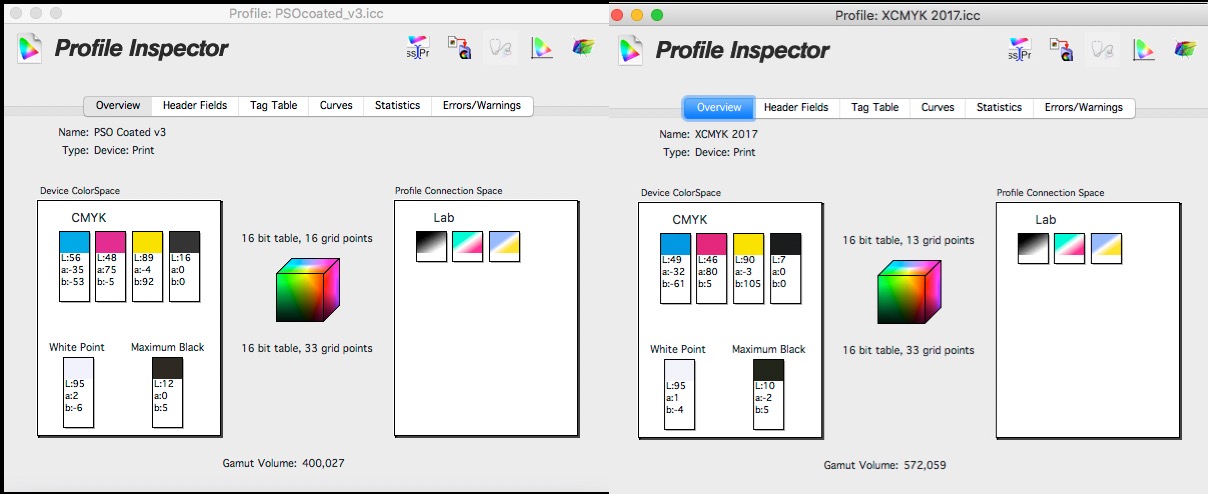
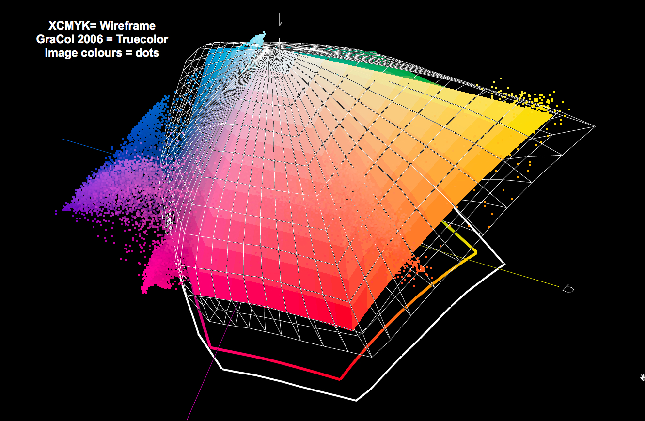
What I learned is that as the Techkon paper says, “it depends”; not all illustrations need the expanded gamut (but some do), and it generally costs more. After reviewing a lot of sample material, I decided that the standard printing solutions with some customization that the best printers offered would be fully satisfactory, even though not defined as “expanded-gamut”. That said, for me this is still an open question to be reviewed with each project because the printing industry for some time now has been devoting a lot of time and attention to expanded gamut and its proponents have a very good technical case for it. See for example the comparative profile gamut data in Figure 11 and the analysis I did with ColorThink Pro (CTP) in Figure 12, plotting all the colors of the Photo in Figure 6 against both profiles. As evident there, some colors exceed both gamuts; some are within GRACol 2006 but not XCMYK; most are within both.
In particular, for our book, I was most concerned about deep, rich black. The choice of paper certainly influences this. As well, Hemlock offers a “rich-Black” spot colour recipe that one plugs into InDesign. The result is that Maximum Black has an L* value ranging from about 8 to 13, i.e. a deeper range of Black tones than achievable with matte inkjet papers in an inkjet printer. It looks rich enough.
(11) Book design includes the following key elements:
- Covers (front, back, outside, inside)
- Front-end material, back-end material
- Curating the photos to include
- Page layouts
- Choice of paper
Covers: I decided from the outset this would be a soft-cover production because the cost of case-bound copies was going to create a cost and pricing challenge for this market. One of the artists, Mr. Wiradharma, was kind enough to design the cover after several of mine failed to pass muster, and he did a superb job – I get excellent feedback on the cover. I made a final decision to avoid gloss on the cover, which in hindsight was a good one. It has much more class as a silk finish.
Text material: The front-end material consists of a short introduction and foreword, written by Jessey Pacho, one of the event organizers, setting the context for the book’s publication, the back-end material is the index of artists, publisher name, logo, copyright notice, printing information, and date.
Photographic Content: Nick and I curated the selection of photos to include. This required criteria – the basis for including or not including photos in the inventory. Our main criteria were (i) to make sure that every painting made during this event is included and (ii) to minimize repetition except in some instances where more detailed views of sections of a mural seemed especially worthwhile. Of course, where I had more than one similar photo of the same painting, we selected the photographically superior versions. There were quite a number of large paintings in this very narrow lane (e.g. Figure 13), making it necessary to shoot panoramas and stitch them. I made all the panos in Lightroom. Provided one prepares the component photos properly (key factors: shoot vertical, camera aimed straight as possible, uniform distance, uniform focal length, sufficient overlap between photos) it usually does a fine job.
Layout: The approach to page layout was largely determined by the aspect ratios of the photos themselves and the desire to make the photos as large as the page size allowed, then using double-page spreads to lay them out in a manner that did justice to their scale. Single-page photos are laid-out in either portrait or landscape mode on the portrait mode pages, generally stretched to the page edge of whichever dimension fills first, and empty space on the other dimension filled with Black, as I did for the inside covers, also Black. The use of Black ink for this particular publication is highly effective, but it required special attention with the printer to ensure that it was rich enough (more on this below).
One makes the actual page layouts using Adobe InDesign. There is of course a learning curve involved with creating the book framework, creating the margins to the printer’s specifications, “placing” the photos on the pages, and for the double-page spreads – allowing for the necessary bleed at the binding edge between the two halves of the spread so that when the book is bound, the double-page spreads will look as seamless as possible. This requires placing the two component photos on layers and creating a small margin of separation of each layer at the binding edge (Figure 14, an example of a powerful two-page spread). The printer took me through how to do this. (By the way, for a fee the printer would look after such things, but I was determined to learn by doing.)

Choice of Paper: This is really, really important for a book of this kind – and indeed for many art books. Every printer has its own inventory of papers and suppliers they are accustomed to working with; the better ones, including Hemlock, will spend time with you sending printed samples and helping to make sure you select the paper best suited to the character of the illustrations. The key factors are the weight, the opacity, and the finish. Nick and I poured over the various samples of materials I received, and after a lot of forth and back with the printer and reviews of multiple samples, we settled on using 100lb. Pacesetter Silk Text for the inside pages and 111 lb. Pacesetter Silk Cover stock for the covers. It has a lovely quasi-luster finish – so not matte which we considered would suppress too much gamut, and not high gloss with its excessive glare. The time we spent on this was worthwhile.
(12) Book Preparation – Colour management and image preparation: There are basic differences preparing files for a service such as Blurb or for offset lithography. For Blurb etc., the photographer using Lightroom in RGB colour mode doesn’t need to know much about what goes on under the hood when a file is sent from Lightroom to Blurb. If working only in Lightroom, about the most that’s recommendable is to softproof the photos using an RGB profile that resembles the Blurb digital press as closely as feasible, because Lightroom does not recognize CMYK profiles (would that it did). Then when the file is sent to Blurb, they look after all the rest of the pre-press.
This user-friendly combination of Lightroom and Blurb is not available to complete a press-ready workflow when dealing with offset lithography. To get these photos looking as accurate (and appropriately rich) as an offset press can deliver, unless one buys the file preparation service, one needs to dirty one’s hands in some pre-press, such as working within ink limits/total area coverage and CMYK press profiles, both in Photoshop and InDesign. The better printers (e.g. Hemlock in Vancouver Canada, Genoud Arts graphiques SA in Lausanne Switzerland) provide guidance on their websites, downloadable profiles, and scripts of settings suitable for their presses and a lot of technical advice on file preparation. This kind of support is indispensable for those doing this preparation on their own, especially if they don’t have a raft of hands-on experience.
My photographs began life as Sony ARW raw files, and they needed to end-up as a press-ready PDF file which meets the printer’s specifications for offset lithography. So here’s the processing sequence:
(1) Adobe Lightroom: Process the photos as one normally would to make them good-looking multi-purpose raw files. I edit them under soft-proof for the printer/paper profile I would normally print with on my Epson SC-P5000. I know this is wider gamut than offset presses can reproduce, but that gets adjusted below. Export the edited photos to a bespoke folder on the hard-drive in TIFF format, 16-bit, Adobe RGB(98) colour space, full linear dimensions at 300~360 PPI (for this printer’s specs). While many of us normally edit photos in ProPhoto space for inkjet printing, the printer specified ARGB(98) for offset lithography.
(2) Adobe Photoshop: Convert the photos to press-ready condition before exporting to a press-ready PDF. The main steps include the following:
(a) Re-sample the photos to the correct printing dimensions and resolution.
(b) Load the correct CMYK ICC profile in Photoshop. Install the Color Settings File (“*.csf) and synchronize the latter across Adobe applications using Adobe Bridge; this is necessary for consistent colour from Photoshop, InDesign and Acrobat. In my case, for example, these files were GRACoL 2006 (ISO12647-2) and Hemlock GRACoL_0611.csf respectively.
The main operative factors here are that one needs to be able to simulate the press conditions in final image editing to assure consistency between the softproof one sees on one’s display and the printed product that comes from the printer, and however one adjusts the photos, the ink limits are not to exceed the limit the printer specifies, which for Hemlock is 340%. (Maximum area coverage by definition is 400%: 100% for each of C, M, Y and K – but this would over-ink the press sheets, so a lower total area coverage is specified.) Once the printer’s CSF file is installed, the applications should reflect the appropriate ink limit, but one should check it in Photoshop’s colour settings. The end result is that one wants to see all the subtlety of tone and colour that the artist intended (for example, Figure 15).
(c) Convert all the photos to CMYK with this press profile embedded and save them to a new folder.
(d) Soft-proof and adjust as appropriate for every photo using the GRACol 12647-2 profile as the soft-proof condition. Check that the adjustments don’t force the ink limits to be exceeded.
(d). Sharpen the photos for output – my preference remains the now discontinued but still functional Photokit Sharpener 2, which provides custom sharpening presets for offset lithography.
(3) Adobe InDesign and Adobe Acrobat: This is where we perform the book construction and ready the book file for export to a press-ready Adobe PDF file. So, continuing the steps from above:
(e) Set-up a new book project in InDesign. While this application has a learning curve, I found the most practical and understandable resources for learning what I needed to know about using InDesign for creating this book are the Hemlock File Preparation Guide, downloadable from their website and a book titled “Book Design Made Simple” by Fiona Raven and Glenna Collett, 2nd Edition, published by 12 Pines Press in Vancouver Canada.
Set-up includes for example, covers, number of pages, trim size, bleeds at the trim margins specified by the printer. If the publication has a lot of solid black background colour, as this one does, Hemlock provides a formula for rich Black ink which one specifies as a Spot Color in InDesign. It’s also good for reproducing photos having a lot of Black (e.g. Figure 16).

(f) Implement all the page layouts by “placing” the photos onto the pages and expanding them to the correct size within the margins (including the bleed), making sure to create the layers and pull-apart spaces for the two-page spreads.

(Photo layout is edge to edge.)
(g) Save the InDesign file, at which point the application checks the file and highlights potential errors that need to be fixed before completing it.
(h) From InDesign File > Adobe PDF Presets >Define, load the Hemlock GRACol.joboptions file available on their website. That done, this is now available as an Adobe PDF Preset for exporting the completed book file from InDesign to a press-ready PDF. The Hemlock File Preparation Guide and Adobe’s CS6 Print Guide provide complete information on all the Acrobat settings for the press-ready PDF document, but the “joboptions” file looks after all those settings.
(i) Review the Acrobat PDF and if OK, upload to Hemlock; the remainder of the book-making process is in their hands, EXCEPT for the fact that once they have created the printing plates, there needs to be a final approval process between themselves and the customer. The printer is looking for the customer’s permission to print (what the French call “prêt à tirer”). That is the final moment of decision, after which there is no turning back. So, it feels like, and is, serious business.
There are two ways of handling this process: the customer is present at the printers to approve sample press sheets produced just before the main press run, or there is a virtual session over the internet for doing the same thing. The latter requires good color management at both ends of the conversation. In my case, it was the only feasible option given the distance between Vancouver and Toronto and the fact that we were/are in the middle of a pandemic. After reviewing about half a dozen different sheets, with a particular focus on the cover and making one or two minor adjustments, I authorized them to print.
About a week later the books turned-up at my front door, and we were most pleased with the outcome. It looked very much as we expected it should, and that is success.
While I was discussing job details with printers and before any printing orders were placed, a number of other parallel processes were necessary.
(13), (14) Creation of publisher and publisher’s imprint. This task happened before any contact with printers. It is very helpful, in some respects necessary, to have a business identity in order to engage the attention of the printing houses and to undertake other commercial aspects of the project. (Figure 18)
Some years ago I had set-up a corporation in which to house my consulting and commercial photographic activities. A very cheap, immediate and simple way of doing this in Ontario is to simply visit a Government service center and buy a numbered incorporation. It costs $360, and bingo you become the owner of a numbered company. This avoids all the time and cost of certifying the originality of the company name, which can be otherwise time-consuming and costly. (There was a time when suspicious me thought numbered companies were some kind of voodoo, like anonymous Swiss bank accounts, but that’s not true – it’s just a really useful convenience.)
The only problem is that it has no “curb-appeal” – numbers mean nothing tangible to anyone. So, for publishing a book, it’s good to create an “Imprint” with its own logo, which is just another name within the corporation that covers the publishing venture and serves as something the public can identify with. So, I created an imprint called “Imaging91”, designed a logo for it, and that became the visible entity publishing the book. Having done so, to make sure this Imprint and its logo could not be copied – i.e., stolen or impersonated, I needed to buy a trademark for it. In Canada one registers a trademark with the Canadian Intellectual Property Office (CIPO) Trademarks e-Filing Service, by submitting an application along with a $480 application fee and following all their instructions for filling and filing the application form, which includes an attestation that one has verified the uniqueness of the name and logo. They review the application and issue the trademark as appropriate. Seamless process.
(15) ISBN number: An ISBN is not strictly necessary as long one has no intention of selling the book through commercial channels other than one’s own. However, if it were at all contemplated to market the book through the book trade, an ISBN is essential. In Canada getting an ISBN is a free government service provided by “ISBN Canada”. So, one applies and gets it. Also, a seamless process.
(16) Barcode: Again, not strictly necessary if not marketing through the book trade, but as for the ISBN, I opted for a barcode just in case. Welcome to the world of barcodes. Barcodes can be deep, complex and expensive, or they can be simple and inexpensive. I opted for the latter. While there are all manner of services providing barcodes, I found the cheapest and easiest approach was to buy an app called “Barcode Basics” published by “Ghostotter”. It has presets for various kinds of barcodes, including for ISBNs. Using it is easy.
(17) The sales website: This combined with the marketing initiative is of course the backbone of the marketing enterprise. It needs to do at least the following:
- Capture the attention and interest of the potential customers;
- Describe what should be important to them about buying this book;
- Show them enough about the product for them to have confidence in buying it;
- Make it easy to place an order, select the shipping option and pay for it.
- Establish a channel of communication with the customer, starting with “order fulfillment”.
Part of putting this together is one’s own creativity in doing or buying website design, while the other part is the framework for integrating all these sales and fulfillment functions. I found the most tractable approach was to opt for a service provider that caters for everything except the creative part; that way one has an integrated system for handling orders, payment, fulfillment and shipping.
As I already had a web-hosting arrangement with GoDaddy, I only had to add their web-marketing component (extra fee) and build it with the templates and tools they provide. GoDaddy’s offerings are barely adequate (and also in some ways infuriating) in respect of site design and selling options. One of my intentions going forward will be to seek a better web-marketing solution than what GoDaddy offers, but for the time being it’s workable.
They provide connections to services such as Stripe and Paypal for handling payments and in the case of Canada, only Canada Post for shipping. One creates accounts with all of these services in order to use them through the bookselling website. The payment processing fee works out to a bit over 4% of the selling price, which is a seller’s cost. Shipping is an additional charge the customer pays, and unfortunately these days – expensive. Mailing one of these books even within the city of Toronto costs over C$ 11, using Canada Post parcel service with a tracking number and a small business discount. This is a straight pass-through to the customer with no add-ons.
The sales portal on the website calculates product charge, shipping cost, sales tax and presents the customer with a total payment amount to charge on a card or pay through Paypal; once the customer orders, the payment is immediately notified to me, whereupon I can fulfill the order by clicking a button which pulls up a page allowing me to thank the customer for the order, provide the tracking number and once sent, the order is noted as fulfilled. To enable me to do that, on the Canada Post website I enter the shipping details, pay the fee, create a shipping label and print it; then the order is ready for packing and dispatch. The process works very well.
(18) Packaging materials: I procured the packaging materials from U-line Inc. They have vast choice of packaging options for every conceivable need and their service is good. A central concern is that no books should arrive damaged, so I selected materials accordingly. Packing is a seller cost. The inner packing is a polyurethane envelope holding the book, and the outer packing is a sturdy close-fitting box with protection from bumps in transit that could otherwise affect the book. There has not been one complaint of damaged goods yet.
So on top of the printing cost, the other payouts the seller absorbs in the sales price are the payment processing fees and the packaging costs, plus any other miscellaneous costs (for example, promotion).
Outcome:
Our book has been well-received – i.e. those who bought it like it. We’ve sold a good number of copies, and hope to sell the remainder between now and next summer. We introduced a new product recently to complement the book. You may recall what I said above about how mural art is ephemeral. Well, one of the key paintings in the Alley, Nick’s Panther (Figure 19), was tagged over and over again.
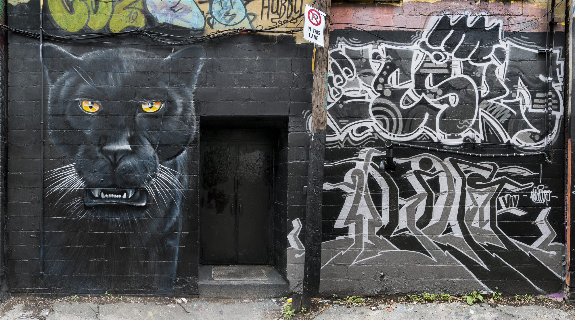
He got tired of fixing it and one day quite recently decided to paint the whole thing over, substantially changing the animal’s character from sternness and consternation (Figure xx), to downright anger (Figure 20), leaving less of the sort of space that encouraged taggers. Within hours of its completion, I went down there to photograph it.
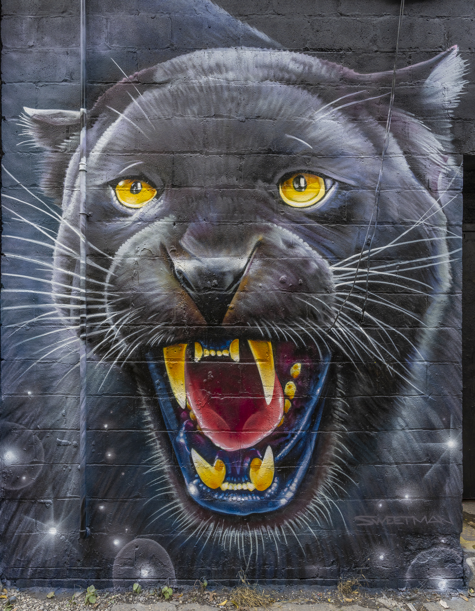
We were suitably impressed with the impact of the photo (because the painting itself has tremendous impact), so we decided to offer it as an option with the book or as a stand-alone print, with modest pricing considering they are signed and numbered original inkjet prints. We’re also working on other avenues for bringing the book to broader public attention, as we remain confident that a limited-edition press run of this unique item should sell-out sooner than later.
The most important things about this book are the social message it carries (Figure 21) as well as the preservation and propagation of the event and its high quality mural artistry.
I shall not re-print it: once it’s gone, it’s gone. You may learn more about it at www.imaging91.com/store.
Mark D Segal
Toronto, December 2021
Toronto, ON
Mark has been making photographs for the past seven decades and started adopting a digital workflow in 1999 first with scanning film, then going fully digital in 2004. He has worked with a considerable range of software, equipment, materials and techniques over the years, accumulated substantial experience as an author, educator and communicator in several fields, was a frequent contributor to the Luminous-Landscape website and now contributes frequently with in-depth articles on the PhotoPXL website. Mark has contributed over 75 articles to the two websites up to Q1-2024, with a particular emphasis on printers and papers, given his view that a photograph printed on paper remains the epitome of fine photography, as it has been from soon after the medium was invented and started gaining momentum in the 1830s/1840s. Mark developed a particular interest in film scanning and authored the ebook “Scanning Workflows with SilverFast 8, SilverFast HDR, Adobe Photoshop Lightroom and Adobe Photoshop” (please check our Store for availability). In his “other life” (the one that pays for the photography), Mark is a retiree from the World Bank Group and was a consultant in electric power development.