Black & White Image-Making – Part Two
In an earlier article “Black & White Image-making in the Digital Age, I listed six of my principles for selecting the best candidates for B&W conversion from a digital image library. This may not seem important or necessary to those photographers who have little experience working in monochrome media. However, the fact is that what looks good in color rarely works well in B&W without knowing how different the same composition can look between the two media.
If the end goal is to create fine B&W images, this knowledge will save many hours of wasted effort when selecting subjects to photograph, and ultimately when selecting images to convert that are not suited to the B&W medium.
The following principles are repeated here in case the reader didn’t see his August 31, 2020 article on this subject. They represent only a basic starting point, as graphic art has so many dimensions, and black & white photography is a very sophisticated graphic art form
B&W Principle # 1
- Look for scenes that have broad swaths of dark tones alternating with lighter mid-tones, as opposed to scenes which have a range of light to dark tones broken up into small interspersed patches.
B&W Principle # 2
- Select those scenes and images in which the broader swaths already form a dynamic and pleasing composition.
B&W Principle # 3
- A light-toned subject against a dark background has a higher B&W success probability.
B&W Principle # 4
- A dark-toned subject against a light background should have well defined shadow detail.
B&W Principle # 5
- Keep the composition simple.
B&W Principle # 6
- You don’t know until you try it.
This last principle is a reminder that there are exceptions to every rule and guideline. Ultimately experience and instinct will suggest that a scene or image which doesn’t appear to follow any of these principles might still lead to a strong B&W image because it is graphic in other ways. Whereas the first five principles offer high probabilities of success, there are always those images that have less obvious potential, but may ultimately display stunning graphic impact.
To enable easier reading, this article will follow a little different path than did Part One. Instead of stating a principle and then illustrating it with several final images, 18 images will be shown; and after each a short analysis will follow addressing why the image is successful in B&W. This will include citing additional graphic principles not previously covered.
Image # 1
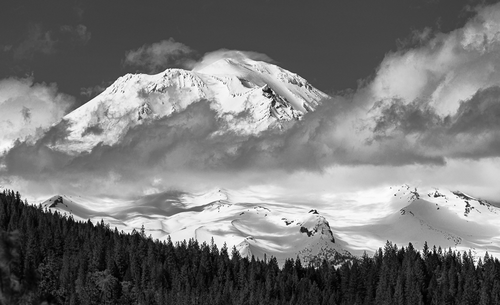
There is some rough tonal banding in this image going from the dark forest in the midground, to the mostly white tones of the snow covered mountain, to the middle gray of the open sky. But, the whole show is Mt. Shasta completely covered in snow after a winter of record snow. The clouds passing in front of the mountain throw shadows of varying density to break up what would otherwise be a monotonous bright white. There is also a strong graphic effect of the dark toned trees showing in sharp relief against the white mountain. This shows that graphic composition is not only a matter of well-defined lines; texture and small pattern can be equally appealing. This was possible here because Mt. Shasta was completely covered in snow as opposed to seeing it’s well-known snow cap resting on a dark rocky base.
Image # 2
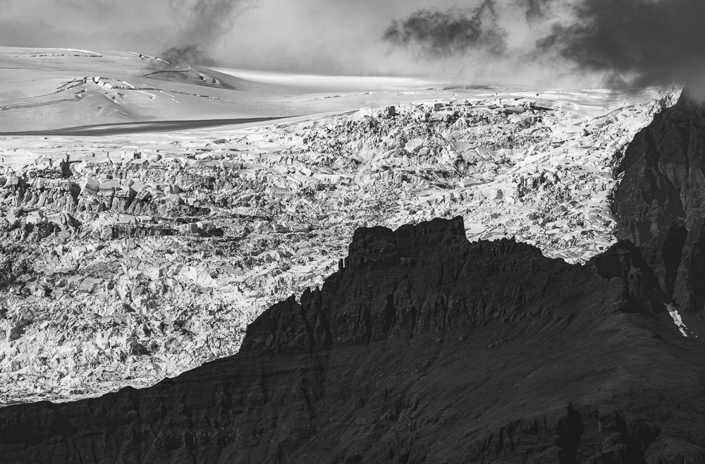
In Iceland, a dark midground of ancient hardened lava flows contrasts with the light-toned background of snow and ice. However, in this case the division follows a long dynamic diagonal instead of a horizontal line. This is a good embodiment of the “fire and ice” phenomenon often referenced in Iceland travelogues. The part of the glacier visible in this image is in constant motion, buckling and churning up soil and rock, and thereby creating a range of reflectance’s. The icecap is less disturbed and more uniformly white.
Image # 3
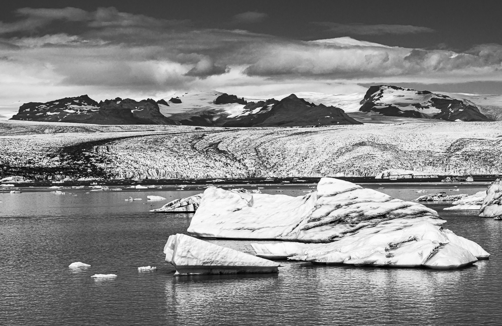
The upper half of this image has rough bands of alternating light and dark tones from glacier to mountains to clouds to sky. The medium gray-toned glacial channel would be a fifth band, but is interrupted by the iceberg in the foreground. However, this is a more exciting graphic composition because the top outline of the iceberg strongly resembles the upper outline of the distant mountains starting from the right edge of the frame to almost midway. Surprisingly, there are many such coincidences in Nature; and they can strengthen a graphic composition.
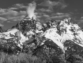
Image # 4
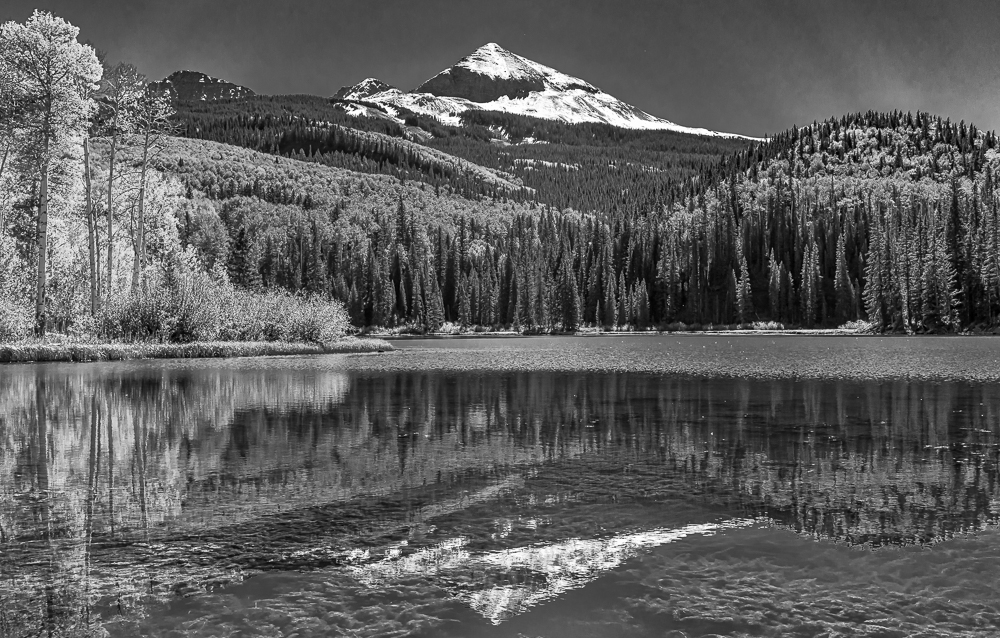
Mountains capped with snow, and particularly when accompanied by their reflections, often produce stunning B&W images because of the contrast between light and dark tones. However, in Autumn when the Aspen produce brilliant yellows, few photographers would think about making anything but color prints. Also, depending on the shape and scale of the light Aspen groves vs the dark pine and fir forests, monochromatic renditions can look very busy if there are too many small interspersed areas of light and dark.
The view from Woods Lake toward Wilson Peak avoids this problem because the Aspen groves cover the lower-lying elevations while Wilson Peak looms over conifer forests. The result is a harmonious arrangement of alternating light and dark layers which is also reinforced by the reflection. The bright Aspen trees on the left lakeshore keep the image from being symmetrical and static.
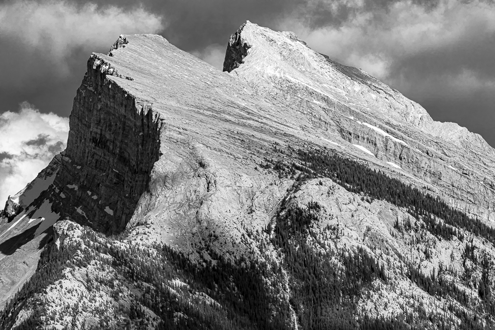
Much of the Canadian Rockies consist of uplifted limestone that formed on the floor of an ancient sea. Mt. Rundle is one the best examples of this. The steeply angled flat face is largely free of vegetation and snow. The sunlit mountain registers in B&W as a light medium gray tone, or a Zone 5 to Zone 6 per Ansel Adams. Theoretically, this would result in a weak looking B&W image. But, it doesn’t because the form is massive and imposing, and also because there are sufficient dark tones in the shadowed vertical face and in the lower-altitude dark forests to provide balance.
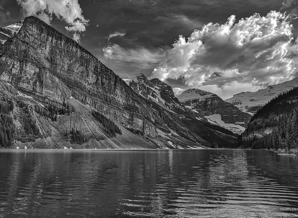
This is the classic and over-subscribed view of Lake Louise and surrounding mountains which is almost always beautiful in color. However, in this exposure, the sun is shining from the right background placing these peaks in open shadow. At first glance, the color image didn’t look as if it would convert to a strong B&W image. A closer look indicated otherwise. The back-lighting moved the mountains about one zone into the darker medium gray range. The eroded limestone texture of the mountain on the left made the darker cast richer. And, though the snow on the mountains in the far background darkened from white to light gray, the backlit clouds contain lighter tones that brighten this image.
These light tones are strongly reflected in the lake creating a triangle that compliments the wedge-shaped mountain on the left. Once again, B&W images are successful if they feature shapes, lines and tones that can capture the viewer’s eye and lead it around the image.
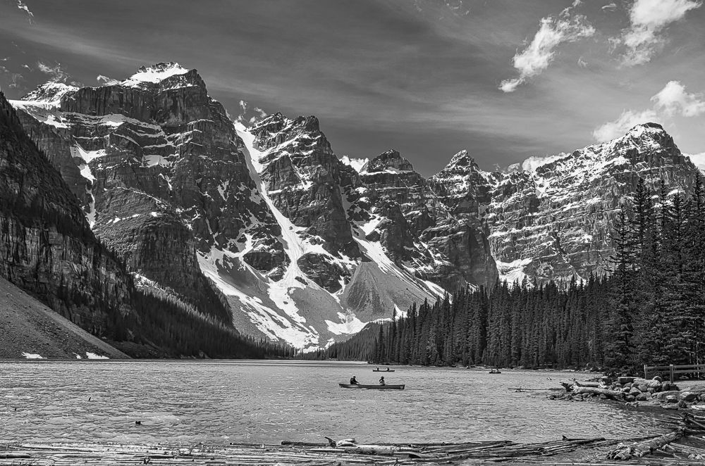
Moraine Lake and the surrounding peaks is another classic view in the Canadian Rockies, and my personal favorite as well. It is magnificent in color. It turns out that the B&W version is also compelling. What makes it work is the medium to dark highly textured mountains lined with snow, and the still darker trees separating the landforms from the uncommonly luminous lake water. Moraine Lake contains considerable glacial silt that strongly reflects open sky light to create a light turquoise color. While this is beautiful in color images, it also has a higher level of reflectance that makes the lake register one zone lighter in B&W images.
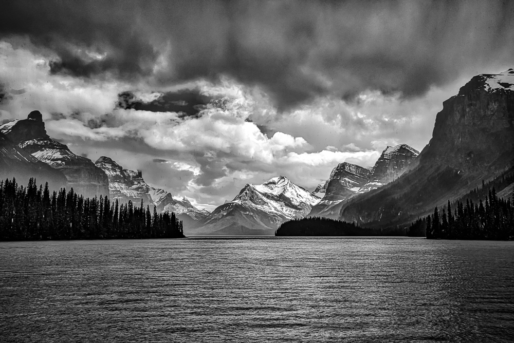
This is one of those rare occasions in which color didn’t do justice to my memory of this dramatic scene. But, the B&W conversion knocked it out of the park. When I captured this image, we were returning from the south end of Maligne Lake when the sky suddenly darkened and unleashed an intense downpour. The trees on either side turned almost black. But, in the background the sun was still shining on Mt. Unwin anchoring the Queen Elizabeth range on the right, and opposite the Maligne Range on the left.
The strong representation of every luminosity tone from Zone 0 (deep black) to Zone 9 (almost pure white) is well distributed in this image and shows drama and balance. The foreground consists of dark overhead rain clouds, and the lake riddled with heavy raindrops. The almost black (Zones 0 & 1) stands of pine and fir separate the lake from the mountains which occupy Zones 2 to 4, except for the snow which occupies Zones 8 & 9. These zones may mean little to the reader. But, it is worthwhile to read pages 15-19 of Ansel Adams’ first book “The Negative” to see how he assigns values to common landscape elements which if correctly placed will achieve a sense of reality, particularly when the light is dramatic.
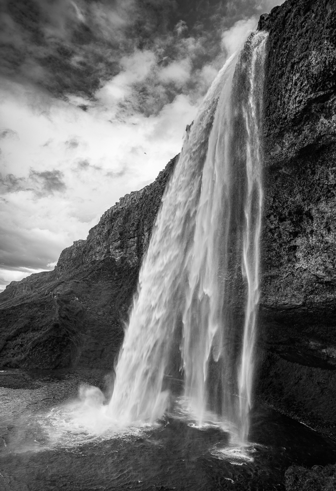
As edited during the conversion, this is a simple B&W image consisting of sky, waterfall, bluff and pool. The color version shows a light green vegetation covering the dark lower landform. Though not representative, I strongly darkened the green to simplify the image and emphasize the waterfall. Compositionally, if you consider the beginning of the falls as the center of a circle, straight lines emanate from that point, first sideways, and then increasingly more downward to define first darker sky, then a wedge of bright cloud, then a wedge of dark rock, and finally a narrow light wedge of water cascade. This is different than horizontal banding, and could be called radial banding which relates to elements taken on an angle and get smaller as they recede. It is equally effective as a graphic tool. To appreciate the scale of this waterfall, the tiny white dots on the left (about 3/4 of the way down from the top of the 197-foot high falls) belong to people viewing the falls from a platform.
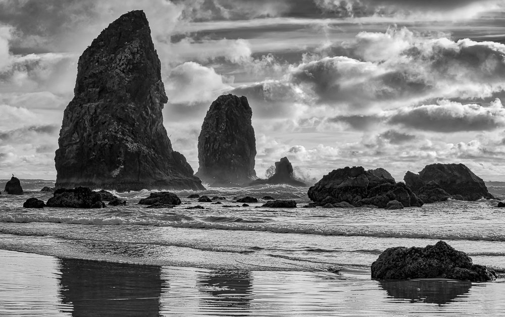
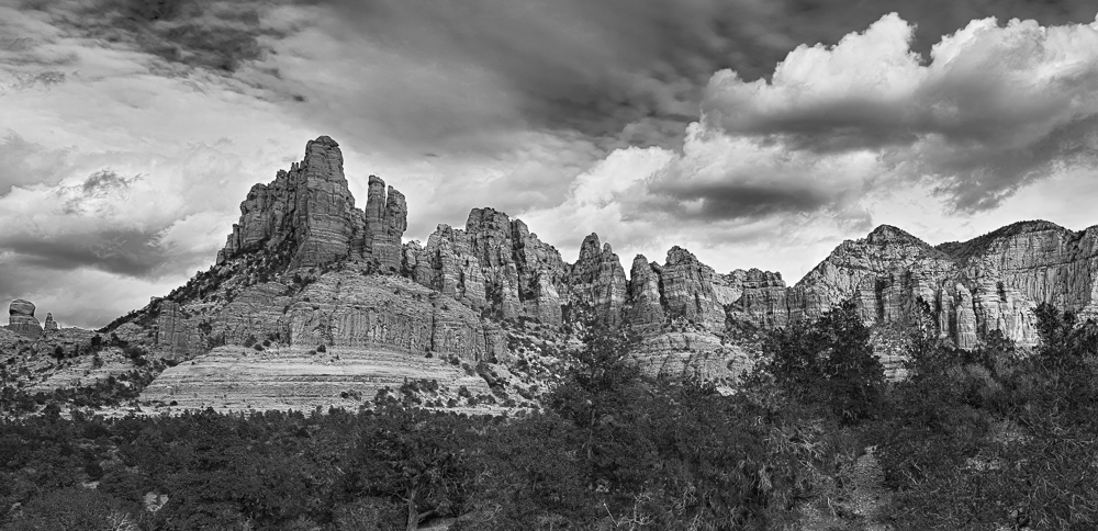
The rock formations along the Oregon Coast are well suited to B&W photography. They are typically Zone 3 to 4 dark gray in luminance but read one zone darker when backlit. The strong dark shapes contrast well with a turbulent cloud-filled sky. And similarly, the lighter tones of the foamy waves and wet sand contrast well with the rocks and sky. Though the dark rock is graphic, it is important to avoid over-darkening to preserve shadow detail in the sea-stacks, as there are dozens of nesting seagulls in the rockface crevices. Notice a large wave breaking over the small sea-stack toward the middle of the image.
To make this image work in B&W, it was necessary to create strong separation between the red rock formation in the background and the green trees and shrubs in the foreground which normally have the same reflectance. On film exposures, Ansel Adams would have used an orange filter to reduce light coming from the green foliage, and also darken the blue sky. He would also have underexposed the negative and developed it longer to increase overall contrast. With digital editing in Lightroom Classic, the green luminance slider was moved to the left to darken the trees and deepen the contrast between them and the red rocks. Additionally, the blue luminance slider was also moved to the left to darken the blue sky and the lower cloud surfaces.
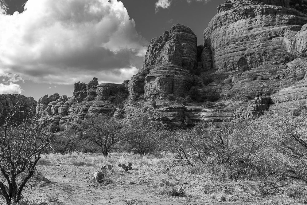
Photographed on an oblique angle to the plane of these formations makes the background rocks appear smaller in the distance, and increases the amount of sky showing. Without something to fill that blank sky space the image would have looked less exciting, particularly in B&W. I had to wait a few minutes for a cloud to fill that space, which gives a good balanced look by sandwiching the dark red rocks between light foreground and the light-toned cloud.
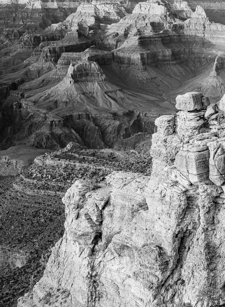
This perspective was obtained by positioning the camera so that a strongly lit foreground ridge protruded into the scene, contrasting with the darker canyon formations below. This in turn created two triangles, one light and the other dark. The repeating shapes of the eroded buttes, the abundance of texture, and the counter-position of light and dark triangles produce a strong graphic image.
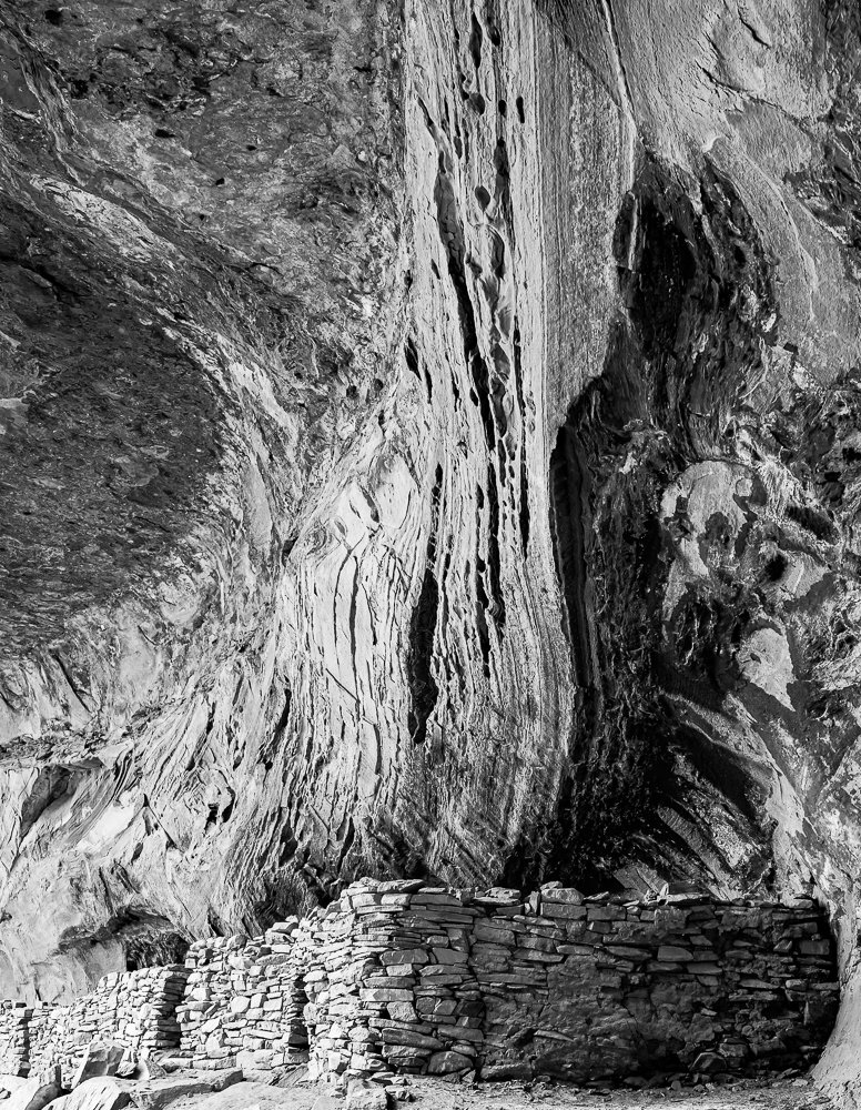
I made a series of images of ancient Native American ruins, and have found that many of them produce good B&W images. Most of these ruins were built in eroded cliff openings known as “blind caves”, where there is an overhang to protect the inhabitants from both weather and attack from above. In the Southwest, the rock walls and “ceilings” housing these ancient dwellings invariably display much texture and color variation, as well as carbon deposits from centuries of campfires. They are colorful sites. Yet, they really come alive in B&W images which strongly emphasize the intricate patterns and textures often present in many such sites.
This ruin in Long Canyon was not meant for permanent occupation. The Sinagua peoples held the Sedona red rock formations to be sacred and built their homes on flatter areas west of Sedona. This ancient structure is relatively crude and was used by hunting parties for short durations.
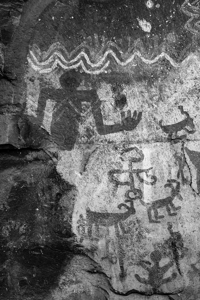
Pictograms are basically graphics painted on textured rock surfaces. They translate readily to B&W imagery. This is one of the more striking ones.
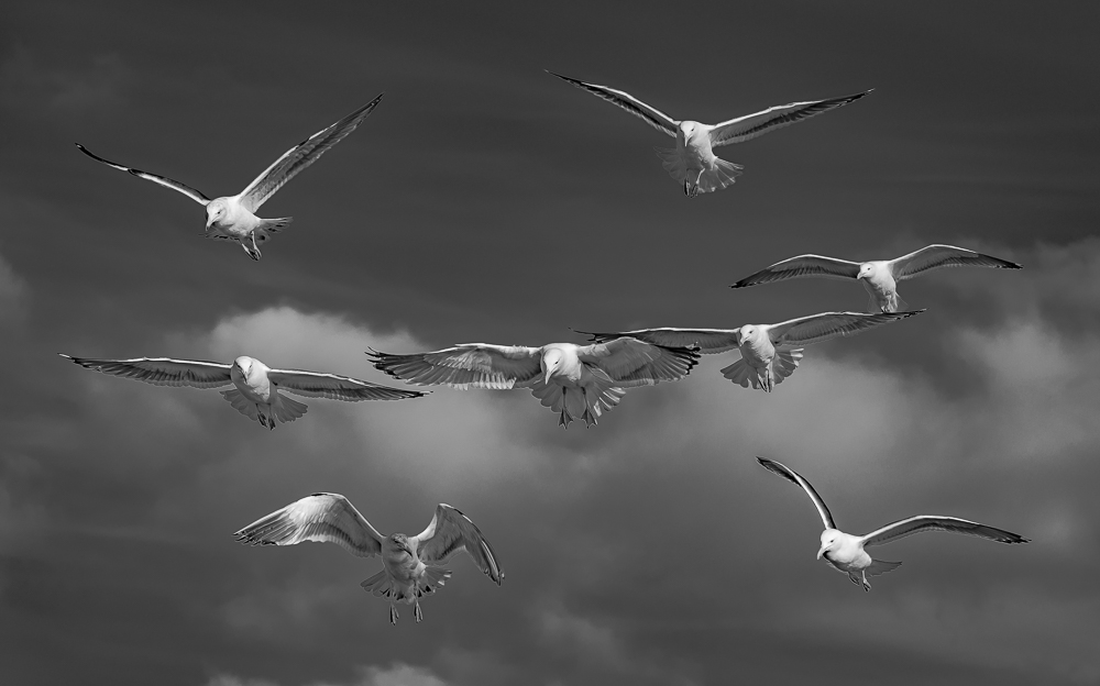
Seagulls are white with black and gray accents. So, B&W images of them against the sky always work well. The difference between this rendition and the original color one is that the sly is a moderately dark gray instead of blue. I like it better because there is nothing to draw attention away from the gulls. The strong vertical and horizontal elements of this “H” formation create a simple but striking graphic.
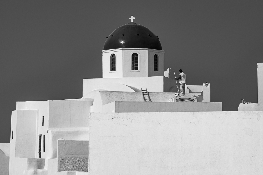
Many forms of architecture utilize graphic elements and principles. The whitewashed buildings of Santorini in the Greek Islands are familiar all over the world. Aside from the obvious parallel horizontal and vertical elements, the dirtier walls with the freshly painted ones create a series of different shaded rectangles. The dark windows and church dome anchor a full range of luminance zones
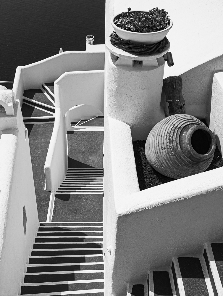
This photograph of a multi-family building in Fira, Santorini was specifically taken for the purpose of making a B&W print. Built on the steep slopes of an ancient caldera, many buildings in Fira have small footprints, but many levels. This requires many exterior stairs to provide access to individual living units.
For this image, I placed the wall that separates the house from the stairway exactly in the middle of the vertical frame. The top of the left half of the image is the Aegean sea below, and shows up as a very dark gray. In contrast, the top of the right half of the image is white, and is the roof of the adjoining residence. This reinforces the sense of two different but closely related halves of the image. The left half is full of alternating white and black lines, while the right half is more about smooth white planes complemented by round decorations. The two halves are united at the bottom of the image by the stairway wrapping around the residence. While graphic design is present in most of my B&W images, the graphic characteristics of this image are the main subject.
Conclusion
I wrote this article and the preceding one to illustrate the unique beauty of B&W photography and also hoping to motivate those who only edit in color to give B&W editing a try. It is definitely a different way of seeing, and will definitely add to the joy that photographers derive from their creations.
Harvey Stearn
October 2020
Sedona, AZ
To see the scope and essence of Harvey Stearn's photographic art please visit www.CameraStops.com. Mr. Stearn began photographing Western landscapes and wildlife at the age of 13, spent 50 years pursuing his passion in the field and in the darkroom before fully converting to digital photography in 2002. He developed color prints as well as monochrome, but switched over to digital capture and editing in 2002. Though he was a top executive for two large scale land development and home building corporations, he always found time for his fine art photography which won many awards. His work was exhibited in art museums in Southern California and Arizona, and was also featured in billboard advertisements and published in magazines. Mr. Stearn served on the California Arts Council for nine years, including two years as Chairman and another two as Vice Chairman. In addition, he was the founding Chairman of the John Wayne Airport Arts Commission in Orange County, California. Mr. Stearn’s work was sold through Arizona galleries for 15 years. In recent years he wrote 33 illustrated articles for PhotoPXL.com and 14 articles for Luminous-Landscape.com. In 2013 he published a book entitled “In Search of the Old West” which has been widely acclaimed. He was a guest lecturer on photography on a cruise ship visiting Chile, Argentina, Uruguay and the Falkland Islands. His work was among the top 100 images printed in NANPA's Showcase publications in 2019 and 2020. Images have been edited and selected for two new books on Landscape photography which will be published in late 2024 and early 2025.