The Hahnemuehle Natural Line Paper Review
Hahnemuehle recently asked me if I would be interested in having a look at their new “Natural Line” of inkjet papers. Needless to say, I was. The “Line” includes three products – Bamboo, Agave and Hemp. Bamboo is not new, and I had reviewed it on Luminous-Landscape quite some time ago. Agave and Hemp are new. The company encouraged me to take a fresh look at Bamboo regardless, insofar as all three are components of the same new product group. I also thought it a good idea to have a consistent analytic methodology applied to all three, and I developed my latest test routines quite sometime after the original review of the Bamboo paper, so I tested all three papers for this article using my latest approach described in two separate articles on this website: for the overall testing: (https://photopxl.com/augmented-inkjet-printer-paper-and-profile-evaluation-190617/) and for the greyscale diagrams: (https://photopxl.com/hahnemuhle-rice-paper/, from below Figure 5).
Let’s begin at the beginning, asking why a “Natural Line” – given the plethora of high-quality matte inkjet papers on the market and the concerns I’ve heard about the market for printing, why add these? After some discussion with Hahnemuehle it turns out that the main purpose for producing this line of papers relates to environmental conservation – such that if one can obtain as good print results and other qualities of the papers with more environmentally-friendly materials, it makes sense to offer them, and environmentally conscious print-makers should buy them.
So, let’s briefly look first at the environmental claims and the sustainability of the substrates as papers.
According to Hahnemuehle, “the plants that provide the cellulose require minimal maintenance, grow quickly and don’t need any pesticides. Their rapid growth means that more cellulose can be produced on the same cropland than with other raw materials, and they also require much less water, helping to save valuable resources and protect the environment.”
The composition of the substrates varies by product (all are 290 gsm/0.5mm thickness):
Bamboo: 90% Bamboo fibres, 10% cotton;
Hemp: 60% Hemp fibres, 40% Cotton;
Agave: 70% Agave fibres (sisal), 30% Cotton.
The company claims “high age resistance of over 100 years” (ISO Standard 9706 compliant/museum quality). There are two aspects to this: fade resistance and tarnishing of the image, depending mainly on coating and ink, and durability of the substrate itself. According to Hahnemuehle, the papers are OBA-free, acid-free and lignan-free. As well, these plant materials have been known over centuries for their durability and long history in paper making; for example, in respect of Hemp, Hahnemuehle says: “Hemp was an essential part of paper production for centuries, and due to its extremely robust fibers, it has often been used for long-lasting historical documents, such as the Gutenberg Bible and the first drafts of US Declaration of Independence.”
Print longevity, as I’ve said before, is a highly specialized business and not one of my areas of expertise. Nonetheless, especially when third-party test results are not available, I grill each manufacturer whose products I test about longevity. Hahnemuhle assures me that they are using state-of-the-art production processes and testing procedures to assure longevity standards are met. Given the company’s very long-standing product specialization, expertise and reputation, I’ll accept that their product testing for ISO 9706 compliance justifies their claims of longevity.
In light of the papers’ thickness and weight, I was particularly interested to see how well the sheets would pass through the manual feed slot of the Epson SC-P5000, which bends the paper on its way through to the print head area. There were no issues (tested with US Letter size sheets for Agave and Hemp, and 13×19 inch sheets for Bamboo).
After generating custom profiles for each of the papers (i1Pro 2 with i1Profiler, X-Rite 2371 patch target, Epson Velvet Fine Art Media Type), I put them through my standard test suite consisting of my 48-patch colour + B&W patch set (Figure 2), my 100 patch B&W set, the Atkinson printer test page for overall colour reproduction quality, and the Roman 16 low key B&W image for the quality of black shading appearance.
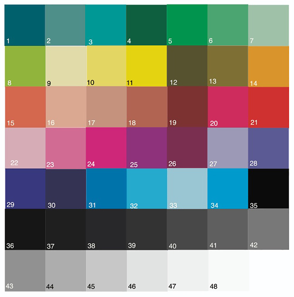
Hahnemuehle profiles for the Agave and Hemp products were not available at the time this article was being prepared. They do, however, provide a profile for the Bamboo product and I did test that one.
Figure 3 shows the results for the three papers in a comparison-enabled layout:
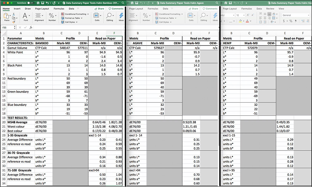
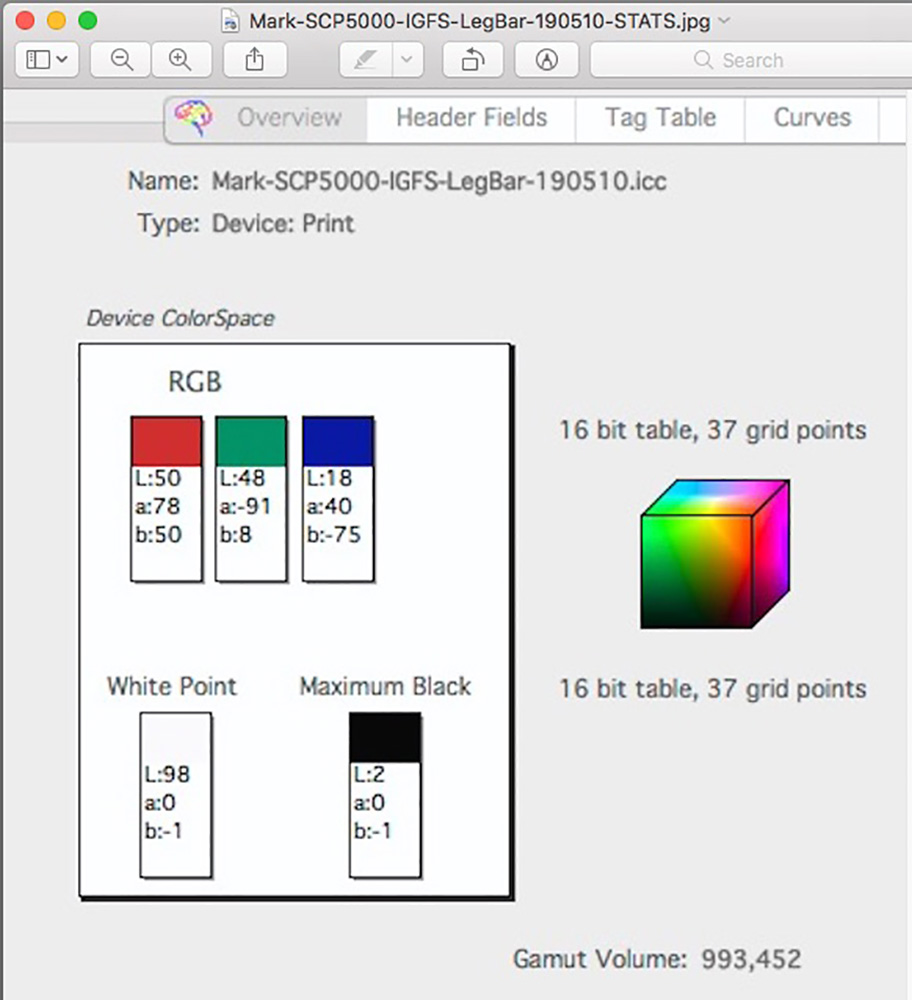
Starting with the Profile characteristics read from ColorThink Pro, the gamut volumes across the three papers are very similar, in the range of 548K~580K; gamut volume from the custom profile for Bamboo is 5% lower than the largest of the group (Hemp). This gamut volume range is typical of high-quality matte papers and falls substantially below the 993K achieved with Ilford Gold Fibre Silk (IGFS, Figure 4), a fine luster paper custom-profiled for the same printer. This is a normal expected range of differences between these media types.
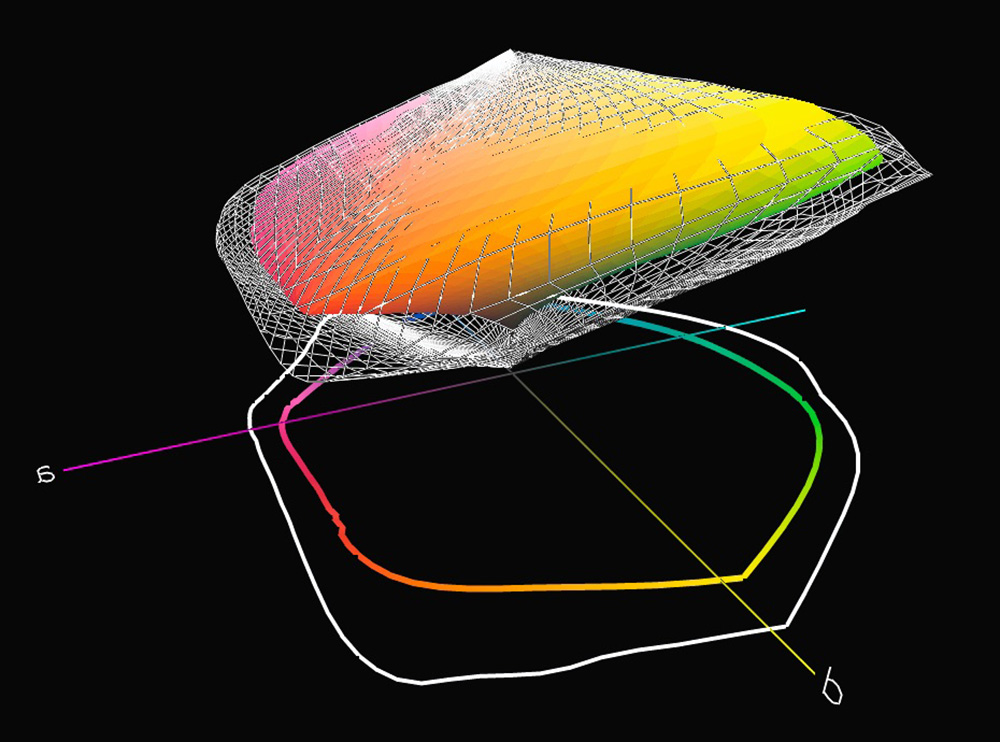
The Black point of the three profiles for the Hahnemuehle Natural Line is in the range of L*13~14, again typical of the values found for the higher quality matte papers. By comparison, the Black point of IGFS is L*2, which goes some way to explaining the difference of gamut volume between the luster and matte papers. As well, the gamut boundaries of the primaries are very different between the luster and matte papers, as you can appreciate comparing any of the RGB primaries in Figure 4 (IGFS paper, RGB numbers) with those of Figure 3, rows 10~18. Figures 5 and 6 compare IGFS vs. Hahnemuehle Agave in 3-dimension, the wireframe being IGFS. Agave shows slightly more maximum saturation of the lighter orange and yellow colours, but otherwise considerably less.
This, of course, doesn’t mean that excellent prints can’t be had from matte papers. Countless images are routinely edited to look fine printed on such papers; that said there are also countless images benefitting from wider gamut glossier media. I only demonstrate these differences between matte and luster coatings to situate the relative limits, generally, of matte papers in the context of what’s achievable from our current high-quality printers using more reflective, less ink-absorbing media. This also raises the point that when I test matte papers, I adapt the colour values of my test patches to the narrower gamut of matte papers so that I am only testing for how accurately the printer-paper-profile (PPP) combination reproduces in-gamut colours, without the added complication of how the profile and Rendering Intent shift out-of-gamut colours, (and for Perceptual Intent in gamut colours), to cohere with the gamut limits of the matte PPP combination.
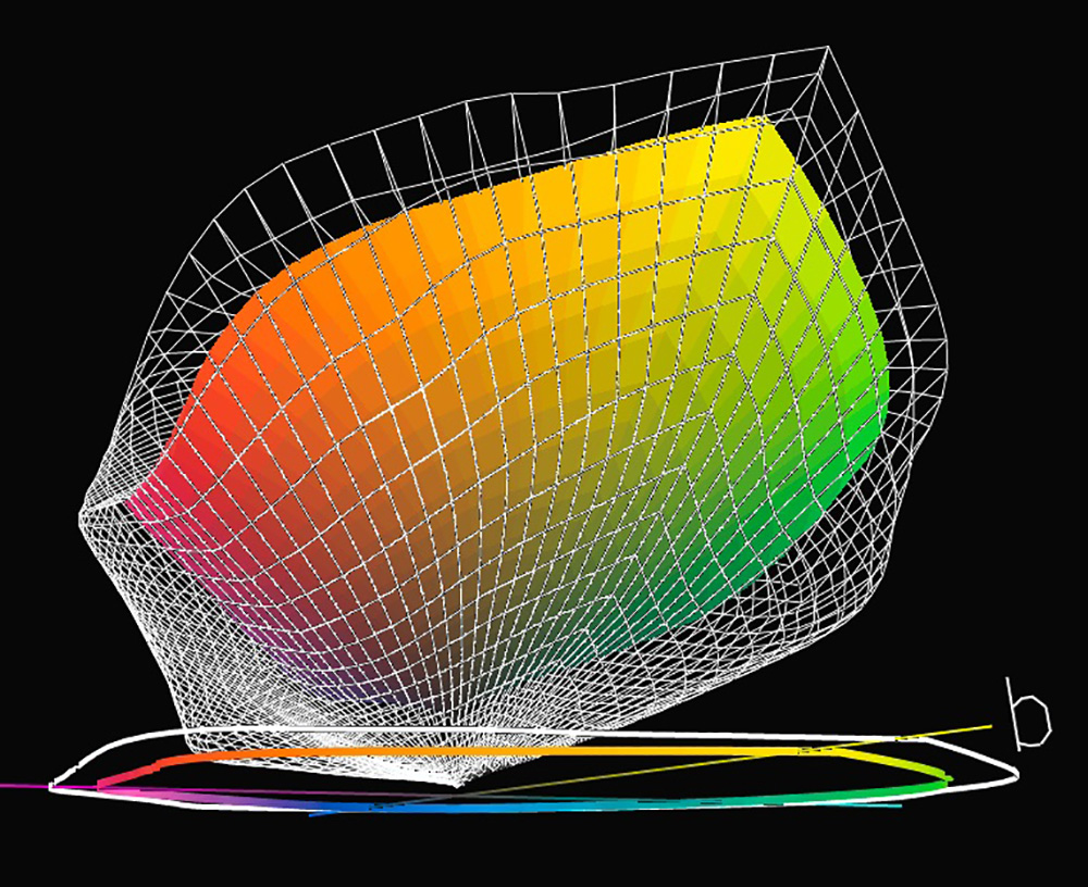
I asked Hahnemuehle about putting wide gamut luster coatings on these substrates, and they responded that it could happen, but these options remain to be tested.
Reverting to Figure 3, this time examining the results of printing test targets with these profiles, my summary comment is simply that the accuracy of the test results from these prints is very impressive.
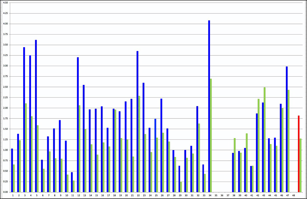
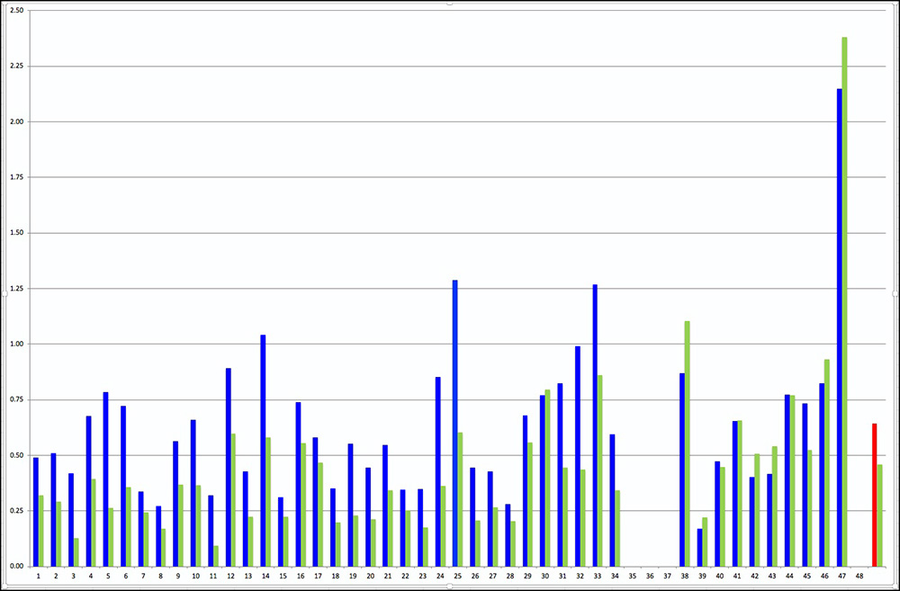
For the 48 patch target and the three papers printed with the custom profiles, the highest average dE(76) is 0.64 (Bamboo paper) and the highest average dE(2000) is 0.46 (again Bamboo paper). The worst colour slightly exceed dE2.4 (Bamboo paper), none of the other worst colours exceeding 1.8 whether for dE(76) or dE(2000). The Hahnemuehle profile for Bamboo paper performed slightly less well than the custom profiles, but there are well-known technical reasons why this is inevitable (differences of equipment, software and settings between profiling and profile testing when using OEM profiles). That said, the average dE(76)/(2000) for Bamboo paper using the OEM profile is 1.82/1.28, which is still good. This data should be appreciated in the context that human visual perception is not supposed to see differences smaller than 1dE value and often wouldn’t perceive differences of 2 or even 3 dE values, depending on the colour and context. I reproduce graphs showing the detailed performance by patch for the patches in the diagram of Figure 2.
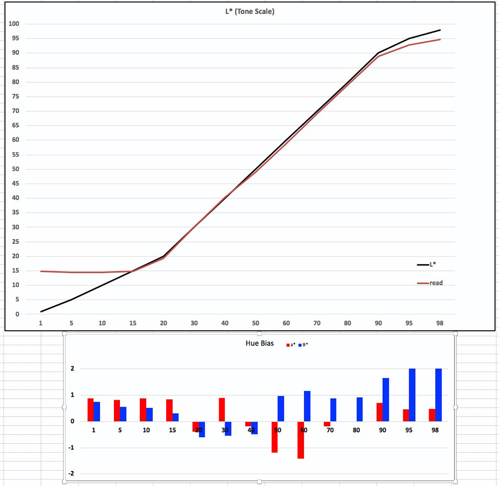
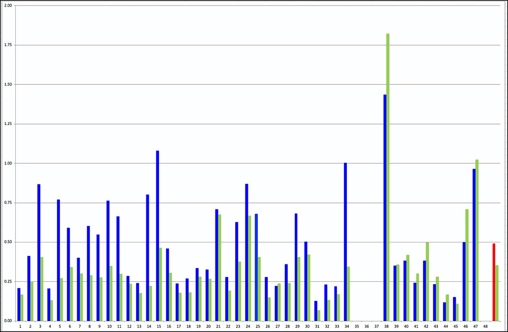
For each PPP test there are two graphs: the first graphing dE(76) and dE(2000) values for 44 of 48 patches (colours and B&W), and the second focusing only on the linearity and neutrality of the grayscale patches. The average dE values exclude patches 35, 36, 37 and 48 because they are out of gamut – the PPP combination cannot reproduce them. Figures 7 to 14 show the detailed outcomes for the 4 combinations tested.
(1) Bamboo – Hahnemuehle Profile (Figures 7 and 8):
11 of the patches in Figure 7 show dE values exceeding 2.0. Grayscale linearity (upper portion of Figure 8 looks satisfactory from about Levels L*15 to 95. Grayscale neutrality (lower portion of Figure 8) is contained within +/- 1 except in the range of L*50~60 and toward paper white in the range of L*90~98. Despite these variances, on the whole the grayscale would appear to be quite neutral.
(2) Bamboo – Custom Profile (Figures 9 and 10):
Please be aware of the left side dE scale difference between Figures 7 and 9, the former going to 4.5, the latter to 2.5. Focusing on Figure 9 for the custom profile, only 5 patch values exceed dE 1.0, four of which by very little, while patch 47, a near white, reaches over 2.0 because of the low density of ink applied to a warm-tone paper. Looking at Figure 10, grayscale linearity is excellent between L*15 and L*95, while neutrality is also very well preserved at least up to L*90, whereupon the media hue imparts a slight yellow bias.
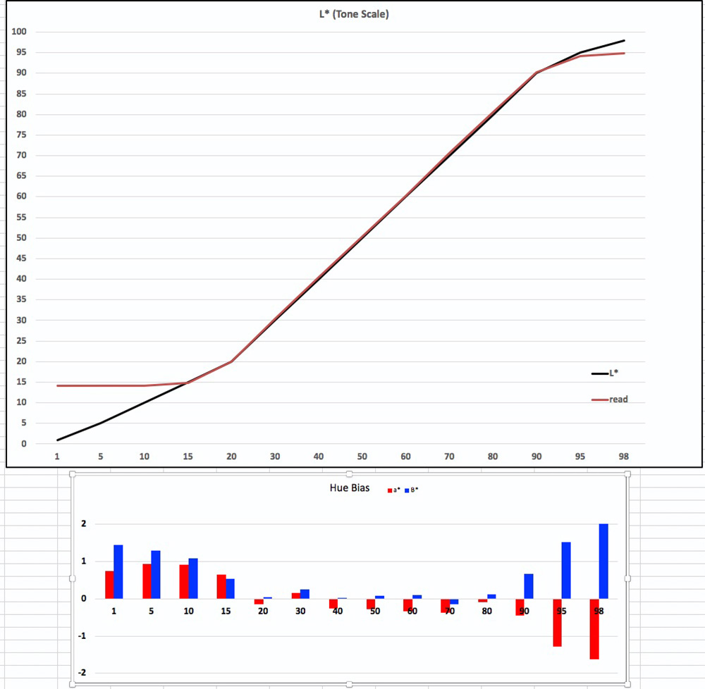
3. Agave – Custom Profile (Figures 11 and 12):
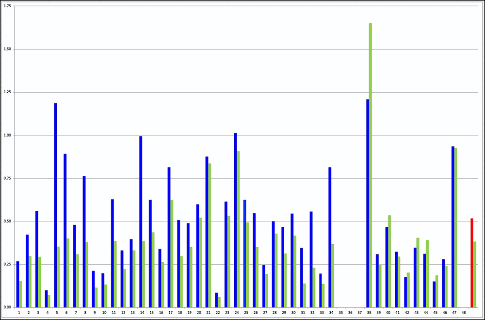
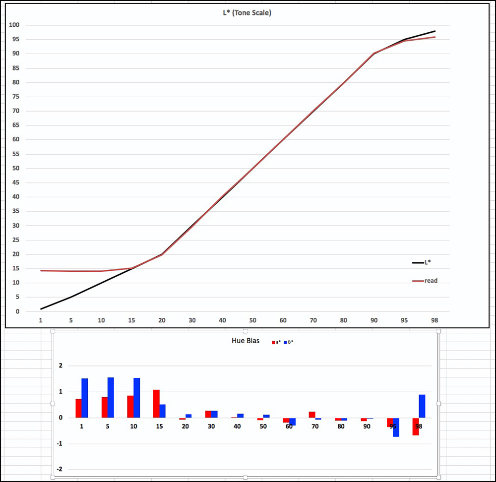
4. Hemp – Custom Profile; (Figures 13 and 14)
The results for the Hemp paper, custom profile (Figures 13 and 14), are even a shade better than they are for Agave. The average dE (76/2000) is 0.5/0.35 respectively for 44 patches, which is amongst the best I have ever achieved. (As for the other papers, four grayscale patches are excluded because they are out of matte gamut.) Only two patches have dE exceeding 1.0, the worst case being a lower Black tone at about dE(2000) of 1.8.
The linearity of the grayscale patches (Figure 14 upper) is excellent between L*15 and L*95, and grayscale neutrality is likewise excellent beyond L*15 (Figure 14, lower).
In sum, all three of these papers are amenable to fine profiling and can produce tones and colours on paper to a high degree of accuracy.
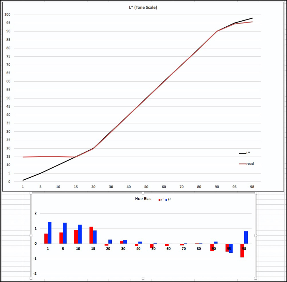
While I have made and measured all the 100-patch grayscale graphs for each of these papers, I shall not reproduce them here as they largely confirm the story from the grayscale patches reported above. I can send images of these graphs to readers on request. Suffice to say that the custom profiles, the Epson driver and these papers combine to produce highly satisfactory grayscale renditions from the Epson SC-P5000 printer to the extent achievable with matte papers.
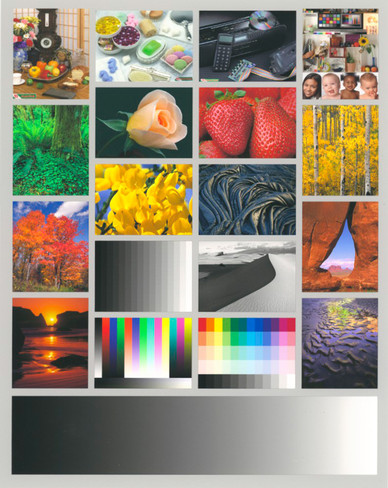
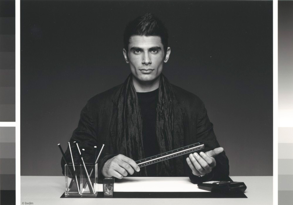
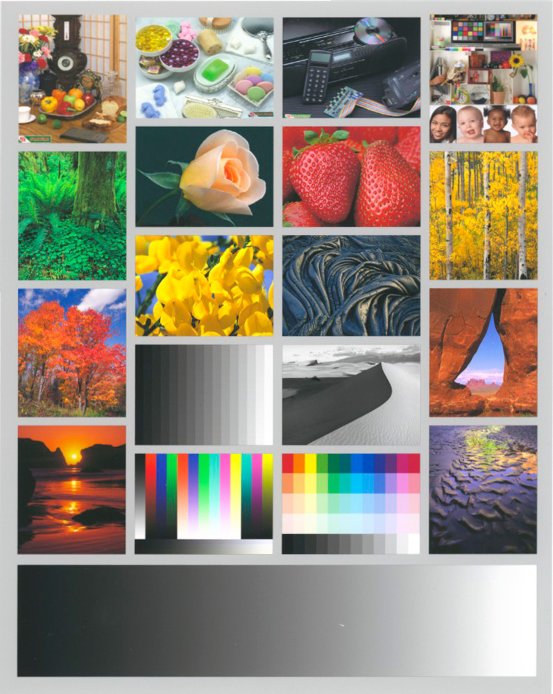
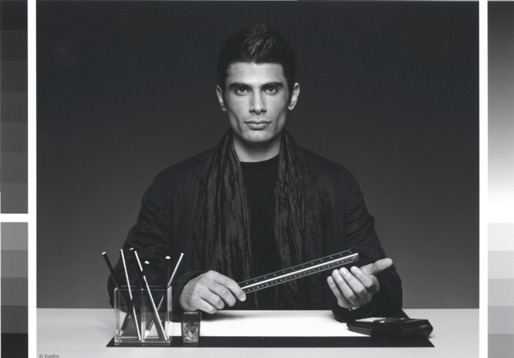
Turning from the data and graphs to real photos, I printed the Atkinson printer test page and the Roman-16 low-key grayscale images on each of the papers, scanned them to reproduce their actual appearance as closely as I could, and present those outcomes just below.
1 Bamboo Paper:
2 Agave Paper:
3 Hemp Paper:
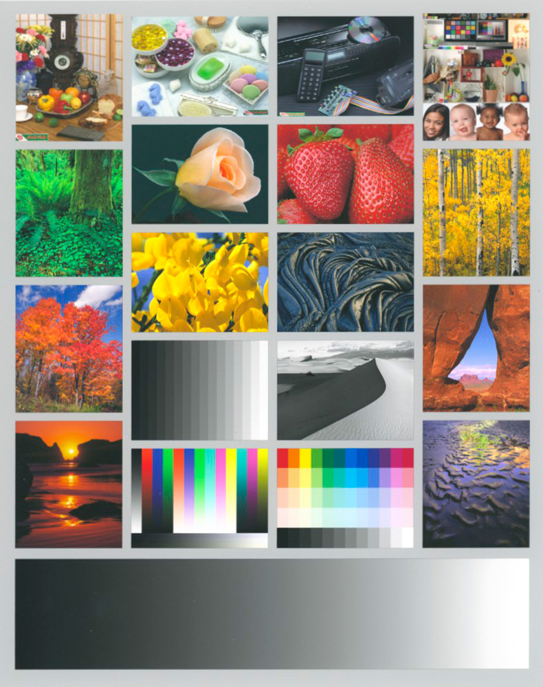
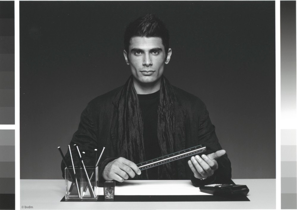
These very good results are expected from the quality of the foregoing data. I was particularly pleased with the deep shade appearance in the Roman-16 images despite these being matte papers with less deep Blacks than achievable with Luster/gloss papers. The tell-tale signs of good tonal separation are the distinction of pleats in the scarf, distinction between the scarf and the jacket and distinction between the man’s hair, jacket and the background. As well, the Atkinson printer test page images show very well, despite there being some out-of-gamut colours in the image file. The colours of the images look normal for this well-known test page, and the grayscale renditions and tone ramp are very satisfactory.
In sum, I think these are fine papers, I appreciate Hahnemuehle’s effort to produce products that are environmentally aware, and I recommend them.
Mark D Segal
November 2019
Toronto, ON
Mark has been making photographs for the past seven decades and started adopting a digital workflow in 1999 first with scanning film, then going fully digital in 2004. He has worked with a considerable range of software, equipment, materials and techniques over the years, accumulated substantial experience as an author, educator and communicator in several fields, was a frequent contributor to the Luminous-Landscape website and now contributes frequently with in-depth articles on the PhotoPXL website. Mark has contributed over 75 articles to the two websites up to Q1-2024, with a particular emphasis on printers and papers, given his view that a photograph printed on paper remains the epitome of fine photography, as it has been from soon after the medium was invented and started gaining momentum in the 1830s/1840s. Mark developed a particular interest in film scanning and authored the ebook “Scanning Workflows with SilverFast 8, SilverFast HDR, Adobe Photoshop Lightroom and Adobe Photoshop” (please check our Store for availability). In his “other life” (the one that pays for the photography), Mark is a retiree from the World Bank Group and was a consultant in electric power development.


