Hahnemühle “Rice” Paper
Publishers Note . . .On this launch occasion of PhotoPXL I am pleased to publish Mark Segal’s article on Hahnemuehle’s Rice Paper. As many readers will recognize, for a number of years Mark had been the main author on Luminous-Landscape producing many reviews of printers, inkjet media and film digitization equipment and techniques. Mark joined with us here at PhotoPXL.com from the earliest inception of the site’s development and has been actively preparing new material in the same areas, of which the present article on Rice paper is the first. Stay tuned – over the coming weeks I shall be publishing more of Mark’s articles, the main ones in the works being a methodology piece, followed by reviews of Epson’s new Legacy Textured paper, and two new offerings from BreathingColor: their Belgian Linen canvas (a unique product) and RiverStone Satin Rag. I shall open discussion topics in the PhotoPXL Forum for each article as it is published, and Mark advises that he will handle all questions and discussion related to these articles from the PhotoPXL Forum. – Kevin Raber, CEO and Publsiher
While attending a photographic event here in Toronto late last year I met up with a Hahnemühle representative. We were looking through their paper catalog and Rice paper, first marketed in 2013, attracted me as a potentially interesting “product with a difference” that I hadn’t tested and reviewed; so they sent me a package to test and I’m glad I took an interest in it – it’s a nice product.
According to the Hahnemühle website: Hahnemühle Rice Paper is an ultra-light, cellulose-based Fine Art inkjet paper with an inkjet coating specially tailored for Fine Art applications. The white, lightly textured paper with subtle laid lines, does not contain optical brighteners. It is acid- and lignin-free to conform with ISO 9706 for museum quality. It’s compatible with pigment and dye inkjet systems. It is 100% α-cellulose and weighs 100 gsm. So it’s not made from rice, but it does look a bit “Asian” and maybe that justifies some kind of association with rice; but then again, what’s in a name? We’ll see.
This review will follow my usual procedure for testing and evaluating inkjet papers. Firstly, I use ColorThink Pro (CTP) to look at the manufacturer’s paper profile and my custom profile (for the Epson SC-P5000 printer), telling us about gamut volumes, gamut shapes, black points, and white points. I make my custom profile using my X-Rite i1Pro 2 and i1Profiler set. I measure, from purpose-built targets, the performance of both profiles for range and accuracy of tone and hue reproduction on the paper and complete the review by evaluating prints of normal photos on this paper.
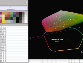
Figure One contains all the basic data I’ll be referencing in this review:
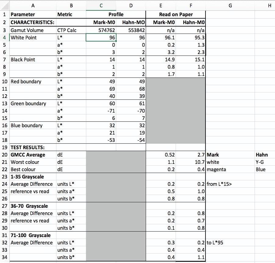
The gamut volume is quite similar between the two profiles (Hahnemühle’s and mine) and falls within the normal range for inkjet matte papers, which puts it well above the range we see for the Japanese Washi papers. Figures 2 and 3 show relative gamut shape from top and bottom respectively. The partial showing of the wireframe means the two gamut volumes differ a bit, but I doubt this matters for selecting whether to use Hahnemühle’s profile or a custom profile (in this case mine).


The actual White point of L*96 is very good, considering there are no OBAs to enhance a perception of whiteness. According to both profiles, the paper is slightly warm, with b* values slightly on the yellowish side (+2 for Hahnemühle’s profile and +3 for mine, the difference being insignificant). The a* axis is neutral for both profiles.
Black point measurement is the same for both profiles, being quite neutral, and down to L*14, which is a relatively deep Black tone for a matte paper (some of which can be as high as L*18~20).
The gamut boundaries of the RGB primaries are close between the two profiles and within the range of specs we see for other quality matte papers.
Turning to the lower portion of Figure 1, the results from printed targets, there is a fairly substantial difference of colour printing accuracy between the custom and the Hahnemühle profiles, recalling that the lower the dE values the more accurate the colour reproduction in terms of replicating the file values of the colours on paper. My profile averages dE 0.52, which is excellent, and Hahnemühle’s is dE 2.7, which is fair. My worst colour is White at dE 1.1, while theirs is Yellow-Green at dE 10.75. My best colour is Magenta at dE 0.2, and theirs is Blue at dE 0.4. Figures 4 and 5 show graphs of the per colour performance for both profiles (the Red bar being the average of the 24 blue bars). Recall from my previous paper tests, these differences reflect absolute differences between the image file values for these colours compared with their printed values as read with an i1Pro2 spectrophotometer.
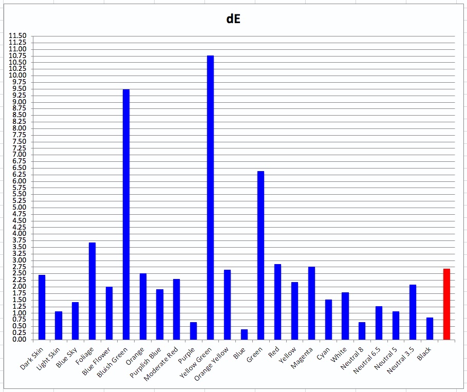
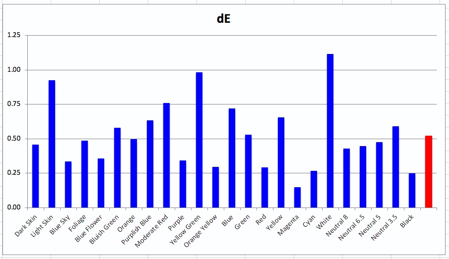
Please note the big difference of scale on the left side of Figures 4 and 5.
The outcome for the custom profile is excellent, while that for the Hahnemühle profile less satisfactory, noting that we expect a well-made custom profile to outperform a canned profile if for no other reason than that the printers and the measuring instruments differ between the making and the usage of the canned profile.
That said, in this case it appears that Hahnemühle made the profile with a P9000 printer, expecting it to perform just as well on the P7000 and P5000 printers, given that the three models share the same inkset and printhead. Unfortunately, this is not always a reliable expectation, because other factors bespoke to each driver can influence ink laydown. We saw this between the Canon Pro-1000 and Pro-2000 models when testing them – the problem arose because Canon had modified the Pro-2000 driver to allow for faster operation over the larger print carriage. One wonders whether something similar may be at play for the Epson drivers used in the SureColor series.
Grayscale performance in the range of L*15 to L*95 is very good for both profiles as shown in Figures 6 to 11 inclusive.
To remind how this diagram works:
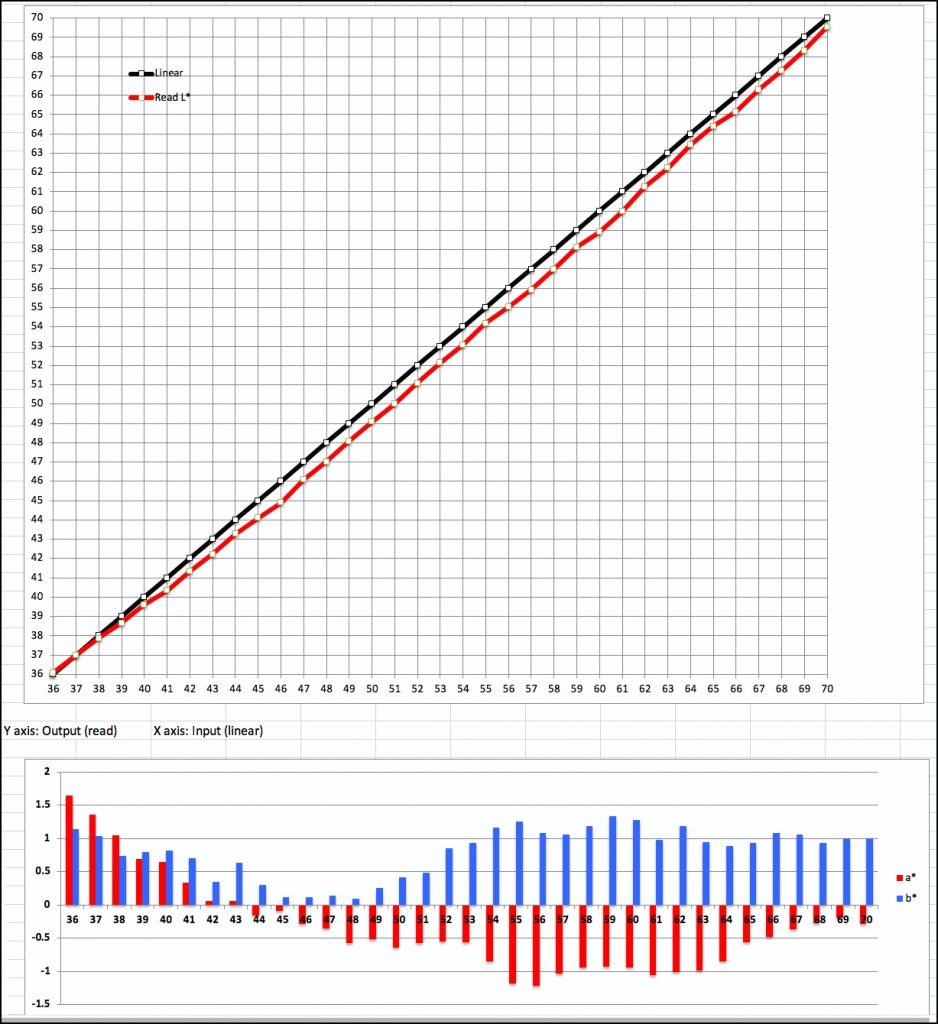
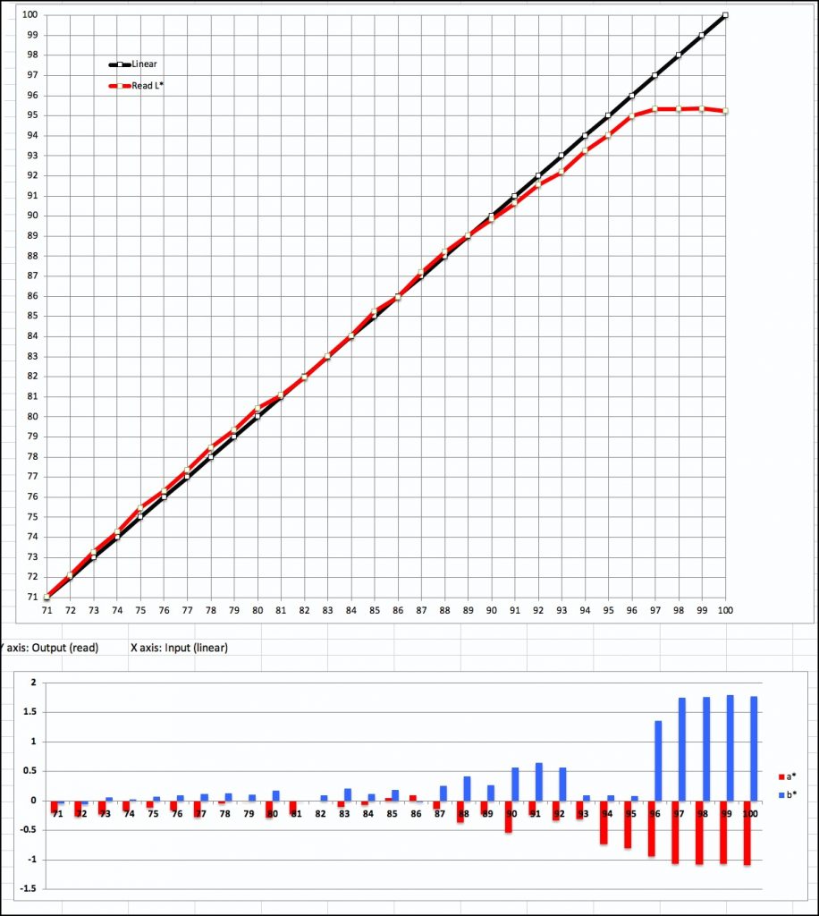
The measurements are all in L*a*b*; L* is for Luminance (or “tone”), a* for the colour range from Magenta to Green and b* for the colour range from Yellow to Blue. The L* scale goes from 0 to 100. The a* and b* scales go from -128 to +127, with 0 for both defining neutral gray; positive values are warm (Magenta or Yellow tending) and negative values cool (Green or Blue tending). Each colour sample has one unique L*a*b* value.
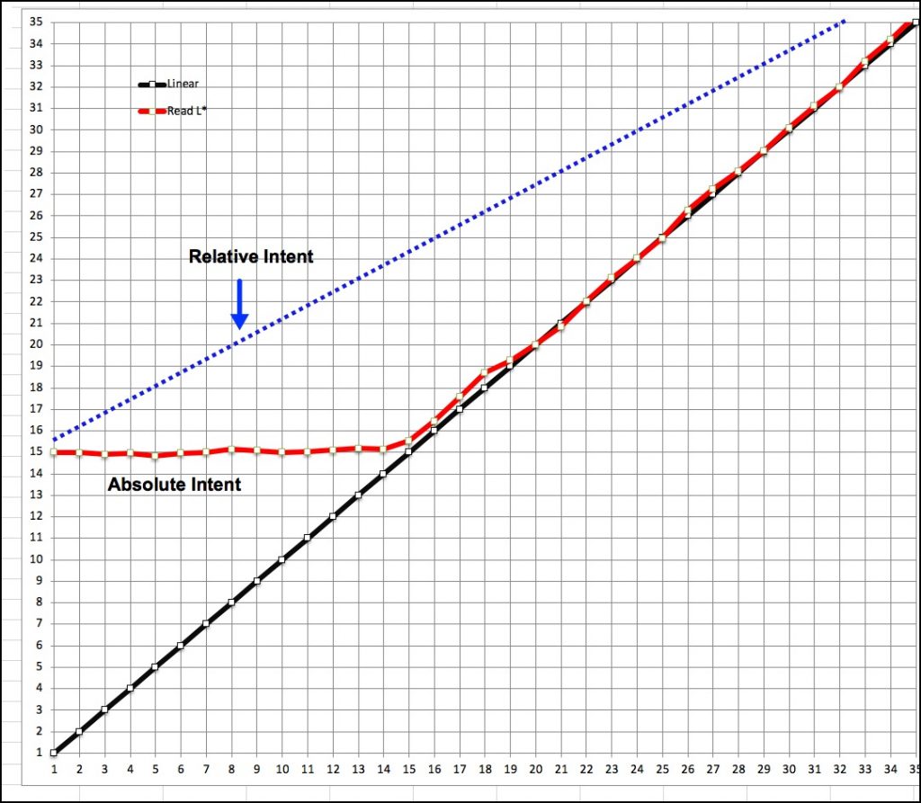
The upper portion of the Figures deals with L*. The black line represents the file reference values for Luminance (Grayscale) for each L* step between L*1 and L*100, broken into three diagrams, one for dark tones (1-35), one for mid-tones (36-70) and one for light tones (71-100). The red line, reading off the left side vertical scale, shows how those values printed on the paper being tested. So, for example, in the diagram of Figure 6, looking at values L*1 to L* 14 inclusive on the bottom horizontal scale, all those values printed at a pretty uniform value of L*15, (read from the red line against the left side vertical scale). As the file values progress from L*1 to L*14, the gap between the red and black lines decreases until it just about converges at L*15 on either scale. The closer the two lines overlap, the better the coherence between the file values and the printed values, and the happier we are – because if we have well-profiled displays and correct print viewing light and we are making our tonal adjustments under soft-proof, the more reliable will be the convergence between what we accept as final on our displays and what we see in the print.
At this point I need to introduce the role of Rendering Intent in how the measurements are made. The measurements forming the Red line are made in Absolute Rendering Intent. This is normally used only for proofing purposes where one is simply trying to see how well the values printed on paper track the file values. This Rendering Intent does not remap White or Black points between the image file values and the paper/inkset being used. It only lays down what the file says without intentional changes. If the darkest Black the paper/ink can reflect is L*14, it will print that value until the file value exceeds L*14. So this is what you see Figure 6, and means that anyone printing photos with Absolute Rendering Intent would see no distinction of shadow values between levels L* 1 and L*14 because they are all the same on paper.
But one doesn’t print real photos this way. A more common choice of Rendering Intent for printing real photos would be Relative Colorimetric Intent with Black Point Compensation (BPC). This Rendering Intent with BPC purposely remaps tones to match file White with Paper White and remaps file Black to Paper Black, changing all the colours between these points relatively to the changes of their file values, so as to avoid unintended discontinuities in print. Figure 6A shows the difference of performance between the two Rendering Intents, where the Blue dotted line shows what Relative Intent would do to the mapping of grayscale tones on paper. The result in a print will be a less accurate reproduction of the grayscale compared with Absolute Intent, but the appearance to viewers will be much more satisfactory because it causes shadow detail to be distinguishable and well related to midtones right up the scale.
As my purpose here is testing for profiling accuracy, I shall remain in Absolute Intent for Figures 6 to 11, but afterward, where I show real photos printed on this paper, please remember they are printed in Relative Intent with BPC, to demonstrate realistic outcomes for ordinary photographs corresponding with how most people print (i.e., using Relative or Perceptual Intent).
The bottom part of the diagram – the graphs with the red and blue bars, show for each Luminance level the neutrality of the printed gray, the red bar for the a* axis and the blue bar for the b* axis. Zero for both a* and b* is neutral – no hue cast in the greys. The shorter the bars, the happier we are, because it means the grayscale is more neutral than if the bars were higher. Colour cast would be very hard to see at +/- 1 or even 2 (see left vertical axis values) on either the a* or b* scales, unless the change from one adjacent hue to the next approximates or exceeds absolute 2 – then one is likely to see a departure from perceived neutrality. That sort of occurrence is unusual.
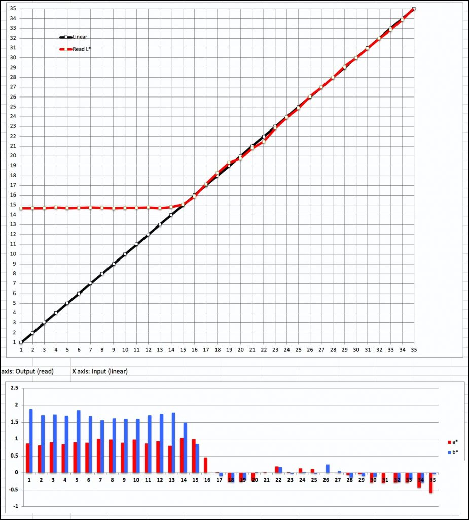
The main difference between the two profiles’ performance is the much smaller deviations from neutral gray for values L*16 to L*35 using the custom profile (Figure 7 compared with Figure 6, lower sections).
For the Hahnemühle profile, Mid Tone reproduction (Figure 8) adheres quite faithfully to the reference file tone scale. The neutrality could be a bit better, but as few tones wander much beyond +/- 1, hue bias would be hardly noticeable.
For the custom profile (Figure 9), Mid Tone reproduction adheres even more closely to the reference file tone scale, and the neutrality of the mid tones is very good, seldom approaching a value of +/- 0.6; the mid tones with this profile will look very neutral.
Turning to the Highlight range, (Figures 10 and 11), Both profiles perform very well in respect of tone value reproduction up to L*96 where paper white takes over and cannot reproduce whiter white. Convergence between file and print values for Levels L*92 to L*95 is slightly better in the Hahnemühle profile, but these differences would hardly be noticeable in a normal print. For both profiles, neutrality normally deteriorates a bit as one gets closer and closer to paper white, the custom profile being only marginally (and insignificantly) better in this regard. On the whole, both profiles do a very good job with the grayscale in this printer.

We can now safely leave the world of graphs and numbers – designed to give you an objective view of the paper’s characteristics – and turn to a visual appreciation of how real-world photographs print on it. (I also do make real photographs in case there was any doubt about it.)
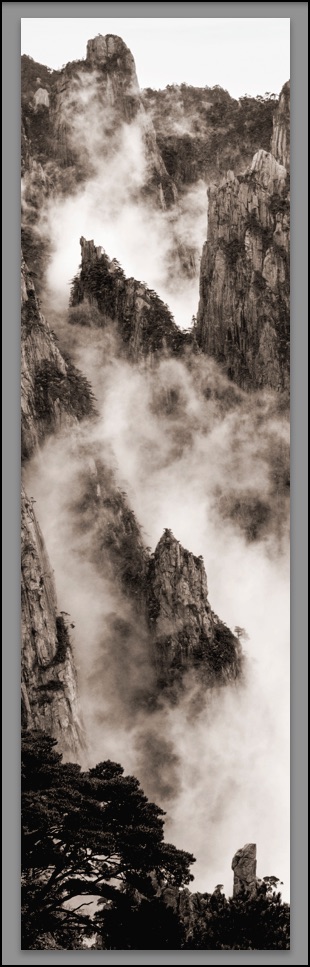
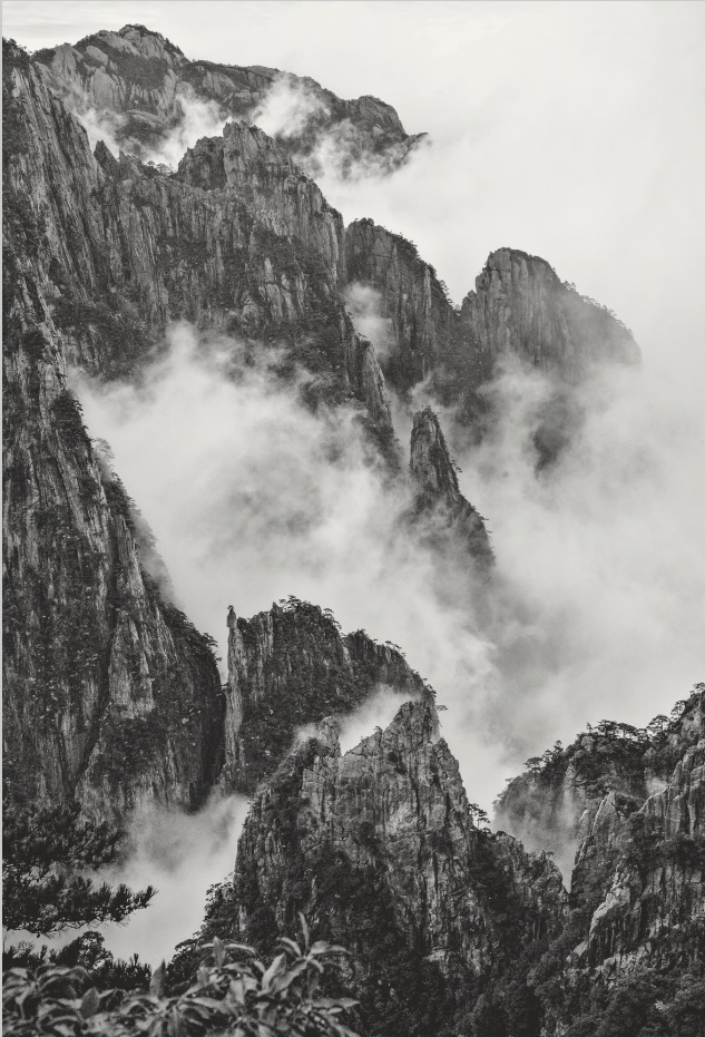
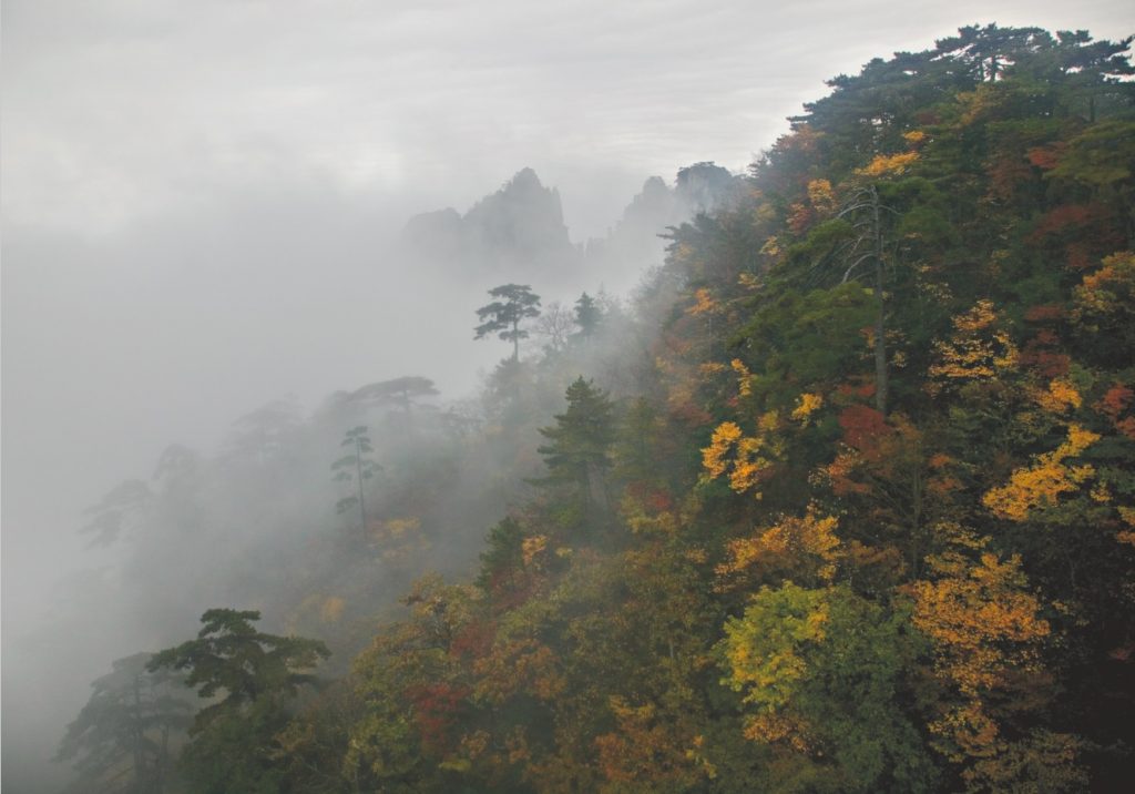
I selected this group of photos from my archives because I wanted to see how well the paper would handle toned Black and White, neutral Black and White, low key colour and the very fine tonal gradations of a misty scene, and then how it deals with more saturated vibrant colours. These photos are reproduced as Figures 12 to 17 inclusive. They are screen grabs of the soft-proofs in Lightroom using the custom profile for this paper. I printed all six of them, of course, and can say with confidence that the appearance of the paper prints and their corresponding screen grabs is very close.
I was very pleased with the results. It can be challenging to make vibrant prints on matte papers which normally dull the colour palette somewhat compared with luster or gloss papers, but depending on the photo, that can be advantageous.
Examining the three photos from the Yellow Mountains, the first thing that impressed me was the paper’s retention of image detail. The depiction of fine detail in the stone and trees as well as the retention of just enough highlight detail and tonal variety in the clouds are to a high standard and make these photos live. As well, the toning and the neutrality were both well reproduced. In the Figure 14 photo, the paper handled the subtlety of the colours and the foggy tones very adeptly.
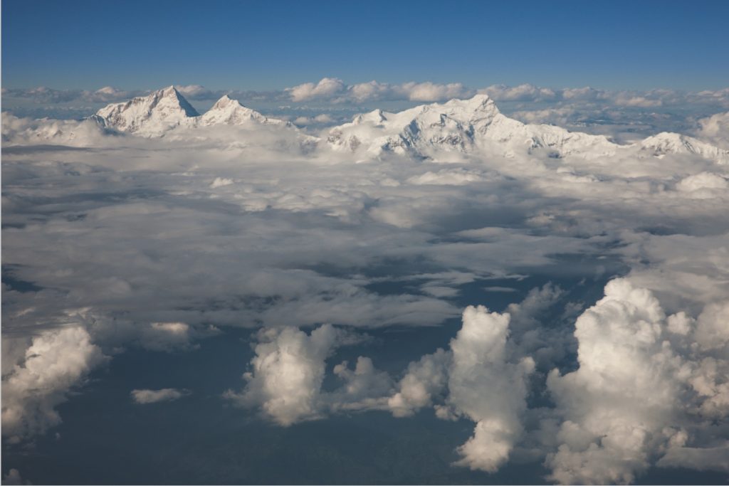
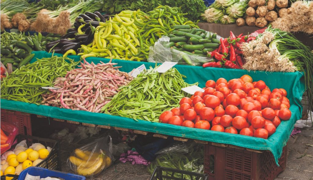
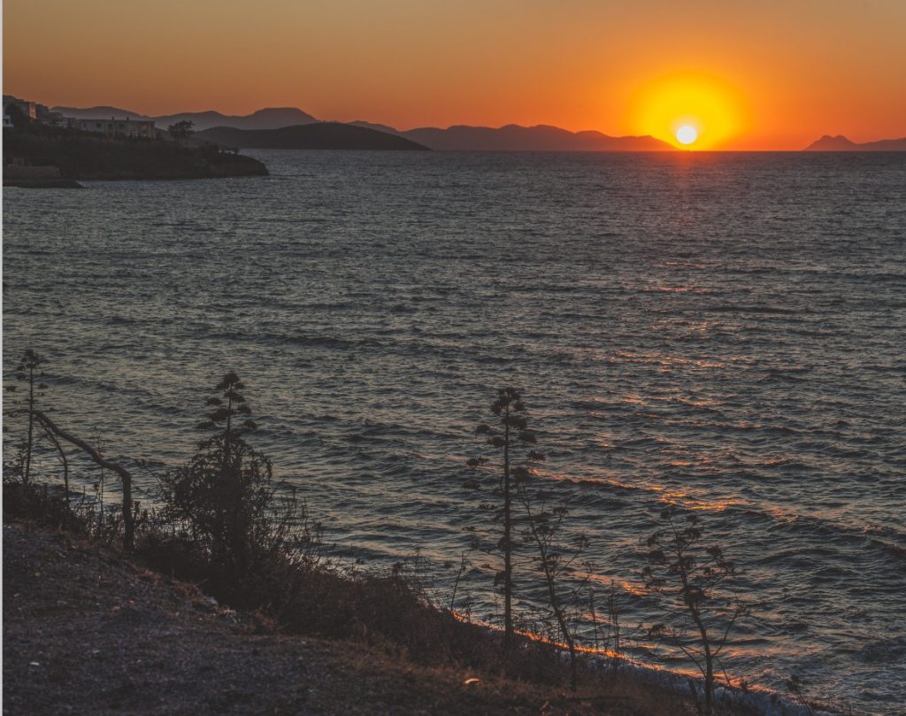
The photos in Figures 15 to 17 are the opposite kind of images, emphasizing strong vibrant colours. The key attribute giving Figure 15 the depth it portrays is, again, the rendition of highlight detail and tonal variation in the clouds and mountain faces. The paper did very well with this challenge. The photos in Figures 16 and 17 are exercises in pure saturation characteristic of those local scenes. For a matte paper, the strong colours reproduced well – not as vibrant as achievable from a good luster paper, but with appropriate treatment in Lightroom, nonetheless very acceptable.
Finally, a word about the paper’s physical characteristics. The paper is indeed very thin and requires careful handling to avoid creating micro creases. However, I had no difficulty whatsoever loading the sheets into the top feed of the Epson SC-P5000 printer, and the printer fed them through with no problems. The laid lines in the paper texture are subtle as Hahnemühle says, but they are visible especially in areas of the paper that have little ink coverage. Some may find this a distraction, others may find it adds character. I think more the latter.
But perhaps most important of all, seeing how thin the paper is, one may be tempted to ask about its suitability for making translucent prints (i.e., prints illuminated from behind). So, I tried that with the photo of Figure 12 and the answer is yes it can be suitable! Preparing the print is a bit trickier because conventional soft-proofing that assumes conventional reflected lighting won’t be reliable, as this is transmitted light from behind. In general, for this kind of lighting one would increase density and tone-down highlights. Figure 18 approximately shows the Figure 12 viewed when backlit.
If you look carefully you can see the slight ribbing pattern in the paper. Note the glow of the mid-tones and the transparency of the shadow detail. This is hard to convey over the Internet but seen in situ, the tonality is very pleasing.
The thinness of the paper also lends itself to printing letters to friends or advertisements that contain photos which one wants to be well printed and can be folded without cracking or lumpiness for putting into an envelope and mailing.
In conclusion, Hahnemühle’s Rice Paper is a high-quality specialty product that allows for making fine prints on a very thin textured media that will stand up to careful handling and should have good longevity, given the stated properties and standards to which it is manufactured.
Mark Segal
June 2019
Toronto, ON
Mark has been making photographs for the past seven decades and started adopting a digital workflow in 1999 first with scanning film, then going fully digital in 2004. He has worked with a considerable range of software, equipment, materials and techniques over the years, accumulated substantial experience as an author, educator and communicator in several fields, was a frequent contributor to the Luminous-Landscape website and now contributes frequently with in-depth articles on the PhotoPXL website. Mark has contributed over 75 articles to the two websites up to Q1-2024, with a particular emphasis on printers and papers, given his view that a photograph printed on paper remains the epitome of fine photography, as it has been from soon after the medium was invented and started gaining momentum in the 1830s/1840s. Mark developed a particular interest in film scanning and authored the ebook “Scanning Workflows with SilverFast 8, SilverFast HDR, Adobe Photoshop Lightroom and Adobe Photoshop” (please check our Store for availability). In his “other life” (the one that pays for the photography), Mark is a retiree from the World Bank Group and was a consultant in electric power development.