Augmented Inkjet Printer, Paper and Profile Evaluation (190617)
 Readers of my inkjet paper and printer reviews previously published on Luminous-Landscape have seen my approach and techniques for evaluating the accuracy of colour reproduction done by various printers on a range of inkjet papers with both OEM and custom profiles.
Accuracy in this context does not refer to scene colours. Typically, apart from laboratory or other constructed conditions, that is not possible. Accuracy in this context means how exactly a printer/profile/paper (hereafter “PPP”) combination reproduces the known Lab values (also called “reference values”) of differently coloured patches in a test target that would adequately represent performance for the millions of colours in a real photograph.
Why is this important? There are two main reasons. The most important of the two relates to the potential quality of the photograph. As photographers we put much effort into how we capture a scene, then, varying a lot between photographers, we put additional effort into how we prepare that image for printing. The editing we do on tone and colour fixes the tone and colour values of every pixel in the image file to our taste. Having done all that work on the image, if we are serious about our printing, we want our print to match those tones and colours under specified lighting conditions as closely as possible. We want to know whether the materials and profiles we are using are a help or a hinderance to achieving that objective, and these tests facilitate that understanding. In a nutshell: we want to know how well the PPP combination can follow the script.
The second reason addresses the reviewer’s conundrum that paper reviews are hard to do over the internet where no paper is seen by anyone other than the reviewer. The only convincing way a reviewer can convey information about the potential accuracy of a PPP combination is to use objective data. There is no reason for anyone to believe me if I say the colours or the neutrality on such and such a paper really come out accurately, absent supporting evidence, especially as I myself may not know for sure unless I make careful measurements! The human eye/brain has perception limits and “fools itself” (i.e. adapts) easily.
So those are the two main reasons for my deep dives into PPP accuracy. There are other important aspects of reviewing papers, such as print longevity, physical appearance and handling characteristics as well as the kinds of images that best suit different paper types, but those are not within the scope of the present discussion. (I never discuss longevity – apart from noting the presence or absence of OBAs – because this is a highly specialized field best left to the experts in that domain.)
Two main technical standards I’ve been using for these PPP accuracy evaluations are the choice of a synthetic 24-patch ColorChecker (GMCC) as the test target, and the use of dE(76) rather than dE(2000) as the accuracy evaluation metric. The GMCC has been very widely used for many decades as a worthwhile testing/control platform. dE(76), although overtaken by dE(2000), remains useful for proofing purposes, where the limited objective is to simply compare the numbers defining what a PPP combination puts on paper versus the file reference values of the target being printed. In other words, if the file reference value of a colour were L*50, a*30, b*30, how closely does the PPP reproduce L*50, a*30, b*30? It isn’t advisable to read more than that into a dE(76) outcome, but it’s important enough as far as it goes. Both dE(76) and dE(2000) start from the same information about the Lab values of the colours in the image file and those colours as printed.
One could raise two key areas of extension to this approach, which I have been intending to implement for some time; that time has come.
Firstly, it is suggested that ideally one should use more than 24 patches for the test target, and secondly it is suggested that one should use dE(2000) instead of dE(76) as the standard for colour difference measurements. I shall deal with these in turn.
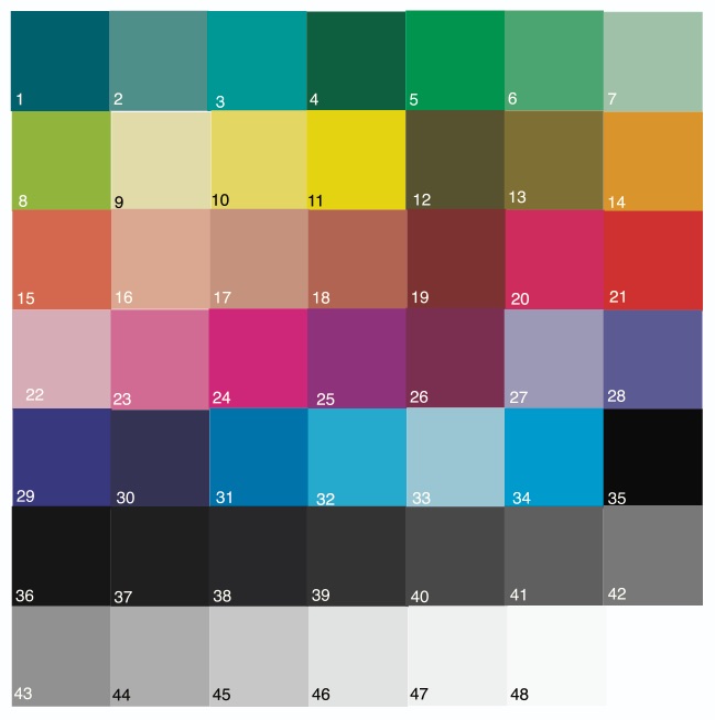
(1) The colours in the target patch set: how many and what are they? Much of the discussion and work in support of printing accuracy has occurred in the context of process control for CMYK presses, where a key concern is the fidelity and consistency of output from one machine to the next. A number of standards and control tools have been developed to address this concern. A White Paper issued by Barbieri SNC (“Achieving Accurate and Consistent Color in Digital Print Production”, undated) features their control strip of 48 patches which they say is “industry compliant” and uses the minimum number recommended in ISO 12647-7. The patchset contains primary colours, primary mid and shadow tones, secondary colours, secondary mid and shadow tones, white point, and chromatic grays. Their target is set-up in a manner bespoke to their hardware requirements. For my purposes, only the quantity and colours of the patches are of interest; using that information for guidance, I constructed my own target for testing PPP accuracy, as explained below. Hence my expanded patch set is now 48, consisting of 34 non-neutral colours and 14 grays, compared with the GMCC patch set which contains 18 non-neutral colours and 6 grays. While the Barbieri target is formatted for their hardware, mine is constructed to be usable with any hand-held spectrophotometer, Photoshop, i1Profiler, and Excel. More detail below. As well, including 14 grays in the basic test allows me to include the same type (but less granular) graphs on Luminance tracking and hue neutrality that I provide in my 100-patch grayscale testing suite.
(2) The dE metric: dE(76) is a measure of the linear distance between two points in a colour space – the extent to which one differs from the other, without regard to how human visual perception would perceive that distance – it is simple absolute difference. So, for example, if a colour having Lab value of 34/-3/22 were printing as 33/-2.5/21.5, the dE(76) formula says the dE is 1.22. dE 1.0 is supposed to be the threshold of a just noticeable difference (JND) for the average viewer. So according to dE(76) this difference is statistically a bit more than just noticeable and absent any issues should be visually a bit more than just noticeable as well. In another part of the colour space there may be another pair of Lab values that have the same dE(76), but for this pair of different colours the value of 1.22 may not strike the viewer to be as noticeable as the other one was. This can happen because there is inconsistency in the human perceptual uniformity of colour differences across the colour space.
dE(2000) was developed to overcome this lack of perceptual uniformity of colour differences across the colour space. Following our example above, the dE(2000) of the stated colour pair happens to be not 1.22, but rather 0.96. Using the dE(2000) metric, any other pairs of colours elsewhere in the colour space having a dE(2000) of 0.96 should cause viewers to have the same perceptual impression of the difference. By the way, because it’s less than 1.0 in this example, it should be slightly below the “JND”. Much testing has been done to confirm the general validity of this metric. So, the bottom line here is that we can say dE(2000) provides a more perceptually correct impression of colour differences between the two elements of a Lab pair than does dE(76). Therefore, which dE metric one uses depends on the purpose of the measurement. If the purpose were to see whether the PPP combination is laying down the same colour values that are in the image file, dE(76) does that. If the purpose were to go further and consistently appreciate to what extent any differences matter perceptually, dE(2000) is more appropriate. In this revision of my PPP evaluation procedure, I provide both metrics in a manner that each colour sample and the average of the 48 samples can be compared for dE(76) and dE(2000).
I’ll now discuss some procedure underlying these materials, so readers will have additional insight into what they are and how they work.
Firstly, construction of the new target:
I downloaded the Barbieri 48 patch control strip from the Barbieri website, extracted the patches so the resulting image of the patches alone could be read in ColorThink Pro, eliminated the CMYK colour list, kept the Lab equivalent list, and used that as the starting point for revisions.
In Photoshop, I constructed a completely new patch set with substantial revisions: (i) I regrouped the grayscale patches so that they would all be at the bottom of the list (rather than in the middle) for convenience of programming graphs focused on grayscale performance. I also re-ordered the sequence of all the non-neutral patches, making colours of the same general colour identification contiguous, for example all the Blues together, all the Greens together, etc., to facilitate analyzing whether any issues are specific to a colour group or more random.
(ii) I redesigned the size and shape of the patches to be one-inch square each, making them easier to read without error using an i1Pro 2 spectrophotometer. Each patch has its own identification number that I assigned for performance tracking purposes, lodged in the lower left corner of the patch.
(iii) I amended all the colour numbers in Photoshop so that they would be integer values only – no decimal places, insofar as the Photoshop info panel does not provide fractional Lab values and I need to be able to amend the colours depending on the gamut of the paper/profile being tested (explained below).
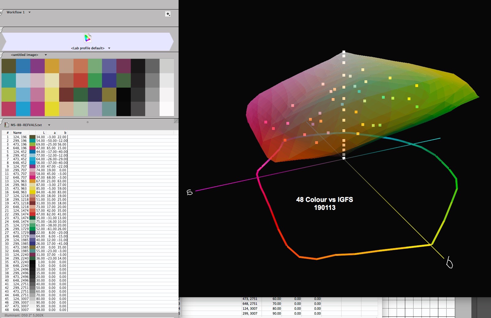
(iv) I constructed the Photoshop image keeping a separate layer for each patch so that I could amend the colour values to be always in gamut when testing papers/profiles that have narrower gamut than my reference paper (Ilford Gold Fibre Silk – IGFS) used to road-test the augmented procedure. This is essential because these analyses are not about how well rendering intents deal with out of gamut colours – that is a separate issue, beyond the scope of my PPP testing. The target looks like this (Figure 1).
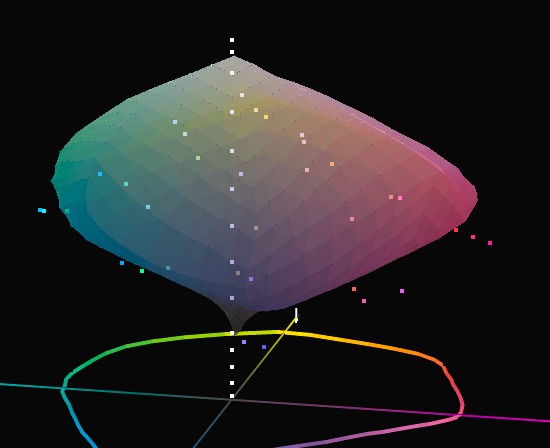
Depending on the paper being evaluated, I may need to verify whether all the patch values are in-gamut, a visual test which I can do by importing both the target’s patch reference values and the gamut map of the profile under test to ColorThink Pro and visually checking that all the patches are in the profile’s gamut (Figure 2). The gamut volume enabled by my custom profile for IGFS in an Epson SC-P5000 printer is very large, at over 993K. This is the largest gamut of any PPP combination I’ve tested. The colour values in Figure 2 are all in gamut. Matte papers typically show gamut volumes in the range of 500~600K. If I were testing a profile for a matte paper, the gamut map would be smaller and some of the patches’ colour values, if unchanged from those of Figure 2, would fall outside its boundaries (Figure 2A Ilford Washi paper, gamut volume 374K, same target reference value patch set).
I can amend out of gamut patches in the Photoshop file of the test target so that all the colours will be within the gamut of the paper being tested and save it as a new target with a new colour list, to be applied to the papers in need of these changes.
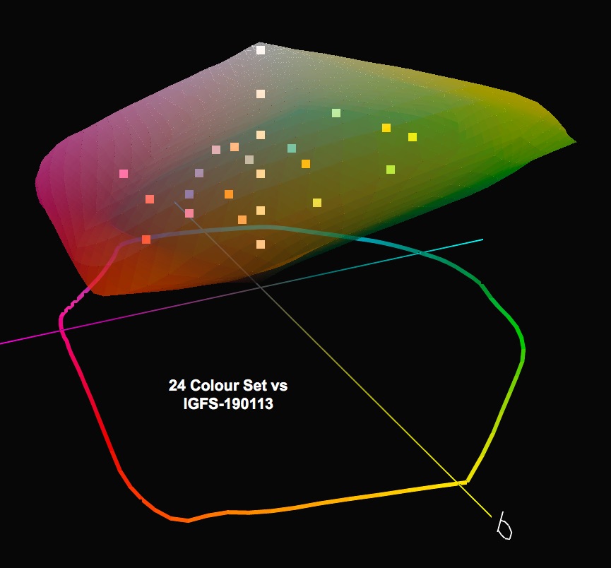
By the way, it is interesting to visualize the gamut coverage of the 48-patch set relative to the former 24 patch set (Figure 3) for Ilford Gold Fibre Silk in an Epson SC-P5000 printer.
Secondly, the dE(2000) table:
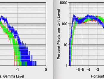
Several Excel spreadsheets are available on-line which calculate dE(2000). This is a non-trivial exercise because the formula is complex and depending on the approach to computation requires some 33 columns of formulas and intermediate results (Figure 4).
The spreadsheet I am using (with permission) for the calculation of dE(2000) is that of Professor G. Sharma, implementing the dE(2000) formula of Figure 4. I inserted that spreadsheet as a worksheet in my Excel workbook for test results analysis.
Both the test target file reference values and the values read from prints of the test target are each imported to bespoke data input sheets of my workbook from CGATS formatted lists; these imported colour lists are linked to both the dE(76) calculation and the dE(2000) calculation, both of which appear in the results worksheet of the workbook as a table and a graph (Figures 5 and 6). In the graph, dE(76) is in blue and dE(2000) in green. The red bar is the average of the 48 patches in dE(76) and the green bar at the far right of the graph is the average dE(2000).
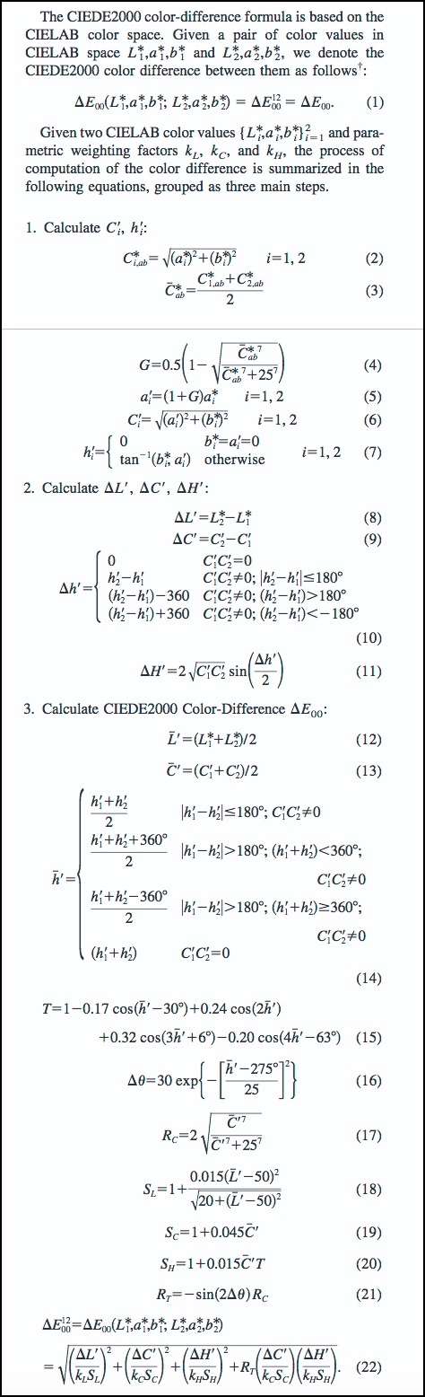
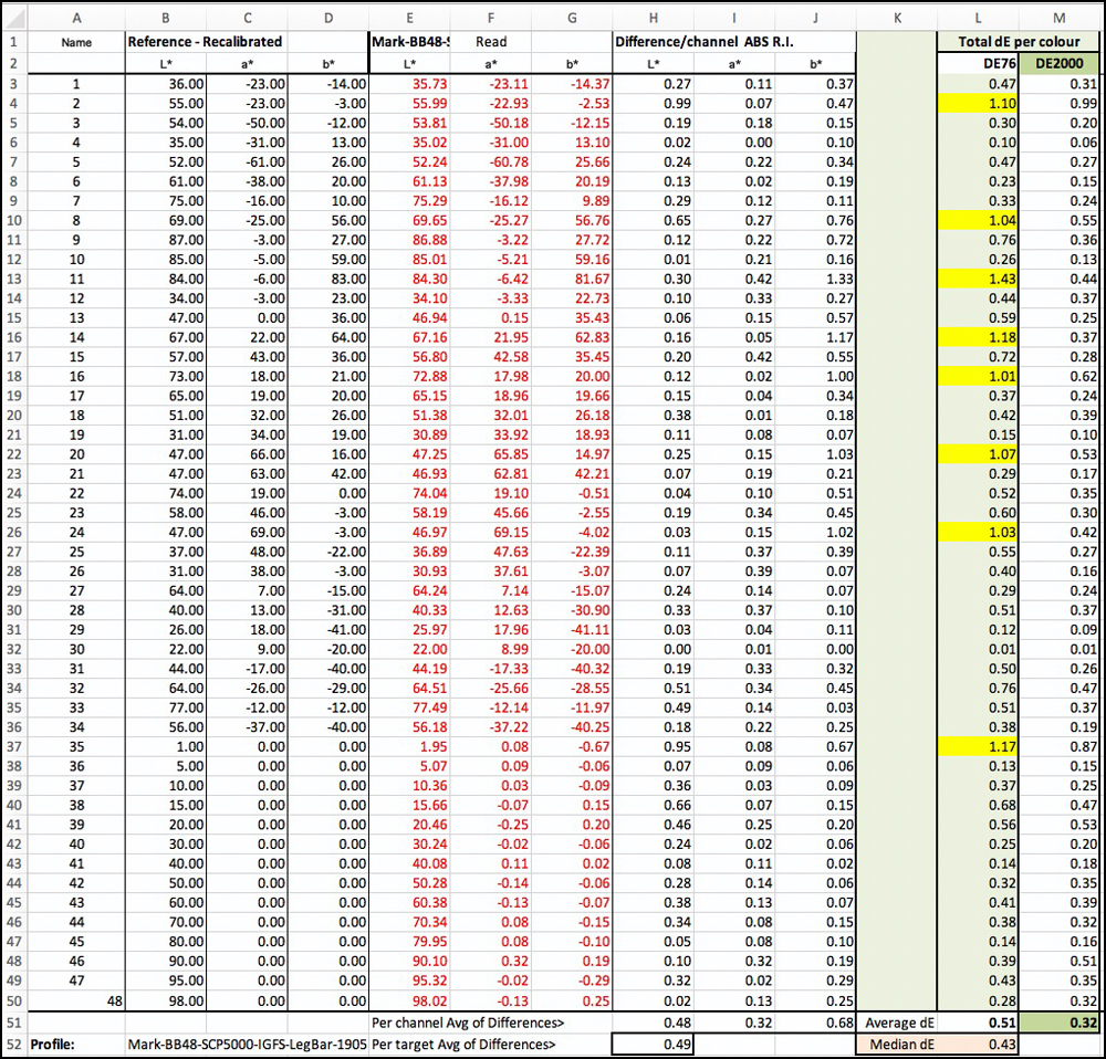
Figure 5. dE Results Table, dE(76) and dE(2000); Epson SC-P5000/IGFS paper (dE results >1.0 highlighted in yellow)
Looking at Figures 5 and 6, (for the Epson SC-P5000 printer using IGFS paper), dE(76) is slightly larger than dE(2000) in only 4 patches. As a result, average dE 76 is greater at 0.51 than is average dE(2000) at 0.32. These are both generally very good results, by the way. This difference of character between the two metrics indicates that on the whole differences between the reference and printed colours are less perceptible (dE(2000)) than indicated by the dE(76) results. This kind of outcome is quite usual.
Comparing this result (dE(76)) with that from using the 24 patch GMCC, this latter result is average dE(76) 0.83. Hence, there is a 0.32 dE(76) decrease going from the 24-patch to the 48 patch evaluation; all said and done, this hardly turns the world around for all the effort constructing this augmented approach, but perhaps for some other profile comparisons the difference may matter more.
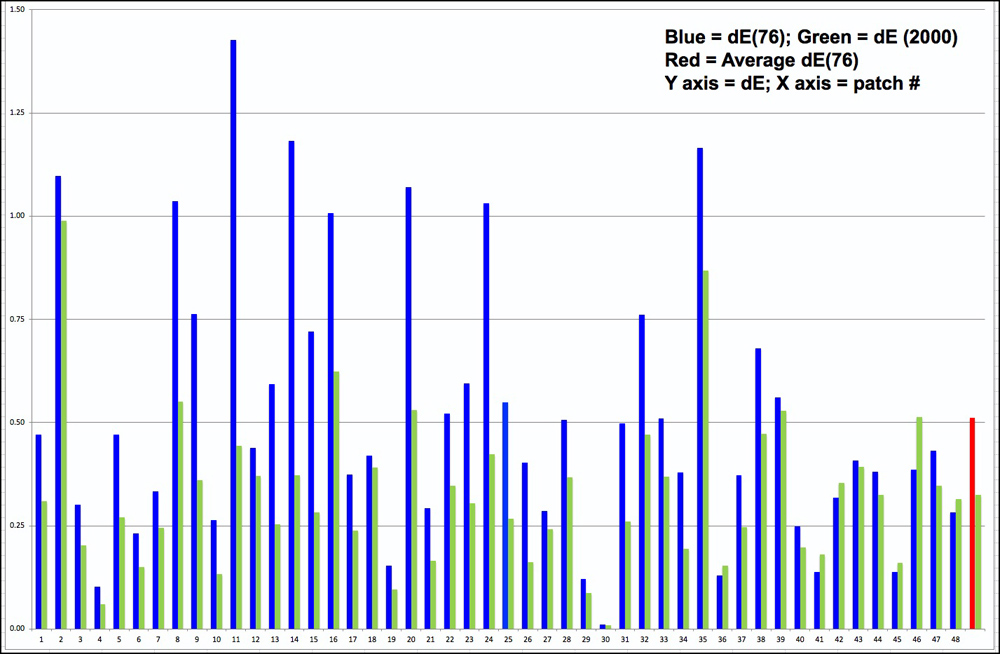
Figure 6. dE Results Graph, dE(76) and dE(2000); Epson SC-P5000/IGFS paper
The entire results sheet looks like this: (Figure 7).
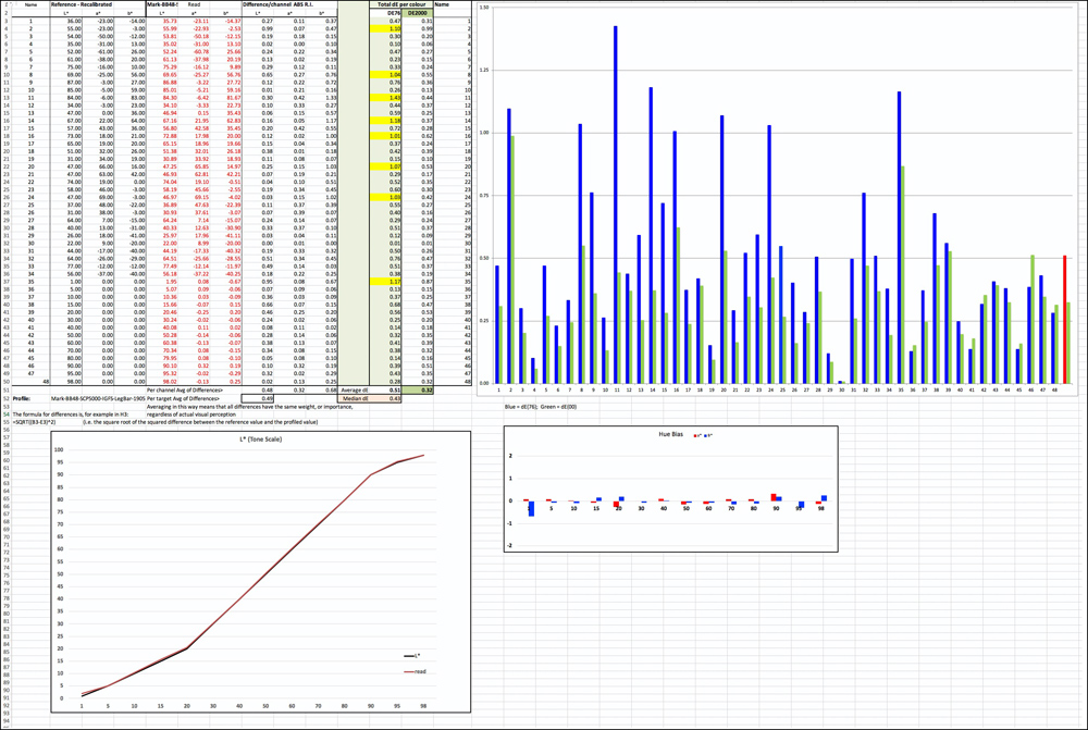
Figure 7. Results Worksheet
Thirdly, the treatment of the grayscale patches:
You will notice two graphs underneath the main results table and graph of the results page shown in Figure 7. (Expanded in Figures 8 and 9).
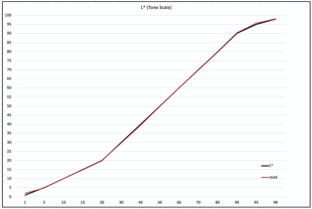
The Figure 8 graph deals with L* (Luminance, or grayscale) and is meant to show how well the printed grays track the gray values in the target file. The black line represents the target file reference values from L*1 and L*100 in 14 steps portrayed by the 14 grayscale patches in the target. The red line, reading off the left side vertical scale, shows the values of those same patches as printed on the paper/profile being tested. The target print is made in Absolute rendering intent. If the red line exactly overlapped the black line, it would mean the luminance progression of the grayscale is being reproduced accurately. The separation between the red and black lines means there is some inaccuracy in the reproduction where the lines diverge. The example here is one of very considerable grayscale tonal reproduction accuracy.
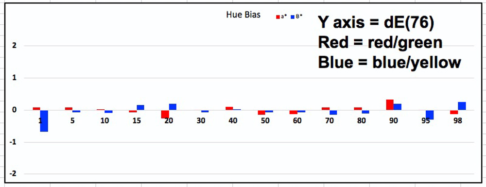
Figure 9. Grayscale Hue Bias; Epson SC-P5000/IGFS paper
The Figure 9 graph shows for each of the 14 Luminance levels the neutrality of the printed gray, the red bar for the a* axis and the blue bar for the b* axis. Zero for both a* and b* (no bars jutting above or below the horizontal axis) means complete neutrality – no hue cast in the grays. The shorter the bars, the more neutral the grayscale. Colour cast would be very hard to see at +/- 1 but perhaps become a bit more obvious at 2 (see left vertical axis values) on either the a* or b* scales; if the change from one adjacent hue to the next in an image were to approximate or exceed absolute 2, one would likely see a departure from perceived neutrality. That sort of result is more likely to happen with the very light tones of papers having an accentuated yellowish or bluish tint. You can observe for this particular example that hue bias of the grayscale should be imperceptible, indicating to those making prints that (in this example) they can safely preserve a high degree of neutrality using a well-made ICC profile and the Epson driver for their Black and White printing.
My future reviews of papers and printers for this website will use this augmented presentation. For the grayscale, I shall also continue to use the more granular 100 step Grayscale analysis that I have already been providing, a detailed explanation of which appears in my review of Hahnemuehle Rice paper published on this website.
Mark D Segal
Toronto,
June 2019
Toronto, ON
Mark has been making photographs for the past seven decades and started adopting a digital workflow in 1999 first with scanning film, then going fully digital in 2004. He has worked with a considerable range of software, equipment, materials and techniques over the years, accumulated substantial experience as an author, educator and communicator in several fields, was a frequent contributor to the Luminous-Landscape website and now contributes frequently with in-depth articles on the PhotoPXL website. Mark has contributed over 75 articles to the two websites up to Q1-2024, with a particular emphasis on printers and papers, given his view that a photograph printed on paper remains the epitome of fine photography, as it has been from soon after the medium was invented and started gaining momentum in the 1830s/1840s. Mark developed a particular interest in film scanning and authored the ebook “Scanning Workflows with SilverFast 8, SilverFast HDR, Adobe Photoshop Lightroom and Adobe Photoshop” (please check our Store for availability). In his “other life” (the one that pays for the photography), Mark is a retiree from the World Bank Group and was a consultant in electric power development.