The New Epson Legacy Textured Paper
Epson recently released this fifth offering in the Legacy paper series. Epson’s description of this paper, as mentioned on the B&H website, says:
“(Epson) Legacy Textured Paper is a pure white, 100% cotton-fiber paper with a highly textured surface and a matte finish. Its mould-made paper base allows the cotton fiber grains to lay down randomly and naturally for reduced curl, and the paper produces deep black densities, an expanded color gamut, gentle tonal gradations, and high image sharpness. With a basis weight of 305 gsm (ed. 310 gsm latest spec) and a thickness of 20 mil, this paper features a 99% whiteness, an ISO brightness of 96%, and does not contain any optical brightening agents.”
Rather than trying to describe the texture, I thought it best to photograph it at an angle to the light, so you can see pretty much what it looks like (Figure 1).
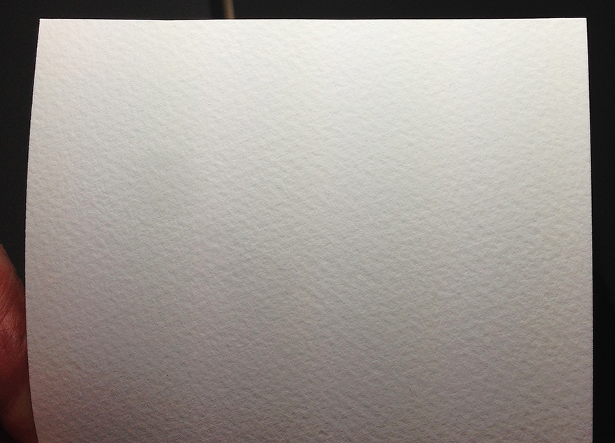
I darkened it in Figure 1 so that the texture would be more visible to viewers. In reality, it is quite a bright white paper, but with no OBAs. It’s a hefty but nonetheless pliable paper that handles well. The roll I was sent for testing loads, transports and auto-cuts in the Epson SC-P5000 printer without issue.
This is the first paper I’m analyzing for the SC-P5000 printer using the augmented testing materials explained in my previous article recently published on PhotoPXL.com. Being a matte paper, I appreciated the flexibility I built into the target design for making sure that all patches with the exception of several dark tones are within the paper’s gamut. Twelve patches required moderate reduction of saturation or increased brightness to bring them into the paper’s gamut as graphed in ColorThink Pro. Hence the matte evaluation target has some patch values that differ from those of the target purposed for gloss and luster papers. I’ve analyzed both the Epson profile for this printer/paper combination and made my own custom profile (“Mark” – using i1Profiler with i1Pro2) from the X-Rite 2371-patch profiling target. The Epson Media Type for use in the Epson printer driver is Watercolor Radiant White.
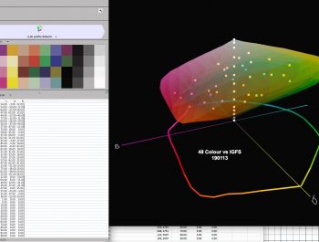
Figure 2 is a data summary of analyses for both the Epson and my custom profile.
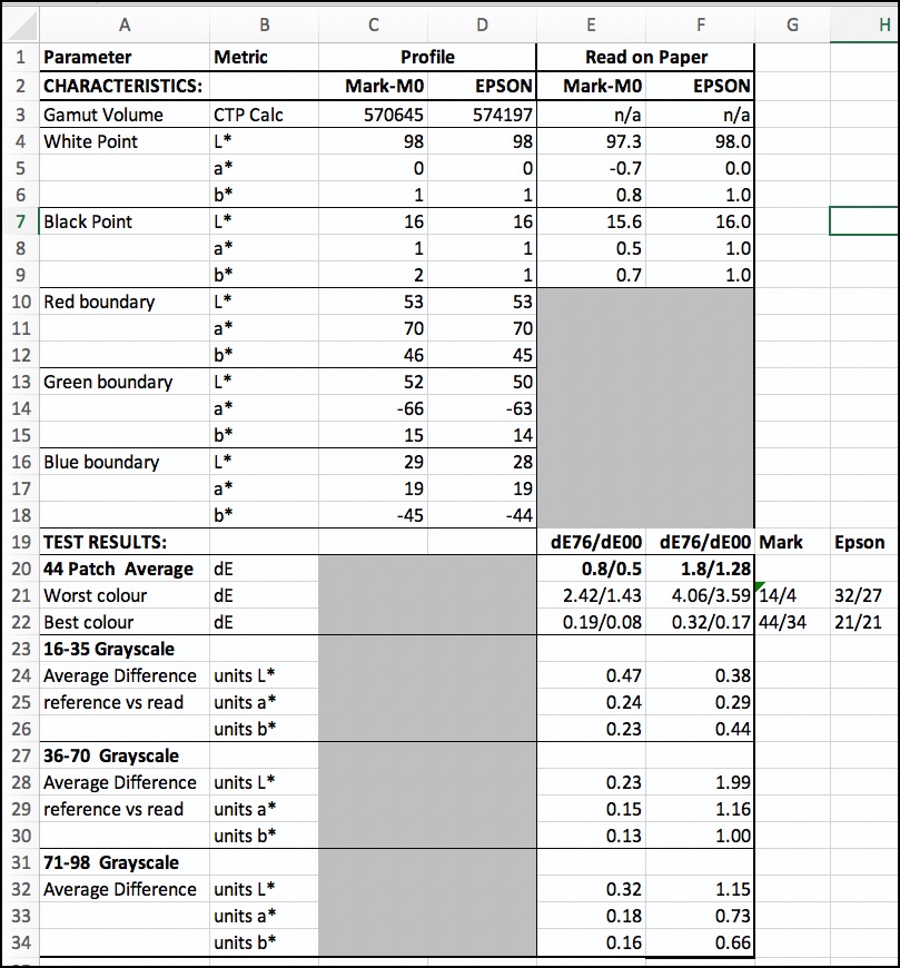
The profile and the values read from the paper, whether for the Epson or Mark profiles, indicates that as advertised, the White Point is both bright and neutral. The Black Point is approximately L*16, which is normal for matte papers and quite a bit less Black than achievable with, say, Epson Legacy Baryta, where the Black Point is in the range of L*2~3 with current inksets. So for this paper, like other matte papers, there is a trade-off between maximum Black and the non-glare, matte surface texture that appeals to many photographers and their clients. That said, seen by itself and with appropriate processing, the Blacks look good.
The PPP (printer/paper/profile) test results are better for my custom profile than for the Epson-supplied profile as expected (their printer and profiling instrument most likely don’t perform identically to mine), but both profiles are usable.
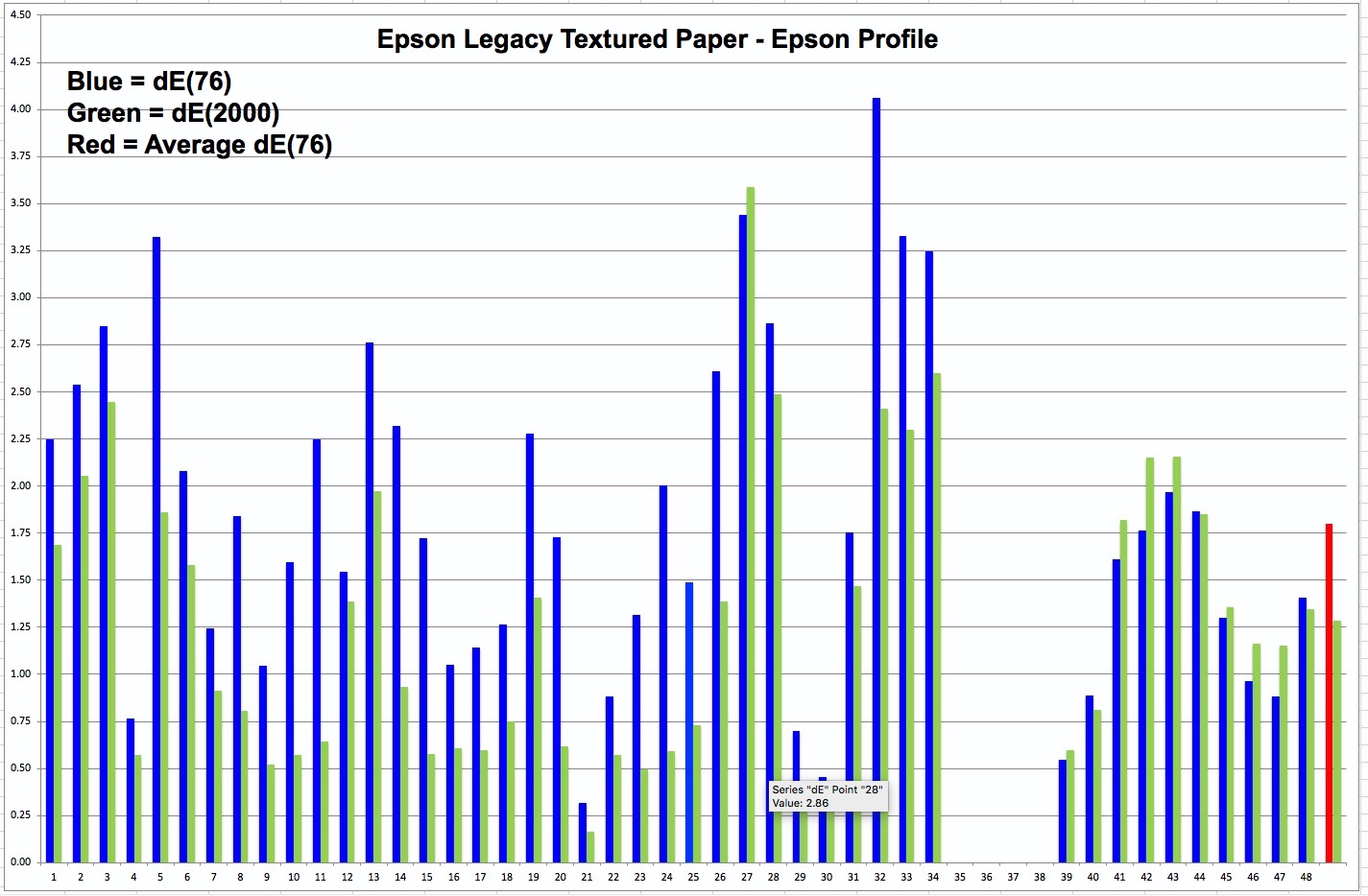
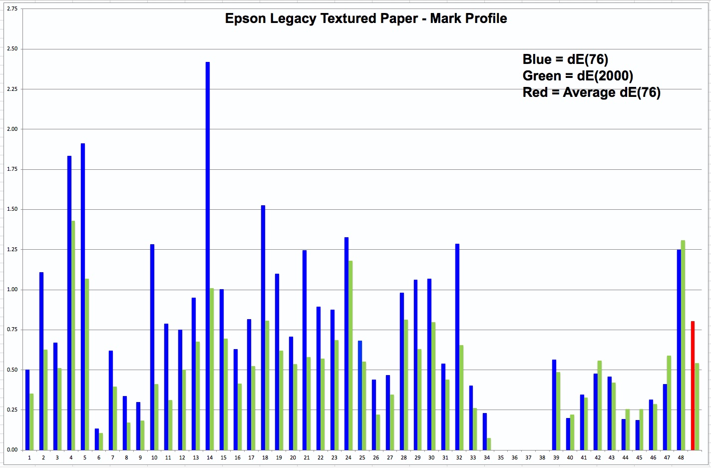
Starting with the 44-patch test (48 patches minus the four darkest blacks that are out of gamut), Figure 3 is a reminder of what the new target looks like; Figures 4, and 5 show the 44 results and the averages for the Epson and Mark profiles respectively.

Please note the difference of the left-side scale for the two charts, and in particular, the average dE values in row 20 of Figure 2.
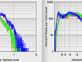
Figures 6 and 7 show the grayscale renditions for both the Epson and Mark profiles respectively:
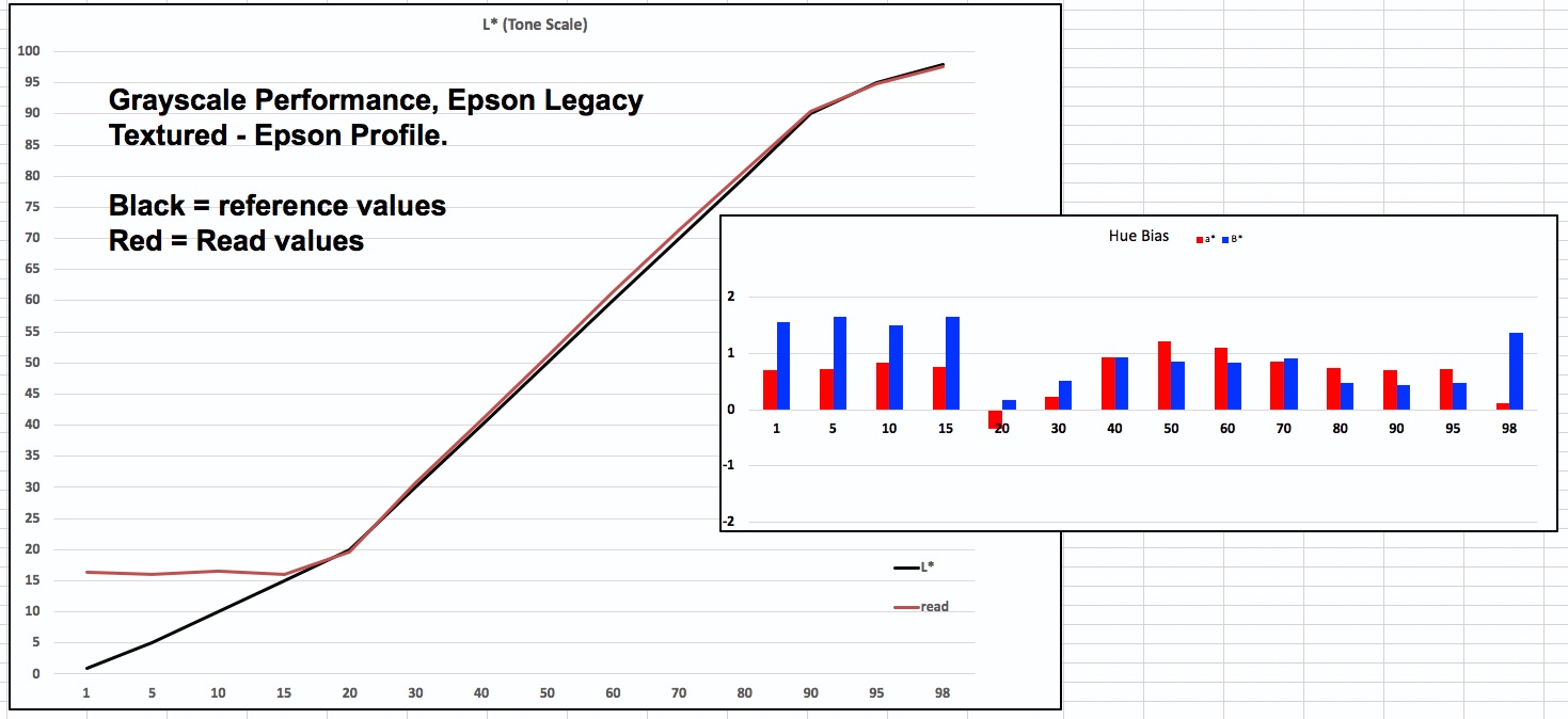

It is apparent from these graphs that grayscale performance is very good, there being, of course, a moderate advantage to the custom profile for the same reasons as noted above. I remind (from my previous article explaining this analysis format) that the closer the convergence of the red line (printed read values) with the black reference values in the left larger graph, the more accurate the reproduction of the tone scale, and the closer the red and blue bars to the zero line (horizontal axis) in the right smaller graph, the more neutral the gray. Because these graphs work in increments of 10 and the appearance of the graphed lines is somewhat compressed, a more accurate reading of grayscale performance comes from the three detailed targets that cover each L* value from L*1 to L*100 in increments of one. These results appear in Figures 8, 9, 10, 11, 12 and 13.
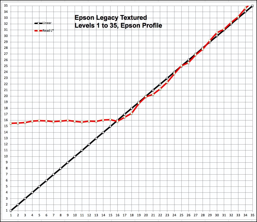
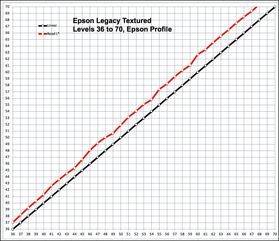
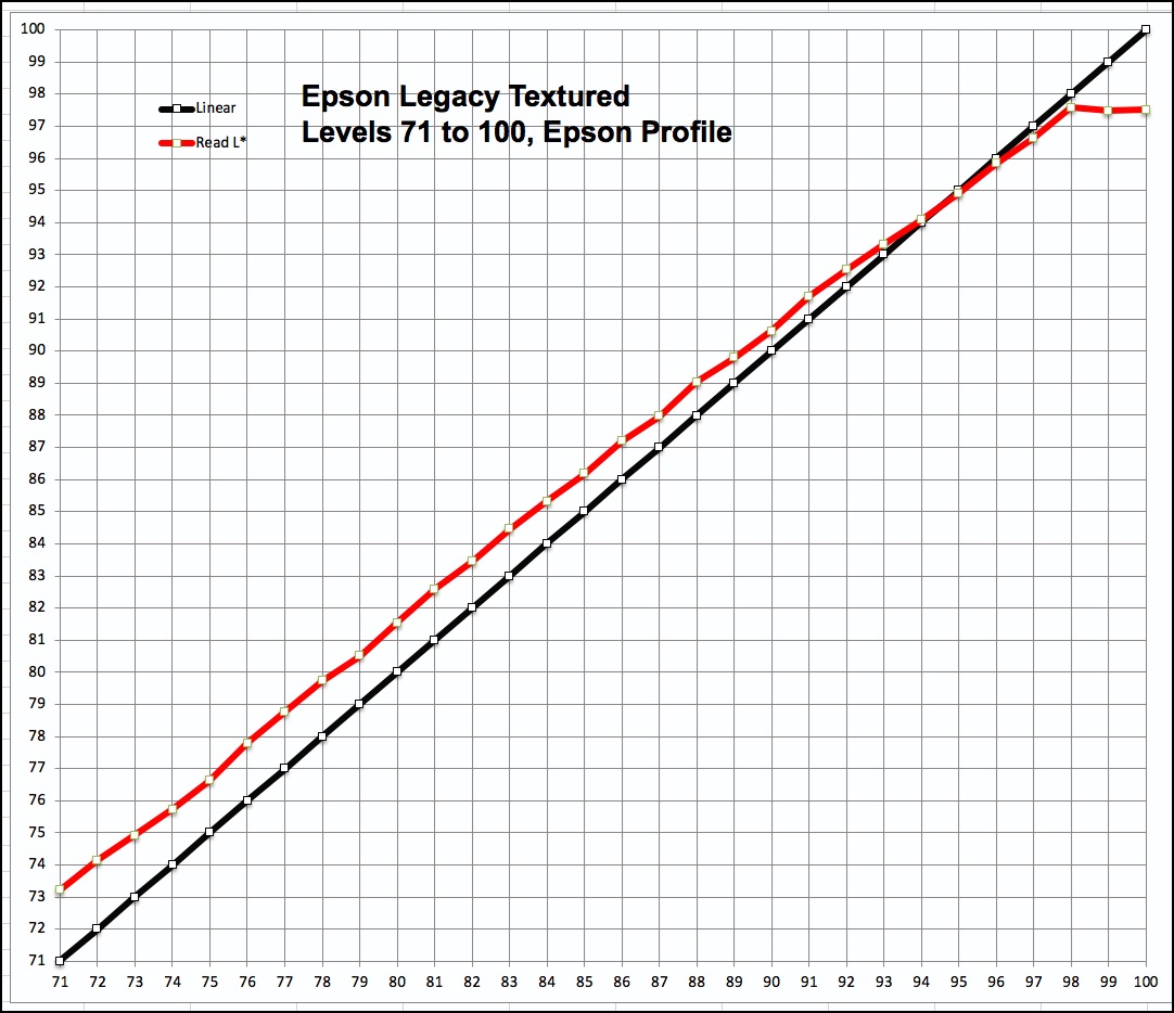
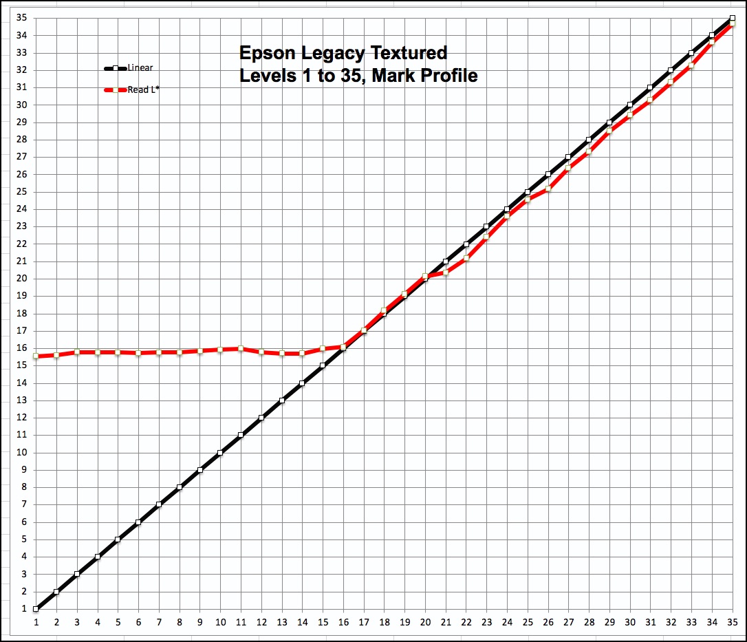
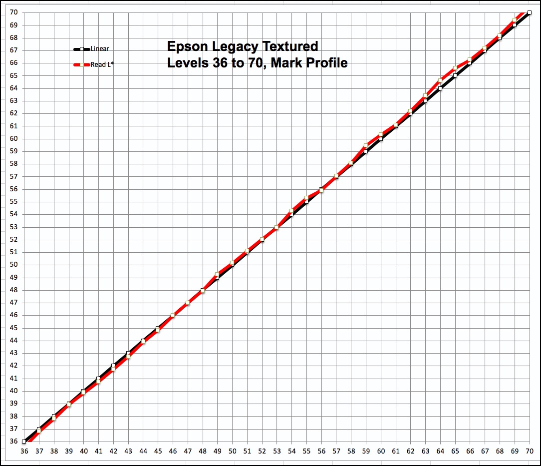
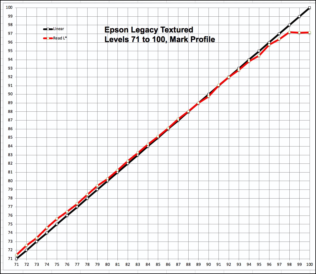
The linearity of the results for the custom profile is impressive throughout. For the Epson profile, the mid-tones show moderate exaggeration of brightness, but the discrepancies are quite linear, so apart from being a Level or so brighter than the reference values, they shouldn’t show a discontinuity. On the whole, the paper handles the grayscale very well and therefore should be able to show Black and White photographs nicely.
Moving from the world of numbers and graphs to real photos, Figure 14 shows a scan of the Atkinson printer evaluation target printed with the custom profile.
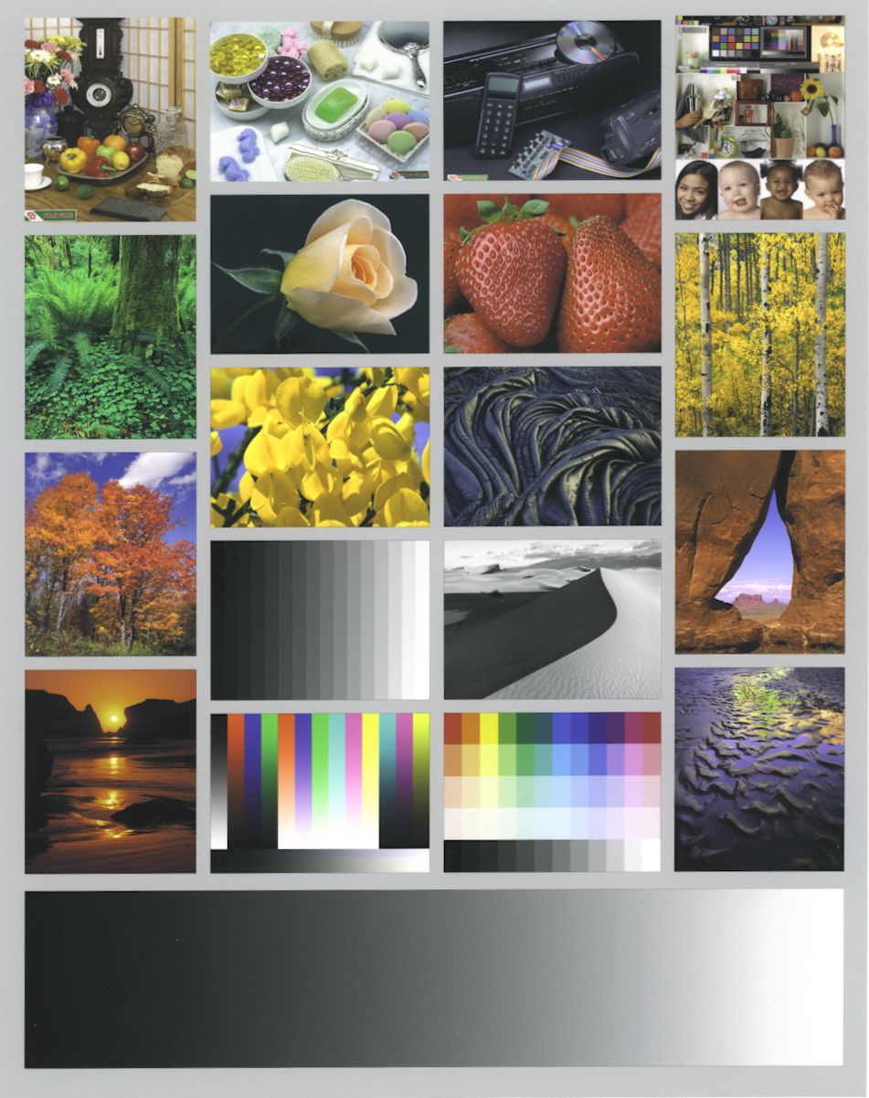
As normal usage for a target of this kind, I made no adjustments to the target image before printing it. The scan (made in an Epson V850 scanner with SilverFast 8) is quite faithful to the print. Adding a bit of Vibrance and Clarity (say in Lightroom) would moderately enhance it.
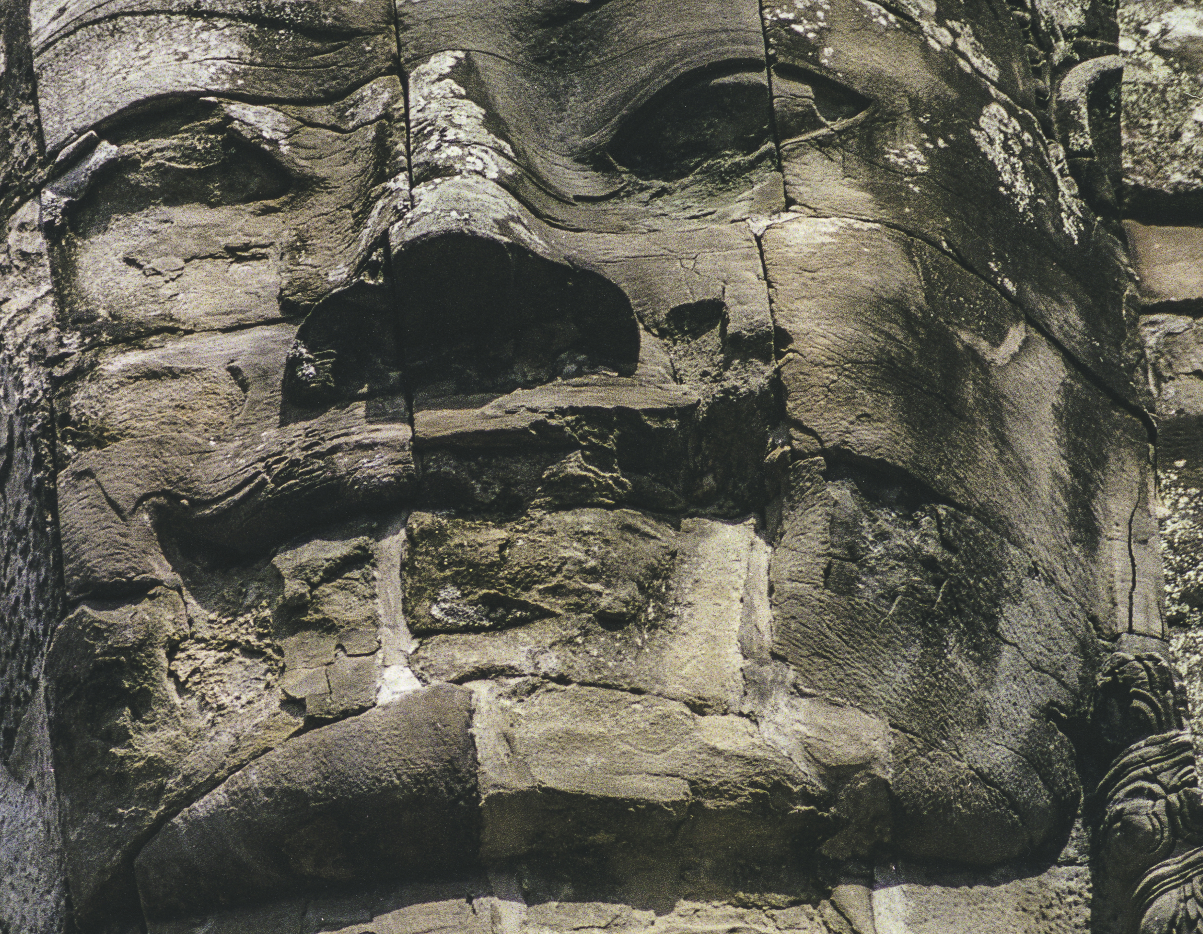
I also wanted to verify how well it reveals image detail. At the same time that I was testing this paper, I’ve been working on what I call a “Very High-Resolution Imaging System (VHRIS)” for digitizing and printing photos made with 35mm colour negative material. (I’ll be revealing what this is all about in a subsequent article to be published on this website.) Figure 15 is an approximate 10”x 8” extract I made in the Epson V850 scanner of the original print which measures 17”wide by 25” long. The ability of VHRIS to scrape off both wanted and unwanted detail from this film (Fuji Superia Reala – no longer made) is quite remarkable, and this paper reproduces it nicely, so I can endorse Epson’s claim that the paper reproduces detail very well, notwithstanding its textured surface – the point being that the texture does not interfere with reproducing the detail in the photograph.
You can almost scrape the back of your hand on this image! I showed the full-length print to a well-traveled couple who appreciates ancient structures and monuments. They were very favourably impressed with this print, especially liking the paper and how well it suited the subject. That comment of course makes a key point about the importance of appropriately matching papers with subjects. So, for those subjects that like matte papers, I can recommend Epson Legacy Textured as a good choice.
Mark D Segal
August 2019
Toronto, ON
Mark has been making photographs for the past seven decades and started adopting a digital workflow in 1999 first with scanning film, then going fully digital in 2004. He has worked with a considerable range of software, equipment, materials and techniques over the years, accumulated substantial experience as an author, educator and communicator in several fields, was a frequent contributor to the Luminous-Landscape website and now contributes frequently with in-depth articles on the PhotoPXL website. Mark has contributed over 75 articles to the two websites up to Q1-2024, with a particular emphasis on printers and papers, given his view that a photograph printed on paper remains the epitome of fine photography, as it has been from soon after the medium was invented and started gaining momentum in the 1830s/1840s. Mark developed a particular interest in film scanning and authored the ebook “Scanning Workflows with SilverFast 8, SilverFast HDR, Adobe Photoshop Lightroom and Adobe Photoshop” (please check our Store for availability). In his “other life” (the one that pays for the photography), Mark is a retiree from the World Bank Group and was a consultant in electric power development.