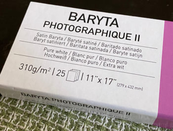
Red River Palo Duro Baryta Fiber 300
Red River Palo Duro Baryta Fiber 300 (RRPDBF)
A Recent Addition to the Baryta-based Luster Papers and M3 Redux
This paper appeared on the market earlier in 2020. I started into the review soon after that, but several aspects of the profiling, compounded by the disruptions attributable to COVID-19 resulted in delayed completion; however, the technical matters are now dealt with, allowing me to bundle up what will be a somewhat longish article for a paper review. That is because when I started testing the paper using Red River’s profile for my Epson SC-P5000, I quickly realized I was dealing with an “M3” profile, which is different from the usual M0/M1/M2 profiles. I’ll get into explaining all that further below.
My first treatment of M3 profiling was in this article from 2017 for Red River’s Palo Duro Etching paper, a matte offering, also having an M3 profile. Fast forward to now, and we have an M3 profile, again from Chromix, for RRPDBF. However, this is not a matte paper, so the character and outcomes of an M3 profile for this paper could differ from the previous findings for the Etching paper. These considerations led me into a fairly extensive exercise comparing M3 with M0 profiles for their relative suitability with this paper. This information, combined with your own trials of the Red River profile, should help you decide whether to use it, or a custom profile.
Before we get into all that, a few words about the paper itself. This paper has a finely textured soft-gloss luster surface on an alpha-cellulose substrate that has a matte-like feel. The Epson Media Type is Epson Premium Photo Paper Semi-Gloss, and the Canon is Photo Paper Pro Luster. Red River does not recommend it for HP desktop printers. To print problem-free it is best to set the paper thickness to 5 and the platen gap to “Wide”. Red River recommends leaving High Speed printing turned off for best print quality. The paper weight is 300gsm, thickness 13.8 mil and has no OBA content. It comes in a large range of sizes in sheets and rolls, details here.
As usual for my paper reviews, I’ll provide a statistical summary of findings from the profiles and evaluation of the profiles for both the Red River supplied M3 Profile (“OEM”) and my custom-made M0 profile. Then I proceed into an appreciation of images made with these profiles. I delve into this latter aspect a bit more than usual in this review because of the “M3” consideration.
So, what are these “measurement conditions” (“M” conditions)? The “Measurement Condition” or “Measurement Mode” defines the character of the light source (according to ISO standards) for measuring colors, as we do when measuring profiling targets for making paper/printer profiles or measuring the results of printing with those profiles.
In 2011, X-Rite produced a technical paper describing these measurement conditions in some detail, which paper is on their website here. As X-Rite explains in this paper, “the need for the M series is driven by the color changes seen in materials containing OBAs (optical brightening agents) when viewed with different light sources.”
In a nutshell, the distinction between the four Measurement Conditions boils down to this for profile-making:
M0: Includes measurement of OBAs and is based on 2856K illuminant (Standard Illuminant A).
M1: Includes measurement of OBAs and is based on measurement matching CIE illuminant D50 (but see qualifications in the X-Rite paper).
M2: Excludes measurement of OBAs (also known as “UV cut”).
M3: defines the effect of polarization – used in conjunction with M2 to minimize surface reflections..
According to the X-Rite paper, M0 is the de facto standard measurement illumination condition for the graphic arts. But this White Paper was written in 2011. Nine years have elapsed and more current thinking (in particular from Konica Minolta) suggests that M0 is an outdated legacy mode and that M1 is a more suitable standard for measuring colours, because it uses the now current ISO standard 3664 for the graphic arts industry, which specifies CIE illuminant D50. Fortunately, for purposes of this paper, it doesn’t matter whether one uses M0, M1 or M2 because the paper has no OBA content. However, using M3 does matter, because it has a large effect on the character of the profile. In principle, it is supposed to enhance black density, shadow detail and highlight detail. In this paper I compare M0 with M3 because my custom profile is M0 and the Red River profile made by Chromix is M3.
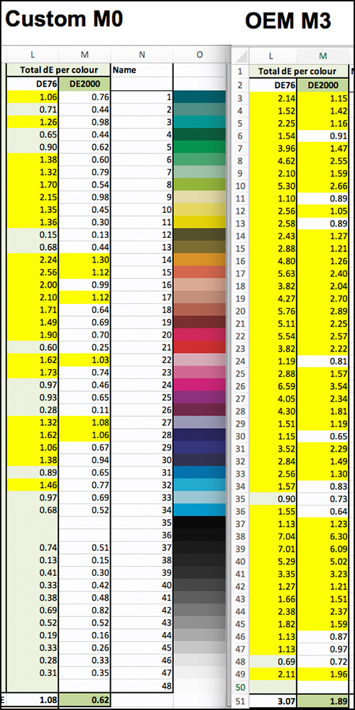
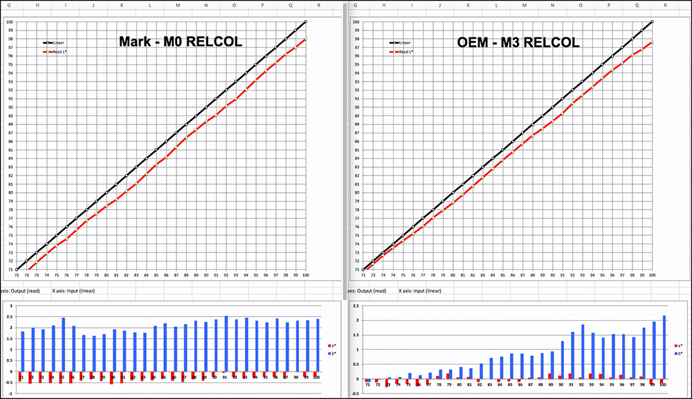
My procedure was to undertake a complete set of parallel tests on both the Red River M3 profile and my custom profile. Figure 1 provides a statistical summary of the profiling results, which I’ll discuss in detail; but first……….
There is a methodological question about the consistency between the M condition used for making the profile, and the M condition used for reading the results of printing with that profile. Should the M condition be the same for both, or does it not matter? Specifically, if the Red River profile is made for M3, should I not read the test results from using that profile with an M3-fitted spectro (which my i1Pro3 is not)? I decided I should test to see whether profiling results are more accurate statistically when an M3 profile outcome is read with an M3-fitted spectro rather than with M0/M1/M2. So, I asked Chromix if they would read two of my test charts produced with their M3 profile using their M3-fitted spectro. They agreed, so using their M3 profile I printed and sent them my 48-patch multi-color and 35-patch neutral Dark Tone evaluation targets. They read them in M3 and sent the results to me. I also read those evaluation targets in M0 using my i1Po 3 spectro. That is why there is a duplicated “read on Paper” column on the right side of the Figure 1 table. So, column F “OEM-M3_M3” is the data from the Chromix M3 reading. Column G, “OEM-M3_read w. M0” is the data from my M0 reading of the same test charts.
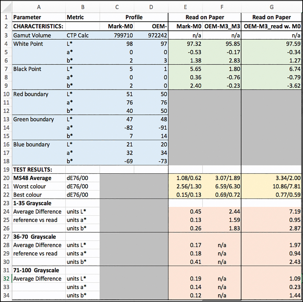
Before getting into the “M condition” comparisons, let us look first at the data describing the profiles, in the feint-blue upper-left quadrant of Figure 1.
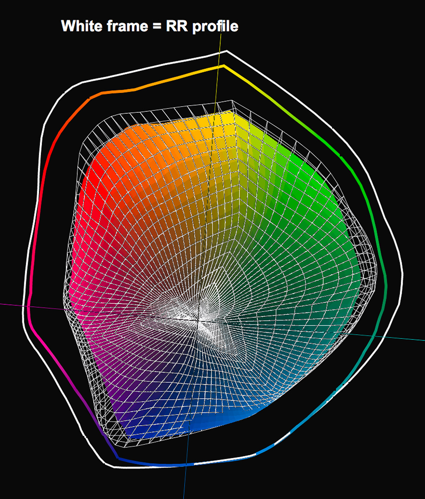
The gamut volume (row 3) differs a lot between the two profiles – my M0 profile produces a gamut volume of about 800K (cell C3), while their M3 profile indicates gamut volume of over 972K (cell D3). The reason for the larger M3 gamut volume is that polarization augments (i) the reading of Maximum Black, i.e. – minimum L* of 1 in their profile versus 5 in mine (cells 7C and 7D) and(ii) the saturation of the b* channel (column C versus D, rows 12, 15 and 18). Figures 2 and 3 show these factors in the profile gamut plots from ColorThink Pro. The White frame and white contour describe the M3 profile. The M0 profile gamut plot is in “True Color”. The White Frame encompasses the darker tones of the M0 profile completely and a bit of the lighter tones too.

Turning to comparative profile performance, the upper right quadrant in Figure 1, feint-green, shows how these profiles perform on paper in respect of White Point and Black Point. We would expect the results on paper to at least somewhat reflect the profile characteristics.
In the feint-green quadrant, let us compare my profile (M0) with Red River’s M3 profile read with an M3-fitted spectro (columns E and F), first for maximum White and then for maximum Black.
Here we see that for the White point (rows 4,5,6) compared with the M3 profile read in M3, my M0 profile provides slightly brighter White, a slightly larger green bias in the White Point (though undetectable to an observer) and a slightly smaller yellow bias (only slightly detectable). No big deal for differences between M0 and M3 here, and that also applies to similar data in Column G reporting on the M3 profile results read in M0 measurement condition.
It’s a different story for maximum Black (rows 7, 8 and 9 in the feint-green quadrant). Using my M0 profile and reading the maximum Black result off the paper in M0, or using the Red River M3 profile but reading the same result in M0, I get L* values of 5.65 and 6.74 respectively for maximum Black, which is several levels weaker than one gets from some other Luster-type papers printed with Photo Black ink (and also profiled and measured in M0/M1/M2).
HOWEVER, when the result of the M3 profile is read with an M3-fitted spectro, the indicated maximum Black is L* 1.8, which is pretty stellar if that’s what one sees in reality. As well, the b* channel neutrality is statistically better for the case of the M3 profile read with the M3-fitted instrument, (-0.23 versus 2.40 or -3.62 using M0).
In a nutshell, we have an early indication here that if one uses an M3 profile and measures the printed results with an M3-fitted spectro, there is a statistically recorded advantage in terms of the depth and neutrality of maximum Black.
But unlike M3-fitted spectrophotometers, human beings don’t look at prints through polarized light (or at least I don’t think we do). Therefore, what’s “true” in terms of what we see under “normal” viewing conditions remains to be observed. This is best done with purpose-built real-world photographs, which I do below; however, first I finish analyzing overall comparative profile performance accuracy for colours and grayscale. I do this for (i) my custom M0 profile, (ii) Red River’s M3 profile reading the test results with an M3-fitted spectro and (iii) same M3 profile but with M0 measurement of the test results.
The 48-patch (Figure 4) colour/grayscale target measurement results are in the feint-gold section of the table in Figure 1 columns E, F, and G rows 20, 21 and 22. The numbers in the cells before the slash (/) are dE(76) and after the “/” dE(2000).
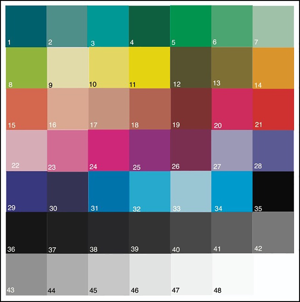
To remind readers, dE(76) in this usage measures the absolute arithmetic difference between a colour value in the image file of a test target and its measured value in a print, while dE(2000) is a more complex calculation of colour differences that is supposed to more consistently portray numerically the impression of such differences on the viewers. We should focus more on dE(2000) for practical purposes, but I show both.
The smaller the dE values the better the print reflects the intent of the image file values. dE values below 1.0 are supposed to be insignificantly perceptible to the “standard observer”, while values above 1.0 are supposed to be more perceptible. Hence, when an average of 48 patch values exceeds 1.0, we know there are individual values considerably exceeding 1.0.
Starting with the average of the 48 patch dE values in Figure 1 row 20 (which excludes one or two values that are out of gamut at the top and bottom of the grayscale), the lowest dE(2000) and therefore the most perceptibly accurate outcome is for my M0 custom profile at dE(2000) 0.62.
For the Red River M3 profile test target, the average dE(2000) values are higher at dE 1.89 (M3) and dE 2.0 (M0).
Row 21 shows that the highest dE(2000) for my M0 profile is 1.30, while for the Red River M3 profile it is 6.3 and 7.8 for their M3 reading and my M0 reading respectively. For both profiles and all three readings row 22 indicates the dE values for the best performing colours are all well below 1.0.
In a nutshell, this little section of Figure 1 tells us two things: (1) my custom profile using M0 produces more accurate outcomes in print than Red River’s M3 profile used in my printer, and (2) one obtains somewhat lower dE values by using an M3-fitted spectro to read the results of M3 profiles – kind of what I expected.
Rows 23 to 34 are dedicated to measuring the fidelity of the printed grayscale, given the widespread interest in how well these papers can accurately reproduce B&W tones. For reminder, my grayscale test targets cover the range from L*1 to L*100 in one L* increments divided into three targets (Figure 5).
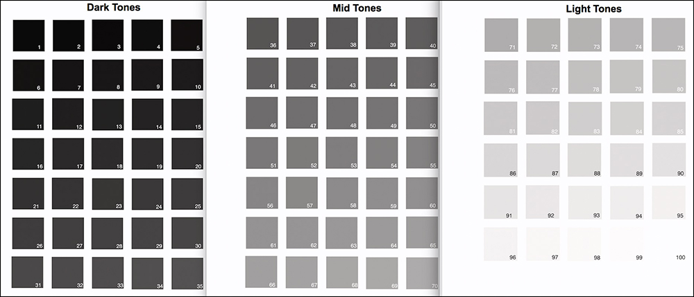
In Figure 1, lower right feint-orange quadrant, rows 24~26 cover the Dark tones, rows 28~30 the Mid tones, and rows 31~34 the Light tones. The data reports the average absolute differences between the target image values for each patch and their printed counterparts for each of L*, a* and b* channels. The closer all the differences are to zero, the more accurate and the more neutral the grayscale rendition.
For all three targets, the custom M0 profile (column E) is the most accurate performer, there being, on average, little discrepancy between target and achieved values for all three channels. The Red River M3 profile test results read in M3 measurement mode are somewhat fair, while the same read in M0 measurement mode are poor for L*, satisfactory for a* and somewhat fair for b*.
I would caution before jumping to conclusions about the relative merits of these profiles that, especially when dealing with Measurement Conditions, one’s impression from just looking at apparently unfavorable numbers could be an exaggeration of problems actually visible in prints. So, we still need to examine the prints of real diagnostic photographs, which I made for both profiles and demonstrate below. But first, let’s have a look at Figures 6 to 9 below, illustrating the details behind some of the summary data above.
All patches highlighted in Yellow (Figure 6) have dE values greater than 1.0. My M0 profile has 6 greater than dE(2000) 1.0, the maximum being 1.3, while the M3 profile has 36 greater than dE(2000) 1.0, the highest being 6.3. Out of gamut colours are excluded from the results. Many of the M3 results fall within a range of 1.5~3.0, which while not ideal, is not necessarily problematic. Pertinent to Figures 6, 7 8 and 9, the differences of accuracy between these two profiles may not be only on account of the difference of measurement conditions. Part of it may be, as usual, that a profile made for the OEM printer may not be exactly right for my printer, even though they are of the same model. There may also be differences of profiling settings and spectrophotometers between themselves and me.
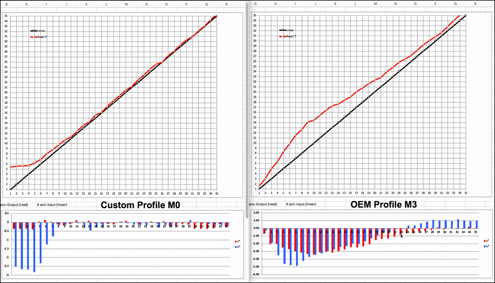
Before exploring Figures 7, 8 and 9, I’ll remind how to interpret them. The upper portion reports on Luminance (L*) results. The Black line shows the target file reference values for each patch, which climb the tone scale in equal increments of 1 L* value. This is tonal gradation. A photograph needs tonal gradation to distinguish detail, and all the more crucially in the dark tones if one wants to reveal photogenic shadow detail. The red line shows the results of reading those patches on the print. The closer the red line converges with the Black line, the more accurately the printing condition is reproducing the file values (and the better the “linearity”). (“Printing condition” is the printer/paper/profile combination.)
The bottom portion reports on hue bias (departure from neutral gray), being a representation of the a* and b* values’ distance from zero. Remember in the Lab colour language, a* represents a red/magenta to green/cyan trajectory, and b* represents a yellow to blue trajectory. When a* and b* are zero, the hue is neutral gray. The longer those bars in the chart project from zero (the horizontal axis), the greater the hue bias. Projection below the axis is cool-tone bias (green, blue, cyan) and above the axis is warm tone bias (red, magenta, yellow). If there were no hue bias, there would be no bars.
Note the left side axis legend for the a*/b* values in each case, because they differ from chart to chart. Bars shorter than +/- 1.0 are of little or no concern, while bars greater than 1.5~2.0 begin to indicate some possible concern about noticeable hue bias in what should be neutral gray.
The prints from which these results are read were printed with Absolute Colorimetric Rendering Intent (ABSCOL), which is appropriate for evaluating how accurately a printing condition renders image file colour values, as it does not adjust them. For normal photos we would often use Relative Colorimetric Intent (RELCOL) with Black Point Compensation (BPC). I’ll get into the relevance of that distinction when we examine the prints.
For the M0 custom profile as portrayed in Figure 7 left, seen through regular non-polarized light, all L* values below about 5.6 are out of gamut for this printing condition. With no adjustments, any values below L*5.6 would be an undifferentiated blackish blob. From target file value about L*6 upward the printed tone scale shows quite accurate tonal gradation.
The right side of Figure 7 presents a very different picture of tonal rendition using an M3 profile, results of which are “seen” or “read” through polarized light. The darkest tone is a very low L*1.56, and from there upward, there is a relatively high and steep slope of the read curve relative to the reference curve, meaning that the profile is adding both brightness and contrast relative to the reference values of the target. This would provide for more obvious separation of dark tones at the cost of accuracy, when viewed through polarized light. The whole red curve progresses into the mid-tones brighter than its reference values.
Now suppose we didn’t have polarized light for reading the results of using that M3 profile, but instead relied on M0/M1/M2 kind of illumination? The comparison of reading the same target print – the print generated from an M3 profile – with either M3 or M0 measurement condition is shown in Figure 7a. The left side of 7a is the same as the right side of Figure 7, provided for convenience of the comparison.

The right side of 7a shows the result of reading the print from the M3 profile using M0 measurement condition. Notice this time the maximum Black is L* 8.3 relative to a file value of L*1.0 and the read values exceed the file values by about 10 levels once the file reference value reaches L*12. The read values then begin to gradually move closer to their reference values.
The steep gradation and elevated positioning of the red curve relative to the reference values shows how the M3 profile result provides a very substantial boost of brightness and contrast in the lower dark tones when seen with say D50 illumination. It’s totally inaccurate but it may produce a pleasing photograph if the goal is to clearly see lots of deep tonal detail. But it comes at the sacrifice of some overall “blackness”. This really illustrates analytically the heart of the case for M3 profiles. The lower portions of Figures 7 and 7a also show that the Custom profile in M0 measurement condition provides much more accurate rendition of grayscale neutrality.
Figures 8 and 9 are comparisons of the M3 and M0 profiles for the mid-tones and highlight tones respectively. The stories here are much less interesting.
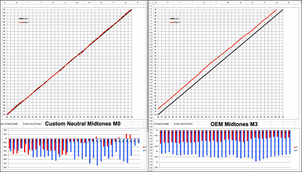
The M0 custom profile printing condition does a stellar job of maintaining an accurate, linear rendition of the grayscale mid-tones. For the M3 profile, the L* gradiant is also excellent, though the rendition is persistently about L* 1.5~2.5 levels above the reference values, and its hue neutrality is not as good.
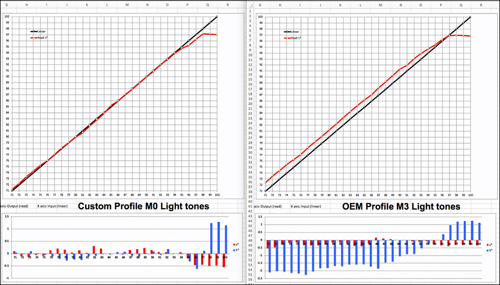
The comparison between the profiles for the highlight tones (Figure 9) is similar to that for the mid-tones, the main difference being that for the M3 profile the printed L* values converge a bit closer with the reference values than they did for the mid-tones.
Summing-up the statistical evidence to this point, it is fair to say that the Custom M0 profile is the more accurate and its grayscale neutrality is better than that of the OEM M3 profile. The M3 profile however provides the capability to boost dark shadow tones in a way that may be suitable in photographs for which this is a desirable property. It’s still premature to conclude which profile is “better” to use. We’ll understand why just below.
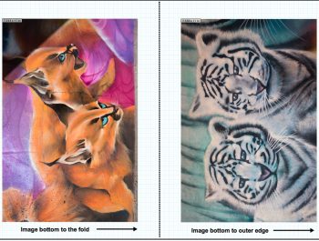
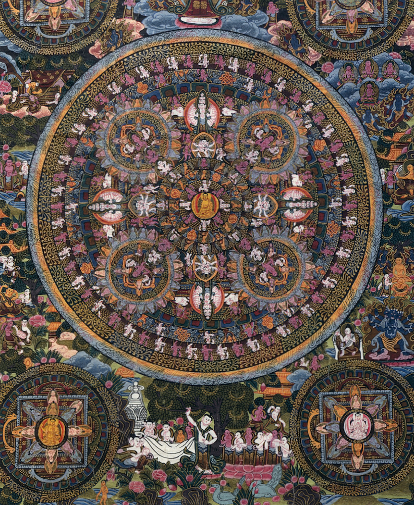
Having now seen the statistical aspects of how these profiles work, I turn to an examination of real-world photographs to complete the review of this paper. These photographs are purpose-built for evaluating printing conditions. I start with the Atkinson Printer Test Page, then selected images from the Roman 16 reference image set published by the German Printing and Media Industries Federation (BVDM). I printed all in an Epson SC-P5000 printer using Relative Colorimetric Rendering Intent with BPC, thus replicating usual printing conditions for a great many people. No other adjustments are made to these images.
Atkinson Printer Test Page:

Both in Figure 10 and holding the prints in hand under D50 viewing conditions, it has to be said that the differences between them are subtle. The print made with the Custom M0 profile has slightly more overall density, so there is slightly less separation between the very dark tones in the M0 version than in the M3 version. Colors are a bit brighter and perceptually slightly less saturated in the M3 version, also expected from the comparative red curve positioning in the foregoing Figures. The M3 version has a slightly cooler rendition of neutrals, again as expected from the evidence of the test charts. You don’t see glaring colour errors in either print.
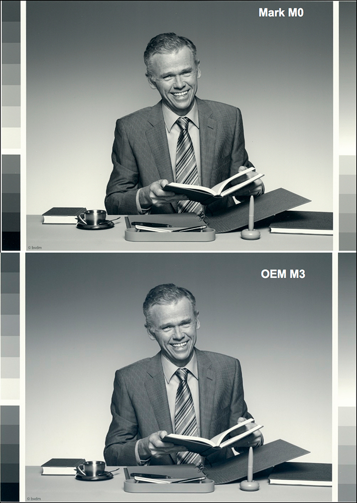
Neutral Dark Tones (L*1 to L*35)
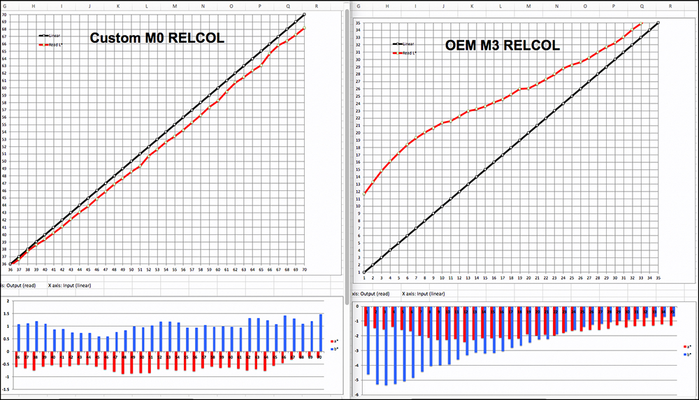
A typical choice facing a great many people printing normal photographs would be whether to use the custom profile or the OEM profile when printing with RELCOL and BPC. Unlike ABSCOL which makes no such adjustments, RELCOL w. BPC remaps the White point of the image colour space to the White point of the printer profile and it maps the Black point of the image colour space to the Black point of the printer profile and the rest of the tonal range is scaled accordingly. In this case, we would be comparing the Red River profile made in M3 with my profile made in M0 (Figure 11), both viewed under D50 (or so) lighting conditions.

The graphs show that the Custom M0 profile should produce results that are both more accurate and more neutral than the OEM M3 profile, and that on the whole the result from the OEM M3 profile will be brighter than that from the Custom M0 profile. Let us see what that looks like in a real photographic evaluation image (Figure 12).

The differences between these two images in Figure 12 are rather subtle, and I should add – slightly more obvious in the handheld prints, which we cannot do over the Internet, but if you look at them long and hard enough you may observe the overall brighter tonality of the OEM result, it’s relatively cooler (less neutral) appearance (especially in the background gradient) and its somewhat more obvious revelation of shadow detail. All of this is expected from the relative shape and positioning of the red curves and the hue bias bars in Figure 12 (scans of the prints), but the extent of the perceptual difference in the prints may be less than what one would infer looking at numbers and curves in Figure 12. So, the choice here boils down to what you like better, not forgetting that we can make adjustments to our photos in our image editing applications. In fact I tried exactly that (Figure 13, screen-grab) starting with my custom profile softproof (upper portion of Figure 12) and superimposing on it a Curves lock-down with only the lower 4 (of 10) Curve points adjusted to increase brightness and contrast (to taste) in the lower dark tones.

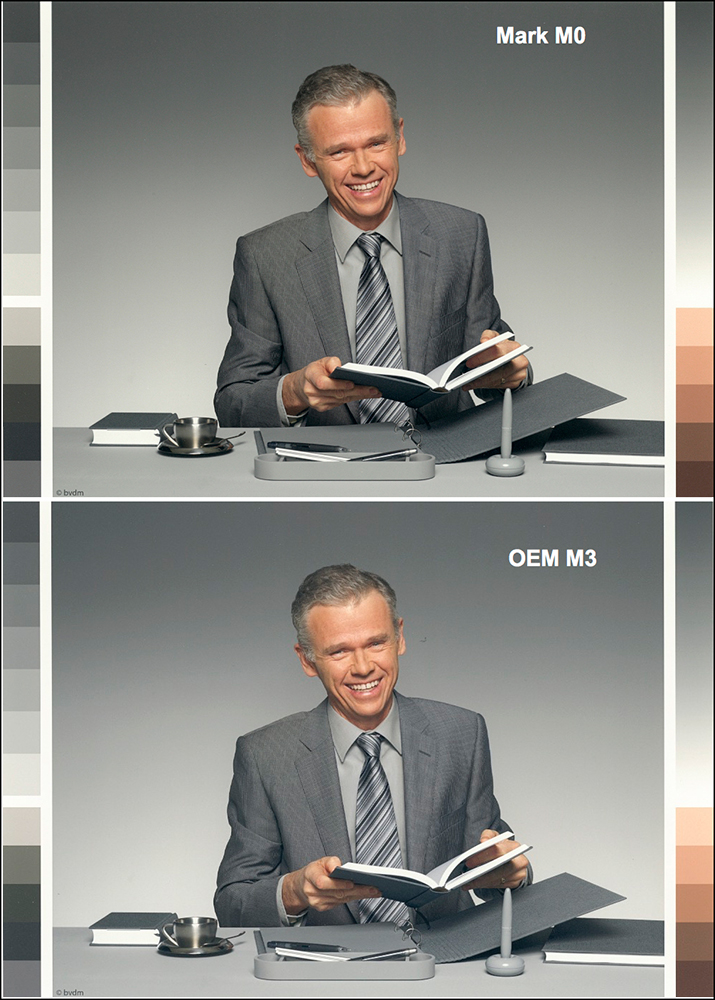
Mid Tones
BVDM provides two mid-tone images in the Roman 16 set, one in B&W and the other in colour for examining rendition of a Caucasian flesh tone. Let us start with scans of the B&W version. Firstly, I show the RELCOL comparison of the Custom M0 and the OEM M3 profiles in graphical representation (Figure 14), then we look at the photos (Figure 15).
From reading the Figure 14 graphs, the expectation is that the OEM M3 version of the print will be brighter and less hue-neutral than the Custom M0 version. Now let’s see.
Sure enough, upon close examination of Figure 15 what we expected from Figure 14 happens in Figure 15. The OEM M3 version is a bit brighter and it has a slight bluish bias compared with the Custom M0 version. Personally, I find the Custom M0 version a bit heavy relative to the image itself and looks perhaps a slight bit on the warm side of gray, but this is easily correctable in processing, as would be removal of the stronger blue bias in the M3 version. Despite what may appear to be major differences between these results from looking at the graphs, the photos themselves appear less different than one may expect.
Turning to the Mid-tone colour photo (Figure 16), the differences between these profiles are somewhat more obvious than they are for the B&W version, and these differences are consistent with the general indications from the graphs of Figure 14. The Custom M0 version is a bit darker, a bit more neutral and a bit more saturated than the OEM M3 version.
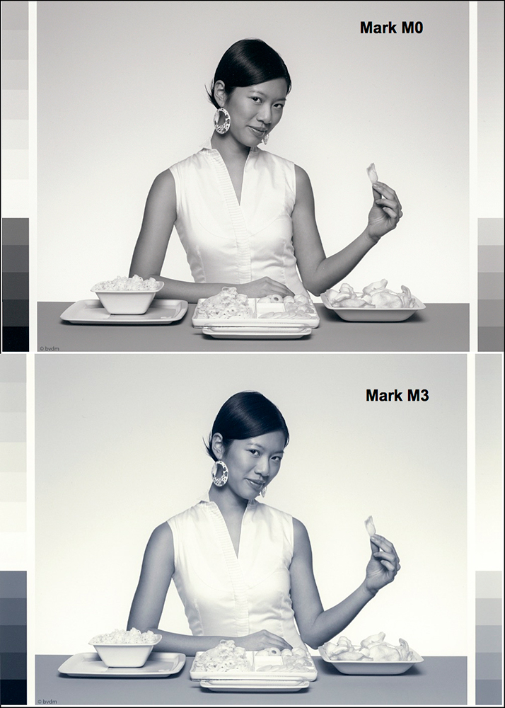
Highlight Tones
The RELCOL curve shapes (Figure 17) for the highlight segment are quite similar between the M0 and M3 profile renditions, so one should expect the prints to look quite similar. Both of them return read values somewhat below the reference values, but the Custom M0 profile a bit more so. Hence, one should expect a slightly darker interpretation of the image from the Custom profile, and that indeed happens (Figure 18).
The highlight detail in the lady’s dress shows through a bit more easily in the M0 version simply because it is a bit darker than the M3 version. Apart from the that the rendition of the highlight areas differs very little between the two profiles.
Summing up the real photographic results of using these profiles, there’s nothing much to commend the one over the other, at least when the paper is used in an Epson SC-P5000 printer, which is the only one I can test it with. The paper profiles well, and for all those who prefer not to bother with custom profiling, using Red River’s M3 profile will work satisfactorily. It gets one into a ballpark that doesn’t require heavy corrections to get the photo looking exactly as one would like it. Some of this would usually be required with a custom profile anyhow. The images that can go straight from the camera to the printer without any editing are few and far between.
The paper produces a rich, full-bodied image (to the extent the image itself allows) with very good rendition of fine detail and texture. Like so many inkjet paper textures require, it is necessary to look at the photos from normal viewing angles to see them properly. With this paper, you know you have the angle of observation correct when the paper texture is not getting in the way of appreciating the photograph, and this is easily achieved at normal viewing and lighting angles. This is a relatively thick and heavy paper that can withstand handling. Finally, while the documentation for the Red River profile recommends reducing the Color Density setting in the Epson driver to avoid the risk of ink pooling, I did not find that to be at all necessary, so I left this setting at its default position.
Mark D. Segal
October 2020
Toronto, ON
Mark has been making photographs for the past seven decades and started adopting a digital workflow in 1999 first with scanning film, then going fully digital in 2004. He has worked with a considerable range of software, equipment, materials and techniques over the years, accumulated substantial experience as an author, educator and communicator in several fields, was a frequent contributor to the Luminous-Landscape website and now contributes frequently with in-depth articles on the PhotoPXL website. Mark has contributed over 75 articles to the two websites up to Q1-2024, with a particular emphasis on printers and papers, given his view that a photograph printed on paper remains the epitome of fine photography, as it has been from soon after the medium was invented and started gaining momentum in the 1830s/1840s. Mark developed a particular interest in film scanning and authored the ebook “Scanning Workflows with SilverFast 8, SilverFast HDR, Adobe Photoshop Lightroom and Adobe Photoshop” (please check our Store for availability). In his “other life” (the one that pays for the photography), Mark is a retiree from the World Bank Group and was a consultant in electric power development.