Two Moab Papers
Two MOAB Papers
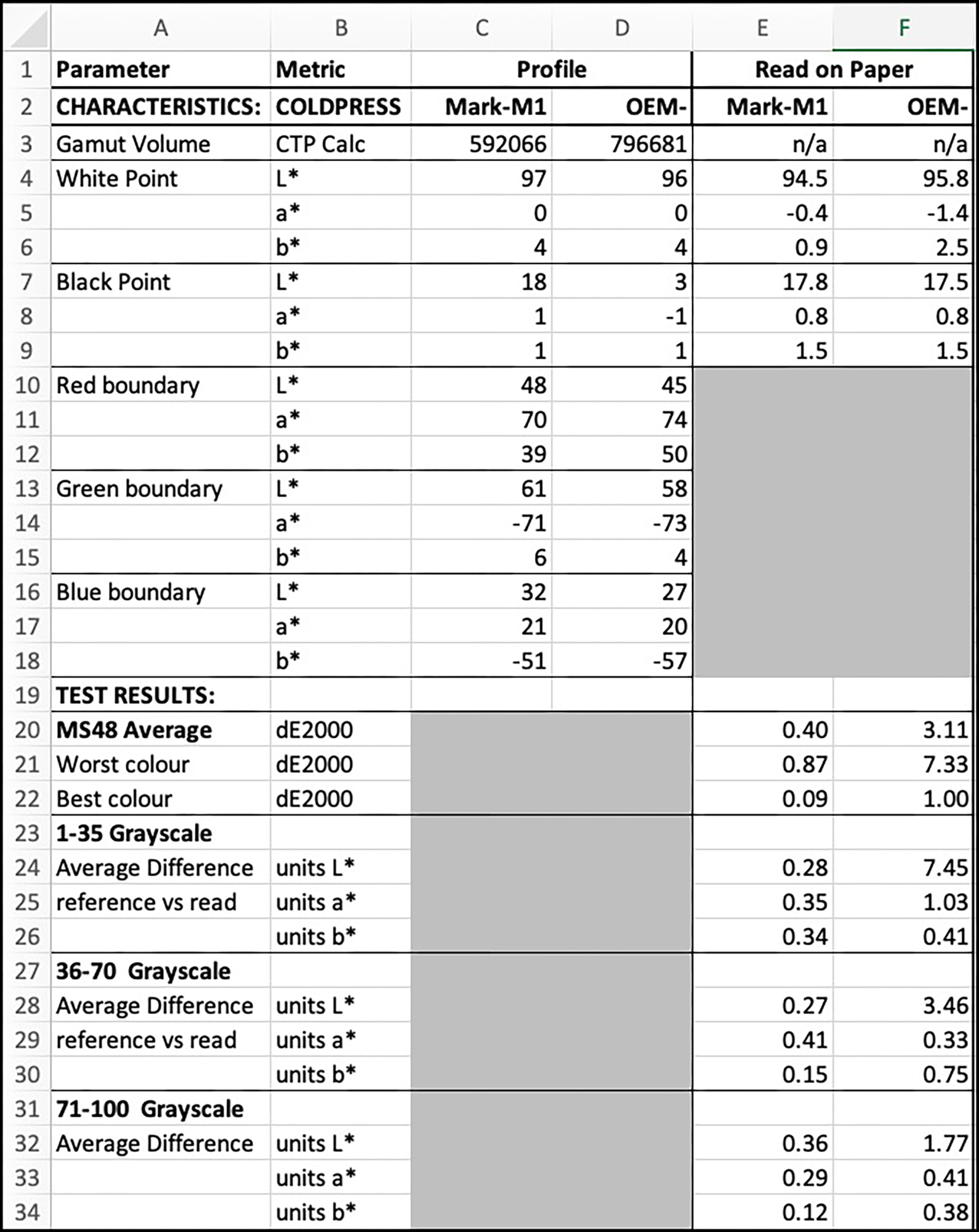
Entrada Rag Natural 300 & Entrada Rag Natural Coldpress 300
Legion Paper recently introduced its Entrada Rag Natural Coldpress 300 (hereafter CP300) paper, so having used and liked its Juniper Baryta paper, I thought it would be useful to test this new one and, better still compare it with its “sibling” Entrada Rag Natural 300 (hereafter RN300) which has been available for some time now, but I had not yet reviewed it. So this is a double-barreled review of both. My conclusion is that both are very pleasing matte papers that print well.
Cold-press and warm-press papers usually have different textures, so I photographed the texture of both surfaces to give readers an impression of what they look like (Figure 1), as a choice of texture could be a primary factor for some people in deciding which to use.
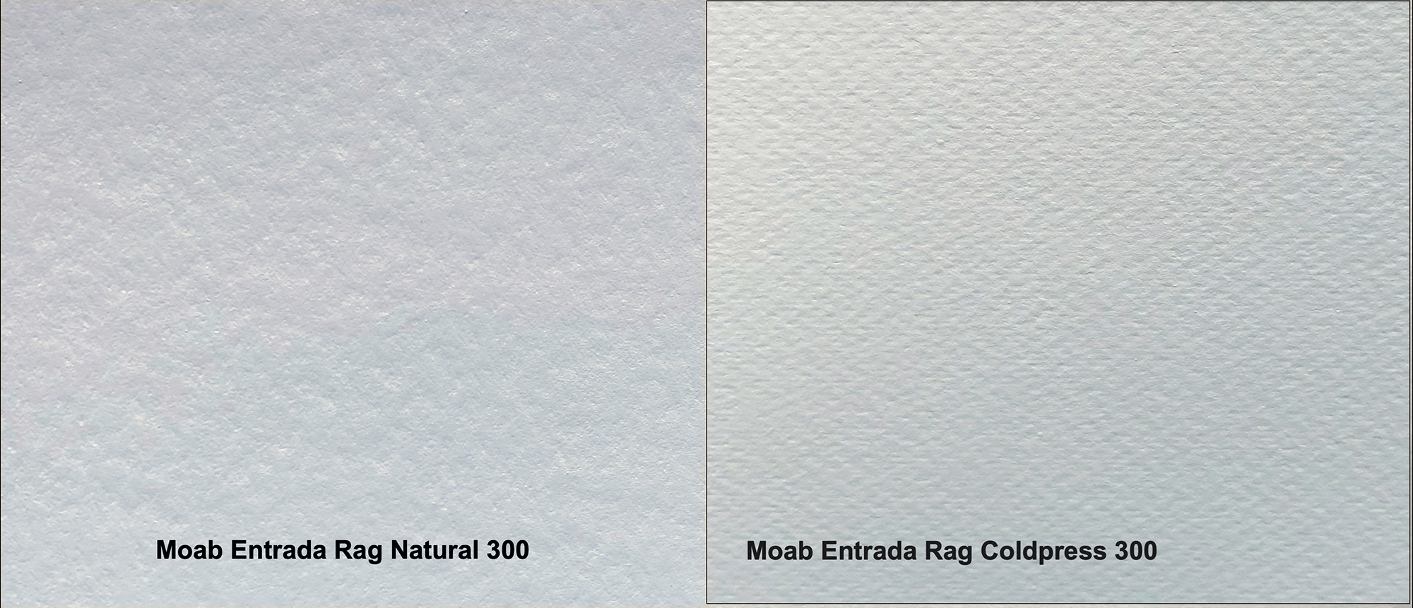
Do not use Figure 1 to compare anything but surface texture. It was darkened intentionally to reveal comparative texture better, and the lighting was uneven and non-neutral.
Both are matte papers with the robust cotton substrate, neither have optical/fluorescing brightening agents, are 300 gsm, and are acid and lignin free. The caliper of RN300 is 22.5 mil, and that of CP300 is 18. RN300 is printable on both sides – I have tried it and it works well, while CP300 is printable on one side. The Media Types to be used in Epson printers for these papers are for CP300, Epson Velvet Fine Art (VFA, Matte) and for RN300, Ultra Premium Presentation Matte Paper (UPPPM) or VFA. More on that below.
My analysis for this review uses the Epson SC-P5000 printer. As usual, I compare results for both the manufacturer (OEM) and my custom profiles. I made my custom profiles for both papers using the Konica-Minolta MYIRO-1 spectrophotometer and accompanying MYIROTools software, as this combination produces the most accurately performing profiles I can achieve.
Profile Characteristics
OEM Profiles
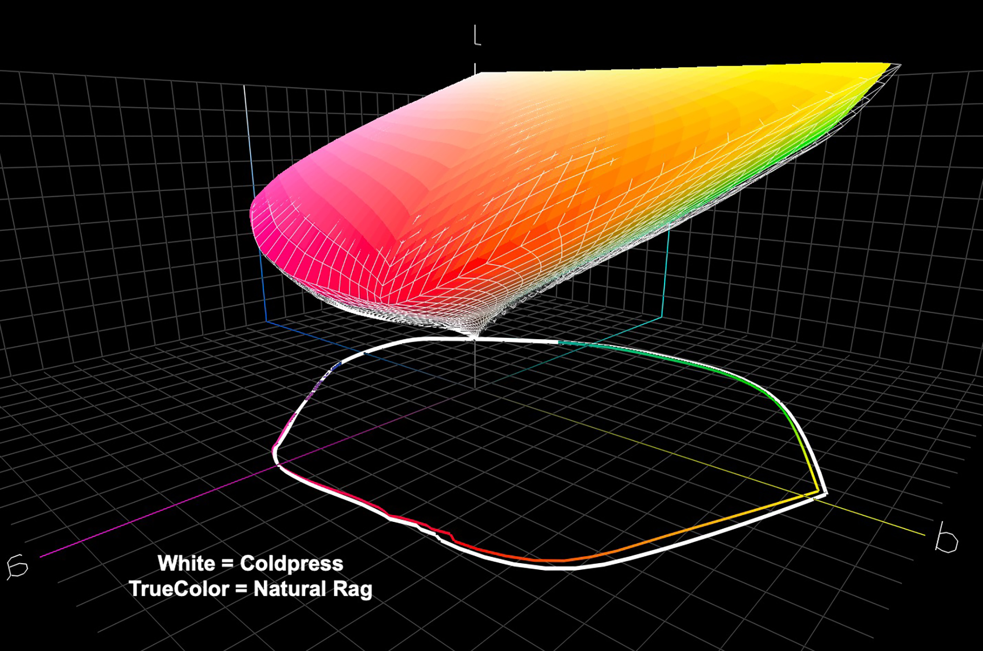
Figure 2 shows the comparative OEM profile analyses from ColorThink Pro.
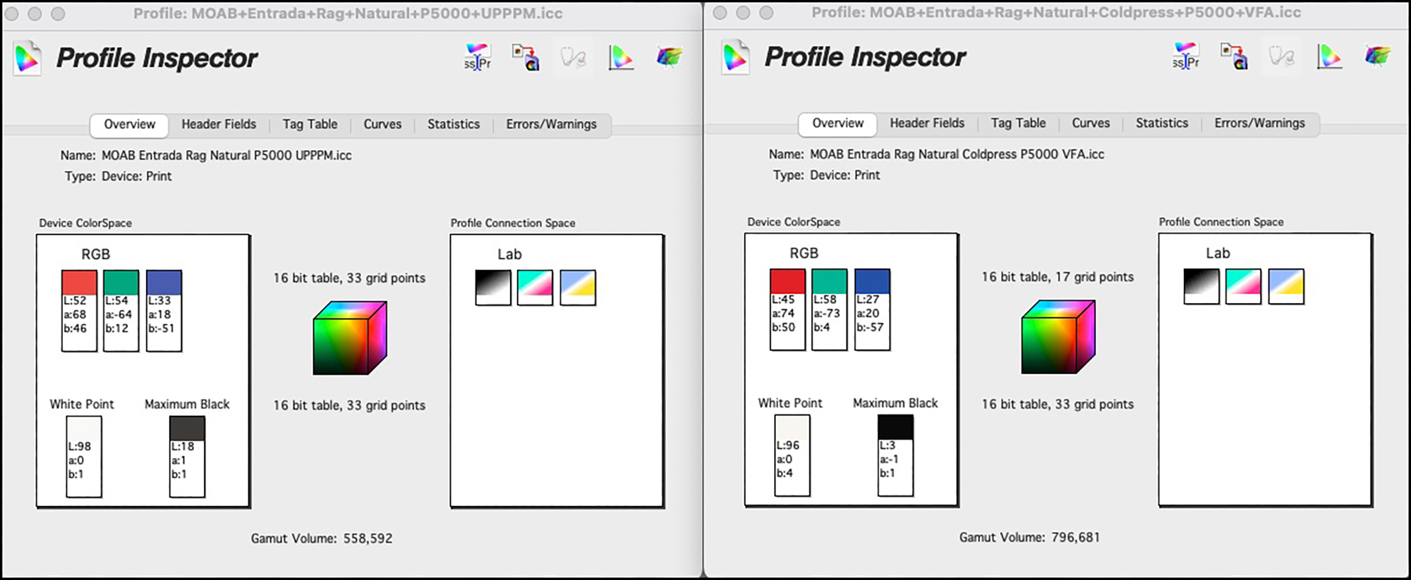
The left panel for RN300 shows a totally expected result for a matte paper. The darkest achievable Black is L*18, gamut volume 558,592. It sits well within the range of other quality matte inkjet papers.
The right panel for CP300 shows a totally UNexpected result for a matte paper: very deep Black and very large gamut volume. This is because Legion paper’s profile is made with the M3 measurement condition (while that for RN300 was M0). M3 reads profile targets using a polarizer in the spectrophotometer. One purpose of doing this is to achieve better tonal separation in the quarter-tones and highlights. I have written about the use of M3 profiles for printing inkjet papers in previous articles, and I’ll say more about it below.
The ICC [International Color Consortium] provides a presentation on this subject, as does X-Rite Inc. in this White Paper. For now, please treat the Maximum Black of L*3 as well as the gamut volume of 796,681 reported in the right panel of Figure 2 with circumspection. Neither reflects what normal viewers would see under usual viewing conditions, and according to the ICC paper referenced here, there is no viewing condition that matches the M3 measurement condition. An M0/M1/M2 profile would correspond more closely with known viewing conditions, and I provide those measurements in Figure 6 below for my custom profiles, but before we get there, let us look at the comparative gamut volumes reported for the OEM profiles (Figures 3, 4, 5).
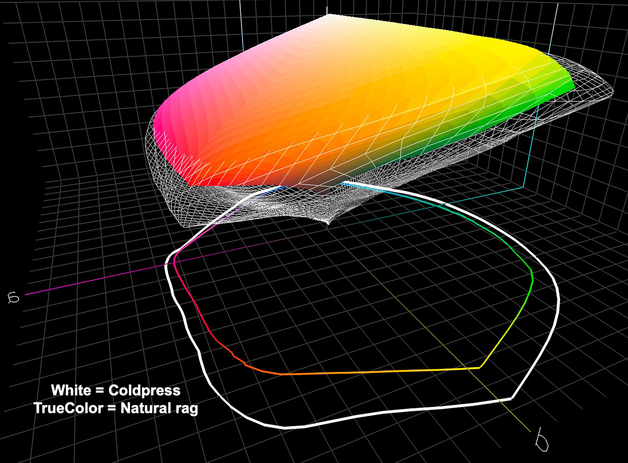
Consistently with the features of M3 profiles noted above, the graphing of the profile data indicates a much wider gamut for the M3 profile in the dark tones.
Custom Profiles
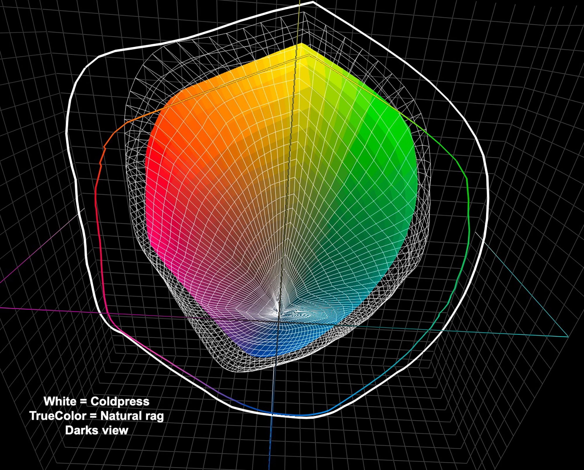
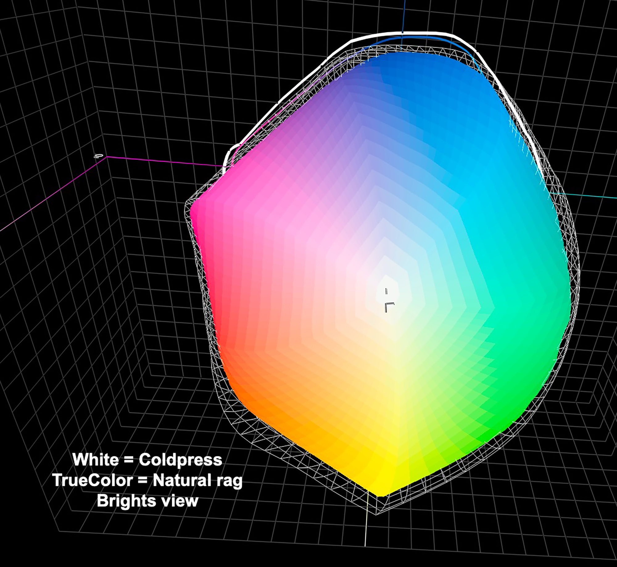
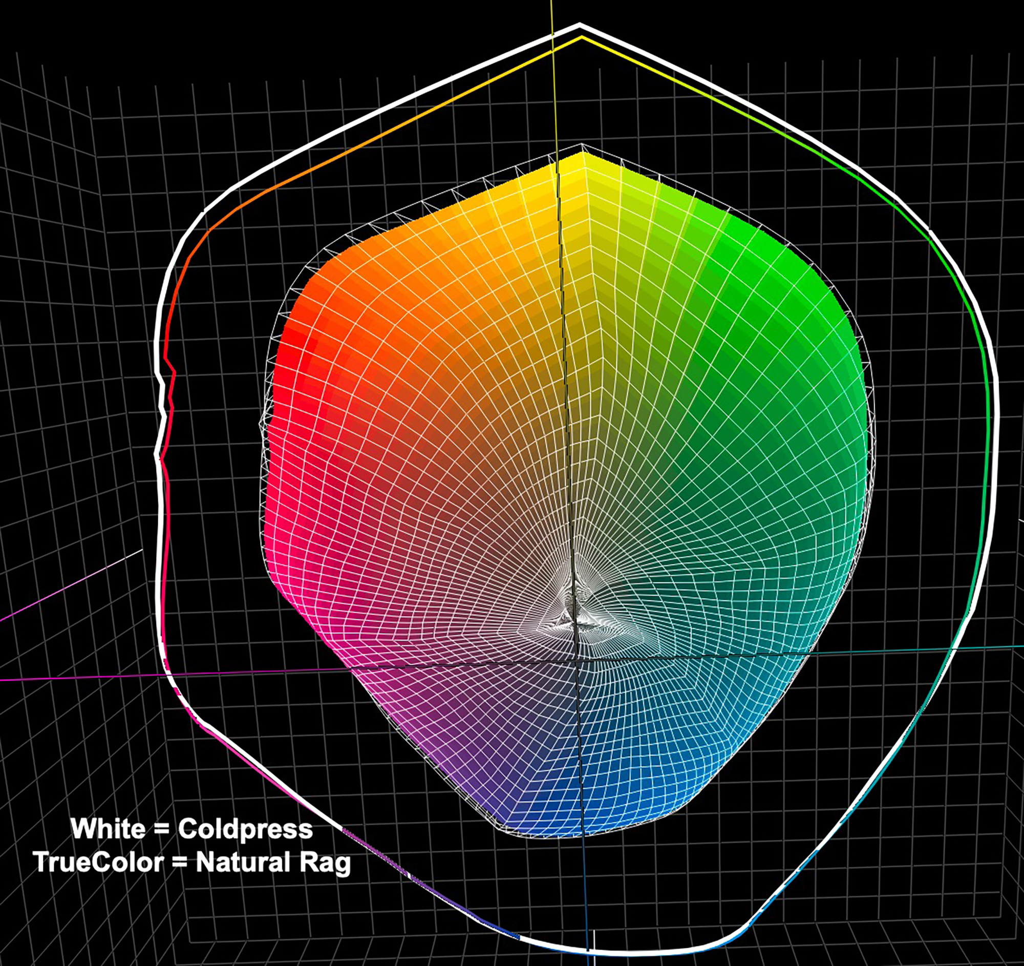
Turning to my Custom profiles made with the Konica-Minolta MYIRO profiling system, here is the comparative profile analysis data from ColorThink Pro (Figure 6.)
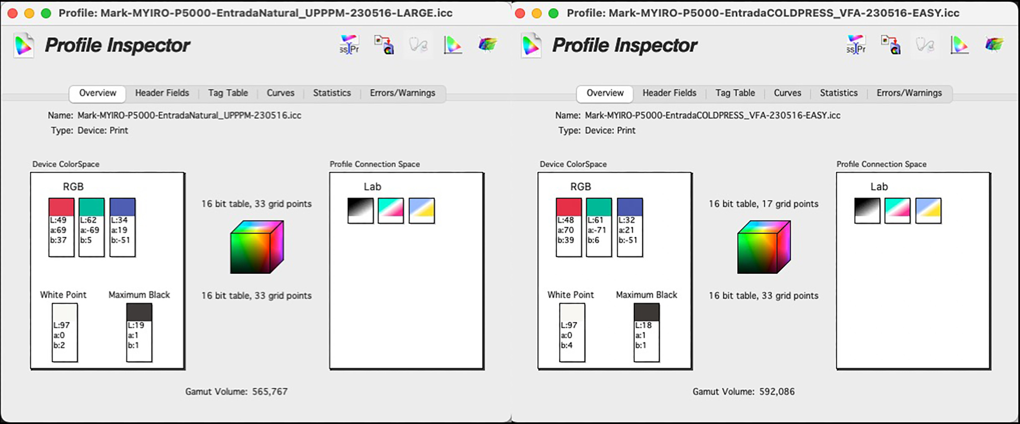
As both profiles are made with M1 measurement condition (includes measurement of both UV and non-UV portions of the visible spectrum), they are directly comparable. The gamut volumes and Black points for both papers are close and within the normal range for such matte papers (for NR 300 and CP300 respectively: L* 19 and 18, gamut volumes about 566K and 592K), indicating that statistically CP300 has very slightly wider gamut and darker black point than NR300, but these differences are not important.
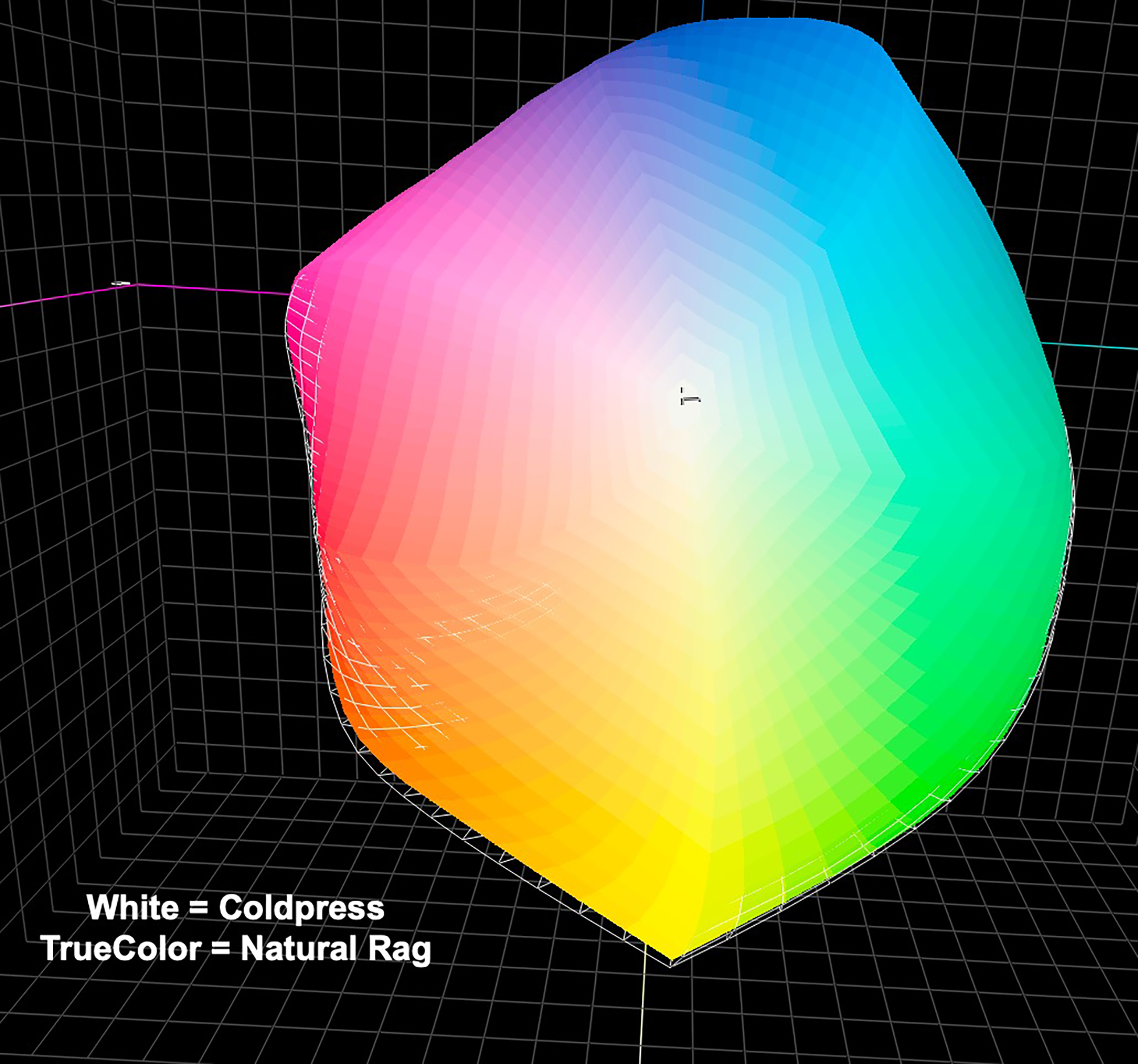
Figures 7, 8 and 9 show the gamut volumes graphically from ColorThink Pro, where you can see that compared with the OEM profiles, the gamut shapes and volumes are much closer to each other for the two papers.
Evaluations
Turning now to printing performance with these profiles, the objective here is to measure how accurately the printing system reproduces the file values of the patches in my test targets. To remind you, my general test target is a 48-patch target with 34 multi-color patches and 14 grayscale patches. Then I use 3 targets covering all 100 luminance points of the grayscale. The more accurate the results, as measured by the dE(2000) metric for the 48-patch target, the lower the risk of disappointment between real-world image appearance as soft-proofed on a properly calibrated and profiled display versus what comes out of the printer on paper, and therefore the less ink and paper waste.
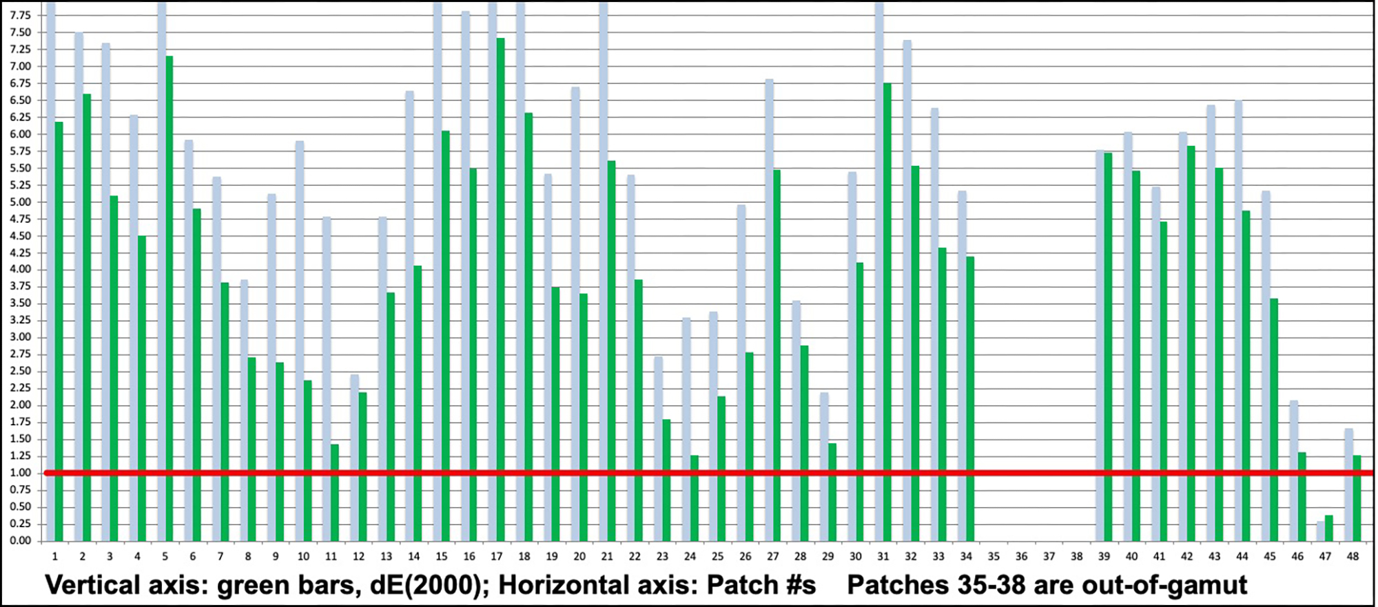
All the colours in the targets are in-gamut for most matte papers, including these, except for a small number of values at the dark and brightest ends of the luminance scale that are out of gamut, particularly for matte papers. Those are measured but excluded from the summary data from row 20 onward in Figures 10 and 15. The object here is not to measure the extent of the discrepancies between file values and out of gamut conditions, but only to analyze the accuracy of what the printer-paper combination is capable of reproducing without gamut compression. For example, when we know already that the maximum Black a printer-paper combination can reproduce is L*19, there’s no point evaluating the inaccuracy that must occur in trying to reproduce a patch with a much darker value of L*10.
Entrada Rag Natural – Performance in Print (OEM and Custom Profiles)
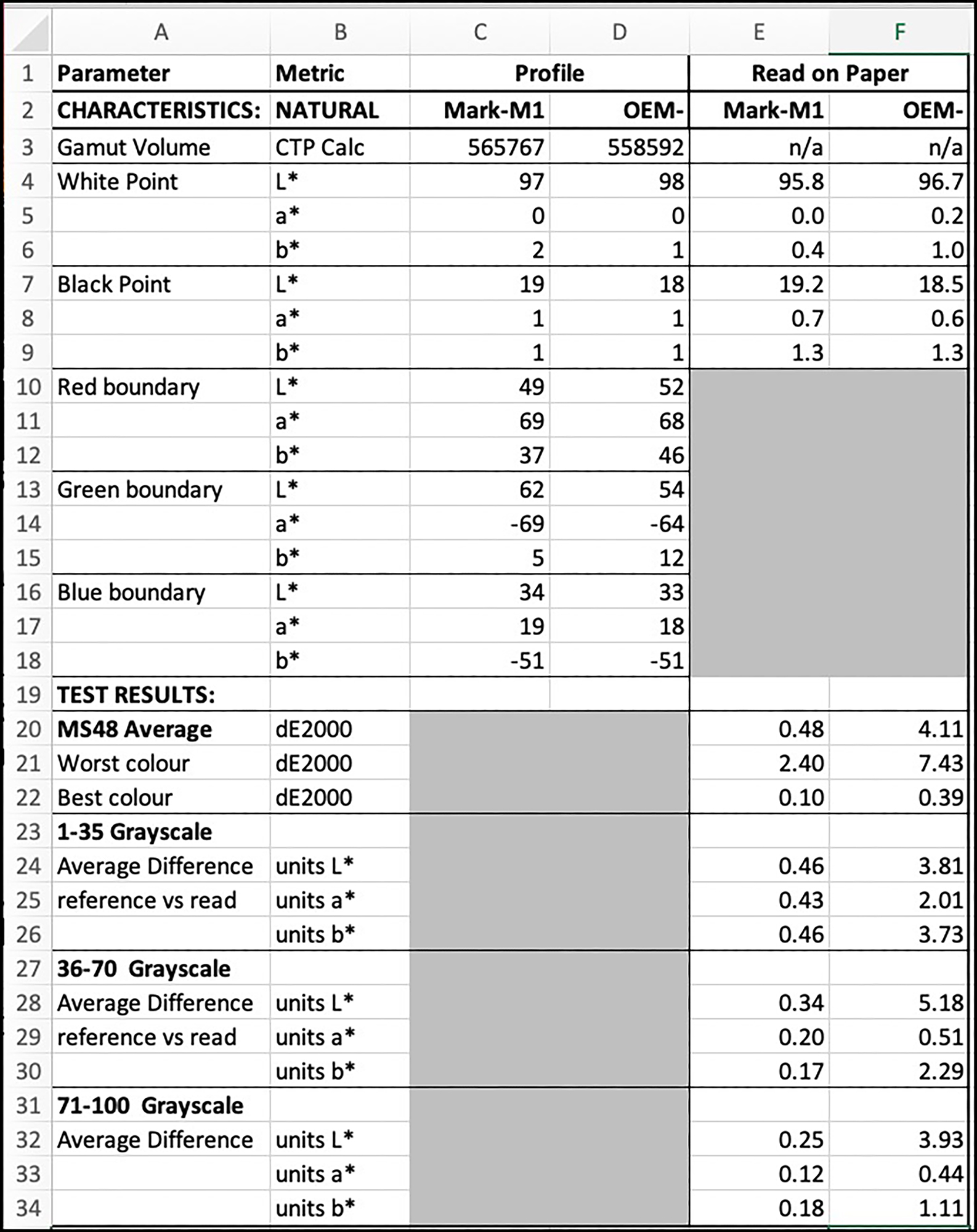
From Figure 10, row 20, for the Custom profile, the overall average dE(2000) value of the 44 included patches is 0.48, the worst being dE 2.4 and the best dE 0.1 (col. E, rows 21, 22).
Only 1 dark gray patch L*20 has dE greater than 1.0, due to Hue bias (reason not known, but it’s not a reading mistake). Considering that a value of 1.0 constitutes a “just noticeable difference” (JND), this overall outcome for custom profiling is excellent and assures that there should be no surprises between the prints and their soft-proofed appearance, provided the soft-proofing is done correctly on a properly calibrated and profiled display.
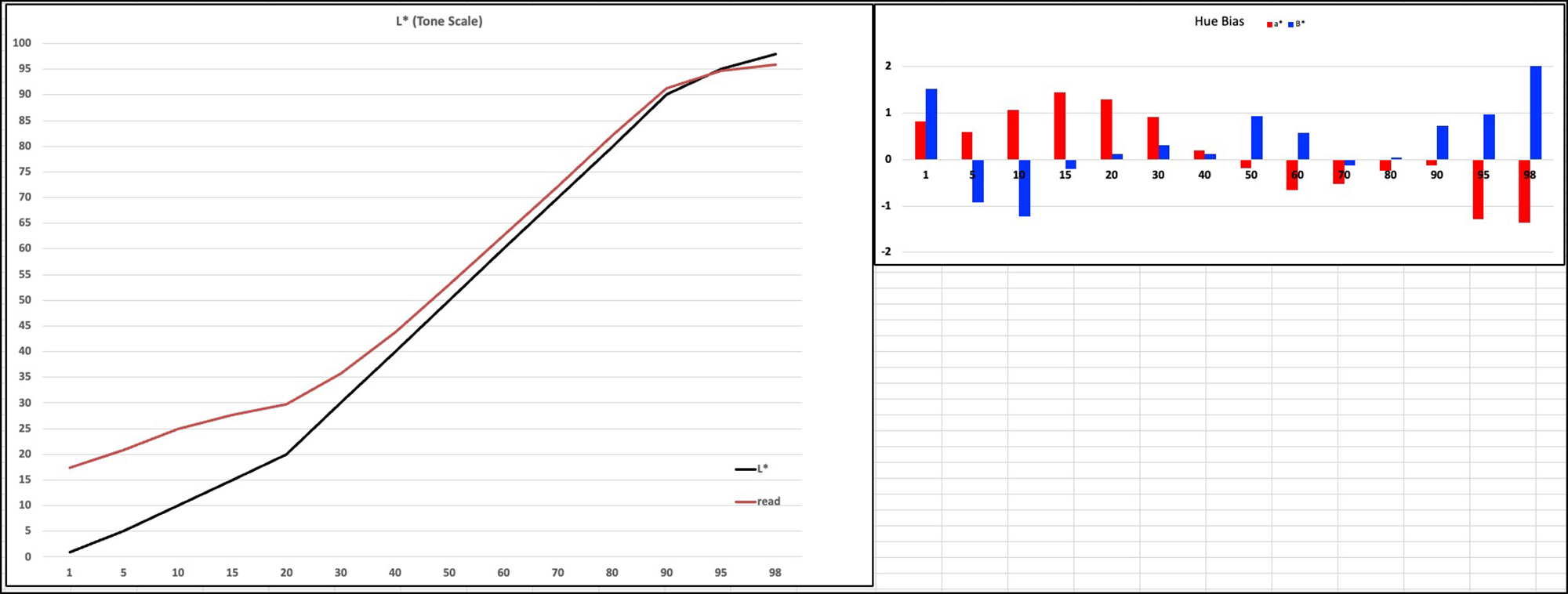
Taking a more focused look at the Custom profile performance of the grayscale portion of this patch test, Figure 12 shows quite accurate outcomes with this paper in test conditions just using the Epson driver and this profile.
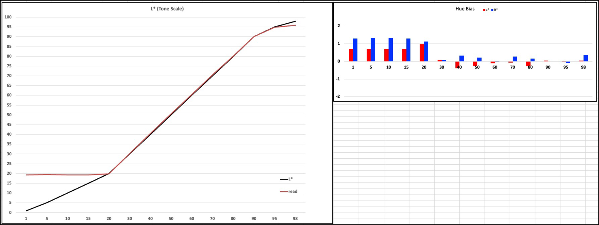
Test and printed tones are just about convergent; Hue bias is insignificant above L*20.
To remind you how to read this figure, the left panel is for tone and the right for hue. These tests use the L*a*b* system for defining colours. The left will indicate the accuracy of tonal gradation, while the right will indicate the extent of neutrality. In the left panel, the black line traces the L* values of the patches in the target file, while the red line traces the corresponding values derived from measuring the printed patches. The closer these lines converge the more accurate the printed result relative to the file values. In the right panel, the red bars depict the a* colour range and the blue bars the b* colour range. The closer they are to the horizontal axis value of zero, the more neutral the reproduction because a*0, b*0 reproduce gray. Again, anything within at least +/- 1.0 are below “Just Noticeable Difference (JND). It is clear from Figure 12 that under test conditions, the grayscale performance of this printer/profile/paper combination is on the whole excellent for in-gamut tones.
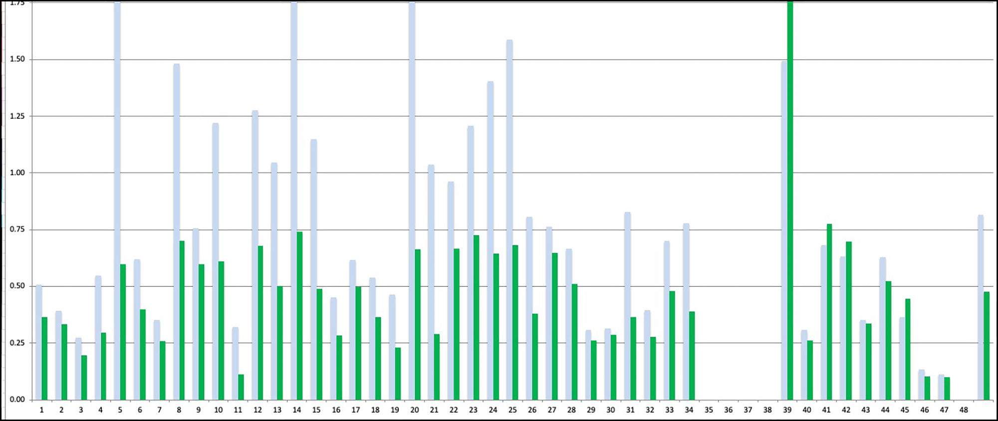
Entrada Natural: OEM Profile
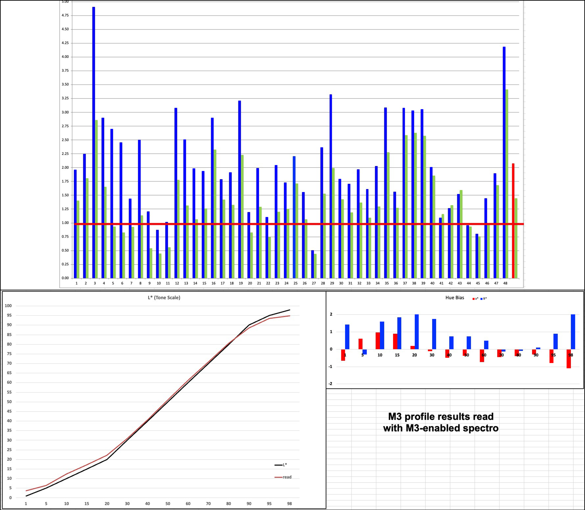
The overall average for the OEM profile is dE(2000) 4.11 (Figure 10, col. F), the worst colour having a dE of 7.43 and the best 0.39. The problems are spread across the target as seen from the two graphs in Figures 13 and 14).
Ideally, we prefer to have no values above the red line, but here you see most of them are.
The left panel of Figure 14, for grayscale tone, indicates the area of concern for dE values of about 5 or more as encompassed in the green box, including a high proportion of the mid-tones. The right panel, for hue bias, are most concerning for the lower mid-tones encompassed in the green box, including from about levels 20 to 55.
While some divergent statistical performance between OEM and Custom profiles is expected for well-known reasons, the extent of it here is unusually large. Legion paper has examined this finding and prepared a new profile for the SC-P5000 printer, this time based on Epson Velvet Fine Art paper as the Media Type rather than UPPPM. It is very much better than the one assessed above, and I recommend that users prefer it.
In light of this new OEM profile being developed, I contemplated just skipping the above presentation of the analysis based on Legion Paper’s original profile; however, on second thoughts, I decided to retain it as a demo, because it affords us an opportunity to examine whether there is any practical correlation between what the numbers emerging from the quantitative analysis indicate about profile quality versus what a comparison of the printed outcomes looks like. Not surprisingly, there is. Looking at the prints of the printer test images, one can see subtle differences of tonality and in some cases, hue, with the more accurate Custom profile being the preferred outcome based on what those of us familiar with these targets expect correct prints of them to look like. I do emphasize, however, that the visual differences between the prints are somewhat subtle because the dE differences between the profiles’ performance in the comparative data are mostly within a range of several points of dE. The only way to show you these differences in an article like this is to scan the prints and post the results. This is of indicative value because the scans are not totally accurate, but anyhow, here are some samples.
In all three comparisons below, the images printed with the OEM profile are somewhat lighter, less contrasted, and show some hue bias relative to the images printed with the Custom profile. This corresponds with the data results in Figures 13 and 14.
Both Legion Paper and I tested their new VFA profile in order to compare the improvement of outcomes (Figure 18). Two important observations emerging from this data are that:
(i) the accuracy of their new profile based on VFA paper is much better than their older one based on UPPPM paper, and (ii) the accuracy of the 48-patch target print done by Legion Paper is more accurate than mine using their profile but printed in my printer.
This latter outcome happens in good part because they printed their profiling target and the test of the outcome from using the resulting profile in the same printer and measured both the profile patches and the evaluation patches with their spectrophotometer, whereas I printed the evaluation target using their profile but from my printer (same SC-P5000 model but of course a different unit), and measured the printed patches with my spectrophotometer, which is not the same model or software as theirs. So while their fully consistent round trip between their profiling and testing produced an average dE of only 0.69, mine was 1.46, and correspondingly my dE of the least accurate patch reproductions were higher than theirs. Both of us are using high-end software and well-calibrated equipment, but because complete consistency of operating conditions between making the profile and testing it is not possible when the specific equipment being used differs between the place of profile origination and the place of profile testing, the outcome can be a bit less accurate, and this is what we’re seeing, which of course is the original basis of the argument for custom profiling. All that said, a difference between 0.69 and 1.46 is not astounding.
To complete my exploration of how these factors influence results differently depending on differences between the profiling and the testing conditions, even though I achieved a high level of accurate results using my profile based on UPPPM paper, I decided that I should mirror Legion’s initiative of making another custom profile based on VFA paper, just to see how my VFA-based profile would compare with theirs, and with my previous one using UPPPM as the Media Type. Here are the key results of testing both the OEM and my VFA-based profiles (Figure 18).
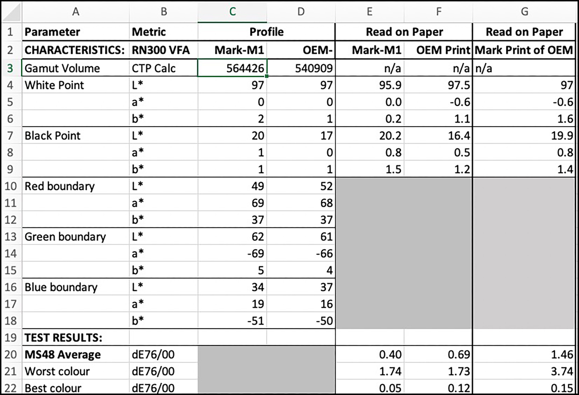
To be sure we are clear about what results from what tests are being compared in Figure 18, the contenders are:
Col F: Legion paper’s test print of their VFA-based profile for NR300 made in their printer; the printed test target patches read with their XRite i1Pro 3+ spectrophotometer and reported back to me;
Col G: My repetition of that test using their profile in my printer, the printed test target patches read with my Konica-Minolta MYIRO-1 spectrophotometer.
Col E: My test of my Custom profile based on VRA Media type, using my printer and MYIRO-1 spectrophotometer.
The procedures reporting results in Cols. F and E are internally consistent from profiling through test printing in respect of both printer and spectrophotometer, whereas the one in Col G is not. And as we expect, the outcome in terms of recorded printing system accuracy is better in Cols. F and E than it is in Col. G, with the outcome in E being the best of the three – but not to the extent that would be noticed in comparative prints of real photographs. Translated into its practical implications, people with SC-P5000 printers using this paper should expect the most accurate results with a custom profile but nonetheless achieve fully satisfactory results using Legion’s paper VFA-based profile, insofar as average dE whether 0.4 or 0.7 are both highly satisfactory outcomes with low dispersion around the averages.
Entrada Coldpress Paper
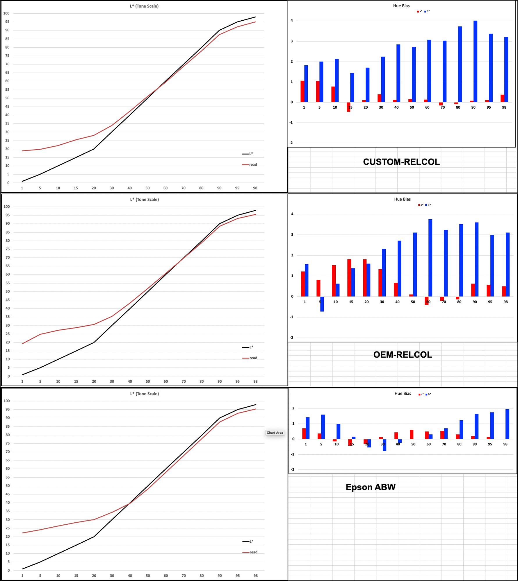
Turning to the Coldpress paper and row 20 of Figure 19, here let me remind you that we are comparing the results from the use of profiles made with different measurement conditions depending on the profiling source: conventional M1 for the Custom profile and polarized M3 for the OEM profile. However, I am reading the results of using the M3 profile with a spectrophotometer and calculation algorithm set to the M1 measurement condition, so inaccuracy of outcomes for the OEM profile is expected, if only due to the difference between how the profile was made and how the results from using it are being measured. (Legion Paper read the results from printing my target using their spectrophotometer in M3 measurement condition, and that much better result is reported further on.)
Entrada Coldpress – Custom Profile
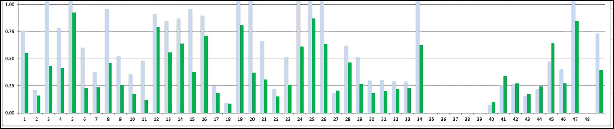
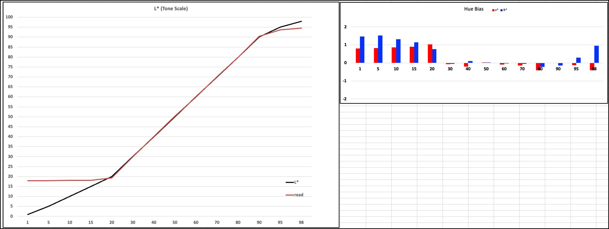
The dE over 44 patches for the custom profile is 0.4 (Figure 19, row 20, Col. E) , the worst colour being 0.87 (i.e. below the JND threshold) and the best 0.09, almost perfect. There is nothing in these results that exceeds the JND threshold (Figure 20), giving very considerable confidence in the results from using this paper under the conditions for which it was profiled. Likewise, the grayscale reproduction (Figure 21) is stellar both in terms of accurately reproducing luminance and neutrality of the grayscale for all in-gamut tones and under test conditions.
Entrada Coldpress – OEM Profile
For the OEM M3 profile, the average dE for 44 patches (M1 measurement condition) is 3.11, the worst colour having dE 7.33 and the best 1.0 (Figure 22). But recall, this is the result of using an M3 profile tested with M1 readings of the test chart.
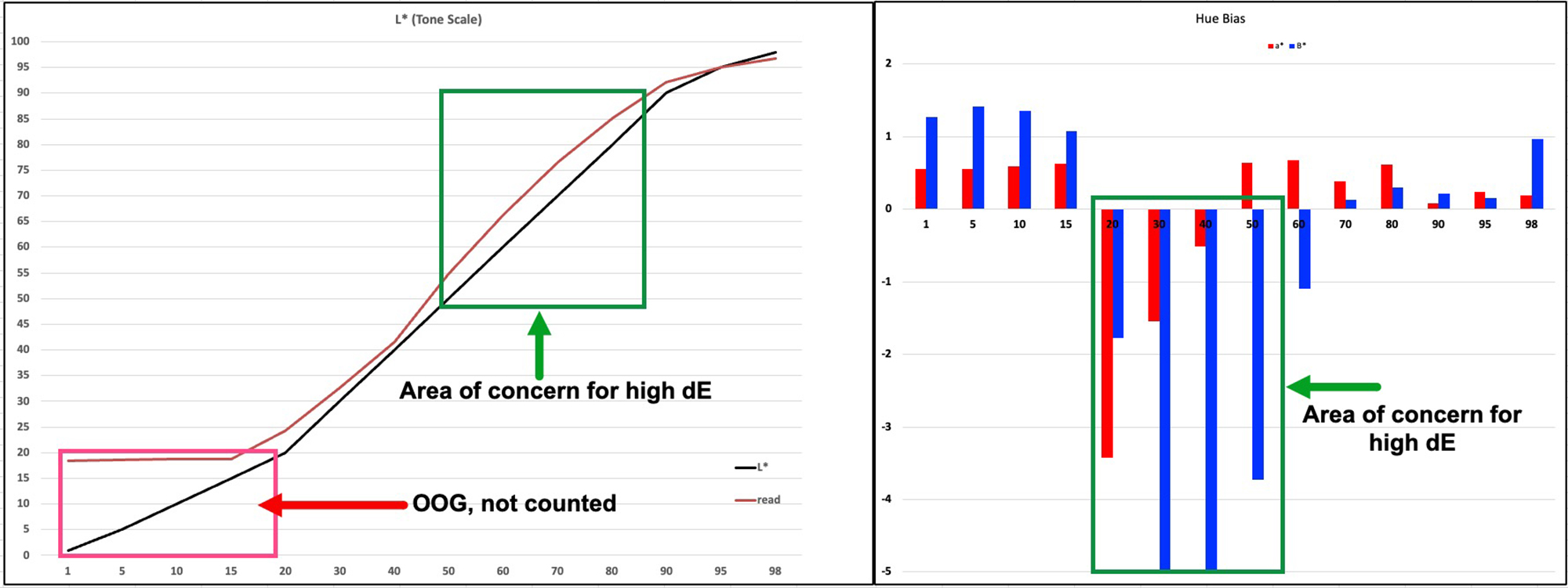
Looking at the grayscale depicted in Figure 23, there is no convergence of read values with file values except at one cross-over point at the bright end of the luminance scale, the printed values being on the whole a bit brighter than the file values; this is expected with an M3 profile. The tonal gradation looks smooth. Hue neutrality is reasonably well-preserved as seen from the in-gamut vales in the right panel of Figure 23.
Sidebar on reading the results of M3 profiles
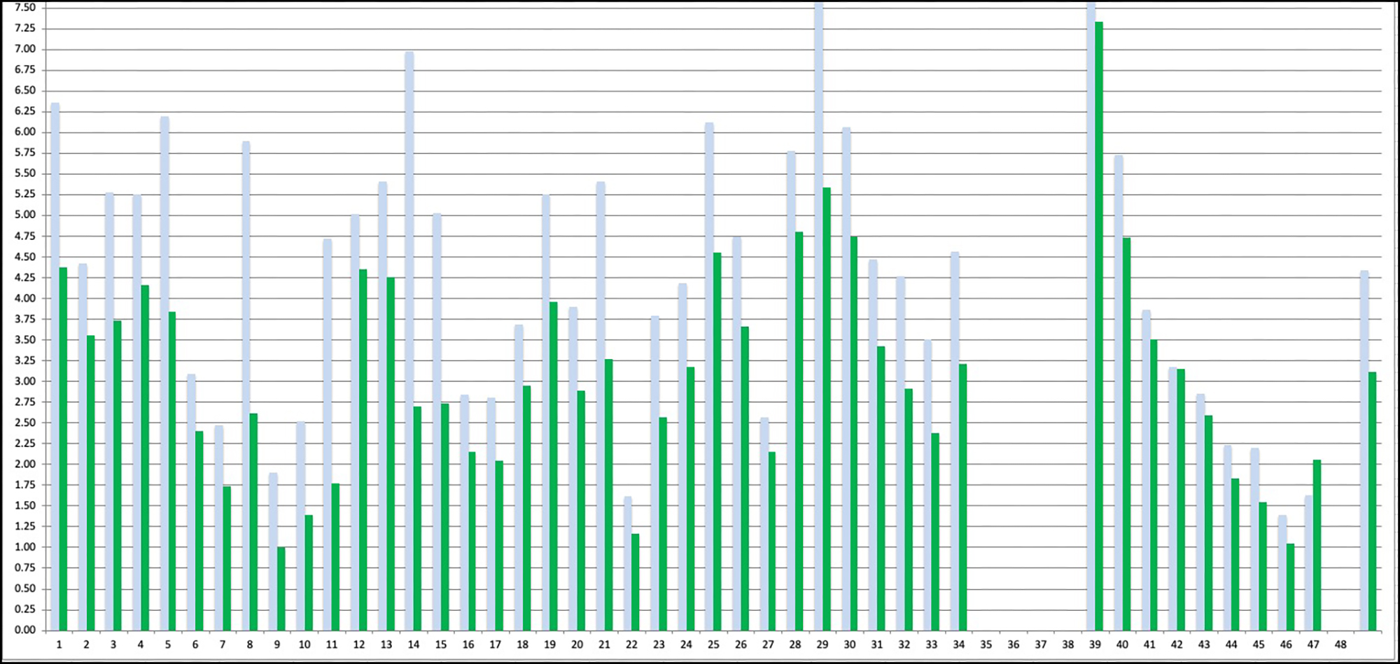
Knowing there is an inconsistency in reading the results of an M3 profile with an M1 measurement condition, I asked Legion Paper to read my target using the same M3-enabled spectrophotometer that they used to create their M3 profile. My hunch was that the test results would show much greater accuracy than I reported in Figures 22 and 23, and that indeed turned out to be the case, as shown in Figure 24.
The average dE for all 48 patches emerging from this result is 1.44 (rather than 3.11 in my reading using M1), the worst colour having dE 4.77 (rather than my dE 7.33). The luminance of the grayscale much more closely coheres with the image file reference values and the hue bias of the grayscale is small. So, these results are OK, the only issue being that we do not look at prints made with these profiles through polarized eyeglasses. Maybe if we did, shadow detail would be more distinct?
I invite readers to compare the left panels of Figures 21 (custom M1 profile) and 23 (OEM M3 profile). This comparison provides insight into how the M3 profile produces lighter, more differentiated gray tones at the lower end of the Luminance scale compared with the performance of an M1 profile. You can see in the OEM M3 case how the read values are both brighter and sloped (providing differentiation between tones) at the left end of the tone scale, while they are an undifferentiated, flat string at L*18 until L*18 in the M1 case (providing a non-differentiated tone mass up to about L*18).
But this isn’t the whole story of what happens with the normal printing of ordinary photos. When testing printing accuracy, we use Absolute Rendering Intent, which tells the printer to print the file values, unadulterated. But except for proofing and control work, we usually don’t print that way. Normally, we use either Relative with Black Point Compensation (BPC) or Perceptual Rendering Intent for which there is purposeful remapping of Black Point, White Point, and out-of-gamut colours on the way from the image file to printing.
A focus on the quarter tones (darks) is worthwhile because this is a prime area of the tone curve at which M3 profiling is aimed to improve tonal separation, hence shadow detail. (It can also assist in improved tonal separation of the brightest highlights.) Roughly the equivalent effect of Figure 23 (left-side panel) is achieved with Relative Rendering Intent + BPC, as the source Black Point is mapped to the darkest Black the printer/paper combination can reproduce, and the other tones are ramped-up proportionately. So for example, with this paper (and many other matte papers) a Black point of L*2 in the image file would be remapped to L*18, and the image file tones L*3 upward would be remapped correspondingly upward of L*18.
I reprinted the same target’s grayscale patches used for the graph of Figure 23, but this time using Relative +BPC rather than Absolute Rendering Intent, with both the OEM and Custom profiles. I also tested the performance of Epson’s ABW driver option using a default Neutral-Dark setting, for a reason I’ll explain just below. (Figure 25).
If you examine the left-side of the left-side (Luminance) panels of all renditions in Figures 23 and 25, you will notice that they look similar. The Black point is remapped to about L*18 in all of them, and subsequent tones remapped upward of that accordingly, in a roughly similar slope of increasing printed Luminance as the test patches’ file values get brighter.
However, there is considerable divergence of behaviour when it comes to Hue bias (right side of these diagrams). You will notice that the Relative Colorimetric prints show more hue bias, particularly on the Blue-Yellow colour axis, then did any results using Absolute Rendering Intent, or the EPSON ABW driver setting at the bottom of Figure 25.
The main conclusion that emerges from all of the foregoing about printing with an M3 profile on these papers is that an M3 profile is not going to affect the rendition of the grayscale dark tones all that differently than just using a standard M1 profile using RELCOL Rendering Intent.
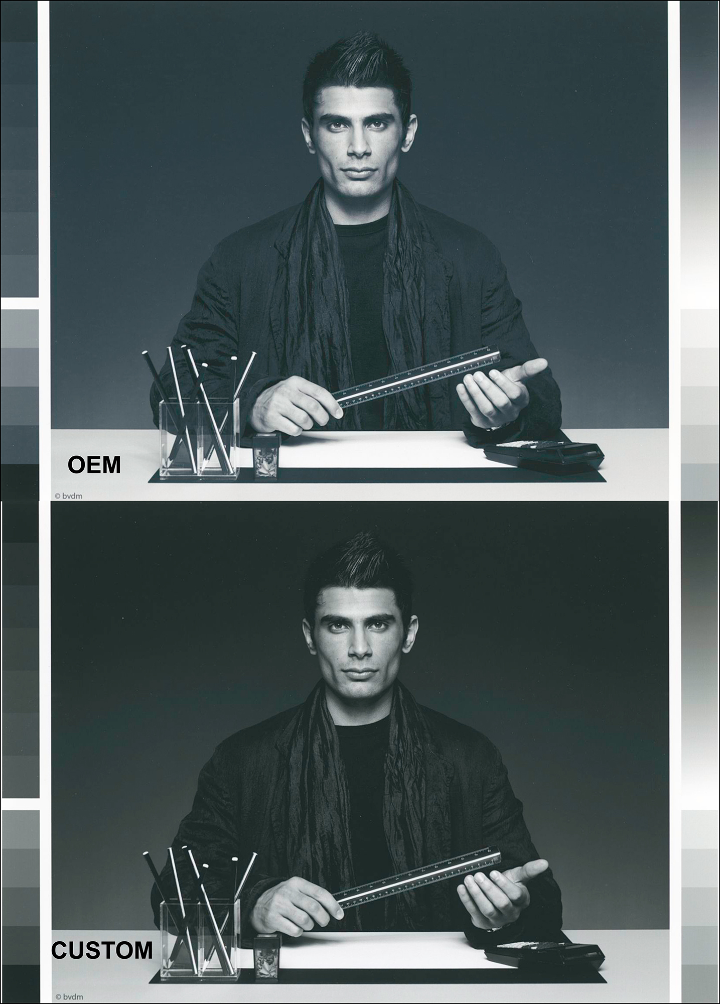
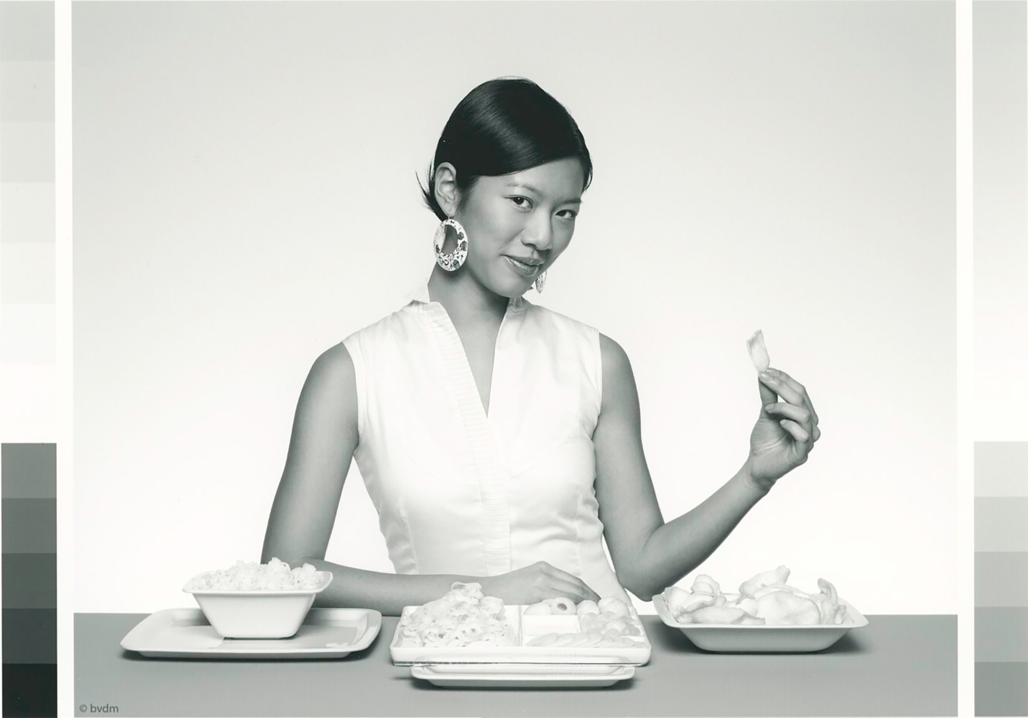
I turn from the world of numbers and graphs to show you what difference it makes to the prints of a real-world dark tone photo (the BVDM Roman 16 dark tone B&W photo) using the OEM M3 or Custom M1 profiles on CP300 paper, compared with the BVDM’s rendition of the reference image. So once again, an imperfect demo from scans of the prints (Figures 26, 27 and 28).
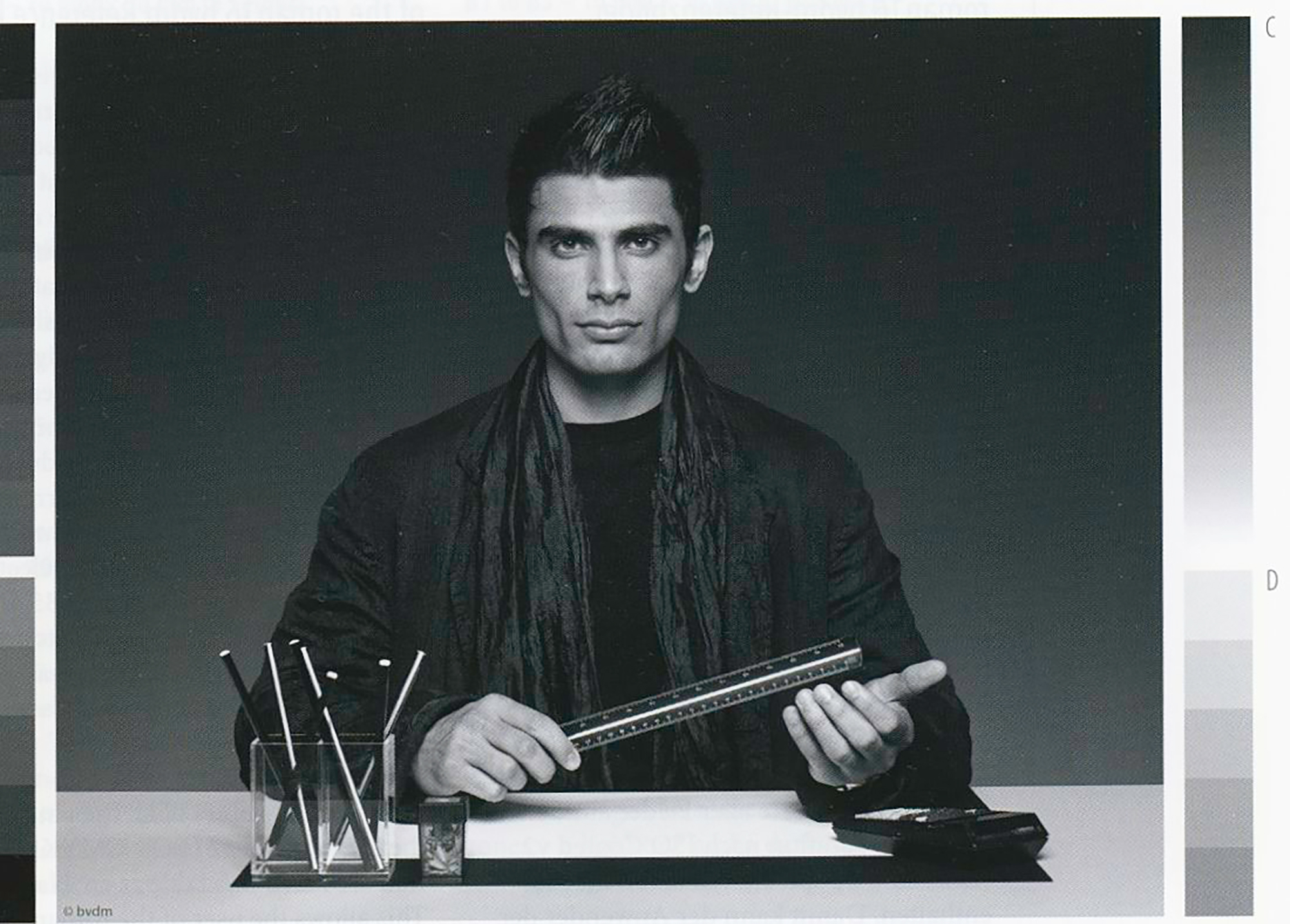
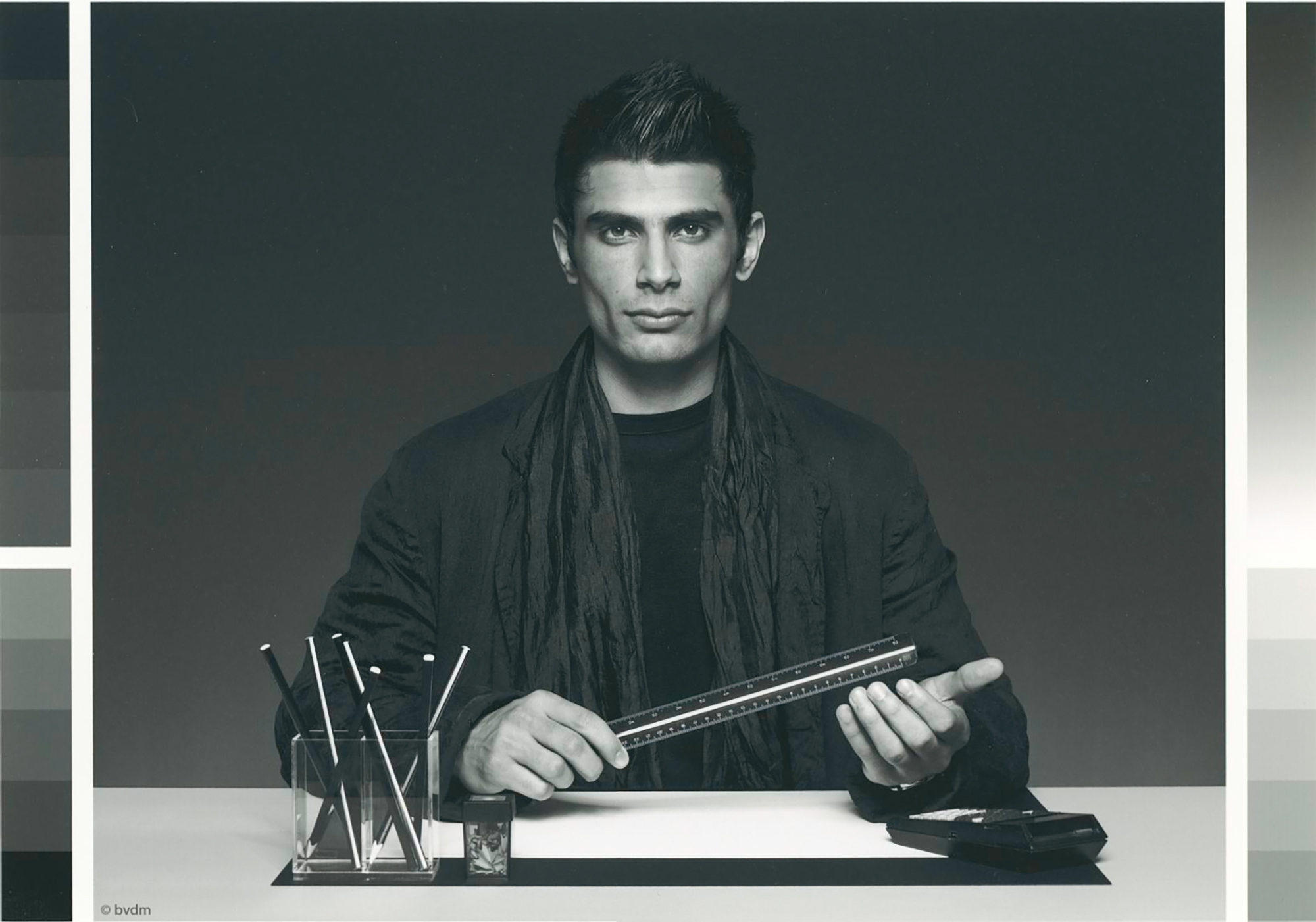
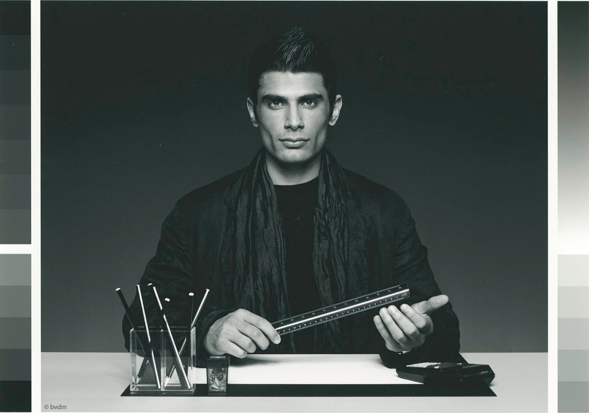
Looking first at hue, the BVDM reference image is a bit cooler than either of the inkjet prints I made from the BVDM image file; this is expected from the hue bias showing in the height of the blue bars in the two upper graphs right-side panels of Figure 25. The yellow bias in these prints comes from the Relative Rendering Intent picking up the warm tone of the paper (output profile). Absolute Intent picks up the cooler white of the source profile. I’ll show this more obviously below.
Looking at comparative grayscale luminance, I find that the overall appearance of the BVDM reference image sits between those of the OEM and Custom profiled inkjet prints. The OEM result is overall a bit lighter, providing more tonal separation between the subject and the background, while the Custom result is a bit heavier; again, this is expected looking at the relative heights of the red lines in the Figure 25 graphs, left-side panels (the higher the red curve, the brighter the printed tones). In this case, I think I would prefer the M3 result.
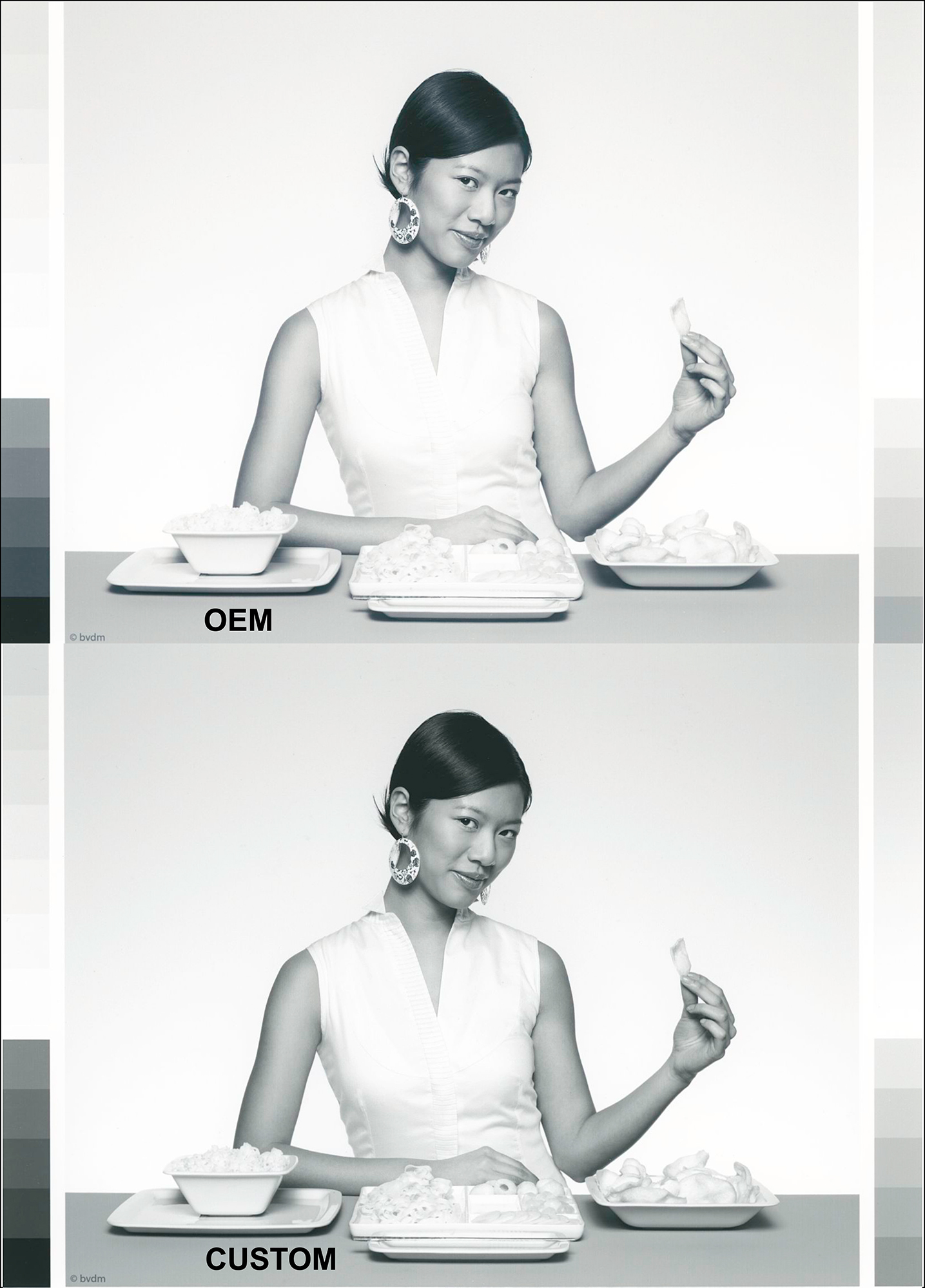
Turning to the highlights, M3 profiles are said to provide slightly superior tonal separation in highlight areas. Tested with the Roman 16 B&W Highlight test image, I didn’t see it – that aspect of the images looks pretty much the same. Again, I scanned the BVDM B&W Highlight reference image from the manual, as well as my two inkjet prints (OEM and Custom profiled) of the image file (Figures 29, 30 and 31).
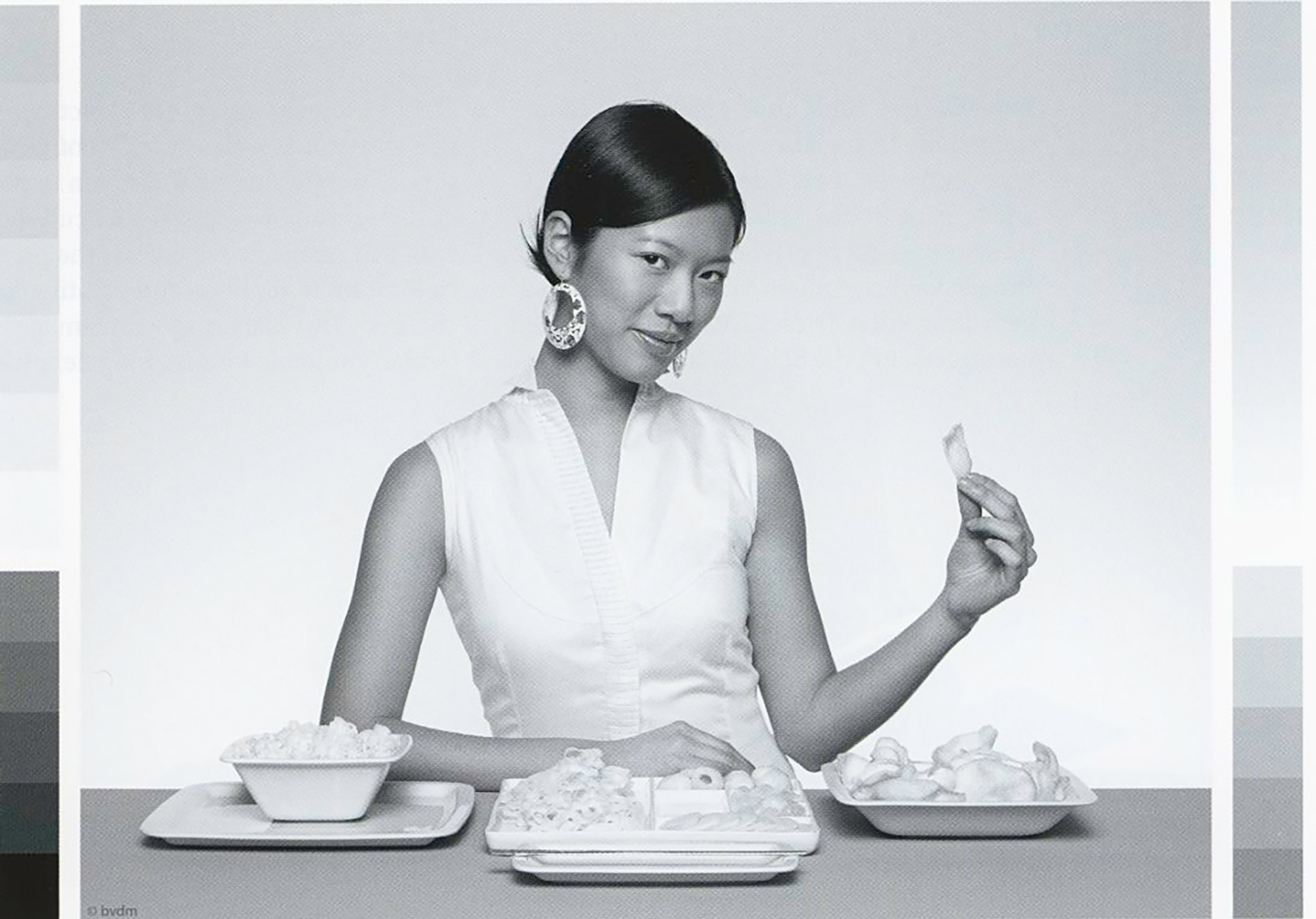
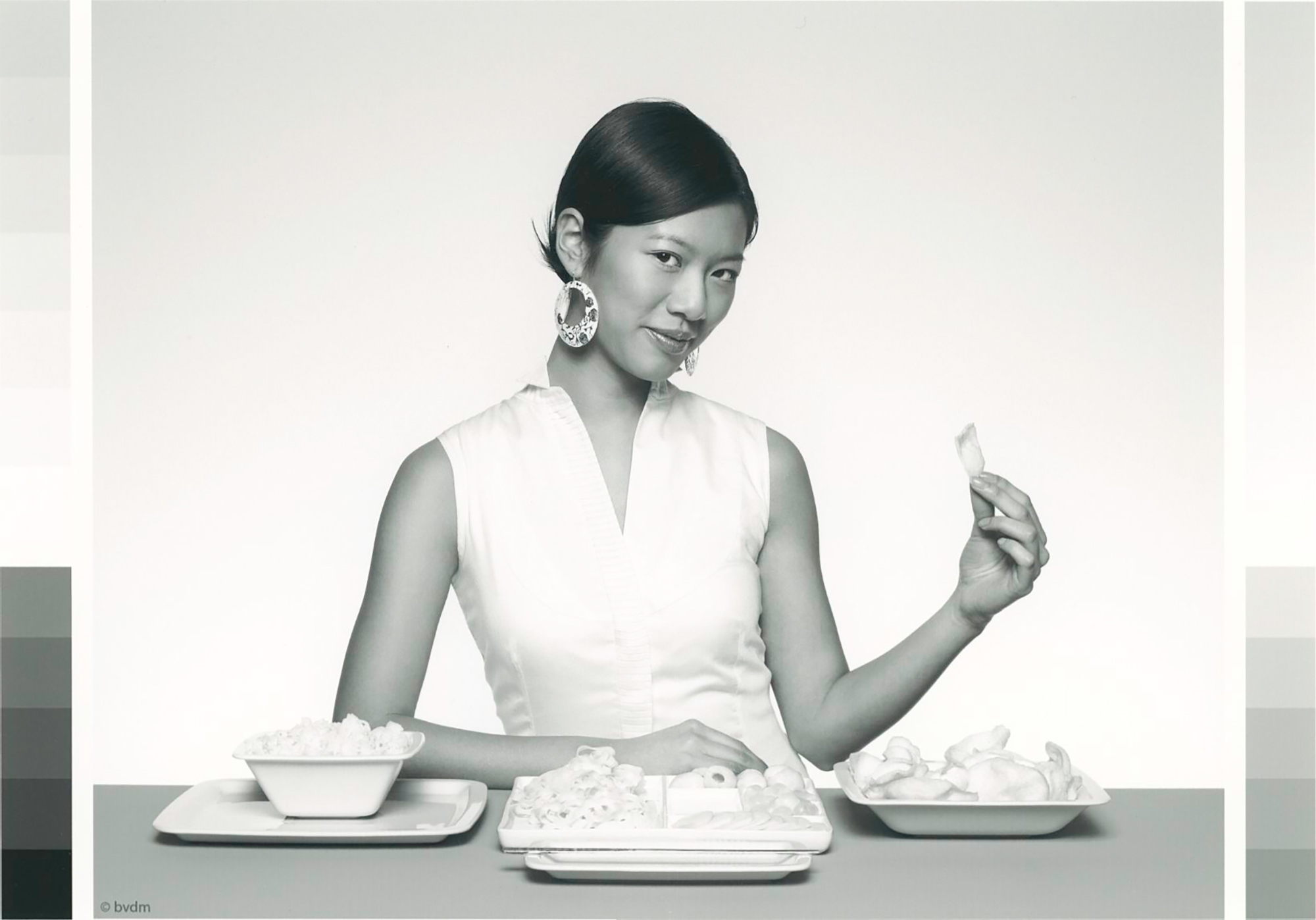
Comparing Figures 30 and 31, there is very little difference between them for either hue or luminance or clarity of highlight detail. This is expected from the similarity of the luminance curves positions and blue bars in the upper two graphs of Figure 25. However, comparing Figure 29 with either 30 or 31, we do observe a much clearer distinction between the hue of the BVDM reference manual image and the inkjet prints, the latter being warmer. This is expected from the rather substantial difference between the b* value of the source white point and the output profile white point of about 5~ 6 dE points.
I’ll conclude this little odyssey into differences between Relative vs. Absolute Rendering Intent by mentioning that whichever one starts out with, some deft adjustments in Curves can alter the initial appearance to compensate for undesired impacts of either. I don’t demo the “how-to” here because it’s somewhat off-topic, and these are test images, the purpose of which are to see the unadulterated effects of what we are testing for. But you can trust that I have explored this territory before making this observation.
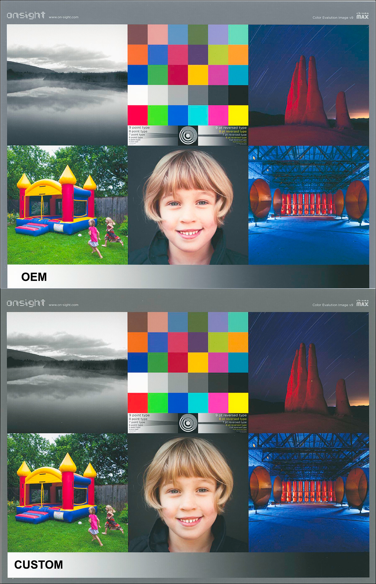
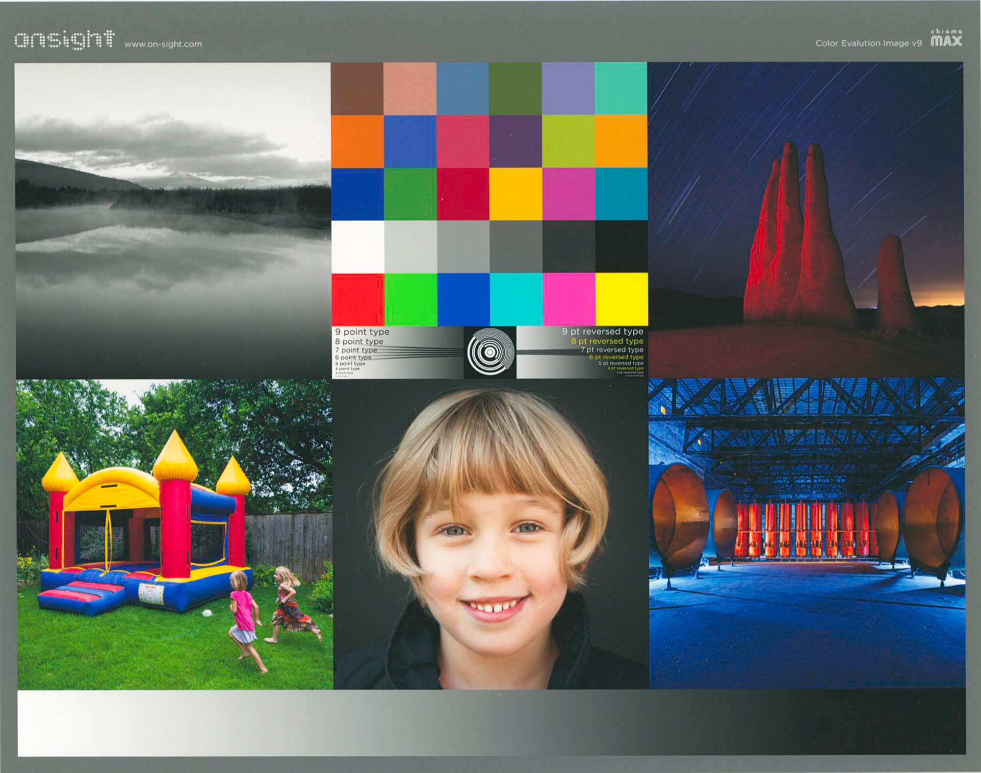
Finally, the Onsight printer test image for both the OEM M3 and Custom M1 profiles: the printed outcomes are so close one strains rather hard to see any material difference between them. The OEM shows a very slightly greater tonal distinction in the darkest tones, but apart from that it’s six of one, half a dozen of the other. I am pleased with either result. The colours are very good. The blacks look rich despite this being a matte paper with rather elevated maximum Black (by the numbers), and the reproduction of fine detail is excellent. What I can’t show you over the Internet is the actual heft and feel of the paper, which is really very nice. It’s a robust, “artsy” paper that will be enjoyed by all those who like this kind of matte product for their photos. So I recommend it.

Mark D Segal (*)
June 2023
(*) A big thank-you to Legion Paper for their cooperation in the preparation of this review.
Toronto, ON
Mark has been making photographs for the past seven decades and started adopting a digital workflow in 1999 first with scanning film, then going fully digital in 2004. He has worked with a considerable range of software, equipment, materials and techniques over the years, accumulated substantial experience as an author, educator and communicator in several fields, was a frequent contributor to the Luminous-Landscape website and now contributes frequently with in-depth articles on the PhotoPXL website. Mark has contributed over 75 articles to the two websites up to Q1-2024, with a particular emphasis on printers and papers, given his view that a photograph printed on paper remains the epitome of fine photography, as it has been from soon after the medium was invented and started gaining momentum in the 1830s/1840s. Mark developed a particular interest in film scanning and authored the ebook “Scanning Workflows with SilverFast 8, SilverFast HDR, Adobe Photoshop Lightroom and Adobe Photoshop” (please check our Store for availability). In his “other life” (the one that pays for the photography), Mark is a retiree from the World Bank Group and was a consultant in electric power development.