The New Epson SC-P900 Printer Review
Introduction and Set-Up
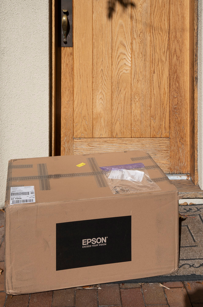
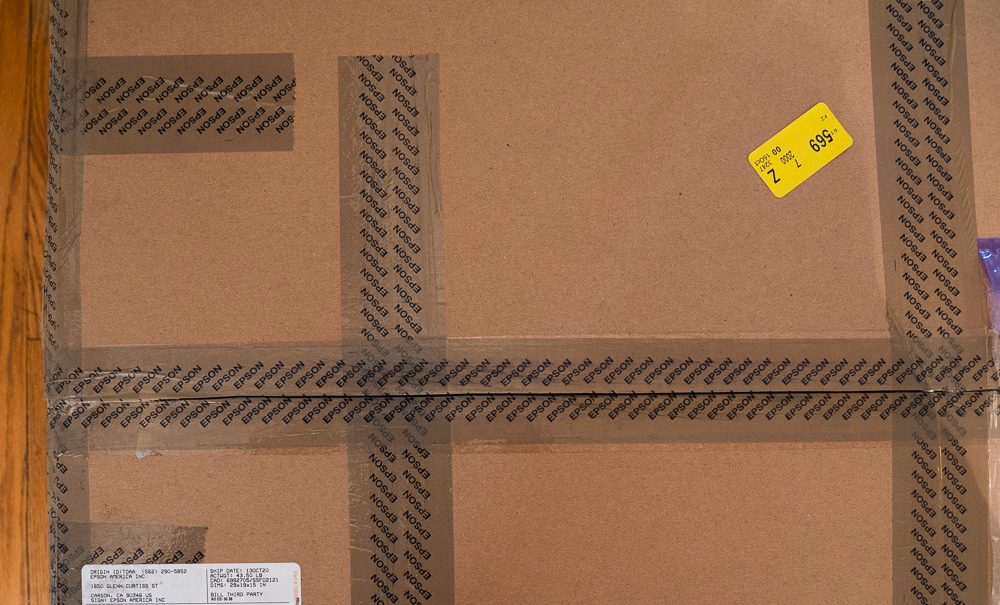
I walked home from visiting with a friend, socially distanced and masked as the times require, and as I reached my front door, I was pleasantly surprised to see a large box from Epson America sitting at the doorstep (Figure 1). Aha, “this is IT”, I said to myself as I hustled it inside the house, took a bite of lunch and got down to “work”.
Publisher’s Note: what follows is a very significant and detailed overview of the Epson SC-P900 printer. At PXL we believe you don’t have a photograph until you can hold it in your hands. With the introduction of the P700 and P900 printing is taken to a whole new level of ease and accuracy. Never before has been so easy to print from any mobile device as well as your typical applications on notebook and desktop computers. Mark, thank you for such a detailed report. You’ll find a summary of all the major points at the end of the article if you want to scroll down.
This printer can be purchased at B&H Photo.
Let’s begin at the beginning with Epson tape. The first bit of specialty tape one encounters is outside the box, having the name “Epson” imprinted throughout. They just want to make sure you know this is an Epson product packaged by Epson and not tampered with by anybody else (Figure 2). I think this is recent, and a good idea.
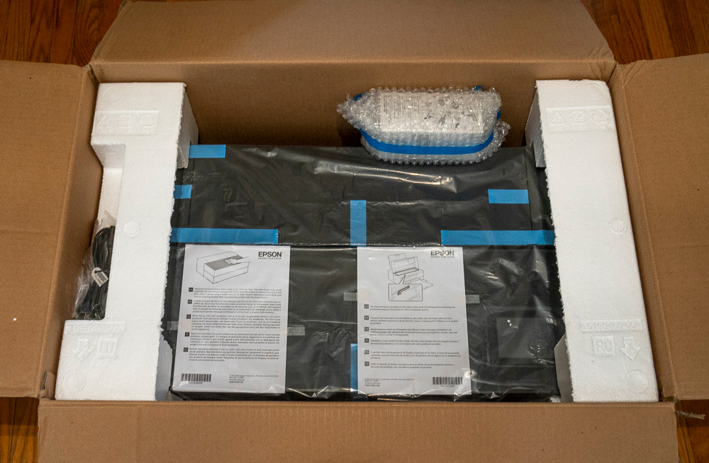
Then there is the conventional and famous “Blue Tape” waiting to be peeled off once we get the product out of the box (Figure 3) and positioned to set-up. The small package in bubble-wrap at the back is a spare maintenance tank. Epson provides this because the one inside the printer gets filled to about 90% of its capacity with printer initialization. The ink delivery system comes filled with shipping fluid, so it needs to be voided and ink replaces it on initial set-up.
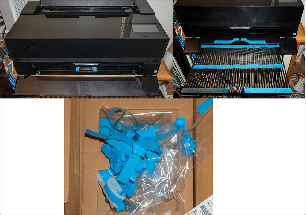
You’ll find blue tape ever so neatly and precisely applied in various places, and you do need to remove ALL of it before doing anything else (Figure 4). Epson provides this packaging to minimize risk of damage in transit.
OK, enough about tape and unpacking. Let us proceed with the START HERE poster that comes with the printer and follow it, step-by-step. It’s very clear. They even advise us not to drink the ink. No kidding, they really do! I don’t know what the stuff tastes like, but at CAD 1.31/mL (after sales tax) a 750 ml bottle of wine at that price would cost CAD 982.50, and I guarantee you that here in Toronto I can buy really nice 750 mL bottles of Ontario wine for 1/50th that price. So it’s just plain uneconomic to drink the ink if nothing else. BTW, I work in CAD. To get roughly equivalent USD value, divide CAD by 1.35.
Now for the serious part: no-one I consulted knows how much ink you actually get to use from the starter cartridges. But with a couple of assumptions and a bit of work we can figure it out – roughly. So, I’ll do that here, because “roughly” is more information than nothing. But do be aware, this is my estimate based on the stated assumptions – nothing Epson has blessed or even had anything to do with.
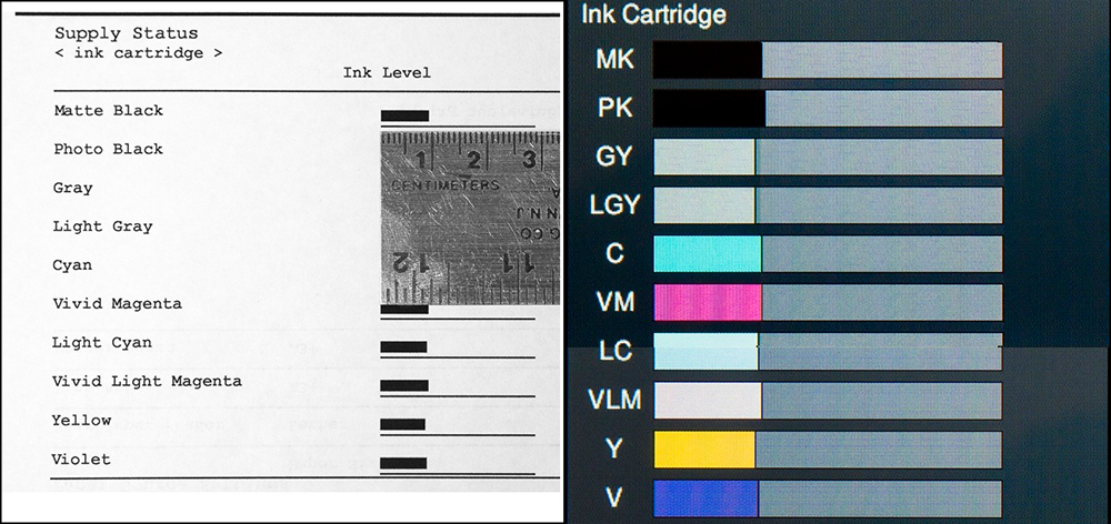
What matters to “printer economics” about starter ink is how much remains in the cartridges after the initial fill. The initial fill charges the lines and those lines need to remain charged for the life of the printer, so we never use that amount – it’s an overhead built into the cost of the printer. But we can use the amount that remains in the cartridges. These are normally 50ml cartridges, so I assume that Epson’s info panels showing ink remaining are based on ultimate 50 ml per cartridge and there are 10. Whether you measure from the Status sheet (Figure 5 left) or the LCD screen (Figure 5 right), the proportion of 50ml remaining to be used is about 0.31= 15.5 mL per cartridge x 10 cartridges = about 155 mL total. After six weeks of printing, I’ve printed about 67 sq.ft. of inked surface and so far only the Light Gray tank was replaced. I estimate that I’ll print another 35 sq.ft. or so before all the cartridges will need to have been replaced.
This information is useful for separating machine cost from remaining ink value in order to calculate a capital consumption cost for use of the machine itself, and later on to calculate ink cost per print. We’ll get to that. But first, let’s finish setting up the printer. After loading the ink, we place a sheet of plain paper into the top feeder and then install the driver. I did the whole set-up using the USB connection. One can also do it Wireless or via Ethernet. I discuss this later in the context of wireless printing software.
Beware, however: if you install using USB and want to switch to a wireless operation, according to the manual you need to uninstall the driver and re-install it as a wireless device, following the network set-up instruction in the START HERE sheet. The manual also provides guidance on moving from a wireless to a wired connection, in which case it appears unnecessary to re-install the driver. However, the manual provides no guidance on how to move from a USB installation to a wireless network installation; it’s doable as I’ll demo at the end of the review. (The latest version of the Manual for this printer is here, and it now includes sections on printing with Mac OS.
Once the driver is installed, we are asked to load the Epson Media Installer (EMI), included in the driver software package. We want to do this, because it manages a number of print settings, contains the Epson profiles, and will manage other papers and profiles we may wish to use. I’ll show how to use the EMI at the end where I discuss software. BTW, in case you want to access the Epson profiles apart from using them in the Print dialogs of your printing application, for macOS, you can locate them by going to (System > Library > Application Support, and from there follow the tree in Figure 6.
Epson recommends checking for the availability of a firmware update. When you print a nozzle check the firmware version is shown. Check it against the website version. If the latter has different numbers, update the firmware by downloading and installing it following on-screen instructions. It’s seamless and keeps the printer features up to date. Much more conveniently, if you establish a wireless connection, then in the LCD go to General Settings >Firmware Update>Notification and set it to ON, the printer will check for available updated firmware when you turn it on, and if it finds any, it will prompt you to install it from the LCD. I’ve done this twice already; it’s painless.
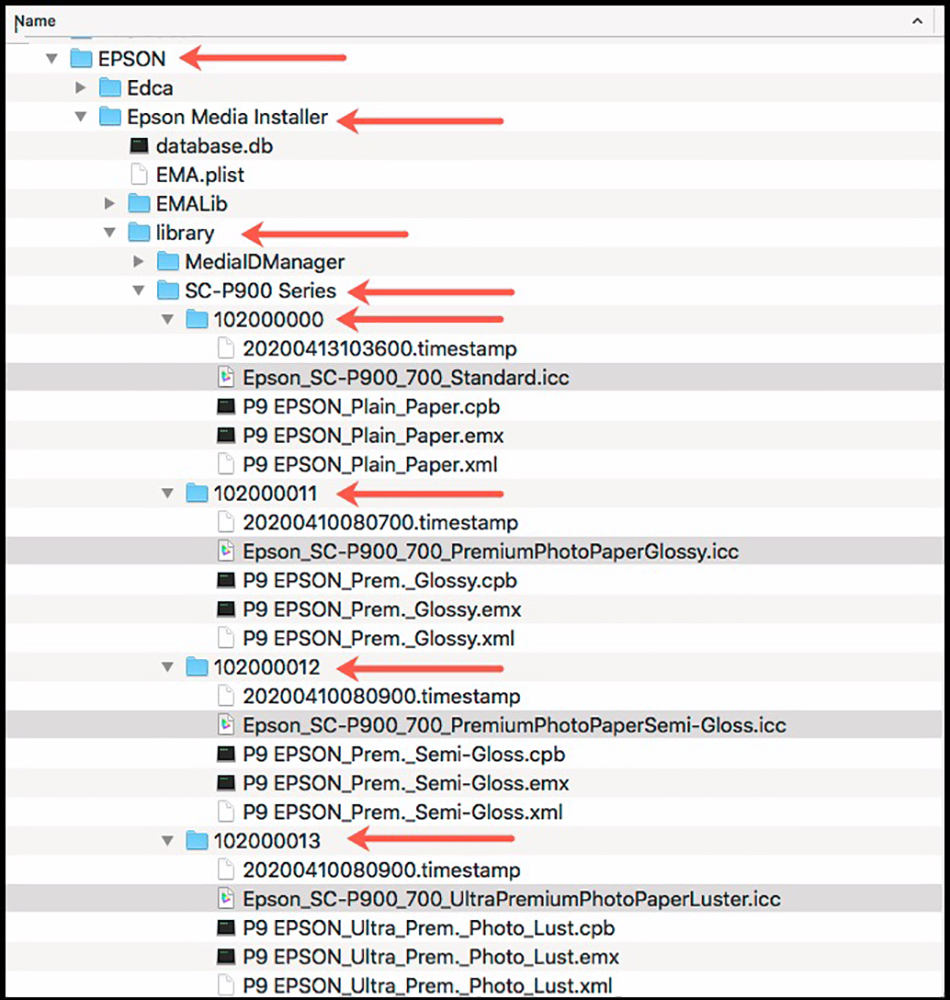
(Long list follows on; the ICC profiles are highlighted in gray.)
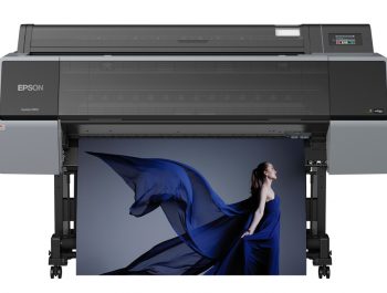
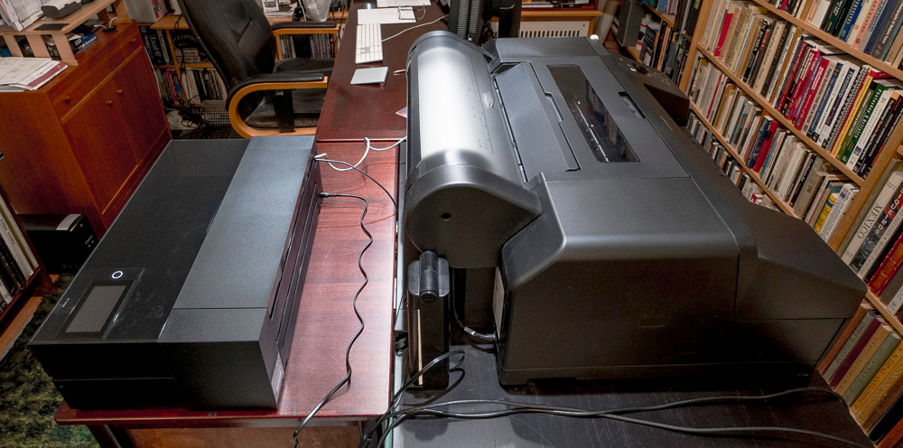
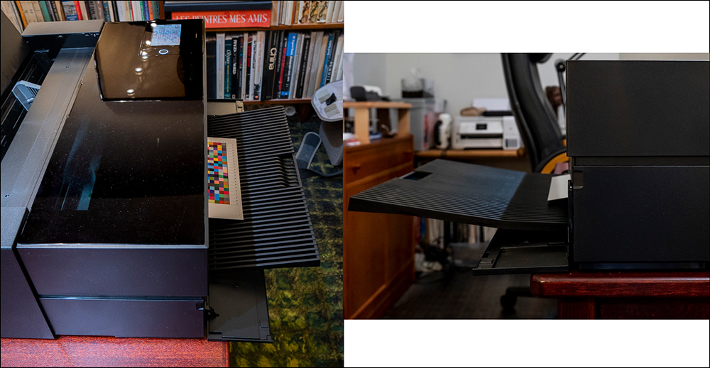
Now that I’m set-up, let’s see the size of this printer compared with an SC-P5000 (Figure 7). So, if you are in the market for a new printer and you were thinking of either an SC-P900 or an SC-P5000 and space were an issue, this gives you an idea of how they compare. Both are 17-inch printers. The optional SC-P900 roll holder attaches to the back of the printer (not shown here). The SC-P5000 roll holder is not detachable. To use the front sheet feeder for printing on thick media, 16 inches of free space behind the SC-P900 is needed.
This raises a primary question doubtless on many readers’ minds – do I need this printer? The answer cuts different ways depending on your situation and needs, so I’m not telling anybody what they should buy; but I do provide information facilitating a decision. One typical situation would-be owners of P3880s or SC-P800s pondering an upgrade to the SC-P900; another would be either upgraders or those new to printing wondering whether they should buy an SC-P900 or the still current SC-P5000. The two primary sets of considerations are relative print quality and feature sets.
The five main parameters of print quality are color gamut, color rendition, Blacks and shadow tones, detail rendition, and smoothness of tonal gradations. Over the past decade or so, improvements on all these criteria tend to be moderate, not revolutionary, from one model to the next.
The SC-P5000 is a stand-out for color gamut – the Epson SC-P800, SC-P900, and Canon Pro1000/2000/4000 don’t come close for PK papers, but many photos don’t need the wider gamut it provides, as I’ve demonstrated in previous printer reviews.
This printer can be purchased at B&H Photo.
The rendition of Black and handling of shadow detail depend more on the user’s photo editing skills, on the paper used, and on driver settings rather than on technical differences between these printers, possibly save for the new Black Enhance Overcoat/Carbon Black (hereafter “CB”) feature of the SC-P900, that I’ll discuss in detail further on.
But operational features are a different story, and here we get into some very obvious differences. The key new features distinguishing this model from its predecessors are:
- It can operate on 2.4 and 5 GHz wireless.
- The touch screen control panel is large and bright with easier access to the various printer functions, making it much more user-friendly than previously and a delight to use. We can customize what we see on the touchscreen. It displays key settings while printing, so if we see we goofed-up we can cancel the print job before it consumes much ink.
- It has dedicated channels for Matte Black and Photo Black inks, eliminating channel sharing and switching that consumed time and ink on previous Epson models.
- The print path is lit, allowing us to see the progress of the print (can save ink if we see an unexpected disaster taking place). And it’s just cool seeing the print come along!
- It has smaller physical dimensions than its predecessor (about the size of an SC-P600 despite the 4-inch wider carriage), allowing it to be used in smaller spaces, in part made possible by smaller ink cartridges (prices per cart are adjusted accordingly).
- There are advances in the print head: 3 droplet sizes per nozzle in a single pass; variable droplet sizes as small as 1.5 picolitres; ink repelling coating to reduce clogging risk.
- Epson claims a 6% larger color gamut compared with the SC-P800, (we’ll have a look at that further on).
- Print permanence is stated as up to 200 years for color and 400 years for B&W, based on interim results (still under test) from Wilhelm-Imaging Research Inc. (I would like to see this inkset assessed by Aardenburg Imaging as well.)
- There is the above-mentioned new Black Enhance Overcoat technology that increases maximum Black density on high gloss papers without the need for a dedicated coating cartridge; it is engaged by using the Carbon Black (hereafter “CB”) mode in the driver Print settings. We’ll see what it does below; the Epson Sales Reference Guide shows a bit of visible difference. It is also supposed to improve contrast and reduce bronzing and gloss differential – neither of which I found problematic in the predecessor printers.
- Fine Art paper (flexible and below 0.50mm) loads easily in the top feed.
- There is new Media Installer software included with the driver package allowing one to specify and save new Epson media, customize some settings, and add third-party papers. It performs a lot of installation seamlessly.
- One can make prints from mobile devices (phones and pads), complete with color management and ABW mode using the Epson Print Layout App, available in the App stores (I’ll demo it in the software section at the end).
So, quite a list of improvements to consider. Whether any of this makes an upgrade from an SC-P800 (or earlier) worthwhile is a personal matter. The remainder of this article may help you decide. I include several comparisons from SC-P800 data.
(As a side note, in case anyone is thinking about a choice between the SC-P900 and SC-P5000: the SC-P5000 is a different class of printer meant for a high-volume production market, viz. more expensive, wider gamut (though not always useful), automated roll management functions with numerous image placement and cutting options, built-in roll cutter and maximum print length of 44 feet, versus 10 feet for the SC-P900. The cost per ml of ink is much lower for the SC-P5000 because the cartridges hold 200 mL rather than 50 mL in the SC-P900. Hence, the suggestion here is to choose according to your needs. The SC-P900’s comparators would be the SC-P800 it replaces, SP3880, or Canon Pro-1000.)
So, we come now to the menu of items for testing how well this printer makes prints – to my mind the most important matter of the lot. The dimensions I want to explore include:
- Paper handling, driver settings, and operating features
- Printer economics
- Test results: at least one PK and one MK paper type
- Printer Manages Color versus ICC profile Colour Management
- ABW versus ICC-profiled B&W printing
- CB mode on gloss media
- Quality differences from different speed/quality driver settings
- The functioning of the Media Installer
- The functioning of the roll holder
- Printing from an iPad
- The Epson Print Layout upgrade to version 1.5.2
Paper Handling, Driver Settings, and Operating Features
This printer is really well-designed and quite easy to use. It will be a piece of cake for those accustomed to Epson professional printers, or a fairly painless learning curve for those who are not. A better-drafted manual would certainly be helpful, but for the most part, users will find the answers to unanswered questions with a bit of “poking around”. As well, I’ll demonstrate here certain key new features and what they mean for prints.
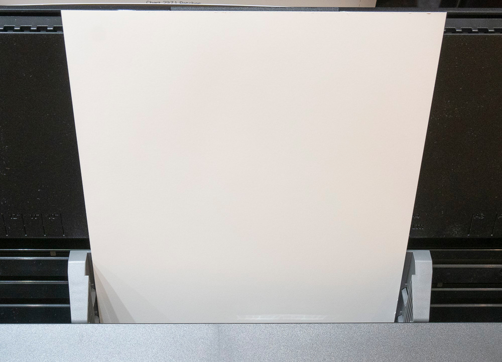
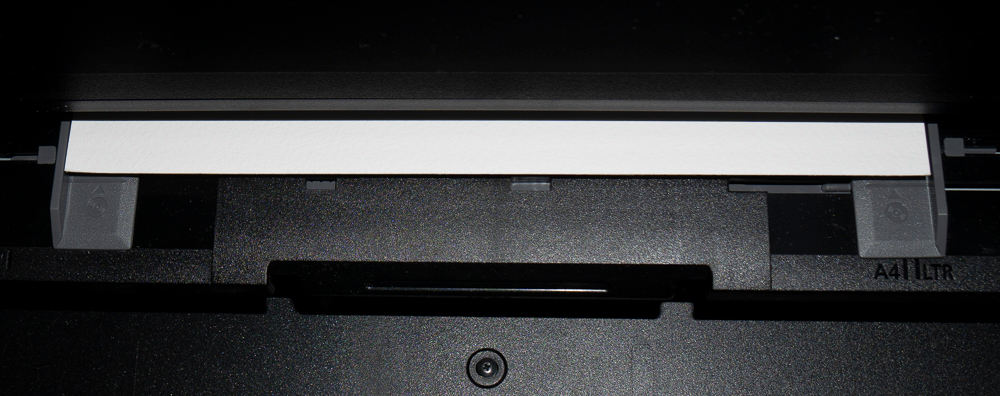
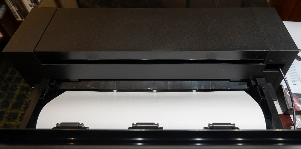
Top Paper Feed: Epson calls it the “Rear Feed”, but it’s actually on top, so I call it the Top Feed – yes at the rear of the top of the printer but don’t go looking for a paper feed in the rear of the printer unless using the roll holder. Contrary to the ambiguity in the manual, we should load all Epson fine art papers less than 0.5mm other through the top sheet feeder. (Cold Press Natural and Legacy Textured should be loaded through the front feed.) Gently drop the paper between the gray guides, letting it hit the bottom (Figure 8), and slide the gray guides to the edge of the paper. My experience indicates it is very reliable.
Do not use the front feed for fine art papers less than 0.50mm thick – every time I tried it pushed them up to the top feeder where they jam on the mechanism, wrecking the sheet. The manual is unclear about this, but I’m being very clear, just so you’ll know. Use the top feed for all papers less than 0.50mm.
As well, when loading 17×22” cut sheets that are especially pliable (for example Epson Legacy Fibre), be sure to have the back assembly stretched to the maximum and load the paper so that it sits evenly in the feed. If you do this, it works fine. If you don’t, there is a small risk that the paper could skew, and this printer has no skew protection mechanism for the top feed, so it could make quite a mess of crushed paper inside the printer – you can extricate it, but a situation to be avoided.
There is a “thick paper” option via the LCD Menu > General Settings > Printer Settings > Thick Paper **, useful if one gets tiny head strikes due to swelling of the media coating.
Flat paper holds steadily through the print process without leaving any markings on the paper surface. I verified this under an illuminated magnifier with several papers whose coatings are sensitive to markings. Paper with edge curl can skew the page toward the end of the print, printing the remainder at an angle.
The other two feeds are the front feed for thicker media exceeding 0.50mm thickness, and the optional roll holder for roll paper.
The Front Paper Feed
Both the manual and the instructions provided in the LCD guide are not great at showing us how to use the front feed, so I shall do so here, saving you the grief I came to until the friendly folks at Epson sorted me out. Like so much in life, once you know how to do it, it’s easy and works fine. This front feed is a substantial improvement over that in the P800.
- Open the Front Feed Tray by pulling it out. It only moves several inches, so don’t force it. It will look like this opened:

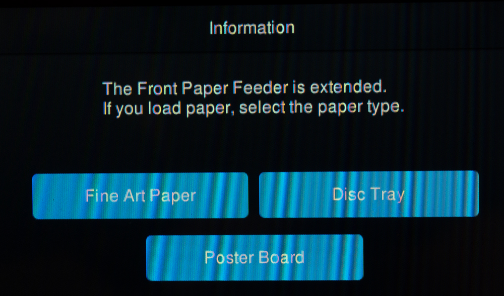
FF 1. Pay attention to the horizontal lines on the gray sliders (see my arrows) - A dialog will come up asking you to select the appropriate generic media, which in our case is Fine Art Paper:
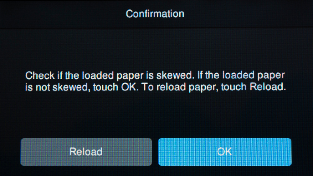
- The text in the “Description” on the LCD tells you to insert the paper lining-up the sheet with the front edge of the tray. Do not do this. Instead, line it up to the horizontal lines on the gray guides, as shown in LCD’s own diagram inset, and red arrow in my photo (below, right): (This is where I got messed up. I missed that little inset in the left image below, instead followed the written instruction to align the paper with the tray front, and the paper failed to load, but the error message on the LCD doesn’t say exactly what I did wrong; instead, it went into a continuous loop asking me to reload, which I could only escape by rebooting the printer.) It’s very important to line the paper-up exactly as shown below.


- The sheet readied to load will be positioned as shown in Figure FF5: then press “Complete”.
You will be asked to check whether the paper is skewed. If you lined it up properly, it will not be skewed so touch OK:
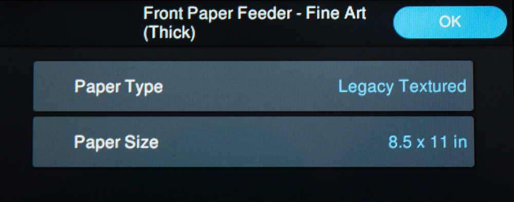
- You will be presented with a screen to select the correct media:
After clicking OK, the paper will load. By the way, do not open the back flap for this procedure, but if the sheet is long enough to protrude from the back, do peak around the back as it starts loading to make sure the paper is feeding through the slit in the back flap. That’s all there is to it. As usual, it works easily and reliably once you know-how.
The Roll Holder
This is an optional accessory for the SC-P900 which easily attaches to the back of the printer, by lowering the back flap and inserting it as illustrated in the set-up poster.
I’ll expand the scope of this section a bit to demonstrate the setting-up of a pano for printing, as well as the procedure of using the roll feed. I’ve found from experience that the following arrangements provide for a trouble-free experience from start to finish. It begins with the pano set-up in Photoshop and in the printer driver. Here are the steps, in order.
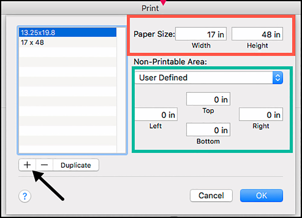
(1) In Photoshop (similar in Lightroom), first decide and determine the linear dimensions. In printer-lingo, the “width” is the width of the printer carriage, for this model maximum of 17 inches, and the “height” is the length of the pano being printed. However, in Photoshop it is the other way around, and this is where confusion can begin. So we’ll avoid such confusion from the start. In Photoshop’s Image Size dialog, as usual, set the photo’s linear dimensions and the resolution you will send to the printer. In my demo case, the pano is 17 inches high by 48 inches wide. This will be the printed dimensions, borderless because the canvas is a 17” roll.
(2) Click on Print Settings in the Photoshop Print dialog, which takes you to the Epson printer driver. Click on Paper Size, then scroll to the bottom and click on Manage Custom Sizes (Figure RF 1).
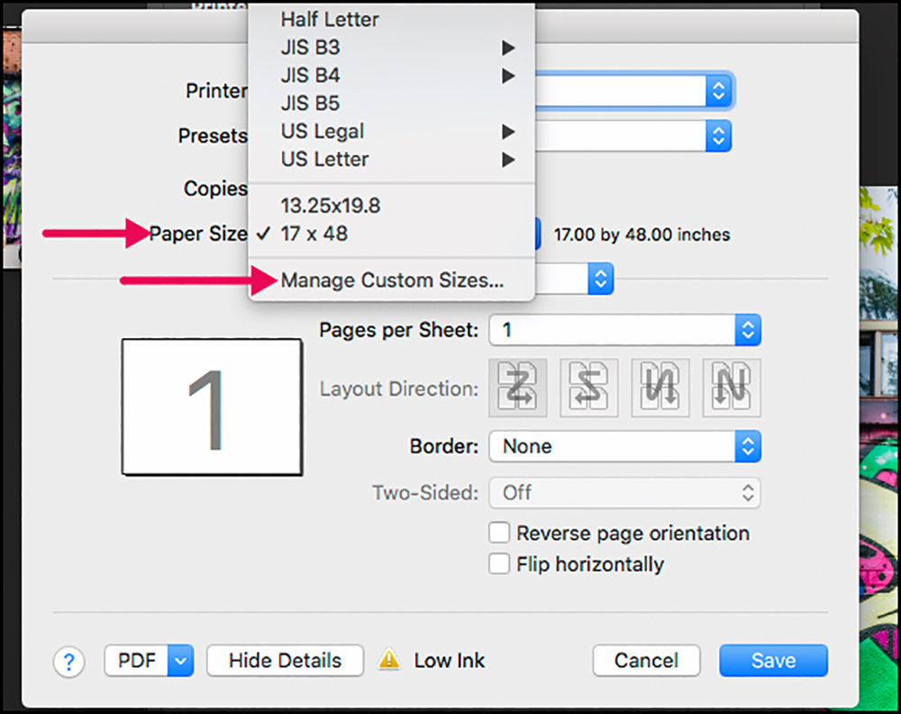
(3) Once inside “Manage Custom Sizes” we create a new custom size preset (Figure RF2). Click on the “+” (my Black arrow) to create a new name, type in a name for the size preset (I use the dimensions). I created “17 x 48”. Where I put a Red rectangle, around “Paper Size”, enter the dimensions the PRINTER understands, i.e. width now becomes 17” and height 48”. Keep “User-Defined” for the non-printable area, and in the green box select 0 for all the margins because we are printing borderless. (Otherwise enter values for margins, but make sure the image size is reduced accordingly in Photoshop.) Click OK.
(4) You will be returned to the main driver dialog, where you want to make sure to have selected the new paper size preset (Figure RF 3, red arrow).

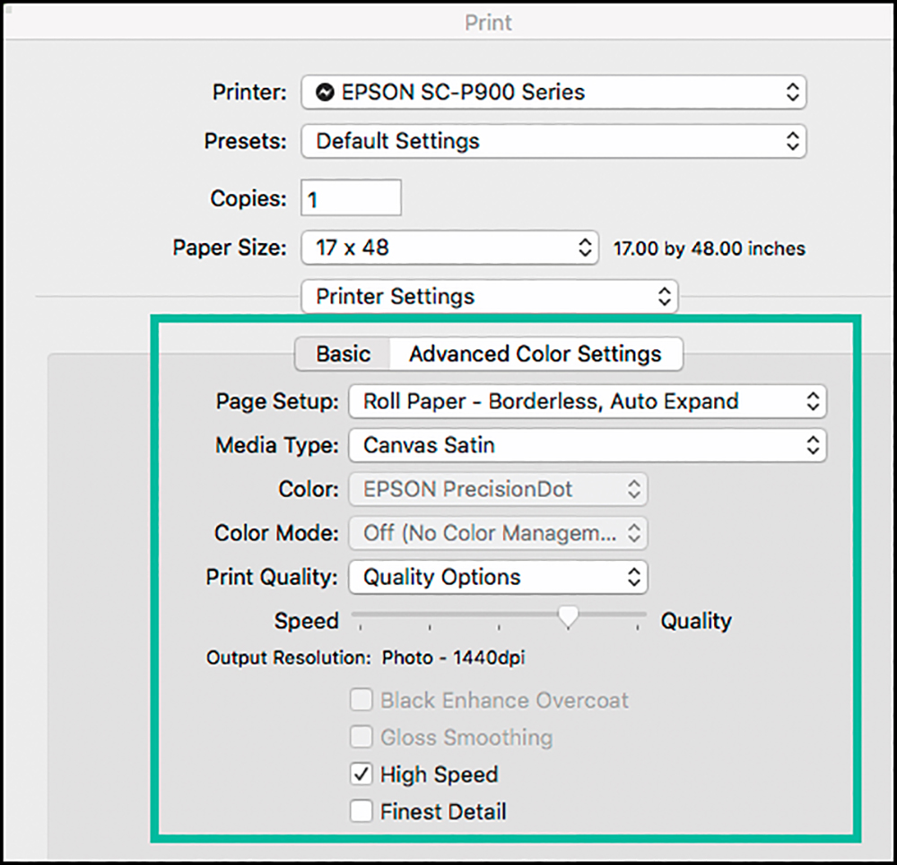
(5) Go to Printer Settings and make your quality choices (the content of my Green box, Figure RF 4). Note that for Epson Canvas materials the only available resolution in the driver is 1440 dpi., and for Matte finishes CB is not available. Click Save. The Auto Expand option is useful for those planning to stretch the canvas on a frame.
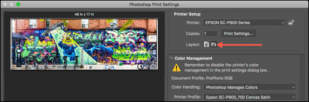
(6) Most importantly now, you are back in the Photoshop Print dialog, where you want to make sure to select Landscape orientation (red arrow, Figure RF 5). The pano you are printing should fill the preview frame with the whole image showing if all the paper size, image size, and orientation are coherent. This way, it should print correctly.
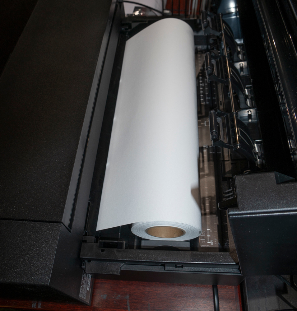
We are now ready to load the canvas and print. The roll holder is attached. The loading process consists of the following steps:
(1) Start the printer, go to Paper Settings on the LCD, and select Roll Paper.
(2) As instructed on LCD, open the roll holder cover.
(3) As instructed on LCD, place the paper into the holder.
(4) Feed the canvas under the small white rollers as shown in Figures RF 6 and RF 7.
(5) Continue feeding until you hear a beep then close the cover.
(6)) The printer starts loading the canvas.
(7) The LCD then says there is Canvas 17.01 inches loaded.
You can start printing.
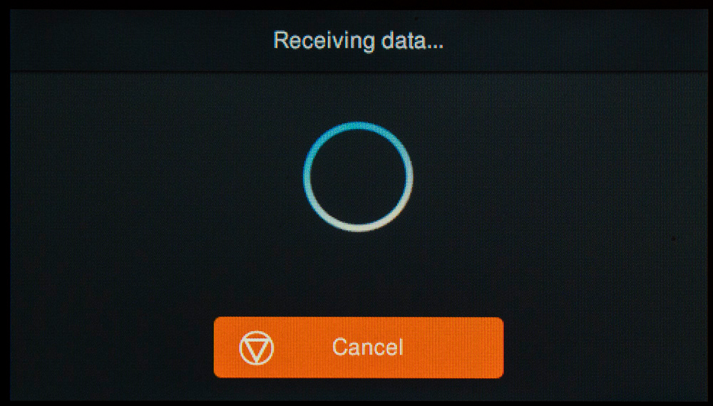
You could encounter a situation where the printer anticipates there may not be enough ink in one or more or channels to complete the job. When you commission the print, the printer starts working, the LCD saying it is receiving data, then a message appears advising to replace an ink cartridge because there may not be enough for the print to complete. You are given the option to carry on regardless (risking stoppage due to empty ink during printing) or to replace the ink. The manual says that if one replaces a cartridge part way through printing, the colour may differ slightly once it resumes. So I decided to replace two of them, based on the ink status info (Figures RF 8 and RF 9). Pulled cartridges can be reinstalled if they are not completely exhausted.
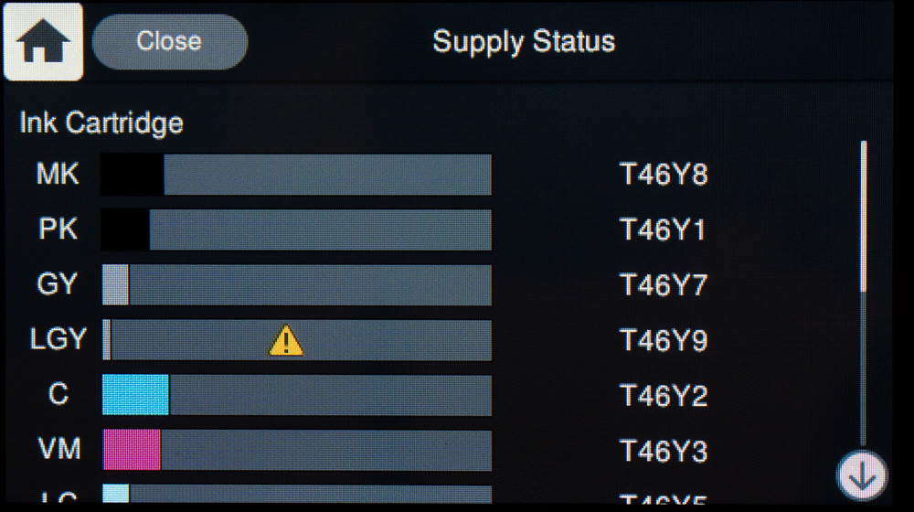
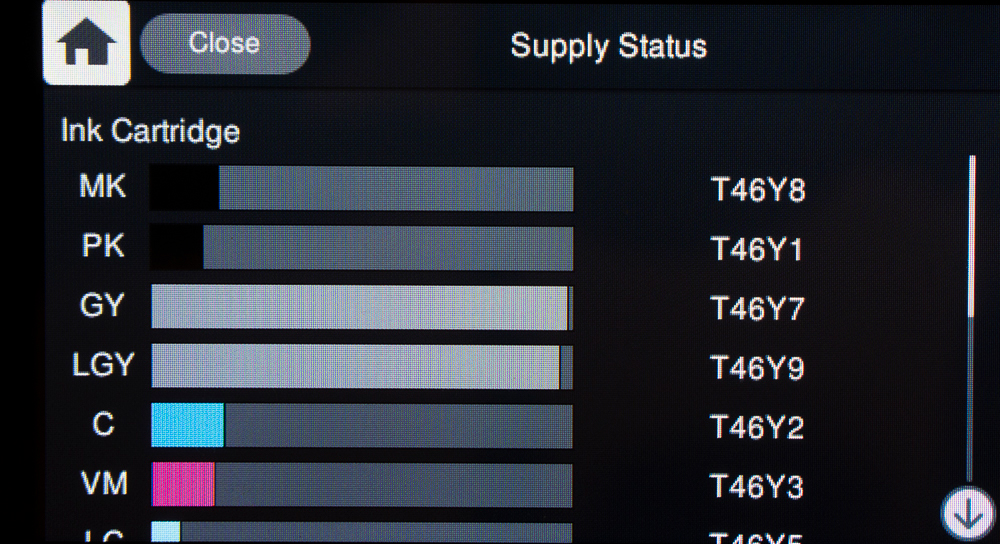
I can see comparing the bars in figures RF 8 and RF 9 that LGY probably would not have lasted for the whole print (the used amount showing in RF9 exceeds what appeared to be remaining before printing in RF8), whereas GY most likely would have lasted; (nothing lost – after printing, I reinstalled the previous cartridges and when they exhaust, I’ll replace them with the newly started ones.)
Having installed the new cartridge to get this pano printing, the printer stuck in “receiving data” status forever, so I canceled the print job and started it over. Once the printer is happy with its ink supply, it will pull up a menu in the LCD asking you to confirm the media type and size, and with roll paper, it offers you the option to print a cut line just beyond the end of the print; I selected that option. Printing worked fine, as seen in Figure RF 10, which is a photograph of the actual pano print laid on a table, 4 feet long 17 inches high.
Once the print is complete a message in the LCD gives you an option to “Eject and Cut” which is the one I selected, as it moves the end of the print fully out of the printer and exposes the printed cut line, which really helps to make a straight cut. This is recommended for trouble-free reloading the roll next time, so do use it. Once finished cutting, you press Done and the canvas unloads (retreats back into the printer).
I selected borderless printing because I wanted to see whether this printer would really do that accurately and without making a mess. It produced a flawless borderless print (top and bottom – left and right you need to trim) and there was no spillage of ink visible in the printer. What’s more, the image quality was excellent: clear, sharp, good tone, and color throughout. Very impressive – 10/10.
Reverting to the photographic aspect for a moment, when printing on a roll of canvas (or any matte papers), I can’t emphasize enough the importance of editing tone and color properly under soft proof before sending it to the printer. The gamut volume and maximum Black of much canvas media are quite limited (in the case of Epson Canvas Satin about 512,387 and L*22 respectively (versus over 800,000 and L*3 or so from a high-quality Luster paper in this printer). The following screengrabs from Photoshop show three image states illustrating how one needs to adjust photos under soft proof for printing on media with limited gamut and Black density.


Driver settings:
Some driver options are different enough in the SC-P900 that it’s worthwhile explaining what they are.
As before, the big divide in terms of printing control is the choice (in the photo application) between Printer Manages Color or Application Manages Color (e.g. Photoshop, Lightroom).
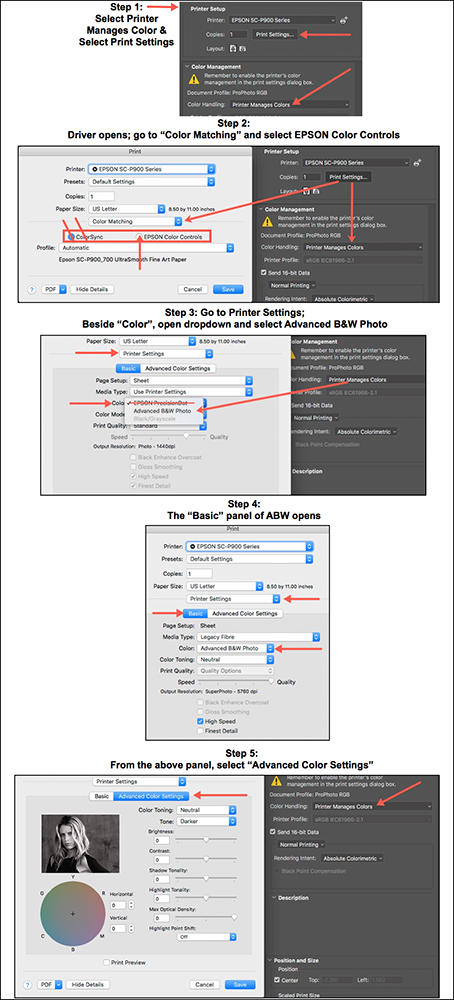
Printer Manages Color gives easy, quick, and fairly decent results. Generally, Printer Manages Color is best reserved for accessing the Advanced Black& White (ABW) feature of the Epson driver to make Black and White Prints, discussed in detail later in this review.
For now, focusing on managing the driver, the route to ABW is shown in Figure 10 (macOS version). By step 5, all the controls needed to flavor ABW to taste are available. By the way, working in ABW mode, there is also access to CB for gloss/luster papers. It is deployable in the driver’s Print Quality selector along with ABW, as I’ll show when discussing ABW.
Application Manages Color: Once embarked on this path, printer color control options are greyed-out to avoid conflicting color management (Figure 9).
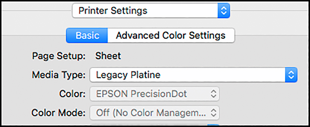
For the P900/P700, the driver provides new options for managing print quality, given the new print head design and the CB option. The quality options the driver provides differ depending on the Media Type because CB is applicable to gloss-type papers only. I’ll illustrate in-depth with two paper types: Epson Legacy Platine and Epson Legacy Fibre. First, for Media Type in the driver, there is a selection called “Use Printer Settings”, which if selected, means that the driver will cohere with the paper choice in the printer LCD panel (more on the LCD panel below). The two must cohere one way or another.
Epson Legacy Platine
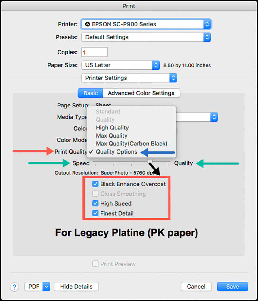
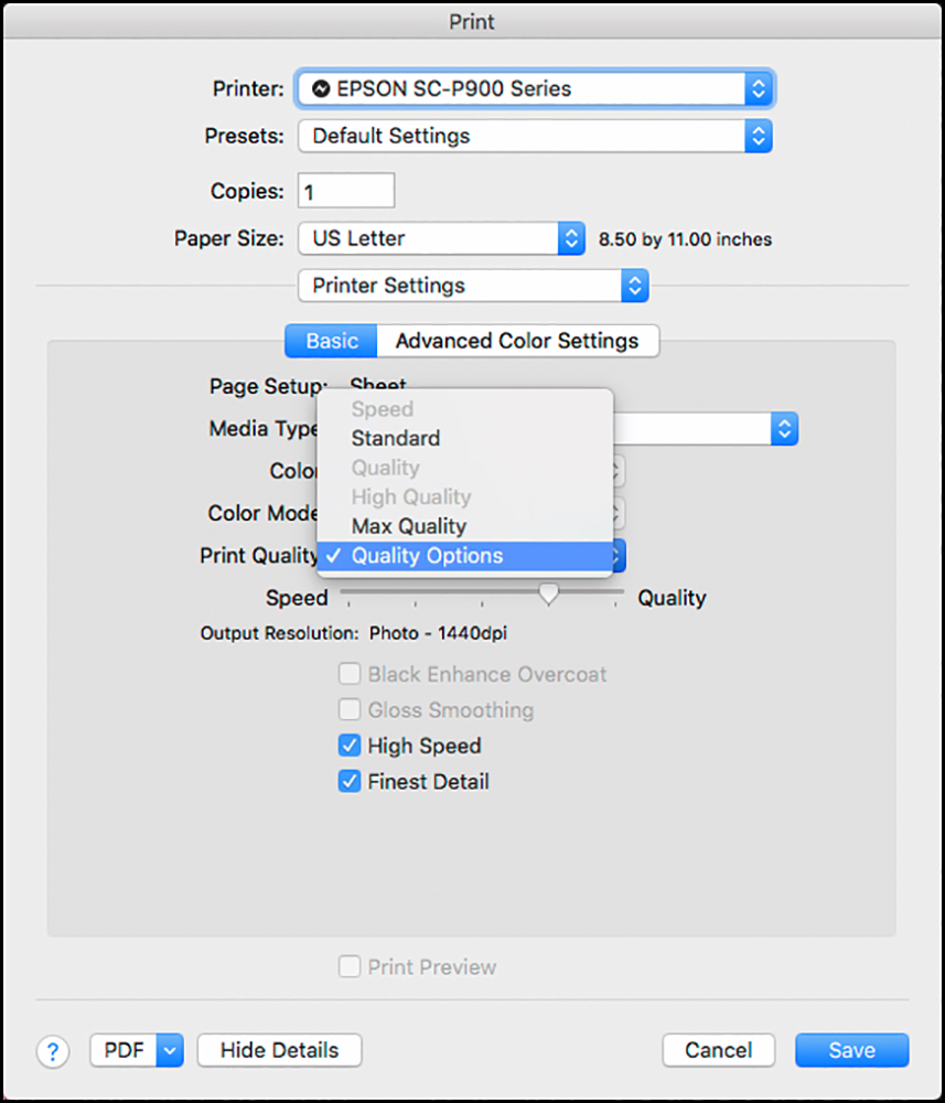
Notice between my two green arrows (Figure 11), there is a new control bar showing the progression to be made going from speed to quality (low to high resolution, the low being 1440 dpi, and the high 5760 dpi). To some extent they are offsetting: more quality, less speed; I’ll show the trade-offs below. Optionally, the “speed/quality” mix is manageable by selecting the Print Quality (red arrow) dropdown and selecting from the choices available for this paper (the “Standard” and “Quality” choices are not available for this paper).
Now, here’s where things get just a bit subtle, so please read carefully. When you choose a quality setting in the pull-down shown in Figure 11, the treatment of the options I’ve enclosed in a red box (Black Enhance Overcoat, High Speed, Finest Detail) will be pre-determined (like a “preset”) and greyed out of your control, EXCEPT if you had selected “Quality Options” (blue arrow) AND you set the speed/quality slider at the 4th position (going from left to right, Black arrow), whereupon you will be able to turn on or off any of those three available choices that are within the red box.
If you set that slider to the final position, CB gets turned on and greyed-out. Both the 4th and 5th positions give us 5760 DPI quality, but the micro-weave differs a bit between them – I am told not to an extent most human eyes would see in the size range of prints we would generally make with this printer.
As before, “High Speed” enables bi-directional printing (I assess it further on). Fine Detail is more useful for vector graphics. I examine the contribution of CB below.
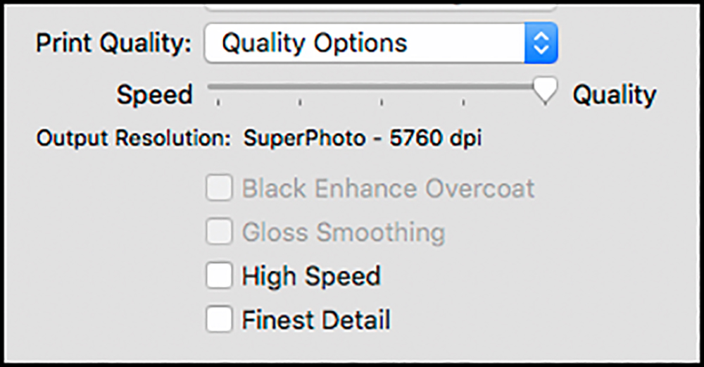
Epson Legacy Fibre (Figure 12):
Because this is a matte paper, CB is not an available option, so it is greyed out even when selecting “Quality Options”, which opens everything that can be user-determined. For this paper, by selecting “Quality Options” in the dropdown, the choices of whether or not to use High Speed and Finest Detail are workable. The Speed/Quality slider for this paper has only two available notches: the 4th from the left provides 1440 DPI quality, as shown in Figure 12, and the last one 5760 DPI. With “Quality Options” selected in the Dropdown, you can turn off High Speed, turn off Finest Detail, and move the slider to the right-most position providing 5760 DPI resolution (Figure 12a). This would provide the highest quality print for Epson Legacy Fibre paper.
Other papers would enable different combinations of quality settings in the driver; you’d see them by loading the media type and just checking at the places I’ve shown here.
__________________________________________________________________________________________________________________________________
Sidebar on Paper Settings in the Driver
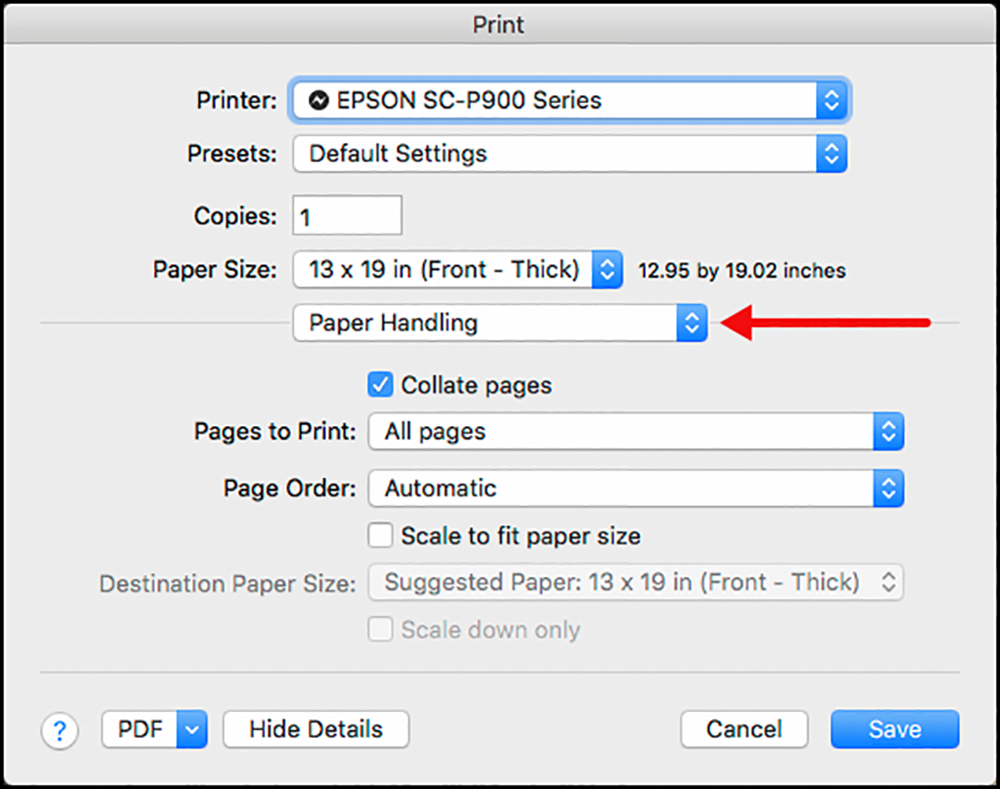
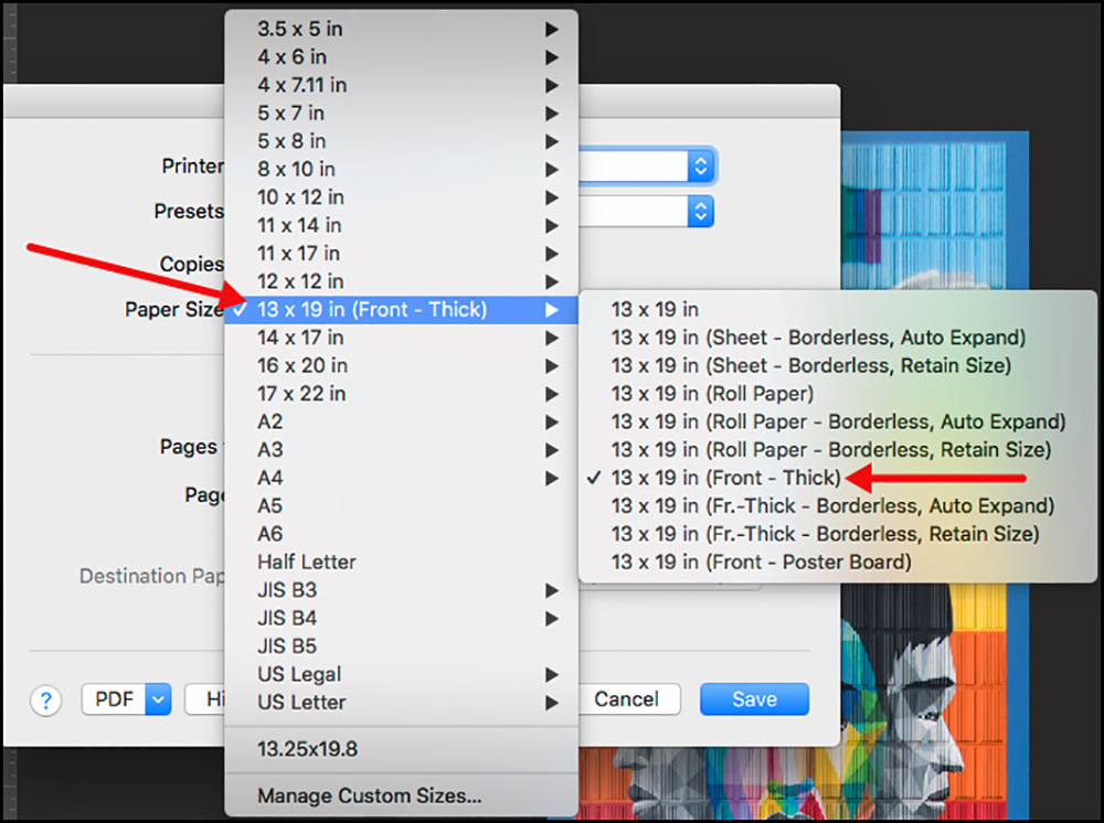
This information is not new, but as a reminder to those less familiar with the Epson driver: The general principle is that the driver bundles paper source, format, and size together. For example, let us say the intent is to make a 13×19 inch print using stiff media to be fed through the front paper feed. Select the Paper Handling menu item in the driver; scroll to the 13×19 inch size group, expand it, and the whole range of available source and format choices opens, of which one selects “Front” (right-most red arrow) in this example.
_____________________________________________________________________________________________________________________________
One observation perhaps important to you – there could be very large differences of time required to make a print depending on the selections you make in the Quality Options section of the driver.
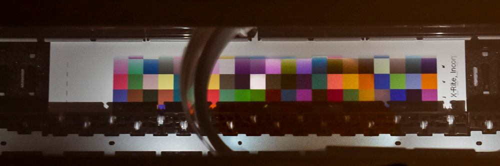
For example, my 48-patch printing evaluation target measures 49 square inches. Printing it on Baryta paper at highest quality: 5760 DPI resolution, High-Speed OFF and CB ON, took 9 minutes, 44 seconds. Trying it again at minimum quality: 1440 DPI resolution, High-Speed ON and CB OFF, the printing time was 1 minute, 8 seconds. So, the range in printing time is about 10:1, depending on the paper and settings. Here are several more indicators of print speed depending on the settings used, for a 6.5 x 9-inch print on a US letter-size sheet:
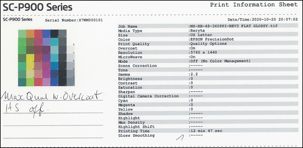
(a) Baryta paper, 5760 DPI, CB ON, High-Speed OFF: 13 minutes, 27 seconds.
(b) Legacy Fibre paper, 5760 DPI, NO CB, High-Speed ON: 3 minutes, 41 seconds.
(c) As (b) but High Speed OFF: 7 minutes, 43 seconds.
For Legacy Platine Paper, 49 square inches printed:
(a) CB ON, High Speed OFF: 19 minutes, 47 seconds;
(b) CB and High Speed both OFF: 9 minutes;
(c) CB and High Speed both ON: 6 minutes.
Settings clearly impact printing speed, and they influence quality. Details further on.
Once we’ve made our settings in the driver and in the printing application, we are ready to print. As usual, we can make Driver Presets of any combination of driver settings we wish to preserve for future use (the “Save as New Preset” option in the driver Print Settings).
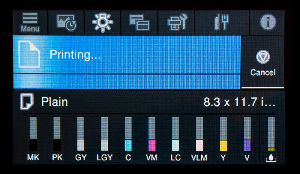
Operating Features: With all settings made, let us have a look at the SC-P900’s new features for making a print, many of which focus on the newly designed and enhanced printer LCD (which we can customize for which functions we wish to maintain readily at hand). The following sequence of illustrations shows how the process unfolds using the top feed, or what Epson calls the rear feed, but is really on top of the printer.
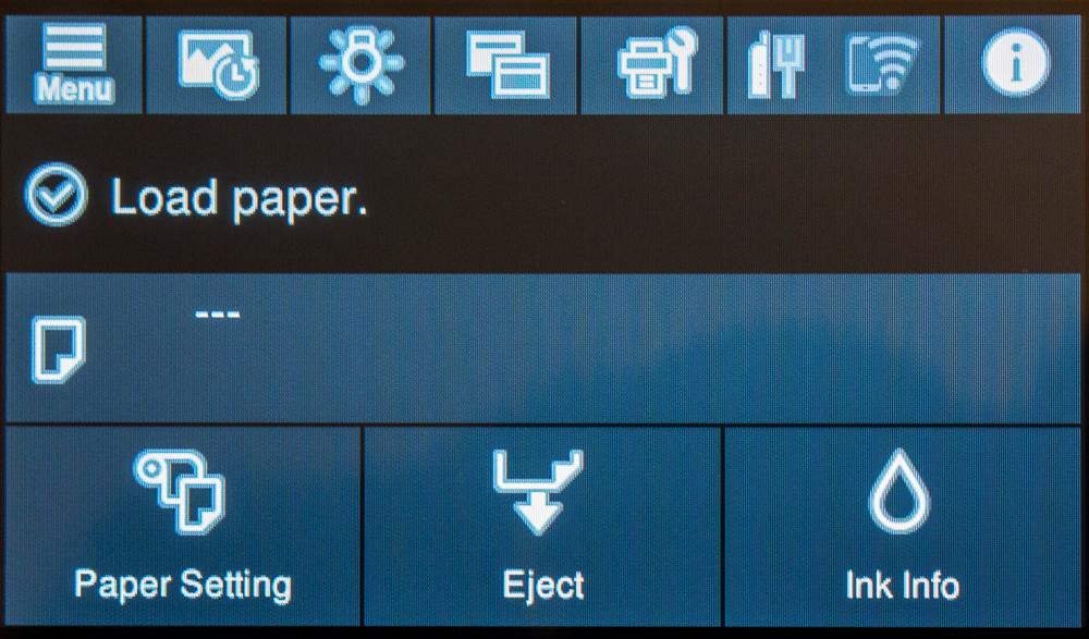

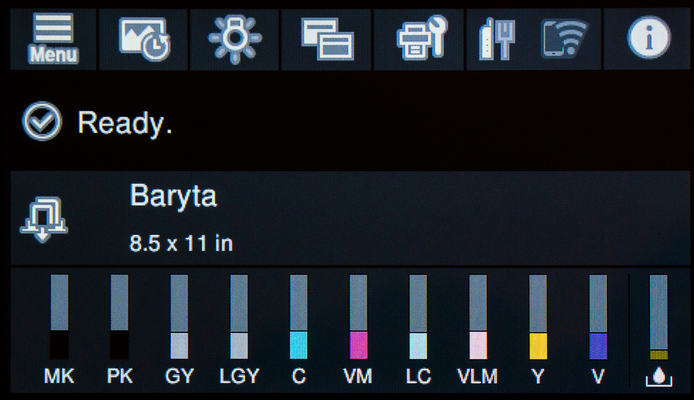
(Note: The “Baryta” Paper Type was generic pending a specific paper; the driver is now updated with a specific Baryta paper, being Legacy Baryta II, forthcoming early 2021. The Media Type I show here is just to illustrate the process; it isn’t a recommendation.)
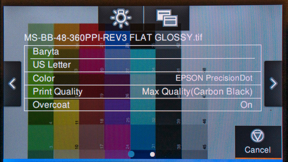
You can scroll three screens of overlaid information clicking on the arrows right/left.
(This feature is really fun – the digital equivalent of the print emerging in the developer tray of yesteryear.)
When printing finishes, scrolling the LCD (Figure 20) produces four tabs of print information. I must say – this LCD is a pleasure to work with. All the possible customizations and settings one can make with this printer are clearly laid out in the LCD menus and easily accessible. Epson has provided a user-friendly approach for customizing all these functions, with strategically produced nag messages to help us avoid mistakes.
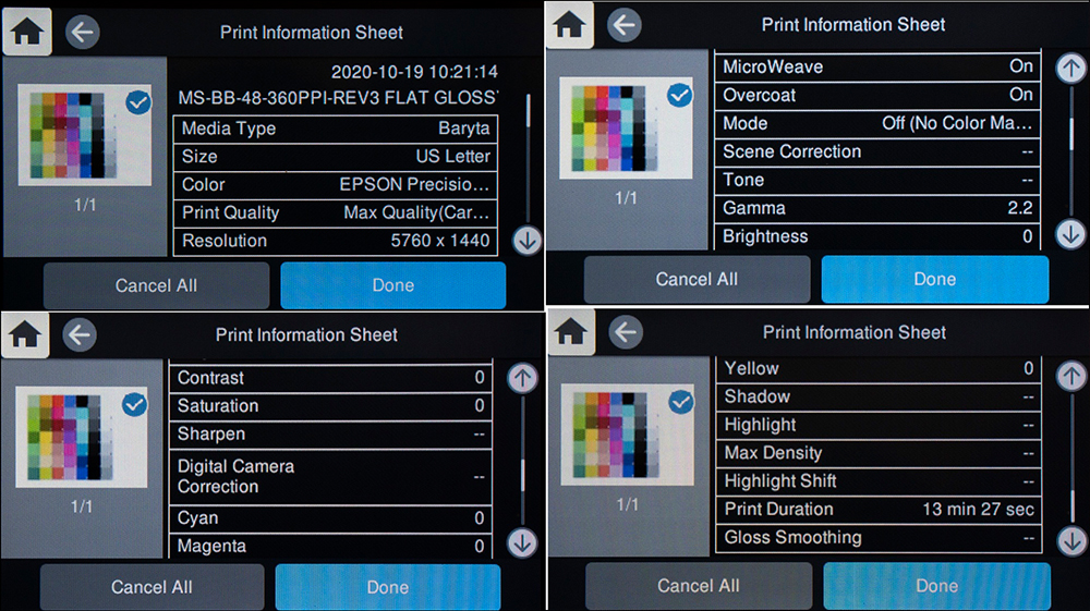
Clicking “Done” brings up a fresh screen with a button one tap to print the information. The printed information looks like that shown in Figure 21.
As the print emerges from the printer, it is held in a nicely designed pull-out tray that has a gently sloping gradient preventing the page from falling to the floor (Figure 22).
Printer Economics:
There’s a limit to how much I can say at the time of writing, because while the machine and paper costs are known, Epson has not provided a utility for reporting on ink used per print and the company has no intention of doing so, notwithstanding that they do provide it for their larger professional models (P4900 onward) and Canon has been providing it for years with the Pro-1000/2000/4000.
To determine the average ink cost per square footprinted specific to this model, it will be necessary to track the square footage printed until enough cartridges are replaced that an estimate of the volume of ink used can be matched against the aggregate square footage printed. But even then, it’s not that easy because ink also gets used for maintenance and those volumes are not reported either. So it’s like trying to unscramble an omelet.
For the time being, I shall assume that ink used for the P900 resembles that for the P4900, on which I have information derived from previous use of that printer: 0.0105 mL/sq.in. or 1.51mL/sq. ft., or 0.57 mL/”standard print” (this is my accounting metric based on a 6×9 inch print on a US Letter size sheet with minimum one-inch margins). I base the cost of ink on the current offers available in Toronto for the complete inkset, which works out to CAD1.31/ml including 13% sales tax. On this basis, the cost of ink for a standard print is CAD 0.74. This excludes overhead ink for maintenance, discussed later in this review.
The cost of paper of course varies according to the paper used and its procurement. The letter-size Baryta paper I have been using costs me about CAD 1.30 per sheet including 13% sales tax.
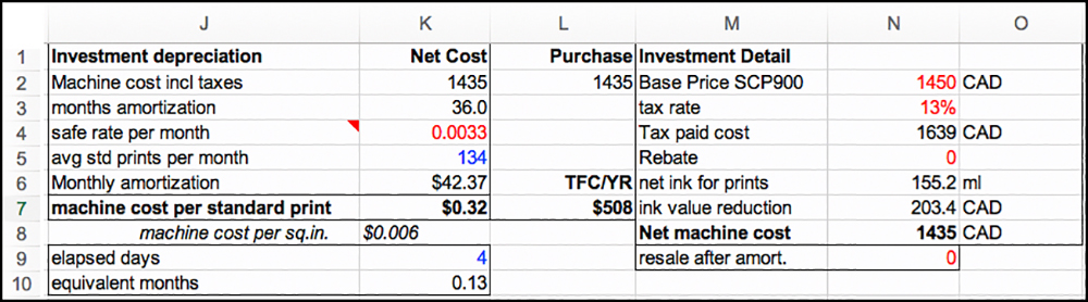
The Capital Recovery Charge for machine usage per standard print calculated in real-time as a function of throughput is a more complex calculation, illustrated in Figure 23. The steps implemented in the Figure 23 algorithm are:
(1) Enter the machine base book value (cell N2)
(2) Add sales tax (cells N3 and N4) (Ontario 13%)
(3) Deduct the value of residual ink (cells N6 and N7)
(4) Enter an assumed number of months you will use this printer (cell K3) (e.g. 36)
(5) Enter a monthly safe rate for the opportunity cost of capital (cell K4) (e.g. 4%/yr)
(6) The foregoing allows calculation of the fixed Levelized monthly machine amortization charge (in this example CAD 42.37 – cell K6) based on book value of the investment.
(7) From the photo printing log file, use the elapsed days of printer life and number of standard prints to date to calculate the current number of pro-rated standard prints per month (cells K9, K10, and K5).
(8) The capital recovery cost per standard print shows in cell K7. This amount is greater with less printing and smaller with more printing; as well, it increases with greater print size. As of the printer’s 4th day of use, the machine charge was CAD 0.32/standard print. It will vary from usage to usage depending on the interval and the number of equivalent standard prints made. After 38 days of use, the charge turned out the same.
Adding it all up, per standard print in CAD:
Machine Cost 0.32
Paper 1.30
Ink 0.74 (uncertain)
Total 2.36 (In USD excluding sales taxes: 1.55)
These are narrowly defined direct costs and depend only on the assumptions made; in particular, the volume of ink per square foot printed remains to be determined for the P900. No overhead (e.g. rent, insurance, property tax), electricity, labor cost or allowance for wastage and maintenance are included. You can “ratio it up” for the cost of larger prints from the same printer.
Basic Test Results:
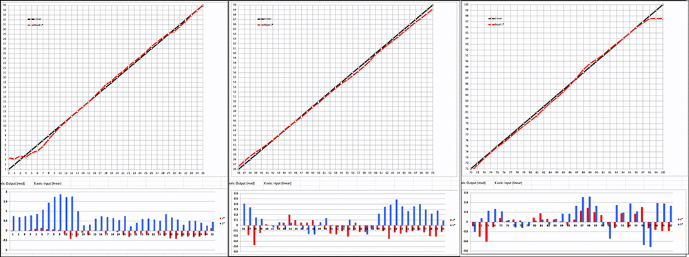
In this section I evaluate printing condition performance using Epson (“OEM”) profiles and my (“Mark”) profiles, to see basic imaging characteristics and how accurately the SC-P900 renders colors (“colors” includes the grayscale) on paper. I do this for one gloss-type paper (PK ink) and one matte paper (MK ink), being Epson Legacy Platine and Epson Legacy Fibre respectively. None of the printers I’ve ever reviewed render image file color values with total accuracy, but they can come close enough that the inaccuracies are immaterial. I use the “dE” metric for assessing numerically the impact of inaccuracy on “standard observers” perception of color differences. This is explained in Annex 1.
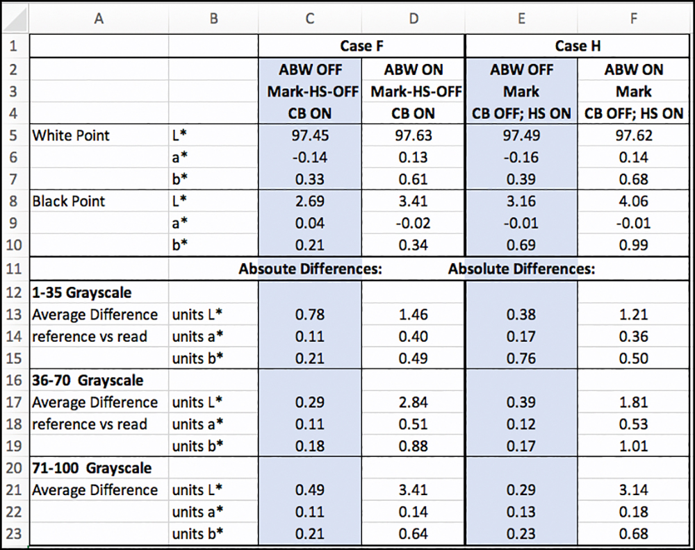
Epson Legacy Fibre Paper:
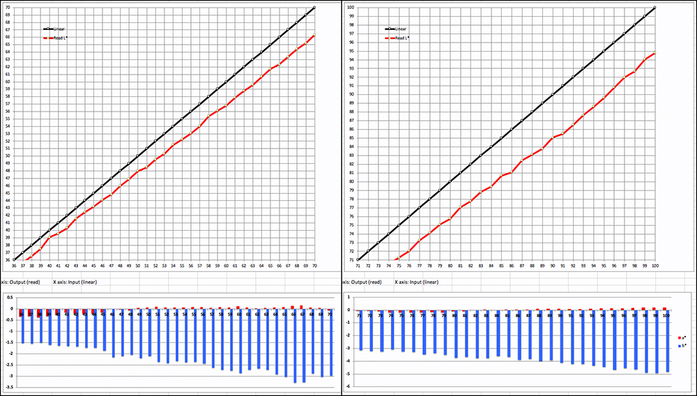
Profile characteristics are similar between the OEM and Mark profiles (Figures 24, 25).
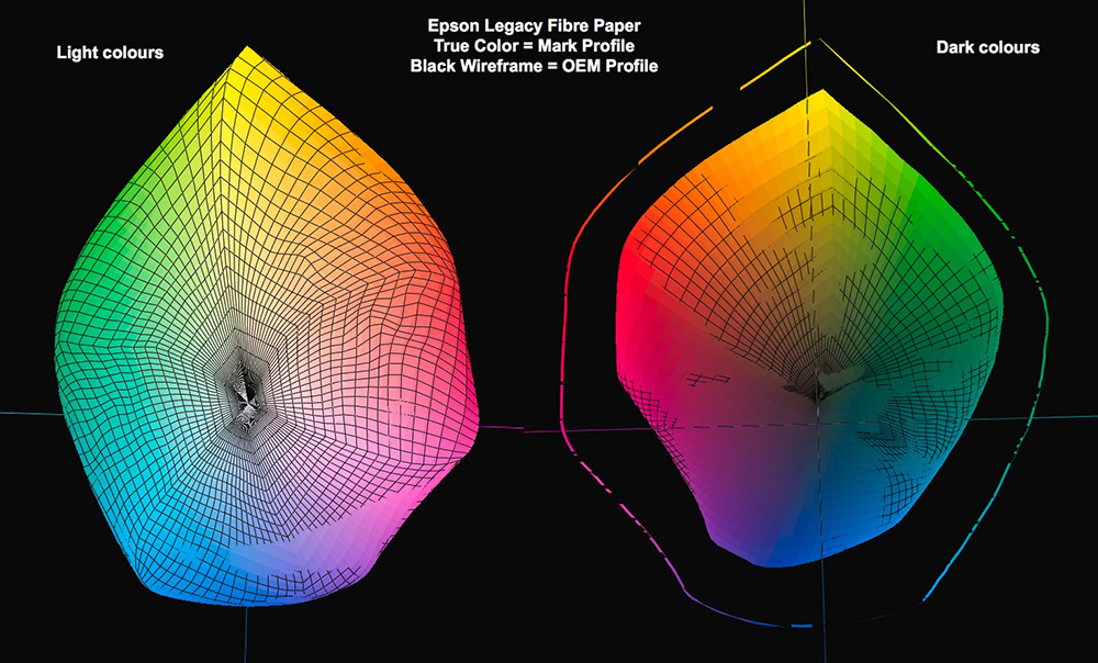
In Figure 24 we can see the near identity of gamut shape between the two profiles and the slightly larger gamut volume of the OEM profile, except for the dark blue/purple colors, where the Mark profile shows through the wireframe depicting the OEM profile. The top left quadrant of the Figure 25 table shows that statistically, the difference of gamut volume between them is insignificant. Maximum Blacks are the same and typical for this paper. There is only a trivial difference between the White points.
The dE results of rows 20, 21, and 22 show a generally excellent outcome for the Mark profile and a generally acceptable result for the dE(2000) set from the OEM profile (evaluation targets printed with High-Speed ON, as testing determined this to be slightly more accurate statistically than using High-Speed OFF. While the dE(76) result focuses narrowly on the bald numerical difference between the file value of the test patch and its read value from the print, the dE(2000) result is a more accurate metric of how such differences would impact the visual perception of a standard observer.
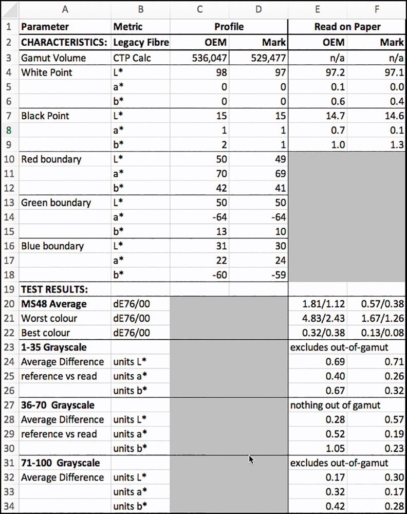
The data underlying this summary information appears in Figure 26. Yellow highlighted cells indicate that the reported dE values in those cells exceed 1.0. Some of the OEM dE(76) results have larger values than desirable. The data for patches 35, 36, and 37 are excluded because they are deep Blacks out of gamut for this paper (and matte papers in general).
Generally speaking, a profiling result will test more accurately when the same instrument and printer are used to both make and evaluate a profile, compared to when they differ between making the profile and evaluating it. I naturally have this make/evaluate instrument consistency for my profiles; but that is not so when I am evaluating prints made with an OEM profile, as I would not be using the OEM’s profiling set-up for my evaluation of their profiles. Annex 1 provides a guide to my evaluation charts and graphs.

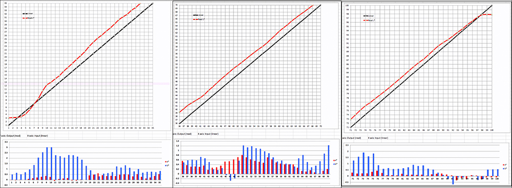
Figures 27 and 28 focus particularly on grayscale rendition for the OEM and Mark profiles respectively. The gap between the red and black lines for file values L* 1 to L* 15 occurs because this printing condition’s Maximum Black is at about L*15 as we’ve seen above.
Smaller differences between image reference values and their printed values will be less noticeable in real-world printed photos than would be larger differences. Theoretically, one is supposed to notice differences beyond a dE value of 1.0, but very often the differences need to be larger than that to be disturbing when comingled in a print having tens of thousands of colors.
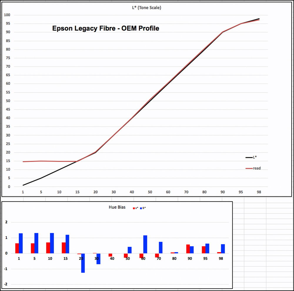

Comparing the results for both Figures 27 and 28, both profiles perform well and similarly for the grayscale, the Mark profile showing a bit tighter adherence to target values than the OEM for reasons explained above.
As a number of people making prints value linearity and neutrality in the grayscale and Epson themselves have devoted considerable effort to the B&W experience, I provide a more detailed analysis of the grayscale in the form of my granular 100 patches (L*1~100) grayscale evaluation targets, disaggregated into three sections, one each for dark, medium and light tones (Figure 29 for my custom profile). The presentation and interpretation of these results are similar to those in Figures 27 and 28, except that they report every Level from 1 to 100, rather than every 10th or so.
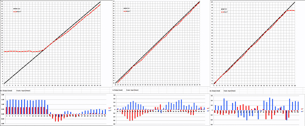
The more granular detail in Figure 29 indicates very moderate departures from strict linearity and strict hue neutrality, but they are not large or discontinuous enough to have a visual impact on the perceived quality of a B&W print. I shall be examining that with real photographs below. Rows 23 to 35 in Figure 24 show statistical summaries for the three graphs (column F for my profile). The data are the average differences from target values for each section of the scale. The closer these values are to zero, the more accurate is the overall rendition on average, and the more satisfying the B&W tonality should be, in respect of both tone and hue bias. The results here are very good.
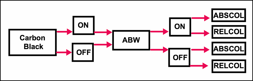
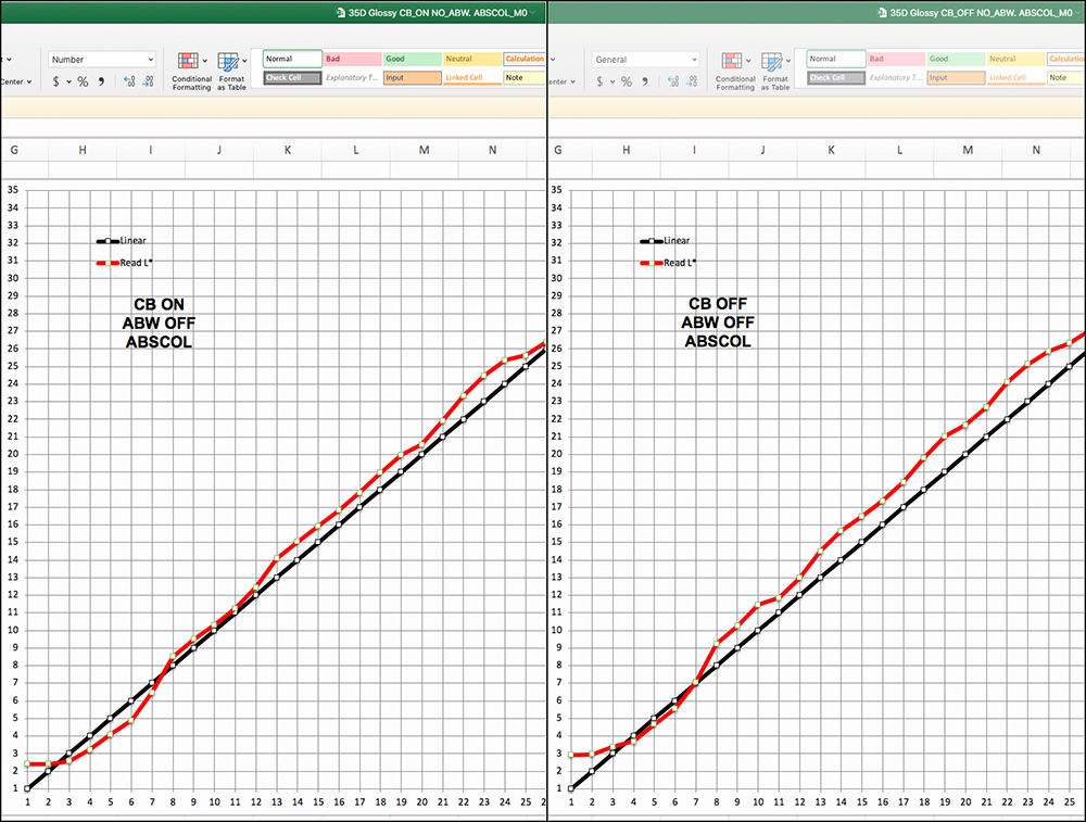
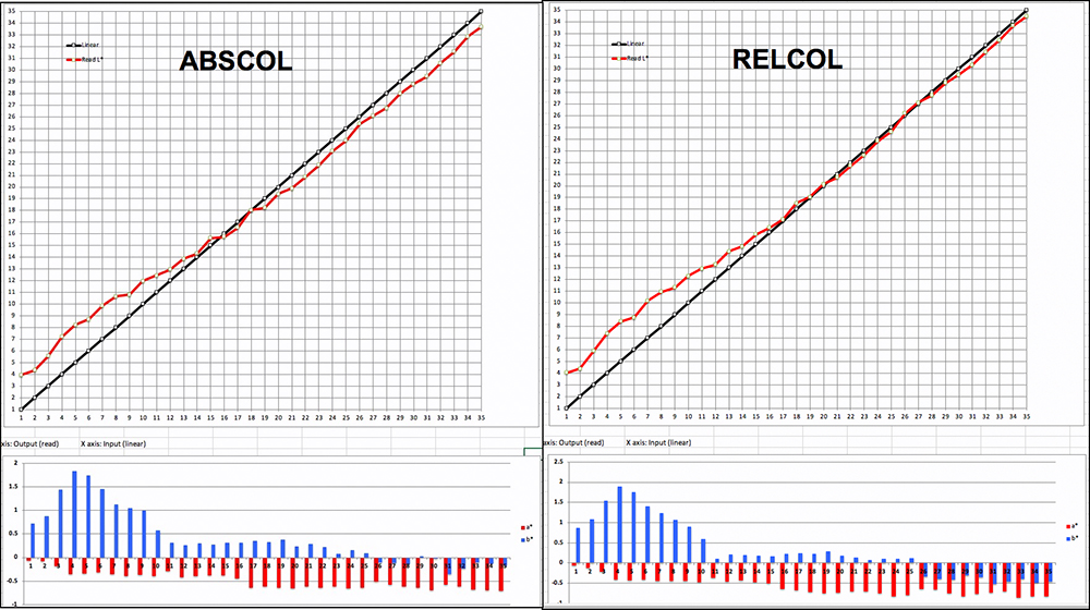
I should remind you that these graphs are generated from targets printed in Absolute Rendering Intent (ABSCOL), which isolates the native behavior of the printing system without the influence of application-induced colorimetric adjustments. It is meant for proofing how reliably the printing system reproduces image file color values. The more accurate the printing system, the more confidence we can have that when we soft proof photos for printing with RELCOL or Perceptual Intents, the tones and colors we adjust will be rendered accordingly on paper, to the extent the soft proofing is reliable enough.
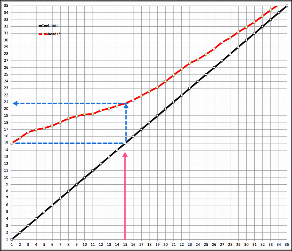
People making B&W prints on Legacy Fibre paper in ABSCOL would indeed see the first 14 L* levels squished into one indistinguishable blob of deep gray, which would be photographically unacceptable for many photos. By printing with Relative Rendering Intent (RELCOL) and Black Point Compensation (BPC), the deepest Black from the image color space is remapped to the deepest Black of the paper/printer profile space, and all lighter shades of the tone scale from there upward would be remapped accordingly. Graphically, the remapping of the dark tonal range is portrayed in Figure 30, which is the leftward graph of Figure 29 whose source target is reprinted with RELCOL and BPC, instead of ABSCOL. Instead of the first 15 levels being bunched together at L*15 (lower blue line of Figure 30), the mapping of file value L*1 is remapped to L*15, and by the time file value L* 15 is reached, the printed value maps to L*21 (dashed blue arrows), opening up tonal distinction albeit at reduced darkness and contrast relative to the image file values. But at least shadow detail is opened up between file values L*1 and L*15 using RELCOL with BPC.
In sum, this printer gets a stellar passing grade for how it handles both color and the grayscale using Epson Legacy Fibre paper – a very high-quality matte media, by the way, for those who like making prints on matte paper. I’ll be showing this in photographic terms rather than numbers later in this review.
Epson Legacy Platine Paper:
This is a PK-ink paper with much deeper Black density and much larger gamut volume than possible from any matte paper and is one of the finest inkjet printing papers on the market; it has a luster-style coating, cotton substrate, and no optical brightening agents.
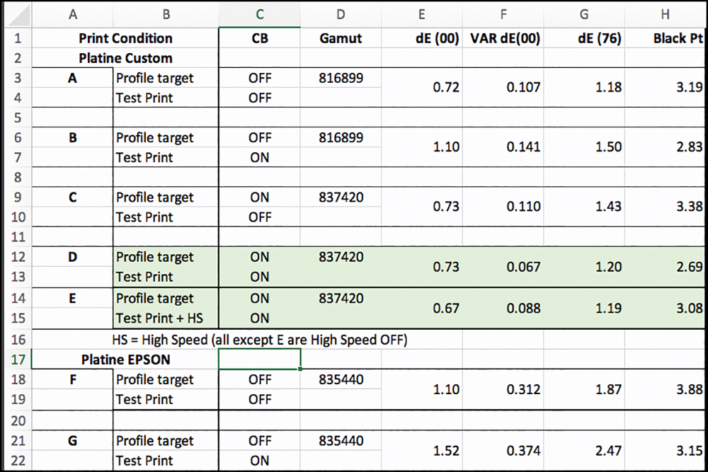
This paper invites extra testing because the new CB option is available for it in the driver and is supposed to provide a deeper Black Point for high gloss papers, the glossier the more effective, according to advice from Epson (this is not a high gloss paper, but I’m exploring CB with it nonetheless, as it’s available; I’ll briefly demo some high gloss further on). When making custom profiles for such papers, one may print the profiling targets with CB on or off. Each produces a different gamut volume (Figure 31) and Black Point, where one sees that the profile with CB ON has a slightly wider gamut than that with it OFF, particularly so for the dark tones (right side of Figure 31).

The availability of CB for this paper creates four options regarding CB being ON or OFF for how one prints the profiling targets and then, the profile evaluation targets. The options are as follows (all are 5760 dpi with High-Speed printing OFF; only CB varies):
(A) Profile Target: OFF; Evaluation Target: OFF
(B) Profile Target: OFF; Evaluation Target: ON
(C) Profile Target: ON; Evaluation Target: OFF
(D) Profile Target: ON; Evaluation Target: ON
Each one of these printing conditions produces different outcomes with respect to (i) accuracy of tone and color rendition, (ii) depth of the Black Point, and (iii) differing gamut; so the objective for my custom profiling and printing is to find out which of the four options is the best overall based on these criteria. This required making two profiles (CB ON/OFF) and two evaluation target prints (CB ON/OFF) for each profile.
Epson makes its profiles with CB OFF, but I can make prints from those profiles with CB ON or OFF. Figure 32 shows the summary results of testing these conditions.
For the Custom profiling, Condition D in Figure 32, highlighted in faint green, is the best, insofar as it’s Black Point is the deepest, it’s gamut volume the highest and it’s dE values similar to Conditions A and C, but with lower variance around the average, which is preferable, because lower variance means fewer colors with high dE values. I hasten to add that such judgments are “by the numbers”; the differences between them are too small to be noticeable in real-world prints, even if you were to put them side by side, and even less so if you didn’t.
Enabling CB adds a lot of printing time (27 minutes printing for 51 square inches), so Condition E is a test of Condition D but with High Speed ON (13.5 minutes printing). Interestingly, although Epson’s official advice has been to turn High Speed OFF for the highest quality, the results don’t fully support that advice. Relative to High Speed OFF, High Speed ON marginally improved the dE outcomes, but increased variance in the dE results in a little, and marginally decreased the density of the Black Point (by 0.38 of an L* level) – not enough that anyone would see the difference in a print. So, by the numbers, using High-Speed ON seems fine. I’ll verify this with real world photographic prints later on, as we also want to view the quality of gradients and detail in photographs.
The results for the Epson profile, Conditions F and G, are a bit less favorable than those for Conditions D and E: slightly higher dE and Variance, slightly less dense Black. Some difference between OEM and Custom profiles is always expected, for known reasons.
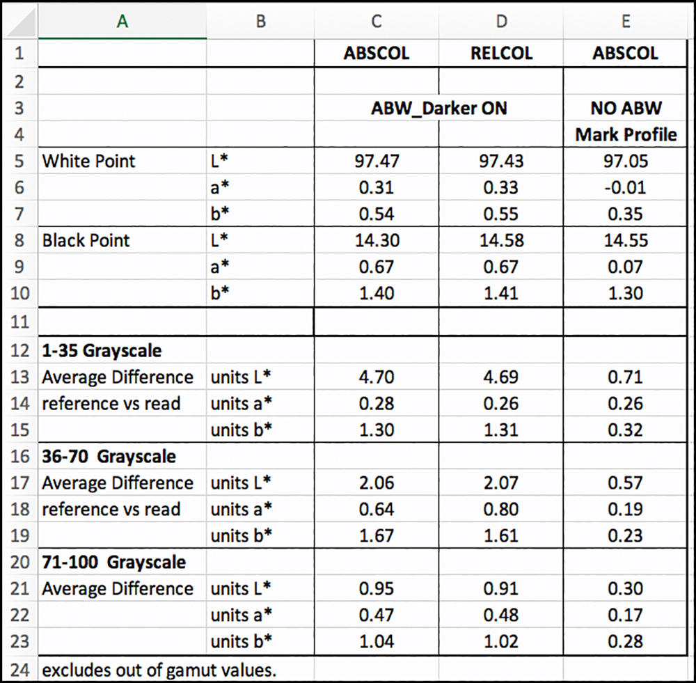
To construct the options for analysis shown with more detail in Figure 33, I culled several from Figure 32 and added two new cases. For discussing Figure 33, the cases are identified by their column letter at the very top row of the Figure. In Figure 33, cases F, G, and J are the same as the printing conditions of Figure 32 D, E, and F respectively.
Focusing on Figure 33, in cases F, G and H the quality setting uses 5760 dpi, options with versus without CB, and High-Speed ON or OFF. In this case, I configured to test the accuracy of the speediest printing option available for this paper: 1440 dpi, CB OFF (profile selected accordingly), and High-Speed ON. The reason for testing this condition is that printing time with the higher quality settings, at the extreme, can stretch to 27 minutes for 51 square inches of print on a Letter size sheet. Figure 33 Column I case makes the same print in 2.25 minutes, so it’s worth looking at the extent of quality it sacrifices for printing about 10 times faster.
Starting with the profile data (Figure 33 faint green panel, read from ColorThink Pro), the gamut volumes for the three profiles are similar, the Mark profile with CB OFF being about 2.5% lower. The OEM and Mark CB ON profiles have about 2% larger gamut volume than does the same paper in the SC-P800 printer (which was 820,422). This small difference of gamut volume in and of itself is very unlikely to make much difference to the appearance of printed photographs from either printer.
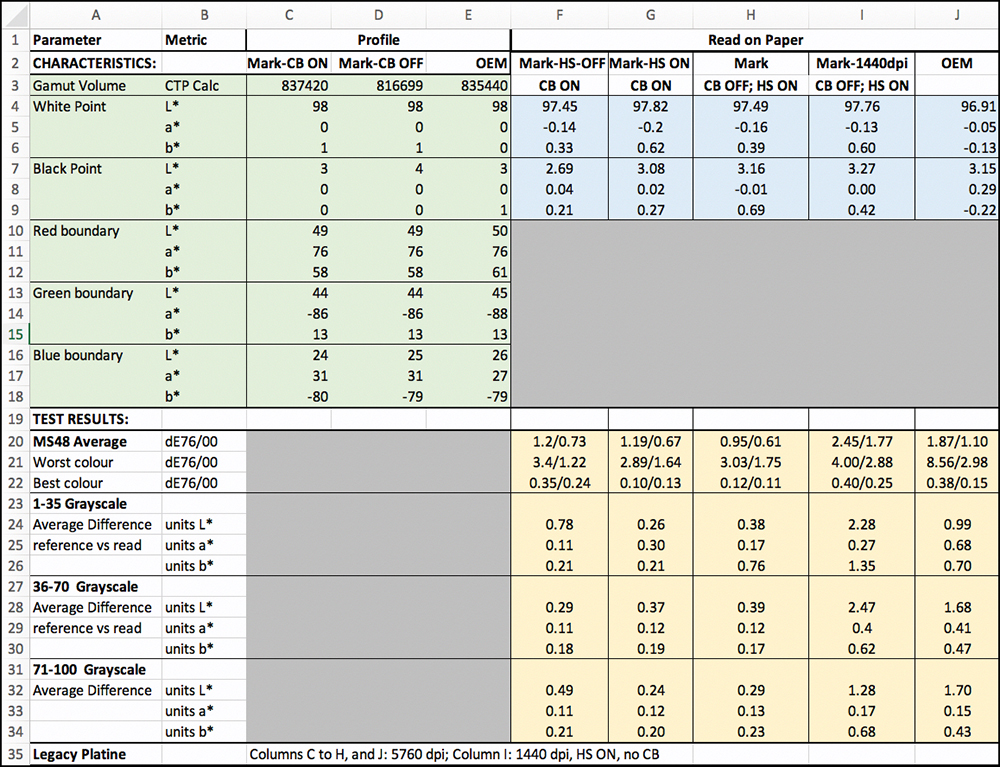
However, the gamut shapes are a bit different; in particular, the Violet ink added to the P900 inkset provides for some comparative stretch of the Blue/Purple gamut boundary, insofar as the b* boundary for the P800 is -74, whereas for the P900 it is -80 (comparing my profiles for both papers), a difference of about 8%, Figure 34 wireframe = SC-P900).
The Profile Black Point (CB ON) for the SC-P900 is about one L* level less Black compared with that for the same paper in the SC-P800 printer, but within a range of L*2 to L*3, it’s insignificant – and please see the more important evidence of printed results just below.
The faint blue and faint orange sections of Figure 33 indicate how these profiles and the varied printing conditions perform on paper. The best result for maximum Black is the Column F case, with High Speed OFF and CB ON. This is also the most painful printing condition, requiring 27 minutes to print 51 sq. in. The Black Point is 2.69, with very low, imperceptible hue bias. Rendition accuracy is very good, the average for the 48BB combined colour/B&W 48 patch-set being 1.2 dE(76) and 0.73 dE(00).
Interestingly, however, the most accurate overall outcome for dE is the Column H case, with CB OFF and High-Speed ON. The average dE results are 0.95 (dE76) and 0.61 (dE00).
By way of comparison, for the P800 with Legacy Platine paper, the average dE 76 outcome was 1.6 (I do not have a dE(00) reading for the P800); hence on this media for custom profiling, the P900 appears to provide on average more accurate tone and color rendition. I say “appears” because the technical conditions for testing the two printers are not strictly the same. When I did the P800 work about 4 years ago, I was using an i1Pro2 spectrophotometer, while I am now using an i1Pro3. Also, the evaluation target I used for the P800 was the 24-patch ColorChecker, while I am now using a 48-patch evaluation target for the P900. I don’t know whether these differences matter.
The three cases portrayed in Columns F, G and H all show close and satisfactory results for the 48-patch multicolor test and for the gray-scale granular targets in rows 24 to 34.
The cases in Columns I (Mark, High-Speed) and J (OEM profile) are considerably less satisfactory. While the case in Column I [1440 dpi, High-Speed ON and CB OFF] prints very speedily, its rendition accuracy is generally less satisfactory (details below); hence, this combination of settings is not recommended for fine art printing on this media if the intention is to preserve accurate tone and color.
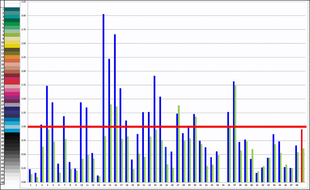
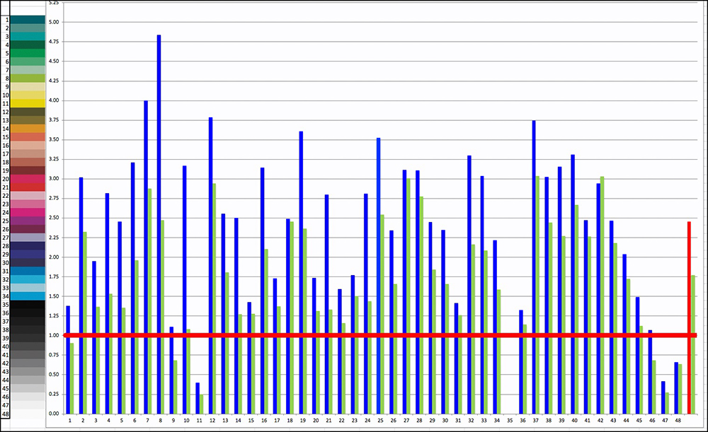
Figures 35 (Case H) and 36 (Case I) provide a graphical comparison of the difference between highly satisfactory and less satisfactory outcomes respectively.
Please note the difference of the numerical values in the dE scales on the left side of the graphs; the error range is much lower for Case H than for Case I. The Blue bars are dE(76) results and the Green bars dE(00) results per patch. Ideally one would like all results to fall below the horizontal Red bar, set at dE = 1.0. Values above 1.0 are supposed to start being perceptible, and the further above 1.0, the more noticeable the departures from the true values may be. Where high dE outcomes are exceptional, I re-read those patches to make sure the result is not due to a misread. Where high dE outcomes predominate, we know in this context that there is a problem related to profiling.
About half a dozen patches in case H have higher dE values than desirable but apart from that, the remainder is OK. In Case I only a few are satisfactory.
Case J, the OEM profile, has several dE(00) outcomes exceeding 8.0, which is highly irregular, and the cause of it is under review. Epson will be producing a new profile for this paper, but the timing is uncertain; once it becomes available I shall retest it and report the results on this website.
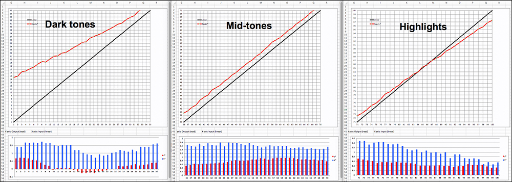
It’s also interesting to look at the detailed grayscale tests for these two cases (Figures 37 and 38 for cases H and I respectively).
In Case H, the Luminance curve tracks its target values very closely pretty much through the in-gamut range, save for a few levels at the darkest end of the tone scale. The bars depicting hue bias are generally well below 1.0 for all but five levels at the dark end of the tone scale and none of those exceed 2.0.
In Case I, while the Luminance curves are generally quite linear throughout the tone scale, they indicate a systematic tendency to print tones that are around a couple of Levels too bright. Quite a number of the bars depicting hue bias show values well exceeding 1.0, when ideally, they should all be around zero, or otherwise below 1.0.
Summing up, the best results on this paper, and perhaps others like it, are achieved using 5760 dpi quality, with CB ON or OFF to taste, and High-Speed ON, unless you have the time and want to produce the absolutely deepest Black from this printer.
Ultimate Black (ABW and CB
Having examined the data for what’s achievable with CB using luster-type papers (Legacy Platine example), we are now well-positioned to explore the remaining potential for improved Black tonal appearance using the Advanced Black and White mode (ABW) alone or newly possible with this printer – combined with CB. Three paper options are of interest here:
- Premium Glossy Photo Paper – normally I wouldn’t use it, but that’s just a matter of personal taste. CB is supposed to have greater effect the glossier the media, so it makes sense to look at it along-side Legacy Platine, which I explored above, with and without ABW and in Absolute (“ABSCOL”) and Relative (“RELCOL”) Rendering Intents.
- Legacy Platine – CB and ABW are both available in the driver for this paper, so the interest here is to explore Black tonal rendition with ABW alone or combined with CB. I’ve already demonstrated what CB does above, so it remains to look at ABW.
- Legacy Fibre – CB isn’t available for it, but ABW is, and being a matte paper we should see what it does relative to the standard ICC profiled-based color management approach explored above.
The ABW workflow in the Epson driver serves a different purpose from the more usual Application-Managed workflows using ICC profiles. ABW is said to be advantageous for producing B&W files in a quick and easy manner, toning B&W photos, and for increasing lightfastness. For people who are relatively inexperienced with the fine art of making successful B&W photos from color images, ABW is useful for making basic conversions and provides workable general adjustments for brightness, contrast, and toning; however, it provides much less of the more granular kind of control over tonality that more experienced amateurs and professionals would prefer to have. That said, it is available as a workflow in the driver, and we also now have the benefit of CB for the P700/P900 models, so these options are worth some analysis.
ABW and CB have different technical aim-points. While ABW operates throughout the tone scale, CB is meant to affect tonal appearance mainly at the darker end of the scale – to maximize Black density and the quality of deep-gray tonal rendition in order to reveal detail that is harder to see without it.
Epson’s default tone setting for ABW is “Neutral darker”, so I leave it there, except for several tests at the bottom of this section. There are several tone settings, but the multiplication of testable conditions quickly becomes unmanageable and doesn’t necessarily add much value to addressing the key matters of interest.
Those key matters of interest are depth of Black, hue neutrality, contrast, brightness, and linearity of the tone scale, particularly in the dark tones. Taking these in turn:
| Variable | Measurement Method |
| Maximum Black | L* (the lower the better) |
| Hue Neutrality | a* and b* distance from 0 (the less the better) |
| Contrast | Slope of the tone curve (more slope = more contrast) |
| Brightness | position of tone curve relative to reference values |
| Linearity | Visual inspection of the printed tone curve |
Notice, I haven’t mentioned color or tonal accuracy as key matters of interest. That is because these functions are not primarily aimed at achieving any particular standard of accuracy. They are all about the “look and feel” of the print – the artistic impression. So one tries them, looks at the outcome, and decides whether one likes it or not. I can portray the relative technical portrayal of what they do, which I think is good to understand, but beyond that, for these adjustments, one needs to see the results in real photos.
Results with Premium Glossy Photo Paper
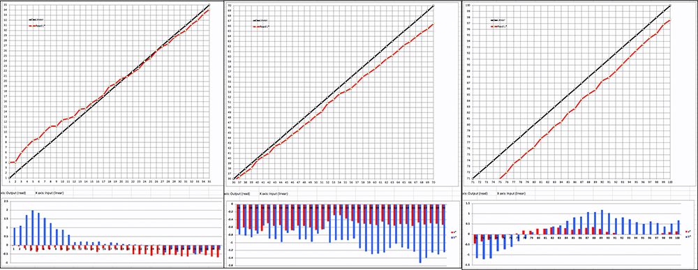
For this paper, there are eight possible configurations to explore. I am, for the most part, limiting the exercise to the darker end of the tone scale, from L*1 to L*35 inclusive, as a rendition of deep shadow detail is often of most interest to photographers and printers, and what we see from about L*15 ~ L*35 can be a decent indicator of what to expect further up the scale. Figure 39 is a graph of the options analysis structure for Premium Glossy paper.
Each of the four options possible between CB and ABW can have at least two Rendering Intents, bringing the total number of options examined here to eight.
I’ll discuss Maximum Black, Brightness, Contrast, and Linearity all by reference to the graphical evidence of the red curves from the printing of the dark zone target for each of the eight conditions depicted in Figure 39. (Figure 45 provides some summary numerical data.) In the graphs below, the further the red curve sits above (below) the black line, the brighter (darker) the tone rendition relative to the target values; the steeper the curve, the more the contrast. I’ve grouped them into pairs for comparison.
Figure 40 shows CB ON and OFF, ABW OFF, ABSCOL, OEM profile.
In ABSCOL mode, we can see comparing the left (CB ON) versus the right panel (CB OFF) that CB provides a Black point about one-half level denser than without. Levels L* 4, 5, and 6 are approximately a level darker with CB ON, and the remainder of the red tone curve (measured values) adheres more closely to the target reference values. This indicates that the part of the tone scale between Levels 2 and 8 in a printed photo using CB and ABSCOL (not available in Lightroom) would be very slightly darker with just a bit more contrast than its non-CB counterpart. From about Level 8 upward, CB has a very minor impact on relative brightness.
Because few people would ever print normal photographs using ABSCOL (usually one prints with RELCOL or PERCEPTUAL Rendering Intent), it’s worth looking at a similar comparison, but this time printed with RELCOL Rendering Intent (Figure 41).
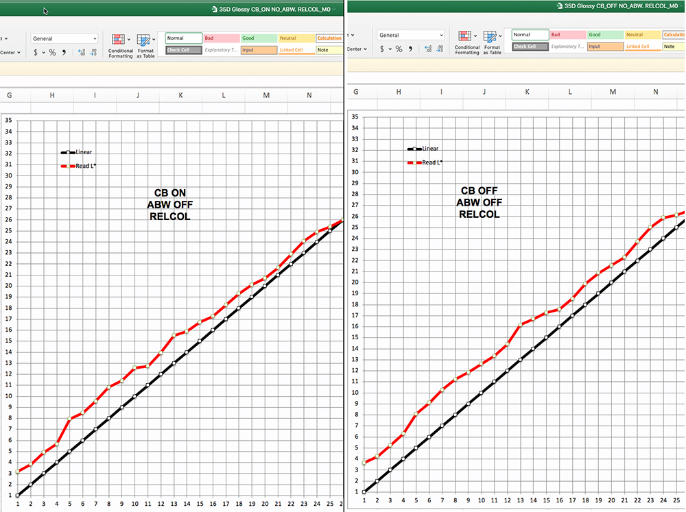
CB ON provides a slightly deeper Black point (less than an L* Level) versus CB OFF. The result with CB ON is a bit less linear than that with CB OFF, but neither of them are strictly linear. For the most part, the extent of non-linearity is not likely to be disturbing in real photographs; however, I would be attentive to the extent of the jump between Levels 4 and 5 in the result with CB ON. The overall brightness of the lowest 25 L* levels will be a bit lower with CB ON than without it, but on average not by more than a Level or so. Apparent contrast over this range will be very similar. We expect RELCOL to have more lift-off from target reference values than happens with ABSCOL, because that is the intent as explained previously, and is what shows comparing Figures 40 and 41.
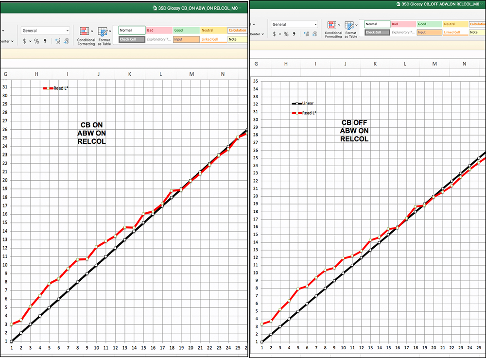
Turning to the cases with ABW engaged, Figure 42 compares CB ON&OFF with ABW ON using ABSCOL.
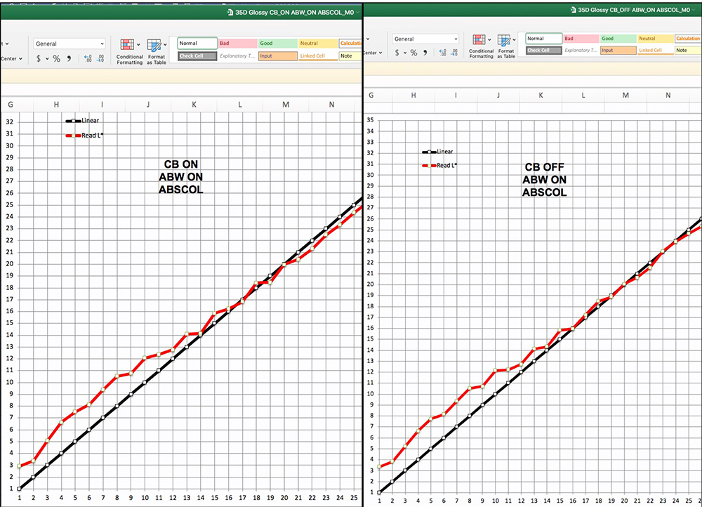
The first thing I noticed is the similarity of the results having CB ON or OFF. From about L* 14 upward, the results with ABW ON are more linear and convergent with the target reference values than for the previous four cases. It hardly makes a difference whether CB is ON or OFF once ABW is ON, in ABSCOL Rendering Intent. The darkest 15 levels show some brightening relative to target reference values, as well as a bit more non-linearity than one would like in theory, but how important in prints, not so much. ABW provides a bit of contrast boost in this tone area, but not much. If one used brighter tone settings in the ABW driver, the red curve would lift further up from the reference values (black line).
Figure 43 shows the same comparison, but this time in RELCOL.
Again, using ABW, this time in RELCOL, there is little to say about whether CB should be ON or OFF. The Black points differ little between the options. Linearity with CB ON looks slightly better from L* 19 upward than CB OFF, but slightly worse below L* 19. Both options, as expected, show similar brightening relative to reference values, but not much difference of contrast should be expected.
In sum, for Premium Glossy Photo Paper, the main expectation for this paper is that when using Relative Rendering Intent with ABW on or off, there will be some brightening of the lower portion of the dark tones, which would have the effect of brightening deep shadow detail by several levels. CB very slightly augments maximum Black density.
Let us examine hue neutrality with versus without ABW in the darker part of the tone scale (Figure 44, and please note the differences of the left side scale when reading the bars in each section).
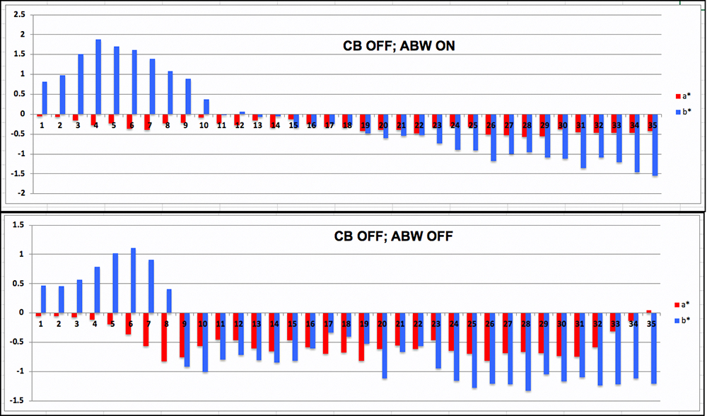
Neither option (ABW ON or OFF) is strictly neutral over the whole scale. Both options show yellow bias up to about L*8 – more so with ABW than without it, then shift to moderate cyan bias upwards of L* 9 or 10. Reading the bars against the left side scales of Figure 44, one sees that the extent of these biases with or without ABW is somewhat similar and on the whole tolerable. These are simple differences of printed versus reference values that would generally be smaller if measured with dE(2000). The probability of anyone being disturbed by an appearance of hue bias in any of these outcomes is low. The comparison for RELCOL doesn’t differ much, nor do any of the others discussed above.
Figure 45 is a statistical summary of the findings for Epson Premium Glossy Photo Paper for the Dark tones (Levels L*1 to L*35).

While all of the foregoing analysis focused on the Dark tones (L*1 to L*35), I prepared one test of how ABW works for the mid-tones and highlights, and I was not very pleased with the test results. The linearity is OK, but the values have shifted from being brighter in the dark tones (Figure 42) to darker in the mid and highlight tones, relative to the reference values and there is more hue bias than I expected from ABW (Figure 46).
These results may be attributable to using the default “Darker” tone setting in the ABW menu, and the fact that this paper is loaded with OBAs, partly explaining the cool tone of the media which ABW does not neutralize. These matters deserved further analysis, so I conducted an additional test, looking at what happens to tonal positioning with the tone-setting in the ABW Advanced menu set to “Normal” or “Dark”, rather than the default “Darker”, and with CB ON or OFF. These are all conducted in ABSCOL to isolate the native behavior of the printer driver without the influence of application-induced colorimetric adjustments.
Figure 47 shows the impact of changing the ABW Tone from “Darker” to “Normal” for the complete tone range (L* 1~35, 36~70, 71~100 from left to right).
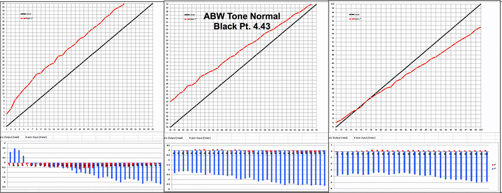
The result is anything but “normal”. The departure from the target values is excessive pretty much throughout the tone scale and shifts between Levels L*75 and L*79 from being brighter to darker relative to target values. The Black Point of 4.43 is nothing to write home about compared with other results achieved above. Finally, there is fairly significant blue hue bias from about Level 24 upward. I haven’t printed RELCOL for this combination of printing conditions, but I doubt it would improve much. If anything, it is likely to further exaggerate the brightening at the bottom of the tone scale.
We’ve now looked at “Darker” and “Normal” tone settings in ABW, both of which are wanting for opposite reasons. So the remaining question is whether “Dark” would be a satisfactory mid-point setting – not too dark, not too bright. And what would be the impact with versus without using CB? I examined these questions only for the Dark tones, which will have to serve as an indicator for the rest (Figure 48).

Comparing the relationships of the Red to the Black lines of Figure 48 relative to the left panel of Figure 47, the “Dark” tone-setting does indeed produce less brightening than the “Normal” setting, which is what we hoped for and expected. The linearity of both Red curves in Figure 48 is a bit shaky but would be of low visibility in print. CB ON (Figure 48 right panel) provides 1.2 levels deeper Maximum Black and slightly more contrast (tone separation) at the very bottom of the scale versus CB OFF.
I’ll provide a summary comment on the ABW options after reviewing the three papers slated for this portion of the review (Glossy, Legacy Platine and Legacy Fibre).
B&W Options with Legacy Platine Paper
In this section, I’ll focus on using an ABW option for several CB results from Legacy Platine (Figure 33). I think Cases F and H are the most worthwhile selecting for ABW analysis here. To remind, for Case F: CB is ON, High Speed is OFF, Resolution is 5760 dpi. For Case H, CB is OFF, High Speed is ON, Resolution is 5760 dpi. Both of these cases were printed in ABSCOL and had satisfactory dE outcomes. The deepest Black achieved so far, not using ABW, is Case F, at 2.69.
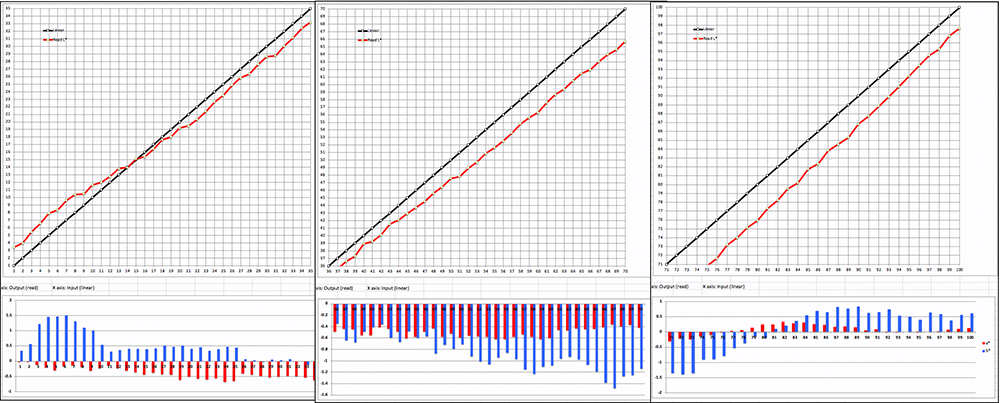
Before getting into the details of mirroring cases F and H with ABW, as these comparisons are all in ABSCOL, I wanted to run a quick ABSCOL/RELCOL comparison for one set of printing conditions. I selected the case of CB OFF and High-Speed OFF, using Epson Legacy Platine (Figure 49).
The outcomes are somewhat close. Black points are similar; there is ever so slightly more brightness in the rendition from Levels 2 to 19 in RELCOL (expected); from L*19 or so upward, RELCOL produced a slightly more accurate rendition than ABSCOL, with slightly better linearity. The linearity below Level 19 is similar for both and less linear than above. The hue bias is quite similar between the two renditions, and not egregious. One would have preferred a bit less bias toward yellow in the L*2~L*6 range, but that part of the tone curve is so dark, and the extent of the bias limited enough, that in normal photographs it would pass unnoticed. This comparison informs us that the observations made below for ABSCOL could be largely valid for RELCOL as well.
I turn now to the comparison of Cases F and H (Figures 50 and 51, Dark tones to Highlights Left to Right), this time with ABW_Darker ON. To remind, Case F (ABW ON this time) has CB ON and High-Speed OFF, while H (likewise) has CB OFF and High-Speed ON. We’re looking for the differences these settings may make to Black density and the shape of the rendered tone curve from L*1~L*100 in ABW_Darker mode.
(Dark, Middle and Highlight tones from left to right respectively)
We’re seeing a broad similarity between the two cases (CB ON or OFF) with ABW active. Black density is a bit deeper with CB ON (Case F). For both cases, there is a brightness boost at the darkest end of the scale, followed by a gradually increasing darkening effect relative to target values as one moves further and further up the scale. There is also hue bias and hue inconstancy throughout the scale in both cases with ABW, more so than seen in Case H without ABW, but it is all contained within a fairly low range, so the numbers and the bars may look worse than they would appear in printed photographs.
Figure 52 presents comparative numerical data, complementing the graphical presentations in Figures 50 and 51. Whether Case F or Case H, for Platine paper, one comes away with the distinct impression that on the whole tone and hue rendition are more accurate with ABW OFF rather than ON, but people printing with ABW is not necessarily aiming at colorimetric accuracy. Whether for Case F or Case H, having CB ON produces – by the numbers – a bit greater Black density.
Legacy Fibre Paper:
The ABW ON/OFF comparison for this paper is much simpler than it was with Legacy Platine because there is so much less to compare (whew!). CB is not available for matte media. In fact, I am running only one case, to compare the results for my profile (non-ABW Figure 25) but this time with ABW ON. The comparisons of interest are Black density, lower-dark tone separation and overall accuracy in ABSCOL and in RELCOL. Figure 53 shows summary data for these comparisons.
With ABW ON, the differences between ABSCOL and RELCOL are trivial. ABW essentially over-rides the choice of Rendering Intent in Photoshop. ABW adds essentially nothing to Black density compared with a good ICC profile (compare Columns C or D with Column E in Figure 53.) ABW isn’t necessarily meant to be accurate, and the data above and the graphs below show that it isn’t. I was particularly surprised to observe that hue neutrality is better preserved with my standard ICC profile than it would be using ABW. Figures 54 and 55 show the full graphical portrayals for the complete tone range using ABW with ABSCOL and RELCOL. Linearity is quite well-preserved in both renderings; however, in both, there is a cross-over between printed and target values in the highlights occurring in the range of L*85 in order to produce a smooth transition into the media white point.

My summary judgment on the whole B&W story, as to what plays better between CB ON versus CB OFF and ABW ON versus ABW OFF, boils down to two simple observations:
(1) Where the maximum Black density the printer can deliver is considered desirable, do use CB with the papers that it supports. However, beware that it adds a lot of time to printing and probably uses more ink. The difference of Black points with versus without it is not large, but it could be just large enough to enhance color and tone separation in the very darkest end of the tone scale.
(2) The main attractive feature of using ABW is the automated ease of getting a B&W conversion and a print from it all in one. However, people who have exacting standards and are prepared to put the time and effort into learning B&W conversions using their imaging editing application and a standard application managed workflow with ICC profiles will obtain more customized and controlled results. As well, they may achieve better hue neutrality with good profiles.
Looking at prints:
We now leave the world of analytics and enter the world of real photographs printed in the SC-P900. You obviously don’t have access to the actual prints – the best I can do is make some, scan or photograph them and show you the results. So here goes. The most common suite of photos I use for demonstrating printing conditions with new printers and papers are: (1) the Atkinson Printer Test Page, (2) The BVDM Roman 16 low-key B&W image for dark tones, (3) The Roman 16 high-key B&W image for highlights and (4) other photographs for illustrating other particular results of interest. Culling from the range of options I analyzed above, I decided on several key comparisons for Epson Premium Glossy Photo Paper, Epson Legacy Platine, and Epson Legacy Fibre. These papers can be taken as representative of gloss, luster, and matte media. Unless otherwise mentioned, the printing is done in RELCOL with BPC, 16-bit, and High-Speed ON.
Atkinson Printer Test Page (Epson Profile, With and Without CB, Epson Premium Glossy Photo Paper)
I show one representation of this test page (Figure 56), because although I printed one with and one without CB, none of the images on this sheet reveal any difference between the two printing conditions. These are printed with the Epson profile – I did not make a custom profile for this paper because I would not use the paper for my own work, and the Epson profile produced a very satisfactory rendition of this very well-known test page. The tone scale is well reproduced, the color appearance is normal, and the sharpness is fine.
CB Demonstration, Epson Premium Glossy Photo Paper
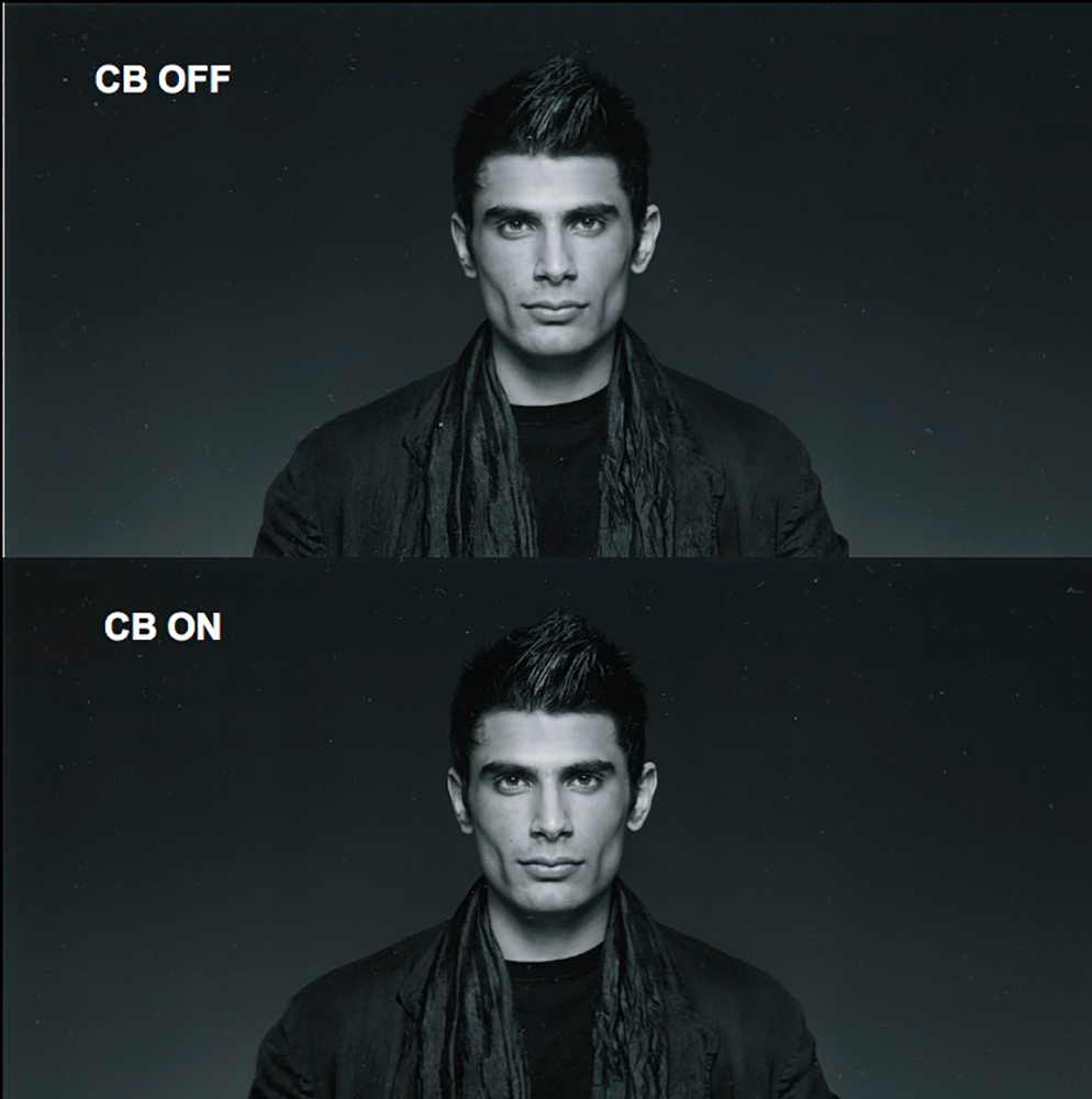
The main interest for doing anything with glossy photo paper was to reveal any visible difference between having CB ON or OFF. According to advice from Epson, this effect would be visible only in photos printed on high-gloss papers having large areas of dense Black populated with saturated color. Finding photos of this character was challenging, and observing the subtle effect that CB produces – an exercise of careful observation. While Figure 57 (Roman 16, BVDM) is a B&W test image specifically designed to test printing conditions for the quality of dark tonal appearance – thus not fully compliant with Epson’s recommended best characteristics for revealing the value of CB, it does help to reveal the contribution that CB makes to good tone separation.
The effect of using CB on such a photo is subtle, nonetheless visible. To assure myself that I wasn’t using my imagination to see differences between them, I showed the Figure 57 prints to my wife who is not a specialist in viewing fine art photography but has a fine sense of artistic vision, and she – without hesitation – picked the photo with CB ON as being the better in respect of how the head and shoulders stand out from the background. This happens because the Black Point is just lower enough to add that bit of contrast producing the more distinct and striking rendition. I’m not for a moment suggesting there is a “sea-change” of difference between these renditions, but the more you look at it, the more you will appreciate that CB ON is a bit better.
Epson was kind enough to provide me the test image the company used in its Sales Reference Guide to demonstrate the CB advantage. I tried to replicate their demonstration with my own test, making one print with CB ON and another the same but with CB OFF, and comparing (Figure 58). The outcome is very subtle, but it exists. The slight increase of Black density in the left-side image accentuates the subject matter ever so slightly.
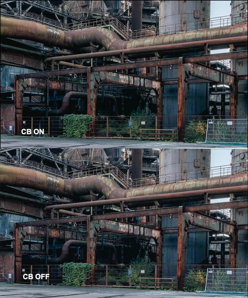
Based on Epson’s advice about the kind of photograph that benefits most obviously from this treatment, I did find one from my photo-excursion in the Deutsche Landschaftspark-Duisburg Nord (Figure 59 – BTW, people who like photographing rusty industrial sites would go nuts there – as I did) that also shows this effect, again ever so subtle. If you look closely at the upper rendition in the very dark shaded area and the immediately surrounding rusting supports and pipes, you will see an ever so slightly more pronounced rendition of dark shade detail and contrast. It may not even be apparent reduced to JPEG versions suitable for Internet posting.
Epson also advised that the effect becomes more obvious if such photos are face-mounted or printed on a shiny metallic substrate. I can’t get into that here.
Legacy Platine and Violet Ink
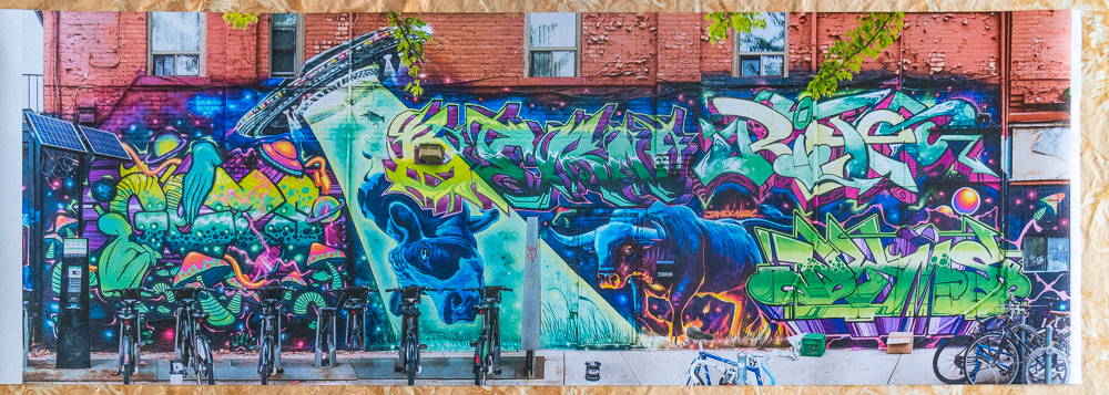
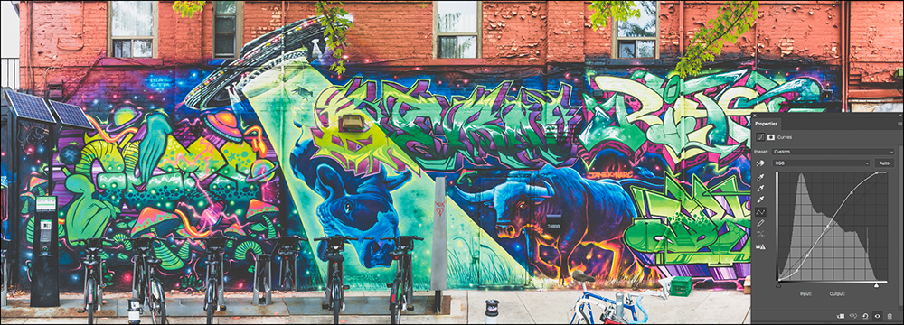
Epson advised me that the impact of including violet ink is more apparent in the rendition of Blue than of Violet. So how to demonstrate with versus without Violet ink. Fortunately I do have an Epson SC-P5000 printer that has neither Violet ink nor a CB quality option, but a wider colour gamut than any other printer I’ve ever tested, so I thought it could be insightful to find a photo with both Blue and Violet, and test for obvious relevant differences between them. I happened to have recently completed a photo-shoot of another fabulous Nick Sweetman mural in downtown Toronto and thought his violet warthog with the swathes of blue paint through it may do the trick (Figure 60).
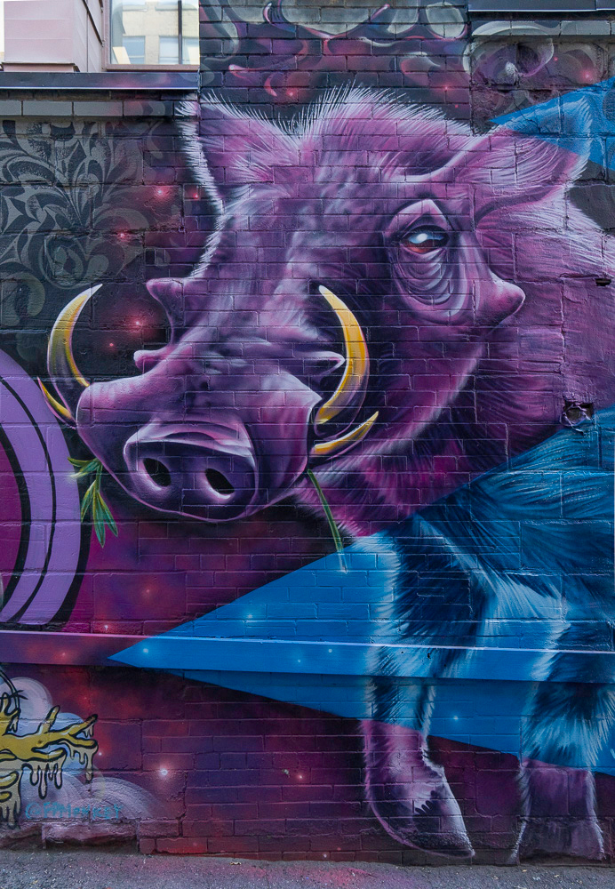
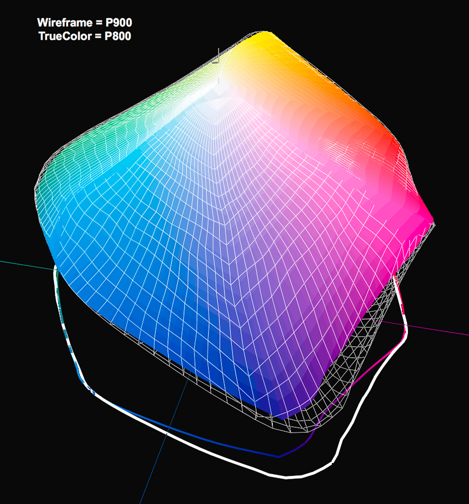
I’m not posting different renditions of this photo here, because quite frankly, after making and studying three different prints of the same file, I could see no difference between them. The same image settings are used for all three except as noted here. The three images are (i) SC-P900 with CB ON, (ii) SC-P900 with CB OFF (both with my custom profile for this printer and paper), and (iii) SC-P5000 (with my custom profile for this printer and paper). I was surprised, but not totally, by the remarkable indistinguishability between these three renditions. Neither my wife nor I could detect any difference between them, viewed side by side in daylight. Just to get a feel for the sheer difference of gamut volume between the printer profiles relative to the image colour contents, I examined it all in ColorThink Pro (CTP) (Figures 61, 62, and 63).
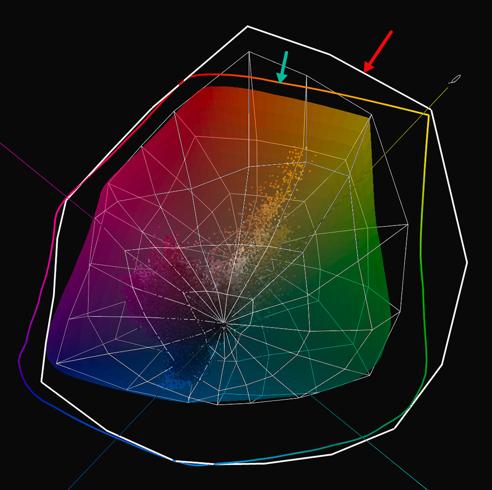
These gamut projections in CTP are done by using the true-color rendition for the SC-P900 printer and paper profile, the white wireframe rendition for the SC-P5000 printer and paper profile, and the decomposition of the photo into about 44,000 unique colors represented by the true-color dots you see scattered largely inside the true-color sphere of Figure 61. The Red and Green arrows point to the two-dimensional gamut representations of the profiles for the SC-P5000 and the SC-P900 respectively. The three-dimensional projection is the two spheres for the two printers. Both the two- and three-dimension projections tell the same story. The SCP-5000 has an overall much wider color gamut, especially over the portion of the hue spectrum ranging from red/orange through yellow/green. However, once into Cyan/Blue/Purple/Violet, their gamut boundaries are similar, except for a small portion of the Purple/Violet segment where the SC-P900 gamut is slightly larger. Recall, these gamut projections are done through CTP’s readings of my custom profiles discussed earlier in this article (Figure 33). What we see here is of course mirrored in the data, whereby the SC-P900 gamut volume for Legacy Platine is in the range of 817,000-837,000, while that for the SC-P5000 is about 993,000.
Now, let us see the relationships of the photo to these gamut volumes (Figures 62 and 63).
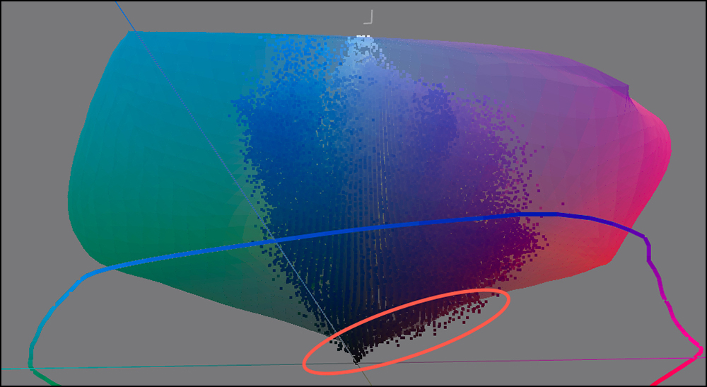

The evidence of out-of-gamut (OOG) picture elements shows as tiny image dots that fall outside of the printer/paper gamut spheres, and that I have highlighted with Red oval surrounds. For this particular photo, a small number of very deep violet elements is OOG, for both the SCP-900 and the SCP-5000, the small differences between them reflecting the small differences of gamut coincidence between the profiles over the range of pink to purple. These projections explain why there is no visible difference between the prints from the two printers and why differences of gamut volume data itself often amounts to less in reality than it may seem from the data.
Another aspect of the prints I need to remark on is the sharpness of image detail produced from both of them. There is no visible difference of resolution or sharpness between the three prints, despite the fact that the SC-P5000 screens at 360 PPI and the SC-P900 at 180. The only difference this causes is that printing from the SC-P5000 is faster. Apparent sharpness and resolution do not depend on the screening number, but rather on the image formation algorithms in the printer technology – the secret sauce.
In light of the addition of Violet ink to the SC-P900 inkset, I considered it useful to also test this printer against the SC-P5000 (which has a very wide gamut but no violet ink) using the Onsight printer evaluation target made by Scott Martin (Figure 64).
The two right-most images in the target are particularly aimed at assessing the quality of deep blues and purples, especially the rendition of the tonal gradations from lighter to deeper shades of blue and violet. The target has added features allowing the very close examination of printer resolution. At least two features allow this: firstly, in the middle of the target there is type going down to 2 pts. Most human eyes cannot read this size of type without a low power magnifier. Also, there are single strands of hair over the boy’s eyes which require a low-power magnifier to see. The target also provides good evidence for evaluating B&W tonality using the upper left image and the grayscale ramp across the bottom. I printed the target in both the SC-P5000 and SC-P900 printers on Epson Legacy Platine using my custom profiles for each printer, and RELCOL with BPC.
The results are that both prints resemble the target image very closely and they are indistinguishable from each other, confirming for a broader range of colors the observations made about the warthog photo (Figure 60). For both printers the resolution outcomes are fine. The 2-pt type is readable in both, and the strands of hair over the eyes clearly visible – a bit more distinct in the SC-P5000 print. The color and tonal gradations are all pretty much identical and looking very good.
Image Appearance on Matte Paper (Epson Legacy Fibre Paper)
Much as I appreciate the artistic feel and non-glare surface of the finer matte papers, normally I don’t print on them because I prefer the larger tonal range (deeper Blacks) and larger gamut volume of, say, luster coatings. For example, as you can see from the Data Summaries of Figures 25 and 33, there are large differences of both Black point and gamut volume between Epson Legacy Platine and Epson Legacy Fibre, both excellent media. So, with the advent of a new printer model such as the SC-P900, I considered it essential to produce and evaluate some prints made on Epson Legacy Fibre, and notwithstanding what I just said, I was very pleased with the results.
Figures 65 and 66 are photographs of the actual 17×22 inch prints I made in the SCP-900, one color, and one B&W. The color print is of a mural in downtown Toronto done by Okuda San Miguel that has excellent properties for this evaluation; the other is a B&W conversion of a color photo I made from a hotel room window in Paris at about 6:30 AM November 2019. I think it more meaningful to show photos of the prints rather than JPEGs converted from raw files in the computer – because those would not show what’s on paper.
A word about the photos: Starting with Figure 65 color print, this mural is 23 stories high. I photographed it in three sections, necessarily at an angle (because I was on the sidewalk across the street) and then stitched the three photos using Lightroom’s photomerge/Panorama tool, which does a splendid job on so many different kinds of photos. (I no longer consider it necessary to use third-party applications for much of the stitching I do.) I then edited the stitched file under soft proof for Epson Legacy Fibre paper and printed it in the SC-P900 with my custom profile for Legacy Fibre paper discussed above, and RELCOL Rendering Intent.
Likewise, I imported the photo from Paris into Lightroom, optimized it in color under soft proof for Epson Legacy Fibre paper, then converted it to B&W using the Lightroom B&W mode, and found that it needed very little further adjustment, save for a minor brightening and contrast enhancement of the very dark tones in the bottom left area of the photo. I printed it using the same ICC profile in RELCOL Rendering Intent (it made no difference I could see soft proofed in Perceptual).
As seen in the hand, both photos are very sharp and very rich. I didn’t expect they would be quite so attractive on matte paper, but they truly are. So I can highly recommend this combination of the SC-P900 with Epson Legacy Fibre paper, processed under soft proof in Lightroom and printed through the Epson driver using standard application-based color management with ICC profiles. Grayscale neutrality is good.
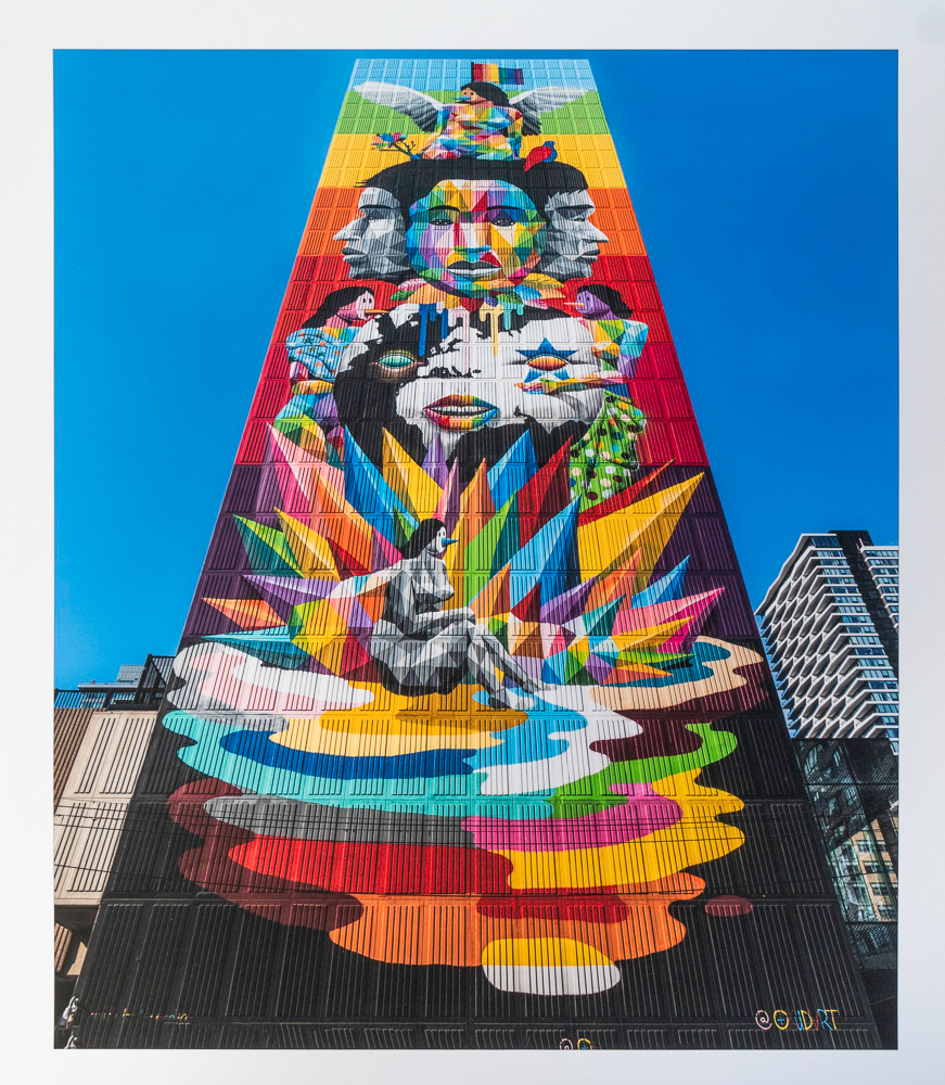
As printed in Epson SC-P900 on Epson Legacy Fibre paper
As printed in Epson SC-P900 on Epson Legacy Fibre paper.
I also printed the Onsight target on Epson Legacy Fibre in SC-P900 and I was truly impressed with how closely the results resembled those from the Platine paper, insofar as Legacy Fibre is a matte paper (Figure 67, a photograph of the printed target, unadjusted). The quality of our best inkjet matte papers and ink-sets is good enough these days that with good profiles one can obtain very rich-looking results on this media.
To complete this review of the Epson SC-P900 printer, I shall briefly discuss ink consumption, followed by three items of software that apply to this model: (1) Epson Print Layout, (2) the Epson Phone/Tablet app for printing from mobile devices to an Epson SC-P900 or SC-P700 printer and (3) the Epson Media Installer.
Ink Consumption
By the time I completed all the printing and analysis done to date for this review, amounting to about 61 square feet printed over the period October 17 to November 22, 2020, I was able to accumulate enough data to produce the table in Figure 68. This table is largely self-explanatory. However, I must highlight the fact that these are early estimates, therefore tentative, and information that depends on ink consumption per print is necessarily inaccurate because there is no accurate data about how much ink per print this printer uses. As explained earlier, I used a proxy from the P4900. The amounts would vary according to quite a few variables describing the character of and printing conditions for each image, and no such information is provided for anyone image to be able to produce representative averages covering many images. Caveat Emptor.
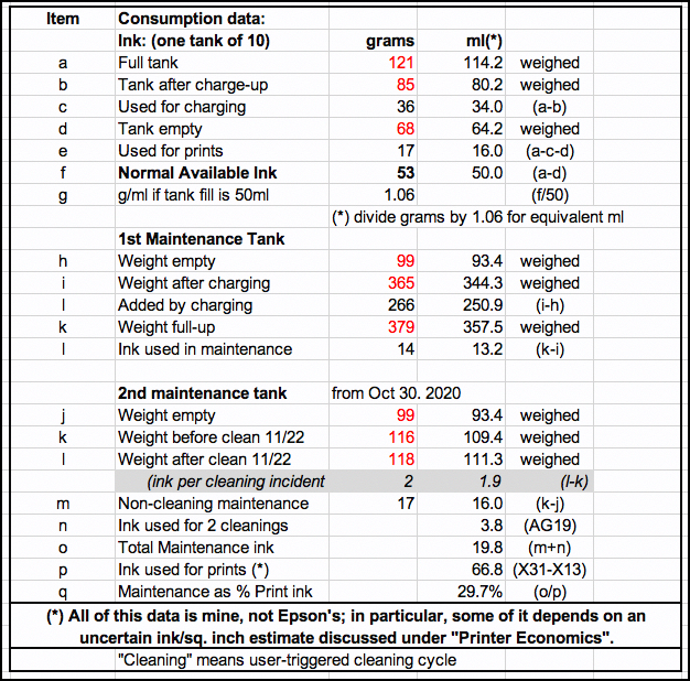
(1) Epson Print Layout (EPL)
I had previously reviewed this software when it was in version 1.3.4. The latest version includes operating improvements under the hood and the addition of Carbon Black in the Print Quality settings. To remind, EPL brings all the settings needed to make a print into one handy user-interface. It does not replace the printer driver or the computer’s printing system, but with this application, you need not go there. An amended version of my previous review of EPL is included here as Appendix 2.
(2) Epson Print Layout for Mobile:
To use this iPhone/iPad app you need to set-up your SC-P900 printer as a wireless device. Epson’s instructions for doing this could be improved, so I provide detailed guidance first, then show the app. There are quite a few mini-steps here, but this is easy to do and you’ll accomplish it in less time than it takes to read all this – unless you speed-read.
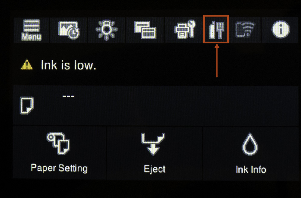
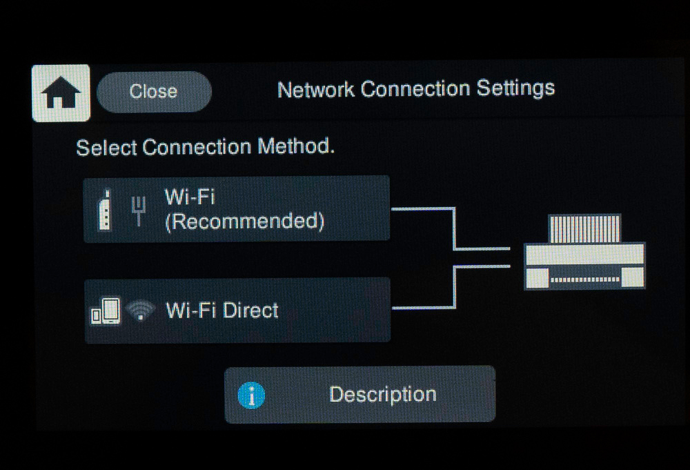

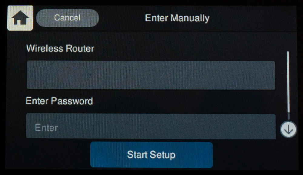

Once this completes, another screen appears indicating that the connection is made. Immediately after that, the LCD told me there is a firmware upgrade available (because with the “check for upgrade” option active in the printer settings, once it can communicate with the Epson servers, it checks the firmware and says whether an update is available). So I proceeded to upgrade the firmware, using the guided procedure as illustrated here.
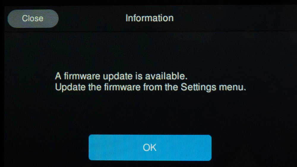
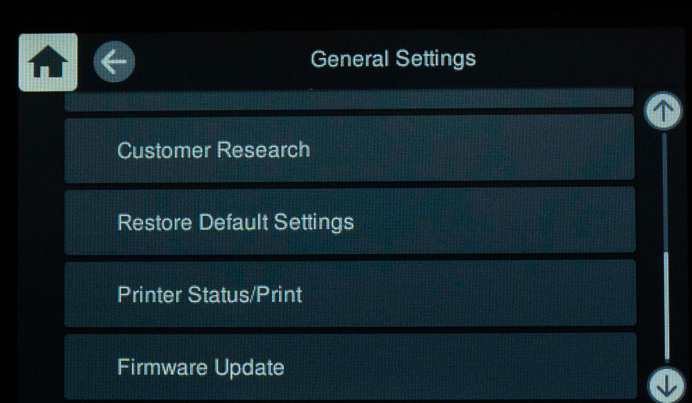
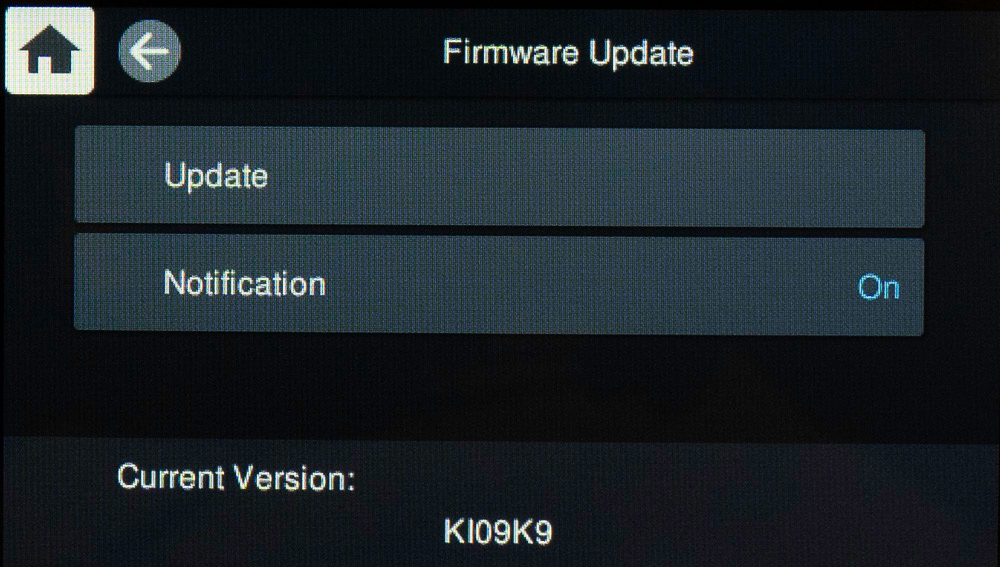
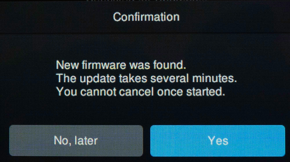
Once this process finishes, as indicated, it turns the printer off and on again, and leaves you with the LCD Home screen, ready to print.
At this stage, we resume the process of completing the wireless connection set-up so that the printer can communicate with the computer wirelessly. These next steps are not on the LCD, they are in the Printer & Scanner panel of the computer’s System Preferences. So we go there.
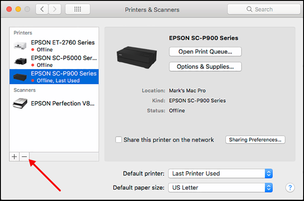
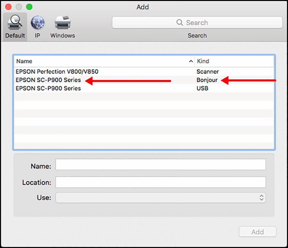
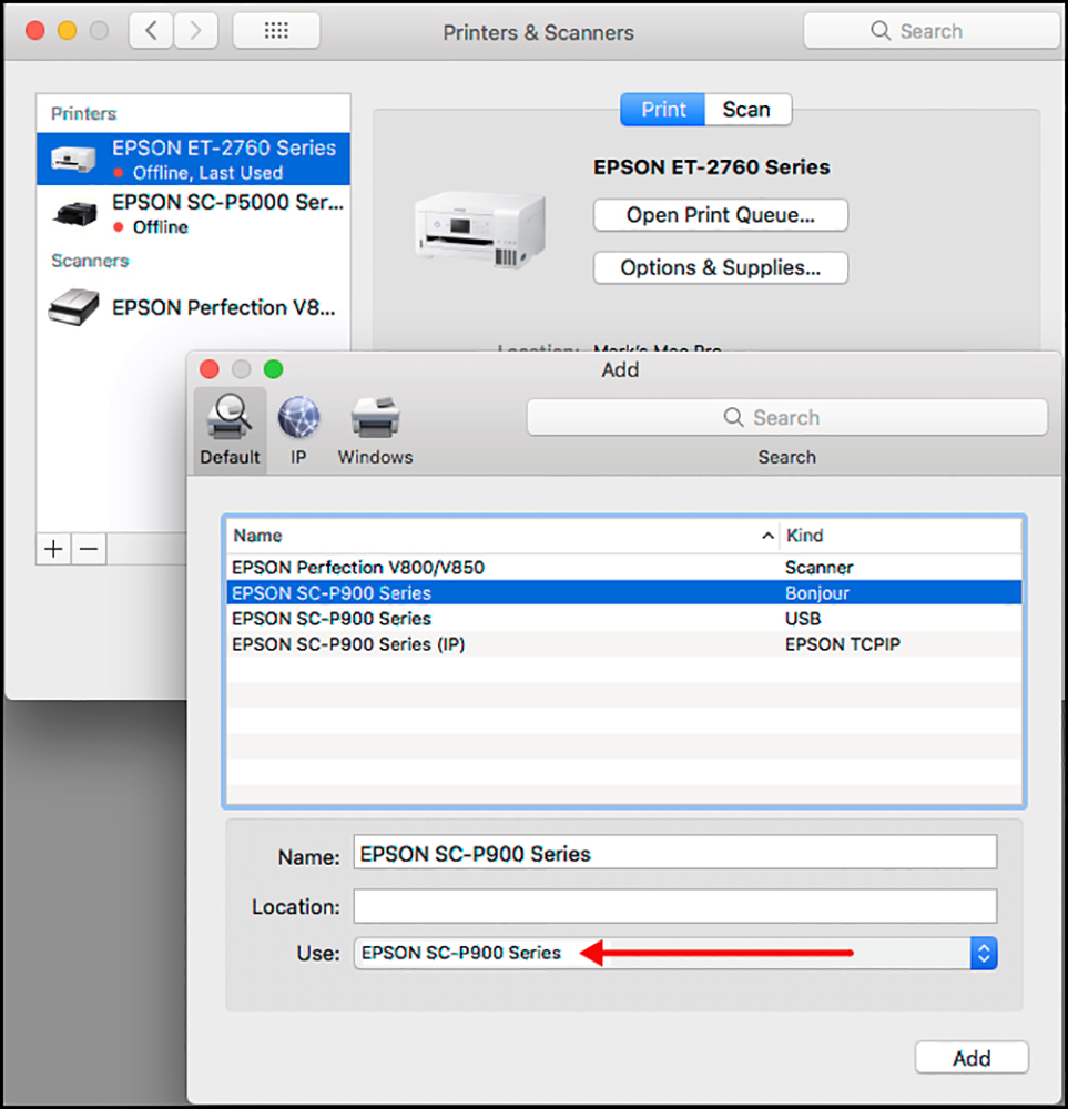
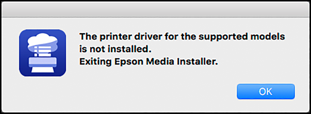
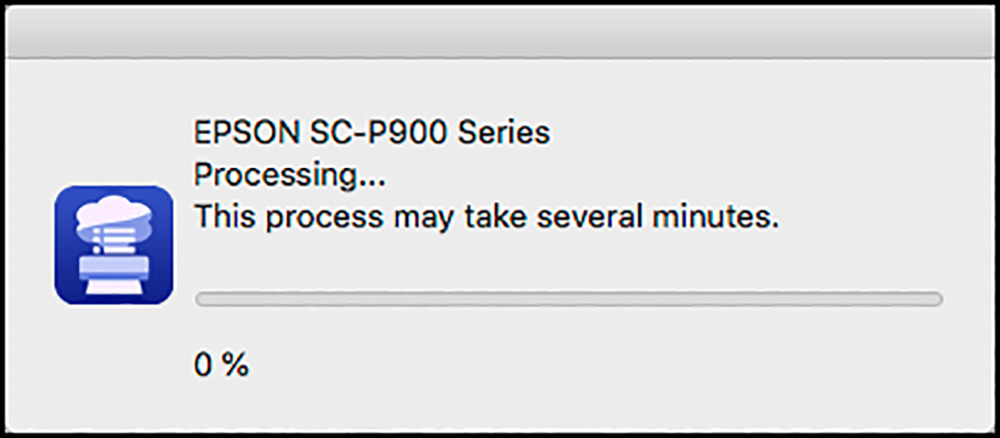
All of this worked seamlessly, by the way.
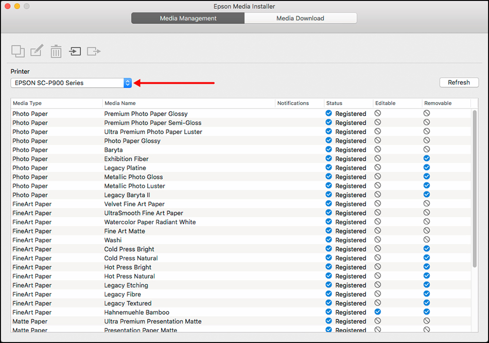
Set-up of the SC-P900 as a wireless printer is now complete, and we are ready to use the coolest functionality this wireless set-up enables – sending photos to print directly from an iPhone or an iPad, using the Epson Print Layout application for iOS, which I assume for present purposes that you have downloaded from the App Store and installed on an iPad. That being in place, I’ll proceed to make a print from my iPad. I’ve never done this before, because it wasn’t possible, so this should be fun. Just before that – one tip not in the manual – you can install the printer for both wireless and USB connectivity. There will then be two versions of the SC-P900 printer driver in macOS Preferences>Printers and Scanners.
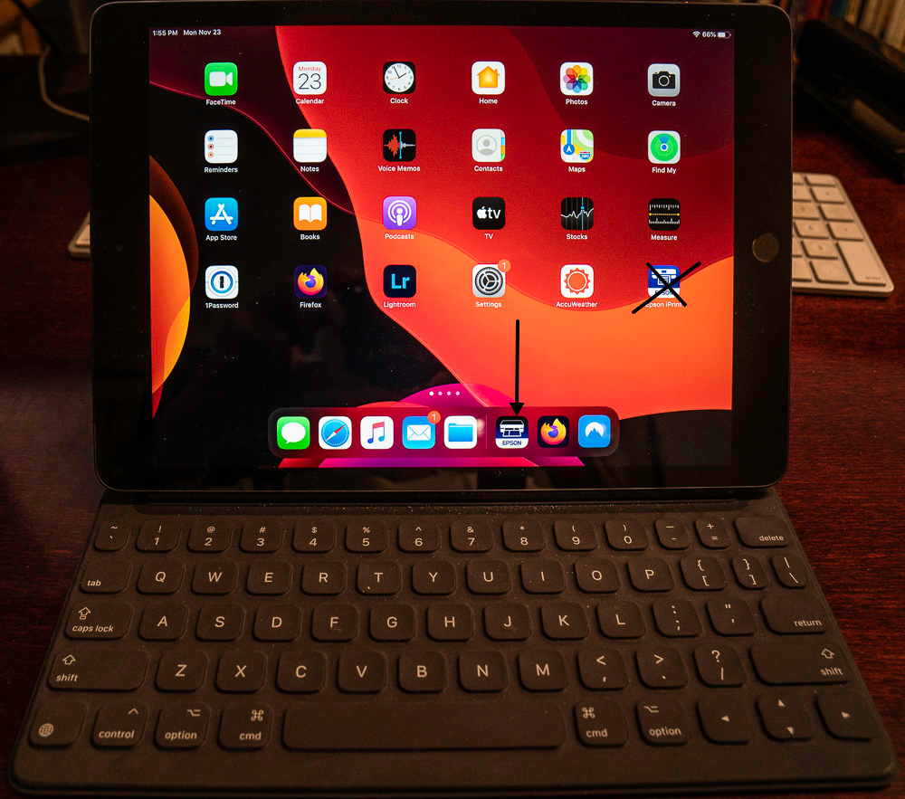
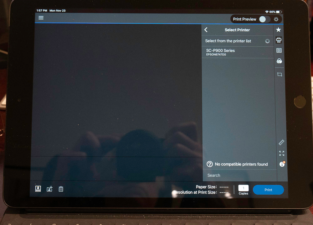
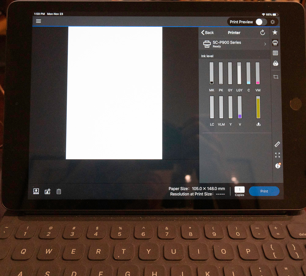

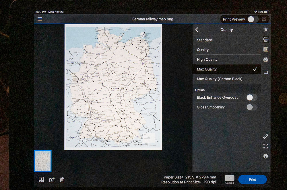
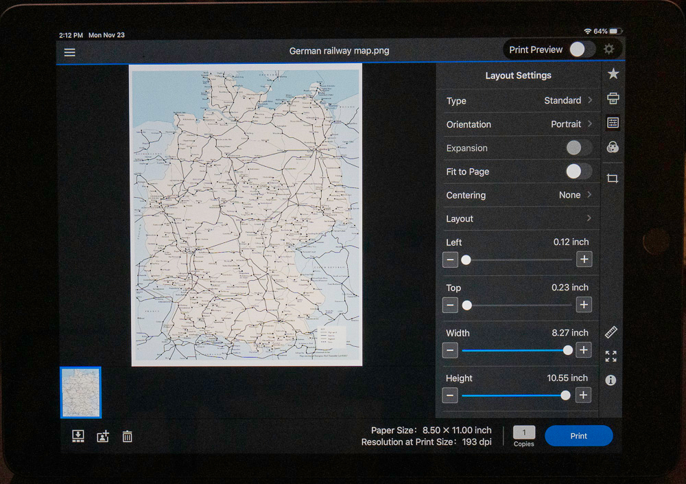
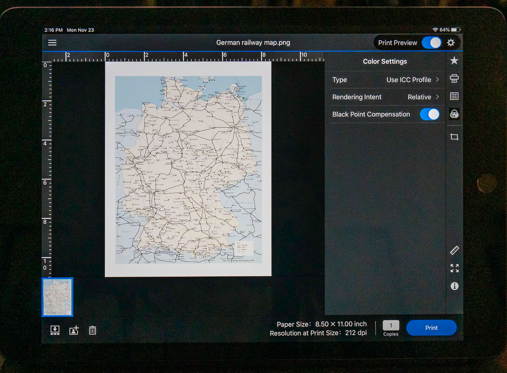
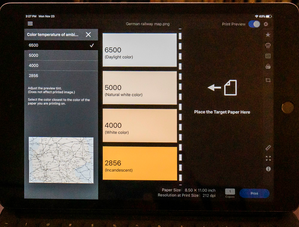
Epson Print Layout for iOS is only available at this time for the P700 and P900 printers. The Desktop version of Epson Print Layout works with not only the P700 and P900 but also with other Epson printers listed at www.epson.com/epsonprintlayout.
(3) Epson Media Installer (EMI):
This is an ingenious application newly developed for the Epson models SC-P7570, SC-P9570, SC-P900, and SC-P700. It allows you to download and install into the driver menu and into the printer software simultaneously new media from Epson as it becomes available, and very attractively as well, to install third-party papers complete with their media type settings and ICC profile. At the time of writing Epson has not yet issued a user guide for the EMI, therefore I shall demonstrate (for macOS) the third-party paper installation process in the following walk-through.
The context is that I have a box of Hahnemuehle Bamboo paper for which I just made a custom profile to use this paper in the SC-P900. The EMI allows me to create a Media Type linked with my custom ICC profile that I can subsequently pull-up every time I want to use this paper in this printer.
EMI is located in the Epson Software folder in your computer Applications folder. When you click on the app it begins to open (Figure EMI 1)
You are presented with the home screen. Make sure to select Media Management and your printer (Figure EMI 2). All currently included Media Types and Media are listed.
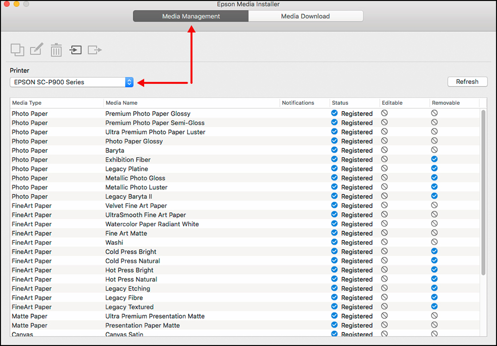
From this list select the Epson Media Type and name that the paper manufacturer recommends for this media. In the case of Hahnemuehle Bamboo, the company recommends Epson Velvet Fine Art paper as the appropriate choice (Figure EMI 3). I click on the name “Velvet Fine Art Paper” and on the icon “Copy Media”.
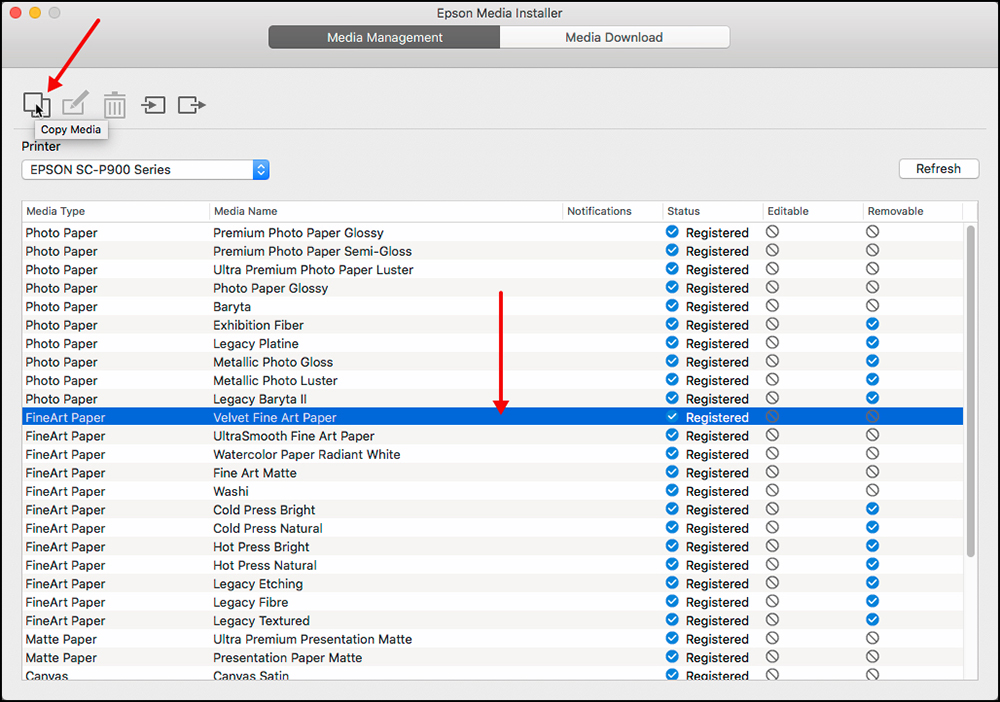
EMI processes the request (Figure EMI 6):
You are prompted for your computer password (Figure EMI 7):
EMI enters into processing (Figure EMI 8):
Once processed, a screen opens allowing you to prepare for editing the media type copy (Figure EMI 9). Click on the name of the media type copy just created and click on the “Edit” icon (second from top-left).
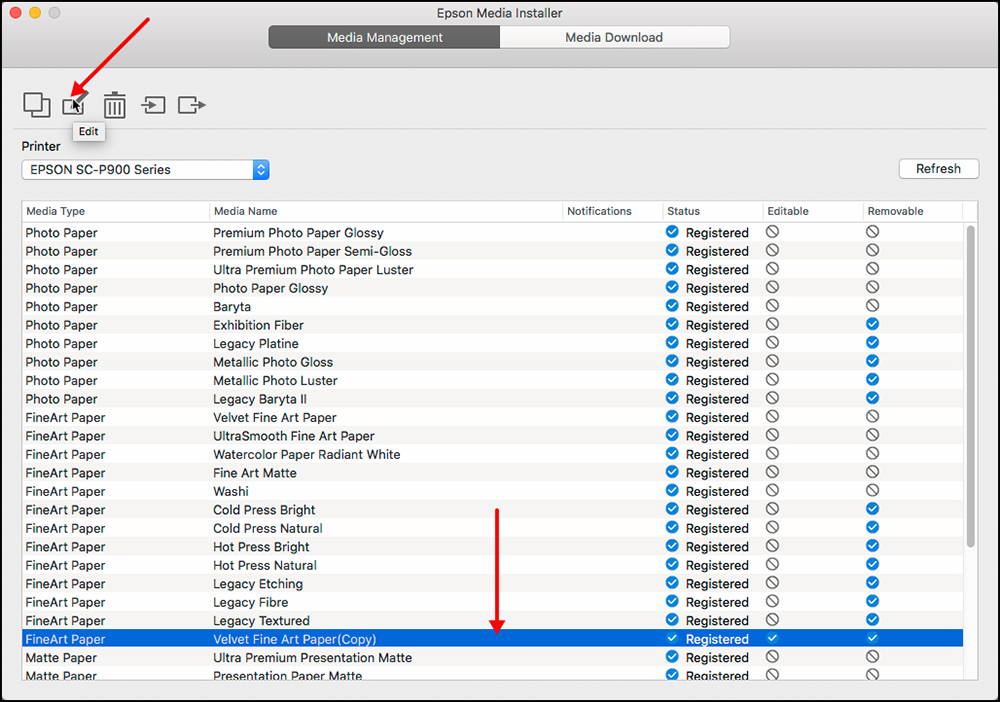

Once processed, a screen appears allowing you to edit key parameters of the new Media Type/Paper (Figure EMI 11).
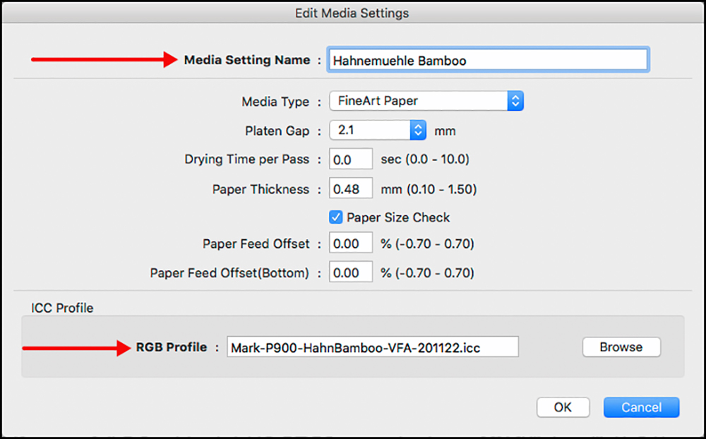
EMI processes the selection (Figure EMI 13):
Once processing is done, a new screen appears showing that the Hahnemuehle Bamboo Media is installed in the EMI system (Figure EMI 14).
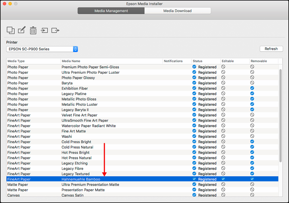
It is also automatically registered in both the printer driver Printer Settings menu and in the printer itself, accessible through the LCD (Figures EMI 15 and EMI 16).
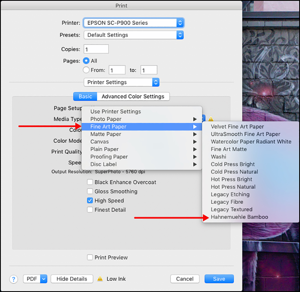
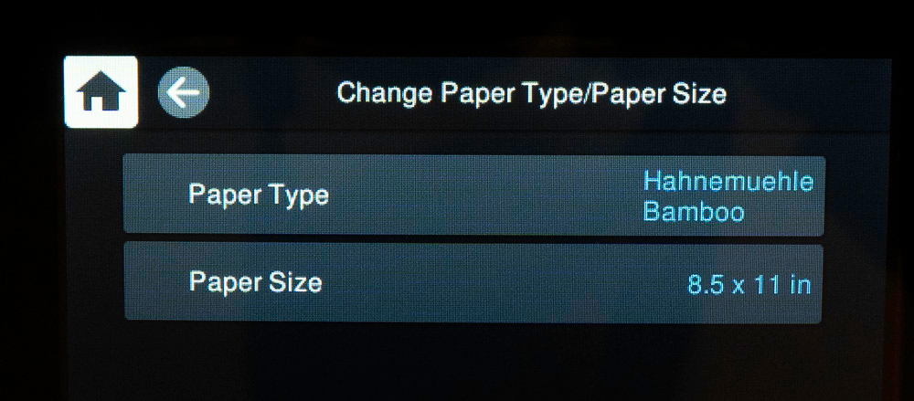
Notice in the upper right of the Media Installer interface there is a “Refresh” button. It can happen that if you need to re-install the printer or you are creating a different version of the driver for another mode of connection (say wireless instead of USB) even though you open and close the Media Installer once to do this, not all of the media types may appear in the Media Type selection options reached through your printing application (in particular, the Epson Legacy Signature Worthy and Legacy media, as well as any you created with EMI, could be missing). If that were to happen, opening EMI and clicking on the “Refresh” button should restore the missing media in the driver.
For Printing on this media from Lightroom or Photoshop, you would make the selections in Figures EMI 15 and EMI 16, then in the Lr/PS Print dialog, select the same profile that you associated with this media in the EMI (Figure EMI 17 shown for Lightroom).
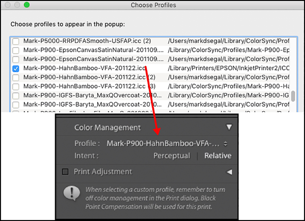
Colour management is complete, printer settings are complete, and you are ready to print. There will be no mismatches of papers and profiles, as all will be consistent between computer and printer. As you see, there are a number of steps to get this set-up, but they are straightforward, and once the initial set-up is done, re-use is very simple.
Summary Observations
Having worked with this printer for over six weeks in the preparation of this review, my overall takeaway is that I really like using it and it delivers superb print quality. To me, these are the two most important outcomes – the rest is really “details” – not unimportant of course, but details. Useability and results are the top-level considerations and by these two criteria this printer scores very high.
The most important usability features, I think, are:
- The elimination of matte or photo black ink switching (very good for all those who use a different kind of media for different kinds of photos);
- The improvements of the feed mechanisms (they work more easily and reliably than their predecessor);
- The user-friendliness of the controls on the LCD panel, which is large enough to be easily readable. Everything one needs to manage is easily accessible and the guided steps it provides for certain processes and adjustments are well done. It also has a useful warning system for when the settings in the driver and those in the printer do not cohere.
- The new Epson Media Installer is most useful for customizing and registering new media types, whether of Epson or third-party papers; this makes their usage convenient and far less prone to error.
- The provision of wireless connectivity, which enables printing from mobile devices using a purpose-built version of the Epson Print Layout for mobile is very cool and works well.
- The printer’s small footprint will be handy for those with serious space constraints.
- With its three feeds plus the DVD printing device, it offers great versatility in the kind of media it will accommodate, including the ability to make long panoramas with the optional roll adapter.
- The one downside regarding usability is the quality of the manual, which could benefit from explanatory improvement in various sections. This will be much less of an issue for those accustomed to using Epson printers, of no consequence to those who don’t read manuals anyhow, and an inconvenience that can be overcome by self-learning and reading other material, such as reviews like this one.
- Although it doesn’t affect printer usability, perhaps I’m not the only one who would like to have data from the printer on ink usage.
In respect of print quality:
- It’s fine: good color, good tonal gradations, good dark tone separation, fine resolution, with good profiles capable of accurate color rendition relative to image file values; this means that people who edit their photos in a satisfactorily color-managed workflow with soft-proofing should experience very few surprises out of the printer.
- The printer produces surprisingly credible output with “Printer Color Management”, but obviously it’s a less controllable and refined workflow than possible with the application Colour Management.
- Its gamut is not as wide as that of a P5000, but few photos need so much gamut; it’s within the ballpark of its more relevant comparators (for example, several percentage points larger than the P800, exactly how much depending on the media and its profiling). Small differences of gamut between printer models in the same general class don’t matter for most photos. This printer can produce more than enough gamut for most purposes most of the time.
- Black and white printmaking produces a visually neutral grayscale in this printer, provided one’s color management, ICC profiles, etc. are good. The ABW mode can render a very decent B&W print, but with less user control and possibly greater longevity than a B&W conversion using Application Color Management.
- The difference of appearance attributable to Carbon Black (Enhanced Black Overcoat) is very subtle but nonetheless present for certain kinds of photos printed on high gloss media.
Should you buy one? I’ll leave that decision in your hands!
Please feel free to leave comments in the forum.
This printer can be purchased at B&H Photo.
Extra PDFs
Annex 1
Annex 2
This Article
Thank you. we hope you find this article beneficial and worthwhile while this site is a FREE site we do appreciate contributions as they help us pay the bills and keep the site alive and thriving. If you would like to discuss this further please leave comments in our forum.
Mark D Segal
December 2020
Toronto, ON
Mark has been making photographs for the past seven decades and started adopting a digital workflow in 1999 first with scanning film, then going fully digital in 2004. He has worked with a considerable range of software, equipment, materials and techniques over the years, accumulated substantial experience as an author, educator and communicator in several fields, was a frequent contributor to the Luminous-Landscape website and now contributes frequently with in-depth articles on the PhotoPXL website. Mark has contributed over 75 articles to the two websites up to Q1-2024, with a particular emphasis on printers and papers, given his view that a photograph printed on paper remains the epitome of fine photography, as it has been from soon after the medium was invented and started gaining momentum in the 1830s/1840s. Mark developed a particular interest in film scanning and authored the ebook “Scanning Workflows with SilverFast 8, SilverFast HDR, Adobe Photoshop Lightroom and Adobe Photoshop” (please check our Store for availability). In his “other life” (the one that pays for the photography), Mark is a retiree from the World Bank Group and was a consultant in electric power development.