The Epson SC-P5370 Printer
This new model is now shipping and raises considerable interest as it combines a number of the most desirable features of its predecessors, the Epson SC-P5000 (discontinued) and the SC-P900. The Epson choices now on the market in the professional inkjet 17-inch carriage width are the SC-P900 (US MSRP: $1349) and the new SC-P5370 (US MSRP: $2095). After testing it rigorously and intensively for over a month, I find that the SC-P5370 is the best printer in its class Epson has produced, and as you read on you’ll see why.
Essentially, the new SC-P5370 is an Epson SC-P900 print system/printhead in a heavy-duty SC-P5000 chassis with built in automatic roll-holder and paper cutter.
So first things first – if I’m in the market for a 17” professional printer from Epson, which of these two should I buy, or put otherwise, is it worthwhile spending the extra USD 750 for the P5370 versus the P900? It depends on (i) how much you print and (ii) whether you make many photos requiring the use of roll paper. If the answer to (i) were “not much” and to (ii) “no or hardly”, then you want a P900. Conversely, you would want a P5370.
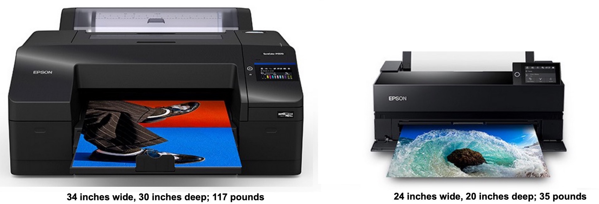
There are also space considerations (Figure 1), and an ink cost versus investment cost trade-off.
Let us examine the trade-off between machine investment cost and recurrent ink cost: P5370 cartridges contain 200 ml (after the 80 ml starter cartridges that come with the printer for priming the ink lines) and cost USD 96 each. The P900 cartridges contain 50 ml and cost USD 44 each. Hence, price per ml is $0.48 for a P5370 cartridge and $0.88 for a P900 cartridge, a difference of $0.40/ml. To recover a machine price difference of USD 750 you would need to consume 1875 ml of ink ($750/$0.40) to recover the investment cost difference from the ink cost difference. I have calculated based on sample data from my SC-P5000 that on average, ink usage per square inch of printing and maintenance is 0.0132 ml. Therefore, the break-even print volume is 1875/0.0132 = 142045 square inches of printing, or 986 square feet, or about 657 prints measuring 12×18 inches on a 13×19 inch sheet, or making a bit less than two a day of these for a year (or about 27/month over two years).
This gives you approximate guidance on comparative printer economics. There are other features the P5370 offers, so let’s have a look:
(i) The printhead is the same relatively maintenance-light device that P900 owners (and predecessor P3880/3800 owners) really appreciate. These heads don’t clog much unless you leave the printer idle over long intervals and/or sit the printer in a very dry environment.
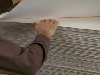
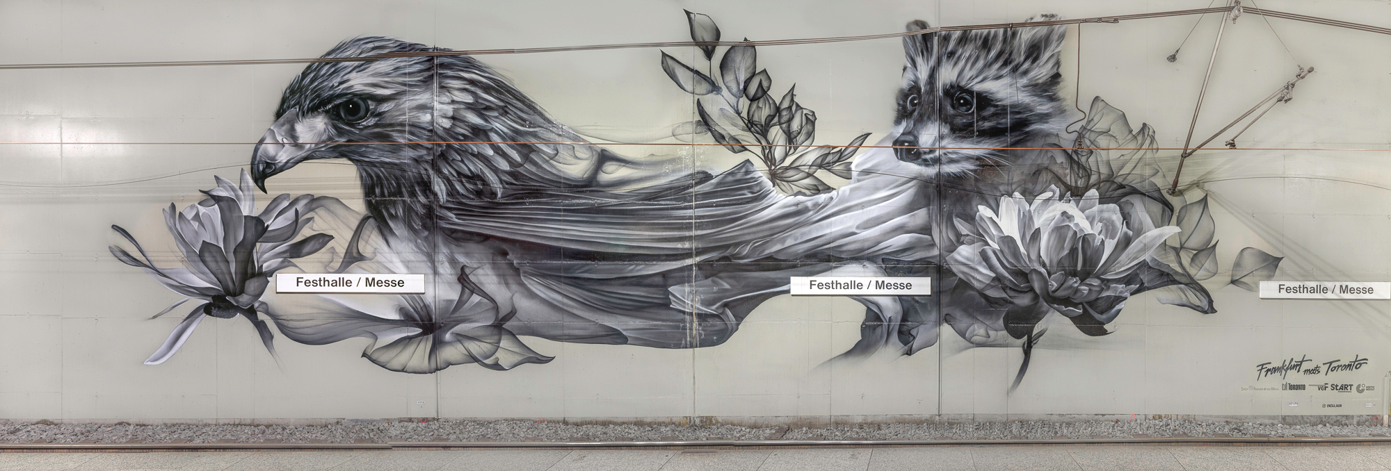
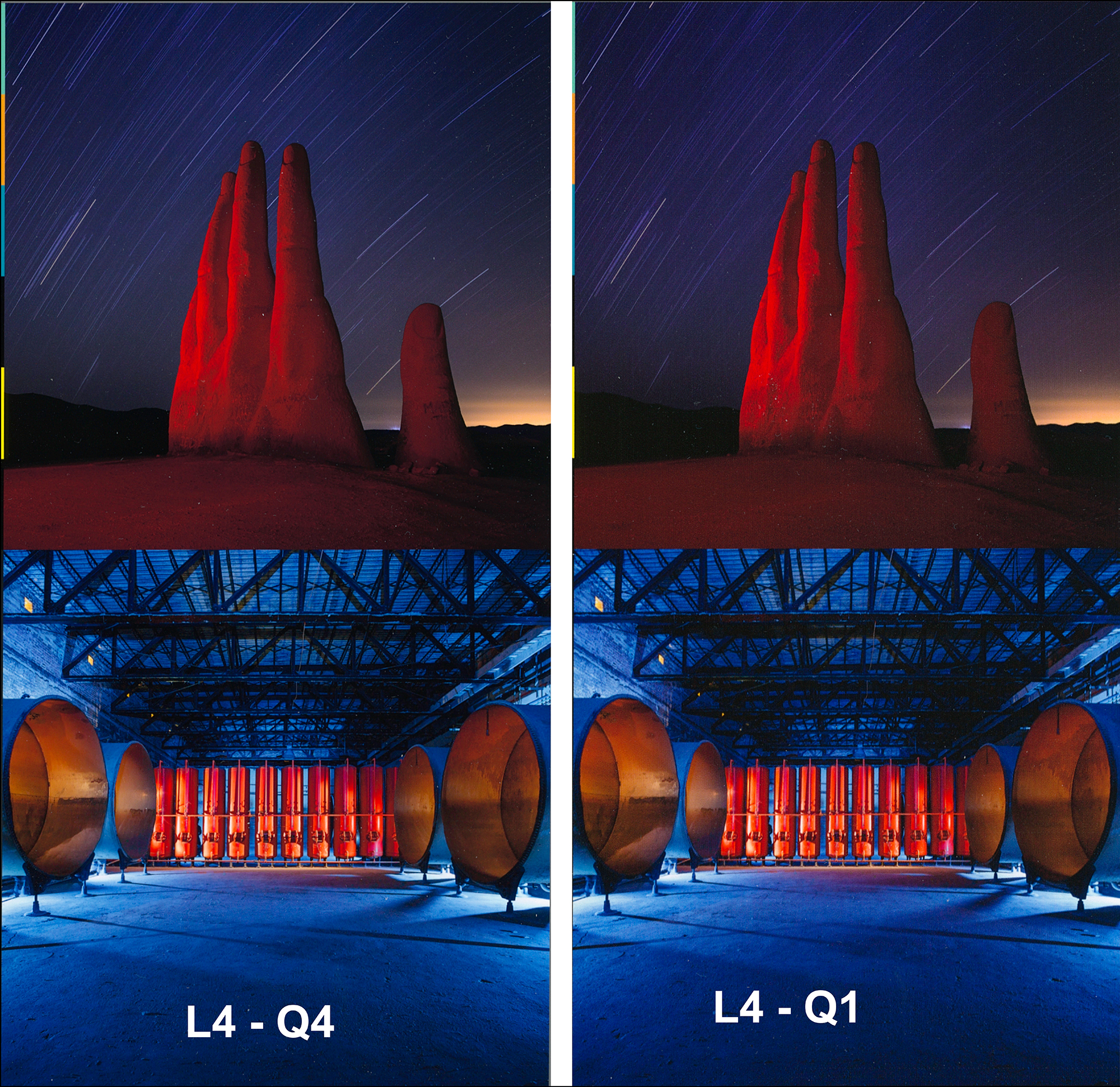
(ii) It has the built-in auto roll-holder with options for auto or manual cut, tracking feet of paper used, cut lines or not, etc. I do a lot of mural art photography (professionally and personally) and find the ease of printing panoramas a real boon to my productivity (Figure 2; borderless, 4 feet long by 17 inches high).
(iii) It uses the same ink colours as the P900, including Violet, intended to provide for extended gamut in dark blues. Unlike the P5000, it does not include Orange and Green inks, but my testing over the years indicates that few photos I’ve processed need those inks; as we’ll see, the P5370 produces gorgeous oranges, reds, yellows and greens without them.
(iv) It provides for enhanced convenience of using 3rd-party papers through the Epson Media Installer (EMI). (I’ll be discussing the EMI In the Applications section of this review.) The EMI can define the user’s preferred printing conditions for each paper, especially integrating one’s preferred paper profile with all the printer mechanical settings for a specific paper.
(v) The P5370 has the build quality of the P5000 with 200 ml cartridges.
(vi) It supports WiFi, which allows printing over a network and use of Epson Cloud Solution PORT, an application I shall be reviewing further below.
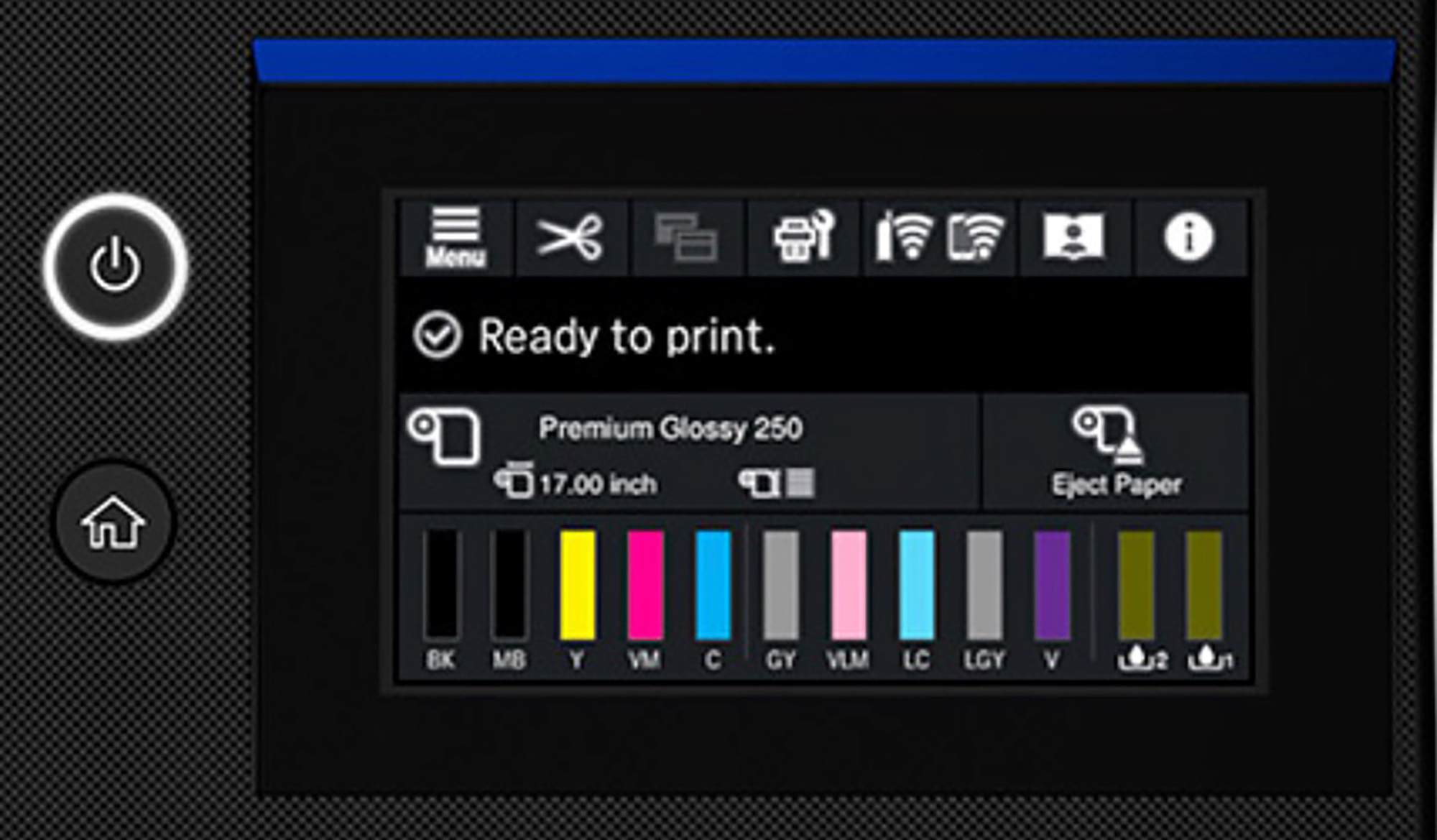
(vii) It has a large LCD screen which facilitates easy use of the on-printer controls (Figure 3), and a “Home” button, which reverts the control panel to its default position.
(viii) NO MORE BLACK INK SWITCHING: like the P900, it has separate channels for PK and MK inks, eliminating the ink-switching procedure on the P5000 and its predecessors.
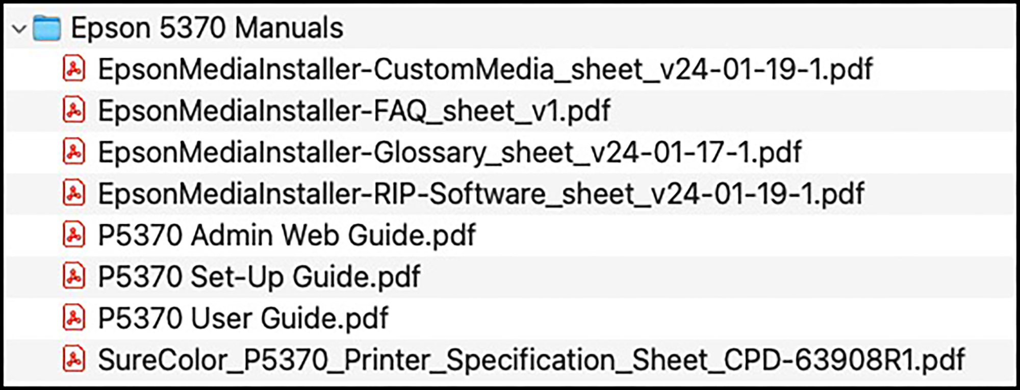
Moving onward to the operational and quality aspects of this printer, let us start with Installation. I won’t belabour it in this review, as it is a straightforward guided procedure, also described in the printer manuals (Figure 4) which I recommend downloading and reading.
I have only four items worth emphasizing here:
(1) Make sure your computer operating system is reasonably up to date. Speaking MacOS (I don’t cover Windows), even though Epson provides for driver versions going back to Big Sur, I learned the hard way it is unwise to try installing this printer on those older OS versions unless they have Rosetta installed. I recommend an OS at least of Ventura vintage. There were complaints some time back that Ventura turns MacOS and printing on their heads; there is a driver setting stability issue and a colour management setting issue with it, but this can be managed with a bit of vigilance I shall get into below.
(2) Make sure during the installation procedure NOT to install the Airprint driver. Epson provides for the installation of two driver versions: Apple “Airprint” and its own “Series” drivers. Airprint, an Apple-mandated option, provides printing capability for consumers with limited functionality, and is unnecessary for a P5370 user. The Epson “Series” driver is the full-featured driver all users of a P5370 will need. It’s easy to make the mistake of installing the Airprint driver and then wondering where most of your access to important settings has disappeared to. Just be careful to only select and install the Series driver when that point of the guided procedure comes up and you’ll be fine.
(3) EMI: It is part of the Combo Installer located in the Epson software folder. It will be installed automatically. Epson Print Layout, however, needs to be downloaded from epson.com/epsonprintlayout.
(4) Check for firmware and software updates: run the Epson Software Updater.
Using the Printer
Using this printer without making fatal errors is not difficult as long as the user remembers to observe a few basic items that must cohere with each other in more than one place. I’m going to focus on printing from Lightroom here, because that is what I normally do, but the same principles apply to printing from Photoshop.
While the primary purpose of this article is to review the qualities (pro and con) of this printer, not provide a “how-to” tract, I think a certain amount of “how-to” up-front will be useful to get you printing quickly and successfully, so once I’ve covered the basics of using it, I shall cover what options provide the best results – and just how good they are.
Let us begin at the beginning with feeding paper into the printer. There are four feeds:
– cassette
– top rear (also called “manual”)
– front straight pass-through
– roll paper
The manual lays out clearly which feeds are to be used for which papers, and the procedures for loading the papers into their respective feeds, so I need not belabour this aspect of using the printer. Just follow the instructions. Be aware, it is necessary to make sure that the paper feed you use for loading the paper must be the same as the one you select in the driver print settings, otherwise the printer will be confused and you will get an error message. The feeds work as advertised, and those of you who haven’t used roll paper with an auto roll holder mechanism will be delighted at the ease of loading and using roll paper with this printer.
Moving on to creating a print, unless using Epson Print Layout (EPL – discussed in the Applications section below), there are three “control centers” for setting-up a print job:
– the printer itself, which one accesses through the printer’s LCD (Figure 3),
– the image editing application (e.g. Lightroom);
– the printer driver which one usually accesses through Lightroom or Photoshop.
I use them in the order given, with a couple of cautionary notes.
Before getting into these control centers, I prepared the profile and media type I wanted for the papers I use most (focus here on Epson Legacy Platine). Using my MYIRO-1 spectrophotometer and MYIROTools software (a profiling and measurement suite made by Konica-Minolta delivering high accuracy) I made a custom profile for the P5370 and Epson Legacy Platine paper, which I named “Mark-P5300-LegPlat-Q3HSON-240301”. In the EMI, I associated that profile to the Legacy Platine Media Type and gave this amended – now new – media type the name LegPlatQ3HSON, to be used when printing with Legacy Platine at Quality Level 3, High Speed ON – a choice discussed below. With that done, we’re ready to set-up the print job. But you could just about as well use the Epson profile – we’ll see that in detail below.
On The Printer
(1) Load the paper as discussed above.
(2) When you load the media the LCD will ask you to select the media type and paper size, which you do right there on the LCD – for example the custom media I made in EMI called “LegPlatQ3HSON” as a new media type, and 13 x 19 inch as the sheet size.
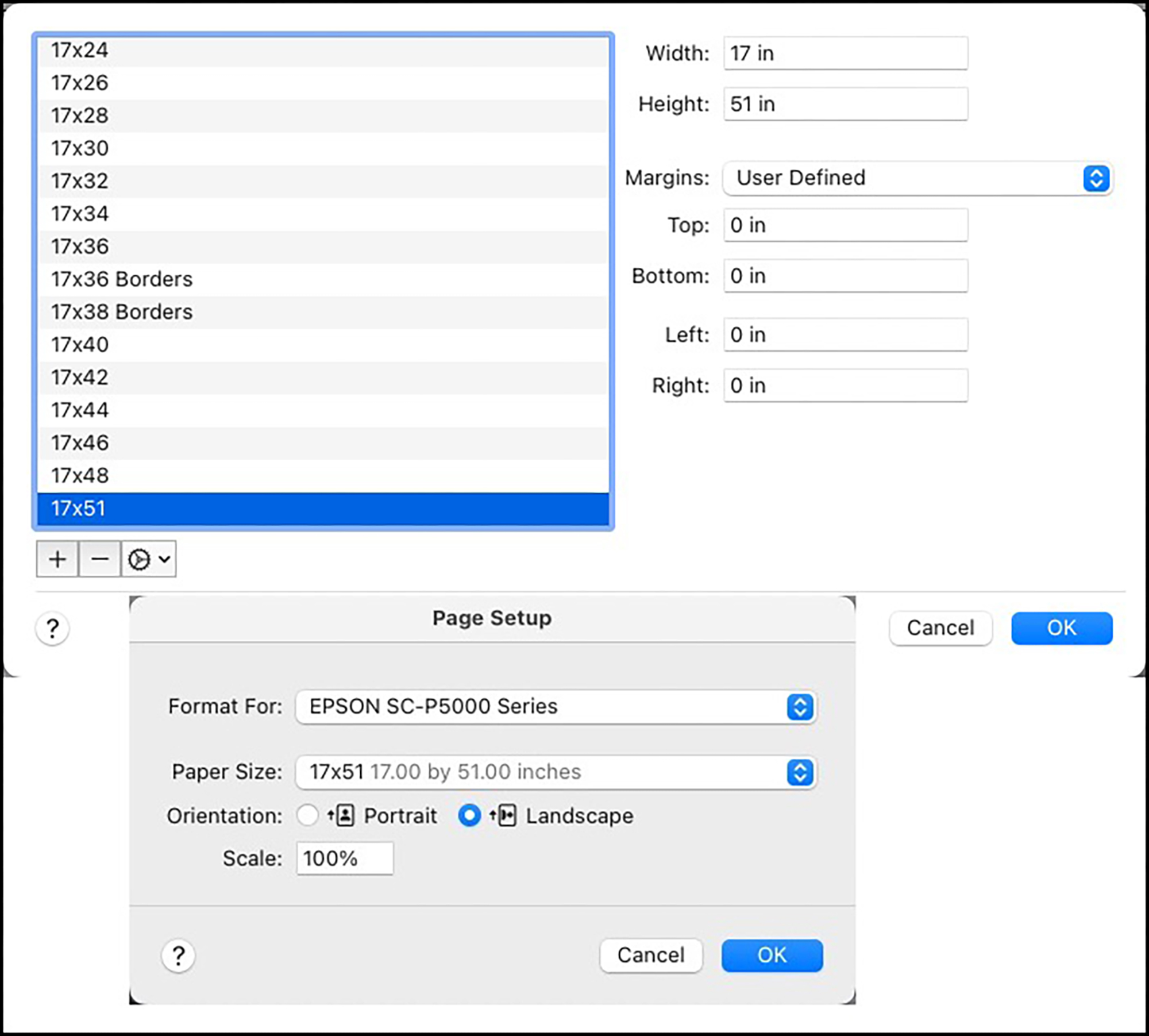
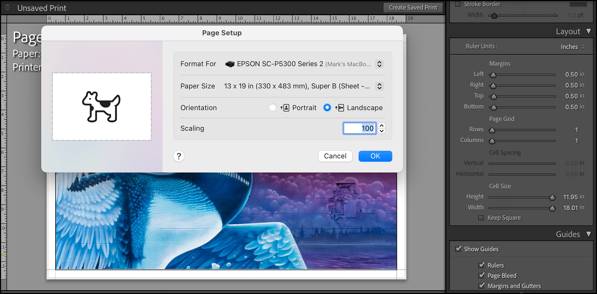
If using roll paper, say to print a Pano (one of the reasons for using roll paper), I recommend first setting up a custom paper size in the Epson driver that corresponds at a minimum with the size of the photo being printed. You access this facility through Page Set-Up in Lightroom, which takes you to the paper size selector in the Epson driver, where you select “Manage Custom Sizes”; this then allows you to create a custom size preset, the example in Figure 5 relating to the borderless pano in Figure 2. I do a lot of pano printing and for years this has worked well.
BE AWARE that even though the pano is 17 inches high by 51 inches wide to look at and intuitively how you think of it, in Epson’s nomenclature “Width” and “Height” relate to the printer carriage and the footage of printed paper respectively, not to how you think of the photo; so, referring to Figure 5, “Width” for a borderless pano is the printer carriage width, which is 17”, and “Height” is how long the pano will be. I allowed for its 4-foot, 3-inch dimension by setting “Height” at 51 inches and then its 17” dimension by setting “Width” at 17 inches. Set the margins to zero, and give this preset a recognizable name, e.g. here: “17×51”. Back in Page Set-Up, select Landscape orientation. For all custom sizes you create, set margins to zero. You can control margins in Lightroom, and the zero setting in Page Set-Up gives you latitude for settings from 0 upward.
Please note – there is an issue with the borderless printing set-up dating back quite some time and not yet corrected in this printer. If you set the paper size to “Borderless Retain Size”, and speaking here of Epson-height, the left-side long length of the print will have a border of about 3mm. If you set the paper size to “Borderless Auto Expand”, there will be no border, but there will be a slight loss of image information on the long sides, which may not matter to many photos, but will to some. This lack of a completely borderless long side that also retains all image information, I am advised, is an unresolved industry-wide issue.
If you had first created a custom media type using EMI, and you wish to use it, the media selector in the printer LCD is the place in which to select it. If you used EMI correctly, it will be here in the list of available media, and once selected it will carry with it the settings the printer needs for handling that media in the way you specified in EMI set-up for that media. More about this in the discussion of EMI below.
So, summing-up what you need to do on the printer LCD: after making sure your paper is registered in EMI (instructions toward the end of this review), select three things: (1) whether you are using roll or sheet, (2) the media type and (3) the paper size.
Moving on to the image editing application (here Lightroom – in the Print Module):
(1) Go to Page Set-Up (which takes you into the driver, Figure 6) and make sure the paper size is what you selected on the printer LCD; verify the orientation (Landscape or Portrait). Click OK.
(2) With that done, in the Layout menu of the Lightroom Print Module set your margins and your cell size, for example as shown in Figure 6 for a 13x 19 inch print with a half inch minimum margin on each side. Lightroom will allow you to make the correct cell size for the photo and margin settings if paper size is coherently specified in Page Set-Up.
(3) In the Color Management panel of the Print Module, select the profile that you had associated or is associated with the media type (Figure 7).
(Painting: Nick Sweetman, Toronto; Photograph by Mark Segal)
In Figure 7 I selected my custom profile in the profile pane. Select the Rendering Intent (relative or Perceptual) you think works best for the photo. Be sure that the profile you select here is the same as that associated with the Media Type you created.
Inset on Using Epson Advanced Black and White Mode (ABW)
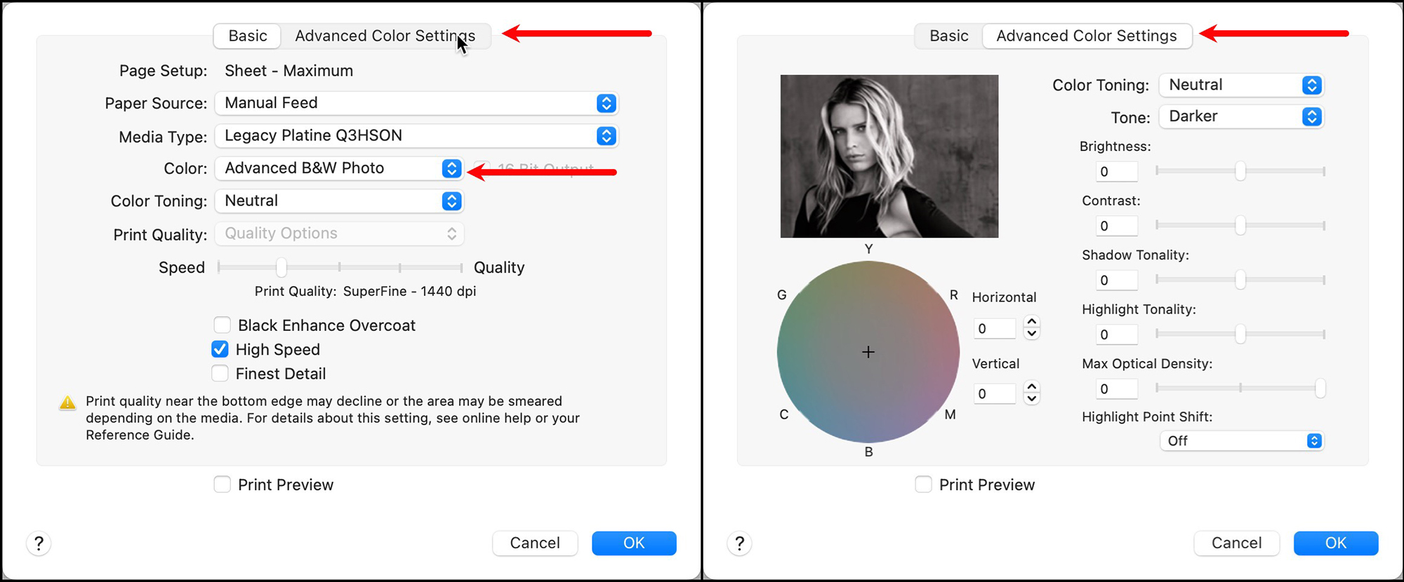
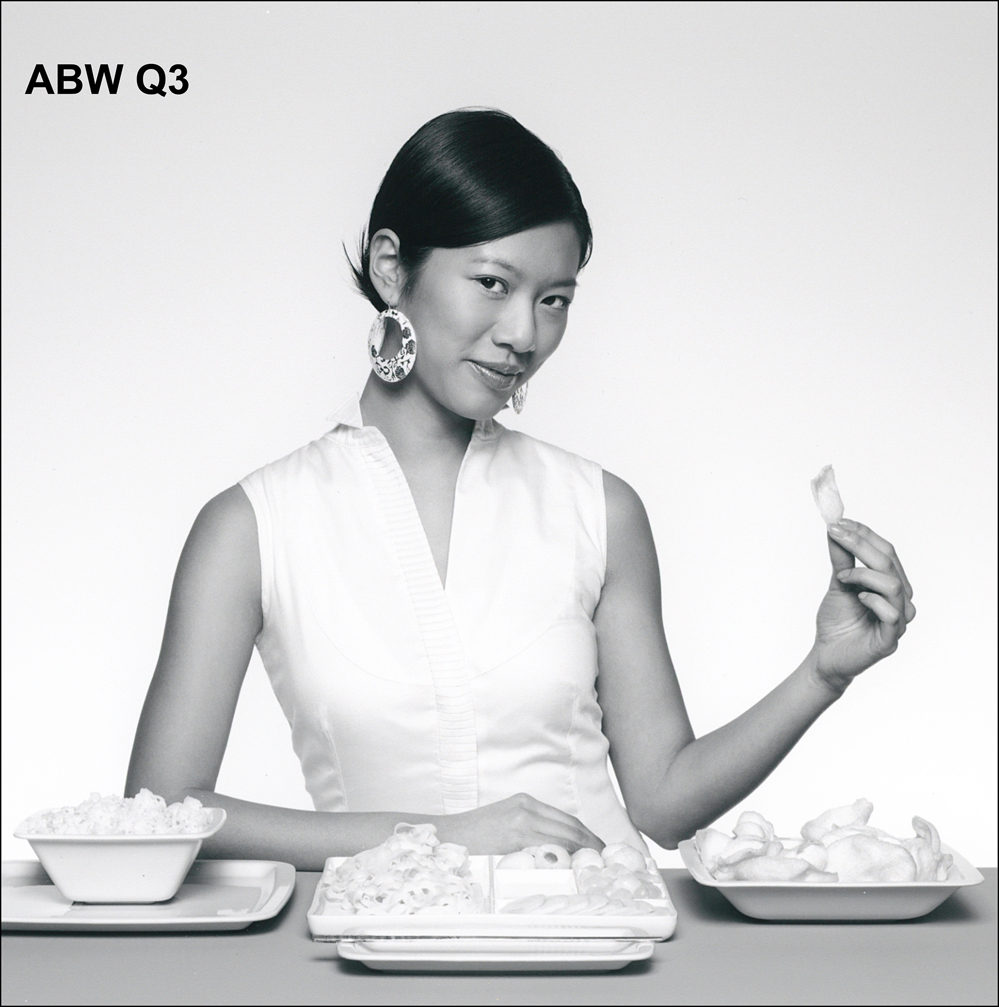
If you wanted to print Black & White using ABW (evaluated below), instead of entering a profile from the drop-down in this pane in Lightroom, select “Managed by Printer”. This then allows you to change the Color setting in the Epson driver from “Color” to “Advanced Black and White” (Figure 8 left side, which shows access to options for using it, and right side – the Advanced Settings for choosing additional brightness and toning effects).
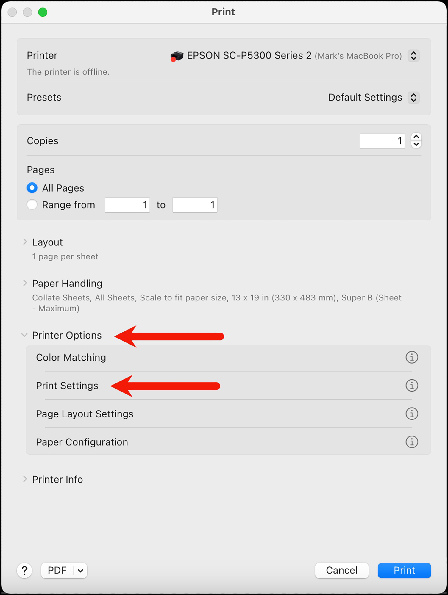
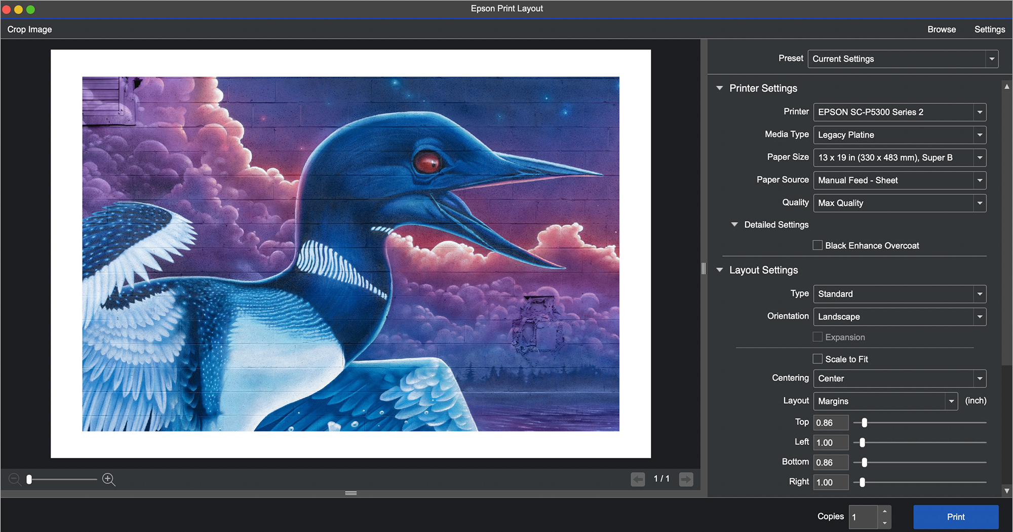
(4) Now enter “Printer…” settings (lower right button in Lightroom’s GUI, top of the Print GUI in Photoshop). This takes you into the Epson driver settings for printing (Figure 9). Click on Printer Options, then click on Print Settings, which takes you into the settings we need (Figure 10). So, let us proceed down the list in Figure 10.
But just before delving in here, let me advise it’s more words than work. There’s really not much you need to do to manage this, referring to Figure 10:
- Verify A
- Select B
- Keep C on Use Printer Settings or re-select the media if you wish
- Keep F on “Quality Options”
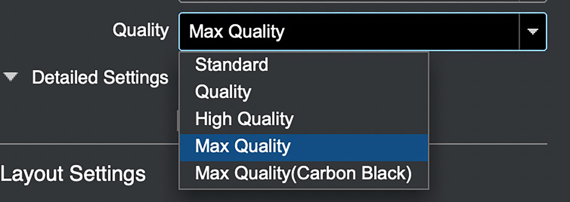
- In “Speed~Quality” chose between 1,2,3,4, or 5 (a lot more on this below)
- Choose whether you want High Speed or not.
- Leave Black Enhanced Overcoat (BEO) and Finest Detail OFF unless you’re really itching to use them. They add loads of printing time, but they do enhance DMax on high gloss media; “Finest Detail” is for vector graphics).
And that’s it!
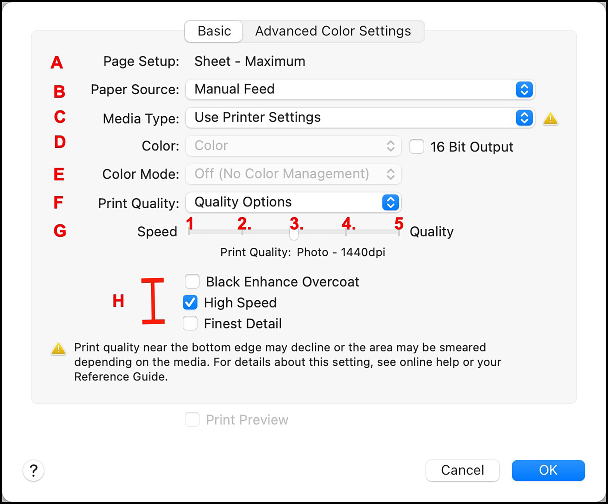
A. Page Set-Up: This should reflect the choice made in the Page Set-Up window.
B. Paper Source: Select the paper feed to be used.
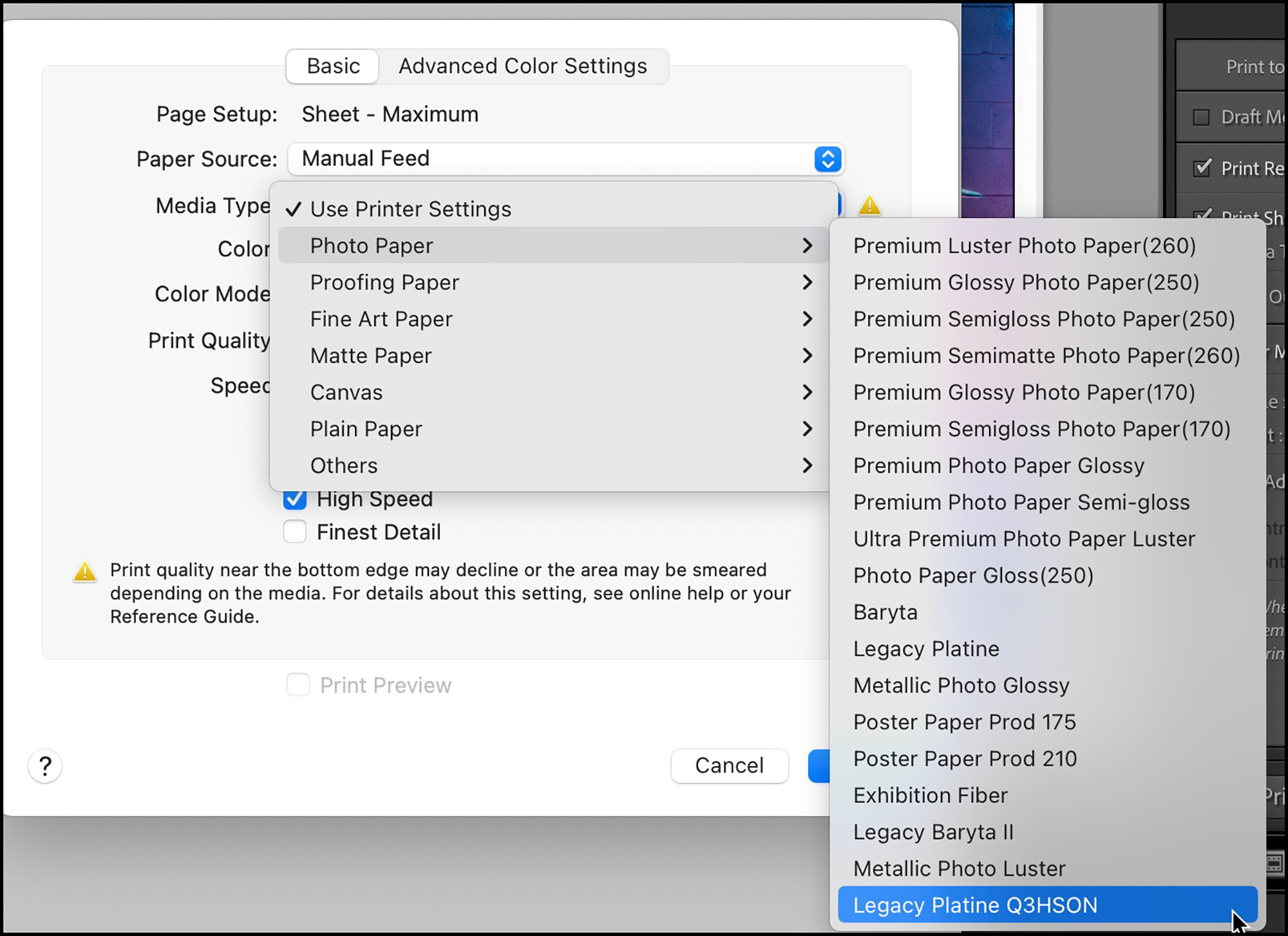
C. Media Type: If you select “Use Printer Settings”, the printer knows to use the Media Type set in the printer LCD. You also have the option here to select the Media Type from the drop-down list, but just make sure it is the same as that chosen in the Printer LCD (figure 11).
D Color: This is greyed-out by virtue of having chosen the ICC profile in Lightroom, as we did above, however, had you chosen “Managed by Printer”, this pane would give you the choice to select ABW as shown in the Inset above.
E. Color Mode: This should be greyed-out because we have selected an ICC profile in Lightroom; it means the application is managing colour, and we don’t want double colour management from the printer driver, so Epson has tried to make this impossible. BUT if you are on Mac OS Ventura/Sonoma, due to a current Apple bug, sometimes it will default to Epson Color (sRGB) which you do not want if using an ICC profile. Always check this setting and make sure if you are using an ICC profile that it is set to OFF (No Color Management).
F, G, and H: Quality versus Speed: Here is where discomfort can occur due to the meaningless labels in item F, but we’ll keep it simple by renaming the steps on the Speed-Quality scale (item G) as 1, 2, 3, 4, 5, and I recommend you select “Quality Options, as shown in Figure 10, item F”. This lets you select items G and H any way you want.
So, focusing on item G:
- “1” is draft mode producing prints very quickly at 720 dpi for draft purposes. Quality is not bad, but not great.
- “2” and “3” both work at 1440 dpi. “2” is a bit faster than “3”, but you’ll be more assured of better quality – in fact superb quality – using “3’ which is only a bit slower. I’ve tested all this, and we’ll look at those results further on.
- “4” works at 5760 dpi which is slower and doesn’t produce visibly better quality than “3”. (We’ll see that further on.)
- “5” is only useful when using Black Enhanced Overcoat, which itself is only useful on high gloss and glossy “metallic” media, where it can produce a slightly enhanced depth of Black. (I’ve tested this in my SC-P900 review and found it of moderate interest.)
Turning to item H:
- We’ve discussed Black Enhanced Overcoat.
- High Speed does make a big difference to speed (about halves the time to make a print because the printhead works bi-directional rather than uni-directional) but does not impair print quality, so there’s no reason not to use it, unless you are having issues with ink smearing or printing on back-lit film.
- Finest Detail is only useful for printing vector graphics and slows printing.
So choose what you want and click OK.
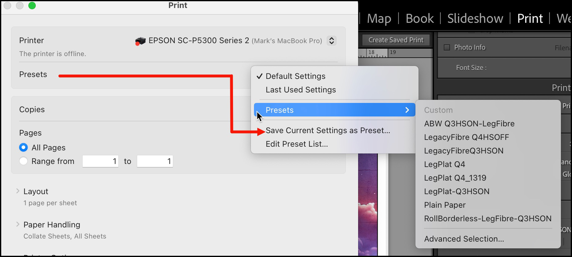
Now, having made those choices, if you intend to use this combination again, I recommend creating a custom preset that contains them all (Figure 12) by clicking on “Save Current Settings as a Preset and giving it a name. Then you need only click on the Preset to activate the group of settings. But if you are on Mac Ventura/Sonoma beware: because of a MacOS bug, the presets may not reproduce the settings you saved. After calling-up a Preset, check the details in the driver Print Settings – I have found it very often necessary to reset the settings to those intended. Alternatively, save your printing presets as Custom Print Templates in Lightroom’s Print module and avoid the risk of this problem occurring.
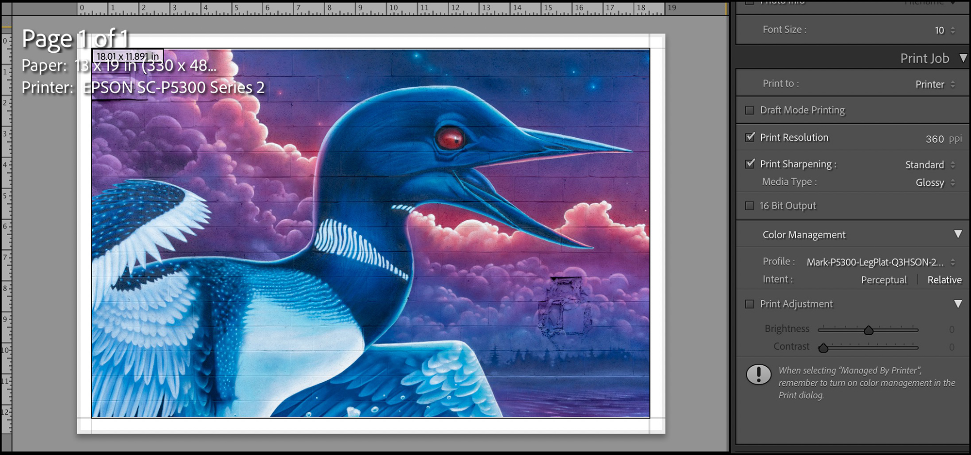
Back in Lightroom’s Print Module it’s safe to set resolution between 240 and 360 PPI. Lightroom will temporarily re-sample resolution to the needs of the Epson driver, and this setting should not normally affect image definition unless the resampling is unusually large from a low number.
Perhaps it’s worth spending a moment on the concept of resolution as applicable to an Epson printer. “Resolution” in this context is about distinction of fine detail in a print, which in respect of the printer driver is about how ink dots are generated and placed on paper. There are two numbers in the public domain people often fixate on: the number of nozzles per inch on the printhead, and the number of ink dots per inch (dpi).
For the Epson SC-P5000 printer, the number of nozzles per inch per colour was 360, as it is for a number of other Epson large format professional printers. For the SC-P900 and SC-P5370 printers, it is 180. Per Epson, this difference affects the printing speed but not image resolution. Whether released through 360 or 180 nozzles, the ink “dpi” (dots per inch) is relevant to resolution, where the user’s choice for the P900 and P5370 printers is 720, 1440 or 5760. On the face of it, we would expect 5760 to deliver superior visible resolution to 1440, but we’ll see later, not necessarily. Quite apart from these numbers, the variable-size droplet and the print-head screening technologies account for the apparent resolution quality we see in prints from this printer. Epson technology produces droplets down to 20 microns, which the human eye cannot see, partly explaining why one can’t see resolution differences between 1440 and 5760 dpi. We’ll see below what the testing shows.
While using the driver is not difficult, there is a yet much easier approach to printing with this printer – the Epson Print Layout (EPL) application. It does not offer quite as many settings options as the Epson driver does, but that is intentional, to simplify setting-up a print. I’ll review it in the “Additional Software” section of this review. It’s great!
SC-P5370 Performance:
We’ve set-up the printer and seen how to use it; now let’s see whether the prints are any good. Spoiler alert: yes indeed, they are – in fact, superb.
My conventional approach to this kind of evaluation is to look at both data and “real world prints” (printer test images and selected photographs) as produced with manufacturer (OEM) and Custom (my) profiles. The data provides objective and precise numerical distinctions between one set of test conditions and another, so you need not just depend on my subjective opinion about such things; however, in order to interpret the practical implications of those numerical distinctions it is necessary to (a) know how to interpret the numbers and (b) see the results in actual finished product – after all, the print is what we value, not patches and numbers. I’ll take you through all that.
As mentioned above, I did all of my data generation and custom profile making with a MYIRO-1 spectrophotometer and its associated MYIROTools software, manufactured by the Konica-Minolta Corporation. This equipment delivers highly consistent and accurate results, and can be used untethered, which makes it ideal for the large amount of comparative analysis undertaken for a review of this kind (6 custom profiles, 148 files of tests, and 139 prints of targets and photos). I provide a methodology discussion here: https://photopxl.com/augmented-inkjet-printer-paper-and-profile-evaluation-190617/, and here: https://photopxl.com/do-the-numbers-matter/.
There are so many papers on the market and printing options available in the Epson driver, that for practical purposes I had to confine the amount of testing and analysis to what I consider to be a practical and sufficient menu of items corresponding with the reality of what I believe most photographers would want to work with. So the research done for this review includes two papers (Epson Legacy Platine and Epson Legacy Fibre, highest-quality semi-gloss and matte media respectively) and several of the most important driver settings in respect of quality and speed. This scope still generates a large number of possible printing conditions, from which I found it satisfactory to be selective. I believe I have a reliable story to tell about this printer’s capabilities and how it should be used.
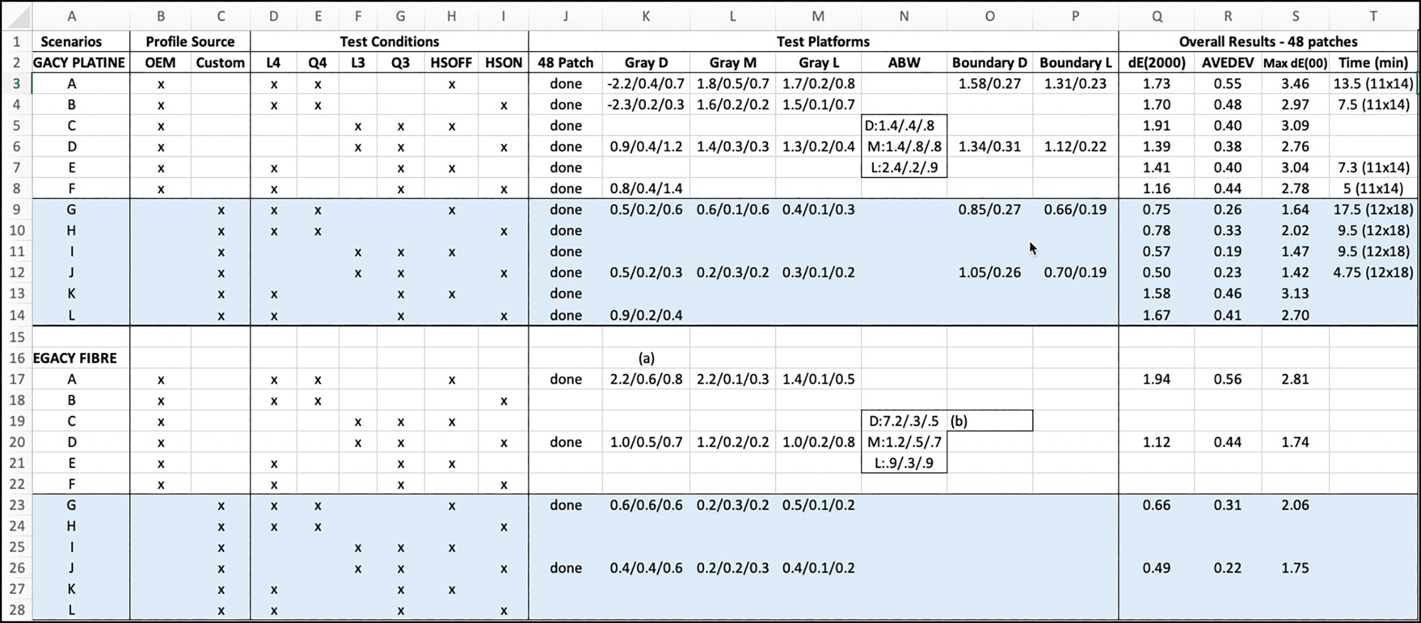
Figure 13 provides a synthesis of the results for the set of printing conditions and scenarios I initially thought would be useful analyzing; scenarios are labelled in Column A.
- Columns B and C indicate whether the profile is from Epson or me.
- Columns D to I are the test conditions I considered worthwhile looking at if the objective were quality prints. “L” relates to the quality setting in the printer driver used to print the profiling target. “Q” relates to the quality setting in the printer driver for making prints. (In principle for best results, the settings used to print the profiling target should be the same ones used to make prints with that profile.)
- Columns J to P are the test targets (Figure 14) I used including all results other than for the main 48-patch target.
- Columns Q, ~ T contain summary results from the main 48-patch target tests.
- Blank spaces are either not applicable to the scenario, or I chose not to work-up, as one sees while doing the research what is or isn’t worthwhile.
The notes below explain the logic of the scenario structure in the table of Figure 13:
| § Scenarios A to F are for OEM profiles; Scenarios G to L are for Custom (my) profiles. | |||||||
| § Scenarios A/B test for comparison between High Speed ON and High Speed OFF. | |||||||
| § Scenarios C/D vs A/B test for comparison between L3/Q3 and L4/Q4 with High Speed ON or OFF. | |||||||
| § Scenarios E/F test for the hybrid L4 profile run at Q3 quality versus the ones above with High Speed ON or OFF. | |||||||
| § Scenarios G to L repeat the above pattern for Custom Profiles. | |||||||
| § For Test Conditions:” L” denotes quality level used to print the profiling target; “Q” denotes quality level used to print the test target (see third bullet above). | |||||||
§ HSOFF means High Speed OFF, and HSON means High Speed ON.
|
For our purposes, it’s not necessary to do detailed analysis of each possible option. Quality settings 1 and 2 in the printer driver are meant for drafts, so I don’t focus on them here, but I produced two test prints at Q1 High Speed On and will comment on them in the results review below. I disregard quality setting 5, because it is only useful for Black Enhanced Overcoat which has very limited usefulness (see my SC-P900 review). That left quality settings 3 and 4 (1440 and 5760 dpi), and for those High Speed can be On or Off. The question then is which of these combinations produces the optimum combination of quality and speed. I tested fewer scenarios for Legacy Fibre than for Legacy Platine, because by the time I finished the ones shown, I considered that I know the “story”. Legacy Fibre produces lovely colour and blacks, but semi-gloss/gloss papers better test the printer’s full gamut capability.
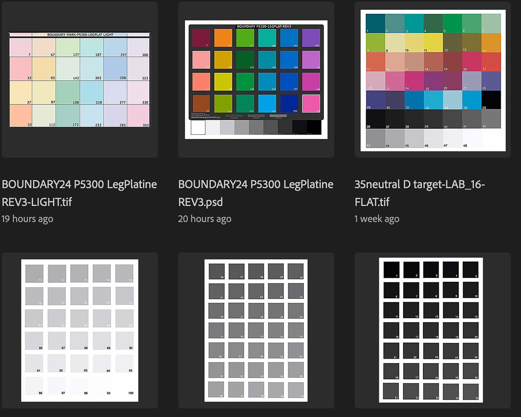
The data-driven aspect of printer/profile performance evaluation that you see in Figure 13 is determined from my test targets (Figure 14), which include 82 colours plus 114 grayscale patches. The upper right target of 48 patches is the main test platform containing 34 colour and 14 B&W patches. The upper left and upper middle targets test for printer performance at or near the gamut boundaries of the profile (very light colours and dense saturated colours respectively). The bottom row of targets provides for a more granular portrayal of grayscale performance. I have described the tests using all these targets in the above-referenced articles. However, I review here a few key points relating test targets to profiles before discussing the Figure 13 results.
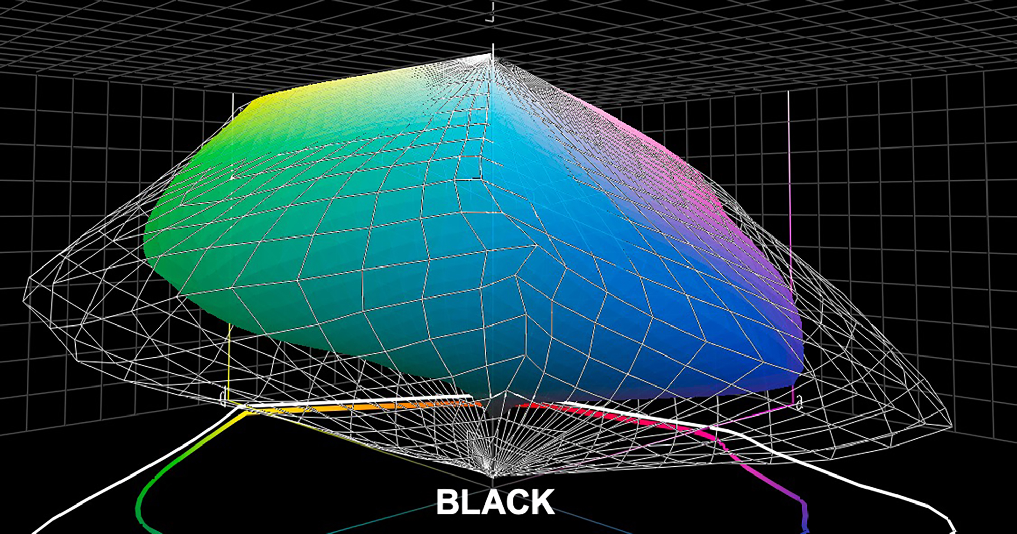
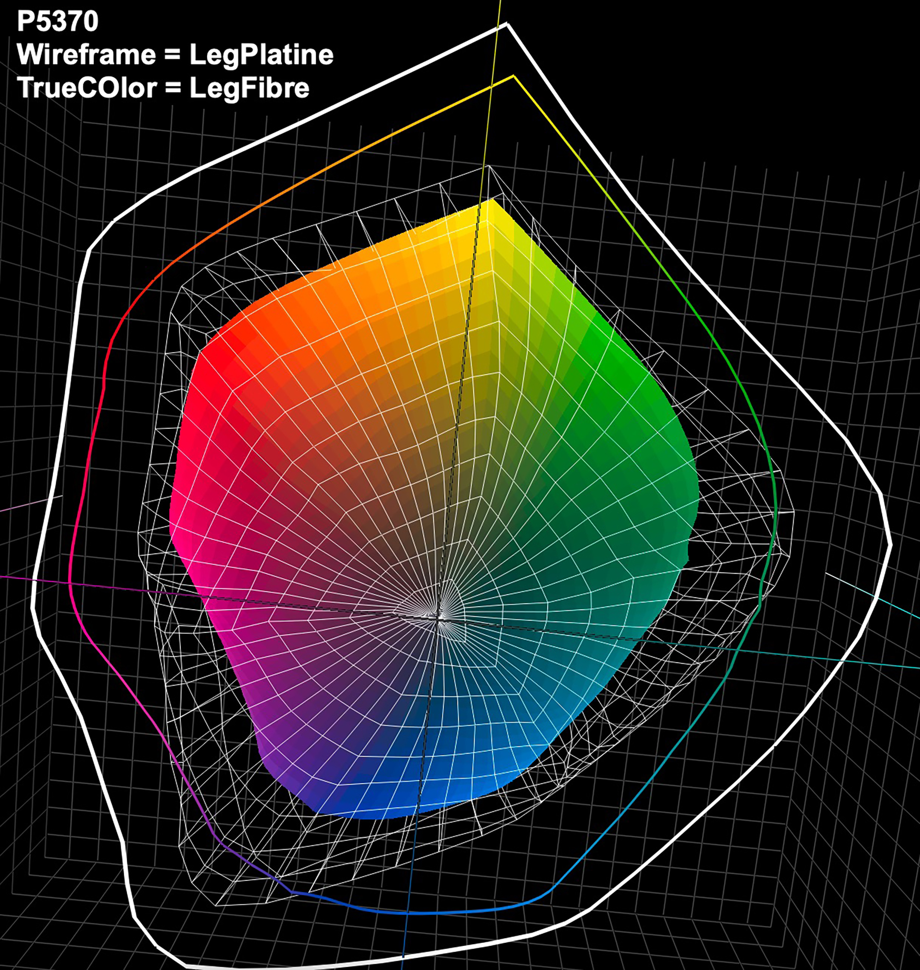
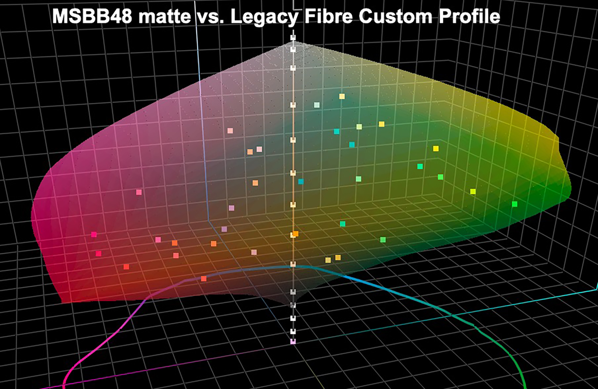
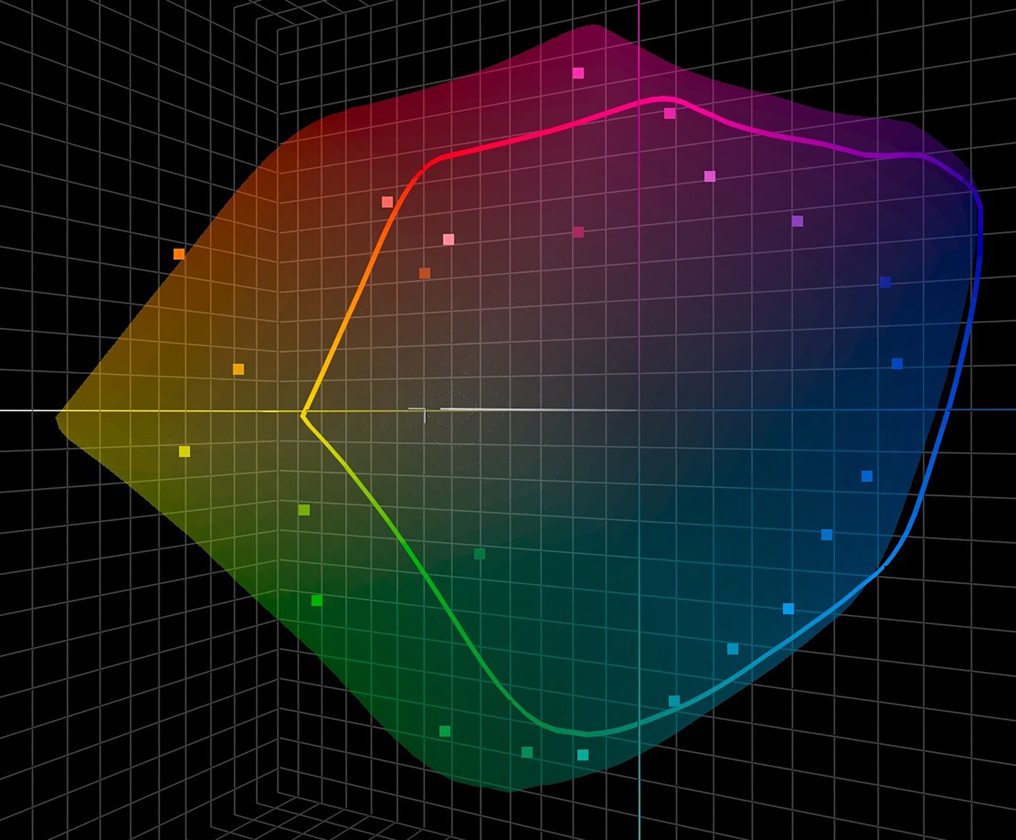
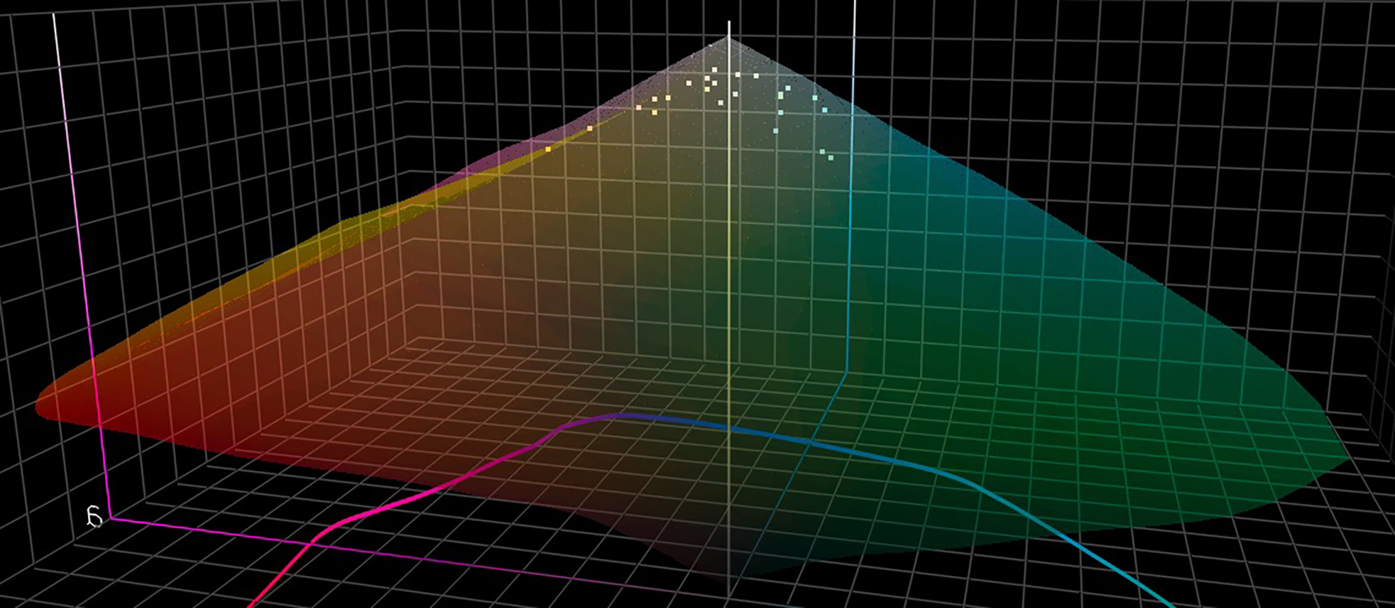
Each printer and paper combination has its own potential gamut as revealed from analysis of its printer profile in a suitable application such as Chromix ColorThink Pro. Luster and gloss papers have much wider gamut and darker Black than matte papers because the ink sits more to the surface and the coating reflects more light. You can visualize these differences for the P5370 printer (graphed in ColorThink Pro) in Figures 15, 16, 17.
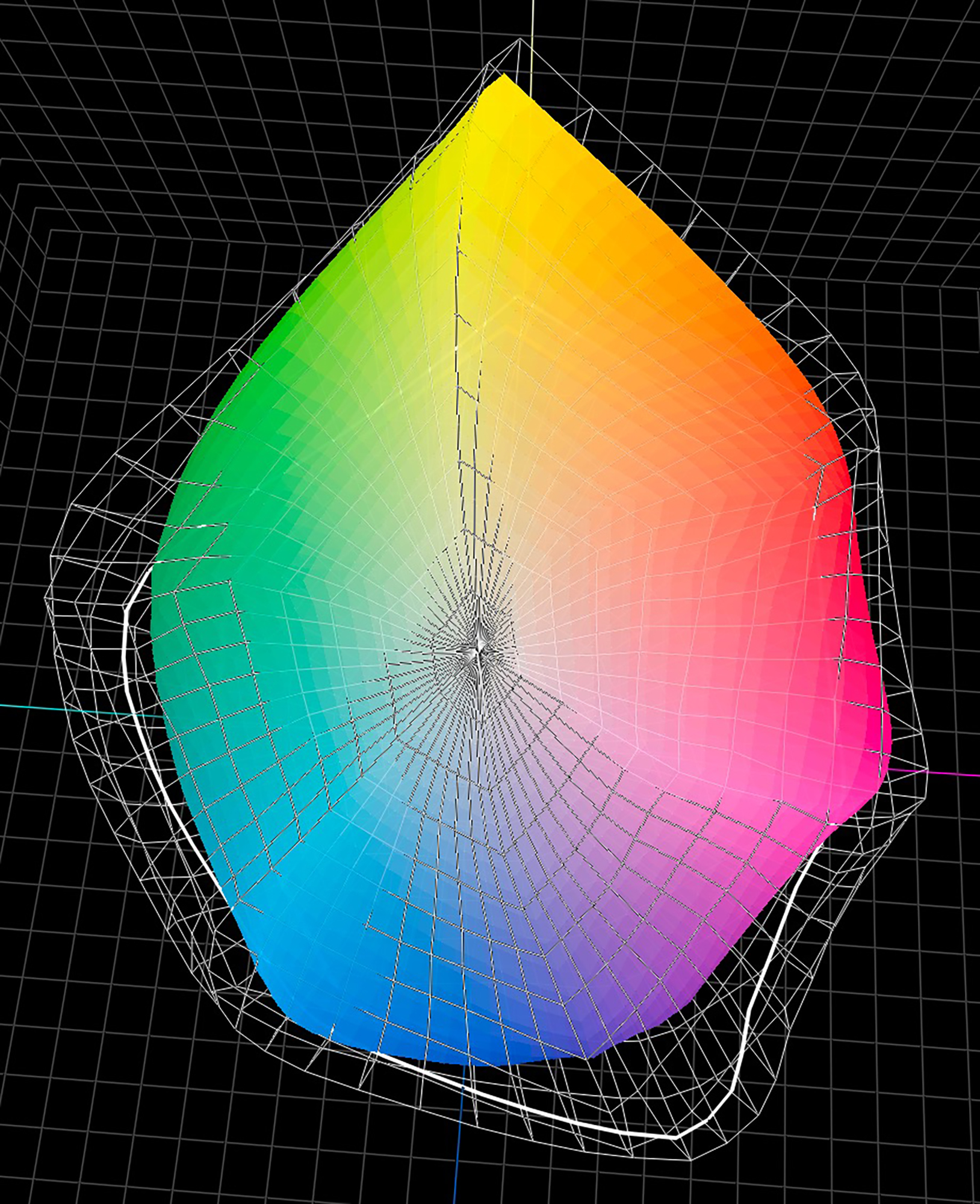
Because printers can’t print colours out of printer/paper gamut, to test printer accuracy the colour patches in my test charts need to fit within the gamut of the paper/printer I am testing. Therefore the colour patches in the test targets include only in-gamut colours. Hence the 48-patch target has two versions, one for Luster and one for Matte and the two Boundary targets are made only for Luster papers to test how the printer handles highly saturated colour by reproducing colours close to the boundaries of the profiles. The relationships between test target colours and profile gamuts are shown in Figures 18 to 21.

Let us now review the results of the testing reported in Figure 13, starting with the overall results in columns Q, R and S. Recall, printed colours are more perceptually accurate the lower the average dE(00) value and the lower the AVEDEV of all the colours’ individual dE values around that average.
(1) While some results are better than others, all are very good, and you would be hard-pressed to see jarring differences in prints, with one possible exception for those who look comparatively and very carefully: the dark tones from some of the Epson profiles are a tad darker than they are from the custom profiles, making deep shadow detail moderately denser in those prints. But data and prints cohere that differences are subtle.
(2) In general, the Custom profiles produce moderately more accurate results than do the Epson profiles. This is normal, because no two machines are identical, so when a profile is made from targets printed in the same printer that will do the photo printing, the accuracy is likely to be a tad better than using a profile generated with another printer, and that shows here, except for scenarios E and F where the Epson L4 profile performed marginally better than the custom L4 profile when printed at Q3 with High Speed On or Off.
(3) I must remark that it doesn’t get better than Scenarios I and J (Level 3 profile used for printing at Quality 3, High Speed ON, for both Platine and Fibre), where the low levels of the average dE(00) and narrowness of the AVEDEV are uncanny, meaning a very high degree of confidence that the photo you adjusted under softproof on your properly calibrated and well-profiled display is what you will see on paper emerging from the printer. It is most important to calibrate and profile your display properly.
(4) The interesting thing about these results is that they are counter intuitive in a good way. One would expect that the combination of L4Q4 with High Speed OFF should generate the most accurate results, because the printing is unidirectional at a resolution of 5760 dpi for both the profiling and the printing. However, it turns out that with this printer, printing accuracy is better at 1440 dpi if both the profiling target and photo printing are High Speed ON and set at Q3 in the driver. And, icing on the cake, 12×18 inch ink coverage takes 4.75 minutes to print with L3Q3 High Speed ON, compared with 17.5 minutes for the same size print at L4Q4 High Speed OFF, or 9.5 minutes using L3Q3 with High Speed OFF.
(5) It is also the case that within the OEM profile scenarios, the L3Q3 settings produce more statistically accurate outcomes than the others. So, more speed, better quality!
(6) Scenarios E/F and K/L examine what happens using an L4 profile with Q3 photo printing. Within the Legacy Platine custom profile set, this is inferior to using photo print settings totally coherent with the settings used to print the targets for their profiles – discussed in point (3) above. However, for the OEM profile set, this is not the case – the hybrid scenarios produced statistical outcomes that are slightly better or similar to the other scenarios within the set.
Having seen what emerged from the Legacy Platine scenarios I determined it would be suitable to reduce the testing menu for Legacy Fibre, wherein I decided to focus the testing on the two cases of L4Q4 HSOFF versus L3Q3 HSON. Here again, custom profiles outperform OEM profiles as expected, and L3Q3 High Speed ON outperforms L4Q4 HSOFF for both OEM and custom profile uses. So there is consistency between media types.
Turning to the Grayscale in columns K, L, M and N for dark tones, mid tones, highlight tones and ABW respectively, let us first deal with Advanced Black and White Mode (ABW, Figure 13 column N), which is only an OEM construct – “profiling” for ABW is Epson’s, within “Printer Manages Color”. For these tests I used the Epson default settings of Neutral in the Basic ABW driver panel and Neutral Darker in the Advanced panel. The questions about ABW are whether it can deliver deeper Blacks, better tone tracking and better hue neutrality than just using an application-managed ICC profile with Color Management OFF in the printer driver.
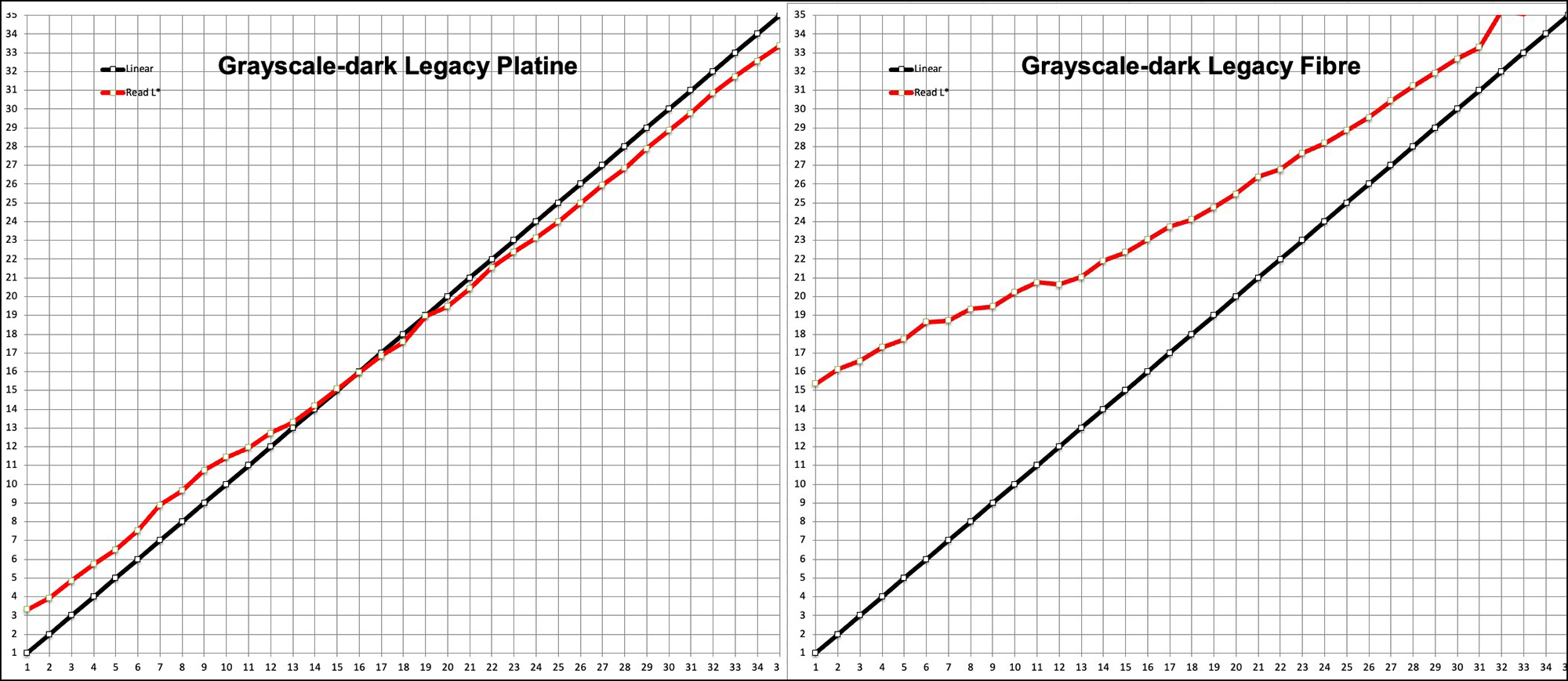
To replicate normal usage, I’ll examine either printing through Lightroom using Relative Colorimetric (RELCOL) with Black Point Compensation (BPC), or through ABW which uses its own version of BPC. Several graphs and a bit of data tell the comparative story (Figures 22, 23 and 24 for dark tones, mid tones and highlight tones respectively):
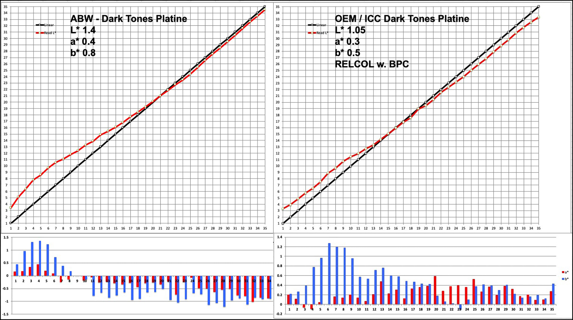
Recalling how to read these graphs: the larger upper section measures Lightness (L*). The Black line plots the reference values, the Red line the values read from the test print. The closer they converge the more accurate the print relative to the colours’ reference values. However, recall, RELCOL+BPC adjusts tones for paper white and the Black Point of that printer/paper/profile combination, whereas the file reference values are independent of these conditions, so there will be inherent intentional inaccuracy when printing with Relative Rendering Intent and BPC (which, by the way, is why for accuracy testing we use Absolute Rendering Intent, which just tries to let the printing system print unadjusted reference values to see how accurately it can lay down the reference colours). The vertical bars in the smaller lower sections plot a* and b* hue departure from 0, warmer tones above the 0 line and cooler tones below the 0 line. The scale shifts from case to case, so read the bars in relation to the left-side scale in their graphs.
The top left reported L*, a* and b* numbers in bold black are absolute average difference from reference values for the range, in the case of Figure 22, L*1 to L*35.
Figure 22 indicates that there’s not much to choose between these two options. As long as the departure from gray don’t exceed a range of about +/- 1.0 or a bit more, most people would not notice a bias. In both cases, the Black Point is at about L*3. Essentially, we see from this representation that it will make little difference in this tonal range whether one prints a B&W photo using ABW or the ICC route.
Similar presentations in Figures 23 and 24 also demonstrate no compelling statistical case for preferring an ABW over an ICC B&W processing approach using the P5370. This is confirmed in actual photos processed through the two workflows.
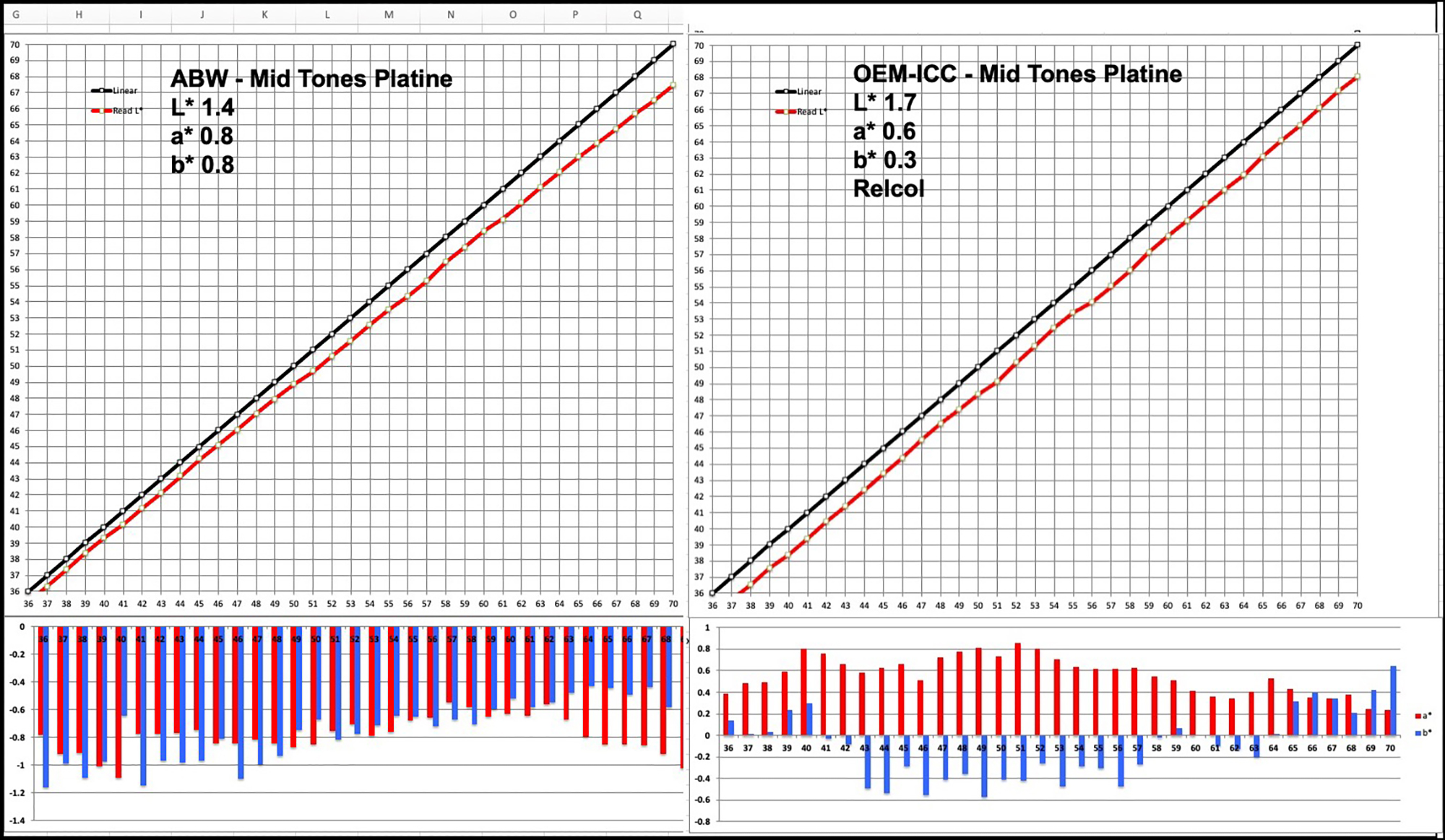
The tone tracking for the mid tones is a bit tighter for the ABW option, but it has a cooler departure from neutrality than the OEM-ICC option, which tends more to be on the warm side. On the whole, hue neutrality is somewhat better preserved for the OEM-ICC option, but in both cases, prints examined in isolation would still look quite neutral to most observers and the tonal separation would look about the same.
For the light tones, lightness tracking is similar between the two options, but the non-neutral bias is more consistent across this range and less in the OEM-ICC route than for the ABW option.
The overall conclusion I draw from this data is that from the perspective of measured tonal accuracy and B&W neutrality, there isn’t much to choose between these options. In both cases from the mid-tones upward there is moderate darkening relative to reference values for the OEM options, and neither case exhibits a deeper Black Point. Non-neutrality differs between them, but in both cases the bias is below or just slightly above a theoretical “Just Noticeable Difference” (“JND”). Some people will prefer the convenience of using ABW and its rather neat toning capability in the Advanced panel of the ABW driver section, while others would prefer doing their B&W toning in Lightroom, using the normal ICC workflow for printing.
Black and White printing may be a case where there could be some small advantage to having a custom profile, insofar as the achievable tonal tracking is tighter and the departure from neutral gray lower from a custom profile, as evidenced from comparing Figures 25 and 26 using L3Q3 and High Speed ON printer settings in both cases; that said, the differences between these results are not large enough to create a compelling case for custom profiling – you can safely use the tested Epson profiles for B&W printing, unless you need highly accurate tonal separation within a narrow range of the deepest dark tones (say L*2 to L*10 or so), wherein it is anyhow difficult to differentiate much detail or notice moderate non-neutrality.
Results seen on Test Photos
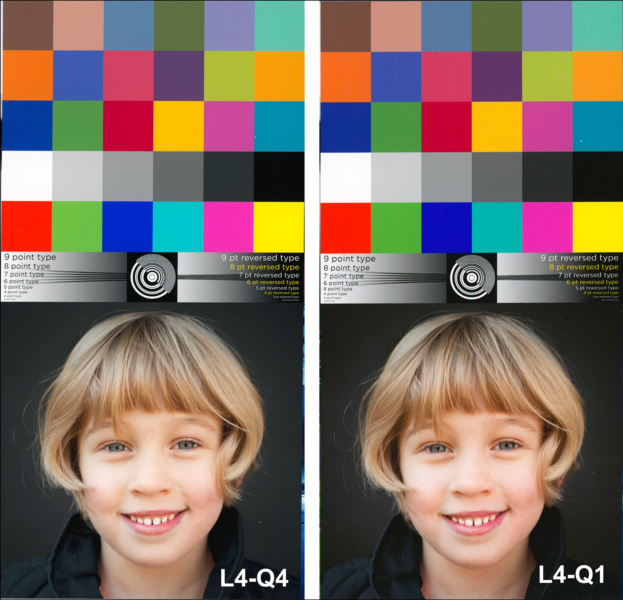
I use two kinds of photos for testing printers and papers: (i) standard test images with well-known properties for print quality evaluation, and (ii) several of my own photographs selected to highlight the various characteristics of good prints. Figures 27 to 35 show the test photos – these are not scans of prints (those come later), they are from the image files.
Figures 27 and 28 are well-known standard printer test pages whose individual photos test for different qualities of printer performance.
Figures 29 and 30 are used essentially by the pre-press and printing industry for calibrating industrial scale printing machinery to a common standard and can be used by anyone else looking for a standard reference for testing various printers.
Figure 31 tests primarily for the quality of the blue-violet-purple range and the tonal variations within it, as well as print resolution.
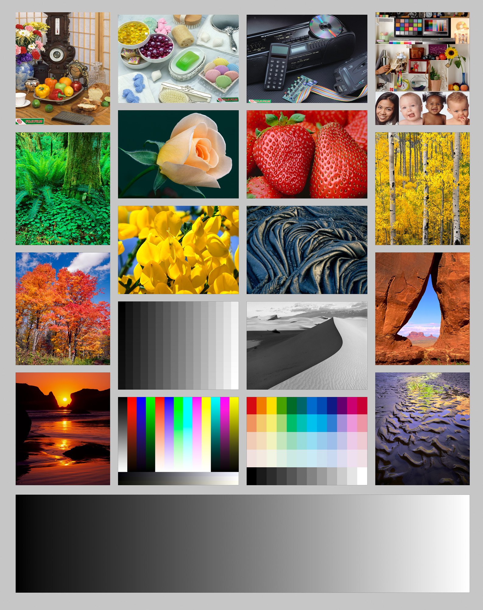
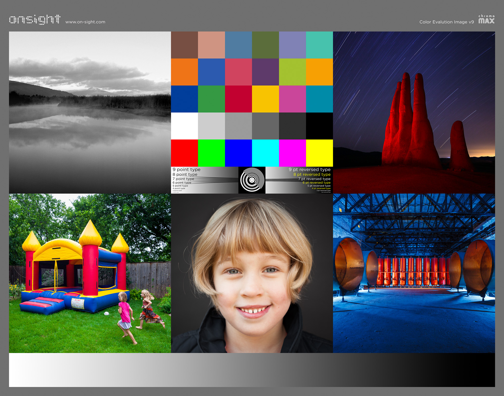
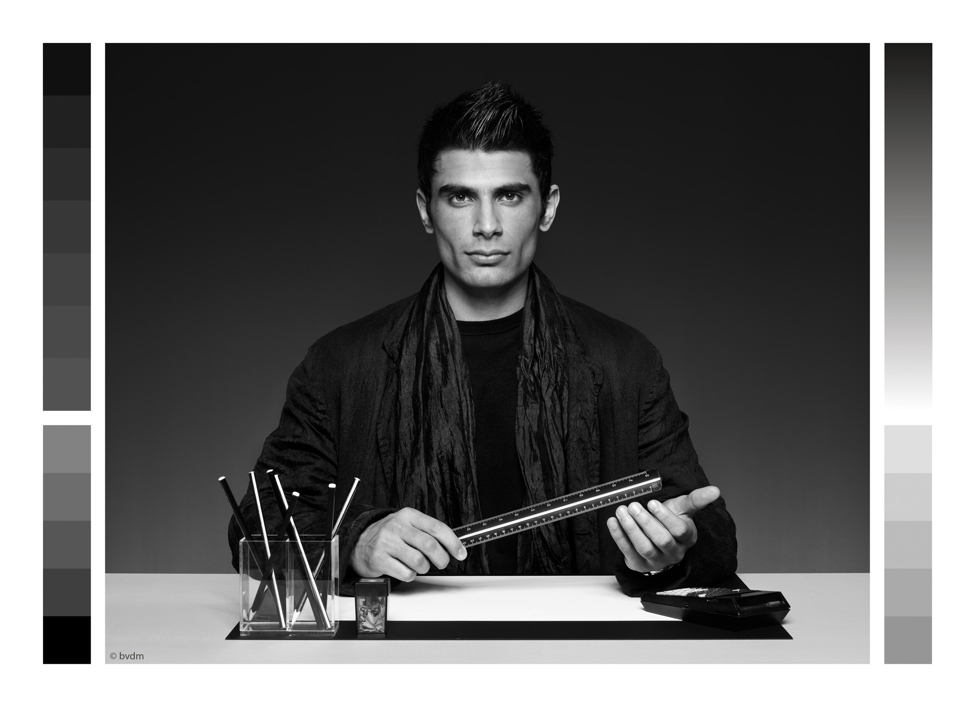
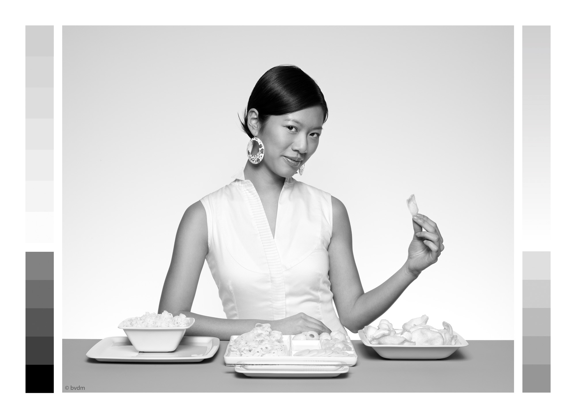


Figure 32 tests primarily for reproduction quality of highly saturated reds, yellows, oranges, green and blue, as well as detail rendition.
Figures 33 to 35 are for B&W testing, with 33 being for a hybrid colour-B&W situation; 34 tests for the smoothness of tonal gradation in the sky and tonal separation in the deep shade parts of the photo, and 35 tests for the subtlety of mid-tone rendition and sharpness of detail.
I printed these photos in either 13 x 19 inch size or 17 x 26 inch, except for the BVDM images which I printed on 8.5 x 11 inch paper, in all cases using a range of the settings listed in the table of Figure 13.
It isn’t really possible for you to have the full impression of these prints over the Internet – you need to hold them and see them. This is what makes actual prints “objets d’art” all on their own – a product distinct from anything one looks at on a computer display, tablet or smart-phone.
The idea of making all these prints was of course to see how the Epson P5370 performs with printing actual photos of the kind you or I would make, to detect differences between differently printed versions of the same photo and to try relating those differences back to the observations I made above emerging from the objective analyses – i.e. relating subjective viewing to objective data.
I don’t trust only my own vision for an important project such as testing a new printer model, so I had two other expert photographer/printers look at them as well. The three of us came to one central conclusion: they’re all good, and one needs to focus hard to see minor differences between them – but they are there, and they do correspond quite closely to what I would have expected from the objective analyses. Figures 36 to 48 below are scans of Legacy Platine prints made in the P5370, minimally adjusted to replicate the print appearances as closely as I could.
This comparison shows the difference for the dark tones of printing at Quality 4 versus Quality 1 (draft) using the Quality 4 profile. You can see that the darkest tones are slightly more nuanced in the L4-Q4 version, but the difference is not great.
This is a similar comparison to that in Figure 36. Here you can see the L4-Q4 version produces slightly softer skin tones because of slightly better highlight treatment. This image is also a good illustration of comparative resolution both in the child’s hair and in the vector graphic above the portrait. If you enlarge this photo or look at it through a magnifying glass you will see that resolution is very good in both versions, just a bit finer in the L4-Q4 one; but considering that the L4Q4 is printed at 5760 dpi and the L4Q1 at 720, the similarity between the two at such a high level of quality is remarkable.
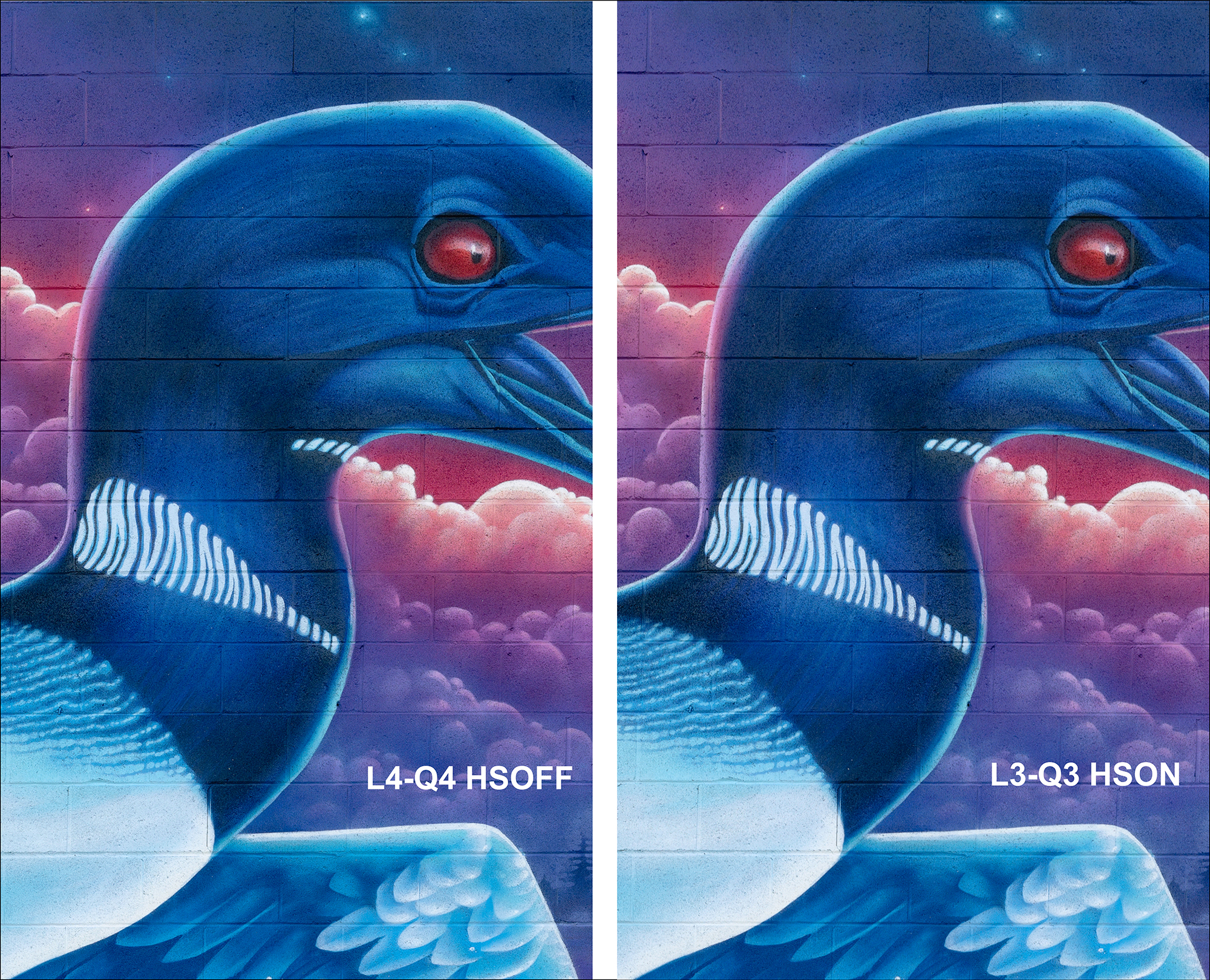
Figure 38 compares 5760 dpi slow speed printing to 1440 dpi high speed printing of the exact same photo. You would expect there to be a noticeable difference of print quality but there isn’t. In fact, I find the deep shade detail better in the 1440 version. If you magnify both of them, you will find no difference in the high quality of fine detail.
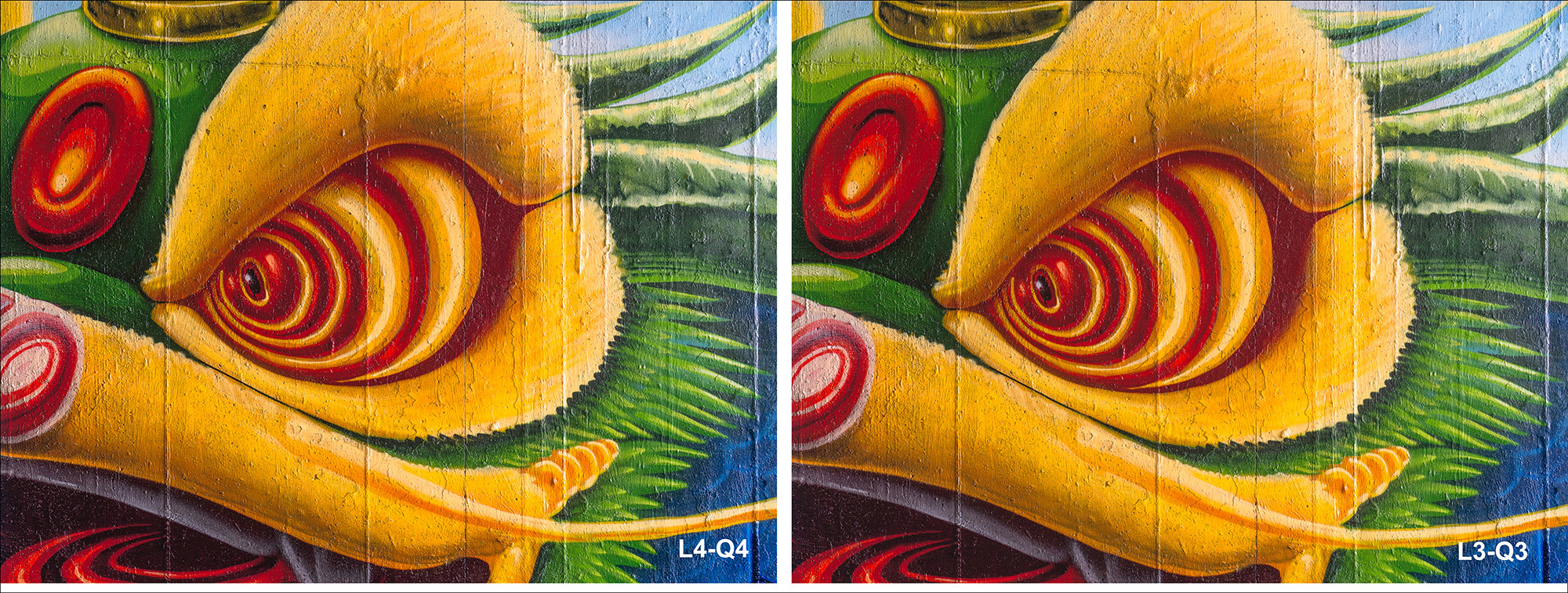
This is a similar comparison to the previous one, but this time examining the print quality of highly saturated warm tones and fine detail. If there’s any difference between these versions, it’s very unremarkable.
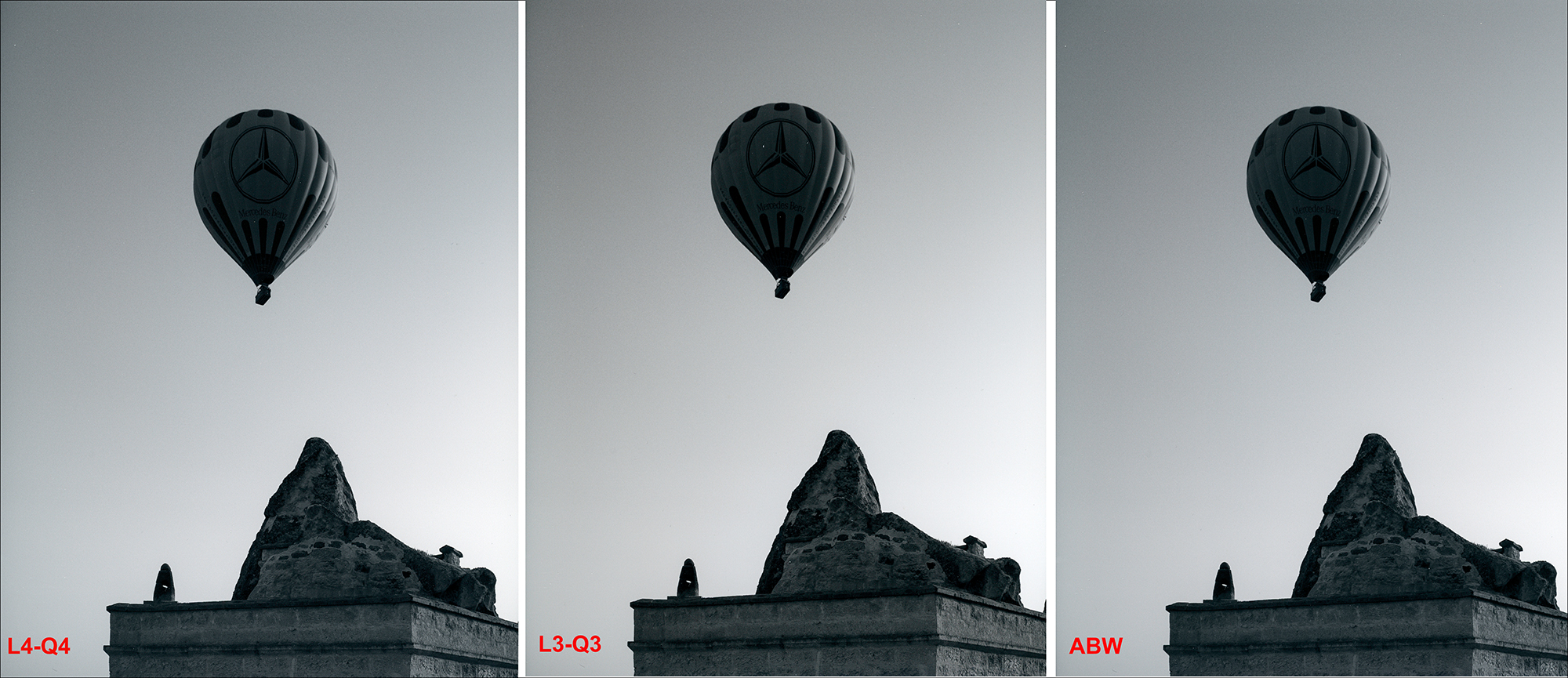
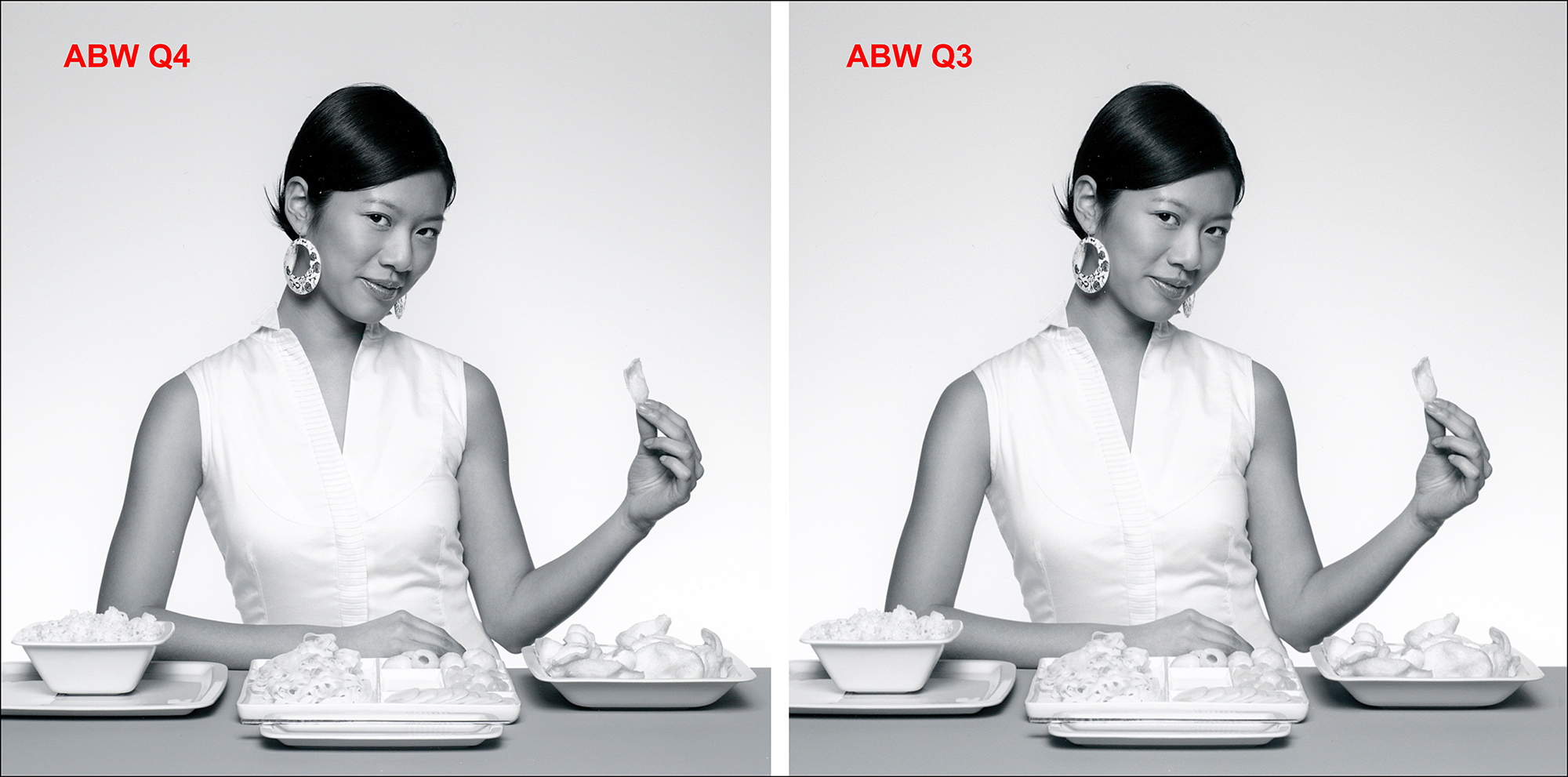
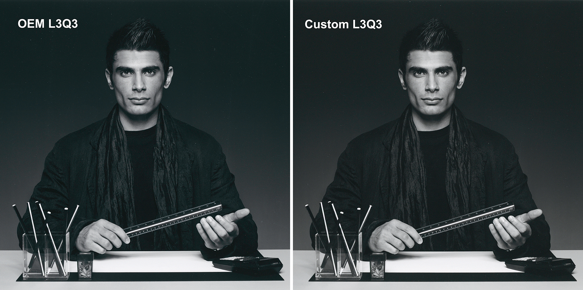
Figure 40 provides three B&W treatments of sky and deep shade, to look for quality differences in the smoothness of tonal transitions and deep shade detail. It’s best to enlarge this image for a better view of what it shows. In all three of them, the tonal transition of the sky is smooth and continuous. The quality of deep shade tonal distinction is good in all three, but I would argue somewhat better in the two ICC versions to the left compared with the ABW version at the right. By the numbers, the gray tone neutrality is a tad better in the L3-Q3 version, but they are all close.
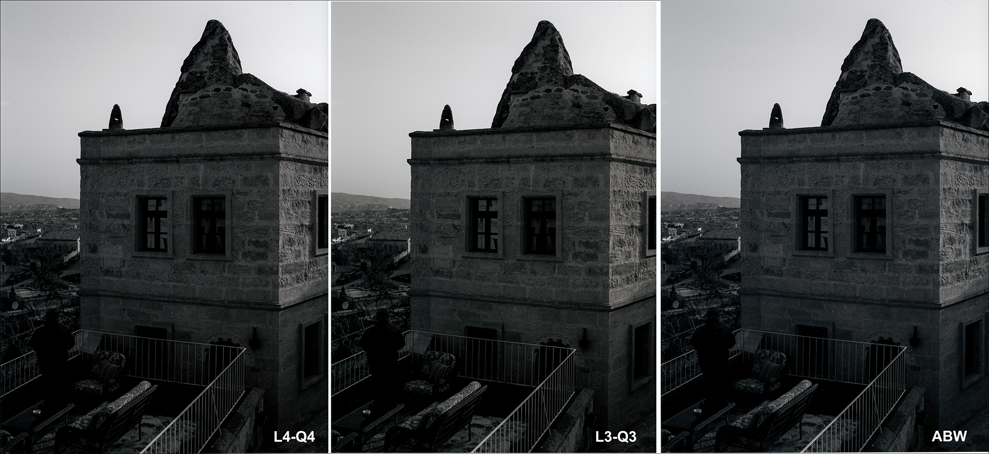
This is the lower extract of the above photo, intended for a particular emphasis on deep shade tonal separation. Again, it is best viewed magnified. Though they are close, I find the L3Q3 version again has very slightly better tonal separation in the darkest parts of the photo than the two on either side of it, but we’re looking at rather small differences.
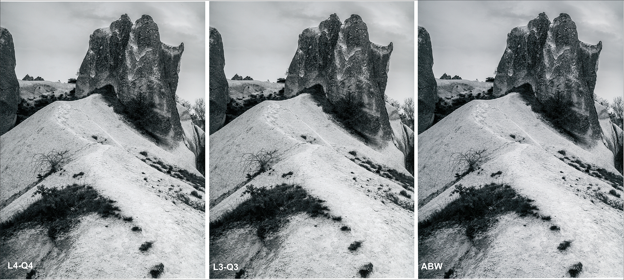
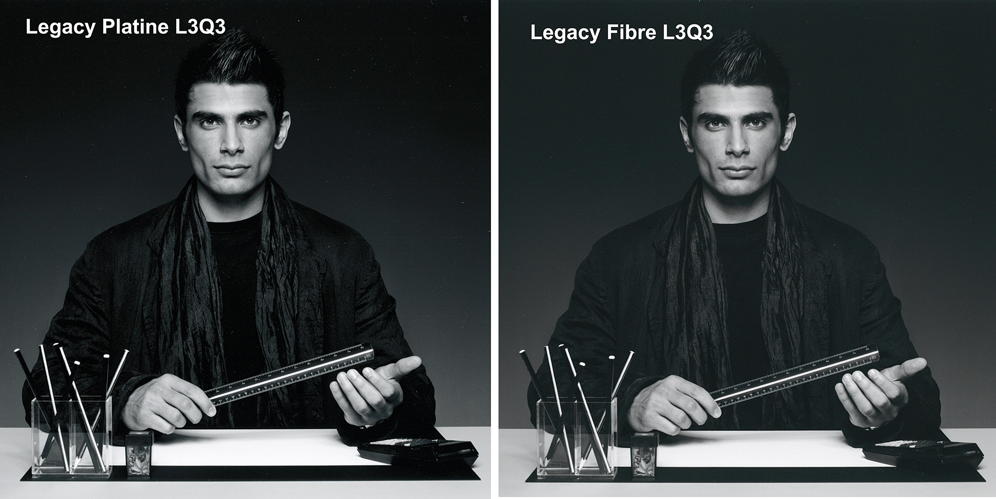
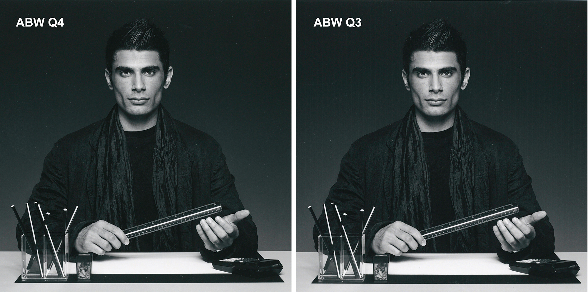
Here we are examining the quality of mid-tone reproduction and rendition of fine texture and detail, comparing L4-Q4, L3-Q3 and ABW. The tonality of the two ICC profile versions is marginally better than the ABW, but they are close. Highlight treatment is subtly better in L3Q3. Upon magnification, you’ll see that rendition of fine detail is excellent in all three.
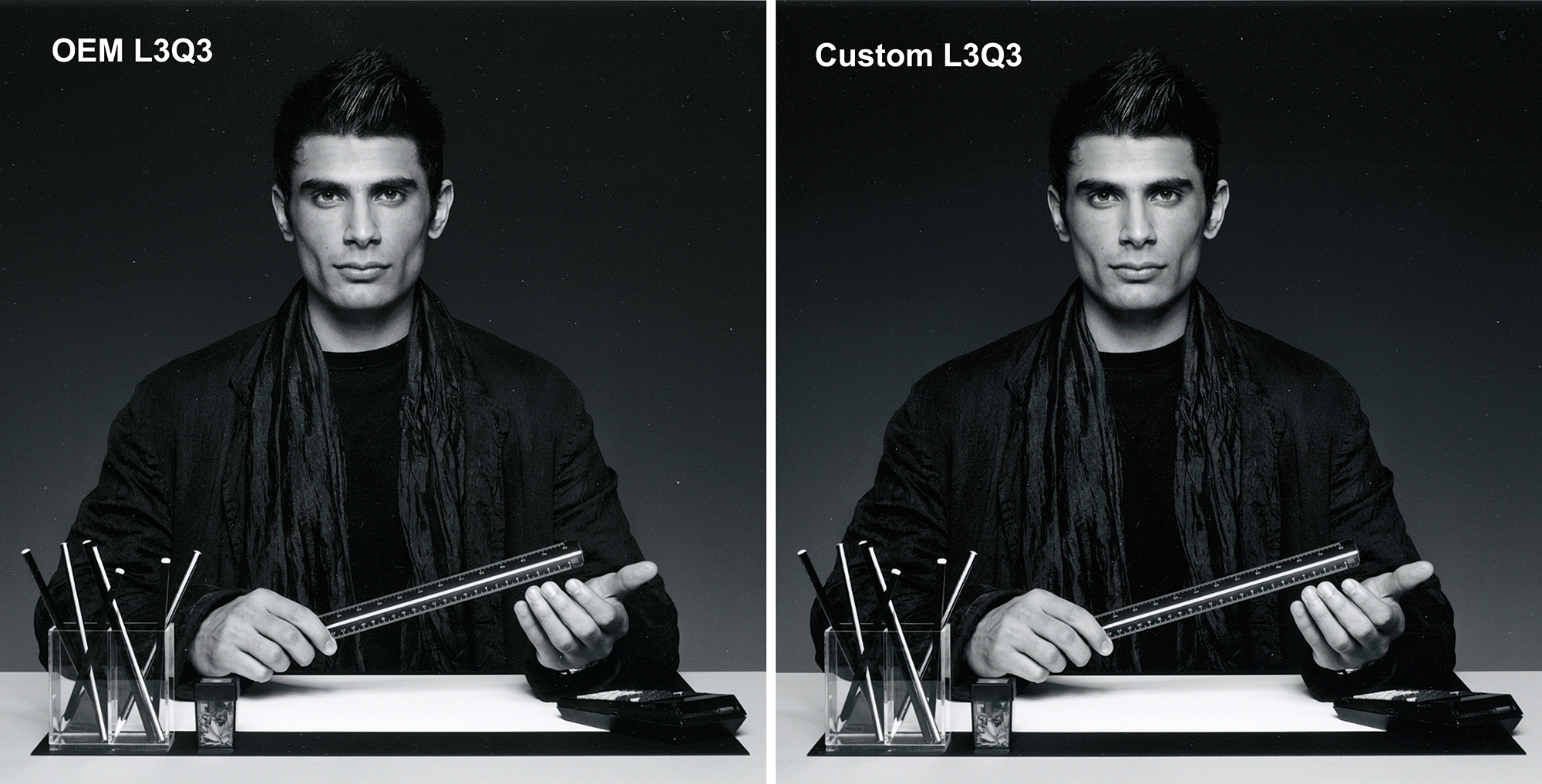
In the Figure 43 case I have a marginal preference for the OEM rendition because there is slightly more tonal distinction between the hair and the background and on the jacket, but the differences are small. The custom rendition has a bit more contrast, which is what creates this difference.
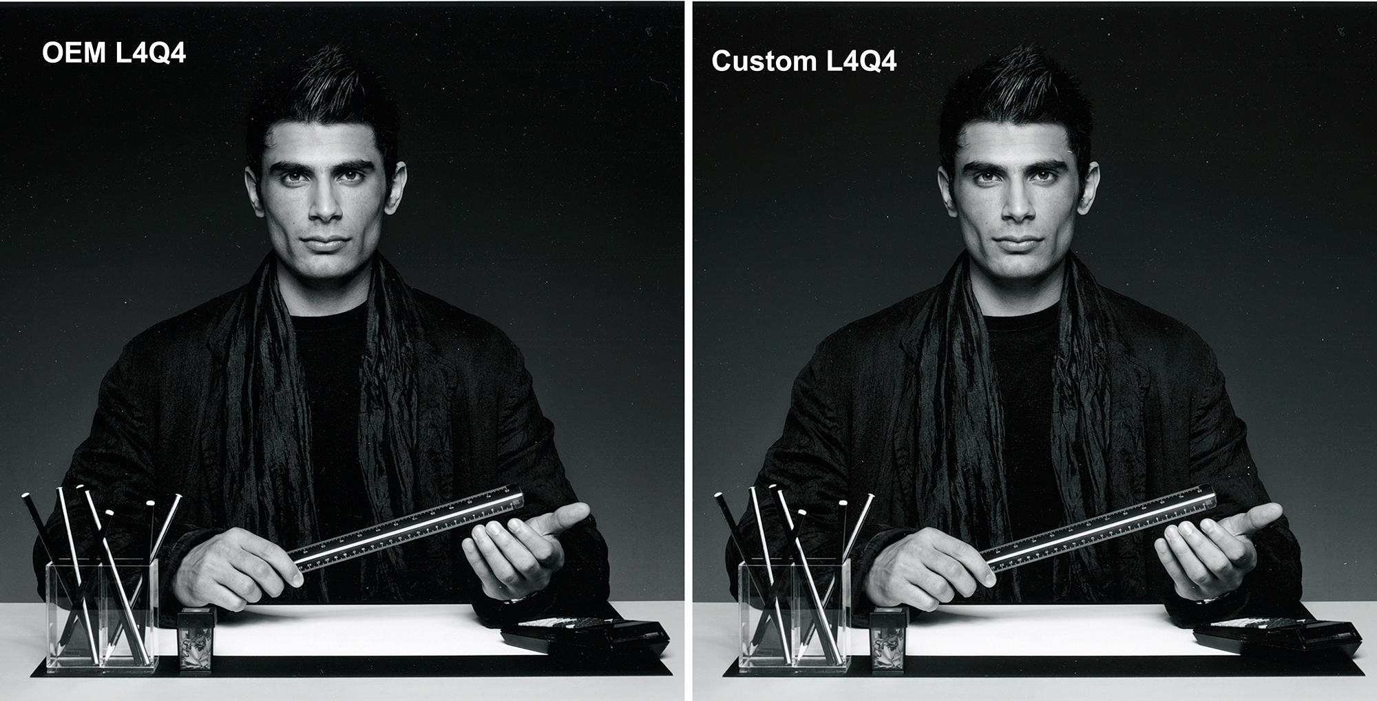
Comparing Figure 44 with Figure 43, I find a slight margin of preference for the Figure 43 renditions, again somewhat favouring the 1440 dpi profiling and printing over the 5760 dpi.
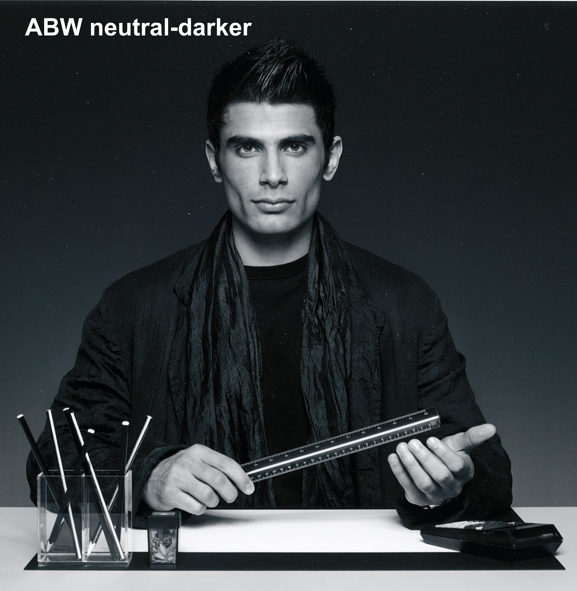
I think this ABW rendition competes well with the others above. The tonal separation is good, and the contrast is nice.
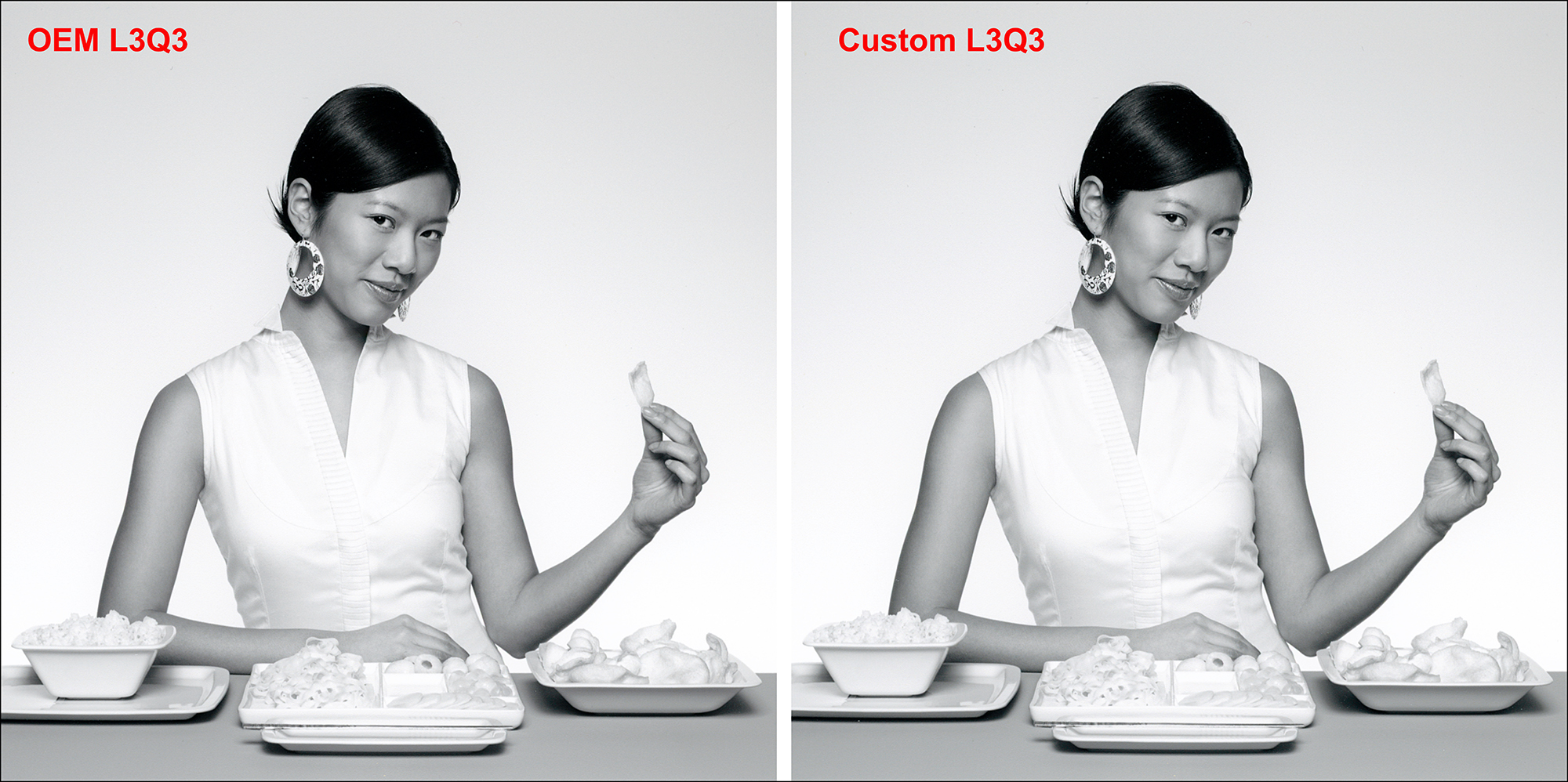
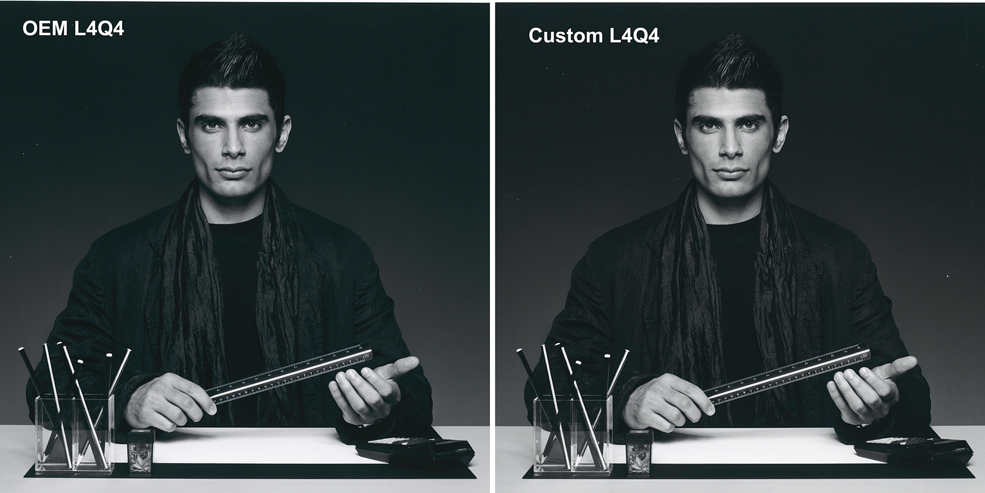
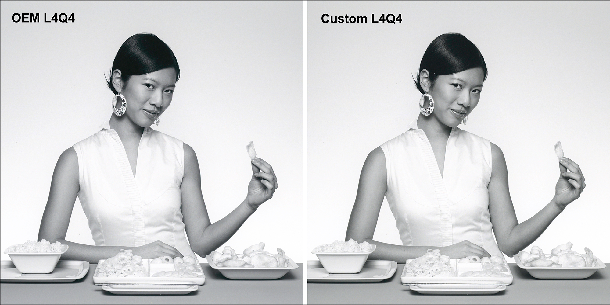
Turning to Light Tone B&W, again, this comparison is best viewed with some magnification. The key comparison is the treatment of highlight detail, especially around the V-neck of the lady’s dress. While they are very close, and the Custom version produces statistically a bit more accurate prints, the detail is slightly better revealed in the OEM profile version. In both cases the background gradients are smooth, and the rendition of the foreground material is so very close.
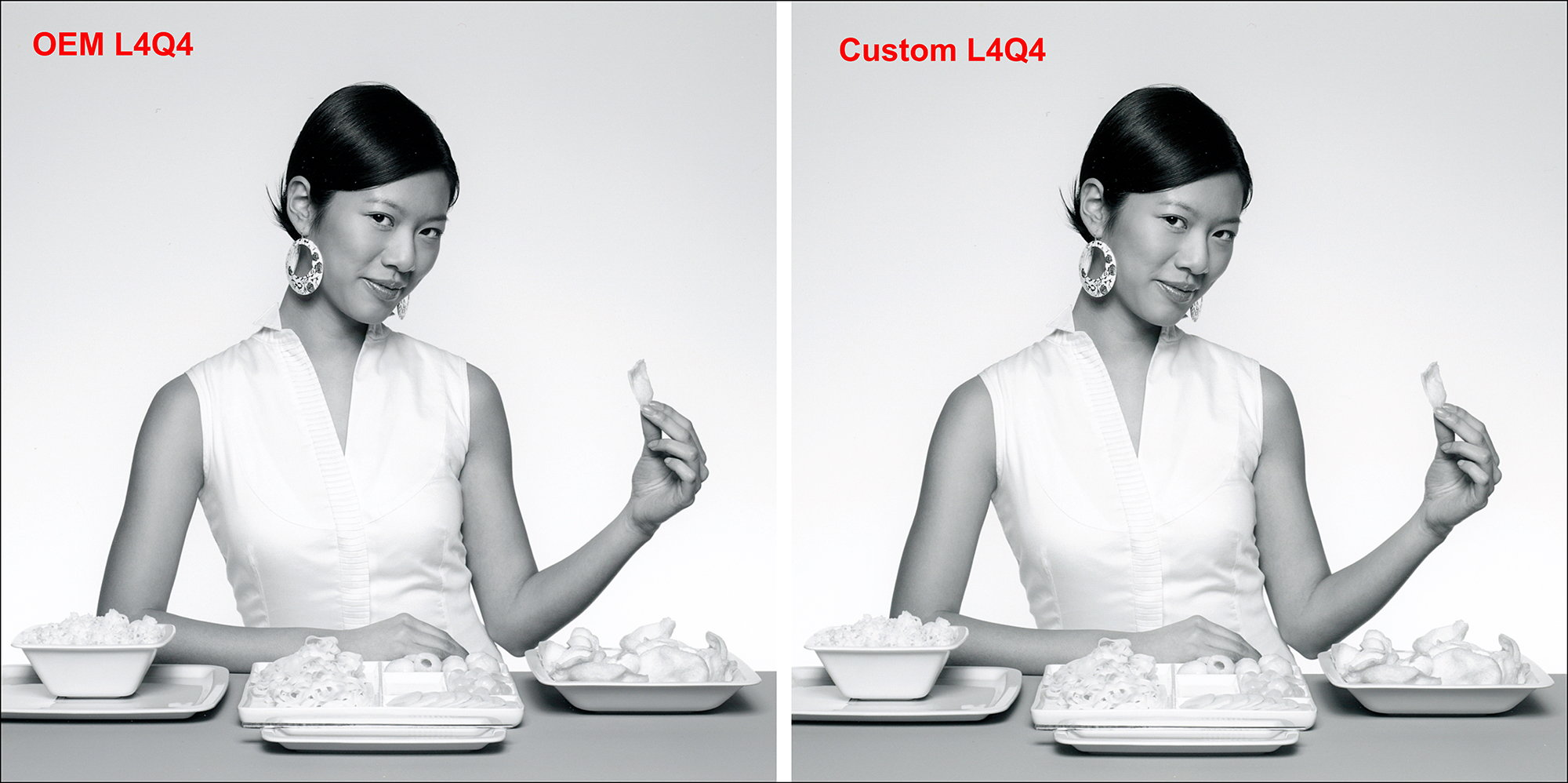
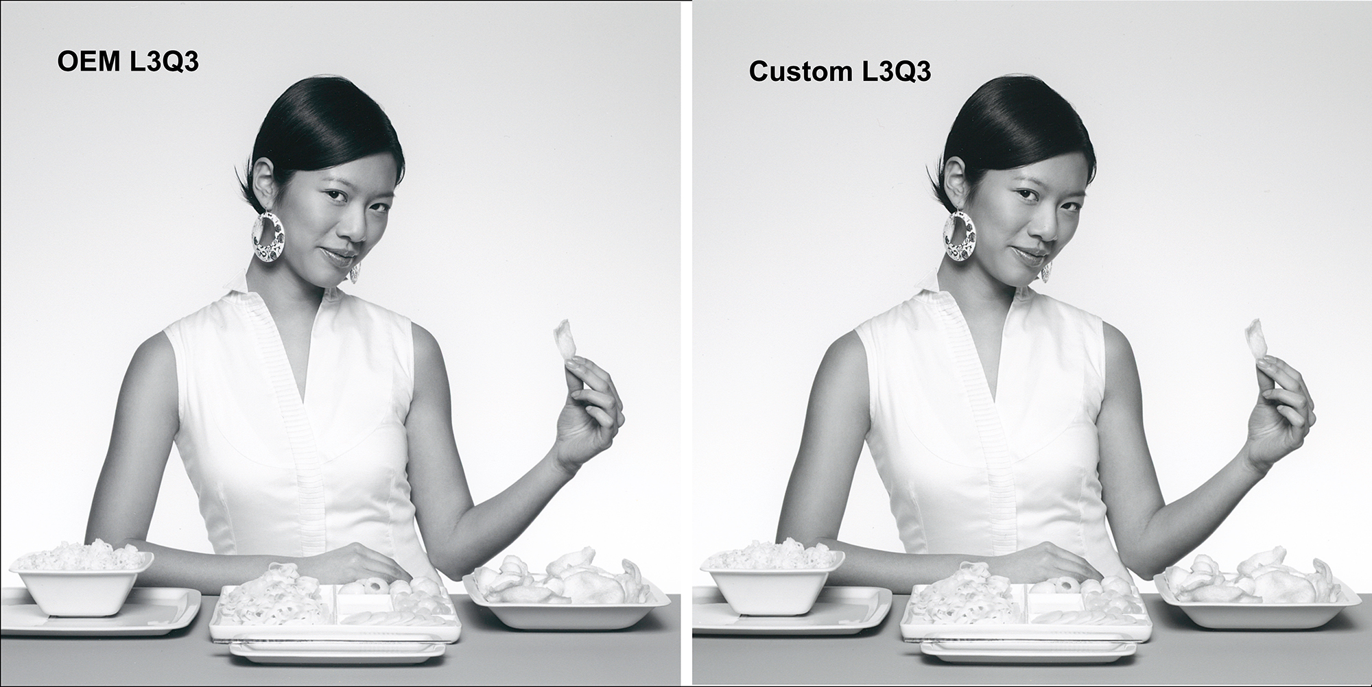
In Figure 47, this time focusing on L4Q4, for the same reason as in Figure 46 I think there is a slight preference for the revelation of highlight detail in the OEM profile version, though again the difference is small. I’d be hard-put to prefer either L4Q4 or L3Q3.
In Figure 48 I see nothing to choose between the Q4 and Q3 renditions; however I do observe that both of them are a tiny bit darker than the ICC profile versions in the two previous figures, which latter I think are more appropriate for this reference image.
I turn now to a few of these comparisons for prints made on Epson Legacy Fibre paper in the P5370. Despite the fact that Maximum Black for Legacy Platine is at about L*3 while for Legacy Fibre it is about L*15, the latter still produces a pleasing Black tone taken in the context of the paper’s feel and texture, which cannot be conveyed over the Internet. A visual comparison of the difference between prints on the two papers appears in Figure 49:
Figures 49 and 49A show the difference of Black density depending on whether one uses a Luster versus a Matte paper. In this instance, while the photos show a somewhat weaker Black and lower contrast for the matte paper (Legacy Fibre) and the slopes of the lines in the graphs show it generically, between the very high quality of these papers and the P5370 printer and its inks, the difference is a whole lot less dramatic than it could be. Seen in isolation of such comparisons, the B&W photos printed on Legacy Fibre paper in the P5370 are pleasing to both sight and touch.
So moving on to the comparisons within the Legacy Fibre family of tests, figures 50 to 60 show B&W and colour test prints using Q4, Q3 and where relevant, ABW settings. The illustrations in Figures 50 to 55 are scans of the prints. Those in Figures 56 to 60 are photographs of large prints (17 inches by about 26 inches) made on Legacy Fibre roll paper. Scans and photos are minimally adjusted to replicate the print appearances as closely as I could.
My general comment on the comparisons in Figures 50 to 55 is that it would be difficult to choose between them, and on the prints in Figures 56 to 60: the quality of the output on the matte paper is impressive in its renditions of both colour and grayscale.


I recommend magnifying these photos to better see the image quality as best as I can portray it over the Internet. If you like high quality matte paper, you’re going to love how this printer works with it.
Final Words
In conclusion on print quality – it will be hard to go wrong – this printer is really good at a variety of settings. The objective and subjective evaluations converge to demonstrate high quality and small differences in outcomes between the various options, which is a great result for those wanting high printing efficiency at high quality.
Cooperating Applications
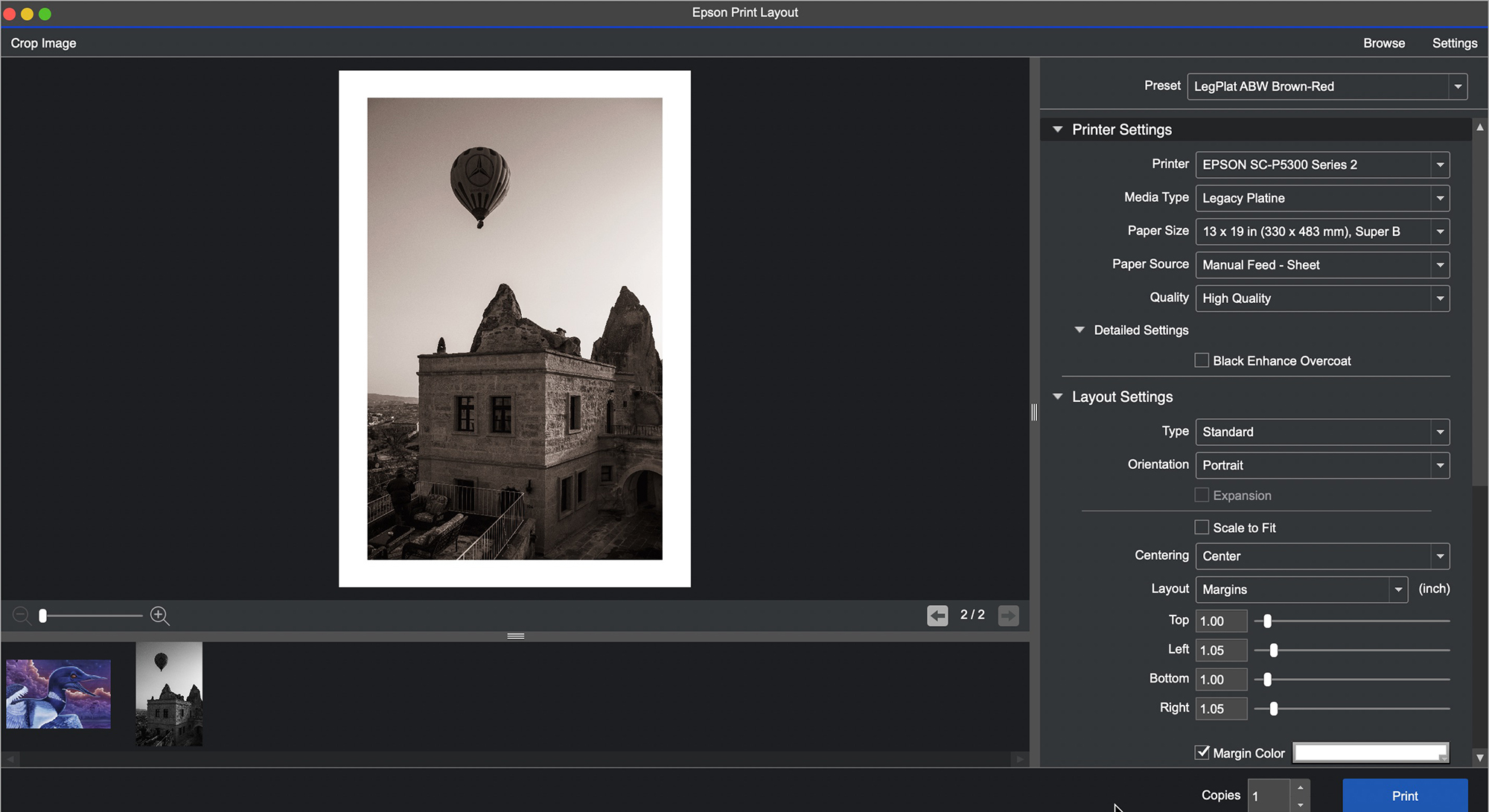
1. Epson Print Layout (EPL)
Despite the fact that we’ve never had it so good in terms of the ease and efficiency of producing highest quality prints, printing industry growth became lackluster within the past decade; the explanation was that “printing is too hard”, especially compared with loading photos onto the Internet. Actually it isn’t, but the approaches through conventional applications and printer drivers do have a learning curve. So the players worked on how to make printing easier, hoping to attract more photographers into printing. One of the best products from that effort is EPL. It can be mastered in a few minutes and produces the same fine quality we’ve seen above.
How so? Well, it doesn’t have ALL the bells and whistles you’ll find in the printer driver, but it has everything that most photographers would need 99% of the time, all arrayed in one column in one application on the right side of the image window. All you need to do is select the correct Media Type and paper size in the printer LCD, then proceed down the column of EPL settings, making all the selections you want for the print, click on “Print”, and you’re done. It’s “revolutionary easy”. So let’s have a look.
Upon opening the application, it loads the printer. If you have more than one printer networked to the same computer, select the appropriate printer.
You can drag a file into the open application, or use “File>Open” (in the Application bar not shown above) to load photos from your hard drive. EPL handles TIFF, JPEG and PSD files; unlike Lightroom, it does not correctly print proprietary raw files or DNG files, because it ignores all the photo edit settings.
Go down the list of Printer Settings, making the necessary choices from the drop-down menus in each pane: Media Type, Paper Size, Paper Source and Quality. Media Type and Paper Source should cohere with what you selected in the printer LCD. Under Quality, there is no choice of High Speed On or Off, but I determined that it prints with High Speed On (i.e. bi-directional); as amply tested above, this is fine.
The labeling of the Quality settings (Figure 62) corresponds with how I numbered them in Figure 10, where I dispensed with the labels and numbered them.
Once you’ve selected the Media Type, in ICC mode the application automatically selects the corresponding Epson profile in the Color Settings section below (unless you create a preset to select another profile) AND it softproofs the photo in the image window accordingly. For example, take a look at the difference of appearance between the rendition of the photo in Figures 61 and 63, where the former is for Legacy Platine and the latter Legacy Fibre.
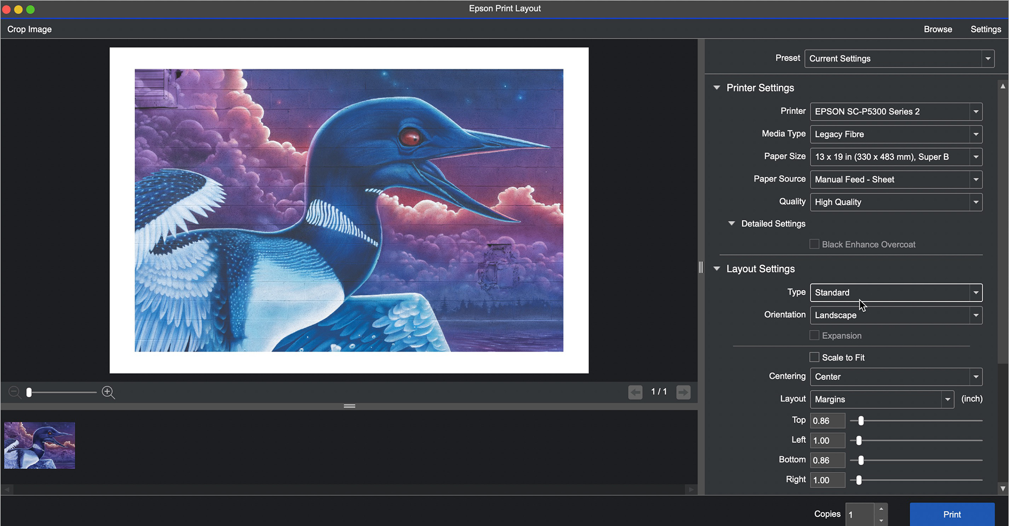
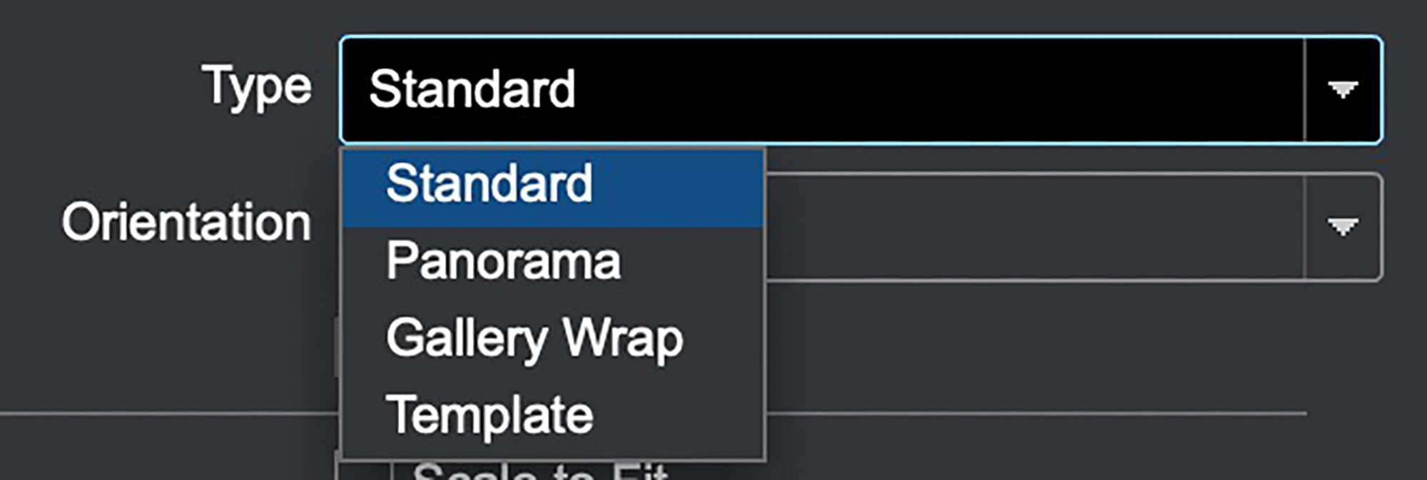
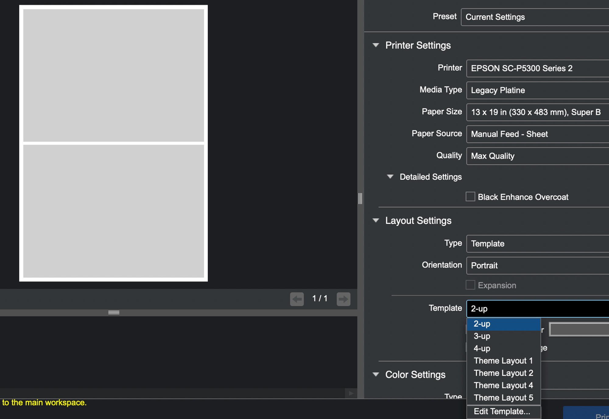
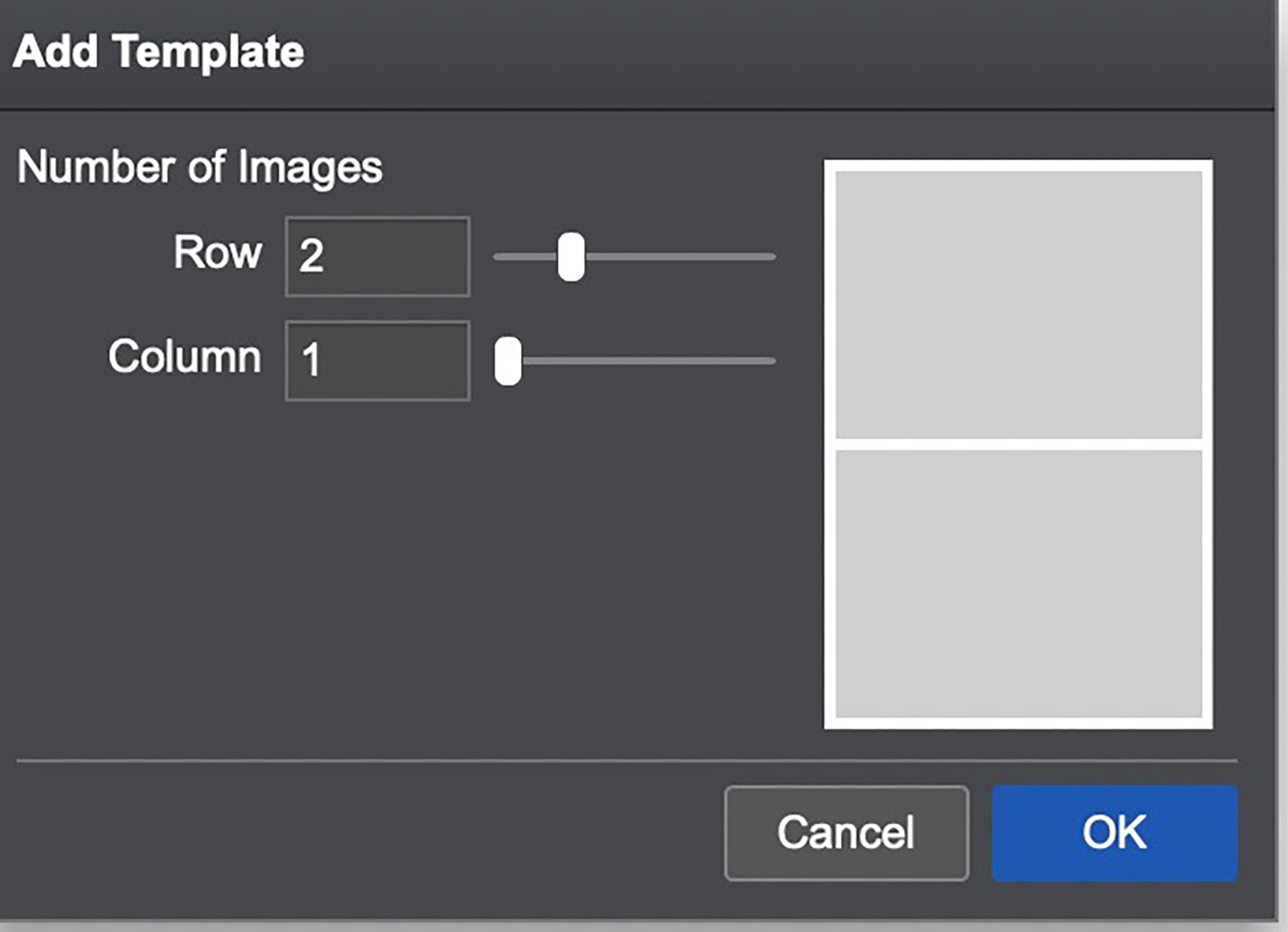
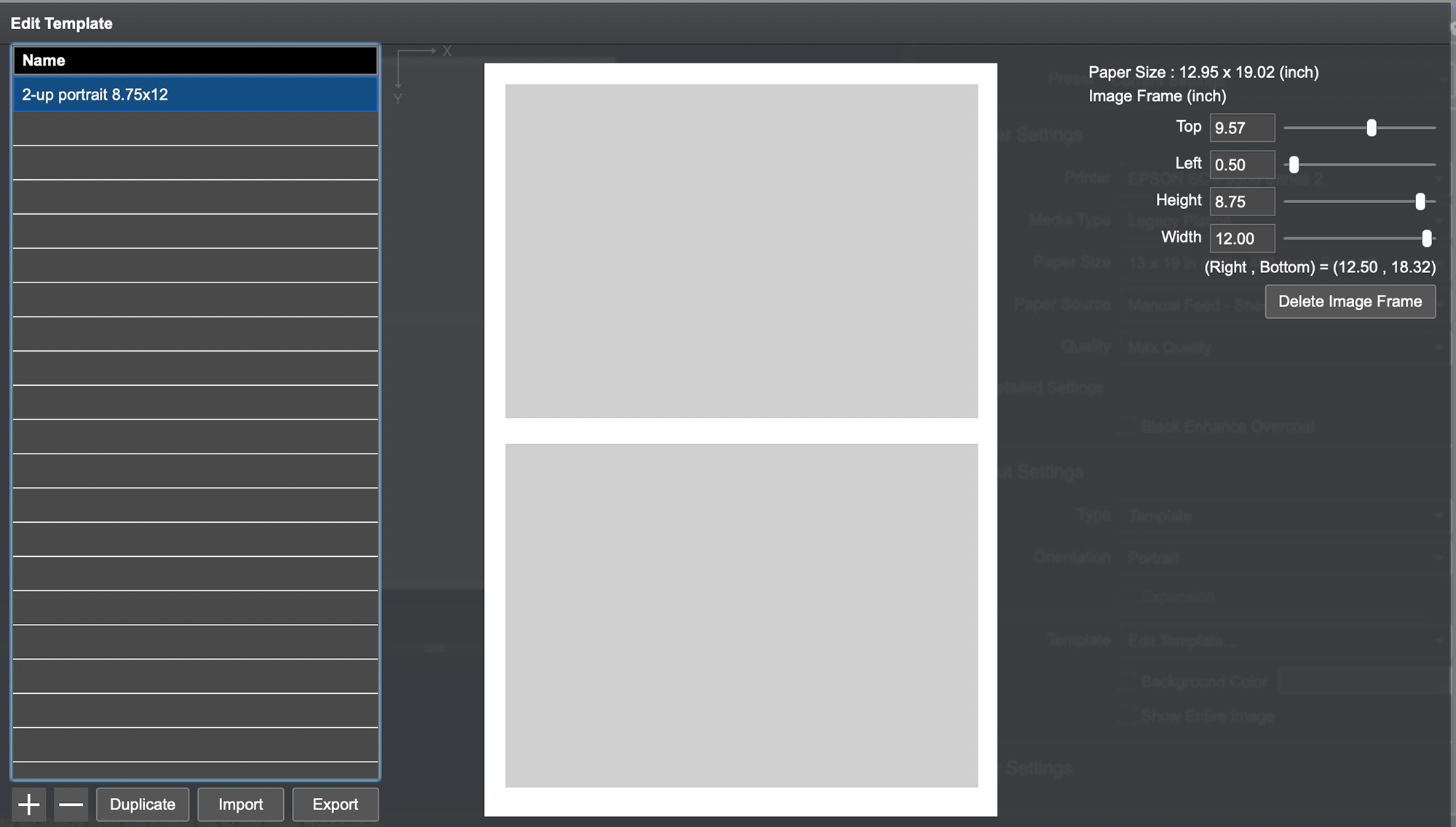
Carrying on to the Layout Settings, for “Type” of layout, we have the options shown in Figure 64. This is self-explanatory. “Template” is interesting – it provides some OEM layout templates (Figure 65) and allows us to create custom templates by clicking on “Edit Template” (Figures 66 and 67). “Standard” is for printing one photo per sheet.
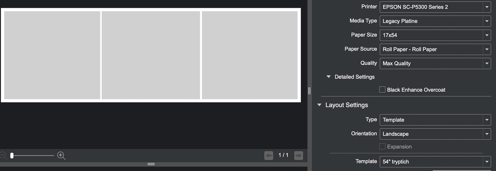
So, just a bit more imaginative, given the ease of using roll paper in this printer, let’s say we want to create a 17×54 inch custom paper size for roll paper and then create a triptych of photos on it. Both can be done in EPL, by creating the custom paper size from the Paper Size drop-down, and then the layout template in the Layout Settings Section (Figures 68 and 69).
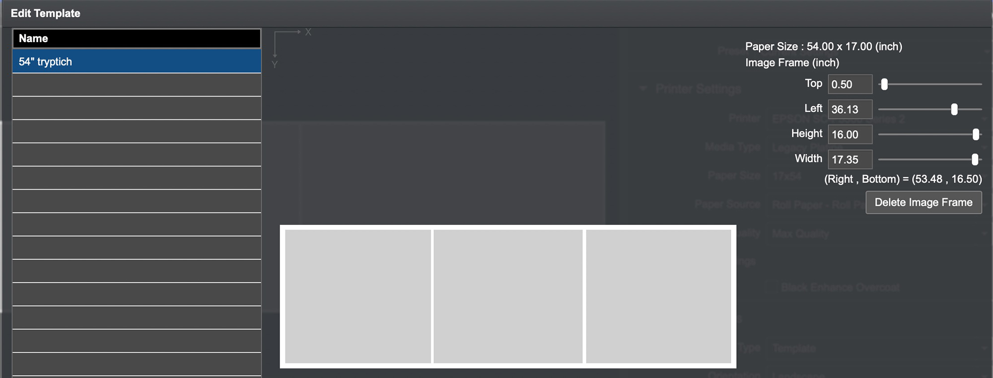
This is a brand-new custom template of my own creation – it wasn’t driven off of any existing Epson Template.
Back to sheets for single photos, if you check Scale to Fit (Figure 70), EPL will fill the page with the photo, leaving the smallest margins the printer makes, but if the aspect ratio of the photo differs from the aspect ratio of the sheet, the representation of the photo cannot be totally accurate. Normally one would leave “Scale to Fit” unchecked, preferring to respect the aspect ratio of the photo even though margins may differ between left/right versus top/bottom.
If you don’t use Scale to Fit, then “Centering” will be of interest (Figure 71).
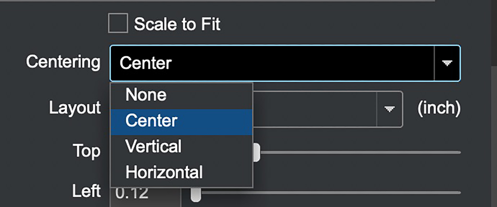
Unless we need more space on one of the dimensions, normally we would center the photo on the paper, so the usual selection would be “Center”, in which case EPL will keep the photo centered on the page as we play with image and margin sizes either numerically, or by grabbing image corners and adjusting visually. It’s very handy.
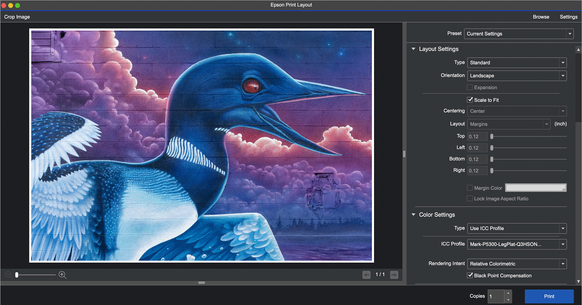
Continuing downward to Color Settings (Figures 72 and 73), it’s really nice to see how boiled-down and simple this has become. You don’t need to be a colour management expert to get your colours right.
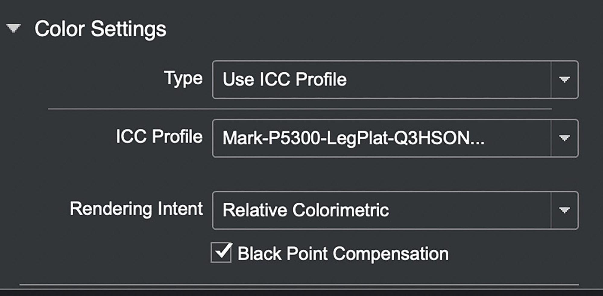
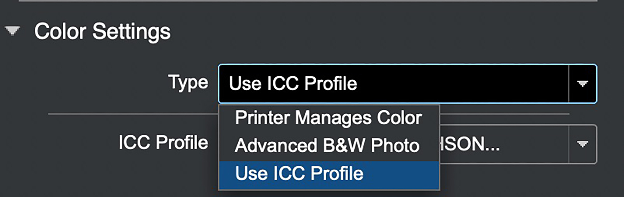
For the Type of color, there are three options: Printer Manages Color (you don’t think of profiles and just let the printer do its thing), or you may wish to make a B&W print using Advanced B&W Photo (ABW), or you may use an ICC profile (normally preferred over Printer Manages Color, especially these days that Epson’s profiles, and those of some paper manufacturers, are pretty darn good).
If you select “Use ICC Profile”, EPL will default to the profile associated with the Media Type, unless you use the pull-down menu to select another profile, and if you wished to save this choice for future printing sessions, you would include it in a custom preset discussed below.
When using an ICC profile, you should consciously choose the Rendering Intent that in your judgment makes the photo look best. With Relative Colorimetric make sure Black Point Compensation is checked; for Perceptual it doesn’t matter, so just leave BPC checked all the time. EPL does not provide two Rendering Intents available in Photoshop: Absolute and Saturation. Absolute is only useful for people doing formal colour management analysis of printing system performance and Saturation may be useful for printing highly saturated posters. Most people never need either of these Rendering Intents, so EPL does not provide them.
If we select “Advanced B&W Photo”, a group of settings opens up (Figure 74) that allows us to express our creativity in B&W photography – for example, toning (Figure 75).
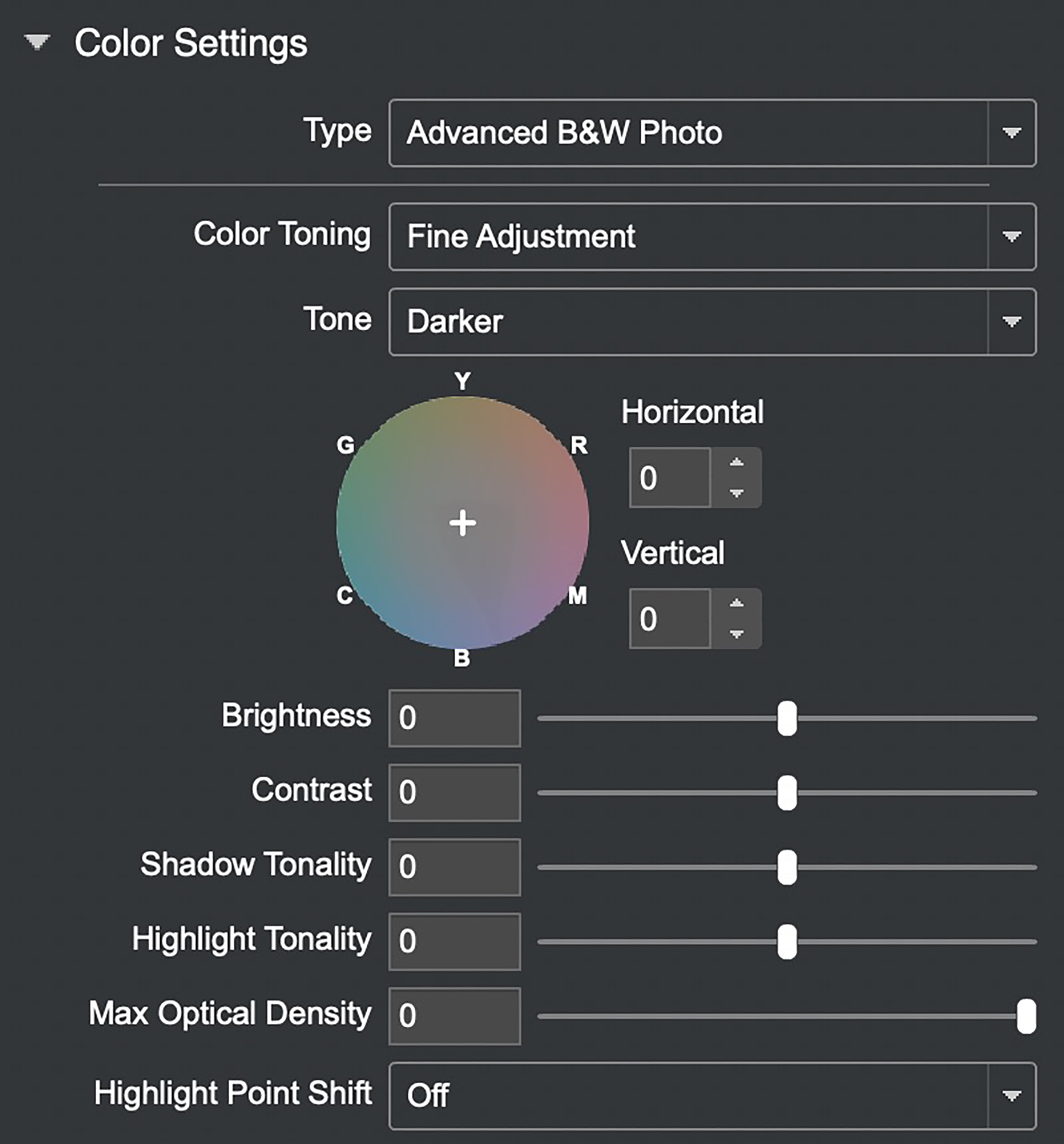
It is best to use ABW on photos that either originated in or have been converted to B&W in say Lightroom or Photoshop beforehand, such as is the case for the photo in Figure 75. To create that version, I simply dragged the “+” sign inside the circle in Figure 74 toward the perimeter between Y and R (for Yellow and Red), and that produced a nice deep Sepia. Using ABW in EPL softproofs the actual photo rather than the proxy used in the driver.
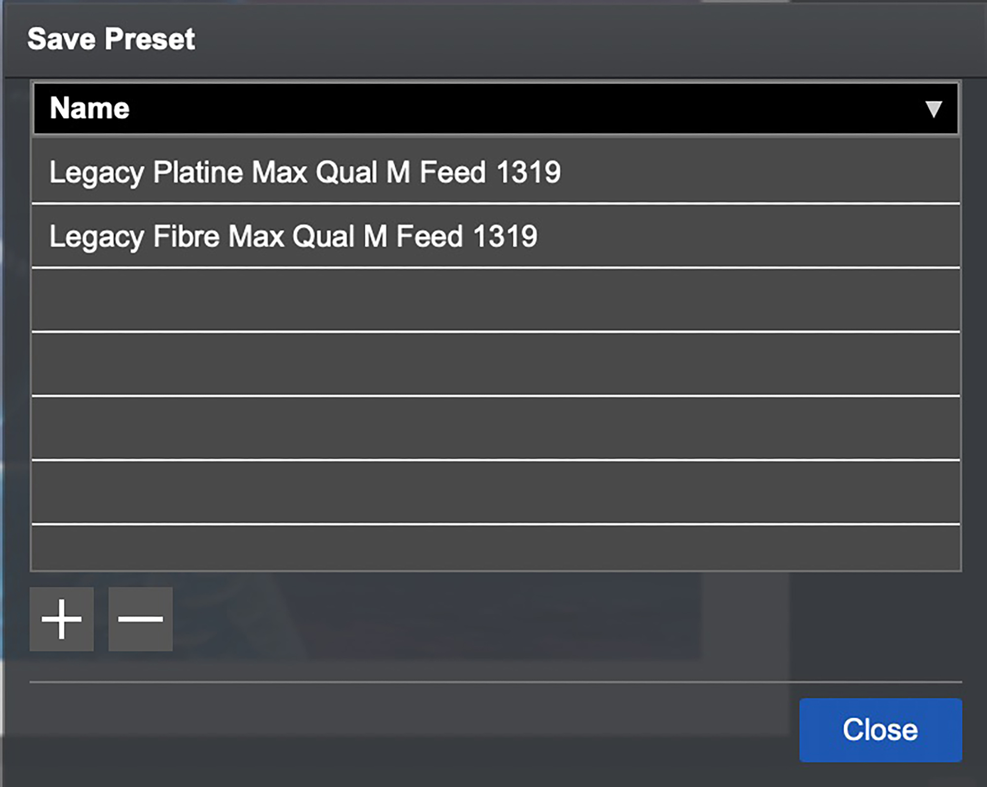
Having made all the choices in these menus down the column, very straightforward, they can be saved as a Preset for future use (Figure 76).
We’ve done a lot here moving down one simple column of settings without messing in either the image editing application or the printer driver to make successful, imaginative prints.
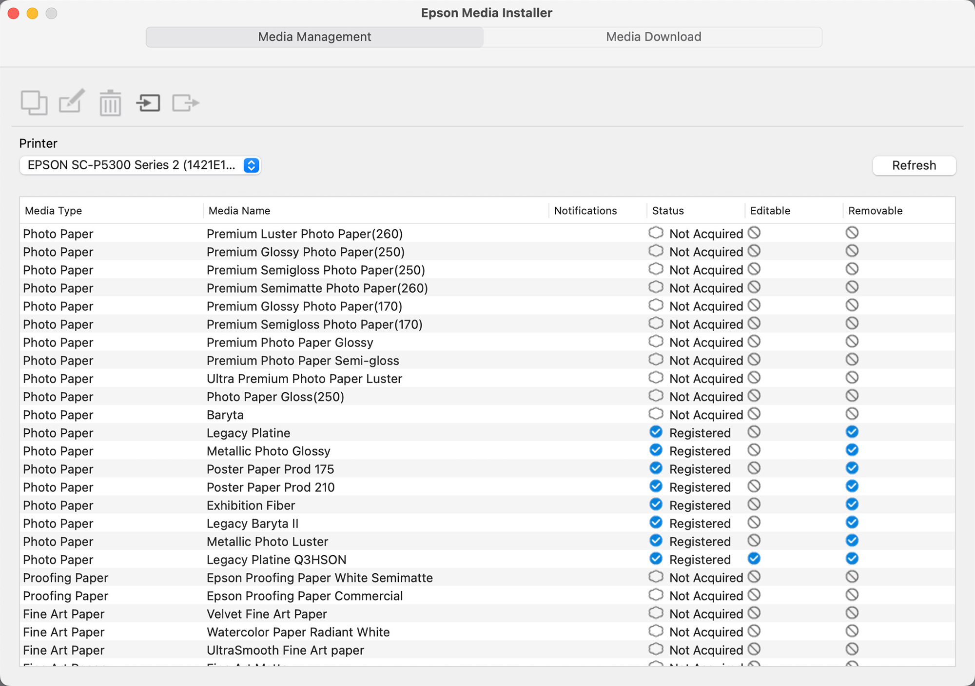
2. The Epson Media Installer (EMI) (Figure 77)
To use this application, turn on your printer and make sure it is connected to your computer and your computer has Internet access.
This application is important for managing printer settings for all media. The main interest for photographers is that it facilitates trouble-free usage of 3rd party media. There is a short learning curve to it, but if you are one of those experimenting with or using a variety of papers, it’s a worthwhile investment of time to learn it. I’ll survey the basics here.
Along with the EMI come two new fuzzy animals you may not have heard of before: EMX and EMY files. An EMX file describes all the mechanical parameters about a Media Type that the printer needs to know for handling the paper correctly, and it includes the printing profile. Only Epson can create this file. Epson has created EMX files for its own papers and a program is getting underway for other paper providers to get EMX files made for their papers. Each EMX file is specific to one paper and printer model combination and the end-user cannot edit them.
An EMY file does all of the above, except that their creation and editing is open to the user. The key operational strategy for doing this with EMI is to make a copy of an existing Media Type, then edit it and save it as a new Media Type in the form of an EMY file. The convenience of it is that once done and we call up the new Media Type, everything needed to print on that media – the mechanical parameters and the printer profile – is baked-in, ready for the printer to use. The EMY file is specific to the serial number of your printer and therefore non-transferable.
Ideally, before using the printer for the first time, download and install EMI, and launch it. Epson recommends doing a Refresh before proceeding further, by clicking on the Refresh button and make sure you are on “Media Management” (top left button on interface). “Refresh” is also useful if for some reason or other a change in your computing environment causes your profiles to disappear – it can bring them back. EMI also provides for doing Updates, which will update any changes to the parameters of profiles in your system. When first installing EMI look to see whether there are updates available to download and register.
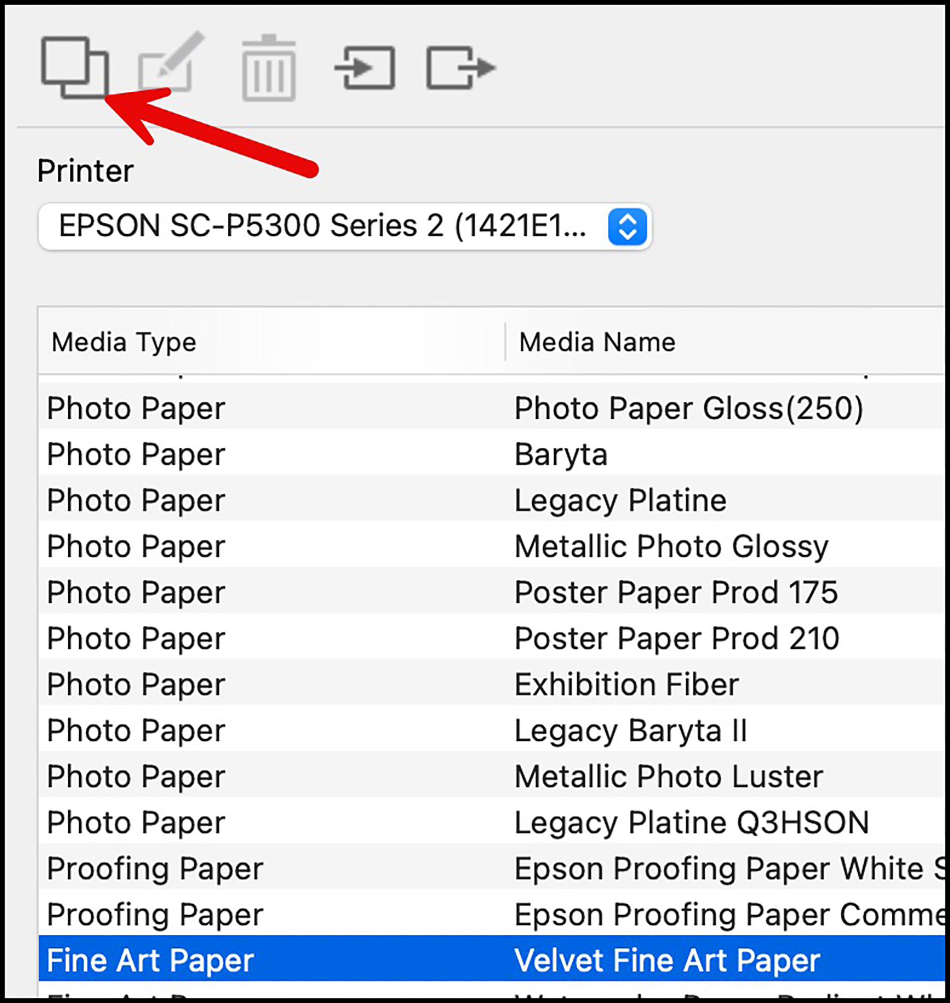
Figure 77 shows that there are papers already registered in my printer, as well as others not yet acquired. Let us suppose I want Velvet Fine Art paper (VFA) registered, but it is not yet acquired. So I need to download it and register it. Figure 78 shows how to do this:
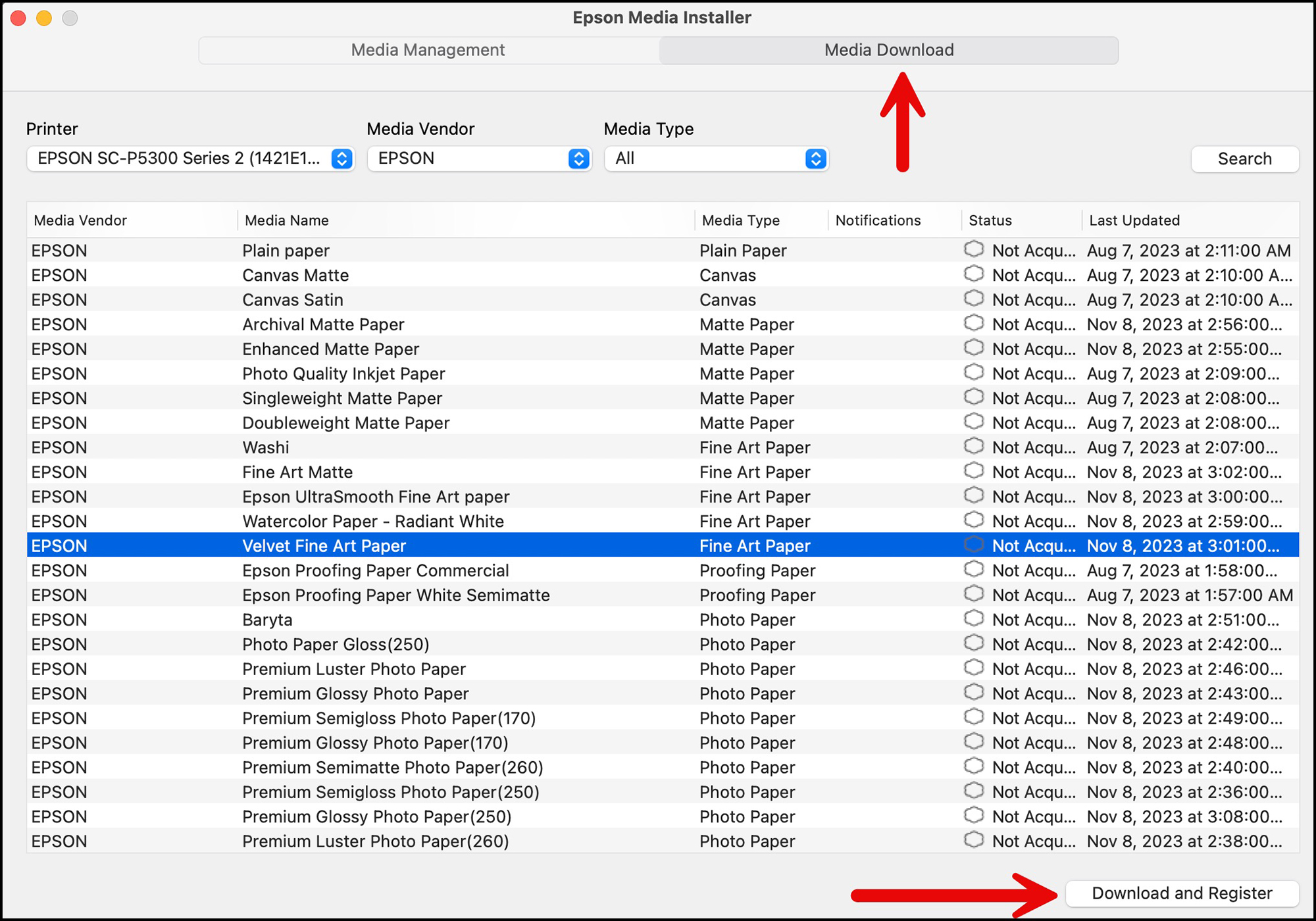
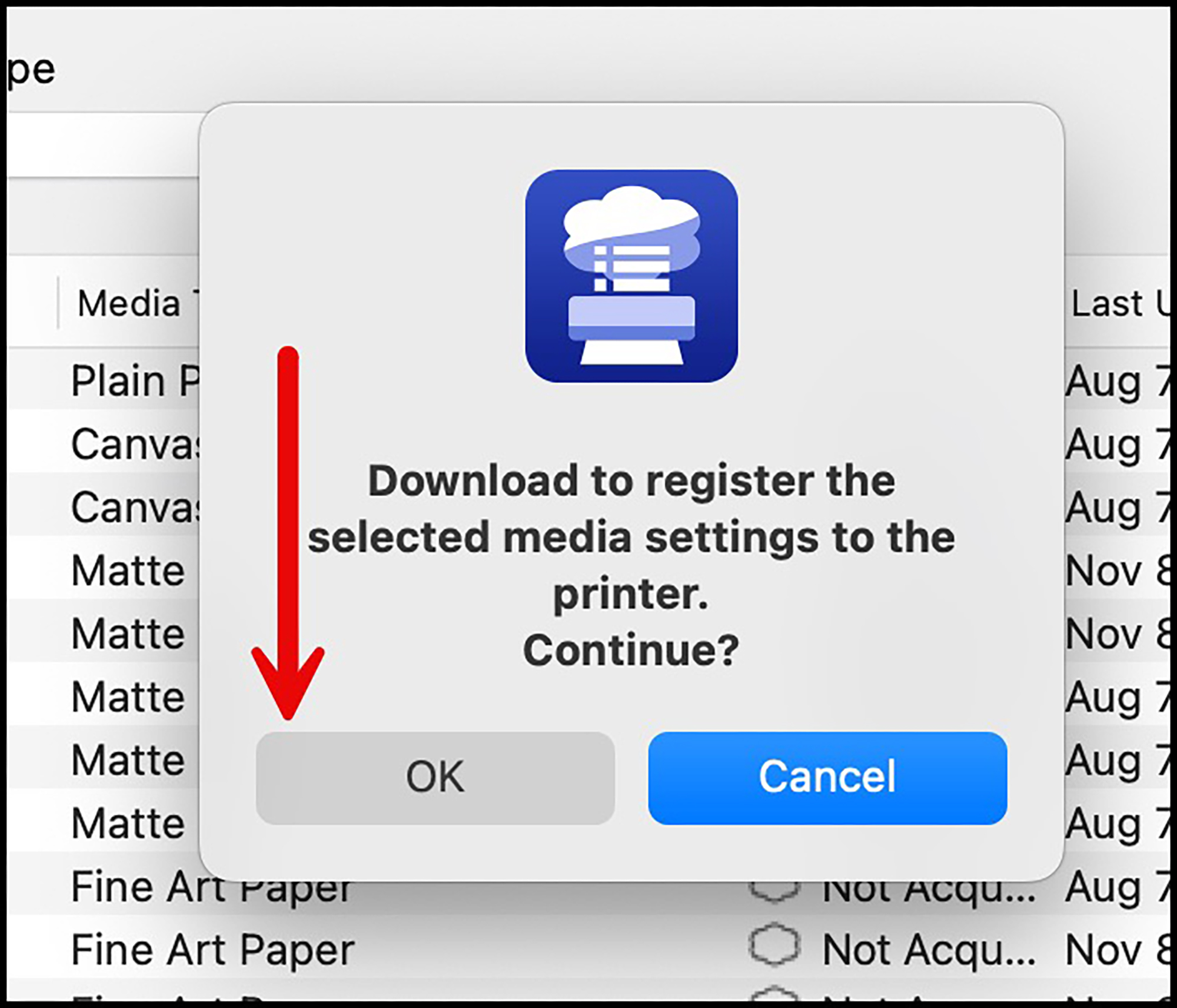
Go to “Media Download”, highlight the VFA paper and click “Download and Register”. This will pull up a nag message asking you whether you really want to do this, with the OK button on the wrong side of the choices and the Cancel button highlighted, which of course would lead an inattentive user accustomed to normal software design to click Cancel and one would then need to start over again. This design flaw is of course like driving on the wrong side of the street and one can only recommend that Epson fix it wherever it occurs, because it’s an unusual layout prone to stopping progress.
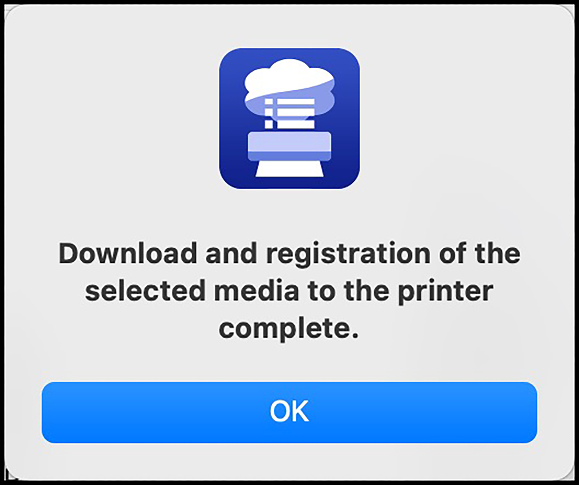
Please be aware that every stage of this procedure has quite a long-delayed response in particular with MacOS (I understand it is faster on Windows), but don’t for a moment think your computer has gone to sleep. Have faith, it does work, and it gets the job done. Once the process is complete you get another nag message saying so (Figure 80).
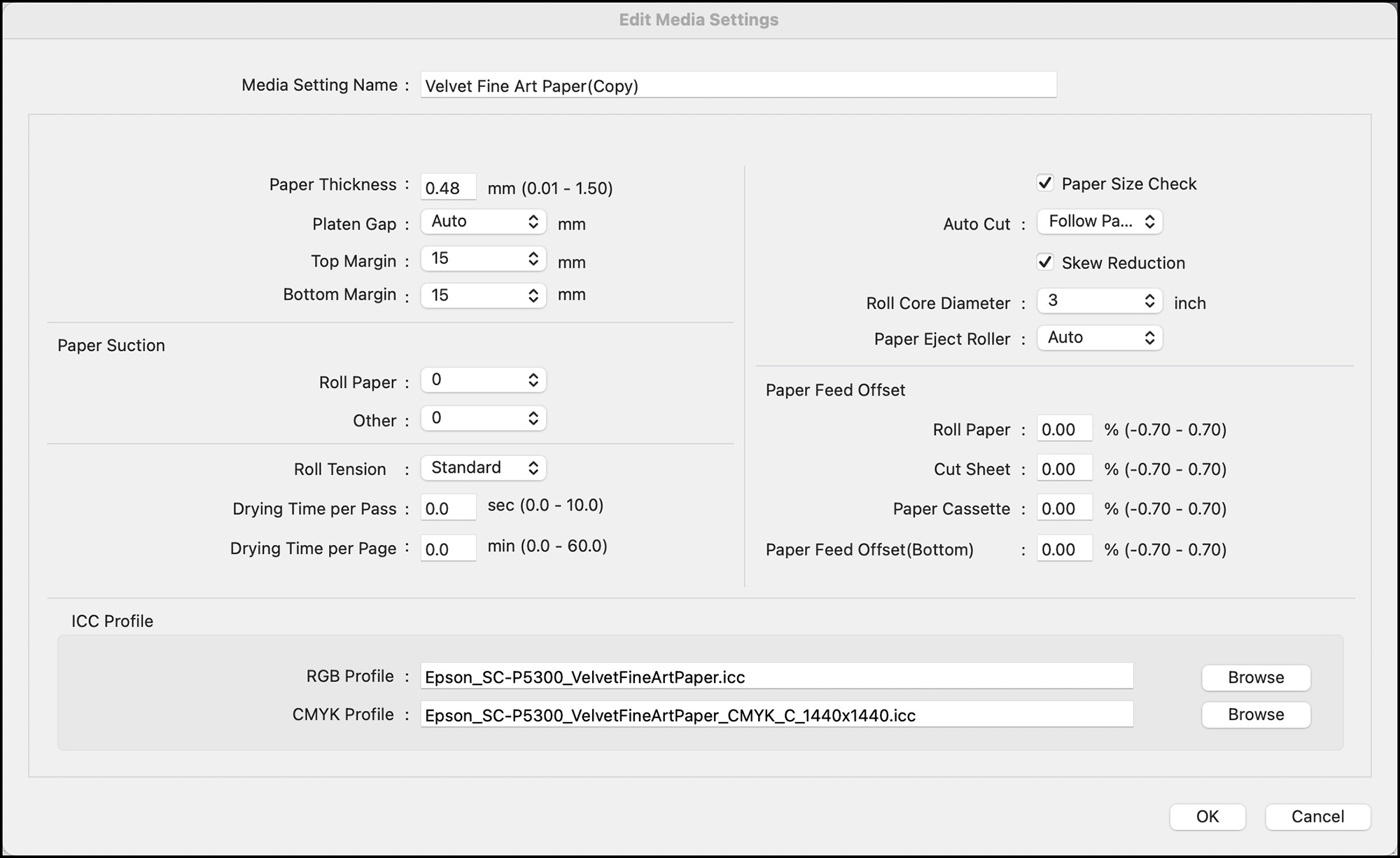
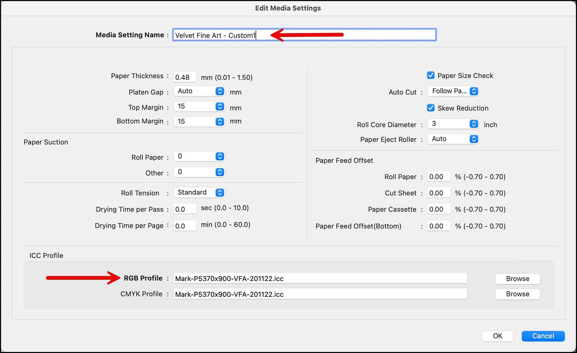
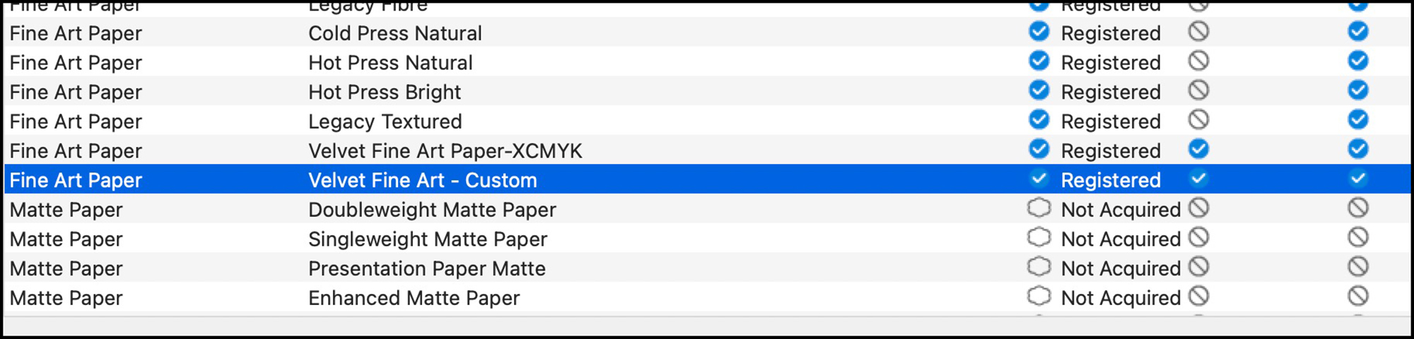
Now let’s say instead of using the correct profile for this paper, I want to experiment and see what happens if I try to use it with a custom profile. I can use EMI to create a new Media Type for VFA with a new custom profile. So, to do this we start by copying the newly registered VFA paper (Figure 81) as follows: revert to Media Management, highlight VFA and click the “Copy” icon at the top of the interface. There will be a nag message with the OK button in the wrong position asking if you want to do this. Click OK. Then with the VFA copy selected, click the Edit icon (Figure 82). You may be asked if the application can install a “helper”. You click OK. Once you do that, a big window opens up with a large menu of editable settings for the paper (Figure 83). For present purposes we can safely ignore all those settings; but have a good look at them to understand just how many variables you can use EMI to modify as the need may be. All we will do here is change the RGB profile near the bottom of the page and rename the Media Type to “Velvet Fine Art-Custom” (Figure 84). Back on the main interface, this new Media Type will appear in the list (Figure 85) and in the printer LCD Media Type choices.
A general note on creating new media types for 3rd party papers: make sure to download the media information for the said paper, in particular the Epson media type they recommend. Then find the Epson EMX corresponding with that media type, make a copy and edit the copy, which becomes an EMY file when saved, all as described above.
Finally, please make sure the media selected in the driver or EPL also appears on the printer control panel, as the Driver does not override the control panel as in the past. They work together as a “handshake”.
Epson provides a support site for EMI here: www.epson.com/epsonmediainstaller.
Well, this completes our brief tour of the EMI – a very good idea that needs an application overhaul (it should be streamlined, conform to normal design conventions and speeded up); I understand Epson is working on all of these issues. Regardless, I encourage you to use it, as it serves a good purpose of facilitating the more efficient use of 3rd party media and edited versions of Epson media should you decide you need some.
Additional information on these two applications – EPL and EMI is available in a very good set of YouTube videos produced by Epson as part of their Epson Print Academy series.
(3) Epson Cloud Solution PORT
Everyone who’s heard of this application, please raise your hands. No-one? Oh, OK, well let’s go to it. This application was designed to manage and coordinate fleets of printers in places like service bureaux, etc., but you and I can still find it useful for retrieving a wealth of useful information about our P5370’s performance, so we’ll spend a bit of time on it.
Epson Cloud Solution PORT (EP) is a cloud-based printer management service that’s free of charge to users of the supported Epson professional printers, including the P5370. To use it, you need to make sure the printer accesses the internet (WiFI or Ethernet). If you don’t have one already, you need to create an account with Epson (free) and have the serial number of your printer handy. You sign in with Epson here: https://epson.com/cloud-solution-port-remote-monitoring-system. (Figure 87)
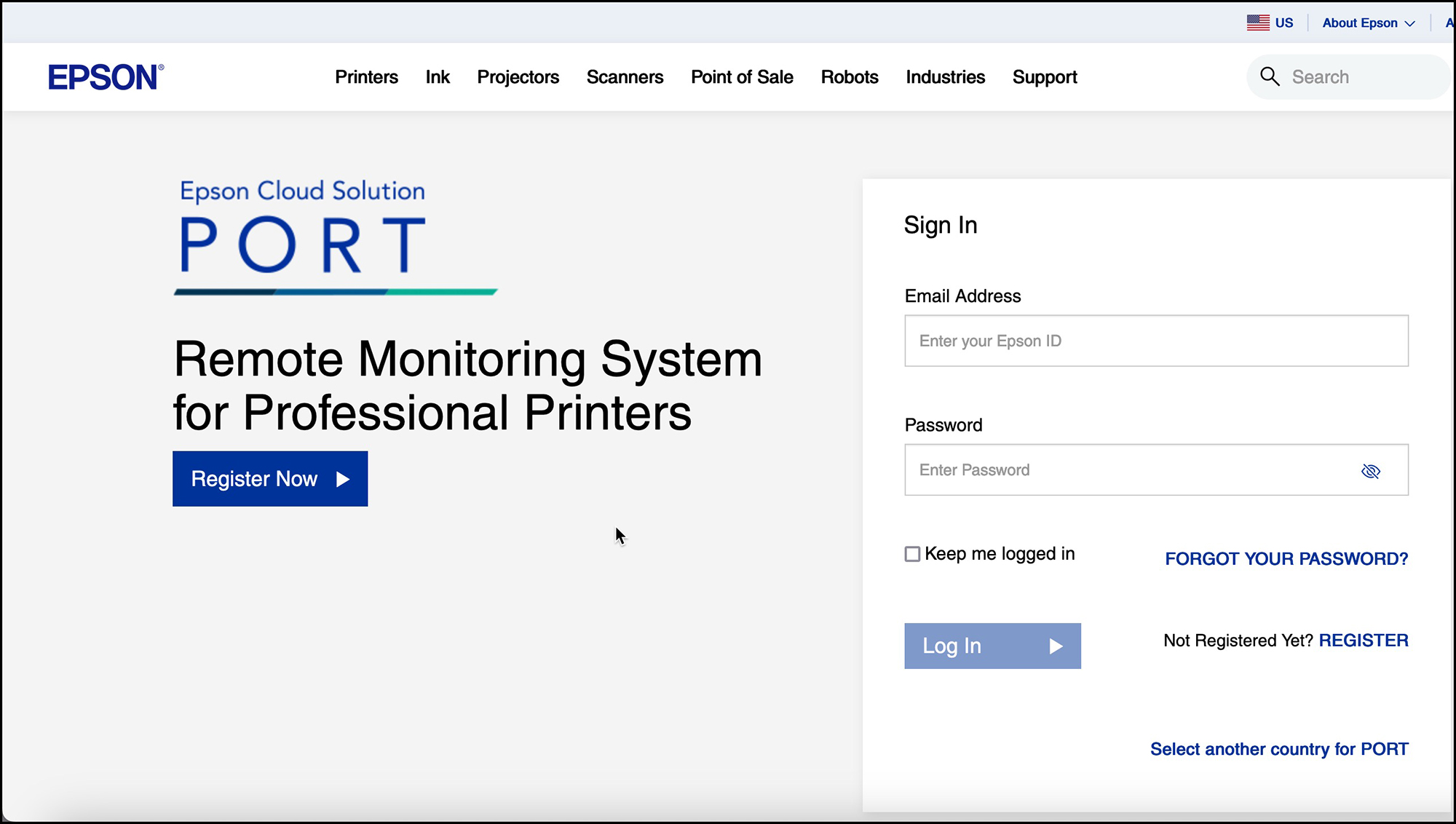
If you haven’t registered a supported printer with Epson Cloud Solution PORT yet, the next screens will guide you through that procedure, which is not difficult. There is a one-time process whereby you sign-in to another Epson Cloud Solution PORT page by giving them your email address and the serial number of your printer. You will be offered a string of code for your printer which you paste into a printer registration window when asked. It could take anywhere from a few minutes to overnight until Epson’s system registers your printer and you are good to go using the software. There are some permissions you need to give them which may feel like Big Brother watching over you, but I am assured that Big Brother is only seeing into your printer and it’s totally harmless. OK. You want the service, just go along for the ride.
Once you are “in”, you’ll get the personalized Cloud Solution PORT welcome screen (Figure 88).
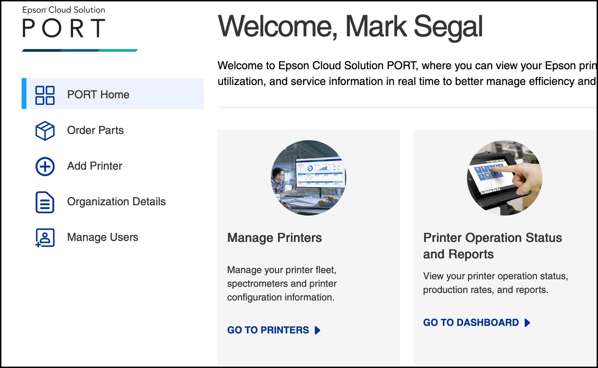
If you don’t have a fleet of printers to manage and/or don’t need to manage your P5370 (most likely the case), your primary interest in using this application is to click on the “Go to Dashboard” option. When you do that, you’ll be presented with a menu of reports you can view (Figure 89).
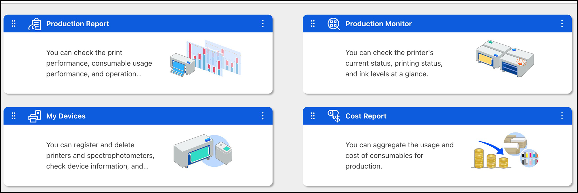
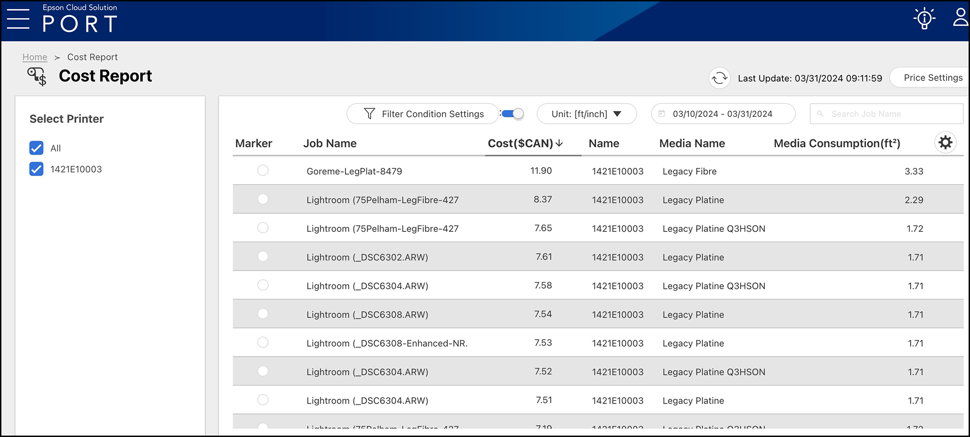
In order to populate these reports you need to provide the names of the media types, their sizes and their costs and the costs of ink you are using. You do this once, unless this information changes, in which case you can edit it. The reports indicated in Figure 89 are available as graphics within the application (following Figures) or downloadable as “.csv” files which can then be converted to Excel or Numbers spreadsheets. Examples of the available information at varying levels of granularity are from my usage covering the period of March 10 to March 31 2024.
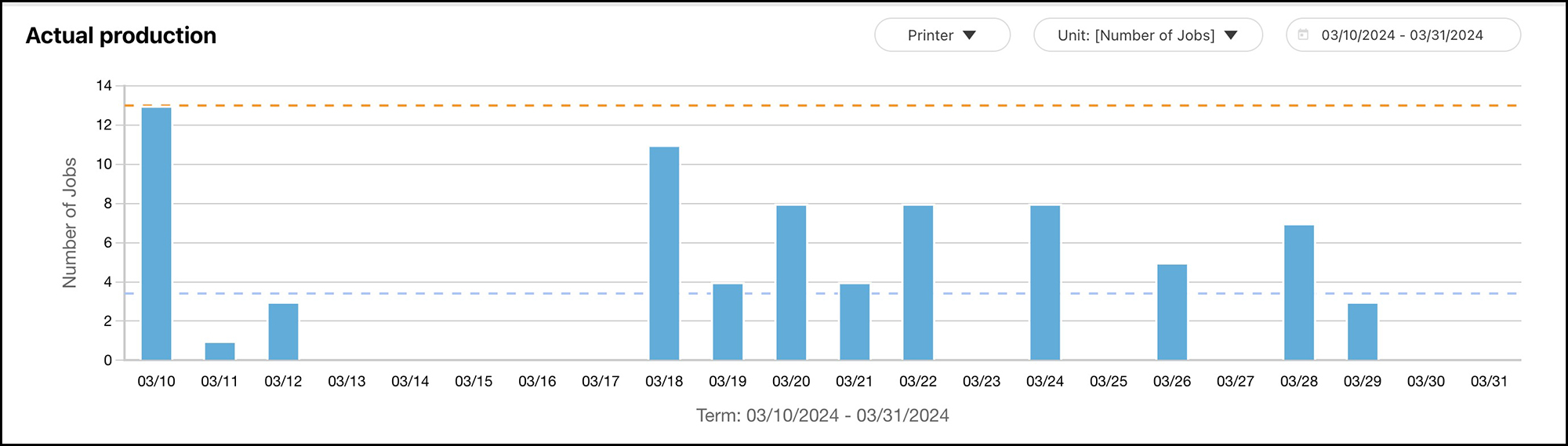
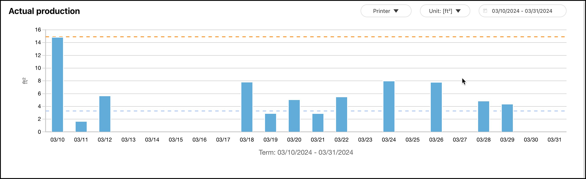
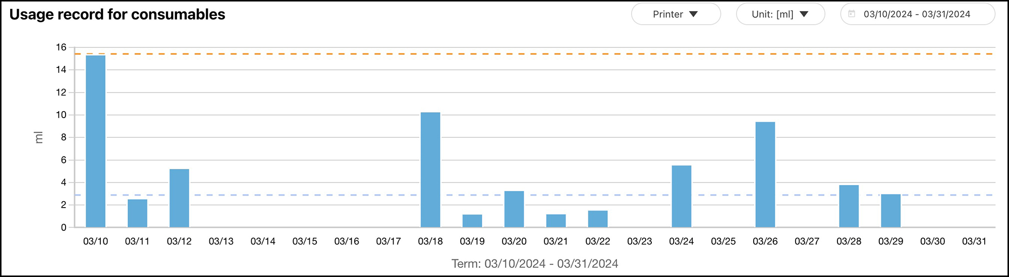
The media consumption report is in square feet of paper used, not square feet of ink coverage on the paper, so you cannot correctly derive ink use per square foot of coverage unless you manually adjust the paper consumption to exclude un-inked square inches.
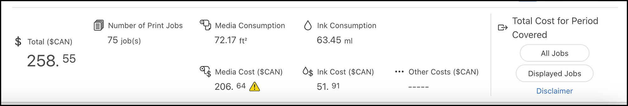
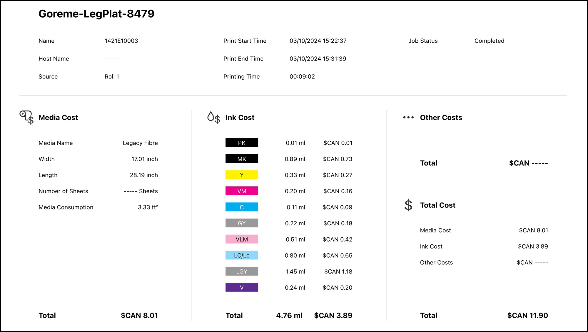
An interesting and realistic point about the information shown in Figure 95 is that of the total CAD 11.90 this big print costed me to make, 8.01 dollars of that is paper and 3.89 dollars is ink – the paper is by far the more expensive ingredient, notwithstanding that most of the complaining we hear is about the cost of ink. Ya, it’s not cheap, but little ink is used to make a print, as shown in the coloured list down the middle of the information layout – only 4.76 ml for a 17”x28” print.
As you can see, this is a useful application for those curious or needing to know the amounts and costs of materials for printing. Epson provides additional instruction on-line.
Concluding comment: I’ll end where I began, this is an excellent printer capable of producing stunning output. What you get from it of course heavily depends on what you put into it. Having a properly calibrated and profiled monitor, knowing how to edit your photos under soft-proof, and paying attention to your print settings on the printer LCD and in the printing application(s) are the keys to the results you’ll be happy with.
Mark D Segal
April 2024
Toronto, ON
Mark has been making photographs for the past seven decades and started adopting a digital workflow in 1999 first with scanning film, then going fully digital in 2004. He has worked with a considerable range of software, equipment, materials and techniques over the years, accumulated substantial experience as an author, educator and communicator in several fields, was a frequent contributor to the Luminous-Landscape website and now contributes frequently with in-depth articles on the PhotoPXL website. Mark has contributed over 75 articles to the two websites up to Q1-2024, with a particular emphasis on printers and papers, given his view that a photograph printed on paper remains the epitome of fine photography, as it has been from soon after the medium was invented and started gaining momentum in the 1830s/1840s. Mark developed a particular interest in film scanning and authored the ebook “Scanning Workflows with SilverFast 8, SilverFast HDR, Adobe Photoshop Lightroom and Adobe Photoshop” (please check our Store for availability). In his “other life” (the one that pays for the photography), Mark is a retiree from the World Bank Group and was a consultant in electric power development.