Mastering The Art Of Photographic Composition – Part Four
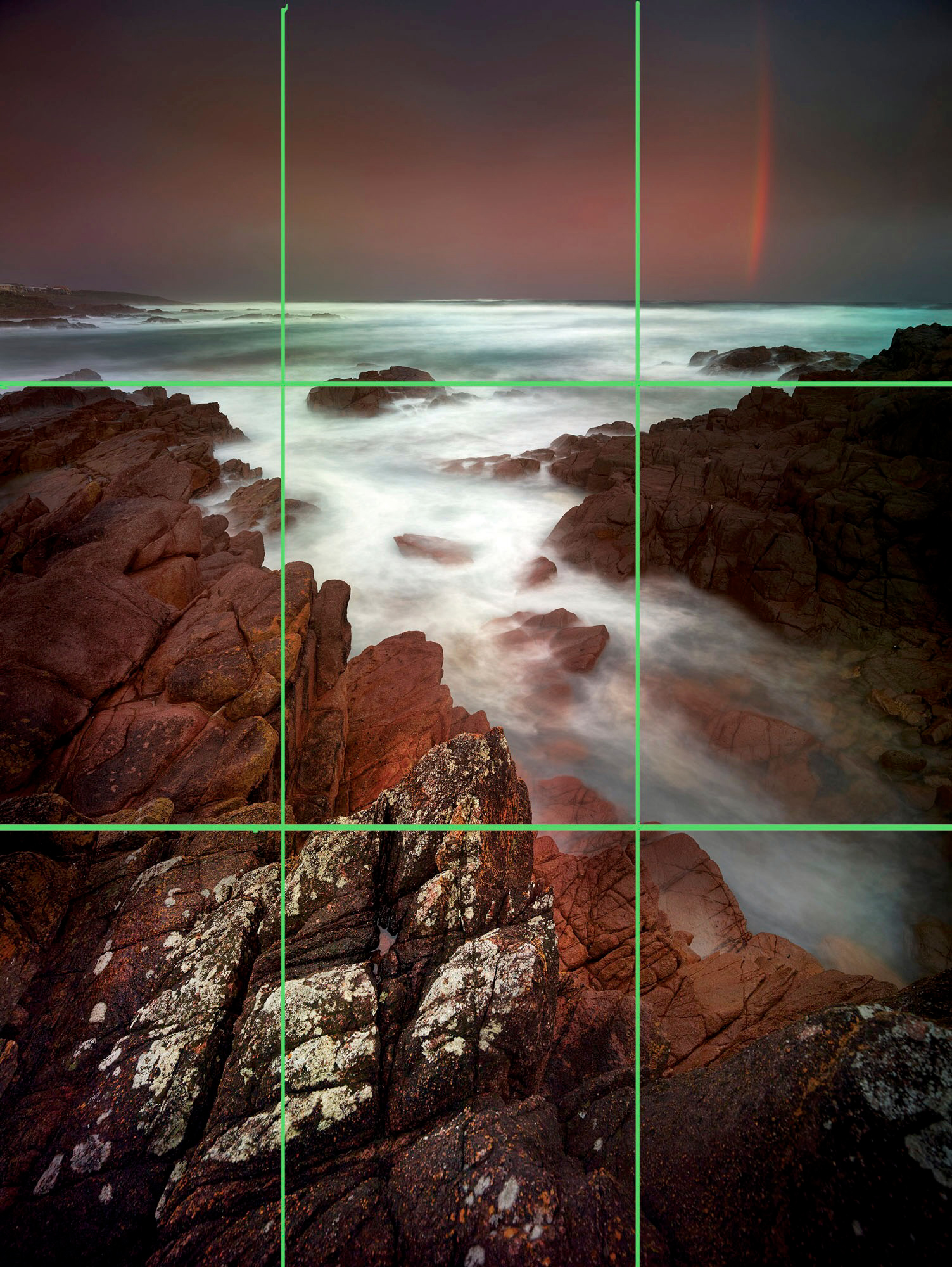
Where Do You Place The Horizon?
Most of us tend to think of the horizon as a line evenly between the sky and the land. Standing out in the middle of a salt flat, there’s no doubt this is the case as the horizon will nicely bisect our vista.
However, when you look at a photo with the horizon bang smack in the middle, it can be a little boring.
In fact, when you’re starting out, it’s a good idea to make sure your horizon is not in the middle. (Just don’t forget that you’re expected to break all these rules from time to time!)
As with other aspects of composition, placing objects in the centre of an image can create a staid, static feeling which provides little excitement or stimulation for the viewer. Often it’s far better to place the horizon either towards the top of the frame or down the bottom, positioning it so there’s no doubt your placement was intentional.
(In other words, don’t move the horizon line just a fraction off the centre because it will still look like you’ve put it in the middle, but couldn’t get it quite right!)
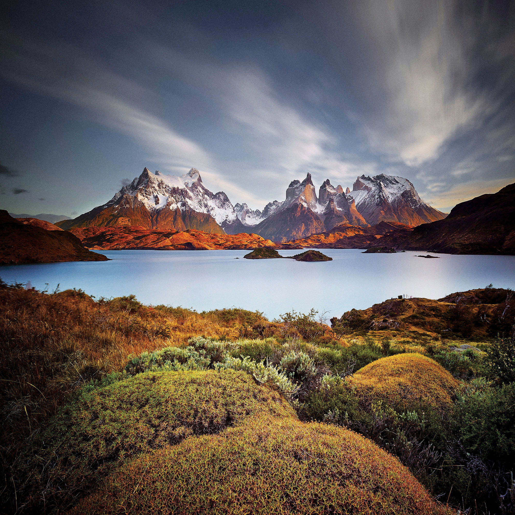
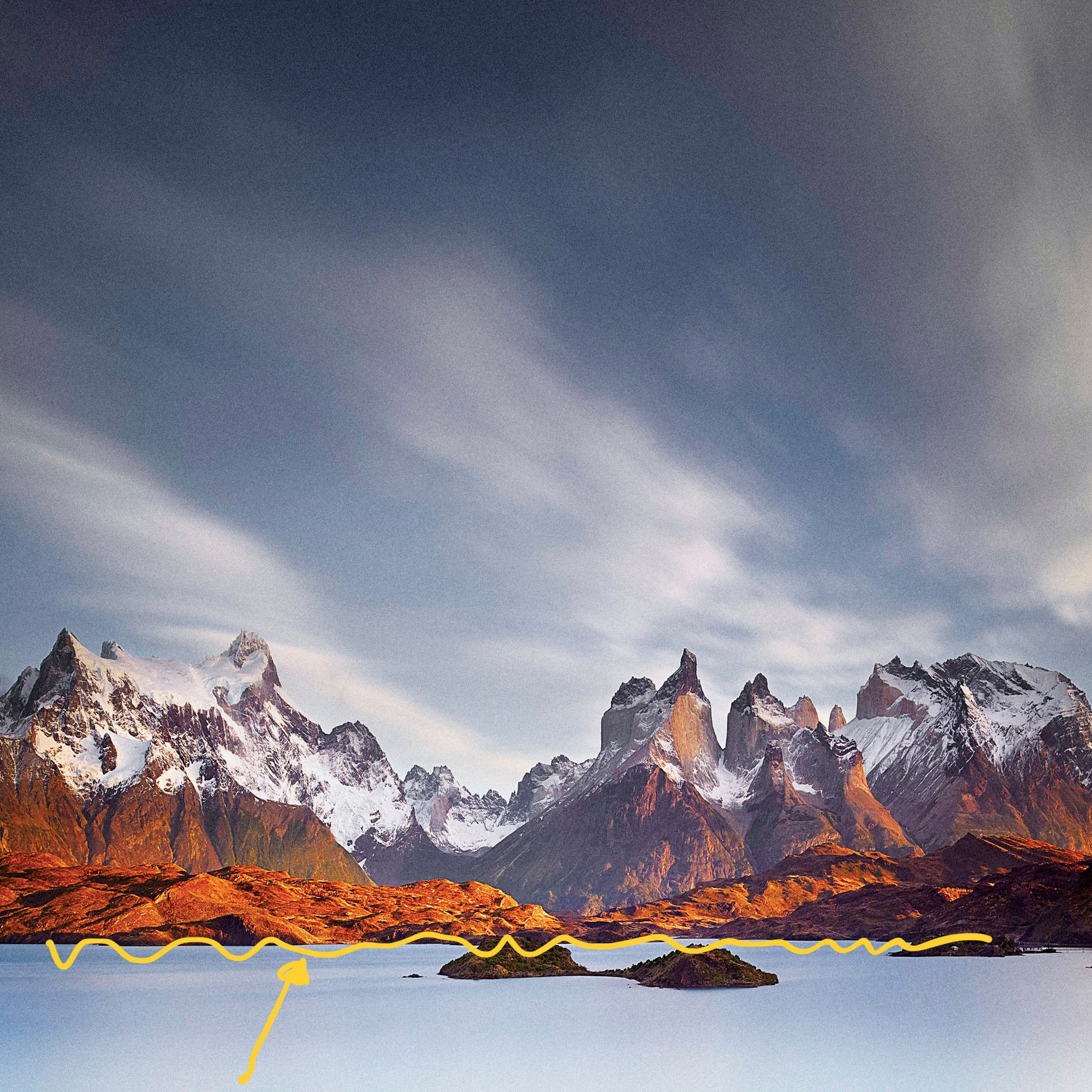
So, when you’re in the mountains with peaks towering all around, where is the horizon?
There’s no need to look for a dictionary definition of ‘horizon’ because no matter what or where it is, the horizon is really just a compositional ‘line’.
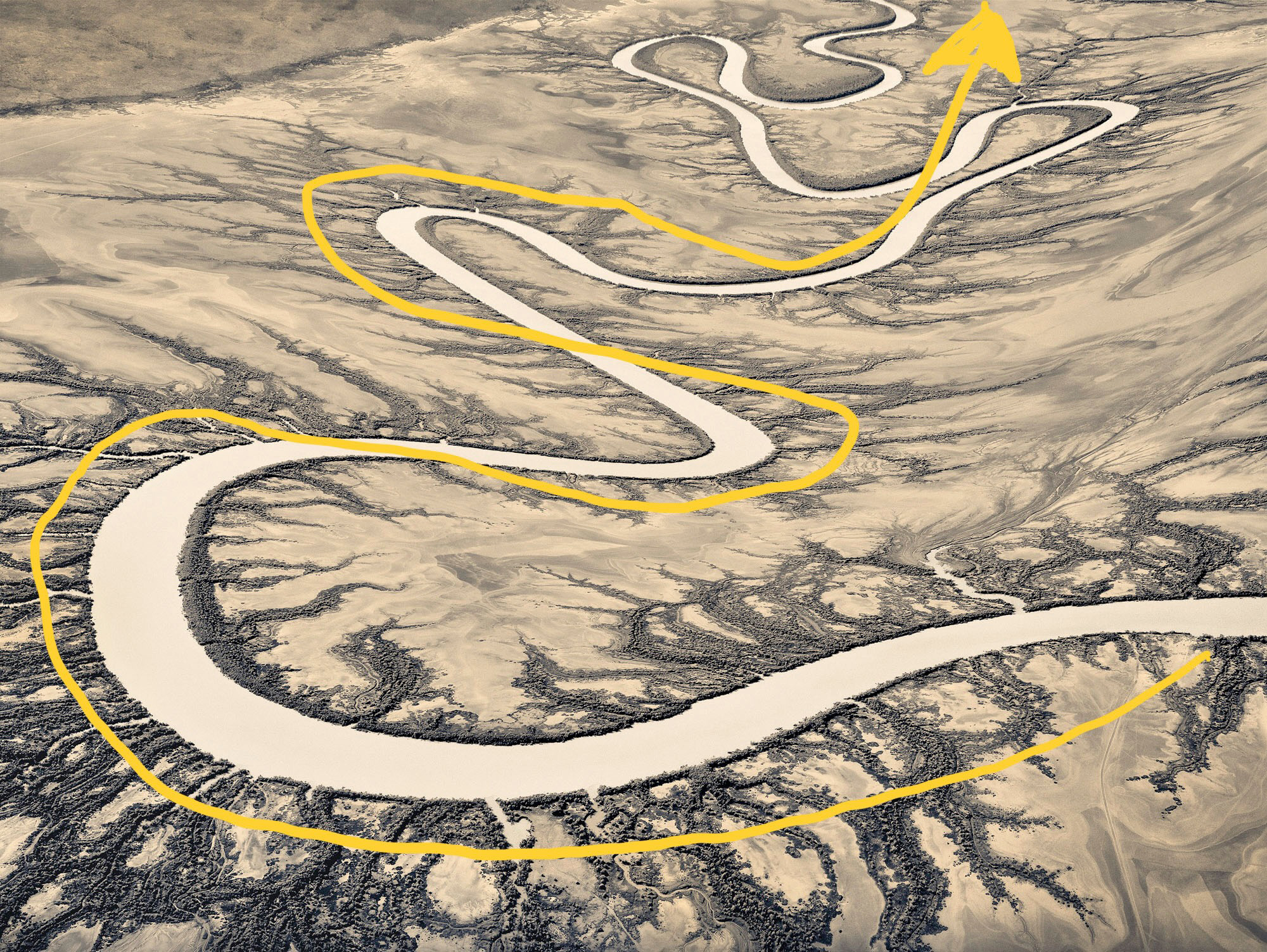
Compositional lines can be real or implied. For instance, a river snaking through a valley creates a curved compositional line. The sides of a building are vertical lines, while the roof might have a number of diagonal lines.
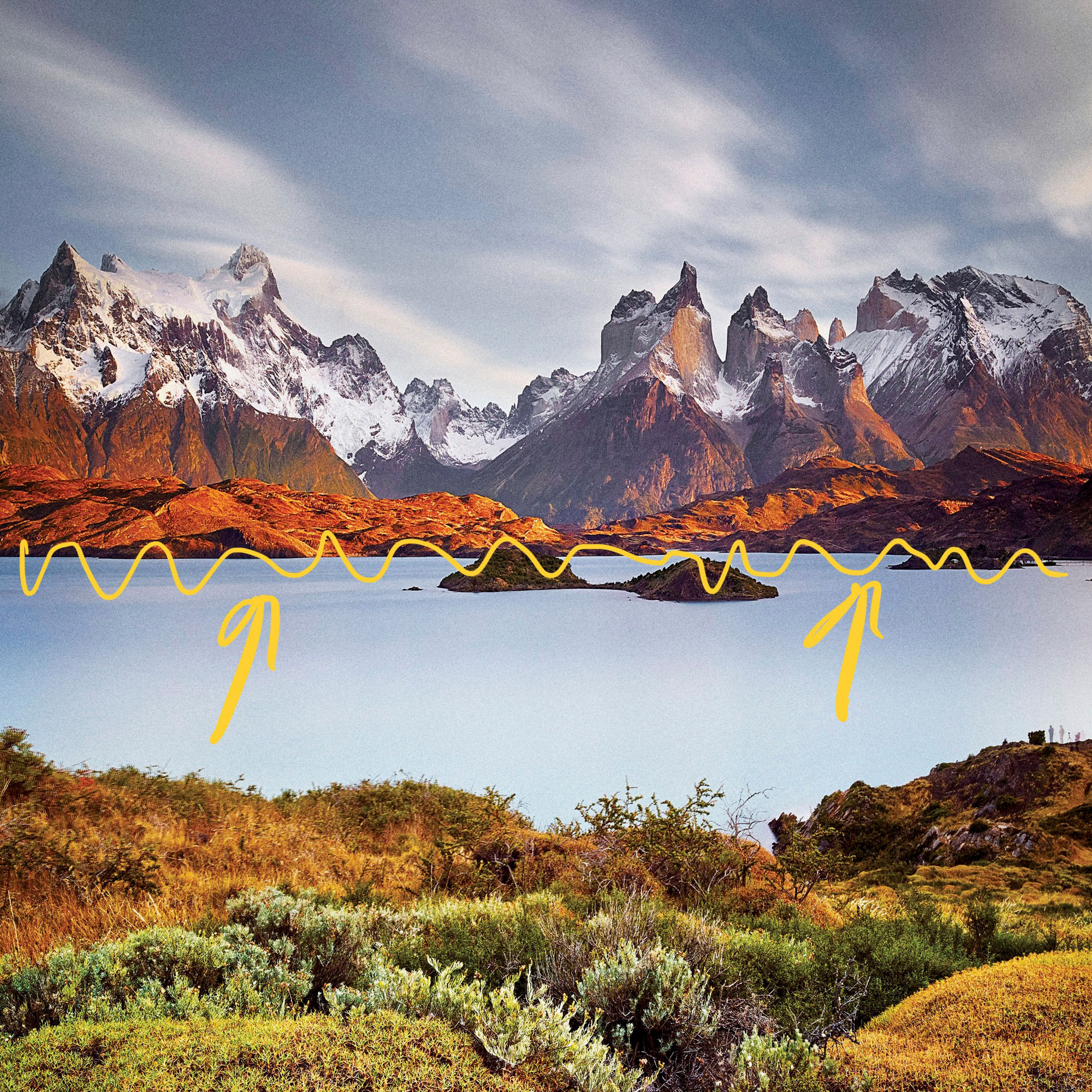
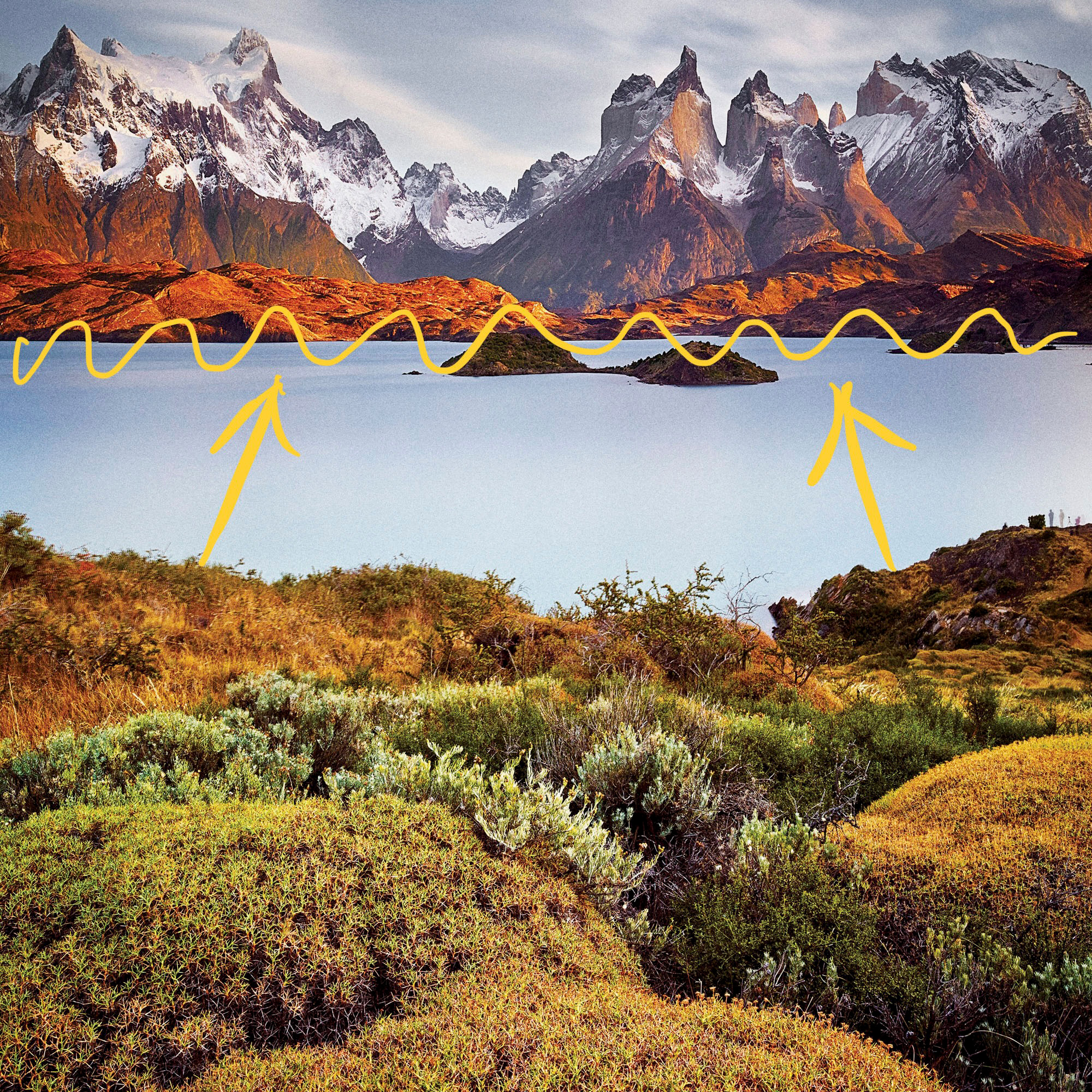
The horizon is typically a horizontal line, but in the case of a mountain vista, it might be a jagged, irregular line consisting of a number of peaks and troughs.
If the horizon is the main compositional line in an image, its placement sets the scene because it determines which part of the image is more important.
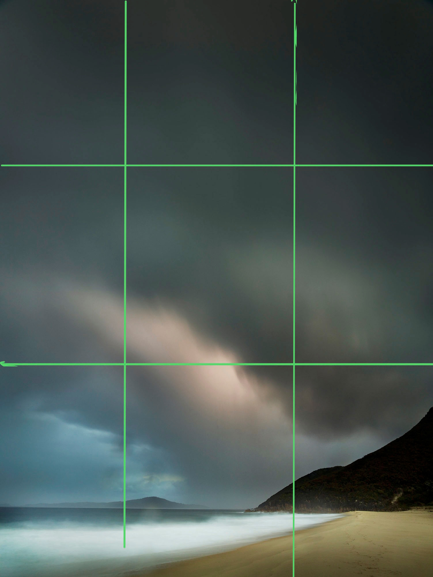
For instance, if the horizon is placed in the lower half of the image, there will be more sky than land and so the sky is said to be dominate. You would use this horizon position if the main subject was a brilliant sky or some thunderous clouds.
If the horizon is in the upper part of the image, then the landscape is the dominant area. The mountains, valleys, and trees are of more interest than the sky and this horizon placement concentrates the viewer’s attention accordingly.
Were the horizon in the middle of the image, neither landscape nor sky are dominant and the message sent to the viewer is that the photographer doesn’t really know what’s more important. In fact, the photographer could appear relatively disinterested.
Of course, there are times when the horizon can happily sit in the middle of the image. You might have a reflection, for instance, and want to create a symmetrical image.
More likely, however, your subject is dominant in the frame and the horizon becomes a secondary element, possibly out of focus.
If the horizon line is important in your composition, you need to select its best position!
So, how does this fit in with the rule of thirds? Since the horizon is a compositional element, it will happily sit on the upper or lower divisional liines using the rule of thirds. However, don’t be a slave to the rule of thirds – pushing the horizon further up or further down can produce much more dramatic compositions.
And as you can see on this page, sometimes having the horizon in the middle works rather well!
Using Compositional Lines and Shapes

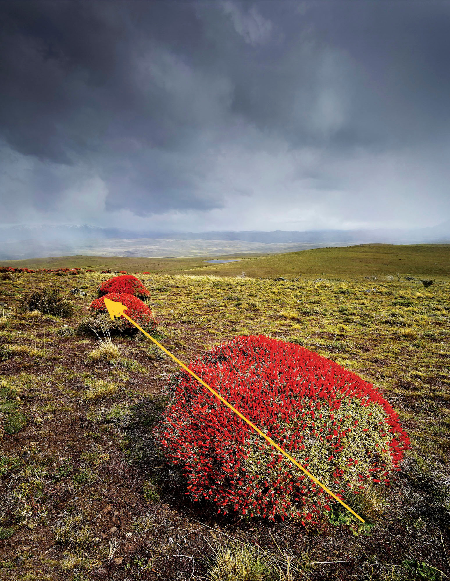
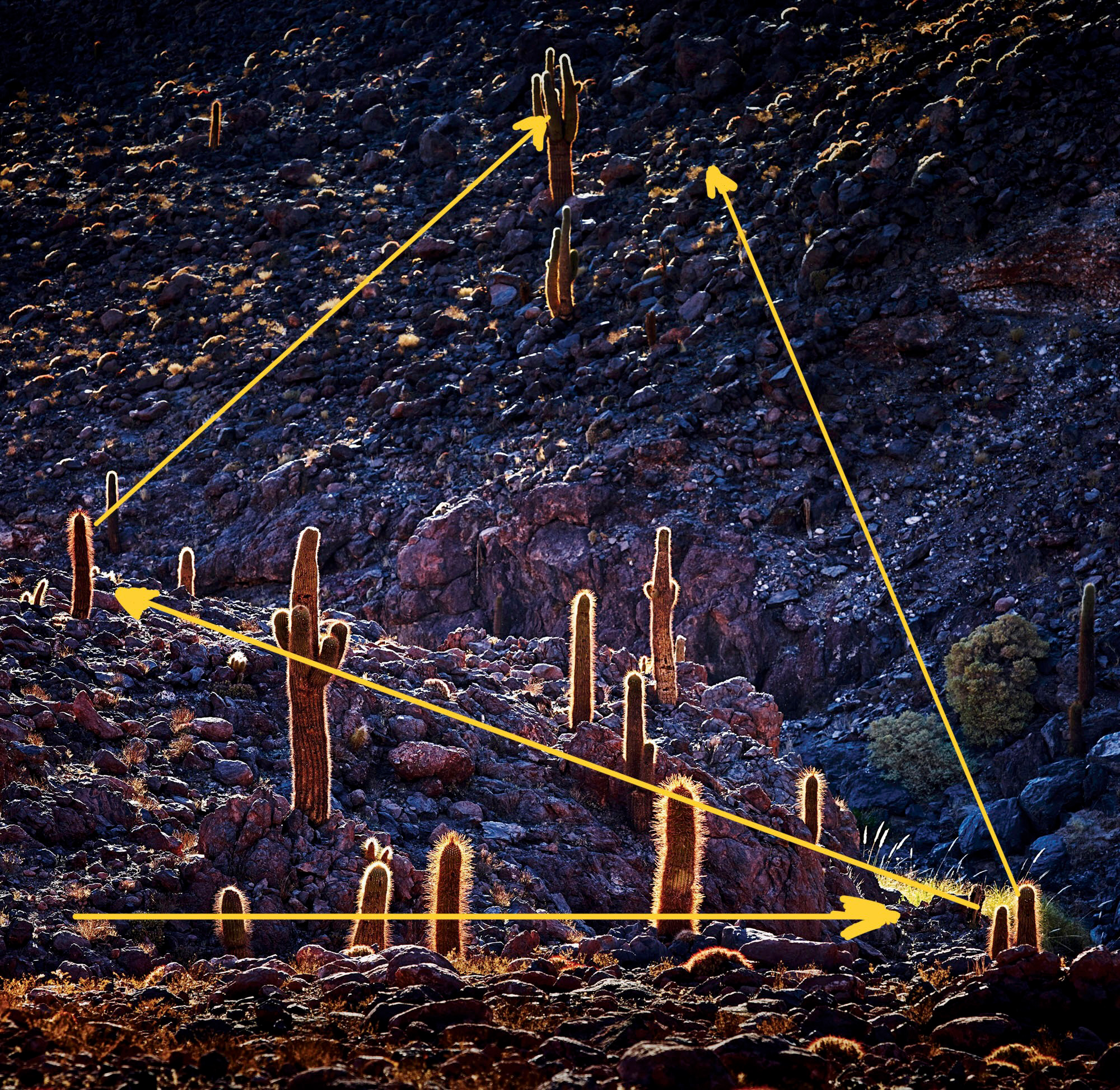
All photographs are made up of lines and shapes.
Lines can be real, like an horizon, or imaginary, such as an implied line between two subjects or objects within the frame.
A line can also be the edge of a shape, the border between two areas, or a real line like a telegraph wire.
Leading lines are lines that lead the eye around the photograph. So, a good example of a leading line is the languid curve of a river snaking its way through a landscape. We start at, say, the bottom of the image and our eyes trace the river through the image to the top. The line is ‘leading’ our eyes.
When putting the camera’s viewfinder to our eye, it can take a little practice to notice exactly where the lines in a photograph are. When we look through the viewfinder, we see the subject as it is, rather than as a series of lines and shapes. However, pressing the shutter and then reviewing the image on the camera’s LCD screen can be a great way to better analyse our composition because the LCD screen shows a two dimensional image. And a two dimensional image is easier for our minds to grapple with, to see the lines and how they link our centres of interest together in the composition.
Lines don’t have to be physically evident in the photograph. Lines can be implied between two or more points of interest, so if there are two people standing in a courtyard, then there is an implied line between them.
Nor do lines have to point directly at your subject or centres o f interest. They merely have to support a direction or an action. For instance, a car on a road, travelling from left to right, is supported by the line of the road itself, but it can also be supported by a line of trees running in the same direction.
It can be difficult to islolate single compositional rules within a photograph and many of the photos in these articles could be used as examples for several compositional tools.
Everything links in with everything else and a successful photograph may use several compositional devices, each supporting the other and building towards a more successful image.
What is often overlooked is the important of post-production in this process.
First of all, you have to have these compositional devices within the raw file – you have to have photographed them in the first place.
Next, you need to recognise that they ar there – and this comes down to educating yourself about art and photography generally. The more you have an opinion about how a photograph should look, the easier this process becomes.
Then, having worked out what the most important compositional elements are in your photography, such as lines or shapes, you can enhance the image to make the stronger.
Use post-production to lighten or darken areas so shapes stand out more clearly, create stronger lines or are more obvious as centres of interest. You can also use colour (saturated or desaturated) and contrast (high and low) to make compositional devices more obvious.
Generally speaking, a strong composition makes a stronger photograph, although of course some photographs are so powerful simply because they break all the compositional rules.
Peter Eastway
May 2022
Sydney, New South Wales
Peter Eastway is an Australian photographer known internationally for his landscape photography and creative use of post-production. He has been involved in photo magazine publishing for over 30 years, establishing his Australia's Better Photography Magazine, in 1995. As a result, Peter and his websites are a wealth of information on how to capture, edit and print, offering tutorials, videos and inspiration for amateur and professional photographers. Peter was the author of the Lonely Planet’s Guide to Landscape Photography. His photography has featured on the cover of the Lonely Planet’s guide to Australia, in articles in the Qantas inflight magazine, and in an international Apple television commercial. And he has worked with Phase One researching and promoting its high-end medium format cameras and Capture One raw processing software. He has also published The New Tradition, an anthology of 100 award winning images with accompanying techniques and discussions. He was one of the featured photographer in the first Tales By Light television series aired on the National Geographic Channel in Australia and produced in partnership with Canon Australia. It can currently be viewed on Netflix around the world. Peter Eastway is a Grand Master of Photography, a Fellow and an Honorary Fellow of the Australian Institute of Professional Photography, and a Master and Honorary Fellow of the New Zealand Institute of Professional Photography. He won the 1996 and 1998 AIPP Australian Professional Photographer of the Year Award. He is a WPPI Master of Photography. He was more recently the 2019 AIPP NSW Epson Professional Photographer of the Year (Australia). Peter is just over 60, rides a short surfboard, believes two skis are better than one, and in case you're buying him lunch, he is vegetarian.