Canson Baryta Photogrphique II – Matt (“CBP2M”)
Very soon after I completed my review of the other four new Canson matte papers (…). Canson announced CBP2M and sent me a box for testing and review, hence this follow-up article.
This is a paper with two important distinctions from most other “fine art” matte papers on the market, and I must say I find both appealing: firstly, the surface texture is very smooth and flat (it has the look and feel of uncoated aspirin, though I’d be mightily surprised if that’s what it is), and secondly, the substrate is alpha-cellulose, not cotton rag. These two features bring two important benefits that should appeal to a good number of printmakers: (i) there simply is no glare from the paper no matter the angle at which you view the print, and (ii) it is robust – doesn’t bend, crinkle or nick easily, yet it feeds through the regular top feed of my Epson SCP5000 reliably, without help – and there is no lint to shed.
The product sheet describes the OBA content as “very low”. A check with the spectrophotometer indicates that is indeed the case (Figure 1).

The extent of UV fluorescence (indicator of OBA presence) can be gauged from the height of the spike of the magenta curve and the absolute difference of b* readings between M2 (UV excluded) and M1 (UV included) measurement conditions. For this paper, the magenta spike is low and the absolute difference of b* between M2 and M1 is 1.95.
By comparison, Figure 2 shows reflectance measurements of two other papers – very high OBA content in the left panel (high magenta spike and b* difference of M1/M2 about 13), versus no OBA content in the right panel (no spike and b* difference of M1/M2 0.06).

The paper weight is 310 g/m2 , thickness 324 um, internally buffered and acid free.
For this paper, as done with the four papers of the previous article, the Canson website provides an ICC profile which was made with M3 measurement condition, rather than the more usual M0/M1/M2 measurement conditions. Recall that the M3 measurement condition features reading the profiling targets with polarized light. I provide a fairly comprehensive exploration of M3 versus M1 profiling in that article and one other hyperlinked therein, so I shall not repeat all that here, save to say that the characteristics of an M3 profile with matte paper are similar for this paper to those others. Judgment about the relative merits of this OEM profile needs to be suspended until assessing the photos printed with both the M3 profile from Canson and the M1 Custom profile that I made as part of my testing. OEM Epson Media Type is Ultra Premium Presentation Matte.
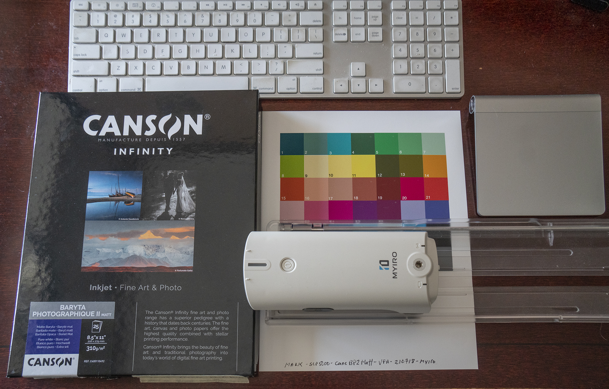
Incidentally, I should mention that I made my custom profile for this paper with the MYIRO-1 spectrophotometer (from Konica-Minolta) and its associated MYIROTOOLS Version 1.2 software. Readers may recall I reviewed this product last September (https://photopxl.com/is-there-a-spectrophotometer-in-your-future-myiro-1-or-i1pro3/) and recommended it for its high-quality profiling capabilities. Now that it has a newer and more user-friendly software version, I can recommend it all the more. One really attractive feature is that it makes excellent profiles from its 840-patch target which can be printed on one A3-sized sheet or 2 A4 sheets of paper. These profiles I have found to perform at least as accurately as X-Rite i1Profiler’s profiles I have made using its 2371-patch target requiring 4 letter size sheets and more measurement time. Wireless usage of the MYIRO instrument also facilitates easier reading of the profiling targets.
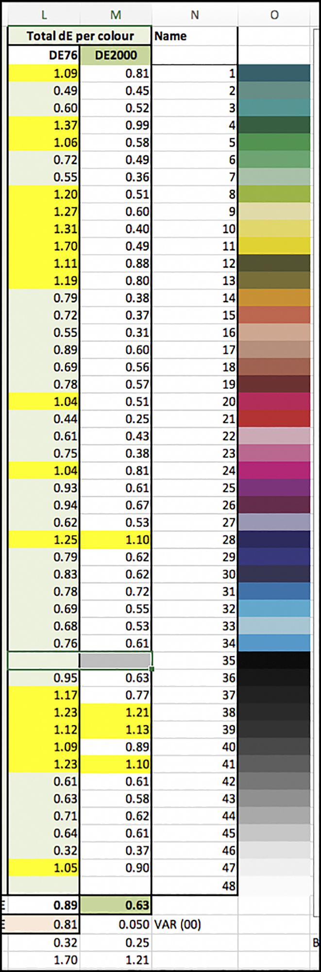
Reverting to the review at hand, it follows the same procedure as my previous ones. Firstly I discuss the printing characteristics of this paper as seen through the OEM and Custom profiles, relying on objective statistical information (Figure 3, Data Summary), followed by presentation of scanned prints of a suite of test photos printed on that paper using my Epson SCP5000 printer.
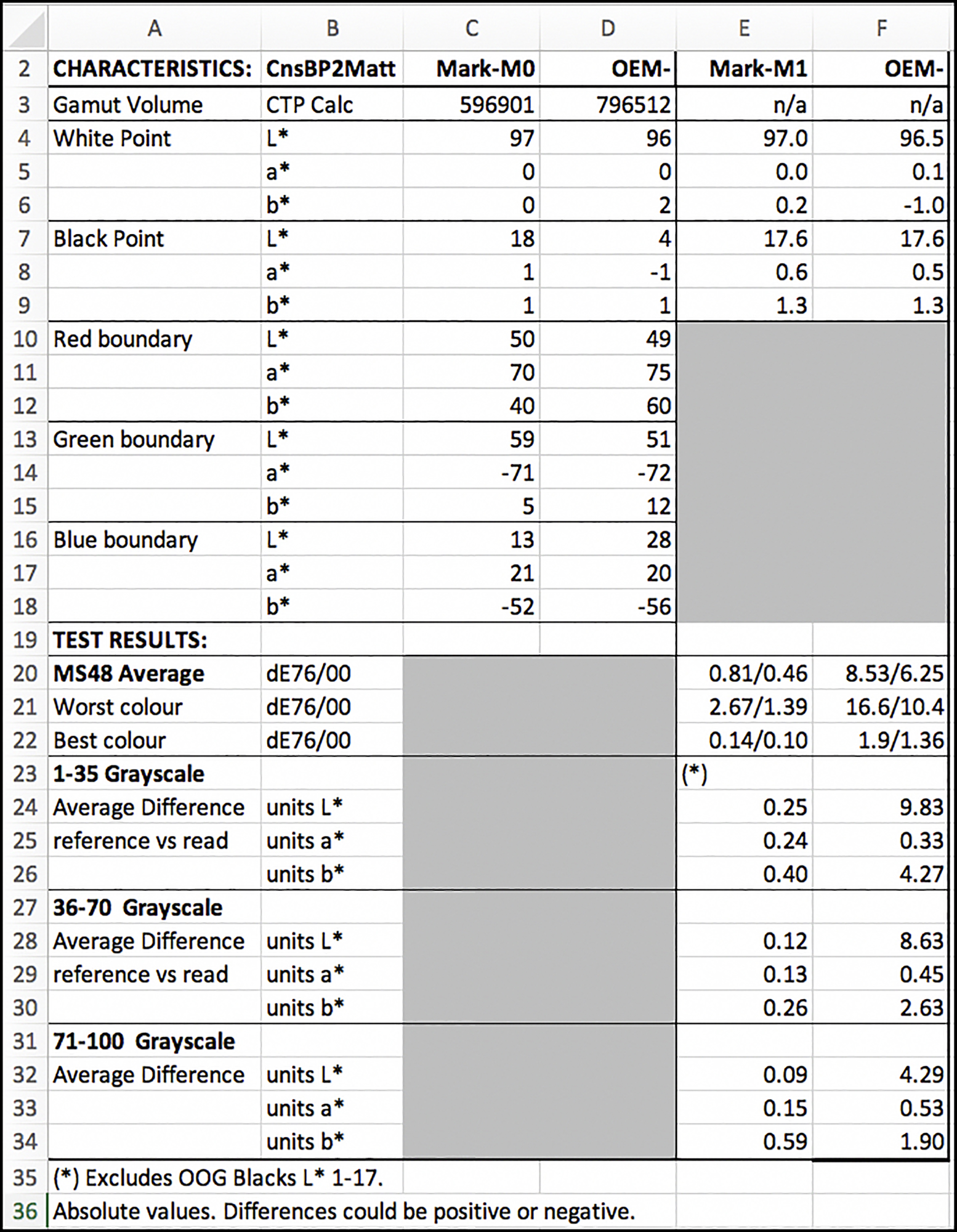
Starting with the upper half of Figure 3, the OEM profile gamut volume is 796512 versus 596901 for the Custom profile (calculated in ColorThink Pro). These numbers are normal for matte paper being profiled in M3 versus M1 measurement conditions respectively. Likewise, the Black Point in the M3 profile reaches a low point of 4, versus 18 in the Custom profile, again characteristic of how the two measurement conditions “see” differently. Regardless of the recorded Black Point in the OEM profile, the printed outcome looks more like that indicated from the Custom profile because we don’t look at prints through polarizers – at least most of us don’t. More on this later.
Turning to the lower half of Figure 3, test results for reproduction accuracy, let’s focus on dE(2000) because the profile construction is optimized for dE(2000). For the 48-patch multicolour target, the bottom four Black levels and the L*100 white patch are excluded, because those are out of gamut for M1 measurements. For the remaining 43 patches, the average dE(2000) for the custom profile is 0.46, the worst colour being 1.39 and the best 0.10; fine results. For the OEM profile, the average dE(2000) is 6.25, the worst colour being 10.4 and the best 1.36. This statistically poor outcome for the OEM profile is expected when reading the output of an M3 profile with an M1 Measurement condition. We’ll see below that statistical accuracy looks much better reading an M3 profile with an M3 measurement condition, the only issue being that peoples’ vision occurs most approximately to M1 measurement conditions unless viewing prints through a polarizer.
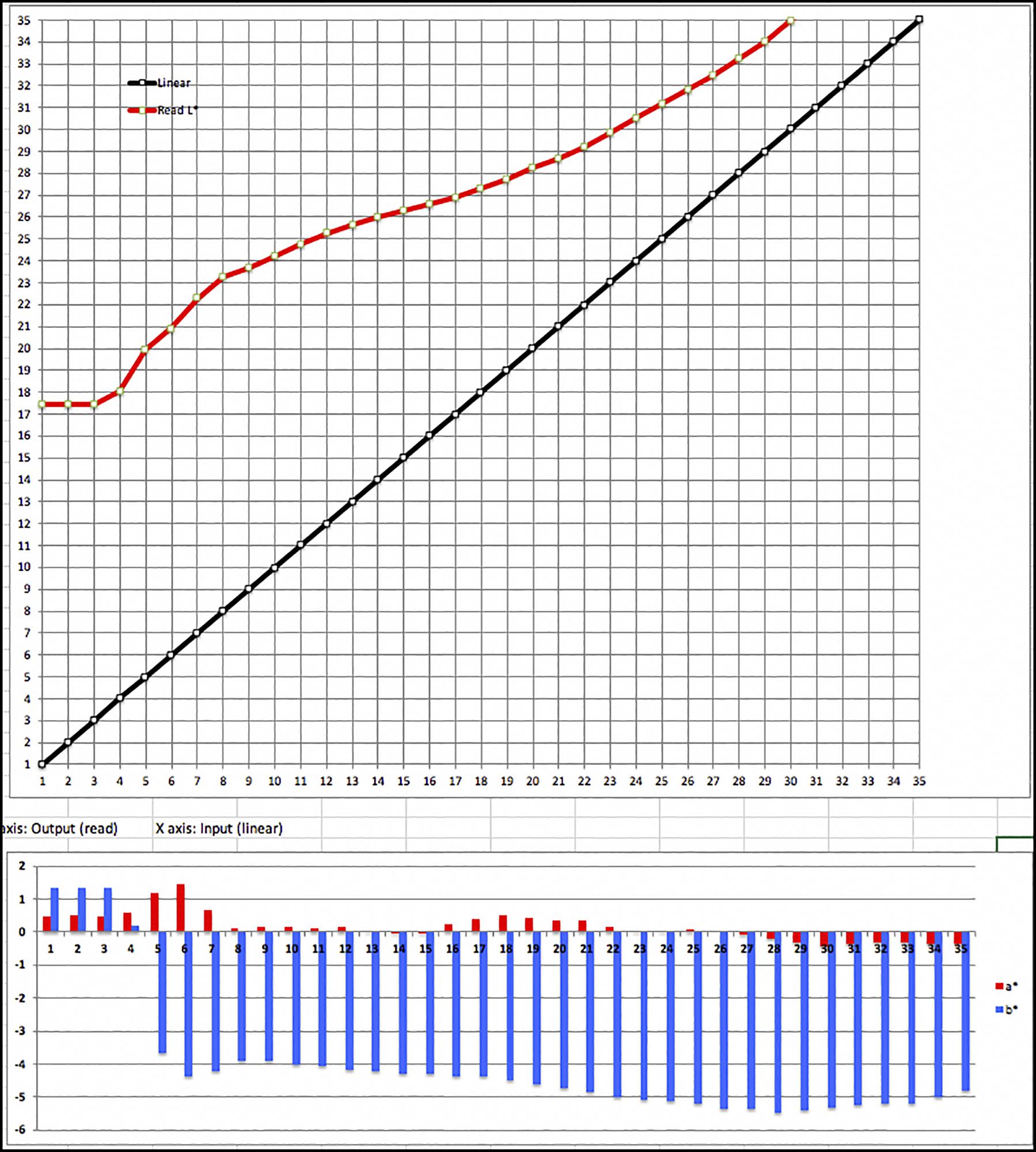
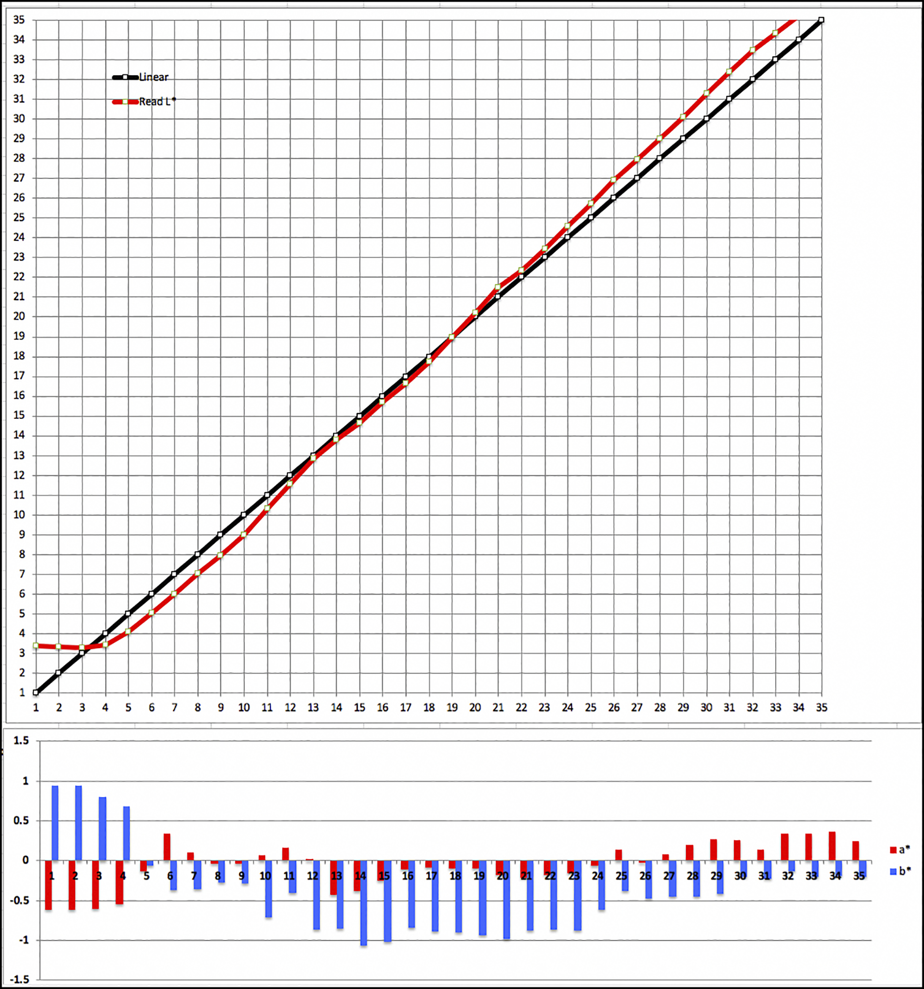
Rows 23 to 34 of Figure 3 concern the grayscale, important for B&W printing. It is divided into three zones – Dark, Middle and Highlight tones. In the dark zone for the Custom profile patches L*1 to L*17 are excluded because they are out of gamut. For the remaining patches from L*18 to L*35 inclusive, the average discrepancy between image patch values and read values from the target print is only 0.25 – a stellar result (here and below, the averages are absolute values, so this is not a case of negatives cancelling-out positives.) Neutrality is also very well preserved, returning average a* and b* departures from neutral (0) of only 0.24 and 0.4 respectively. These results are portrayed graphically in Figure 4.
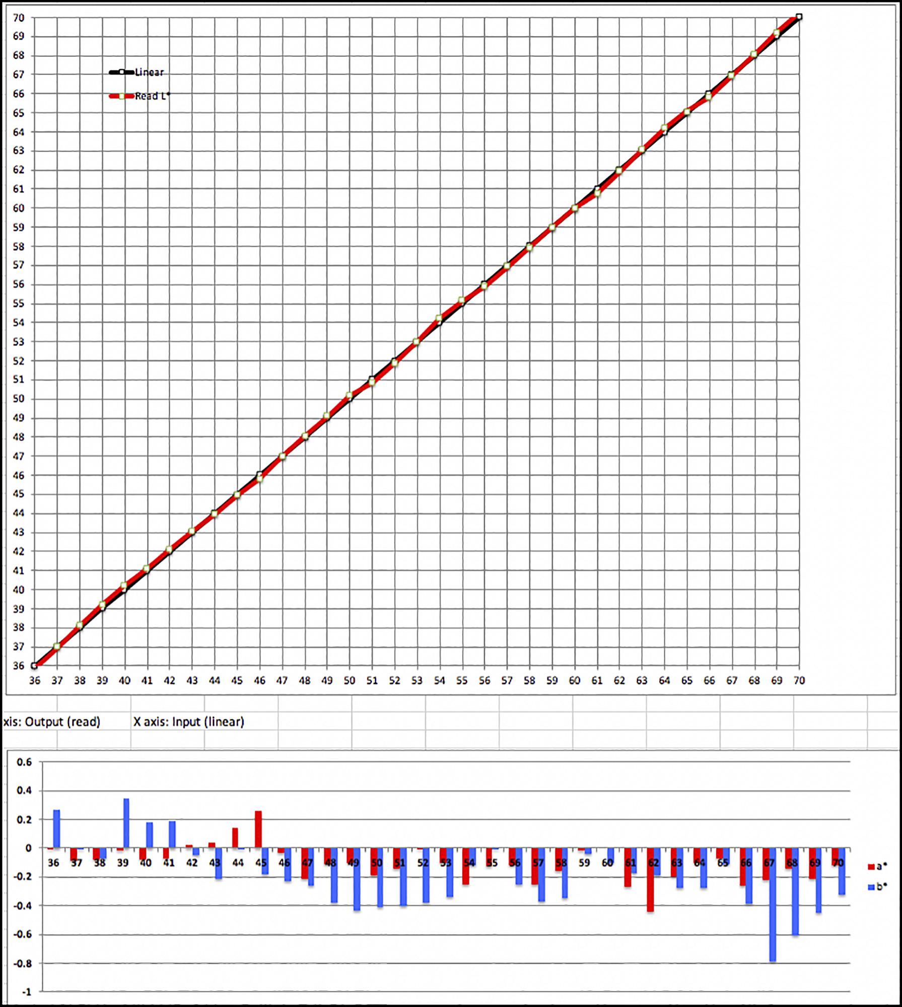
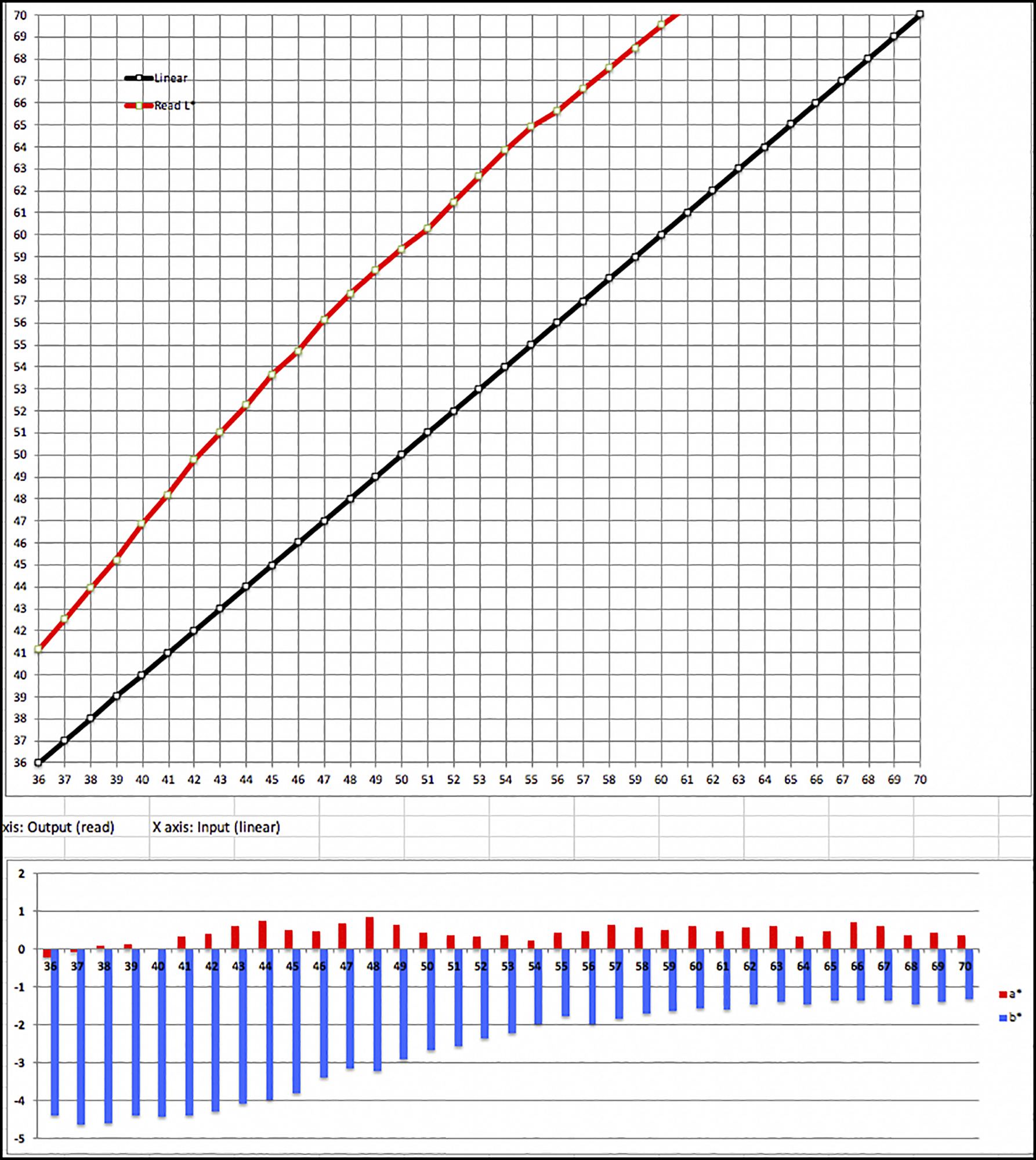
Turning to the mid-tones, Levels L*35-L*70, the accuracy of tonal reproduction is even better, the average Luminance difference being only 0.12, and neutrality almost perfect at 0.13 and 0.26 for a* and b* respectively (Figure 5).
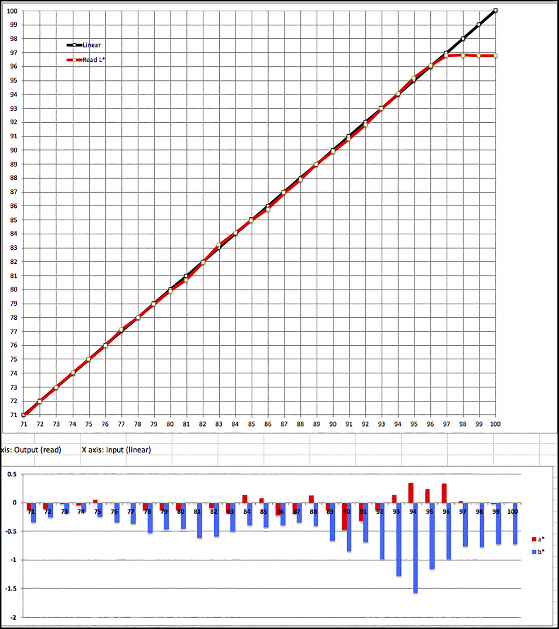
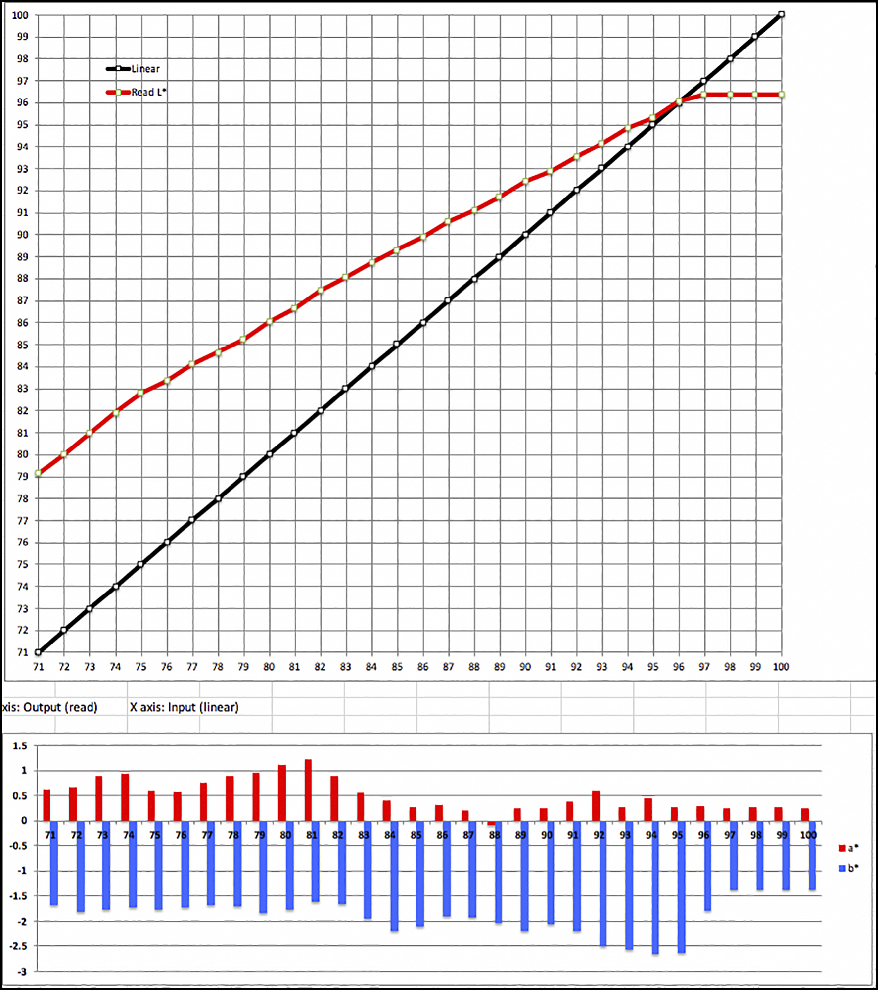
The highlights also record trivial average difference between image file and printed values, being only 0.09, 0.15 and 0.59 for L*, a* and b* respectively (Figure 6). The red line tops out at paper white. Of minor interest, as the inking thins at very high brightness levels, a slight bluish cast of low but varying values appears in the bars of the lower graph.
Reminder for how to read the graphs: Upper graph: Black line: reference luminance values of the target patches; Red line: read values from the print of the patches. The closer the lines converge the more accurate the reproduction of tone values and the smoother the tonal gradations to expect in print. Lower graph: Red bars are for a* and blue bars for b*. The shorter they are (closer to 0 axis), the less any non-neutral hue. Any value less than 1.0 should be imperceptible, or nearly so. To understand the meaning of the bars in the lower graphs, please be sure to reference the scale to the left of each. The scale can vary depending on the data within the graph.
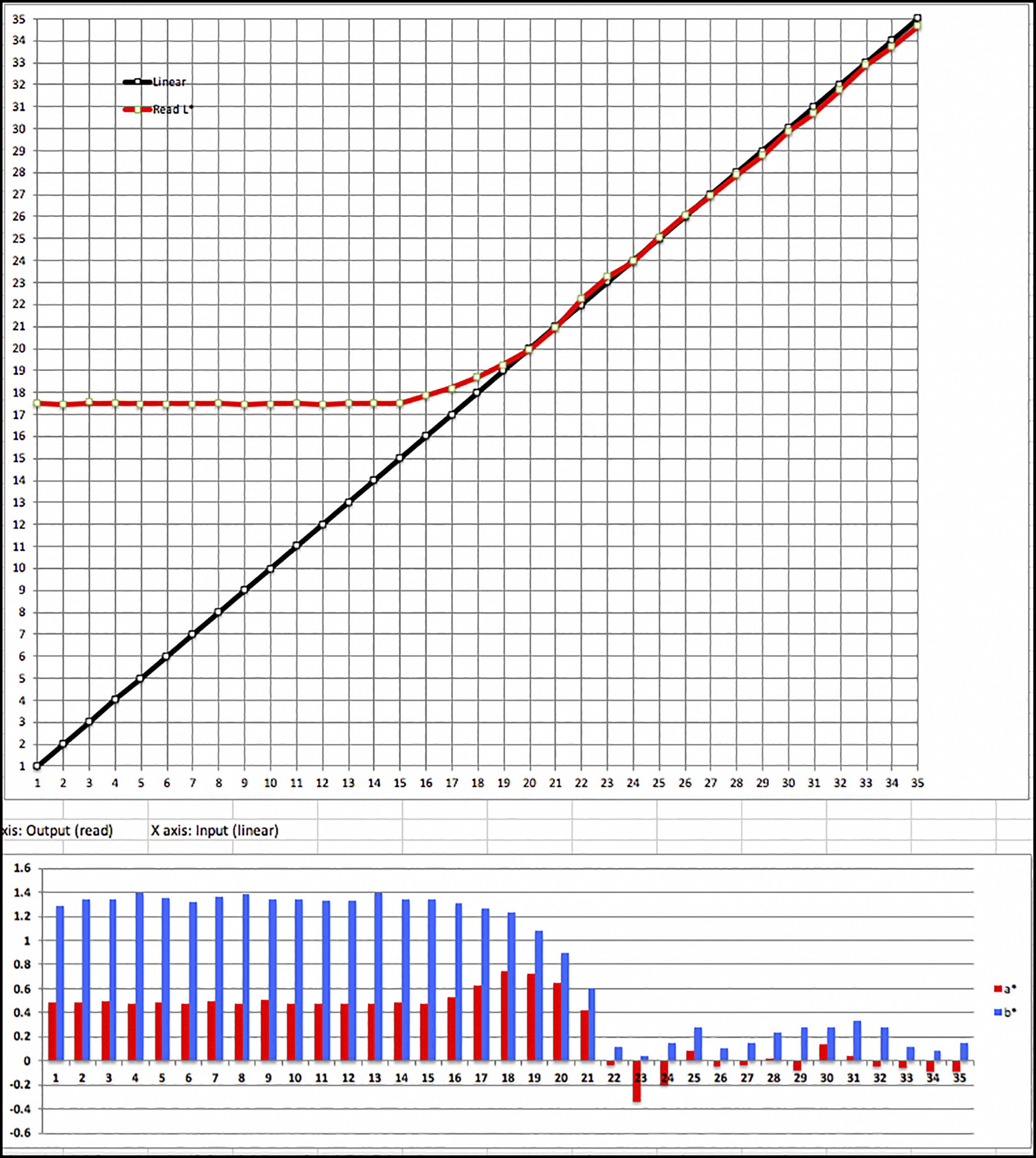
The statistical appearance of the grayscale is less attractive for the OEM profile, again largely because one is reading the results of an M3 profile with an M1 enabled device, which would not return M3 measurements.
Because in theory the Black Point of an M3 profile is so low, only levels 1, 2 and 3 should be out of gamut. The data shows substantial average departures from L*, a* and b* reference values in all three zones of the grayscale, it being most pronounced for the dark tones, for both Luminance and the b* axis (blue-yellow), the direction of the hue bias here being toward bluishness. We will see some evidence of this in at least one of the test prints as well. The data for the OEM profile is graphed in Figures 7, 8 and 9 for the dark tones, mid tones and highlight tones respectively. Recall this is a profile based on the M3 measurement condition whose results are being read with an M1-enabled device (more like how we normally see).
I mentioned above that greater statistical accuracy of results from properly made M3 profiles is apparent when measured with an M3-enabled spectrophotometer. The maker of the M3 profile, Legion Paper, kindly offered to work with me on this measurement condition because they have an M3-enabled spectrophotometer (I do not). They printed my test target on their Epson SC-P5000 printer, measured it with their M3 spectrophotometer and sent me the data file, which I then imported to my analysis framework, the results of which show in Figure 10.
Again, focusing on dE(2000), the average dE of the 46 in-gamut patches is a low (good) 0.63, the least accurate colour having dE 1.21 and the most accurate dE 0.25 – fine results.
Legion Paper also tested their profile for the critical zone of dark tones (L*1~L*35) for M3 Measurement Condition using my test chart, sent me the data file and I ran it through my analysis framework, showing the fine results of Figure 11.
The average differences between reference values and test values for L*, a* and b* are 0.74, 0.20 and 0.57 respectively, all fine outcomes. The upshot of these supplementary M3 tests is that the quality of the OEM M3 profile looks statistically fine when the Measurement Condition in which the profile is made is the same as the Measurement Condition with which the results of using that profile are evaluated. However, outside the confines of an M3 round-trip between profiling and profile evaluation, the results of the M3 profile read in the M1 Measurement condition more closely reflect print appearance under non-polarized viewing conditions. We get to that now.
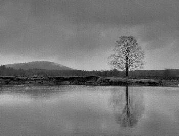
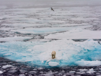
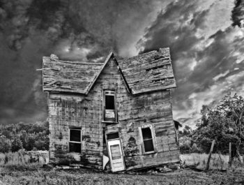
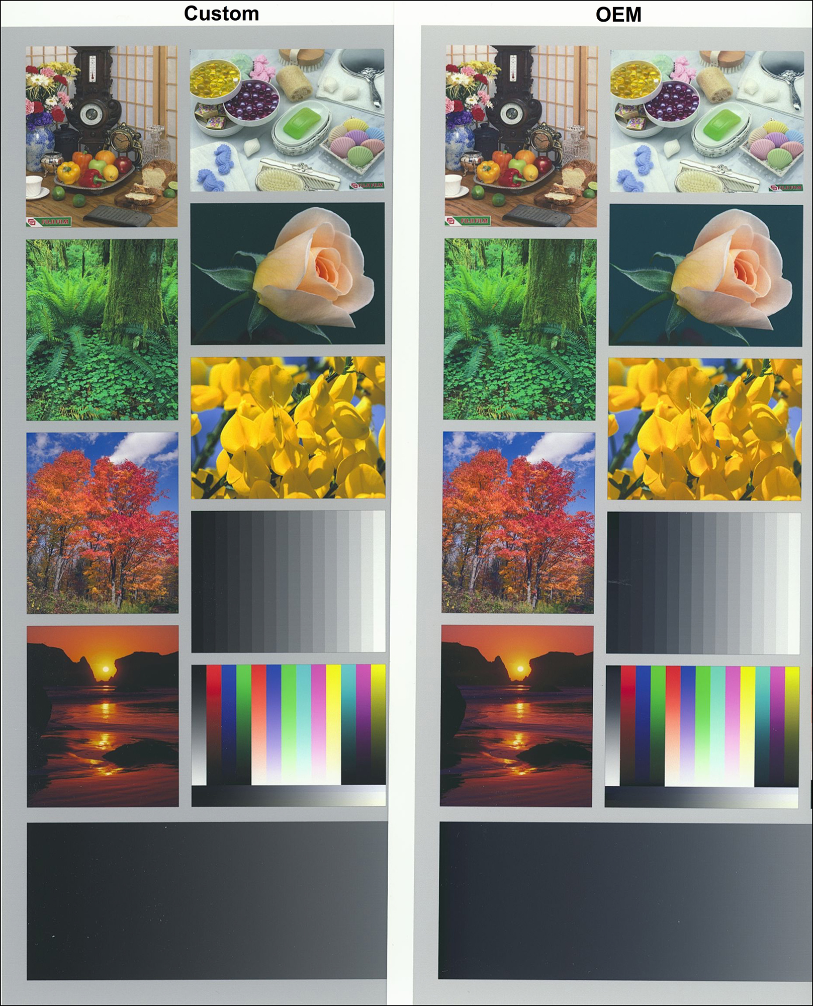
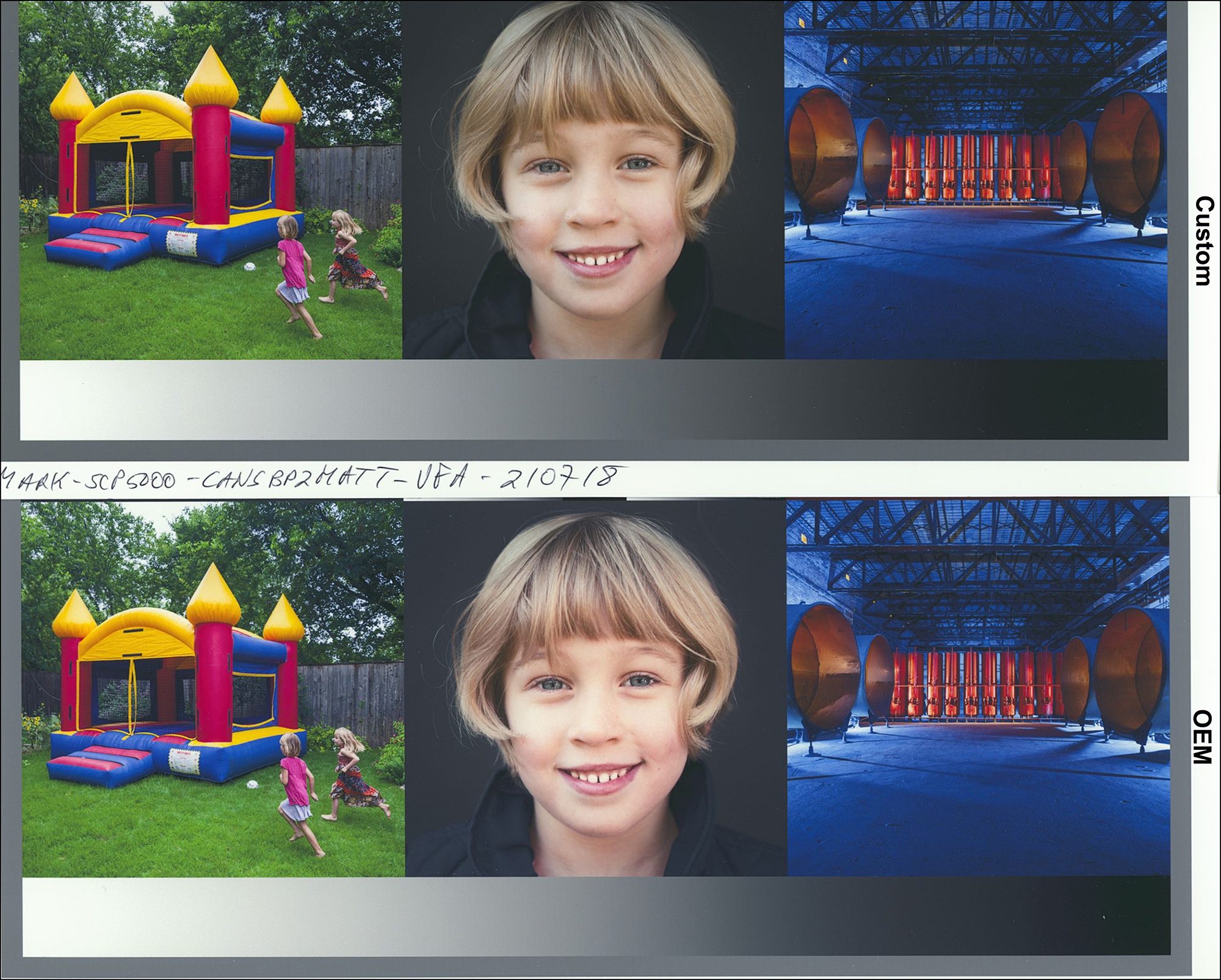
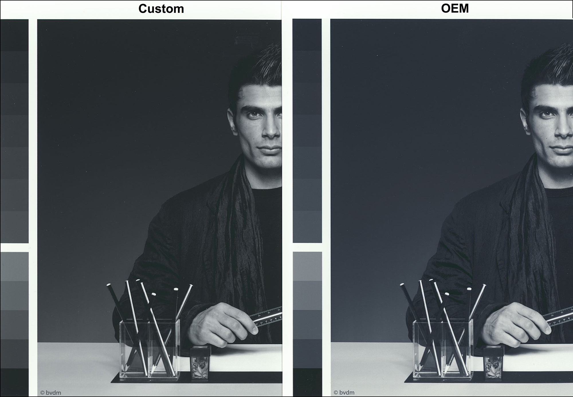
I turn to examining actual photographs made from using these profiles with CBP2M paper. As in the previous article on the other four new Canson papers, I use the Atkinson Printer Evaluation Image, the Onsight evaluation image and the BVDM Roman highlight colour and dark tone B&W control photos for this purpose.
Real photos look good printed on this paper. While they cannot have the extent of tonal depth and vibrance they would on luster or gloss paper, they show well for matte prints.
Despite the apparently large statistical differences between the OEM M3 and Custom M1 profiling results discussed above, the prints are much closer in appearance than the foregoing data suggests they may be. Analysis indicates that the choice of a RELCOL or Perceptual Rendering Intent overcomes much of the difference in rendering between these profiles that we see using Absolute Rendering Intent, (please see my previous article on the 4 new Canson papers for explanation of the different purposes and functioning of these Rendering Intents).
I printed the photographs making no adjustments except for the choice of Rendering Intent, which is RELCOL. After they aired-out overnight, I then scanned the prints in my Epson V850 scanner using a custom scanner profile that renders quite accurate results – the same for all photos. I made no adjustments to the scans before or after scanning other than selecting linear dimensions and scan resolution suitable for reproduction of the scans on this website.
The differences between the photos in Figure 12 from the Custom versus OEM profiles are subtle. The two dominant observations are that the OEM result has a slightly lighter footprint than the Custom, and the OEM has a slight cool cast showing mostly in the neutrals.
The right side of the same target (Figure 13) confirms these observations.
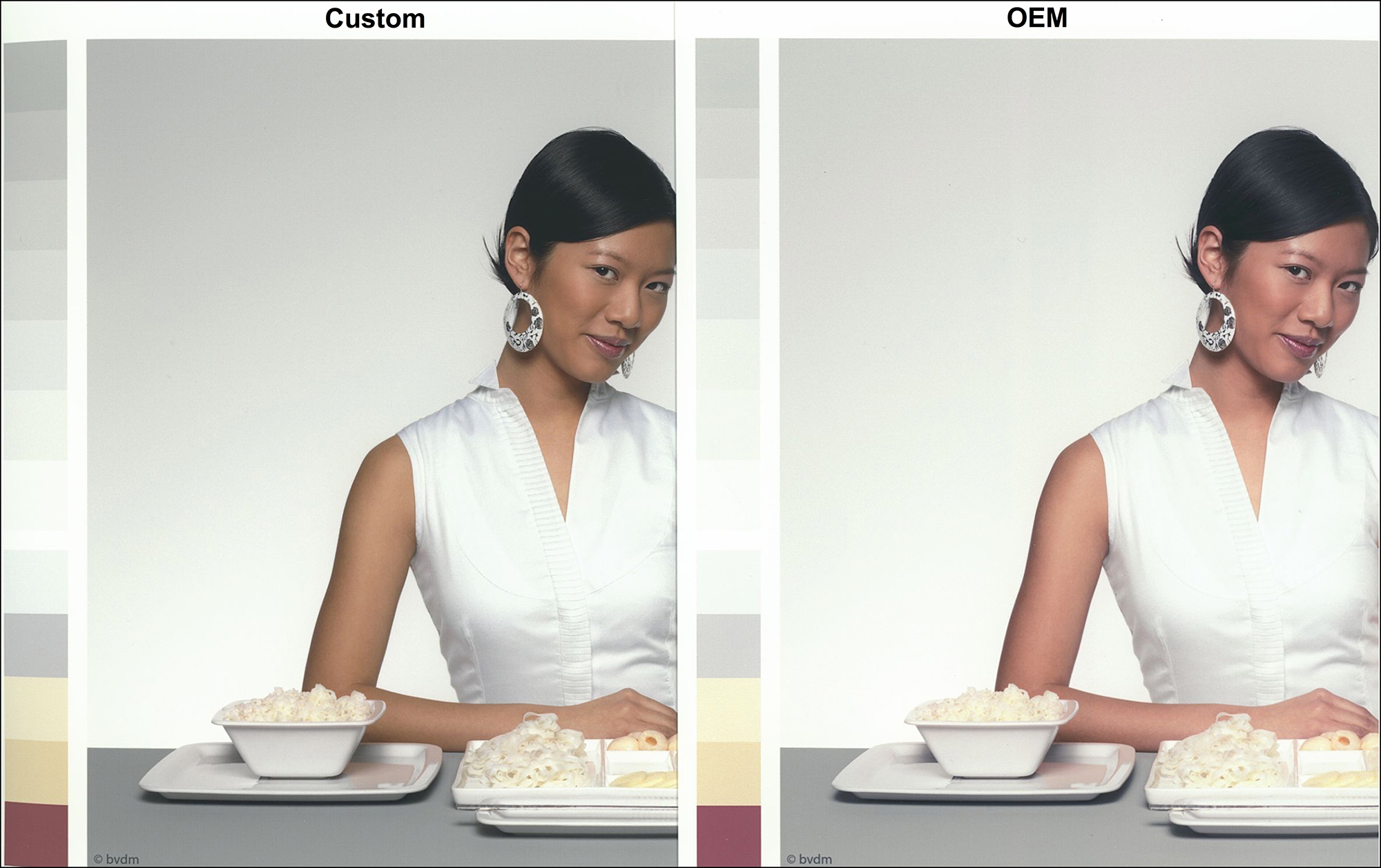
Figures 14 and 15, the upper and lower portions of the Onsight target confirm the above observations. Notice in the OEM profile how the red stone structure in the upper right side stands out a bit more for the OEM profile and the black steel structure in the lower right photo stands out from the deep dark-blue background a bit better with the OEM profile. On the flip side, areas of pronounced highlights in some of these photos are a bit overblown in the OEM profile but contain more tonality in the Custom profile.


Turning to the dark-tone grayscale photo (Figure 16), the differences between OEM and Custom profiling are not very large but noticeable. The OEM profile renders a slightly lighter overall footprint and a slightly less neutral hue compared with the Custom profile.
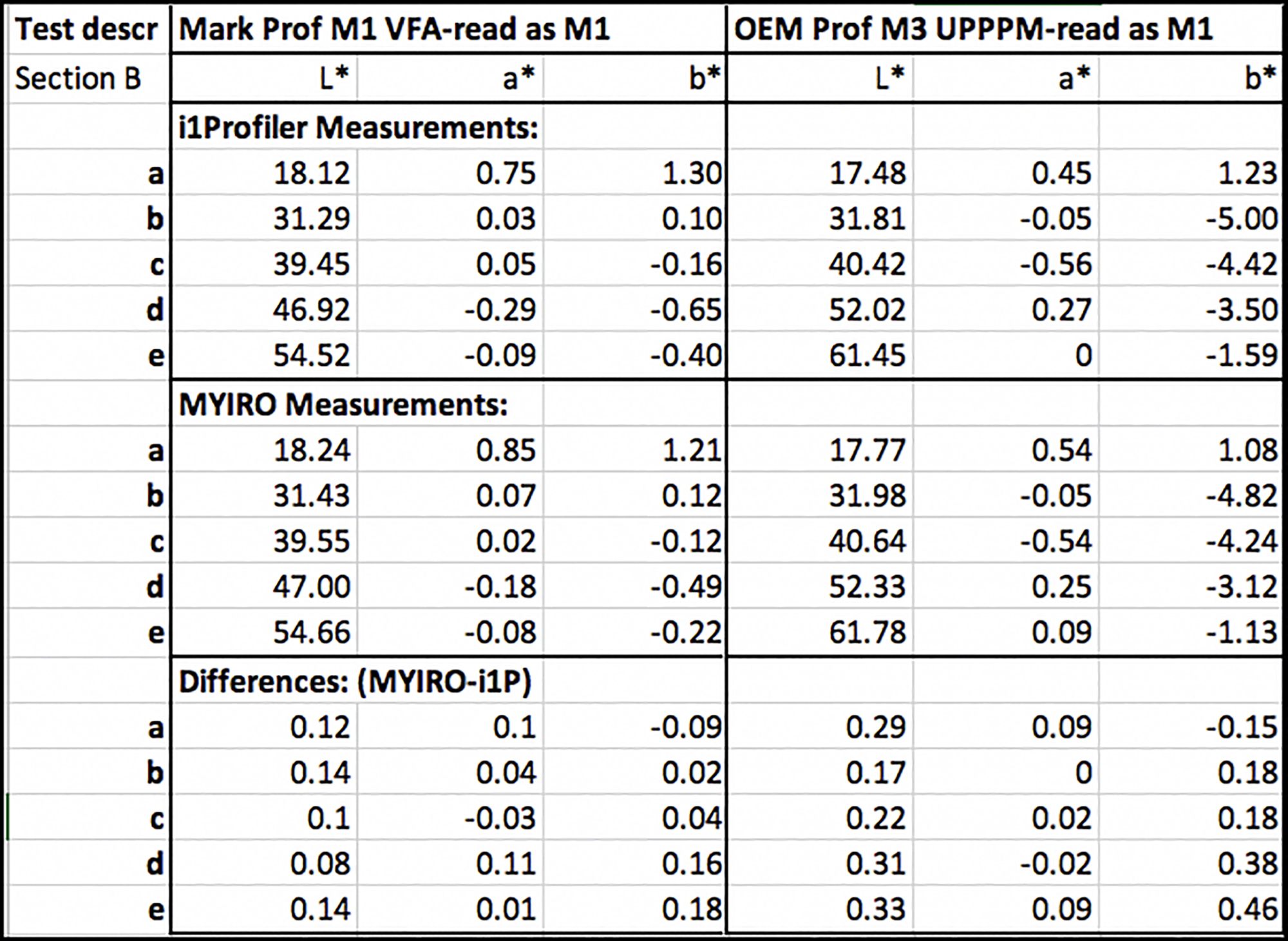
The Roman 16 target allows us to identify more precisely what the differences of tone and hue between different renditions of the same test image are. Particularly useful is the set of five patches in the lower left of each image layout (Section B patches), representing key tone or colour areas of the image itself. I measured these for both targets (Custom and OEM) using both the i1Pro 3 and MYIRO-1 spectrophotometers (just to make sure the data is reliable – Figure 17). In Figure 17, the five patches are labeled “a” to “e” going from darkest to lightest in that set.
The three most relevant observations emerging from this data are: (i) differences between the i1Pro 3 and MYIRO-1 measurements are not visually significant. (ii) From patches ‘c’ through ‘e’, the OEM registers brighter tone, and (iii) there is a statistically significant and visually noticeable bluish cast in the OEM rendition. In other words, the numbers largely confirm the visual observation of these photos.
To get a more granular understanding of the different performance of these profiles with this photo on this paper, I printed my 35D dark tone patch target with both profiles using RELCOL rendering intent and measured the outcomes as I did for Figures 4 and 7 above, which latter are in ABSOLUTE Rendering Intent. The RELCOL results are portrayed in Figure 18.
The two most relevant observations from these graphs pertinent to the visible differences between the renderings shown in Figure 16 are (1) the bump-up in the steepness and level of the OEM tone curve (see the zone in the green box, right-side chart) compared with the Custom curve, indicating more contrast and brightness packed-in to the lowest quarter tones in the M3 profile, and (2) the blue bias in the OEM profile, indicated by the negative projection of the blue bars in the lower section of the OEM graph. This, in effect, is a portrayal of the differences in rendition between the Custom and OEM profiles using RELCOL, or the M1 versus M3 measurement conditions for profile making.
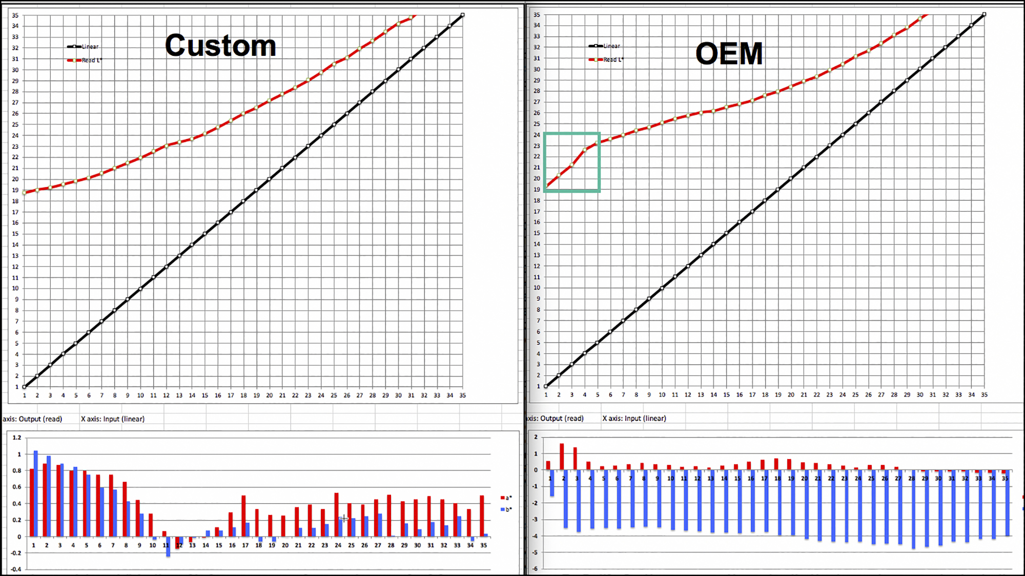
The results posted in Figure 18 are consistent with our visual observation of the differences between the Custom and OEM profiles in Figure 16.
Turning to rendition of highlights, upon close observation of highlight detail in the dress and undergarment that should show through very faintly, sharpl observers will see that the Custom profile reveals slightly more well-defined highlight detail. This observation is consistent with that made in the context of the Onsight target results (Figures 14 and 15). As well, here too the OEM profile shows a slight bluish bias in the dress and skin tones compared with the Custom profile.
Summary and Conclusions:
Canson BP2-Matt is a nice paper in the context of matte offerings. The surface texture facilitates a relatively glare-free view of the photo from any angle the photo would be viewed, and it lacks visible texture – an advantage to those who don’t want visible textured effects on their photos. OBA content is low. Maximum Black could be several levels deeper for my taste. The paper profiles well; however I do have a couple of concerns about the M3 profile: while it has an advantage for separating very deep shadow detail, it can also accomplish this in post-processing; the slight hue bias in the grayscale and absence of soft-proofing capability are not positive features of this profiling. I recommend that Canson provide the option of an M1-based profile, as some may be interested in trying both in their own printing environment to see which they prefer.
Annex Note on Printing and Measurement Consistency
I take this opportunity to emphasize that in some measure the character and consistency of the profile test results depend on the closed-loop consistency of the test conditions. For the Custom profiling and profile testing, I used the same printer and spectrophotometer for both printing and measuring the profiling target and printing and measuring the results of using that profile.
Colour management is meant to be a set of scientific processes and procedures, a hallmark of which is the repeatability of results, but it isn’t perfect and there appear to be limits when working between different devices. Legion Paper, the maker of the Canson profiles, did their own round of testing using my profile, the same paper, my test patch file (35 Neutral D) which they printed on their Epson SC-P5000 printer and used their i1Pro3 spectrophotometer for measuring results. I used a MYIRO-1 spectrophotometer for creating the profile and reading the profile evaluation test chart, but we saw above that the differences between measurements of the same target from the MYIRO-1 and the i1Pro3 range between small and very small.
All that said, their results for the same test as I did in Figure 4 test were not the same as mine, insofar as they obtained a less linear and less accurate plot of the red curve in the upper luminance chart, and less hue neutrality in the lower chart of a* and b* bars testing for hue neutrality (Figure A1).
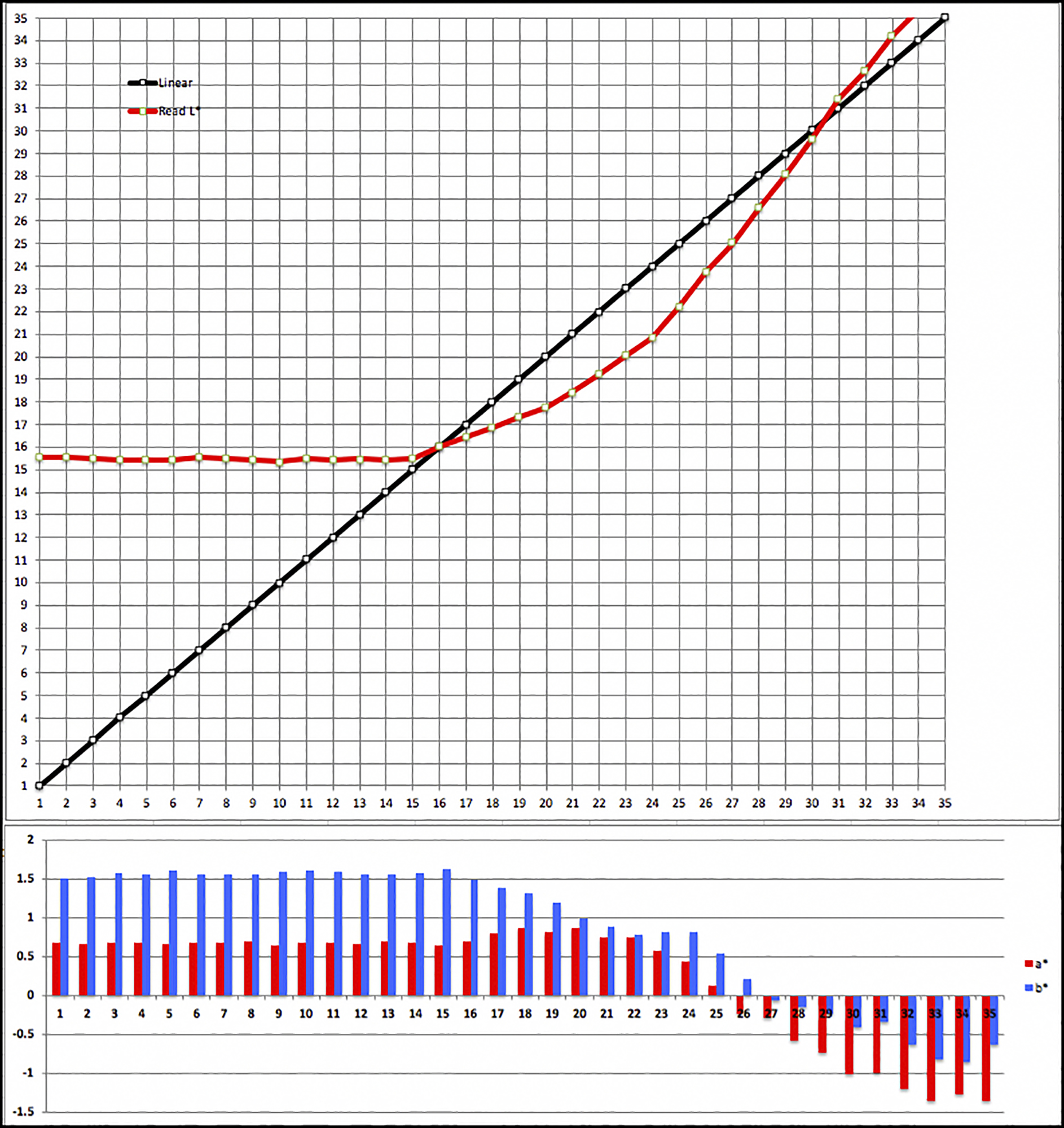
(compare with Figure 4, Mark’s reading of the target printed using the same profile)
Between my result in Figure 4 and this result in Figure A1, I am led to think that mine is the more correct one – not because it’s mine, but for two objective reasons: (i) the Black Point in the Figure 4 result is closer to the Black point of the M1 profile (Figure 3 cell C7), and (ii) beyond the Black Point, my results for the remainder of the scale to L*35 cohere much more closely with the target file reference values.
I don’t have an explanation for why the results differ as they do except to say the obvious – their devices and my devices perform a bit differently even with the same procedures and settings and colour management software doesn’t totally neutralize these differences. I don’t have the means to further analyze it, so I won’t speculate. My purpose in raising this is to emphasize that objective analysis is good for establishing the most critical basic understandings of how these materials perform in a tangible scientific manner, but in the final analysis it’s the prints that tell the ultimate, determinative story.
Mark D Segal
August 2021
Toronto, ON
Mark has been making photographs for the past seven decades and started adopting a digital workflow in 1999 first with scanning film, then going fully digital in 2004. He has worked with a considerable range of software, equipment, materials and techniques over the years, accumulated substantial experience as an author, educator and communicator in several fields, was a frequent contributor to the Luminous-Landscape website and now contributes frequently with in-depth articles on the PhotoPXL website. Mark has contributed over 75 articles to the two websites up to Q1-2024, with a particular emphasis on printers and papers, given his view that a photograph printed on paper remains the epitome of fine photography, as it has been from soon after the medium was invented and started gaining momentum in the 1830s/1840s. Mark developed a particular interest in film scanning and authored the ebook “Scanning Workflows with SilverFast 8, SilverFast HDR, Adobe Photoshop Lightroom and Adobe Photoshop” (please check our Store for availability). In his “other life” (the one that pays for the photography), Mark is a retiree from the World Bank Group and was a consultant in electric power development.