basICColor display 6 – Monitor Profiling Software
Introduction
Those familiar with the purposes and logic of an end-to-end color management set-up know that the capture device, the monitor and the printer should all be calibrated and profiled in order to assure expected and reliably repeatable colors in the final image format. As many readers may have known, basICColor, an important developer of color management solutions, receded into the ether for a while, but has now come back with important updates to three of its key color management applications. The two under the spotlight in this article are basICColor input 6 and basICColor display 6 (for short hereafter “input 6” and “display 6”; basICColor uses lower case “i” and lower case “d” as the first letter in the names of these applications). It has also upgraded “basICColor cockpit”, but further expected development of this application indicates we should wait a while before reviewing it.
Christopher Campbell* and I have been testing and reviewing these products over a long enough period of time that we have come to understand how they contribute to good color management, so we thought we should share these insights with the PhotoPXL community in this review article.
https://www.instagram.com/studiocampbell/
https://vimeo.com/studiocampbell
input 6 is designed for calibrating and profiling input devices (cameras and scanners), while display 6, as the name suggests, is for calibrating and profiling monitors. Christopher, an accomplished artist, has a particular interest in input 6 for assuring the most accurate capture of his paintings, both for his own documentation, and so that they can be shared with dealers and potential collectors. No one wants to fly from Shanghai to Pennsylvania for a studio visit only to discover that a work was misrepresented by a photograph that distorts its tonal scale or hue quality. Christopher has gone to great lengths in using input 6 to profile his cameras, and is obtaining stunningly good results, so he will be the principal author of the future input 6 review. In the past, I demonstrated the use of the previous version of input (input 5) for profiling scanners (https://luminous-landscape.com/the-dark-art-of-scanner-profiling/), so we intend to cover any update to this function as well.
Readers here know that much of my work on this website focuses on papers, printers and profiles (“PPP”) – and in particular how well they reproduce the image file values we create when editing the photos for printing. PPP is the technical infrastructure of image production which just works, as well or as bad as it does; my material in those reviews (un)covers that. But the photographer’s hands-on effort in fine printing is to prepare the image file under soft proof in photo editing applications. To do this with predictive reliability, it is important to use a well-calibrated and profiled monitor that shows colors quite accurately relative to how they will emerge from the printer or other media. The monitor or display is our only window into the photograph before it appears, say, on a piece of paper. basICColor display is the application under review here for calibrating and profiling the monitor.
basICColor display 6
First things first – either with or without the 14-day free trial, one needs to download and install the software, and get it licensed. For those accustomed to a one-stop-shop for nearly instantaneous downloading, licensing and installing software, the experience with basICColor will be different, but it works. To help readers with this procedure I have prepared guidance in Annex 1 to this review.
Once you are licensed (trial or permanent), the application will open, presenting you with the main GUI ( Figure 1).
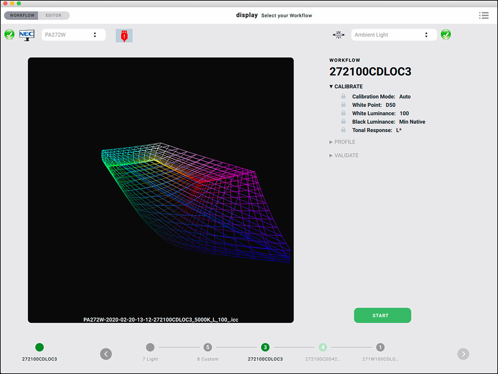
Apart from the fact that it makes accurate display profiles (see further below), one of the most compelling aspects of this software is that it offers an efficient and flexible architecture designed around the concept of “Workflows”. A fully configured Workflow consists of a selected set of profiling options and its associated profile, which I shall explore below.
Probably the easiest way to begin using this software is to adopt one of the basICColor predefined Workflows and create a profile for your monitor with the options embedded in that Workflow. The predefined Workflows are:
1 Softproof
2 Photo Studio
3 Outdoor
4 Video
5 Web Design
6 Manual Pre-Calibration
7 Light
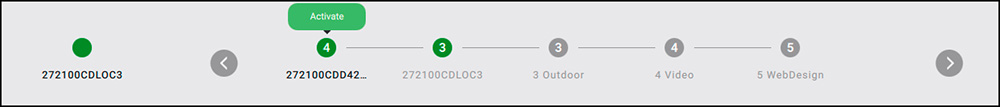
As you might infer from the names, each has a variety of options selected to work best for the purpose at hand, in basICColor’s (experienced) judgment. You select a Workflow by clicking on the appropriate Workflow icon at the bottom of the GUI (Figure 2). You can let the application build a custom display profile for each Workflow, and switch between them at will (for example between Photo Studio and Video) by clicking on the appropriate button, whereupon the correct profile with its unique set of Workflow parameters will be loaded (Figure 2).
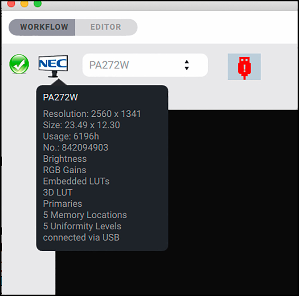
By the way, another neat GUI feature is that if you hover your cursor over the icon of the display, much information about the display’s characteristics is shown, as seen just below:
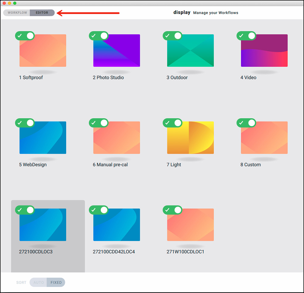
If you wish to start with a predefined Workflow but change one or more of its parameters, you can do that using the Workflow editor (Figure 3), which brings us to the other main operating approach with this software – creating your own custom Workflows and associated profiles. There is a large palette of optional settings that can be configured to suit a wide range of viewing environments and purposes. It isn’t within the scope of a review to explain the basis for each of these options in detail; rather, I shall outline what is offered, why selected options could be of interest, and to demonstrate how very flexibly this application can be configured to suit virtually any user requirements.
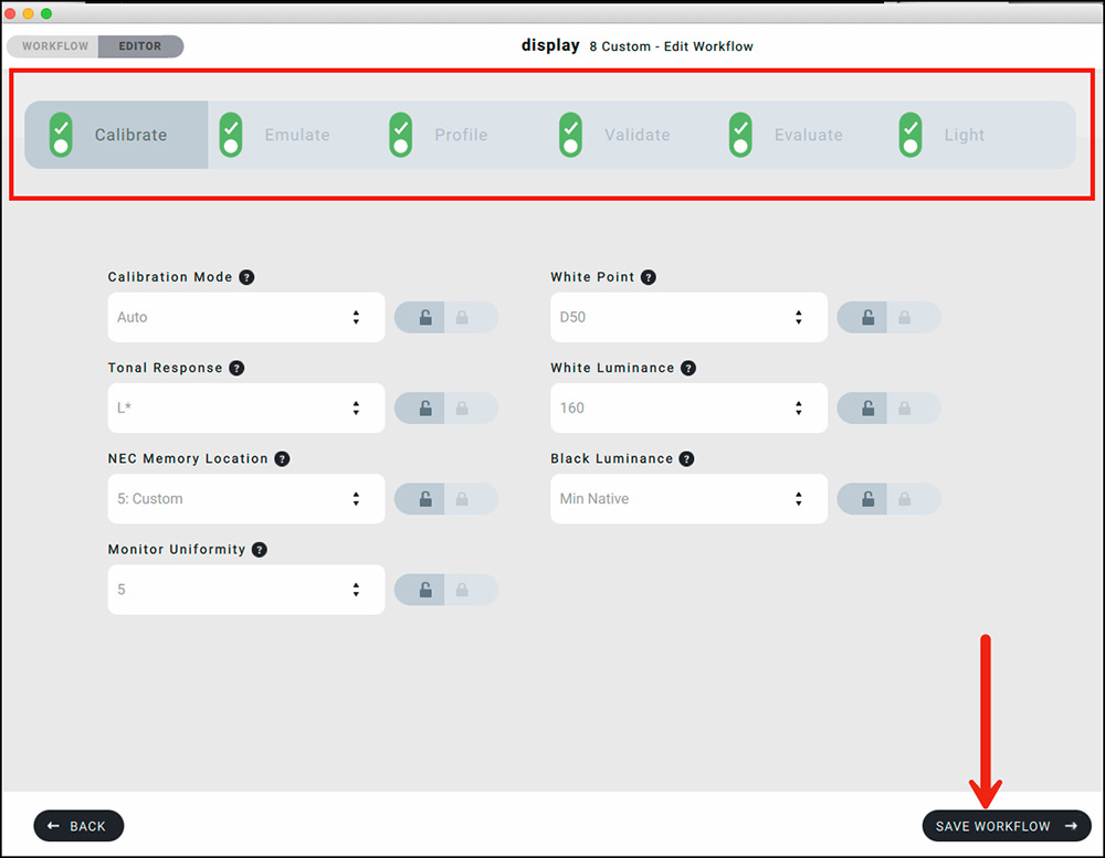
The application provides six main steps for building a Workflow, as listed in Figure 4: Calibrate, Emulate, Profile, Validate, Evaluate, and Light. Some of them contain a number of parameters, each with a choice of settings, which I’ll call options.
The following remarks apply either when you are amending one of basICColor’s predefined Workflows or building a custom Workflow from scratch.
It can make sense to start the process with #7 – “Light”. This process measures your ambient light and print-viewing light. It provides data about the character of your own lighting conditions (e.g. brightness, white point), which is all the more useful if you wish your display profile to take account of them. You can feed the information this process generates into the calibration settings for brightness and white point; or if you measure viewing light and leave the Light process switched on, the profiling function will pick up this information and reflect it in the profile. Your colorimeter must be able to measure incident light in order to use this process. The Light process may also be used to calibrate a viewing booth which provides for this capability through a USB connection to the computer.
Running the “Light” Workflow is optional in the sense that the application allows us to calibrate monitor Luminance and White Point with a number of commonly used pre-defined values, or to set our preferences without necessarily having measured them. Therefore, I have committed my more detailed explanation of the “Light” Workflow to Annex 2.
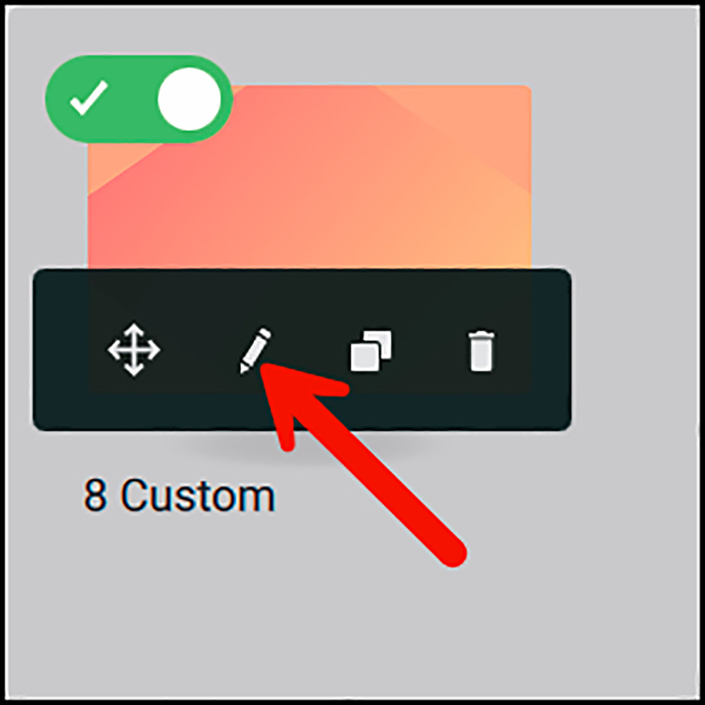
Once in the Workflow Editor, Workflow parameters are edited by hovering the cursor over the Workflow icon of the Workflow to be edited (Figure 5). A black bar emerges with a set of tools including a pencil. Click on the pencil and all the Workflow editing processes become available (Figure 6, the top row of green controls for selecting the process to be edited – in that Figure the Calibrate process (far left) is selected).
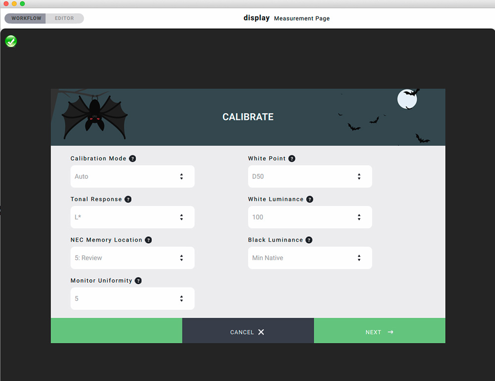
The Calibrate tab is the beginning of Workflow editing, where one sets the all-important calibration options (Figure 6). Let us recall color management basic here: “calibrate, then profile”. A profile is only valid for one set of calibration options because the profile describes the monitor’s color response according to those calibration settings. Change any of those settings, and you need a new profile based on the revised settings.
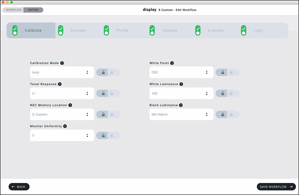
Several remarks on these options, going down them first the left column, then the right.
The Calibration Mode can be either Automatic or Manual. Automatic is designed for display models with which basICColor display 6 can communicate via DDC* for automatically making settings of those features in the monitor that can be used for calibration. At time of writing, display 6 supports DDC for a large number of NEC monitors and EIZO’s own communication protocol for their display models (many of which are listed in Annex 3), as well as a number of other models for which display 6 is not specifically tested, but nonetheless works in whole or in part. (*DDC = Display Data Channel, a protocol enabling communication between the graphics card and the display for making display parameter settings through the calibration software, rather than using the On-Screen Display (OSD) control panel of the monitor.)
For monitors that are not DDC-compliant or whose settings are not accessible using DDC through display 6, one uses the Manual option to see the results of tweaking the monitor’s OSD controls.
The Tonal Response options allow users to select from a range of tone curves* (Figure 7).
(*The tone curve influences the image’s apparent contrast on the monitor.)
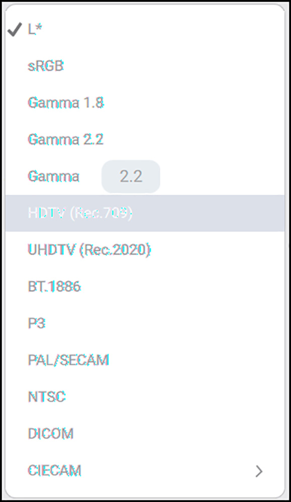
For general purpose photography and especially editing photos for print, L* is the generally recommended default, and the one I use. L* is the most “visually equidistant” tone curve, in the sense that equal percentage differences, say 10 percentage points, between 30% and 40% gray versus 60% and 70% gray should look the same. But as you can see from this list, there are a large number of options to select from depending on your taste and requirements.
-sRGB is the (old) internet standard, mainly gamma 2.2.
-Gamma 1.8 was the Mac standard a long time ago.
-HDTV (Rec.709) is the prior standard for Video and still used.
-UHDTV (Rec.2020) is a new video standard for high dynamic range and has a very large color gamut.
-BT.1886 is another video standard, in this context looking like Rec. 2020.
-P3 is most likely the new Internet standard. All current Apple displays and mobile devices have this color gamut, which is also used for digital video.
-NTSC was the US analog TV standard.
-PAL (Europe except France) and SECAM (France) were analog standards. There is no method for simulating analog TV these days, so NTSC, PAL and SECAM can be ignored.
-DICOM is the medical standard using the Just Noticeable Difference concept, with results similar to L*.
The “NEC Memory Location” options are only relevant for owners of NEC monitors that support a number of locations for storing the different groups of monitor settings constituting a Workflow. For example, my NEC PA272W model allows for storing five different groups of display settings associated to their respective Workflows, and I can switch between them effortlessly with display 6. Any one of them that you select automatically pulls in all the settings and the display profile associated with the said Workflow.
The “Monitor Uniformity” options allow users to select from 1 to 5 grades specifying the degrees of luminance evenness from edge to edge of the display. The higher the uniformity one selects, the lower the maximum brightness that the monitor can attain. However, I find that even at maximum uniformity (#5), I can still make the monitor far brighter than I would ever need it to be. Hence, I select setting #5, maximum uniformity.
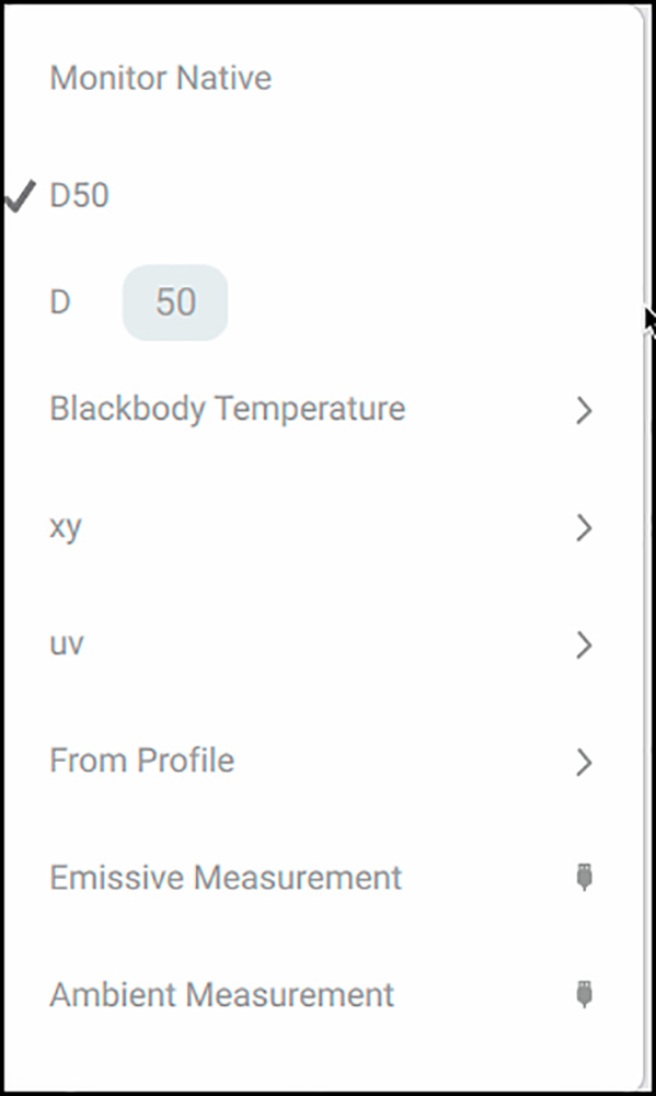
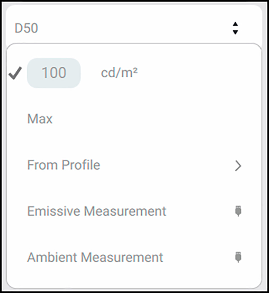
The “White Point” options allow you to specify just about any flavor of monitor white you could wish for (Figure 8).
-Monitor Native is a good setting for laptops, according to basICColor.
-D50 is a printing standard (see below for more discussion).
-Dxx allows the user to enter other values in steps of 100 (see below).
-Blackbody allows one to enter any Kelvin for color temperature (similar to Dxx).
-xy and uv are White Point chromaticities, useful for people who know them.
-From Profile: select a profile and use its measured White Point.
-Emissive Measurement: use the White Point of another measured monitor.
-Ambient Measurement: measure a viewing light and use its White Point.
D50 (5000K) is the most common graphic arts standard, and therefore the one I have adopted. I find that it works well relative to my print viewing lighting, even though, as shown in Annex 2, that print viewing lighting appears to be warmer than D50. A case for selecting a value below D50 might be related to the fact that most gallery and museum lighting is warmer than D50. A case for selecting a higher value might be based on the fact that daylight at noon is typically about 5300K (somewhere between 5000–5500K). Christopher, for example, finds that his print viewing light (natural light entering his studio from the North) is closer to 5600K, so he selects D56 when editing images for printing. He finds that this white point also works well as a general-purpose editing environment, since the standard white point of the web is D65. Additionally, the white point of the (relatively) new P3 color space, which is the color space of both Digital Cinema and all current Apple devices (iPhones, iPads, iMacs, etc.) is D65, so this is also a good choice for video editing.
Many people prefer D65 because it’s less yellowish. Much of this becomes elusive because our eyes and brains accommodate to different White Points rather quickly, such that “white is white” within a range of White Point settings. For the purposes of this review, the key point is that the application provides for a very broad range of choices in how you can specify the monitor White Point.
The “White Luminance” setting (Figure 9) will be better known to many users as monitor brightness. basICColor advises that “luminance” is a more accurate technical term than “brightness”, so I’ll abide by their recommendation, but just so you know what we’re talking about – it’s brightness. Here as well, the application allows us to select the level we want, and I’ll advise that for printing photographs, this is perhaps the single most important setting of the whole lot.
Why? Because the luminance at which you view the photo induces you to set the photo’s exposure in your editing application to make its luminance look “right”. But the printer doesn’t know anything about what you see on your display. It receives a bunch of numbers describing the tone and color in the photograph which you set in the editing phase, and its software converts them to printed dots in a set manner. The problem is that if you make your monitor too bright, you may be tempted into editing your photographs to be too dark in terms of the image file numbers that the printing systems use for the printed output. When setting display Luminance you should also keep in mind that light transmitted through a display usually looks brighter than the light you see reflected off the surface of the paper. Therefore, you need to select a luminance value that takes into account the amount of light that is reflected off your print. If you use a highly reflective gloss or luster paper this value could be higher than if you use a matte paper which is less reflective.
All that now explained, remember I noted above that my viewing light was about 100 cd/m2? I actually read that value from a blank sheet of Epson Legacy Baryta facing the viewing light. Therefore, by setting my monitor luminance at 100 cd/M2, I am roughly mimicking on the display the kind of luminance my preferred printing paper reflects, which helps to use soft-proofing on the display as a reliable prediction of what will come out of the printer. Also, recall that my ambient light is very low. If I were to work in a brighter environment, I would need to set the monitor luminance higher to offset the perceptual impact of the brighter ambient light. Recall that Christopher proofs large prints using natural North light streaming-in from floor to ceiling windows, so he edits using D56 and 160 cd/m2.
I prefer the dimmer settings for both because I find them easier on my eyes and – this is the critical point – they work well in respect to the coherence between the appearance of the photos soft-proofed on my display and printed on paper. So, the main point here is that Christopher and I work in different brightness and White appearance conditions, each calling for different display parameter settings. display 6 is capable of handling all of it – and much more.
Looking at the options listed in Figure 9:
– the first one allows one to specify the desired luminance in cd/m2;
– “Max” will use the monitor’s maximum brightness;
– “From profile” allows one to obtain luminance from a profile, another monitor or a viewing light;
– “Emissive” and “Ambient” measurement options allow one to use the results of measured light.
The “Black Luminance” setting (many would know it as the Black Point) lets you set the monitor Black from amongst a number of options (Figure 10).
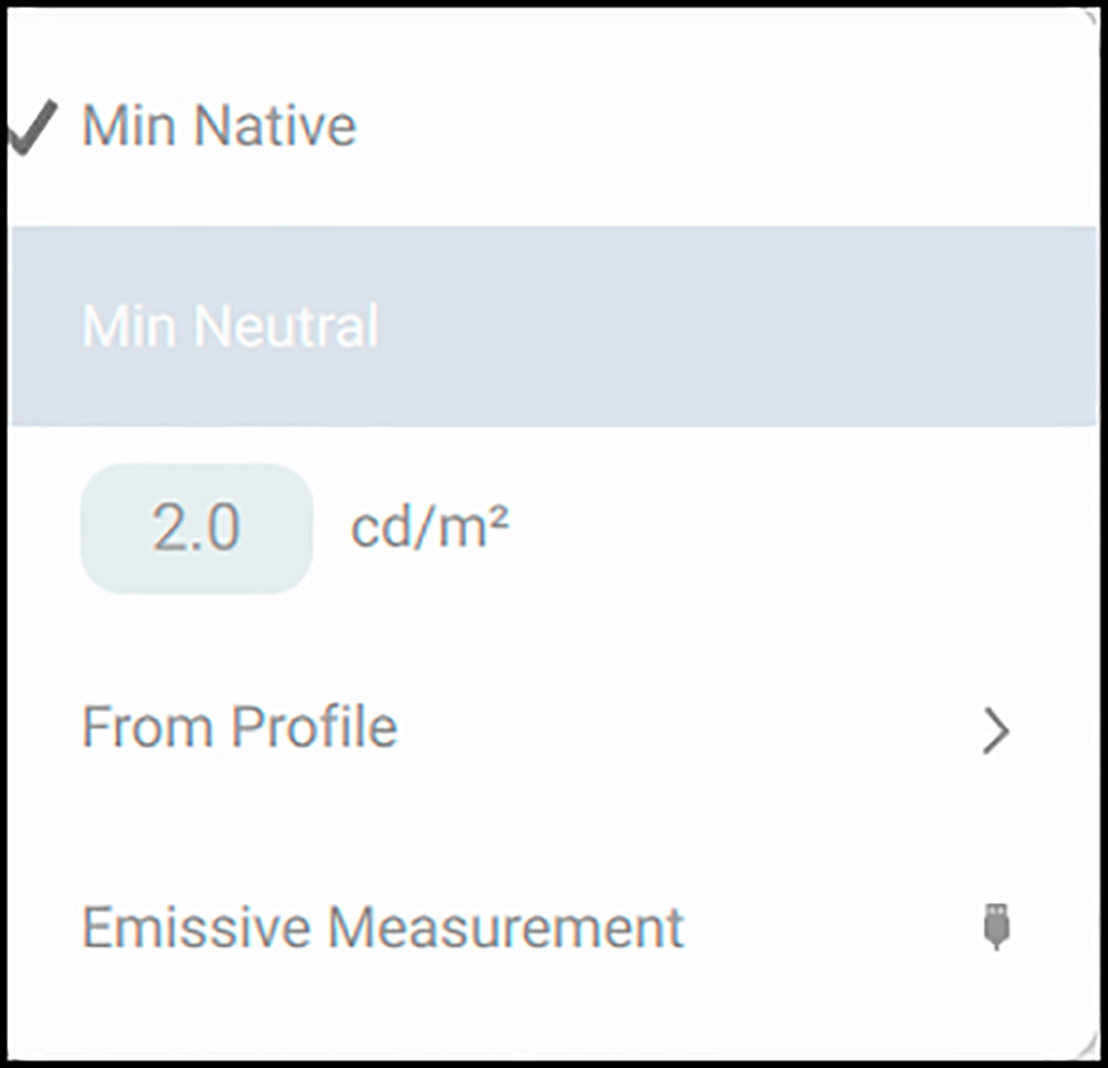
I prefer “Min Native” because that sets the Black Point at the blackest level the monitor can reach. This maximizes the amount of shadow detail I’ll be able to see on my display. But if for some reason you prefer other values, the options are there to be deployed as appropriate. All monitors display a slightly bluish-black on purpose to better show thin type, but this has no impact on image appearance. Minimum Neutral will calibrate to a more neutral Black than this bluish-black; however, it is not a preferred option because it makes no difference to the apparent neutrality of the image, but to achieve neutrality it must slightly increase red and green in order to equal blue, causing the Black point to be a bit lighter than Minimum Black, thereby reducing tonal range a bit. The options also allow the Black luminance to be selected from a profile, or as the result of an emissive measurement.
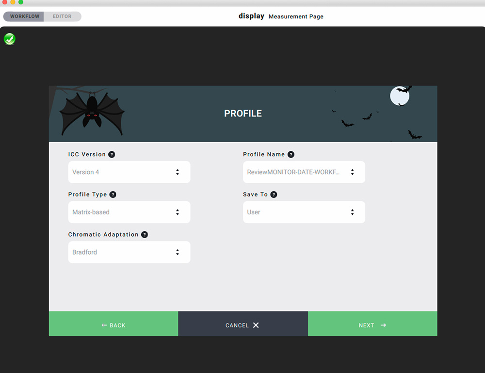
We’ve now set the Calibration options for this Workflow; the profile the application makes will incorporate these settings. Let’s bypass the Emulate tab for now and focus next on the Profile options (Figure 11).
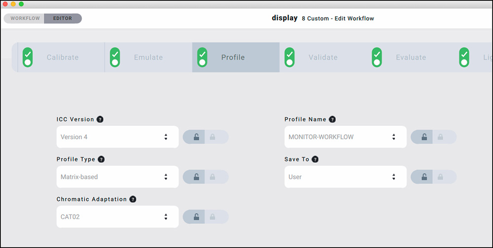
Two choices are offered for the ICC profile version: Version 4 or Version 2.1. These are versions approved by the International Color Consortium (ICC). The ICC publishes technical material on its website explaining its preference for using the Version 4 profiling framework (http://www.color.org/whyusev4.xalter). However, some users have had issues with V4 profiles in certain computing environments. Personally, I haven’t experienced such problems with Version 4 profiles for either display or printer, but then again, I haven’t used every variety of equipment and software that could possibly reveal them. Given the ICC’s preference, I would suggest opting for Version 4 unless you experience problems with it. The key point for this review is that the software gives us the choice.
Perhaps more arcane than the issue of the ICC Version, is whether the profile should be Matrix-based or LUT based. The distinction here turns around the mathematical approach for calculating color transformations in the profile, specifically, the number of color points used in the calculations. A Matrix profile uses fewer color points than a LUT (Look-Up Table) profile. The general recommendation is to use an LUT profile type when possible, because it may give more accurate results. However, it doesn’t work with MacOS from Sierra onward, therefore the option is greyed out. Happily, matrix profiles are fully satisfactory for monitors that perform to a high degree of linearity across the color space; that, combined with the very sophisticated mathematics underlying the matrix approach in display 6, allows a smaller number of points to suffice for accurate outcomes. In my case, I use a high-quality linear display (NEC PA272W) and MacOS High Sierra, hence a matrix profile is my only option. As we’ll see below, it works very well. The key point here is that display 6 gives you the option to use either approach as long as the OS supports them.
I turn to “Chromatic Adaptation” (Figure 12).
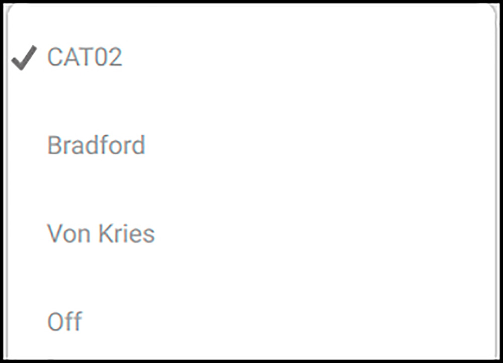
What’s this all about? Parker Plaisted posted a good explanation on Color-Image.com back in 2012: “The ICC had specified CIE D50 for the white point of the Profile Connection Space (PCS*). Therefore, all the color coding in the PCS had to have a white point of D50. That worked well for output profiles (e.g., printer profiles), but it created an extra step in the creation of display profiles (e.g., monitor profiles) and RGB color-space profiles when the native white point was not D50. That extra step was the application of a “chromatic adaptation transform.” (CAT) (*PCS: every colour-managed process needs two profiles, one for the input, the other for the output; the PCS is the interface which connects input and output profiles. It is the destination for input transforms and the source for output transforms.)
The CAT uses mathematical models to transform non-D50 data to D50. Each CAT uses a slightly different formula and display 6 gives us the choice of which formula to use. It should only be turned off when you purposely do not want transforms to D50 (say for the Internet where D65 is the applicable standard). The basICColor default is for CAT02, which is the most modern model, but display 6 allows one to select Bradford or Von Kries. For printing, I find D50 with CAT02 works well, so that is my setting for this parameter.
Profile Name: We do not get to create our own names with this application, but we can select the variables that go into the name and identify the profile, then the application creates the profile name accordingly (Figure 13).
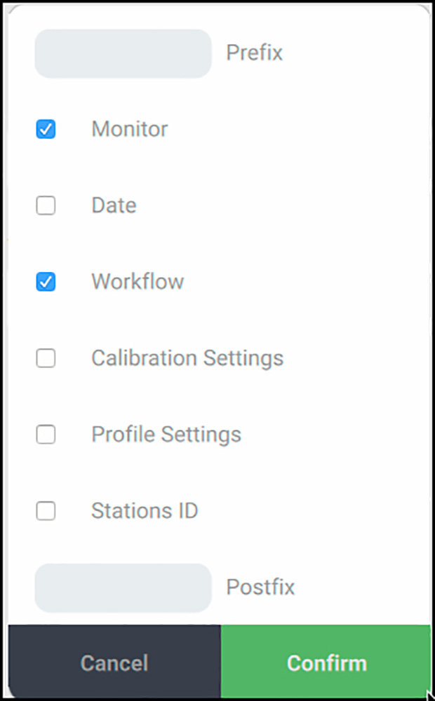
basICColor recommends trying to keep profile names shorter rather than longer because some operating systems may choke on long profile names. If you leave Prefix and Postfix empty and just tick the boxes for the information you want in the profile, the application composes the profile name from those checked boxes. If you need other information not provided by the check-box options, you may type it in the Prefix or Postfix.
Finally, the “Save to” window gives you the option of saving the profile to the User folder, or to select some other custom location. It’s usually best to select the “User” option, where there is a Profiles folder that every color-managed application searches to find the appropriate profile. Afterward, I also copy new profiles to the System level Profiles folder.
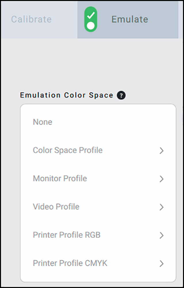
The Emulate Tab:
“Emulate” in this context means replicating a color space (e.g. sRGB, ProPhoto RGB) when using image editing applications that are not color-managed and require a native color space in a monitor. Christopher advises, for example, that until recently Adobe Premiere Pro wasn’t using color management, and even now it isn’t clear whether it is being implemented fully or correctly. In color managing for Video it is essential to reduce the colour gamut of a wide gamut display to the actual video space in which the video will be viewed, in most cases Rec.709, which has the same primaries as sRGB. There are categories of color spaces that can be emulated from which to select (Figure 14), and within each of the shown categories, there are (many) selectable options. If the Emulate process is left switched on for the Workflow being created or amended, the profiling will take account of it. Users of Photoshop, Lightroom, and other such color-managed applications need not concern themselves with it.
The Evaluate Tab (Figure 15):
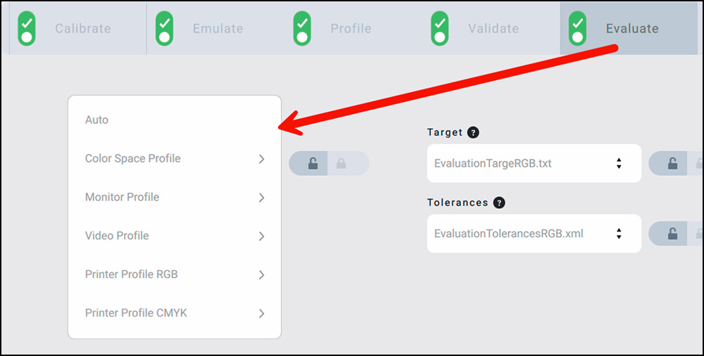
The purpose of this function is to evaluate whether the monitor is capable of displaying the full gamut of a selected color space. For example, if you were emulating a printing space such as GRACOL(*), you would want to know if your monitor is capable of soft proofing GRACOL. If it can’t, that would indicate you need a wider gamut monitor. If you soft proof on an inadequate monitor the monitor would be clipping colors in an unpredictable way – for example, a saturated teal could be clipped to a Cyan, which would be misleading. (*GRACOL: “General Requirements for Applications in Commercial Offset Lithography”.)
So, the process begins with the color space to be evaluated (upper left pull-down in the Evaluate Tab). You may select from a number of categories you may wish to evaluate (left side of Figure 15).
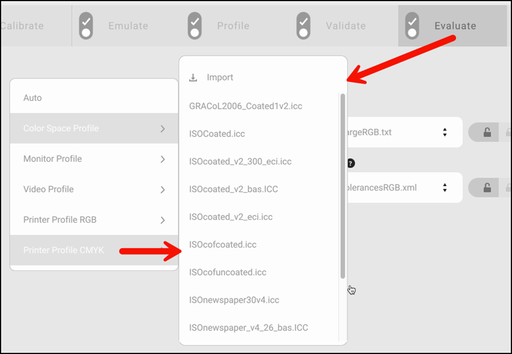
Within each of those categories, there are options to choose from, the options being the available types of profiles within each category (Figure 16); (e.g. for a CMYK printer profile, the list in Figure 16 is available, or you may import others). If you select “Auto”, display 6 will evaluate the color space option selected in “Emulate”. The Evaluate process is for information; it does not affect the profile.
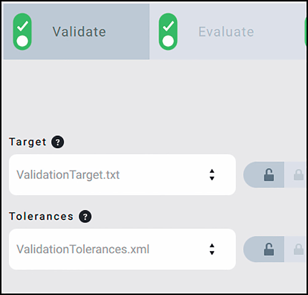
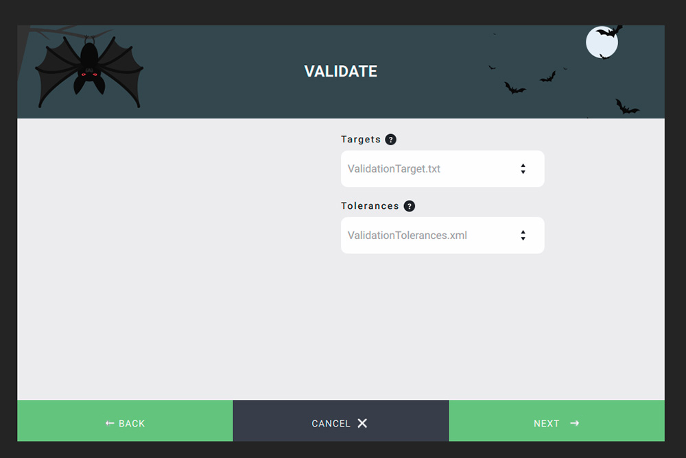
As one needs to use a target for performing the evaluation, display 6 provides a couple of targets or allows you to import various targets that users may require, such as the FOGRA(*) Media Wedge or others. Evaluation often requires that results be within certain tolerances. The user may specify the tolerance standard in the Tolerances window (*FOGRA: Forschungsgesellschaft für Druck und Reproduktionstechnik – Research Company for printing and reproduction technology, Germany.)
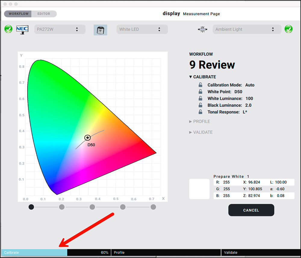
The Validate function checks the round-trip accuracy of the profile once it has been created. This is where the “rubber hits the road” and we see the quality of the profiling process, as we really do want to know how accurately the display reproduces colors on the display using a given profile, and especially how well it reproduces display luminance and white point, as these are critical factors for reliable soft-proofing in a color-managed chain from display to print. display 6 lets us select the Targets and Tolerances for running the validation (Figure 17). Further on I shall demonstrate a validation.
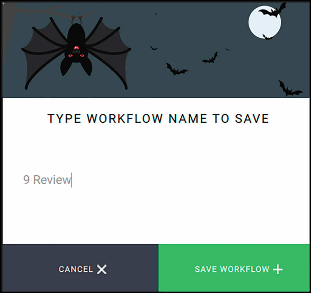
After selecting from the numerous processes and options that display 6 allows us in creating a Workflow, we save the Workflow (Figure 18, lower right of the interface).
When we click that button, we will get another dialog box asking us to name the Workflow (Figure 19). Just for demo purposes I used a nondescript name – “Review”, but in principle, it’s a good idea to give the Workflow a name that allows you to recognize the essential features of that Workflow. For example, if the Workflow pertains to creating a profile for an NEC display meant to edit Video using Rec.709 and 160 cd/m2 Luminance, you might wish to name it “NEC Rec709 L160”.
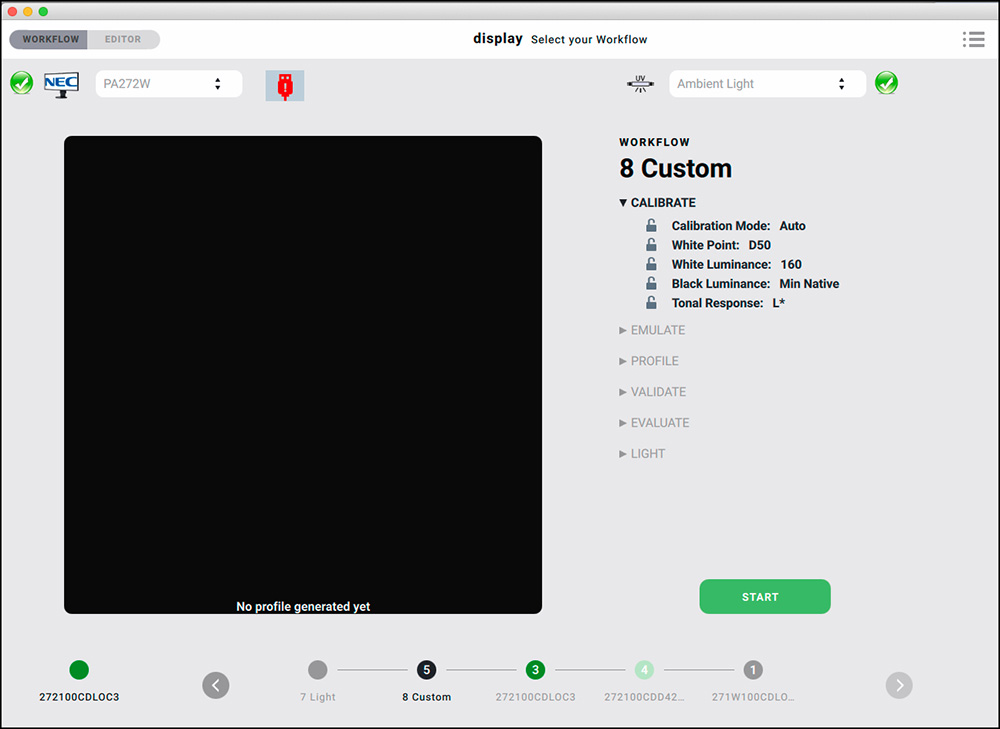
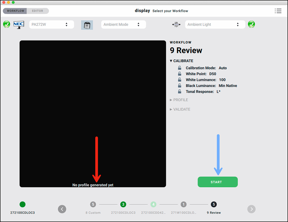
Reverting to Figure 18, you will notice the red box in which I enclosed all the process tabs. Not all of them need to be used for creating a profile. It depends on what the user wants included. So before saving the Workflow, those tabs can be clicked on or off as desired. That said, the three you should want to retain are Calibrate, Profile and Validate. After saving a customized Workflow with these three functions active, the resulting Workflow interface appears (Figure 20). However, you will notice a big black box with the notice in white at the bottom of it saying: “No profile generated yet” (see my red arrow). display 6 is simply reminding us to generate a profile from this Workflow.
As a matter of best practice, before beginning to make an actual display profile, you may want to prepare as follows:
- dim any bright lights that might interfere with the colorimeter;
- go to System Preferences > Energy Saver and set “Turn display off after” to 1 hr” (to ensure the display will not turn off during the process, which takes much less time than an hour);
- clean your display with a suitably gentle glass cleaner and a microfiber cloth;
- make sure that the USB cable from the monitor to the computer is connected if you have a display that is DDC compliant such as an NEC, or an Eizo, which has its own communication protocol that basICColor can access.
Plug your colorimeter into the computer and click “Start” (my blue arrow).
A window will appear allowing us to review and confirm all the calibration settings before we move on to measurement (Figure 21).
We are allowed to revise any of these settings at this stage if we so wish.
I’m not, so I click on “Next” (lower right), and a screen pops-up allowing me to review and amend the Profile settings (Figure 22). I’ll click “Next” with no amendments.
A final screen appears allowing me to review the Validation settings (Figure 23).
As I’m not changing any of those, I click “Next”, and then the profiling process begins (Figure 24).
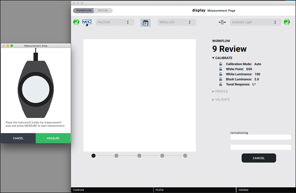
As the instructions under the image of the colorimeter say, place the device on top of its image and click “Measure”. display 6 then runs through the procedure of setting the Calibration values, building the profile, and then validating it (see Figure 25 showing the progress bar at the bottom of the interface, giving you real-time assurance that the process is working and where it has reached).
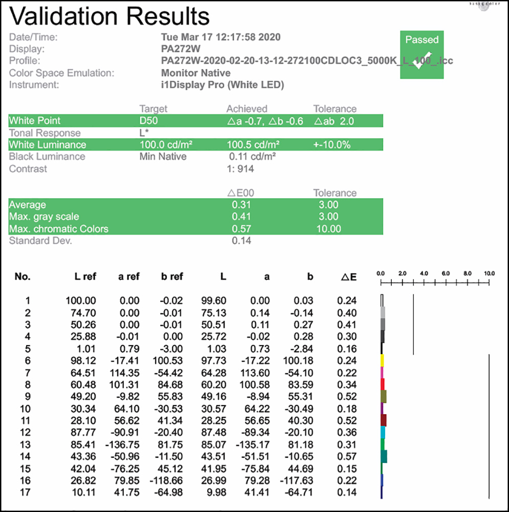
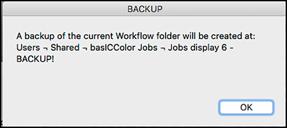
At the end of the profiling process, display 6 shows immediately whether the profile validation passed or failed and provides a wealth of information about the nature and quality of the profile. The wireframe (Figure 1) allows a user to see the display gamut as a three-dimensional volume so that for example, you can compare your display gamut to a standard gamut such as Adobe RGB (1998). If you click on the “Report” button you get an extremely detailed seven-page report of the validation. (By the way, this report is stored on your hard drive and accessible using the file path <Users ▸ Shared ▸ basICColor Jobs ▸ Jobs display 6 ▸ Reports>).
display 6 validates the profile by flashing a series of patches on the display which are processed through the profile. Differences between the file values of the patches and their measured values on the display are then recorded.
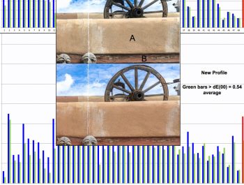
The “Validation” page (Figure 26) is probably the most useful summary, where you can see the degree to which display 6 was able to meet the calibration values set in the Workflow. This is the point at which we learn that some displays are better behaved than others. For example, with Christopher’s NEC PA272W, the maximum ∆E2000 value for the chromatic colors is 1.91, well below the “Tolerance” value of 10. Profiling his iMac Pro display, however, shows that the monitor is somewhat less even, with a max ∆E of 5.53 on an unruly dark red, though still well within the pass/fail tolerances.
My validation report for my NEC PA272W (Figure 26) shows impressive results. The overall dE(00) is 0.31, which is stellar. The maximum dE values are barely more than half a dE, which means they are insignificant. Most importantly, the White Luminance at 100.5 cd/m2 is just about bang-on accurate. For me, this is the most important variable in a “monitor to print” color-managed Workflow (because inappropriate monitor brightness is often the principal cause of printing errors), and in my case it is correct. You can see in Figure 26 the individual results for each of the 17 patches tested; the shorter the bars the better the results. It doesn’t get much better. The instrument I’m using with basICColor display 6 is an X-Rite i1Display Pro. Good software combined with good hardware can produce very fine outcomes.
With modern LED-based hardware, displays are much more stable than the prior generation of LCDs which used cold cathode fluorescent (CCFL) backlighting, therefore frequent re-validation is not really necessary. Still, it’s so easy to validate your monitor profile in display 6 that there’s no reason not to do it periodically. Just click the green “Checkmark” button at the upper left and display 6 runs your profile through the same set of patches used in the original validation in less than thirty seconds, so that you know immediately that you’re working with a consistent set of values.
One of the convenient usability features of display 6 is that if you have created a number of different Workflows and associated profiles to provide the particular display conditions best suited for different tasks, you can very quickly switch between them by simply clicking on the required Workflow in the main interface as shown in Figures 1 and 2. NEC provides 5 memory locations for storing these Workflows, and on Eizo monitors the downloading of the hardware settings is so fast that it is equivalent to an unlimited number of memory locations.
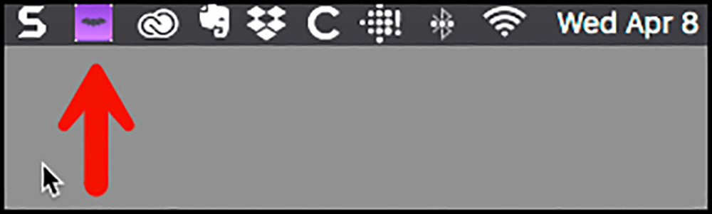
After you quit the application, you can access the basICColor display 6 Control Panel, represented by a purple square on your display menu bar (Figure 27).
Once in the Control Panel, two tasks can be performed. One is to switch profiles (Figure 28). This can be very handy, for example, if you are editing both still photos in one application and video in another. As I discussed above, there may be a large difference between the color spaces applicable for, say, video versus still photos printed on a gloss or luster paper. In these conditions, we want the display to show colors that cohere accurately with the color characteristics of the selected medium. Being able to repurpose the display just about instantly with a mouse click is a very neat feature of this software.
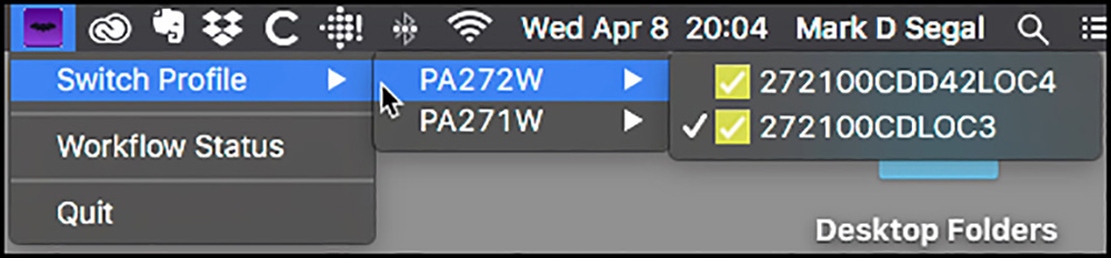
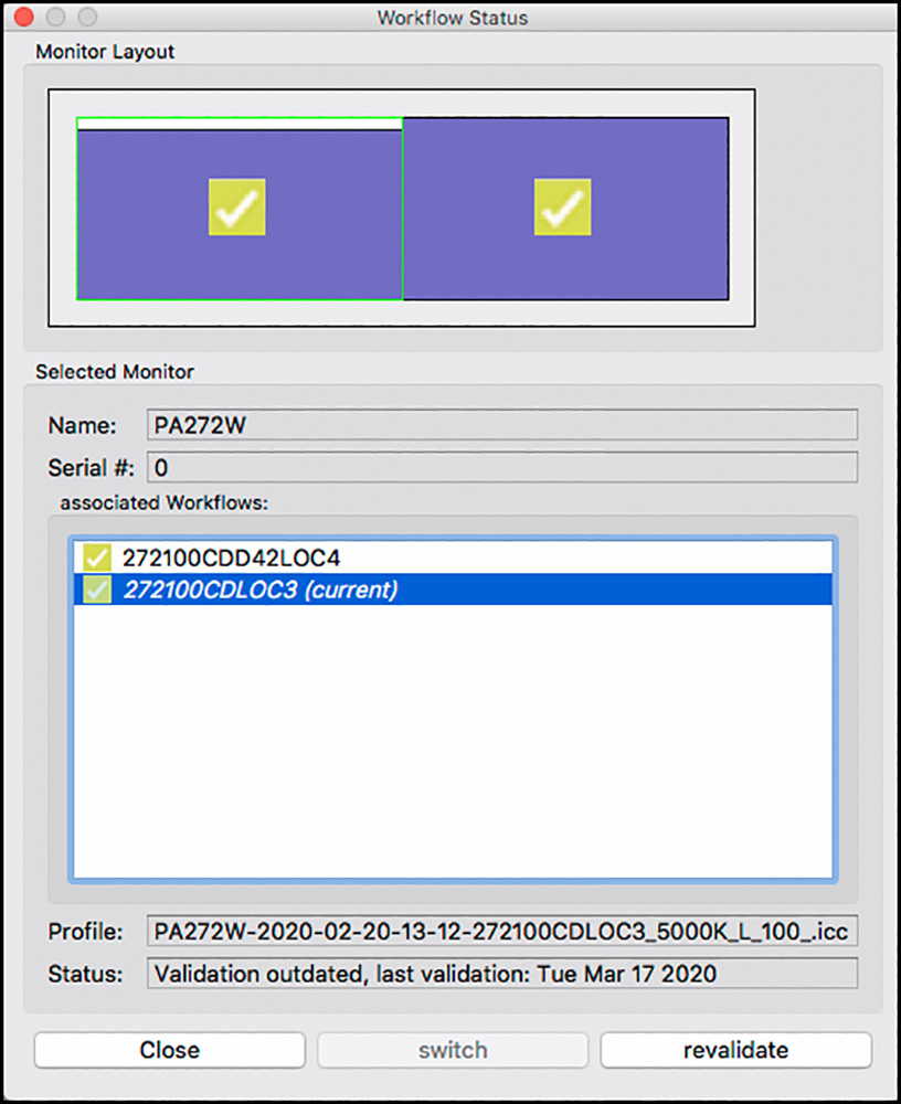
The other purpose of the Control Panel is to show Workflow status, i.e. which is the active Workflow for which display (if you have more than one), and an option to revalidate the profile for the active Workflow (Figure 29) without having to first open the application.
Concluding Remarks
basICColor display 6 is an extraordinarily versatile application for characterizing and profiling computer displays to a very high degree of accuracy. The manual (to be augmented from the existing Quick Start Guide) in conjunction with the application gives the user a good grounding in how to optimize his/her display profiling requirements for the task at hand. The application is user-friendly and convenient, especially considering the flexibility with which it can be configured to meet the highly varied requirements of different users and the sophistication of the feedback it provides in emulation, evaluation and validation. It should be used with a good quality colorimeter specifically designed for display profiling, and finally – it’s an excellent value at 69 Euro.
Thank-you to Franz Herbert (http://chameleo.eu/about-me/) and Christopher Campbell for their substantive inputs to this article. I, of course, am responsible for how I used their advice.
Franz Herbert, with decades of experience developing color management software, is the principal developer of display 6.
As we will be seeing more of Christopher on PhotoPXL, here is his biographical sketch.
Christopher Campbell, State College, PA
Christopher Campbell received his B.A. at Yale University in 1979 and studied with Ansel Adams in Yosemite in 1981. He pursued documentary work in photography and film before his graduate work in art history at Brown University. Living in Paris in 1990 on a Fulbright grant, Campbell met the painter Joan Mitchell and the encounter was transformative. Campbell shifted his focus from art history to painting, and moved to Vétheuil, France, where he lived and worked with Mitchell for extended periods, beginning the studio practice that is now drawing international attention. He has taught art history, as well as painting and photography, at the College of the Holy Cross, the University of Michigan, and the Pennsylvania State University. Campbell is often in demand as a consultant and a lecturer on color, and his paintings are increasingly sought after on the Asian art market. His work has been exhibited in China, Ireland, Spain, and the U.S. After many years of medium and large format experience, Campbell began working with digital cameras in 2000, when he also began working with early color management software for profiling scanners and printers. Always interested in advancing the state of the art in documenting works of art, he is currently refining equipment and technique for digitizing film via instant capture with a Phase One IQ3 100MP Trichromatic digital back. Campbell is represented by Nataliya Pissarro Fine Art LLC, New York, and Classic Gallery, Shanghai. He lives and works in central Pennsylvania with his spouse, Nancy Locke, a professor of art history at the Pennsylvania State University.
Annex I – Download, Install, License
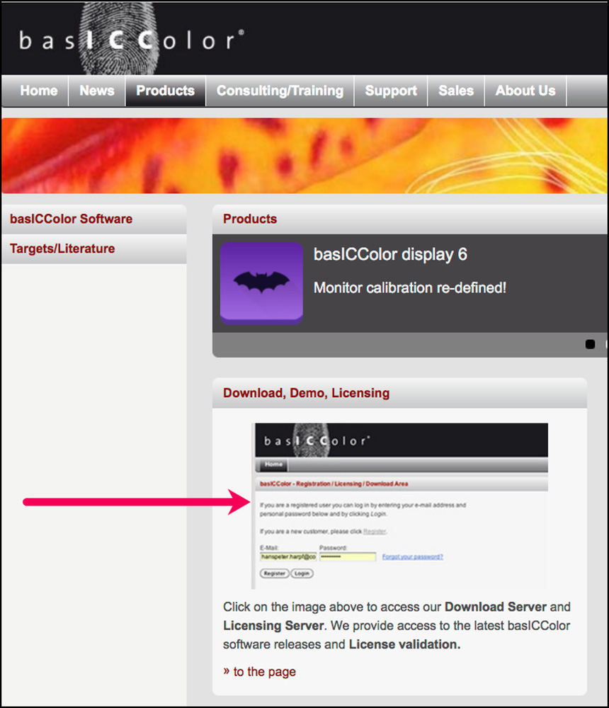
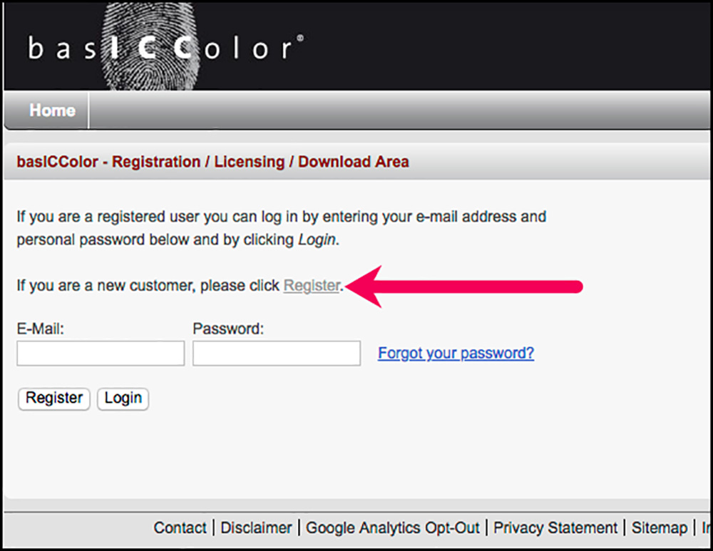
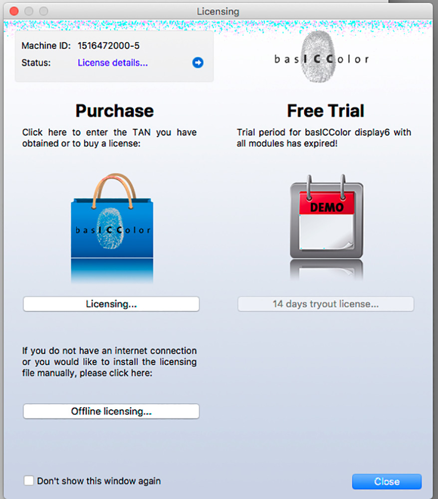
Whether or not you start with the 14-day free trial, which does not require licensing, if you decide to buy a permanent license, there are some preliminaries. You need to register an account with basICColor. Easiest is to register an account from their website. You access it by following step (1) below, then when the Product page appears to click as shown in Figure A1-1 just below; a registration window will appear. Register by clicking the faint gray word “Register” as shown in Figure A1-2. The registration page will then open. Fill it completely and submit it. You will then have an account. You can download the software as described and illustrated below any time.
Then, to buy the software, contact [email protected] and order it. They will send an order acknowledgment with the price and payment information. The cheapest transaction cost is to pay them through Paypal. When they receive the money, they send you a Delivery Note with a TAN, which is akin to a license (see Step 9 below for explanation of TAN and license). You will use the TAN to unlock and license your copy of the software. I recommend you do all this before you proceed with Steps 1 to 8 below unless you have already installed the software (steps 1 to 8 below) based on a 14-day free trial. By the time you get to Step 9 or you want to convert a free trial to a permanent license, you will need to have the TAN. (You do not need to buy directly from basICColor – you can also buy from their appointed resellers, information on their website.)
The procedure (illustrated for Mac, but probably close to the same for Windows) is as follows:
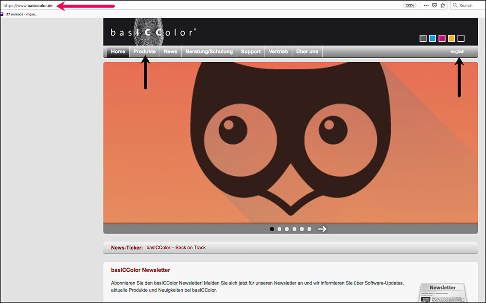
1. Go to their website (www.basICColor.de) which opens in German, and click where it says “English” if you prefer that; then click on “Products” (Figure A1-3).
2. When the Product page comes up, the preferred route to the display application is to click on the purple bat (Figure A1-4).
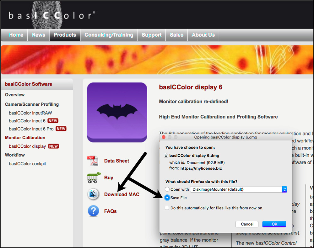
3. You will then be presented with the bespoke page for the display 6 application, which has already detected your operating system (in my case Mac). Select and click on Download and Save File (Figure A1-5).
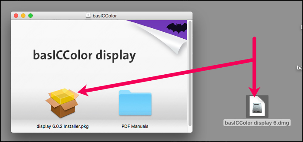
4. Open the “dmg” icon and then the installer package (Figure A1-6).
5. Note the warning sign that pops up near the beginning of the install procedure (Figure A1-7), if you are on MacOS.
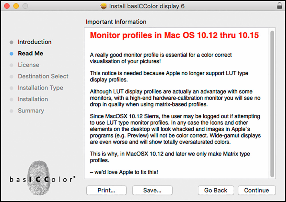
The message is telling us that if we have macOS Sierra (10.12) or above installed, in the interest of assuring that we generally see colors correctly the application will only produce matrix type profiles, not LUT-based profiles (which have many more color coordinates). display 6 computes the best fitting matrix that yields the lowest dE. The better the monitor the more accurate the profile and the smaller the dE.
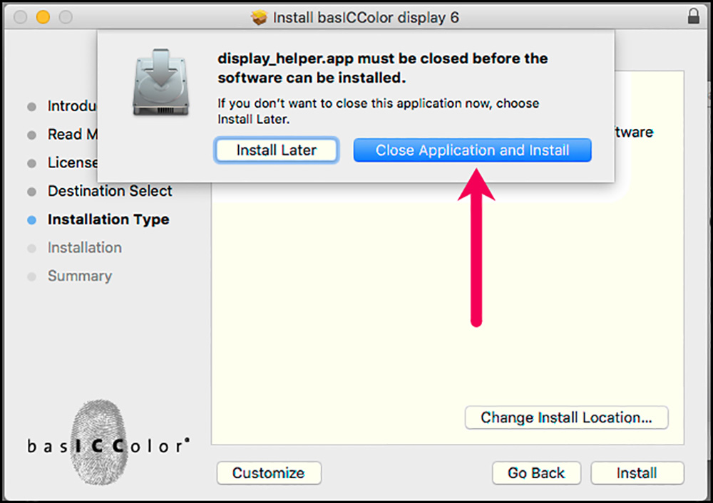
6. The process will ask you to accept the license and then ask you to close the display helper (Figure A1-8).
7. If you previously had Workflows in another version of basICColor display, you will get a notice like the one in Figure A1-9. Just click OK. When the application itself opens for work, it will have found your previous default profile/Workflow and activate it.
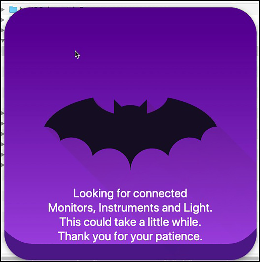
8. The application launches and looks for your monitors and relevant profiling devices (Figure A1-10).
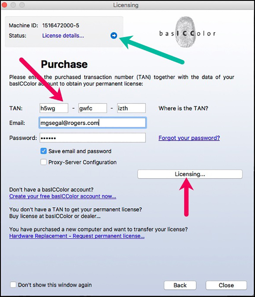
9. If you are not already a licensed user, you will be presented with the TAN and licensing window. The TAN pins the use of the application to one computer, and the licensing file licenses the application. The licensing file is embedded within the application package and gets activated with the TAN; you don’t need to bother with the licensing file unless you change your computer hardware. Enter your TAN and click on “licensing” (Figures A1-11 and A1-12).
(If you change your hardware, you can request a new license from within the application (Hardware replacement). The new license file will be sent via email and needs to be installed off-line.)
10. Verify the status of the license by clicking on “License details” in the upper left corner box of Figure 10 licensing window (see green arrow).
11. If all is well, you will get a success notice having done so (Figure A1-13).
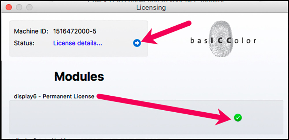
If you got a green checkmark (Figure A1-13, bottom right), you are good to go.
Annex 2 – The “Light” Workflow
The purposes of the Light Workflow are (1) to know the values of the ambient light and media viewing light you are working with, and (2) there are several viewing booths that can be controlled via USB; with some you can only change the brightness, with others you can change luminance and color temperature. display 6 can calibrate these.
To operate this process you need a colorimeter equipped to measure incident light (for example an i1Display Pro). Go to the “Light” process in Edit Mode, hover your cursor over its icon and click on the pencil. The editing options will open (Figure A2-1).
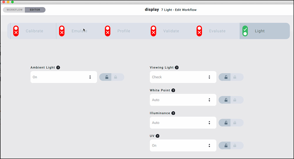
To measure Ambient Light and Viewing Light, these settings are left at their default “On” and “Check” positions respectively. The options for both functions are “Off” (intention not to measure it) and for Viewing Light alone, “Calibrate”. There are several viewing booths that can be controlled via USB; some allow for changing only the brightness, while for others luminance and color temperature may be adjusted. display 6 can calibrate these.
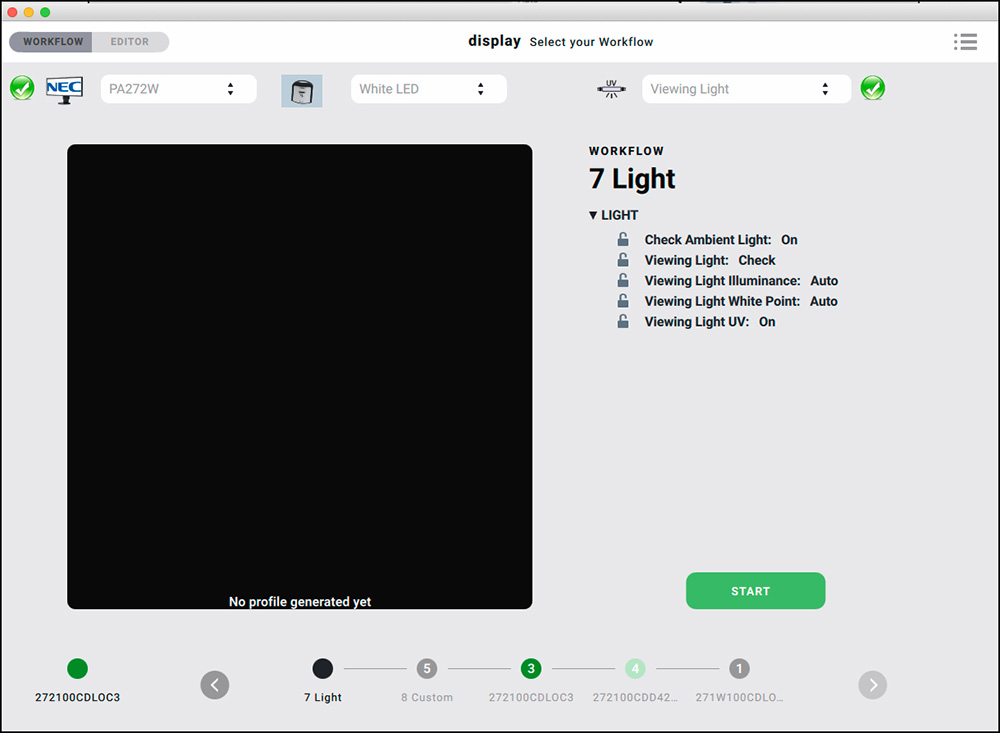
Having selected the desired options, you return to the Workflow by clicking on the upper left Workflow tab, and you will get the screen shown in Figure A2-2.
On the right, the interface shows the options just selected in the Editor. Clicking on the green “Start” button triggers the start of measurements (make sure your colorimeter is plugged into the computer). For this article, I just performed both measurements and obtained the results shown in Figures A2-3 and A2-4. My ambient light is dim, at 10.9 cd/m2, and the color temperature warm at 3094K (which is correct – I have two FEIT energy-saving bulbs about 10 feet away that roughly simulate 60 Watt incandescent). My viewing light comes in brighter and cooler at 101 cd/m2 and 3840K color temperature. The latter is a surprise as the bulbs are 4700K Solux Daylight, but perhaps other influences in the room affected the reading. This latter reading, by the way, can “Fail”. This would happen if luminance is over 64 lux, or if the color temperature when checking the viewing light is more than 500 Kelvin off.
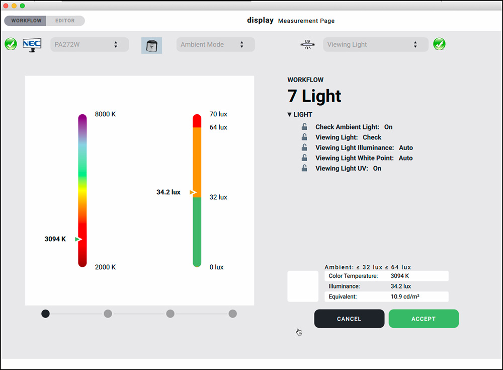
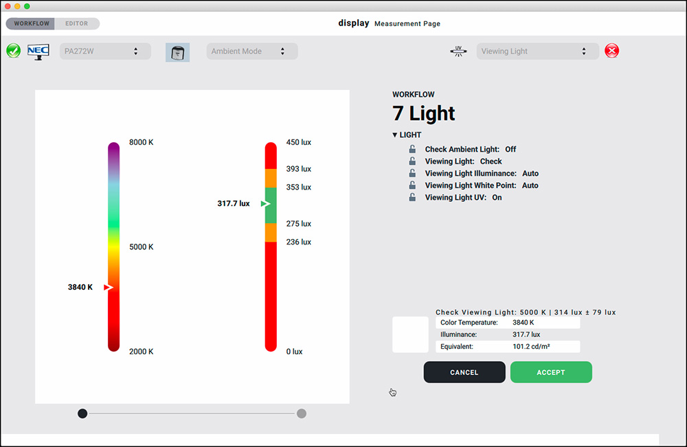
As I mentioned above, these results can be used in profiling if desired.
Annex 3 – Compliant Monitors (DDC or other Protocols display 6 Can Use)
Eizo:
CG210, CG211, CG220, CG221, CG241W, CG301W, CG222W, CG232W, CG242W, CG243W, CG223W, CG245W, CG303W, CG275W, CG246, CG276, CG277, CG247, CG247X, CG248, CG318, CG2420, CG2730, CG279X, CG3145, CG319X, CG3146
CE210W, CE240W
CX240, CX270, CX271, CX241
CS230, CS240, CS270, CS2420, CS2730, CS2731, CS2740
NEC:
PA241,PA271,PA231,PA301
PA242W,PA272W,PA302W,PA242W
PA322UHD,PA322UHD2,PA243W
EA244UHD,EA304WMi,EA275WMi,EA275UHD,EA305WMi,EX241UN,EA245WMi,EX341R,EA295WMi,EA271F,EA245WMi2,EA271Q,EA271U, EA241WU, EA231WU
X841UHD,X981UHD,X651UHD,X841UHD2,X981UHD2,X651UHD2,X551UHD
P404,P484,P554,V404,V484,V554,V404-T,V484-T,V554-T, V554Q
P654Q,V654Q,C651Q,P754Q,V754Q,C751Q,V864Q,C861Q,V984Q,C981Q
PA271Q, PA311D
UN462VA, UN552, UN552S, UN552VS, UN492S, UN492SVS, UN552A, UX552S
(The NEC list may be expanded in the near future.)
Display 6 also supports generic DDC, but given the proliferation of monitors on the market it isn’t feasible to test all of them, therefore the company cannot vouch for which of them actually work with DDC in whole, in part or at all.
Mark Segal
May 2020
Toronto, ON
Mark has been making photographs for the past seven decades and started adopting a digital workflow in 1999 first with scanning film, then going fully digital in 2004. He has worked with a considerable range of software, equipment, materials and techniques over the years, accumulated substantial experience as an author, educator and communicator in several fields, was a frequent contributor to the Luminous-Landscape website and now contributes frequently with in-depth articles on the PhotoPXL website. Mark has contributed over 75 articles to the two websites up to Q1-2024, with a particular emphasis on printers and papers, given his view that a photograph printed on paper remains the epitome of fine photography, as it has been from soon after the medium was invented and started gaining momentum in the 1830s/1840s. Mark developed a particular interest in film scanning and authored the ebook “Scanning Workflows with SilverFast 8, SilverFast HDR, Adobe Photoshop Lightroom and Adobe Photoshop” (please check our Store for availability). In his “other life” (the one that pays for the photography), Mark is a retiree from the World Bank Group and was a consultant in electric power development.