Soft Proofing, The Secret To Making Great Prints – PXL Print Series
By Jeff Schewe with Kevin Raber
With Video Below
What is soft proofing, and why should you care? Soft proofing in Lightroom or Photoshop (or a few other applications) uses color management to predict how the colors in your image will reproduce based upon the ICC profile of the printer and paper combination. Soft proofing shows you what kind of impact will occur in the gamut reduction (gamut is how much of the range of color the printer can reproduce) and the impact on the dynamic range of the image. This allows you to control how your images will print when ink hits the paper.
Is soft proofing perfect? Nope, but it’s far better than guessing and hoping when you hit the print button. Truly reliable and predictable soft proofing depends on some important factors; your computer display, your printer profile, your viewing environment, your ability to optimize or “perfect” your image for output in your imaging software.
The Video (20:08)
This video is an introduction to these factors.
The Details . . . .
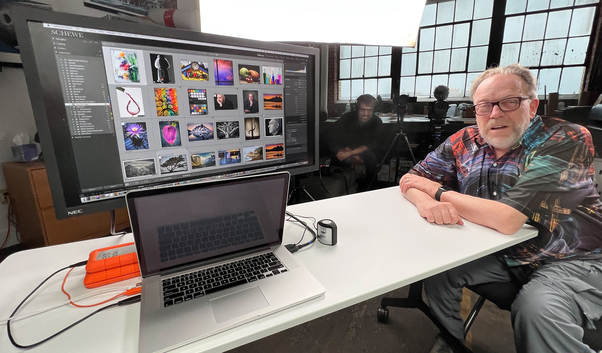
I traveled down to Indianapolis, IN to produce the video in Kevin Raber’s nicely appointed studio in The Stutz Building (the former auto assembly building in downtown Indy). I even brought my high-end state-of-the-art color-critical computer display, a Sharp/NEC 31″ MultiSync PA311D-BK , (B&H Link) with the SpectraView II software and the spectral-matched NEC SpectraSensor Pro Color Calibration Sensor.
Here’s what our shoot set looked like from my point of view…
Yes, it’s expensive…but if you are a content creator vs. a content consumer, you should understand that professional tools cost more than consumer tools. The Sharp/NEC displays are not the only high-end color-critical displays on the market…but it’s the display I’ve chosen.
Note: for full disclosure, I am one of the Sharp/NEC “Color Visionaries so I have a relationship with the company. Actually, mostly with a good friend William Hollingsworth who is a friend and color geek who first turned me on to NEC displays. (https://www.sharpnecdisplays.us/colorcritical/home/testimonials)
Here’s what my studio’s digital imaging area looks like.
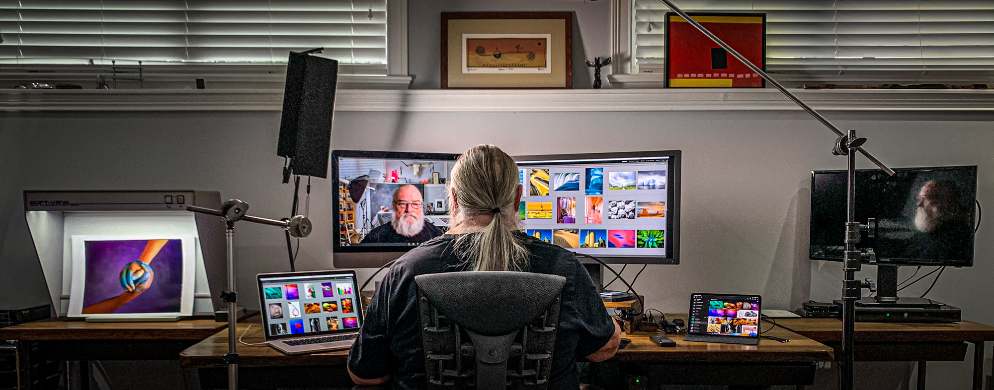
On the left is my digitally dimmed GTI SOFV-1 (discontinued but replaced by the SOFV-1xi model), The main display on my left is an iMac Pro and on the right is the PA311D-BK. My laptop and iPad are on the table and on the far right is a smart tv.
The video will show how to do a basic soft proof setup in Lightroom. Soft proofing in Photoshop is also possible, but we don’t cover Photoshop or other apps here. However, the principles are the same.
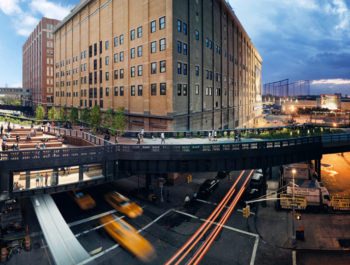
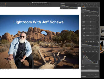
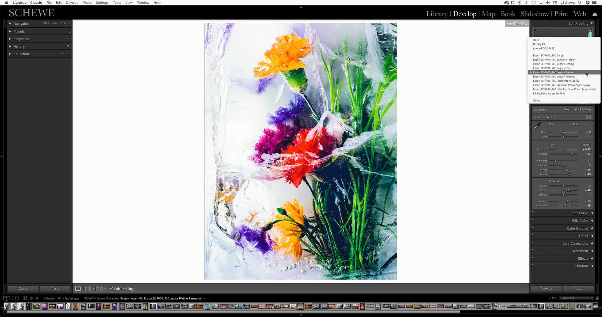
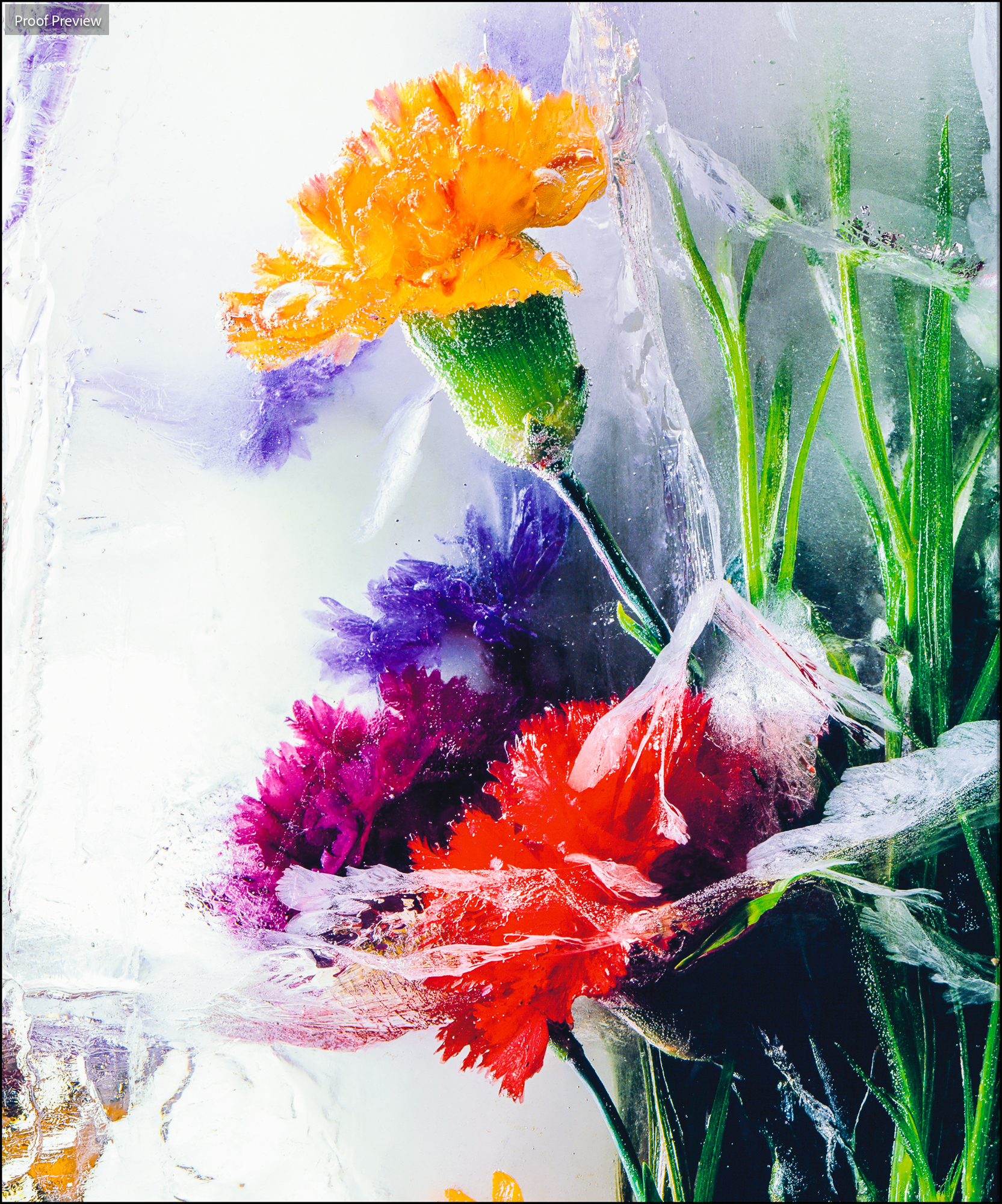
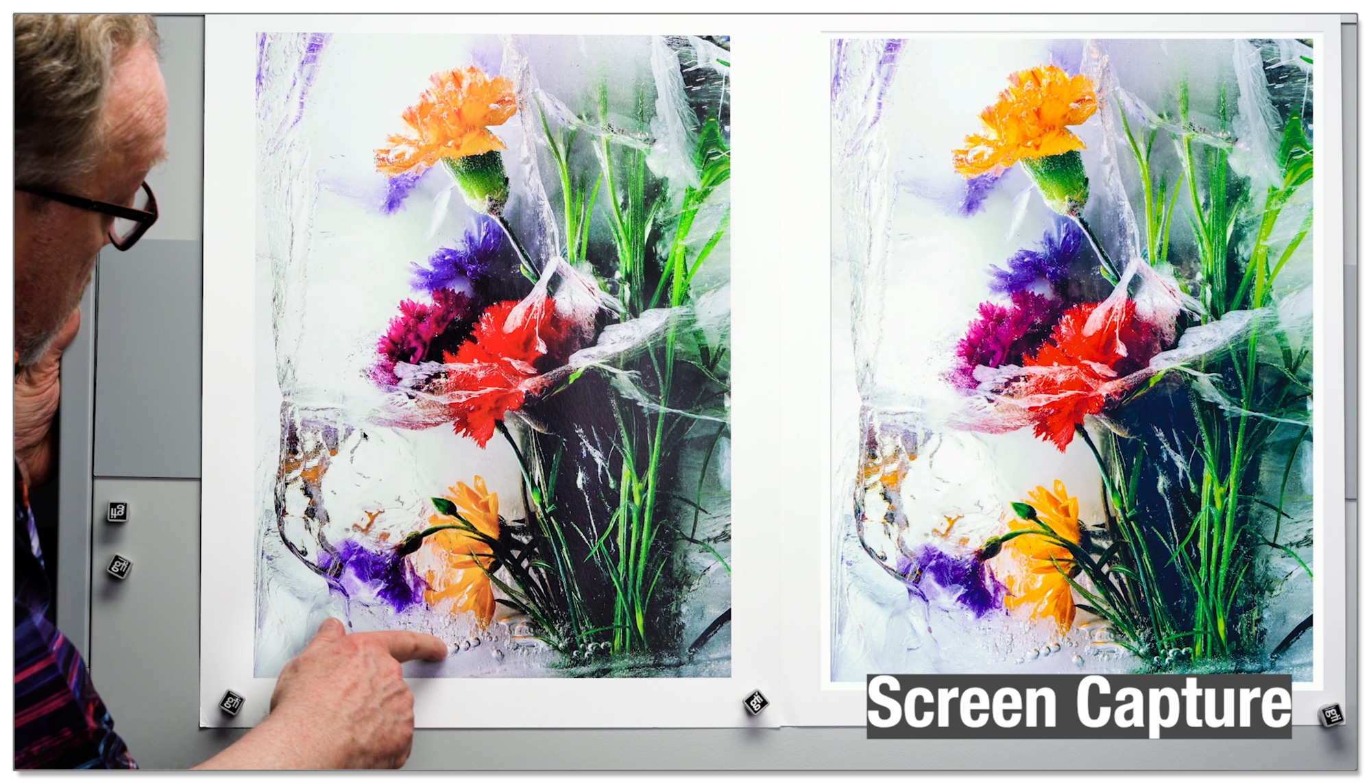
Here are screenshots of the first example in soft proofing of my frozen flowers image (which Kevin seems to really like-he even put his hands all over it when it was on the viewing booth).
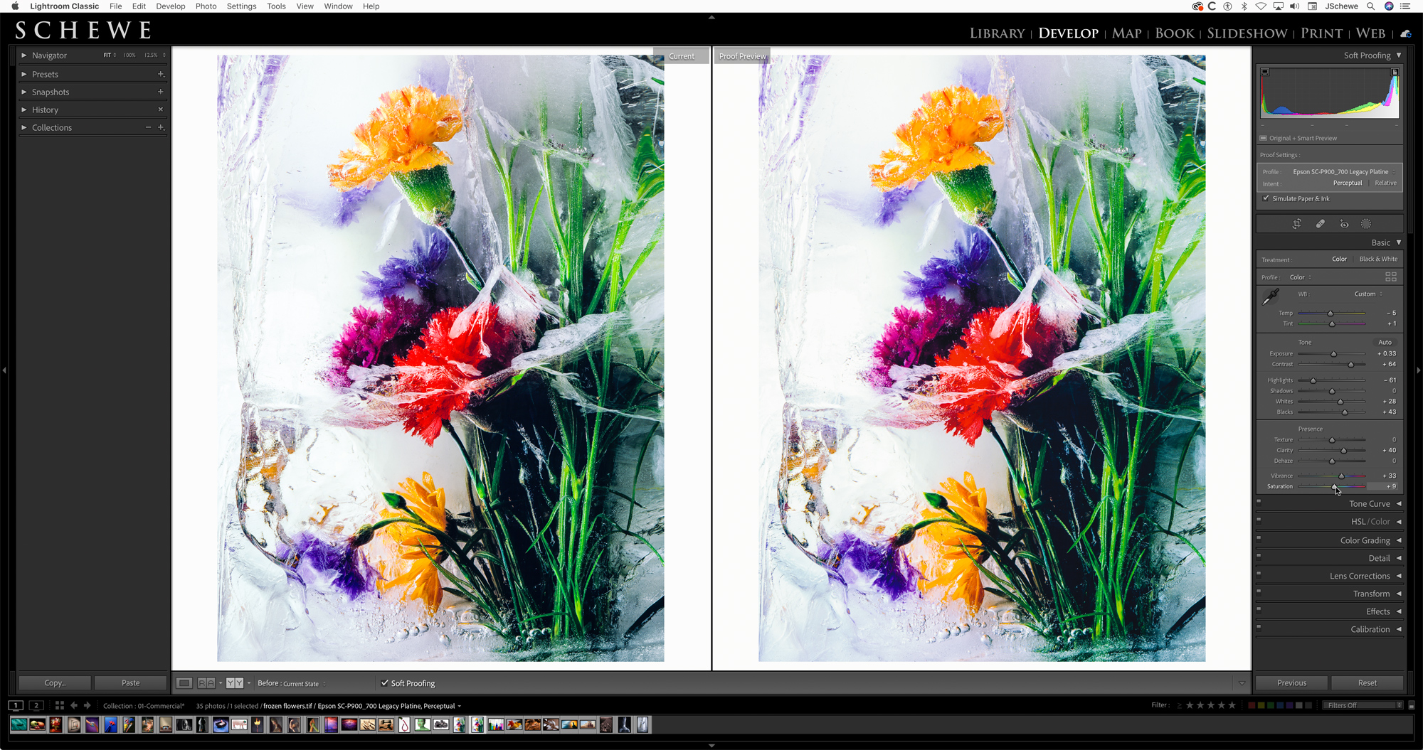
After the preliminary set up, I showed how to use the Before/After function in the Lightroom Soft Proofing toolbar.
The most important decision to make when soft proofing (once you’ve chosen the paper) is to decide which rendering intent will produce the optimal results for the image. Realize, this is entirely image and paper-dependent and it’s far more efficient than wasting ink and paper printing just to see.
Don’t forget, as a Silver or Gold Member you can click on any image to see larger. You can also take advantage of Dark Mode.
Here’s how I evaluated the two rendering intents.

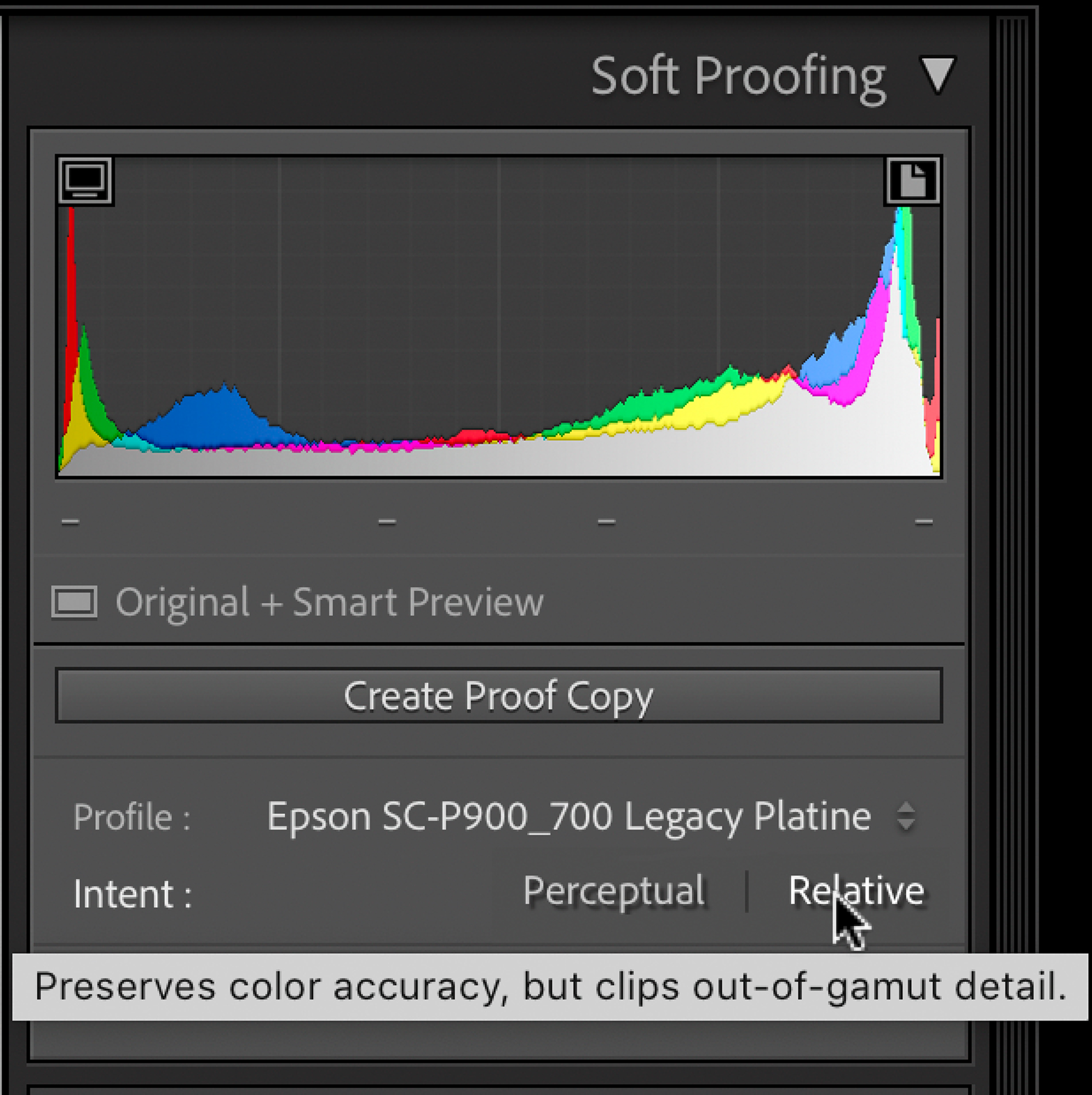
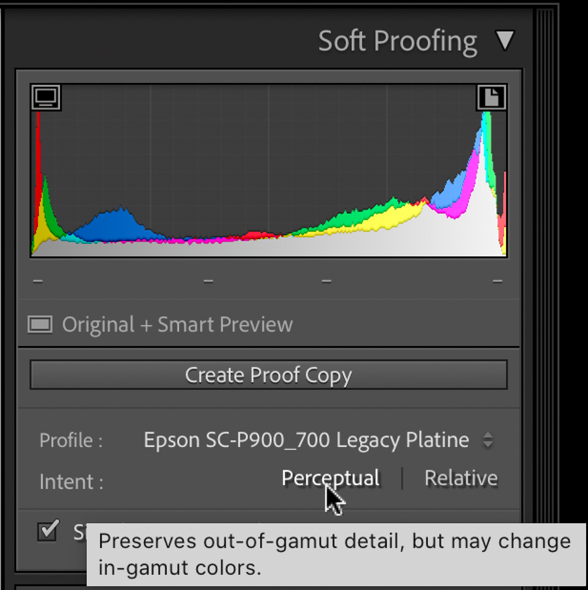
While the side-by-side view is useful if you are trying to match the master image, I find I really want to use the Soft Proofing function as a creative aid to optimize the image for the final print. Depending on the paper, I may punch things up to get the image to look as good as possible when final printing is evaluated.
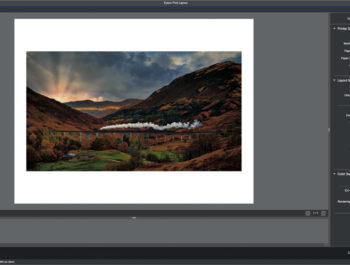
Once the Soft Proofing is done it’s off to the Lightroom Print module to make the print. This is an area where Lightroom really shines and I’m of course biased because I had something to do with it. Adobe licensed the output sharpening from a company I was involved with; PixelGenius. We created a product named PhotoKit Sharpener. The output sharpening component is what impressed Adobe enough to pay us to use it. Bruce Fraser noted Photoshop author and color geek had originally proposed the concept of multiple sharpening passes to address specific areas; capture sharpening, creative sharpening, and output sharpening. While Bruce sadly passed away before the PG sharpening in Lightroom was finished, I took over a consulting part of the agreement and worked with the engineers to improve the input sharpening found in the Detail panel, as well as the output sharpening.
Here’s the image in the Lightroom Print module.
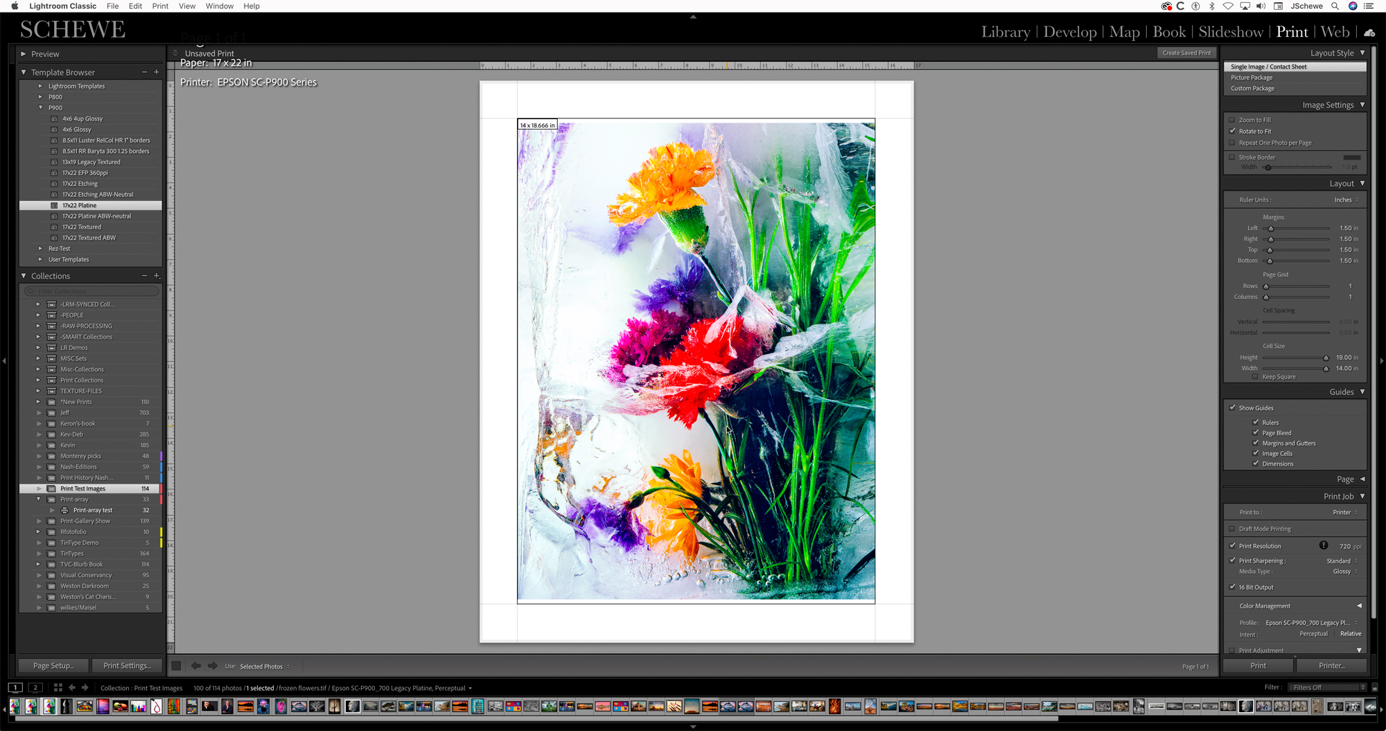
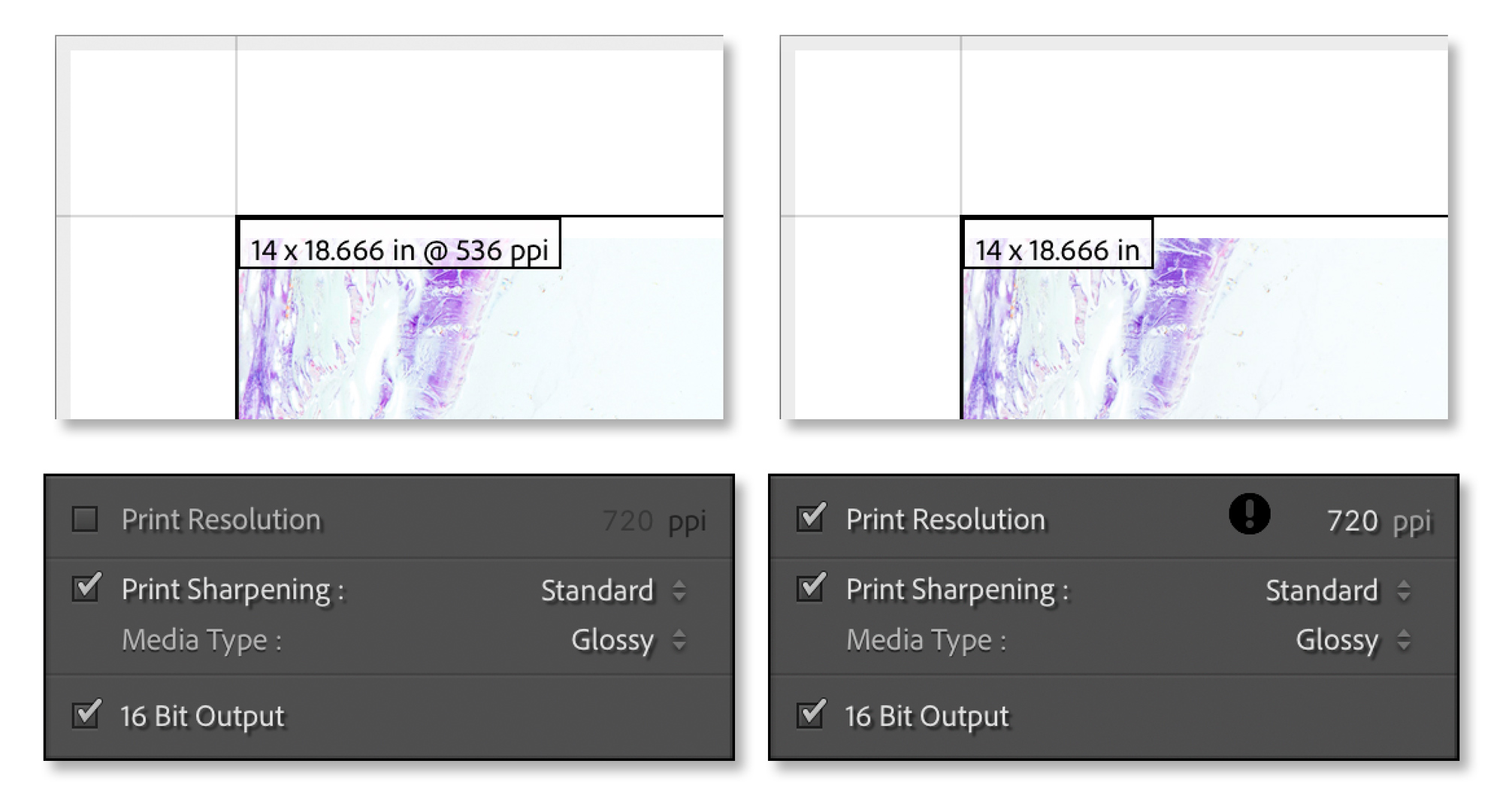
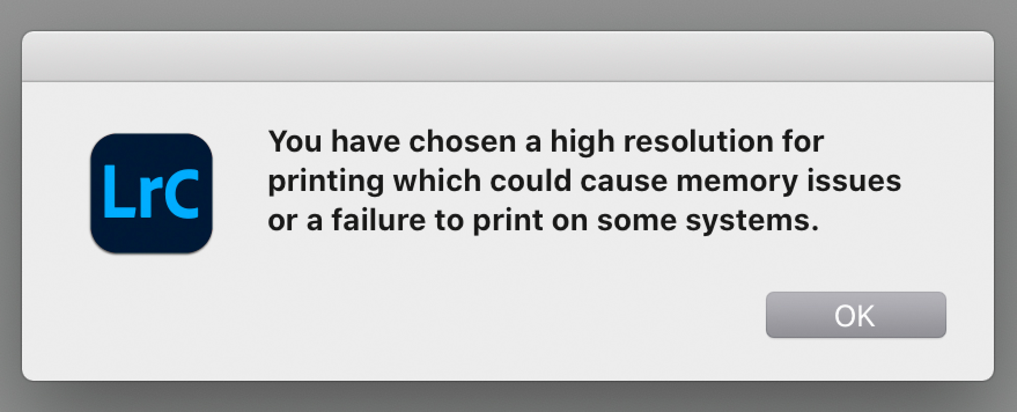
I realize there’s a lot of confusion about what the best resolution to use when printing. I keep it really simple, if the native resolution of the file is below 360 PPI for Epson or 300 PPI for Canon or HP I up sample to 360/300. If the native resolution is above 360/300 I upsample to 720 PPI for Epson and 600 for Canon or HP. Why? Read the article that’s available as a download PDF. While it was written in 2011, nothing has changed since then-other than printers have gotten even better!
NOTE; if you wish to read the original article on Digital PhotoPro magazine, it’s still there, or download it from the link below.
Lightroom makes it easy to determine the native resolution of the file at the final print size. If you turn on the option to show image Dimensions on the Guides panel, you can see the image dimensions and the resolution at the current image print size.
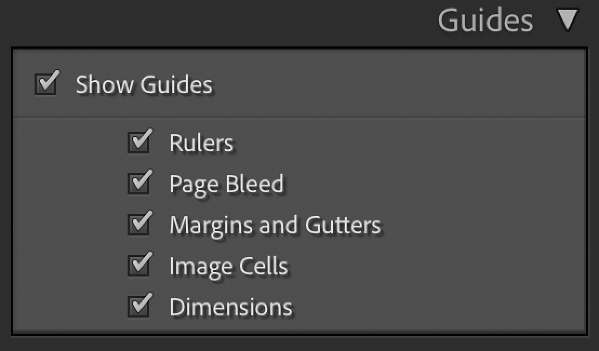
The dimension will show up in the upper left of the image window. Depending on whether or not you have the Print Resolution option checked or unchecked, the info display will show the image dimensions and the resolution of the file at that print size.
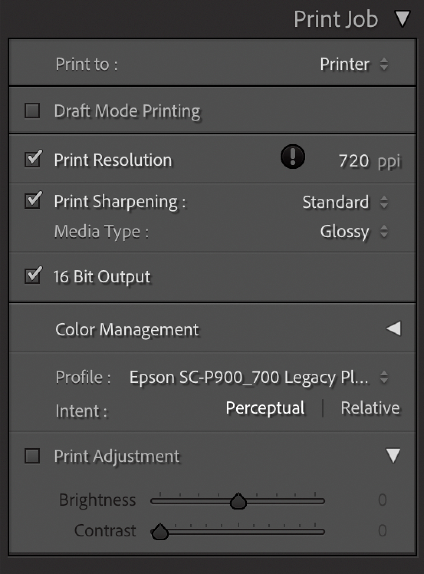
Once the resolution and sharpening are set, I confirm the profile and rendering intent. In this case, Perceptual. The Print Job panel, as set for printing, is shown here.
The next step in the setup to print is to bring up the Print Settings which calls up the printer driver. Different OS’s will show different settings and different printers will offer different options but the basic rule is to make sure the correct media is set in the driver and the correct “optimal” settings. What constitutes “optimal” will vary based on who you talk to.
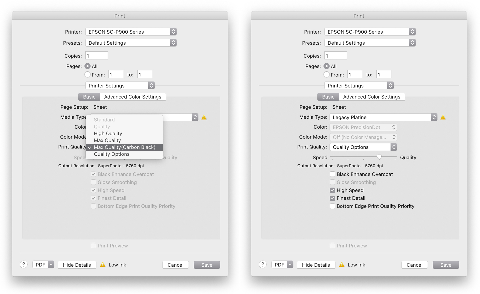
The options and what they mean are in slight dispute. If you select the Max Quality (Carbon Black) option, it’s my understanding that the printer will lay down an extra pass of Gray ink on top of the black printed ink. I may be wrong…Dano from Epson says the ONLY reason to ever use this option is when printing to super glossy papers. Apparently, it is intended to address gloss differential. It does take almost twice the time to print for the extra head pass and it’s really tough to visibly see any difference with the Carbon Black option on or off. However, it is measurable and as far as I know, there’s no downside to using the option other than the longer print time and additional Gray ink use. So…when I’m printing an image that I want to have the optimal ink paper dynamic range, I print with it on. Your mileage will vary and you should do your own tests to decide.
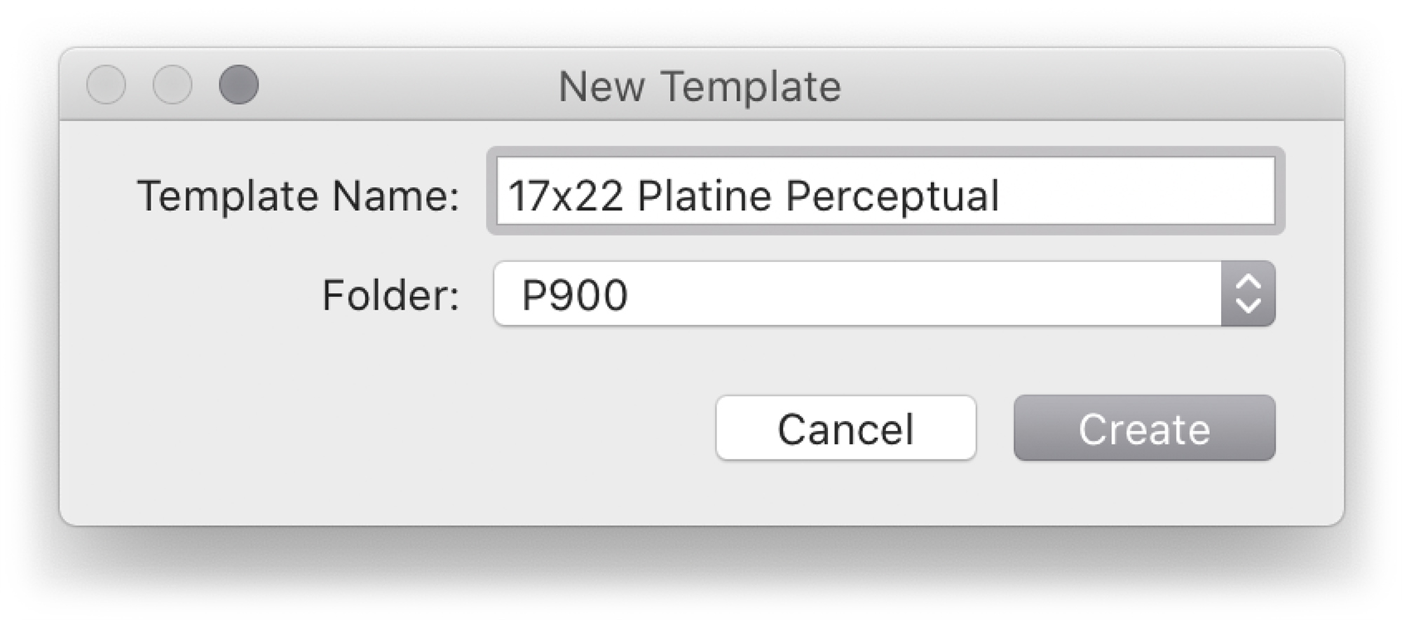
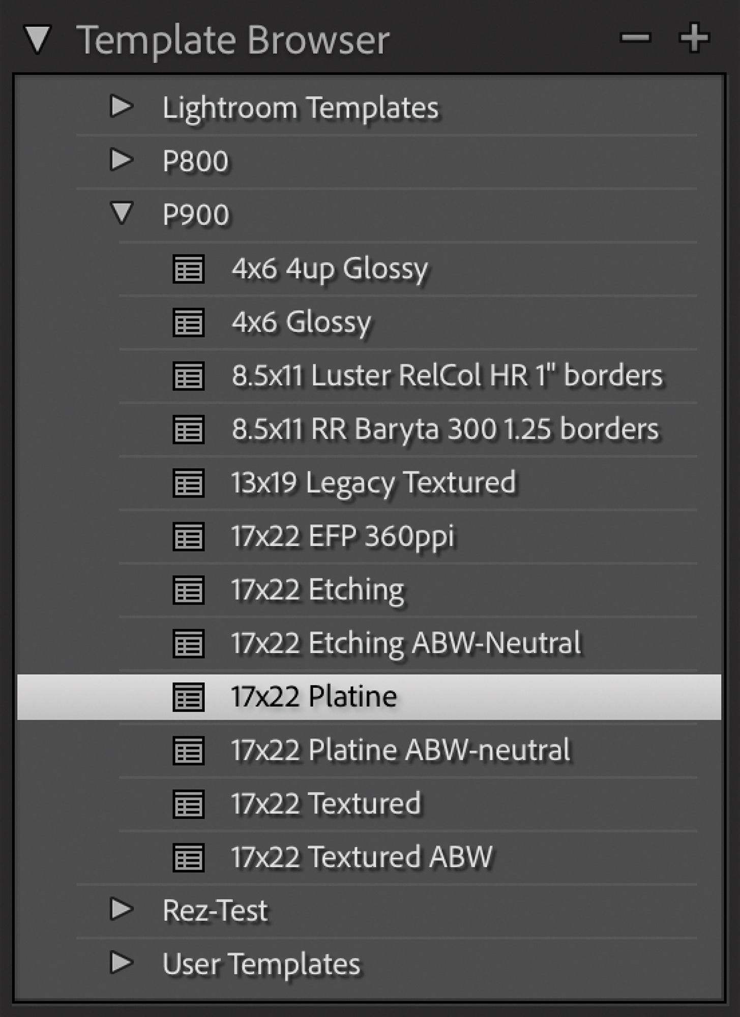
Once that is set, it’s time for what I think is the real major reason for using Lightroom; Print Templates…or presets to store all the print parameters within. It’s an incredible efficiency tool and reduces user error and ink & paper waste–if that’s something of interest to you. The figures below show the New Template dialog box and the Template Browser after creating a new template.
The proof, they say is in the eating (or the pudding), or in this case, the proof of the soft proofing is in the print. Here’s a side-by-side screen capture from the video with the print on the left and Kevin putting his grubby fingers on my print! Where’s your white gloves, Kevin? Is the print a perfect match for the soft proofed image? Nope…but it’s pretty darn close given that this is a screen capture of a video.
The next section of the video shows how using soft proofing can help you decide on which papers will be best for specific images. The image I chose to show was an image that ironically, I shot for Dano back when he was working at Eastman Kodak. The Gumball image was used as part of a film test to compare various types of Kodak film and what sort of color and dynamic range they could produce. It’s a tough image to print considering it’s basically black on black with a spot of color. But using soft proofing on difficult images allows to see what the image will look like when printed.
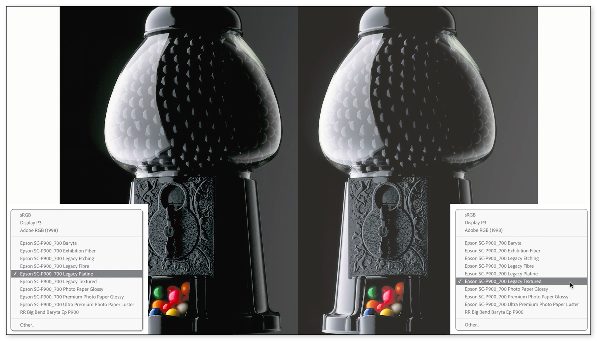
It’s pretty clear at this soft proofing stage that the Platine paper will have a far wider dynamic range than the Textured paper. The D-Max of the Platine was measured at about 2.44 while the Textured paper was about 1.8-which is respectable for a fine art matte type paper, but if deep blacks are important to the image, a glossy type paper will offer a deeper black and brighter white. This is where soft proofing can be useful in helping to decide.
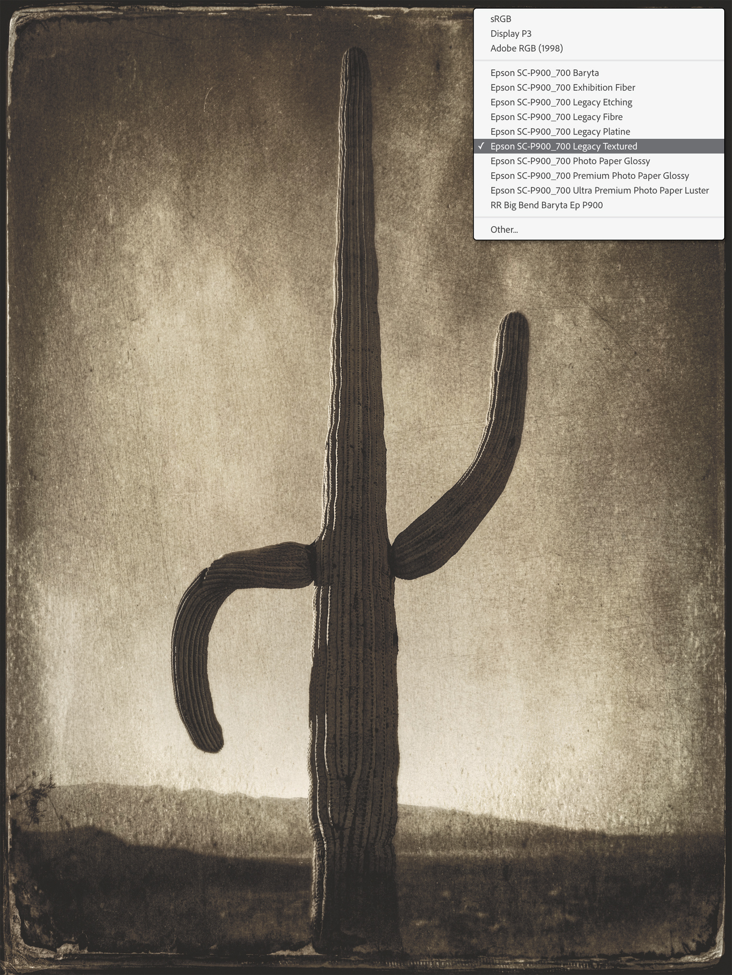
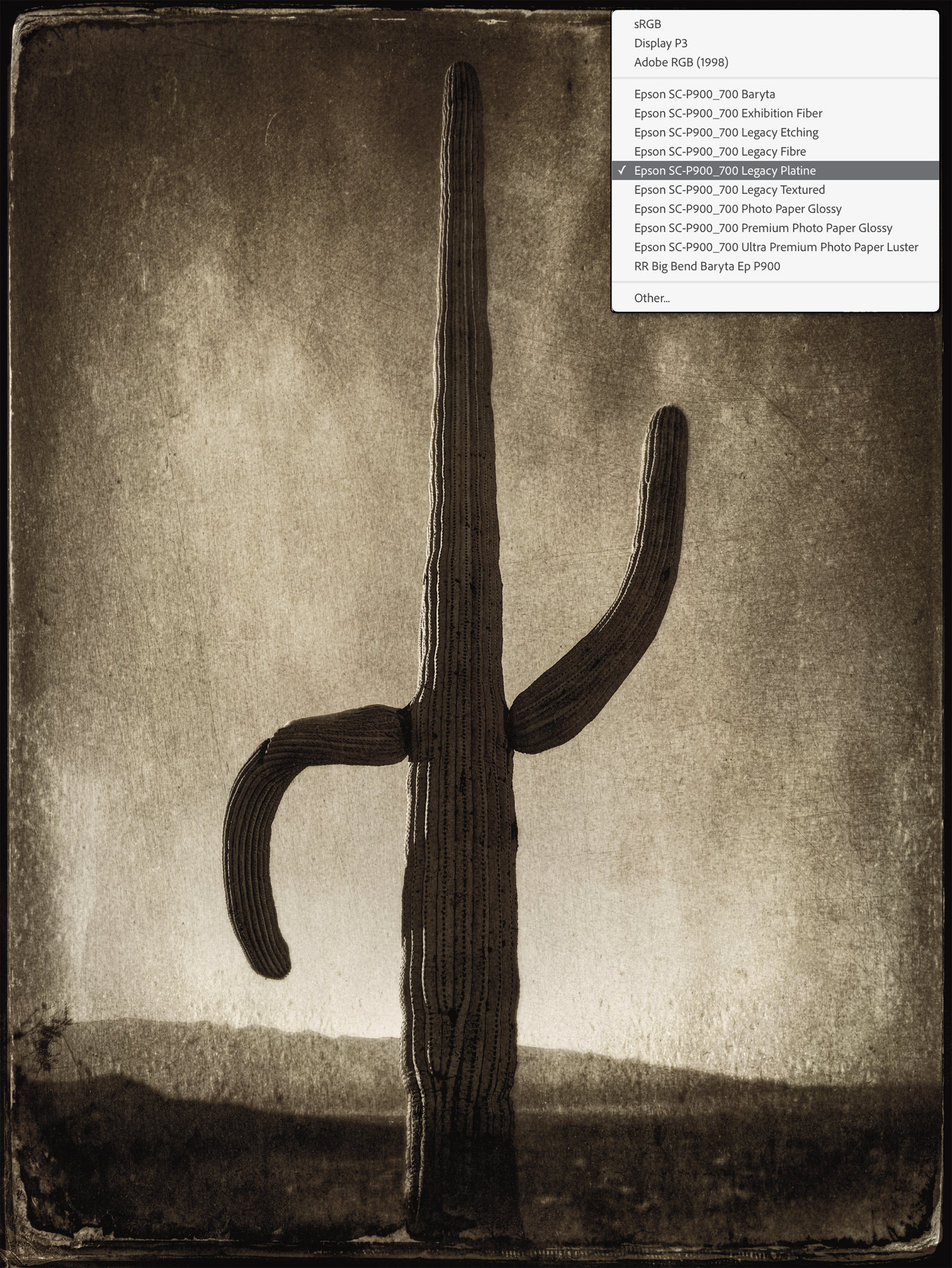
The Legacy Textured is on the left and the Legacy Platine is on the right.
With a side by side soft proofed comparison, the Legacy Textured paper holds the shadow detail well. While the blacks aren’t quite as deep, the overall dynamic range of the Textured paper is, to me, preferable. Plus, what you can’t see here (or in the soft proofing), is the rather nice paper texture. By the way, this image and others WILL be available for sale from my website in the near future, ping me from the Contact form if you are interested.
So, what do you think? Have I converted you to using Soft Proofing to help perfect your prints? If you found this video useful but want to know more, you might want to check out my book, The Digital Print.
Available from Peachpit.com in print and ebook editions and online bookstores. The book is still available in print last time I looked.
You might also want to stay tuned to this website for more information about upcoming news and announcements regarding printing and classroom workshops, but I’ll let Kevin tell you about that :~)

Jeff Schewe and Kevin Raber
March 2022
Chicago, Illinois
Jeff Schewe has been an award winning Advertising Photographer in Chicago for over 30 years. He is accomplished in tabletop, location, portraiture and particularly accomplished in computer imaging. Jeff shoots a variety of subject matter and likes to control as much of the production as possible. He does this by making his own models, designing and building his own sets, painting backgrounds and employing computer imaging. He has been doing his own imaging for almost 20 years in house on his high-end Macintosh systems. Jeff Schewe has been described as a Photoshop Guru’s Guru. He’s on the inside of the development and testing of Photoshop, Camera Raw and Lightroom and has helped guide and direct many features since Photoshop 4.0. Short of some of the Photoshop engineers, there’s probably not many people who knows Photoshop like Jeff. As an indication of his skills and knowledge of fine art printing, he has been named an Epson Stylus Pro. He is a past Apple Master of the Medium and has been inducted into the Photoshop Hall of Fame (2006).