Landscape Image Editing – Recreating What You Saw and What You Felt
The philosophical differences between traditional landscape photographers who favor the literal presentation of their scenes, and modernist landscape photographers who feel free to use landscape captures as starting points for creatively transformed images, haven’t changed much. In fact, these supposedly opposed philosophies are as old as photography itself and find many parallels in the world of painting and other pictorial arts.
But, the arguments are not as cut-and-dried as their proponents often think. Consider that what human eyes see, and how human brains interpret, are approximations of the physical reality of our environment. While there are generally accepted norms for colors, shapes, and textures in Nature, imagery is truly in the eye of the beholder, and there are many of us who see and experience our surroundings quite differently. Without this wide variation, we never would have had a Van Gogh who saw color more vividly than did most people, including fellow artists.
“The camera never lies!” claim traditional photographers. But, the truth is that there is much variation between different capture media, and between different digital sensor designs and materials. Does this imply a free-for-all in interpretations? The short answer is no. Nature photographers do have some responsibility to either reproduce their scenes with reasonable fidelity or to label their work as “creative imagery” when they depart substantially from normal representations. There is a difference between a tree in shadow that takes on a bluish hue and a bright blue tree that is obviously in sunlight. And, consumers of Nature photography have a right to know what they’re buying, or even just viewing.
The more obvious differences are easy to understand and respect. It’s the subtle differences that get murky.
I began photographing Nature in 1951 at the age of thirteen. My initial medium was panchromatic black and white film. For a science-oriented future MIT graduate, it was natural for me to seek total fidelity in my photographs to the scenes I captured, conveniently ignoring the inherent abstraction of reproducing color scenes in black and white. (On the other hand, black & white film was the only game in town for amateurs for another twenty years.)
My views were seemingly reinforced after reading Ansel Adams’ books on photography and studying a number of his large prints at his 1975 retirement exhibit at the G. Ray Hawkins Gallery in Santa Monica. Because he developed a zone system to facilitate consistency of results for given exposure levels and development times, I felt comfortable that there were objective realities that could be consistently captured by using impeccable equipment, materials, and techniques.
It wasn’t until years later that I realized that Adams was merely emphasizing the need to produce negatives with maximum exposure information for the full tonal range, as determined by prevailing lighting, to give the photographer greater choice in expressing the scene or subject. As a former pianist, he famously said: “The negative is the score.”, implying that you can’t produce a quality product without the right raw materials. As an artist and a conservationist, Adams felt free to evolve and to dramatize the vistas that he loved for the purpose of preserving them.
Experience and understanding have also given me a deeper appreciation for the value of artistic interpretation, though I still feel that there is an obligation to develop the skills and disciplines to represent Nature as honestly as possible. What has changed is the combined impact of digital capture and digital editing that allows an almost infinite amount of small variations that collectively can change the impact and interpretation of a scene. These subtleties can induce different moods and often make the difference between a technically competent image and one that has the extra dimension of impact and emotion.
These subtle differences can either be used cynically to grab viewer attention or to induce the same feeling that the photographer experienced at the time of capture. I believe that the latter is fair and reasonable. To do this successfully, more than editing skill is needed. A photographer must also have excellent recall of the details of the scene and of his or her own reaction to it.
As with many subjects, landscape editing that produces both accurate detail and emotional appeal usually results in superior images. But, this is dependent on the photographer’s skill and willingness to re-edit numerous times to achieve the right balance. Also, In my experience, landscape vistas with high emotional potential are more likely to occur when the prevailing lighting is challenging, as in very low or very high contrast scenes.
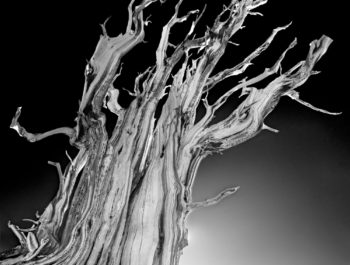
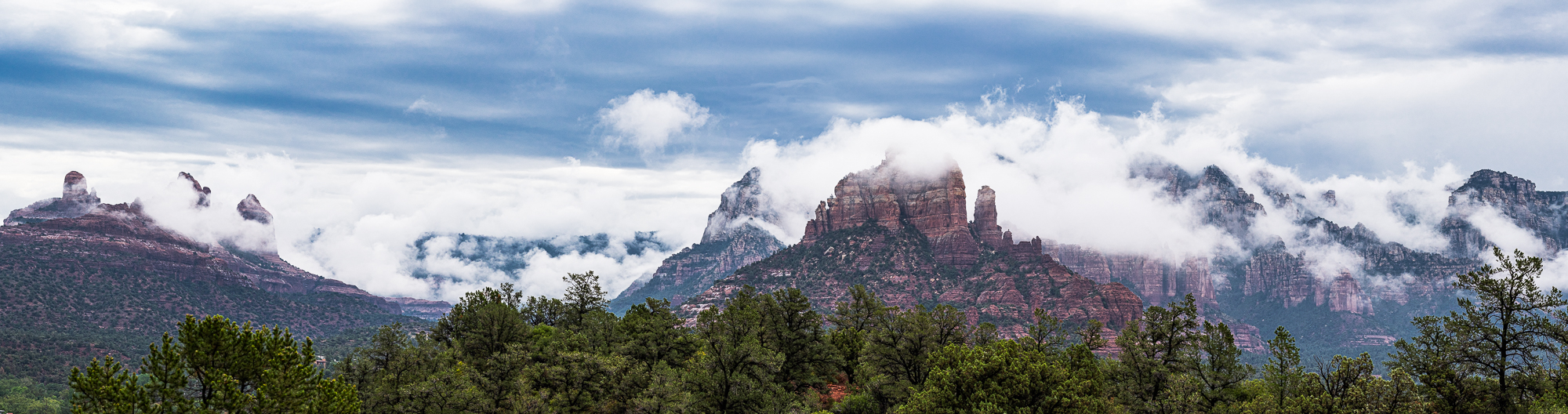
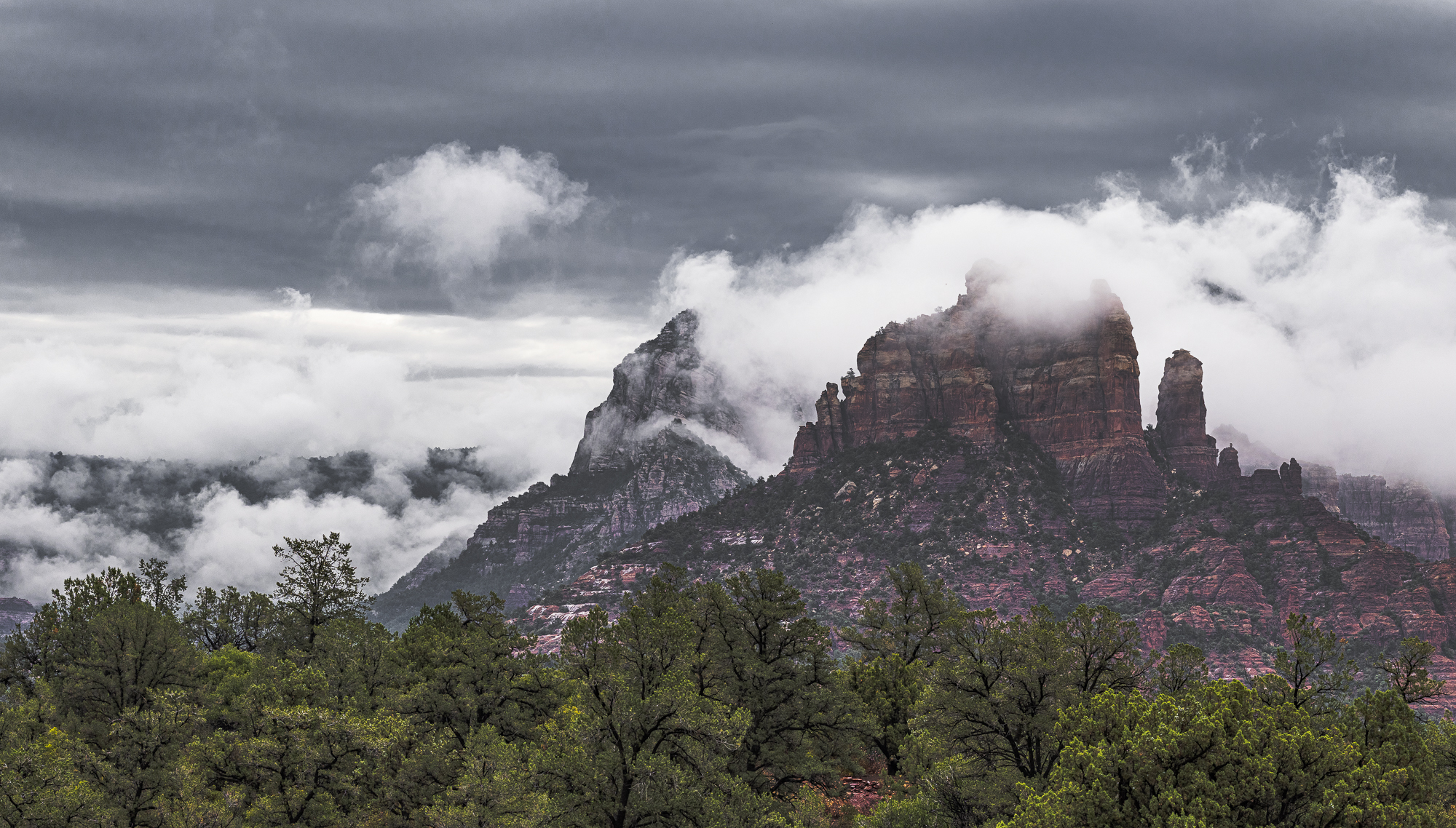
The image shown at the beginning of this article typifies such a situation. Until I started editing it I didn’t fully appreciate how a narrow definition of artistic integrity restricted my representations of Nature. Capturing the mood of dramatic scenes is as important as reproducing forms, textures and colors. The good news is that visual differences in alternative edits can be more striking, yet subtle without degrading fidelity.
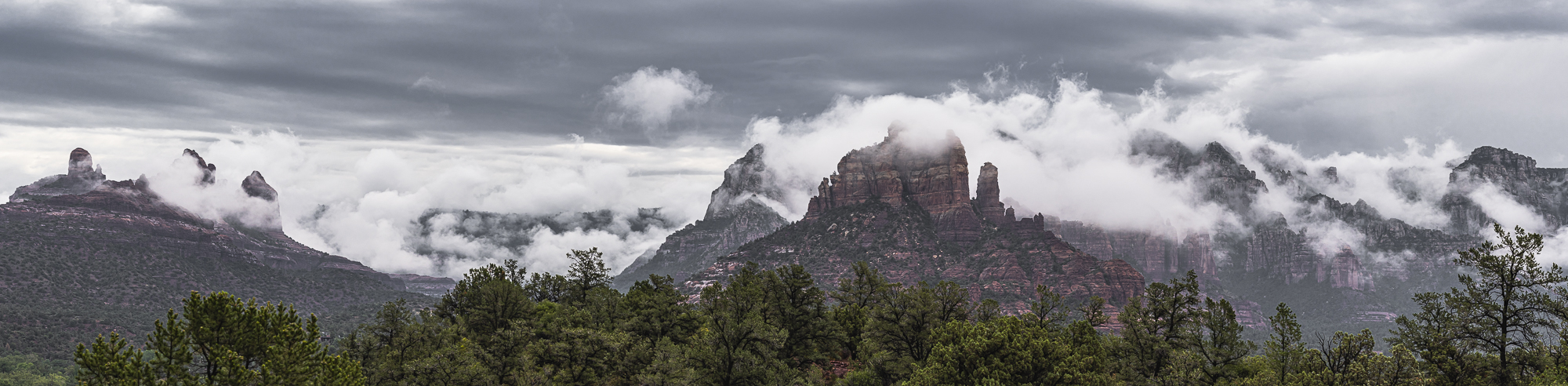
“Monsoon Clouds on the Mogollon Rim” is an ultrawide stitched panorama made from 12 overlapping vertical images. After a week of intermittent heavy rain, the sky cleared enough to provide dramatic compositions, though the morning light was flat and subdued. I started out photographing more limited perspectives to capture interesting interactions between low-lying clouds and individual rock formations. Within 40 minutes, the cloud movement reached peak activity along the entire vista. I raced up a hill to where I could capture enough segments to fully cover the wide expanse before the scene changed. The scene was exciting. But, my past success rate for landscapes with this type of lighting was not encouraging.
After creating the stitched image, I thought more about how I would capture the mood of the scene. If I added in too much contrast the image would lose credibility. But, if I limited my objective to literal capture, the bland result would fail to capture the excitement in the scene. Instead, I needed to produce an image that reflected the mood and feelings that I experienced during captures, despite how difficult it is to make one single moment describe a whole process. Finding just the right balance would be like threading a fine needle, tedious but doable. And, so began a week of editing, re-editing and experimentation with different combinations of small changes.
The least tedious way of illustrating this process is to show the starting point – the initial neutral RAW image, and the intermediate results leading to the final image with a brief commentary on what proved necessary to achieve a good balance between what I both saw and felt.
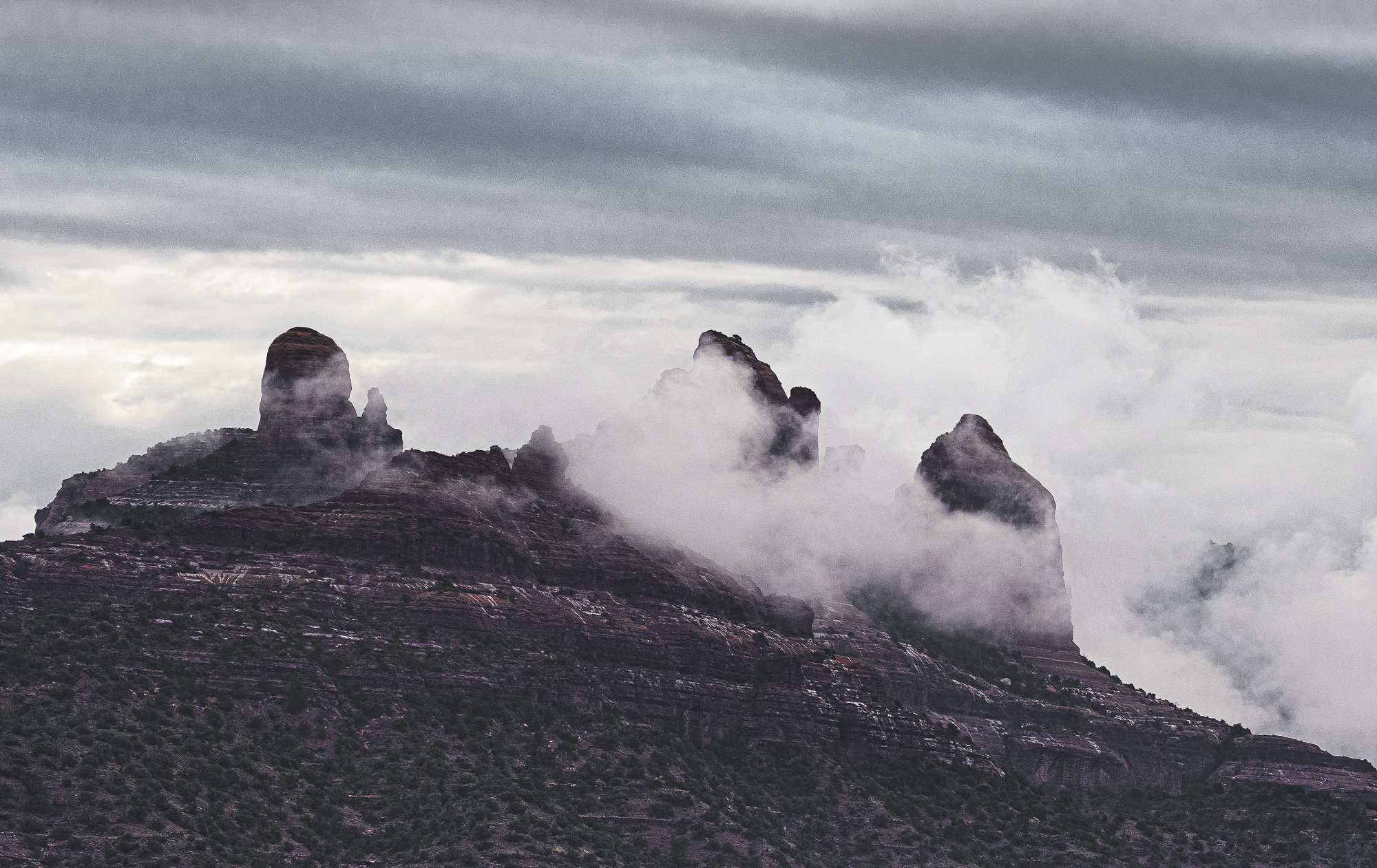
Here is the initial RAW image:
RAW images from camera sensors with high dynamic range are often low in contrast as the exposure data is concentrated within the mid-tones to avoid loss of data in the shadows and highlights as the editing adds contrast. This scene had very low illumination because of the multiple cloud layers. Also, when dry, Sedona’s red sandstone formations generally contain orangey-red layers interspersed with a few light ones. The overall color turns dull red when the sandstone gets saturated with water. That doesn’t happen often in the dry northern Arizona climate. But, we had intermittent heavy rain for the preceding week, leaving all of the formations thoroughly soaked.
There were two obstacles to overcome in the editing. The low filtered light was mostly confined to the lower half of the luminance range, and the contrast at fine to micro levels was similarly muted. Though still white, luminance of the clouds was depressed several levels below normal. The challenge that I faced was to expand both overall and micro-contrast sufficiently to liven up the image without producing an unnatural appearance.
Whatever edits I would make would have to avoid compromising the form and texture in the lower clouds as they were the center of interest. There was also a persistent blue cast in the individual exposures that carried over into the stitched image, as I didn’t have time to take color readings of the prevailing light. My camera’s color balance was set to 5400 K, when it should have been somewhere between 6000 to 6200 K for this exposure.
Another minor complication is that the RAW image already had some edits imposed by the stitching software that was necessary to smooth out differences in color, brightness, and contrast between the different cells (individual exposures) to successfully stitch them together.
Between the depressing prevailing light and the starting point for editing this stitched image, I had to abandon my normal editing workflow which introduced changes that later had to be edited out. So, I started over with modest edits to get a sense of the most effective way to proceed.
My objectives were clear, even if I was not yet sure of the best way to proceed. These were:
- A balanced overall tonal distribution
- Broad separation in the lighter tones from light gray to bright white in order to maximize detail in the clouds
- Maintain middle to dark tones in the rocks appropriate for wet sandstone
- Enhance micro-contrast to give the rocks and foliage character.
The following images give an idea of where I ended each editing session.
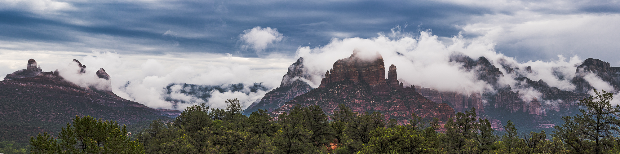

The first edit established a more reasonable luminance range in which the clouds were neutral white and the darker rock and foliage levels established the mood of the scene. However, there was a lot of work to be done to develop richness and detail in the rocks and foliage. I moved in that direction with the second edit by increasing overall exposure. While this also brightened the clouds, it allowed me to work on the rocks and foliage to see how small color-specific changes would inject life in those areas.
In the 3rd edit, it was necessary to darken the overall image slightly to restore detail in the clouds and also maintain the character of the dark red rock consistent with an overcast rainy day. This also made the bluish cast of the higher cloud layer more noticeable, which was corrected in the 4th edit by partially desaturating the blue tones. As with many corrections, there is usually more than one way to get the job done. However, this was a simple fix; and it also served to mitigate the impact of excess blue light reflecting off the rocks. However, I went a little too far in the 4th edit in trying to give the rocks more character by slightly increasing saturation in the red channel. The 4th edit was also the point at which I darkened two small distracting highlights in the foreground and near background.
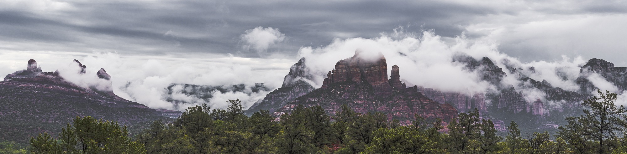
A 5th edit was necessary to take out the previously added red saturation, and I really thought I was finished. But, it’s hard to resist the temptation to keep adding little tweaks that might go too far, as every artist knows. That’s why I try to quit after making good progress, and revisit the results the next day when I’m fresh. But, as I’m usually more critical the next day I made a few more tweaks which became Edit #6.
I am glad I did this, however, as both the lower clouds and upper cloud layer are more distinct, while there is more contrast in the foliage and the rocks are a little less “brooding”. What makes the final edit more successful is that the all-important lower cloud layer shows more definition while the upper layer is lighter.
For me, this final edit achieves the difficult balancing act of trying to make this two-dimensional representation dynamic enough to have an impact, while still preserving the character of the original scene. For me, it captures the feeling I had when taking the picture as well as the prevailing tones and detail of what I saw. Had I tried to pump this image up with more color and contrast, I would have ruined it.
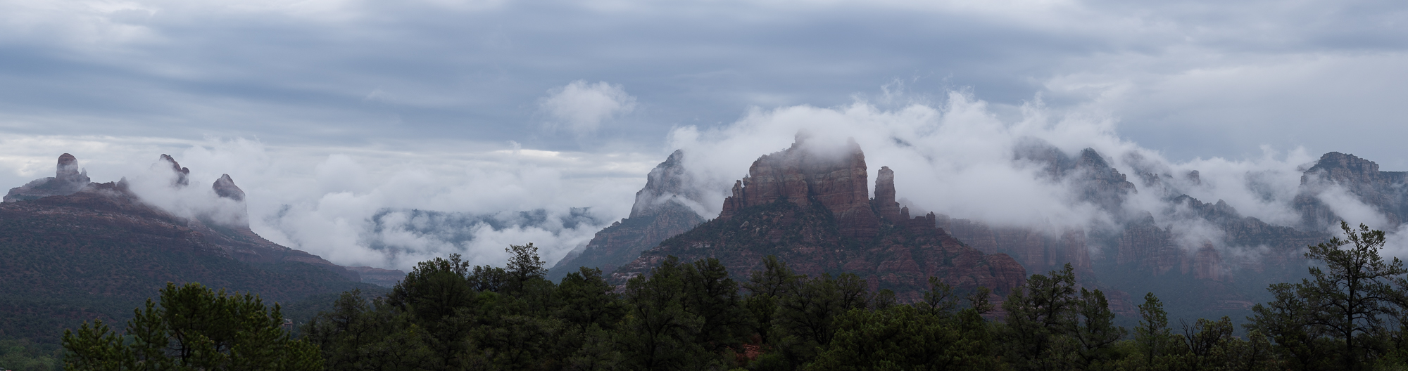
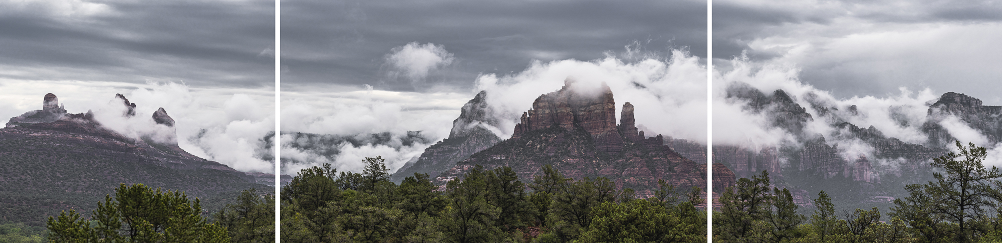
Okay! So now I have a nice panorama. Only it’s an awkward 4:1 aspect ratio image. I think that a frame would destroy the impact, and a 66-inch wide by 15-inch high metal print would look a little lost on someone’s wall. So, borrowing from a photographer friend’s recent project, how about a tryptic? What made me think of that is that this panorama is really composed of three different scenes. If I had broken up this vista that way, here is one version I might have made:
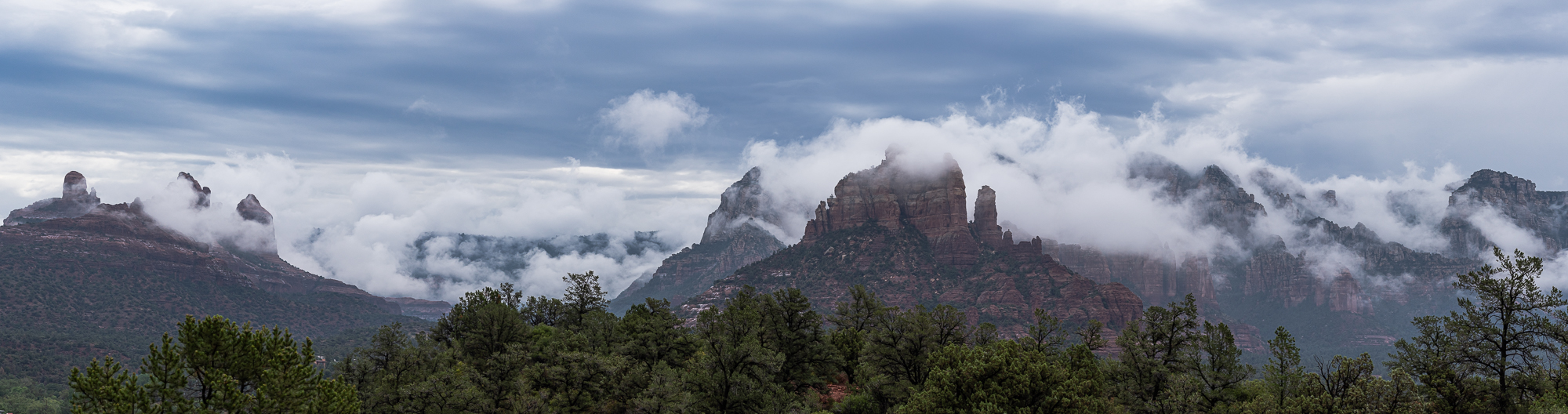
Only, these three scenes belong together because they are part of a larger dramatic weather phenomenon that is more impressive in its entirety. So, here’s what the tryptic would look like:
Earlier I mentioned the difficulty of producing an impactful finished image from a landscape capture made in very low contrast light while remaining faithful to the original scene. The Monsoon Cloud image is not the only one that I’ve made that presented that challenge. Following are two images that I originally gave up on, and have since reclaimed them.
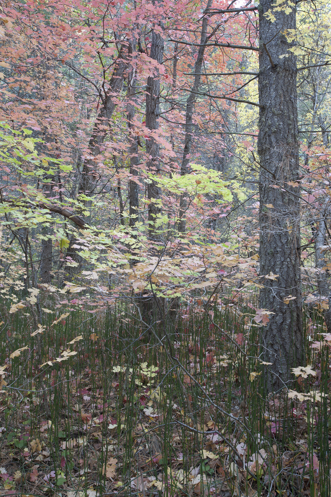
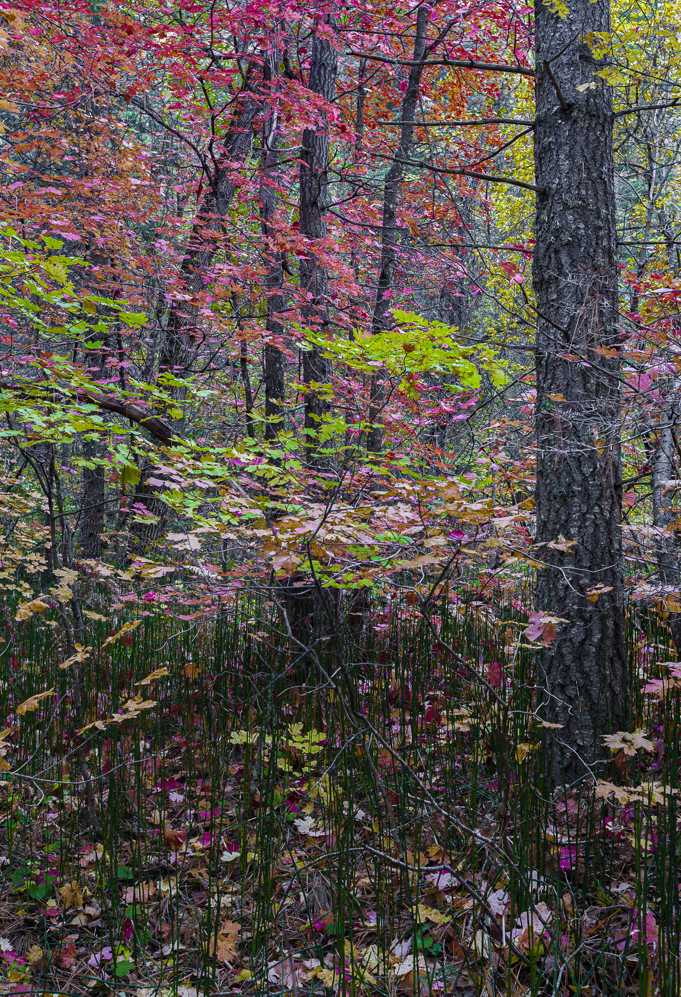
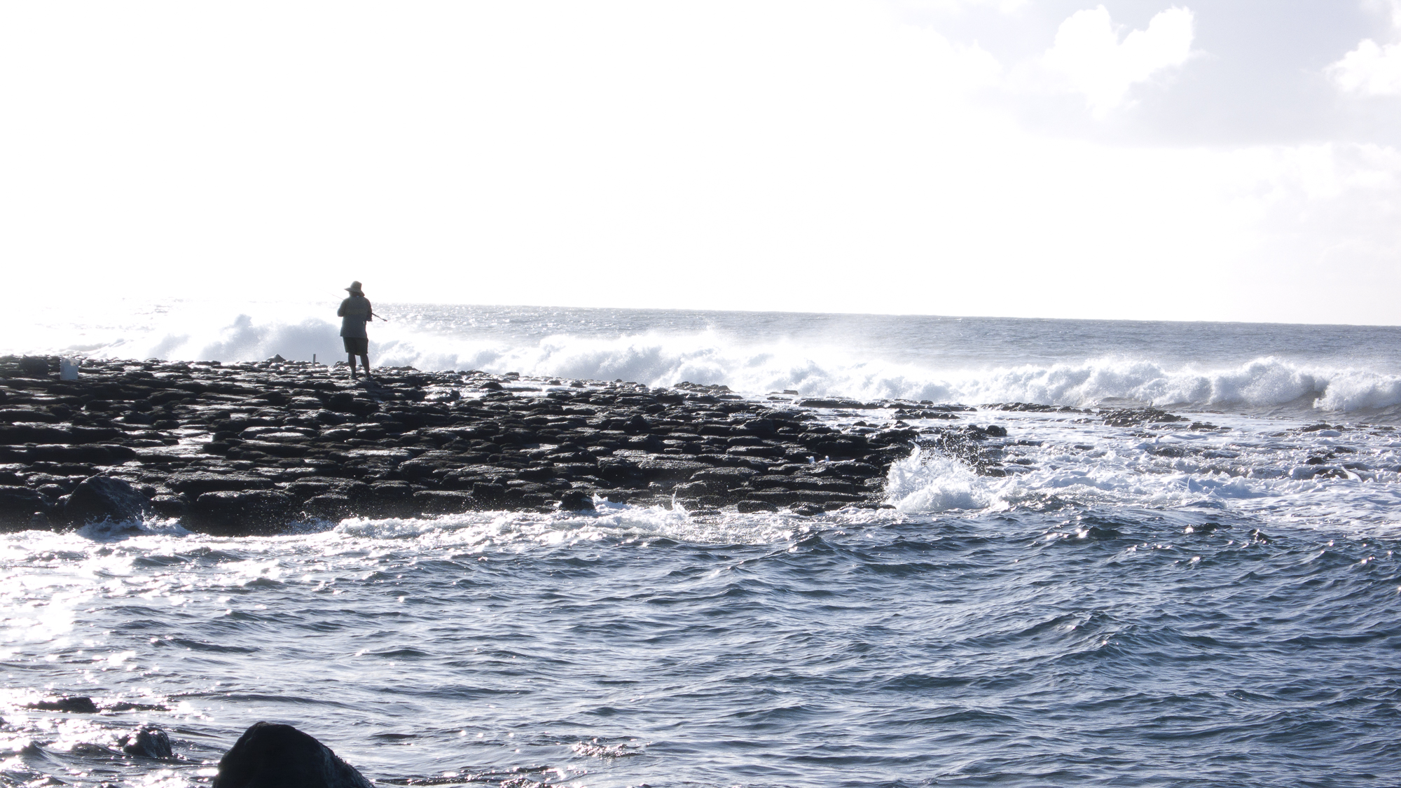
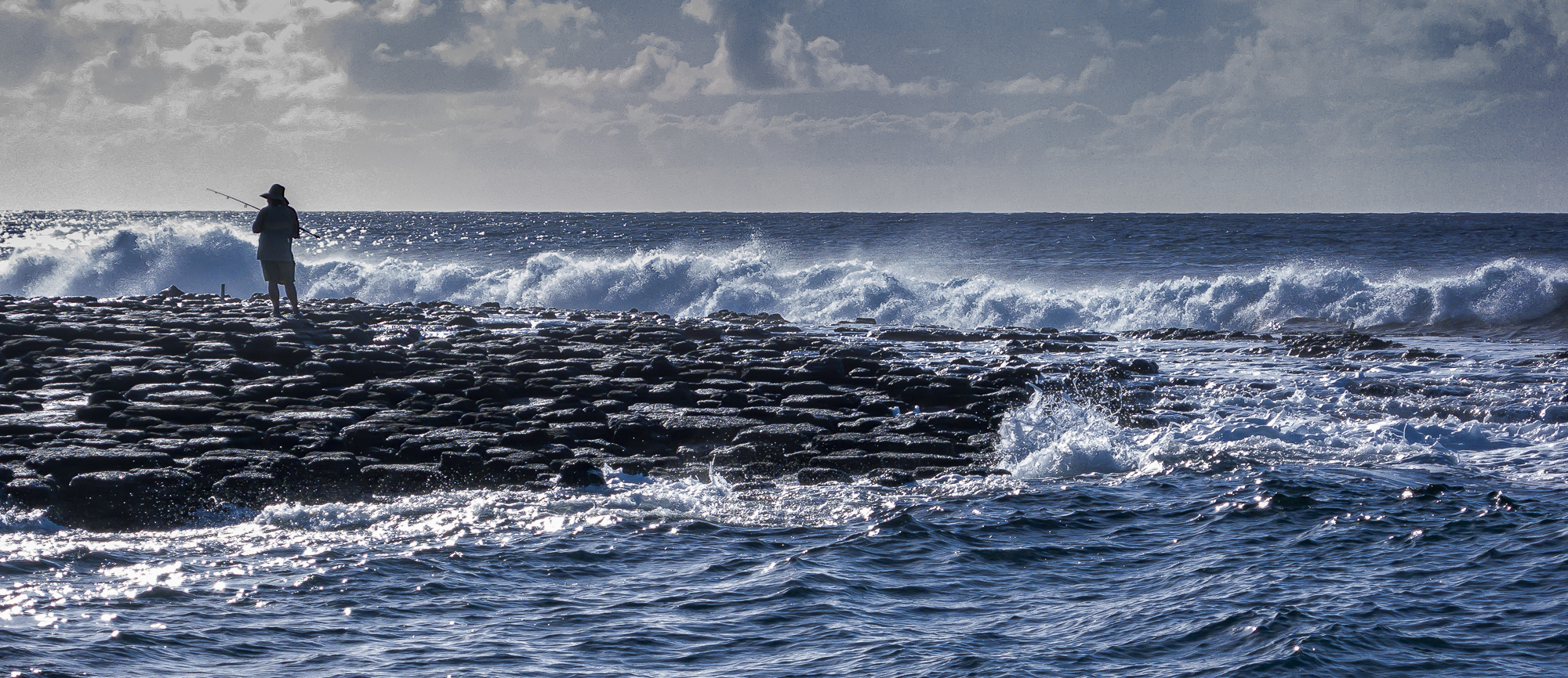
The Autumn scene was taken in very low prevailing light, much like the Monsoon Cloud scene. The fisherman scene was the opposite with overexposed sky and underexposed shadows.
The Autumn scene benefitted from a long exposure time that substantial detail in both light and dark tones. The only challenge was to reproduce the colors, tones and textures while still retaining the mood or feeling of the original scene. It took both more capable software and more experience on my part, and also fifteen years, to meet that challenge.
The fisherman scene was more problematic, and I could have definitely benefitted from using my Sony Alpha 1 camera and its 15-stop dynamic range. Only, this was back in 2007. The highlights and lighter tones in the sky were completely blown out, and the fisherman was almost completely silhouetted. However, the silhouette is still dramatic, and the other main element – the Sea – is lively, as the froth on the waves has enough texture, and the blue of the ocean is vibrant. There is just enough detail in the sky to suggest a hot day with endless ocean, particularly with a panoramic format. Again, this image has both feeling and credibility.
Of course, there may be a number of my readers who read the above images differently, though I think that most would agree that patient editing, even if it takes years, can produce more impactful images that fairly represent what we consider to be reality.
Harvey Stearn
August 2021
Sedona, AZ
To see the scope and essence of Harvey Stearn's photographic art please visit www.CameraStops.com. Mr. Stearn began photographing Western landscapes and wildlife at the age of 13, spent 50 years pursuing his passion in the field and in the darkroom before fully converting to digital photography in 2002. He developed color prints as well as monochrome, but switched over to digital capture and editing in 2002. Though he was a top executive for two large scale land development and home building corporations, he always found time for his fine art photography which won many awards. His work was exhibited in art museums in Southern California and Arizona, and was also featured in billboard advertisements and published in magazines. Mr. Stearn served on the California Arts Council for nine years, including two years as Chairman and another two as Vice Chairman. In addition, he was the founding Chairman of the John Wayne Airport Arts Commission in Orange County, California. Mr. Stearn’s work was sold through Arizona galleries for 15 years. In recent years he wrote 33 illustrated articles for PhotoPXL.com and 14 articles for Luminous-Landscape.com. In 2013 he published a book entitled “In Search of the Old West” which has been widely acclaimed. He was a guest lecturer on photography on a cruise ship visiting Chile, Argentina, Uruguay and the Falkland Islands. His work was among the top 100 images printed in NANPA's Showcase publications in 2019 and 2020. Images have been edited and selected for two new books on Landscape photography which will be published in late 2024 and early 2025.