Breathing Color Belgian Linen
Not long ago, Breathing Color introduced its new Belgian Linen media. It’s a unique product because of its substrate, so I took an interest in testing and reviewing it. Glad I did – it’s a nice product.

As the most distinctive feature of this media is the linen substrate, the first question we may ask is: “why linen?”. So, I’ll start with a few words about linen, and then get into the results of my testing.
According to Wikipedia, linen is made from the fibers of the flax plant. The fiber is very strong and absorbent. Linen textiles appear to be some of the oldest in the world: their history goes back many thousands of years. Dyed flax fibers found in a prehistoric cave in Georgia suggest the use of woven linen fabrics from wild flax may date back to 36,000 BP. Linen was sometimes used as a form of currency in ancient Egypt. Egyptian mummies were wrapped in linen as a symbol of light and purity, and as a display of wealth. In 1923, the German city of Bielefeld issued banknotes printed on linen. Today, linen is usually an expensive textile produced in relatively small quantities. It has a long staple (individual fiber length) relative to cotton and other natural fibers.
Flax fibers vary in length from about 25 to 150 mm (1 to 6 in) and average 12–16 micrometers in diameter. The longer line fibers are used for finer fabrics. Flax fibers can usually be identified by their “nodes” which add to the flexibility and texture of the fabric. It is smooth, making the finished fabric lint-free. A characteristic often associated with linen yarn is the presence of slubs, or small, soft, irregular lumps, which occur randomly along its length. In the past, slubs were traditionally considered to be defects, and were associated with low quality linen. However, in the case of many present-day linen fabrics, particularly in the decorative furnishing industry, slubs are considered as part of the aesthetic appeal of an expensive natural product. In addition, slubs do not compromise the integrity of the fabric, and therefore they are not viewed as a defect.
Linen fabric is one of the preferred traditional supports for oil painting. In Europe, linen is usually the only fabric support available in art shops. It is preferred there to cotton for its strength, durability and archival integrity, particularly if unbleached. Paper made of linen can be very strong and crisp, which is why the United States and many other countries print their currency on paper made from 25% linen and 75% cotton.
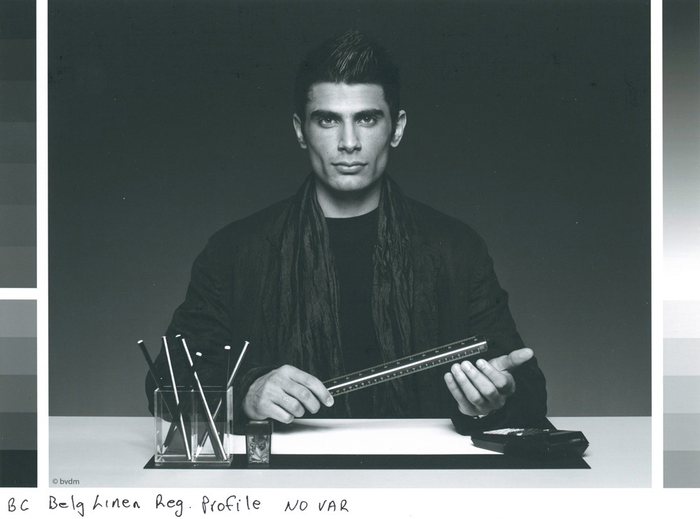
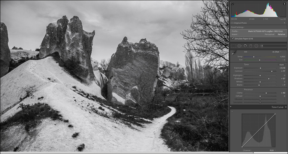
From this abridged description, we can readily see why a linen substrate could serve well for inkjet media: archival properties, great strength and flexibility, and the absence of lint to gum-up our printers. Because of its softness and flexibility in the natural state, it feels and handles more like a canvas than a paper, but the photographs look pretty much like normal photographs printed on matte paper (Figure 1).
The printable surface is an inkjet coating that behaves very much like a conventional high-quality fine art paper. The coating itself and the manner in which it is applied to the substrate seems to be very good: the product can be bent quite a bit without showing any signs of detachment or crinkling, so it can be wrapped around a frame easily. This product combines the good features of canvas and paper, but is neither, so I often refer to it as “media”.
It contains no OBAs. It is a matte finish using a matte media type in printer drivers. For Epson printers the Media Type is Epson Canvas Matte. Weight and thickness is 425 gsm, 18 mil. It comes supplied in rolls only – 17/24/36/44 inch; standard sheet sizes will follow soon. Breathing Color recommends setting the platen gap to wide or wider and using a high thickness setting to avoid head strikes. I did accordingly and found the printer handled it well.
Breathing Color is not supplying profiles yet for the Epson SP-P5000. Hence, they recommend that users make or have made their own profiles, using Epson Canvas Matte (for those with Epson printers) as the Media Type for printing the profiling target. They also offer a no-charge custom profile service for this and any other printer models for which they do not yet offer a profile.
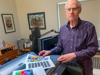
I made a profile for the Epson SC-P5000 using the 2371 patch X-Rite printer profiling target and i1Pro2 spectrophotometer, then looked at the profile characteristics and proceeded with profile testing and measurement.
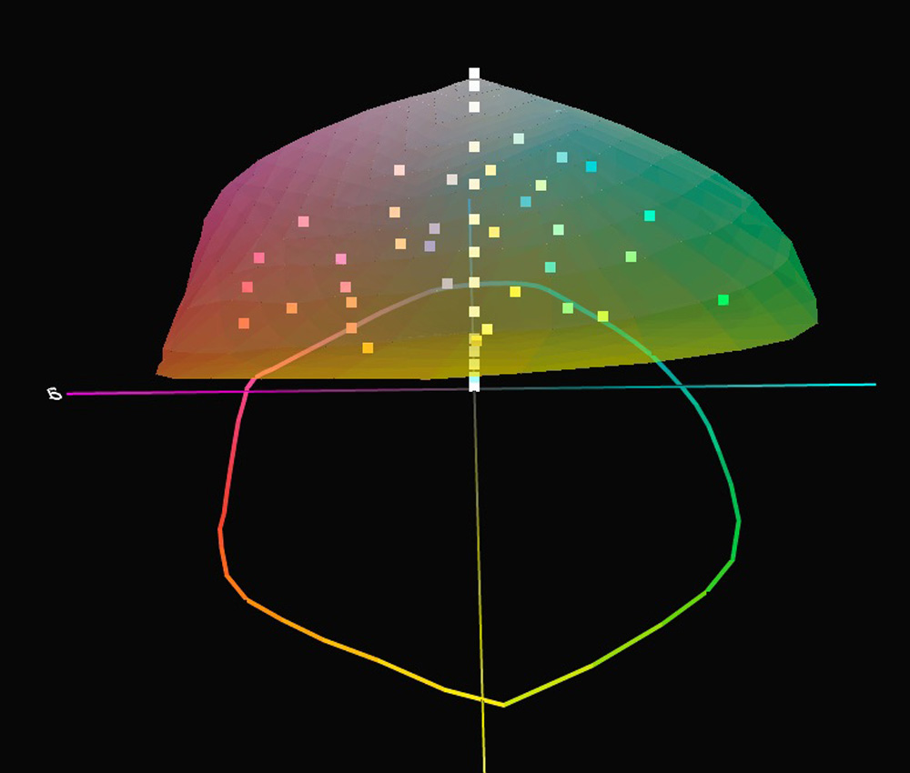
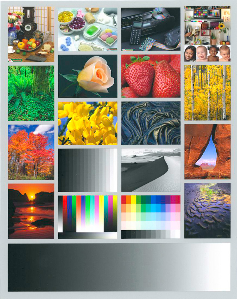
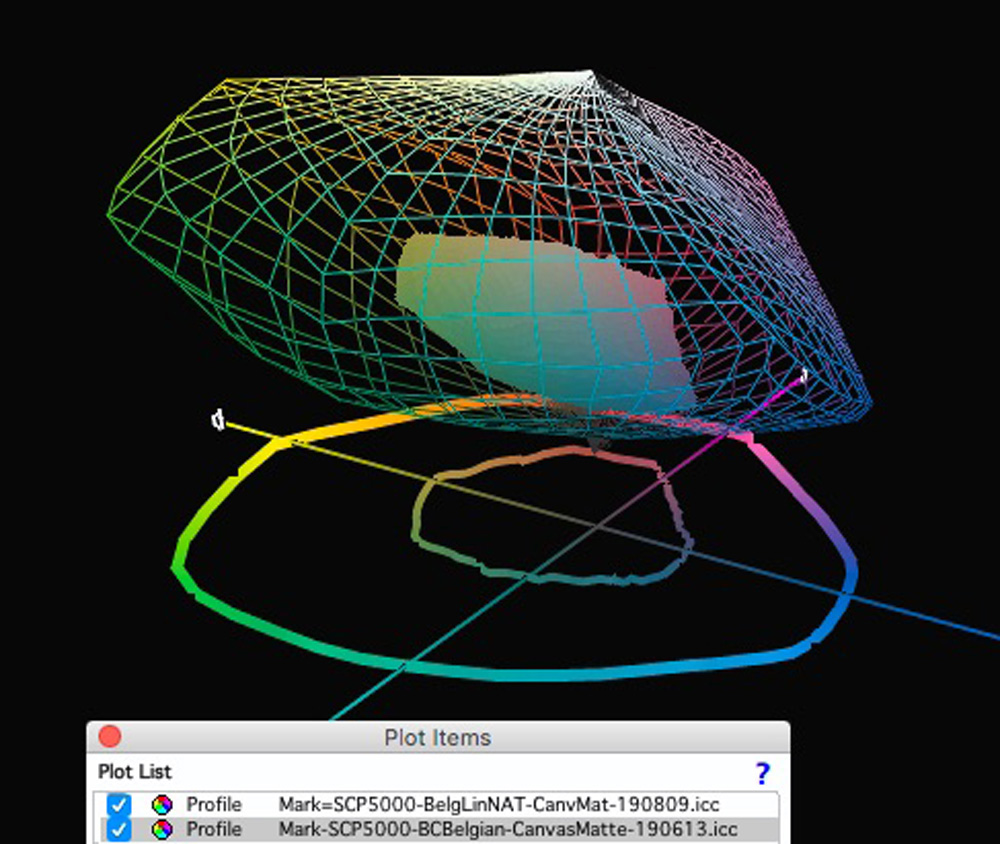
Before proceeding with testing, I made sure that the colour values of the 34 colour patches in my 48-patch test target are all within the profile’s gamut (Figure 2), and they are. The darkest 5 of the 14 grayscale patches are out of gamut so I did not use them in test results.
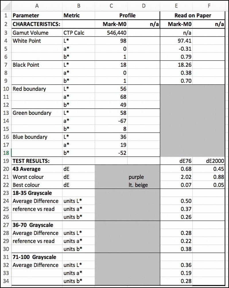
The summary data (Figure 3) on the performance of this media is very good, except perhaps for the Black point, which at L*18, is 2~4 levels lighter than observed nowadays for some of the more recent matte papers.
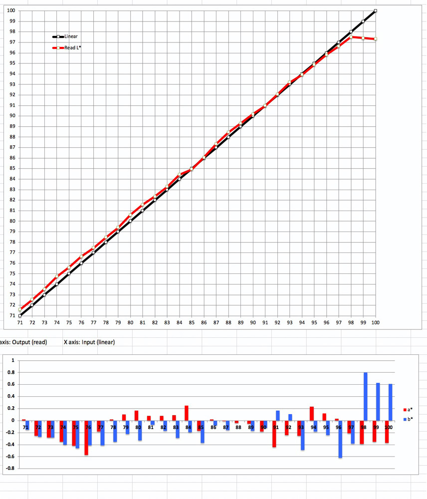
Looking at basic profile data: gamut volume, Black point and White point in rows 3 to 9 of Figure 2, the tonal range is from L* 18 to about 98 in both the profile data and the readings from the target test print. The values of less than 1.0 for the a* and b* channels in both the profile data and the test print indicate a very high degree of grayscale neutrality at the extremes of the tonal range.
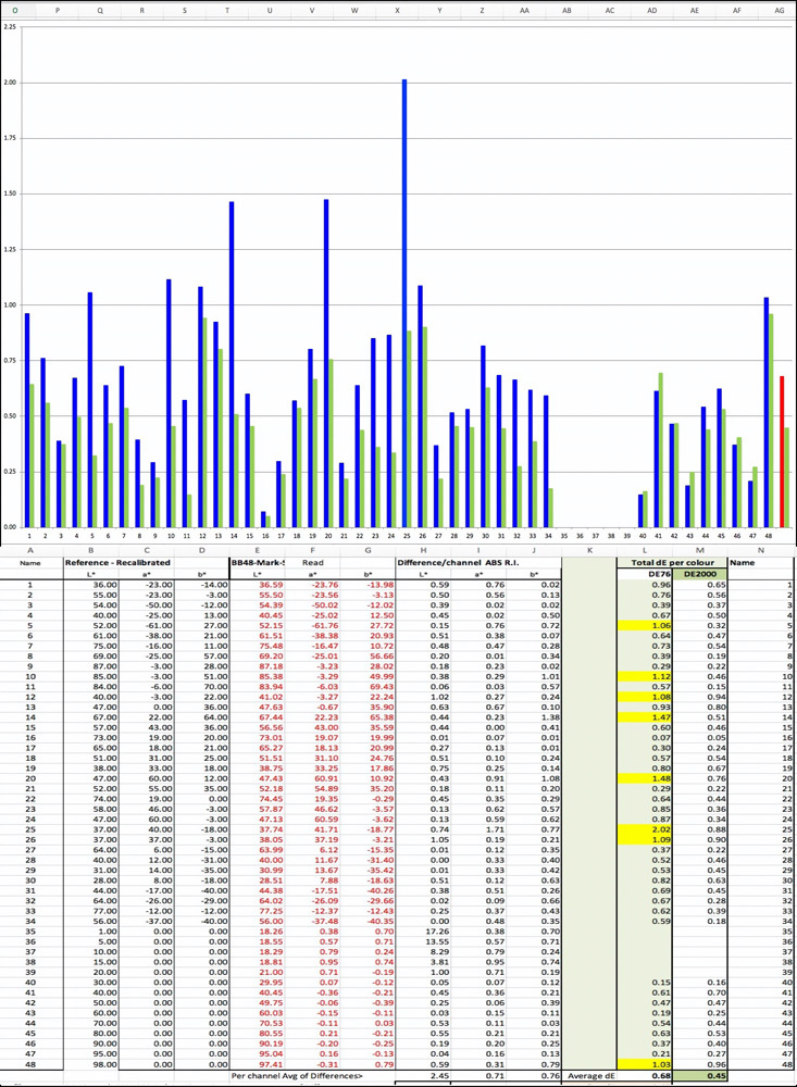
For evaluating reproduction accuracy, looking at the retained 43 patches (Figure 3, rows 20-22 and Figure 4), the average dE(76) is only 0.68 and dE(2000) 0.45. This means that on average the variances from the file values of this test chart are insignificant. Nor are there significant outliers around the average. The worst outcome, which is not bad at all, was dE(76) 2.02 / dE(2000) 0.88 for one purple patch, and the colour closest to accurate was a beige patch with dE values very close to 0. This means that the media profiles very well and is capable of pretty accurate tonal and colour reproduction.
Looking at the Figure 4 graph, all the dE(2000) values are below 1.0 and only 3 of the dE(76) values exceed the range of dE 1.0 ~1.12. (The colours associated with the patch numbers can be seen in Figure 1 of my recent article “Augmented Inkjet Paper Profile Evaluation” published on this website.)
Turning to grayscale reproduction, beyond L* 18, the media’s Black Point, the test result shows a high degree of tonal accuracy and hue neutrality (Figure 5).
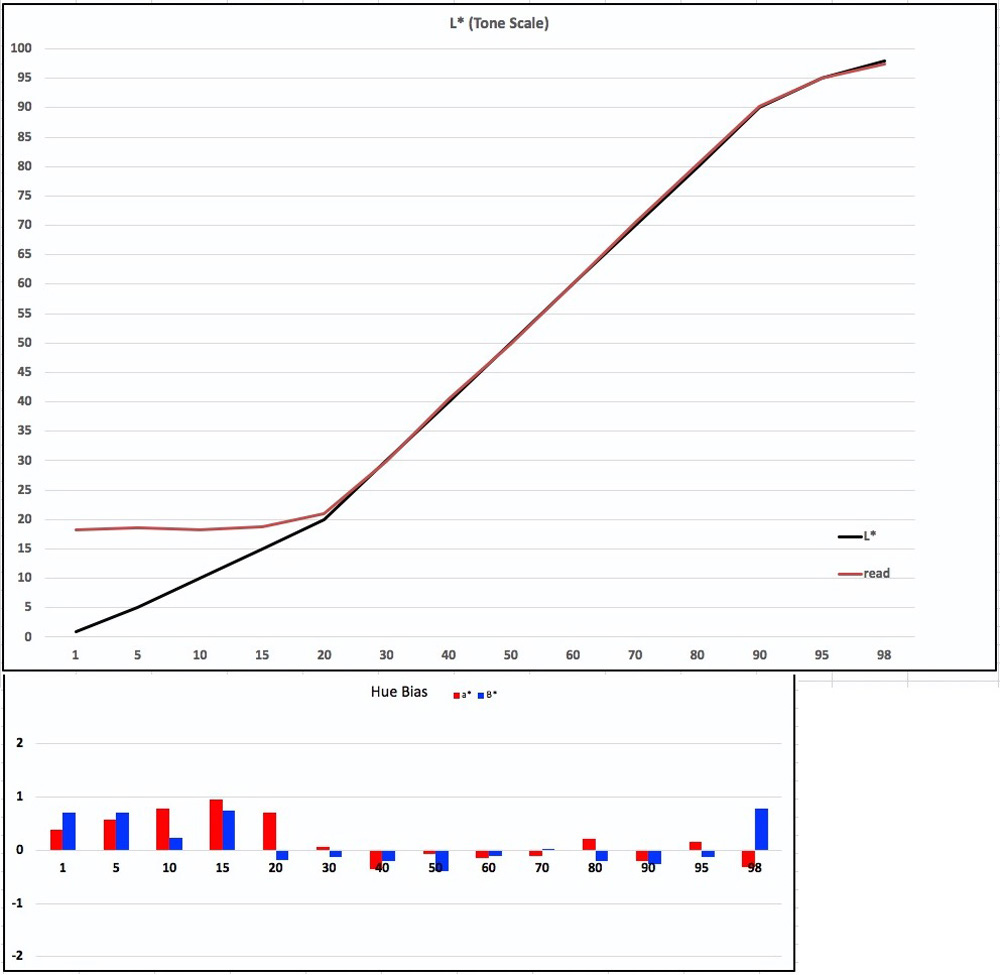
To remind how to interpret the graphs of Figure 5, for the upper portion, the closer the red and the black lines (results values versus file values) converge, the more accurate is the tonal reproduction of the grayscale; for the lower portion, the closer to zero (horizontal axis) are the red and blue bars, the more neutral is the grayscale. Here one sees that beyond about the L*18 Black Point, both tonal accuracy and hue neutrality are to a very high standard. Even the low hue bias in the grayscale below L*18 would be either very little or not apparent in a print on a stand-alone basis.
We don’t print normal photographs with Absolute Rendering Intent; this Intent is used mainly for printer/profile accuracy testing. For Belgian Linen, as for other matte papers, when printing normal photographs, we would use either Relative or Perceptual Intent with Black Point Compensation (BPC). BPC remaps the tone curve from the paper’s Black point, producing printed values upward from the Black point relative to the tone values in the image file.
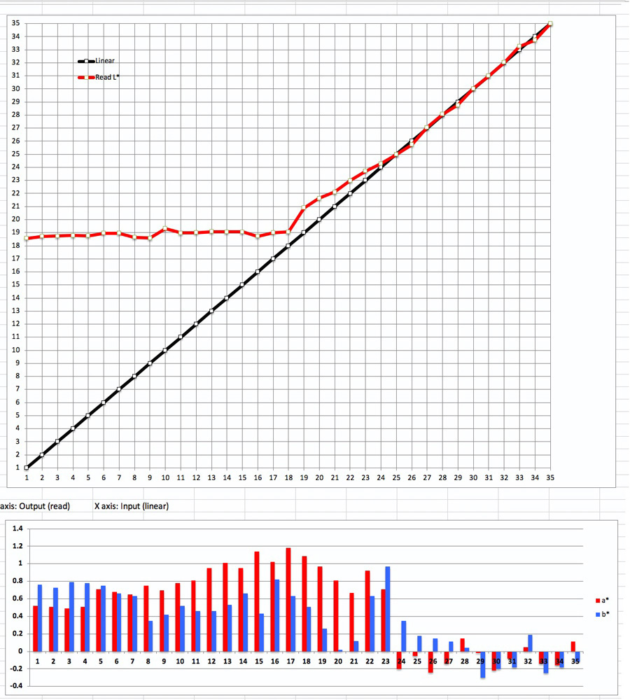
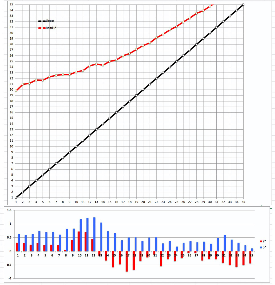
The way this works can be understood from the two graphs in Figures 6 and 7 made from the same test image of the dark tones from L*1 to L*35, Figure 6 showing values for the print made with Absolute Intent and Figure 7 the one with Relative Intent. The Absolute rendition simply reproduces the numbers read from the image file without adjustment, so the red line remains in the range of L*18~19 for all file values below L*18. The Relative rendition maps the Black point of the image file (say L*1.0) approximately to the Black point of the paper (say L*18). Then it remaps in the print all the successively lighter blacks/grays of the image file to correspondingly lighter gray tones upward from the Black point of the paper.
For example, in Figure 7, file value 1.0 mapped to print value of about 19.7, while file value 2.0 mapped to print value 21, and so on, on an upward slope as the grays lighten; the gap between the file values and the printed values decreases as the tonal scale brightens. Hence there is relative printed tonal separation, allowing there to be contrast in the dark tones at an overall set of printed levels that are higher (lighter) than the file values. In these respects, Belgian linen media behaves very much like other matte papers I have evaluated in this manner.
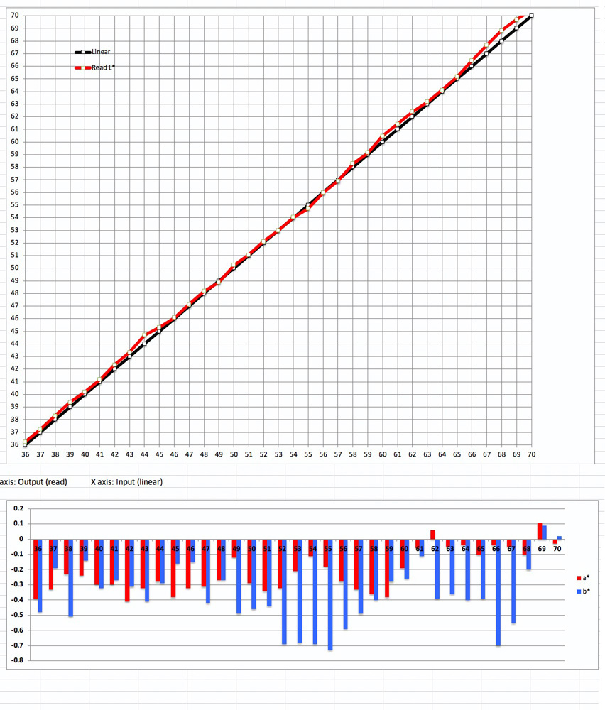
Reverting to our detailed grayscale testing in Absolute Intent, Figures 8 and 9 for the midtones and highlights respectively indicate that this media/profile/printer combination renders pretty accurate tonal rendition and good hue neutrality up to the media White point of L*98. Note that the bars in the lower portions of the graphs reproduce absolute differences from neutral with no mathematics to adjust for the non-linearity of human visual perception. Most of these differences are below 1.0 or barely above it, meaning that they would be imperceptible from neutral for most people. The upshot is that this media would work well for making Black and White prints where smooth tonal gradations and faithful tonal rendition of the image (allowing for the weaker maximum Black of the matte coating) are important.
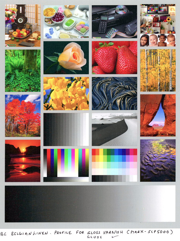
Turning from numbers and charts to real photographs, I was impressed with the overall quality of detail, tone and colour rendition. Of course, appreciating print quality over the internet isn’t like seeing it in hand, but we can come close enough with careful scanning. In that spirit, Figure 10 is a scanned reproduction of the Atkinson printer test page, Which Bill designed to bring out the essential qualities (and issues) of a print.
Notice the smoothness of the grayscale ramp, the good tonal separation of the grayscale strips above the two darkest, the grayscale neutrality, the all-round good colour saturation and the quality of tonal separation of the green leaves from the background of the rose.
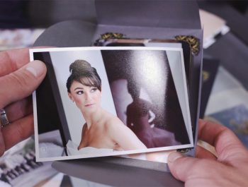
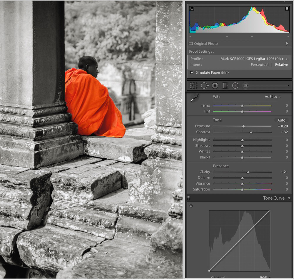
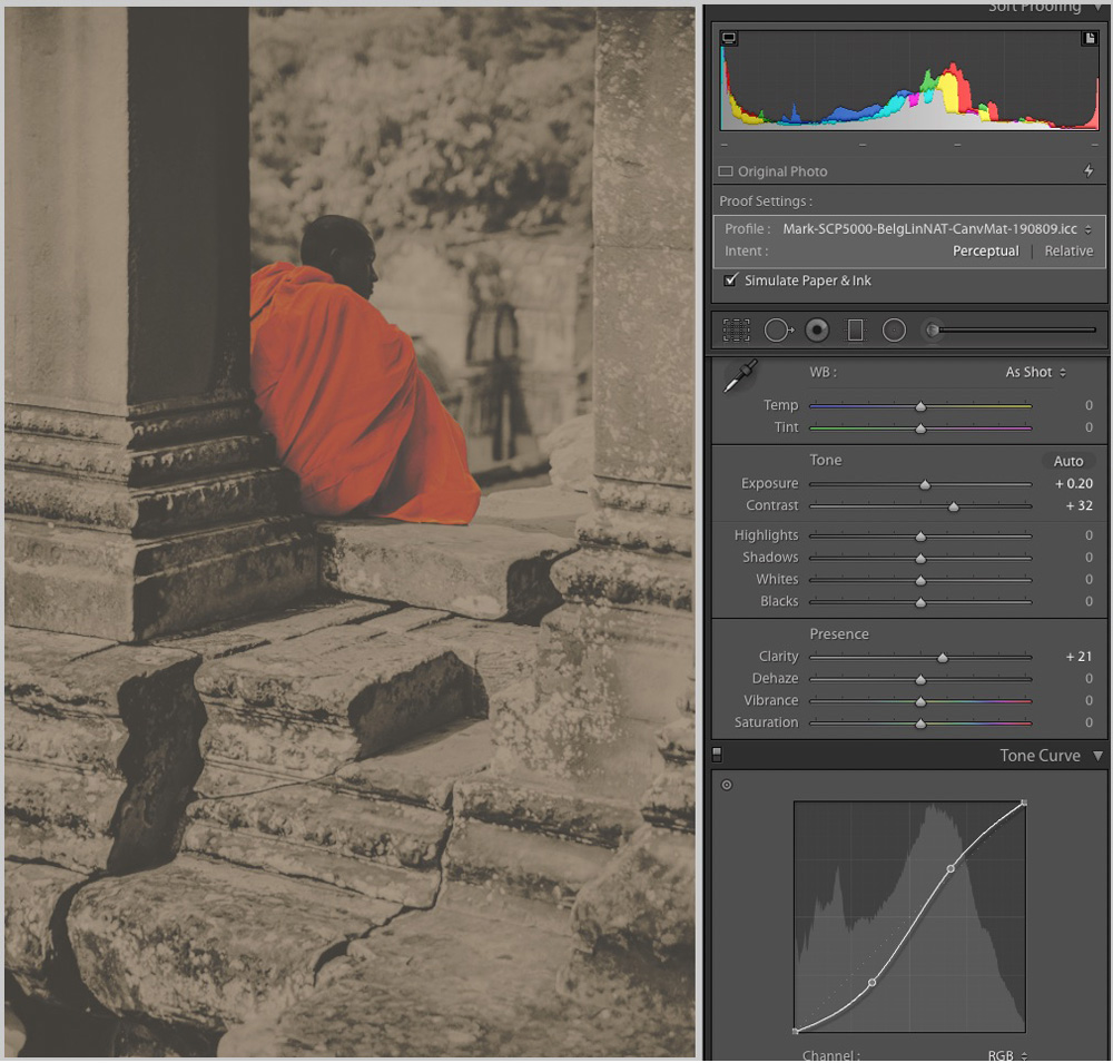
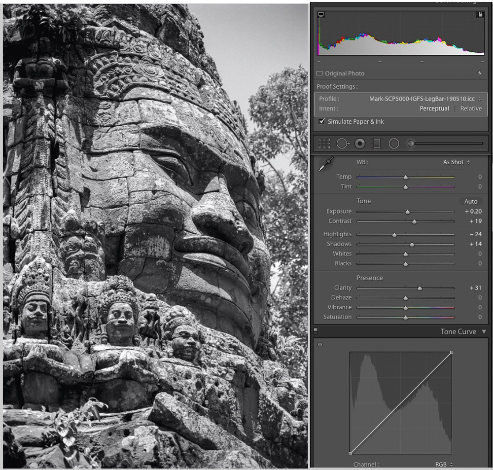
I find a number of my photographs of Toronto street, made with my Sony a6300 and Zeiss lenses, suitable for examining saturated colour and fine detail rendition. For those of you who may not know it, Toronto has much world-class street art supported by a vibrant community of first-rate artists and a dedicated office of professionals in City Hall promoting and assisting it. Nick Sweetman, one of our best, asked me to photograph a raptor he painted in the Kensington market neighbourhood. Just up the way from that painting, Bacon had painted a face of a bearded man against the backdrop of an intricate “piece”. The photos of these works were successful, so I decided to print them on Belgian linen. Scans of parts of these prints are in Figures 11, 11A and 12.

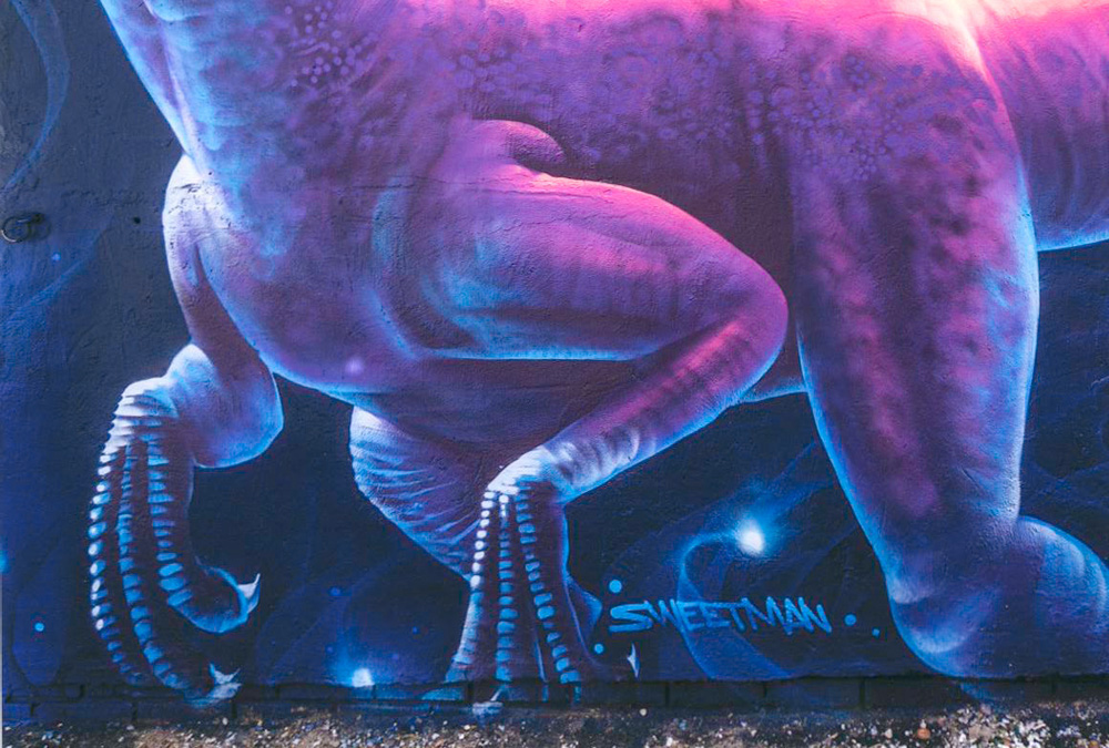
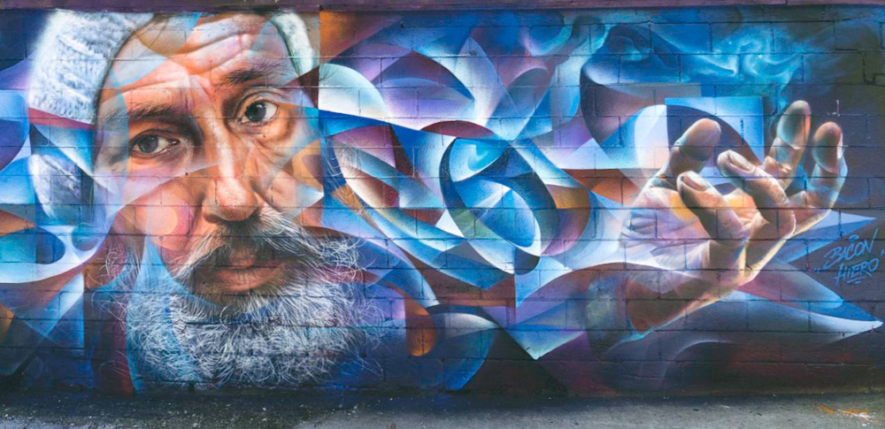
Look carefully at the detail rendition, shadow detail and colour saturation. All impressive.
To wrap-up, I think Breathing Color Belgian Linen is a fine product. It combines the qualities of a fine art photographic print with the flexibility of canvas wrap. With good profiling and appropriate image editing, it is capable of very satisfying tone and colour rendition. Though somewhat costly, I expect Breathing Color to have a challenge keeping up with demand once the word spreads.
Varnishing
Normally, I send completed draft reviews to the manufacturer for a preview so that they can advise whether the articles contain, in their view, any important errors or omissions. In this case, Breathing Color responded to the L*18 reading for Maximum Black and suggested that this could be improved upon by varnishing the prints. They advised that they supply three finishes usable for this paper: “Timeless” Matte, Satin and Gloss. We agreed that they would provide me with a quart each of the varnishes and an application kit (roller and tray), I would experiment and report on exactly what difference it makes, technically, to use these varnishes on Belgian Linen.
I then started thinking about how best to do these tests, insofar as these varnishes would affect reflectance to varying degrees and character depending on the varnish applied. That, in turn, should/could have some impact on apparent tonality and chroma which a spectrophotometer may detect, and hence on gamut volume. After reading the rather thin pickings on the Internet about the colour management aspects of making prints intended to be varnished, I decided that the only way to understand the possibilities and their outcomes is to test two alternative procedures:
(A) Use the profile described above to print my 48-patch evaluation target in three copies and varnish one copy each in Matte, Satin and Gloss, then measure these three varnished prints to compare their results with the unvarnished results reported above.
(B) Create a new set of three profiles from profiling targets varnished with Matte, Satin and Gloss varnishes, then use those profiles to print the 48-patch evaluation target in three copies, each of which would then either remain unvarnished or be varnished with the Matte, Satin or Gloss varnish corresponding to that of the profiling target. Then measure these targets to compare results.
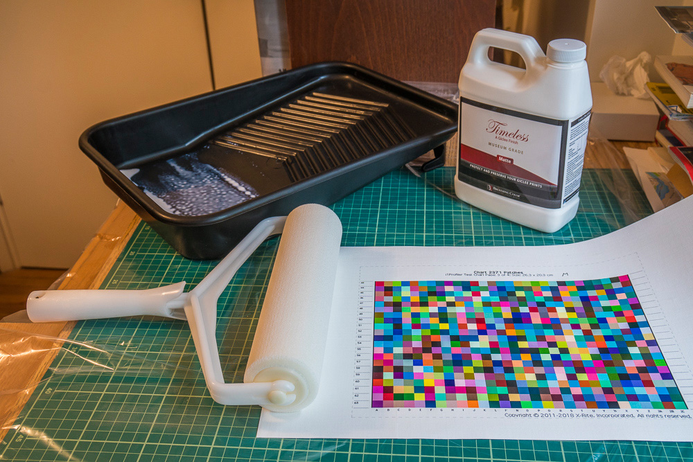
Before reporting on the results of these tests I should say a few things about the varnishing materials and procedures. Contrary to the fright factors and warnings one reads on the Internet about varnishing prints, the materials and instruction videos that Breathing Color supplies for doing this work makes it all rather easy and successful – if you follow the instructions.
The roller is nine inches wide, absorbs the varnish nicely and rolls over the print smoothly. The procedure is to rock the bottle of varnish downward and upward for about a minute to make sure the liquid is properly mixed. Pour some varnish into the tray and immerse the roller in it, so that the roller is evenly covered with varnish. Then apply the roller to the print applying strokes with enough pressure to squeegee the varnish out of the roller evenly across the surface of the print. Do this in both directions (landscape and portrait) in a direction of lighting that lets you see the surface texture of the print. Once the varnish looks evenly applied, let-up on pressure and just skim the roller over the surface in both directions until any bubbles are gone and the coating looks even. At first, the coating has a disconcerting milky appearance, but this dissipates fairly quickly. Once the coating looks bubble-free and quite clear, the job is done. It takes up to a couple of hours for the print to dry enough that it is no longer tacky. Rinse out the tray and roller thoroughly, squeeze residual water out of the roller and give it several hours to dry before the next usage. And that’s it. Breathing Color supplies spare roller packs, which can be a boost to productivity if you want to work with several styles of varnish in quick succession.
Here are the procedures I used to implement options (A) and (B) defined above:
Option (A):
Make three copies of the 48-patch evaluation target using the original profile made from the unvarnished profiling target, let them dry thoroughly, and apply Matte, Satin and Gloss varnish to one of each. Let them dry thoroughly and measure them with my i1Pro 2.
Option (B), which has two variants:
Make three copies of the profiling target. After thorough drying, varnish one each with Matte, Satin and Gloss varnishes. After thorough drying, generate three profiles from these targets, one each to be used for Matte, Satin and Gloss varnished prints respectively. Then print three copies of the 48-patch evaluation target using for each the matte, satin or gloss profile made from the respective varnished profiling targets and then: (variant 1) without varnishing these evaluation targets, measure the results; (variant 2) varnish each evaluation target in Matte, Satin and Gloss finish consistently with the “varnished profile” from which they were printed (“varnished profile” meaning the profile made from a varnished profiling target). After thorough drying, measure the varnished evaluation targets to see what difference this procedure makes to the results compared with the other approaches.
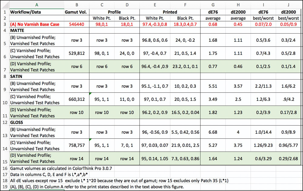
For further clarity, we are comparing four states of prints:
(A) No varnish of either the profiling targets or the evaluation targets (row 3 of Figure 14 results);
(B) No varnish of profiling targets (i.e. use the profile originally generated), but varnish the evaluation targets (rows 5, 9 and 13 of Figure 14 results);
(C) Varnish the profiling targets, but do not varnish the evaluation targets made from them (rows 6, 10 and 14 of Figure 14 results);
(D) Varnish the profiling targets and varnish the evaluation targets made from them (rows 7, 11 and 15 of Figure 14 results).
Before discussing the details of the results, I offer several general observations about the basis of the procedure. The spectrophotometer measures reflected light – it shines light on the patches, which then reflect the light back to the instrument. Therefore, anything that affects the degree of reflectance will alter the wavelengths the instrument reads and hence the numbers. The degree of reflectance plays a major role in determining the apparent saturation/richness of the colours we or the instrument see, and this includes grays, which are also colours. The end product of the measurements includes the impacts of the measurements made to create the profiles as well as the measurements made to evaluate the profile’s performance. Hence, each of the four states of varnishing defined above is expected to have a different set of outcomes. Finally, we expect (based on theory and experience) that the more coherent the conditions between profiling and printing with those profiles, the more accurate (with respect to image file colour values) the printed results should be.
My results in Figure 14 generally cohere with these observations. I shall highlight now the key findings revealed in these numbers.
Starting with gamut volume (column B), notice that as the varnishing of the profile targets proceeds from matte to satin to glossy (in order of increasing reflectivity), the gamut volume (as read with ColorThink Pro) increases – from about 530K (matte) to about 759K (glossy). This is a very large increase. It’s not that the basic underlying colours have changed – the original printed patches have the same files values throughout and remain inert on paper varnished or not – it’s because of increasing reflectance of the colours as we increase varnish reflectance from matte to glossy.
There is a small decrease of gamut volume comparing the no varnish profile with the matte varnish profile (cells B3 and B6 in Figure 14). This happened because the matte varnish imparted a slight reduction of reflectance. The difference between 546K and 530K is about 3% and would not be noticed in most printed photographs of real scenes.
Looking at Profile White Point (Column C, read from ColorThink Pro), with or without matte varnish the value is the same; however, there is a 3 L* reduction for the Satin and Gloss varnish profiles (cells C10 and C14). This must mean that either these varnishes are slightly less than fully transparent, or they have a slightly grayer character than the media itself. Their White points are also slightly less neutral in the a* channel, as the reading changes from 0 to 1.0. Again, these differences would hardly affect perception of most prints.
Profile Black Point (Column D, read from ColorThink Pro) is a more interesting story. Notice how it jumped from L*18 without varnishing (cell D3) to L*24 with matte varnish, a substantial weakening of measured blackness. This means that there is a dulling effect of the matte varnish that has a noticeable impact on Black reflectance. However, as we progress through the Satin and Gloss varnish profiles, the Black point improves markedly to L*11 for Satin and L*7 for Gloss, as reflectance increases. Black Point neutrality is satisfactory for all three.
Of greater interest, the printed outcomes for the White and Black Points are in Columns E and F. For all the White Points in Column E, the printed results vary within a narrow range of 95 to 97.4, the brightest being for the unvarnished results (cell E3). White Point neutrality is satisfactory in all cases, the highest non-neutral outcome being a* -1.1 (cell E9) for the case of the varnished evaluation target from the unvarnished profile target; the second largest deviation (from 0) is b*1.05 for the case of the varnished evaluation target from the varnished profile target (cell E15). All the others are below a*, b* 1. Neither of two noted here would stand out much as non-neutral viewed in a normal photograph.
The density of the printed Black Points is considerably weaker using Matte varnish compared with not varnishing (cells F5, F6 and F7 versus cell F3). The Satin varnish improves Black Point outcomes considerably relative to the Matte varnish, but not for all variants (cells F9, F10, F11 versus F3).
With Satin varnish, the deepest Black Point emerged from varnishing the evaluation target but not the profiling target (cell F9, value L*10). For the two cases with the profiling targets varnished, without varnishing the evaluation target the Black L* is 20, whereas with varnishing them it is 16.5 (cells F10 and F11) – the latter a slight improvement over the no varnish case of L*18.3 (cell F3).
With Gloss varnish, we have the most interesting outcomes of all in respect of the Black Point. By not varnishing the profiling target but varnishing the evaluation target, the Black Point reaches as low as L*5.5 (cell F13). It is a slightly weaker L*7.3 (cell F15) with both the profiling and evaluation targets varnished, but a very weak L*21.9 (cell F14) when the profiling target is varnished, but not the evaluation target.
Looking at Black point neutrality, the a* values are all fairly close to neutral (a*0). The b* values are for the most part close to neutral as well, the exceptions being b*1.4 (cell F6), b*1.5 (cell F10) and b*2.5 (cell F14) all cases being for the unvarnished evaluation target matte, satin and gloss respectively. These departures from neutrality are not egregious, though the gloss one is a bit higher than preferable.
The overall judgment on depth of Black Point density points to the gloss varnish as being preferred for this purpose, which is an expected outcome.
Turning to the matter of overall printed colour accuracy, we’ve seen, as recapitulated in row 3, cells G3 and H3, that whether for dE(76) or dE(2000) accuracy is of a high order without varnishing, using the custom profile one must create for this media at time of writing. The question is whether this level of accuracy is sustained in cases using varnish. The answer is generally “no”, but it varies considerably depending on the combination. Whether for matte, satin or gloss, accuracy is best preserved when both the profiling targets and the evaluation targets printed with those profiles are varnished. This stands to reason as explained above in respect of coherence between profiling and printing conditions, including here the varnishing (or not) as part of profiling and printing.
The matte results show the best overall accuracy of the three, insofar as matte reflectance is the closest to that of the unvarnished base case which performed very well. The matte results of row six cells G6 and H6 are particularly good, where both targets are varnished.
For the satin and gloss varnishes, the only results I consider acceptable in respect of accuracy are those for which both the profiling and evaluation targets are varnished (rows 11 and 15). The average dE values are within an acceptable range and the worst outcomes are tolerable, especially for dE(2000).
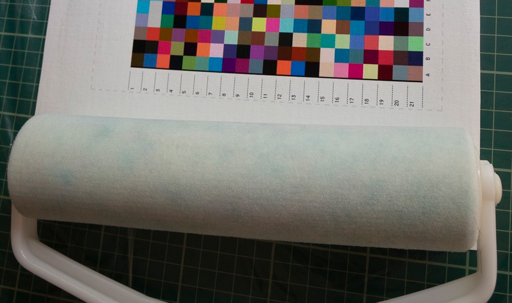
One point I should mention here is that when using the satin varnish, I found the roller showing cyan hues (Figure 15). I don’t know whether this is the behaviour of the varnish itself (a chemical reaction from exposure to air) or the varnish lifting ink from the media, which one seriously hopes isn’t happening. Either way, it’s a bit disconcerting, however it doesn’t appear to have a major impact on outcomes.
Those who would like to have images of the graphs underlying the summary results reported in Figure 14 may request them through this website.
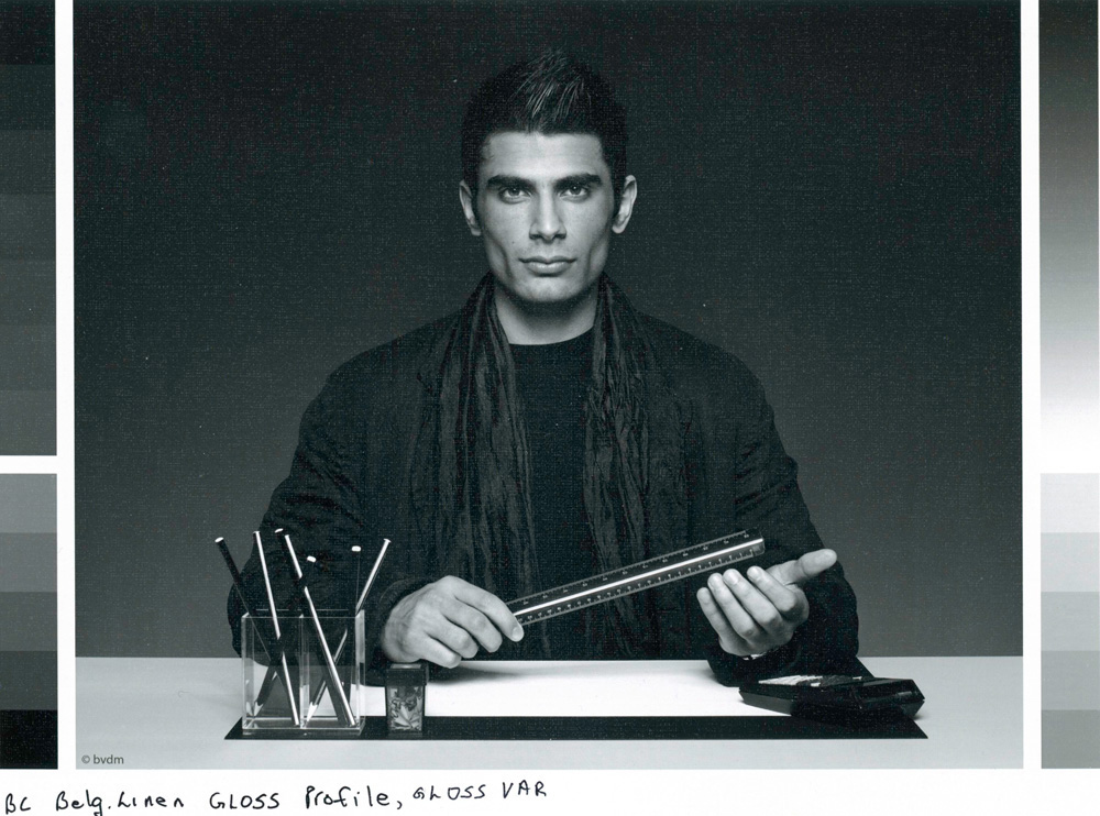
To round out one’s appreciation of varnishing, I thought it useful to present several normal photographs, to the extent one can judge from viewing them over the internet on a display. Figure 16 shows the Gloss Profile/Gloss-varnished print version of the Atkinson printer test image, which you may compare with the result of Figure 10. For the Atkinson test image, the photos do have more “pop” in the gloss-varnished versus the non-varnished renditions. While the differences of appearance are subtle, the gloss-varnished outcome comes very close to the richness of this test image printed on luster paper.
Figures 17 and 18 show the unvarnished and gloss profile/gloss print results of the Roman 16 low key black and white print respectively. The gloss-varnished photo has the appearance of deeper blacks and greater deep-shade tonal distinctions, which suggests that other black and white photographs having this treatment would show superior shadow detail compared with an unvarnished version.
After all this, my summary conclusion on varnishing this media printed in an Epson SC-P5000 printer is surprisingly compact:
If you prefer to varnish and want both satisfactory accuracy of rendition and the most achievable Black density, use the gloss varnish for both the profiling targets and the prints.
My one word of caution is that these results I know to be valid for my properly profiled Epson SC-P5000 printer. I have not tested and cannot say for sure how they would vary with other printers. I think it pretty safe to assume that they would also apply quite closely to other Epson Surecolor printers using the same inkset.
Belgian Linen Natural Canvas
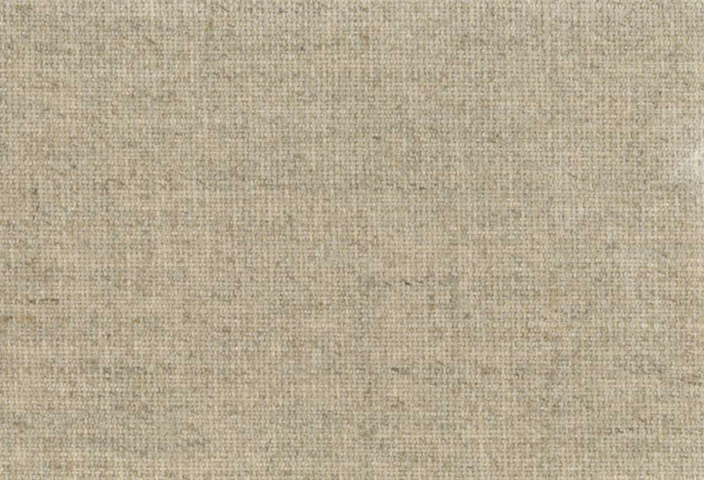
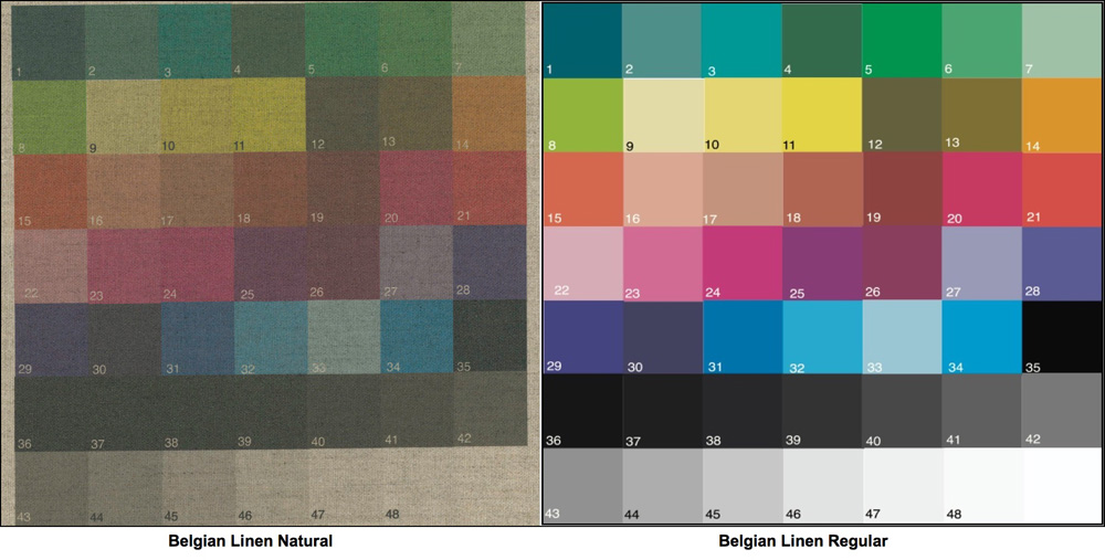
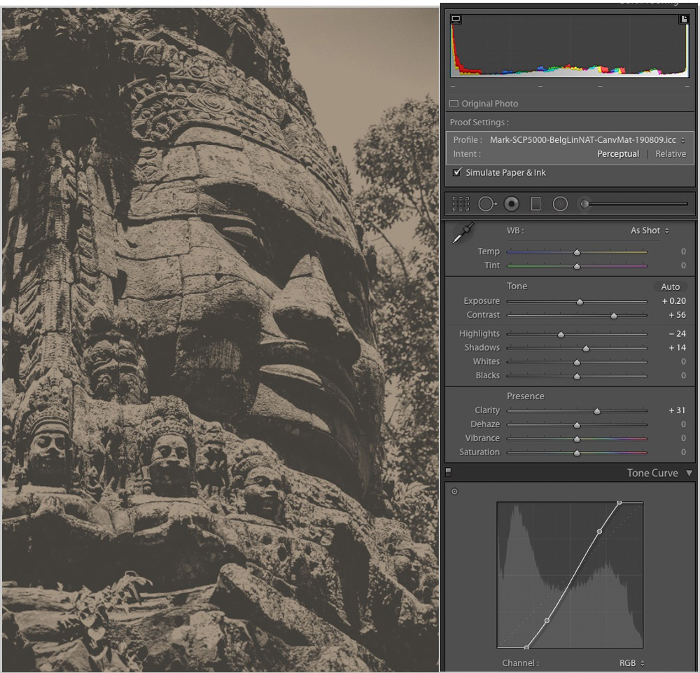
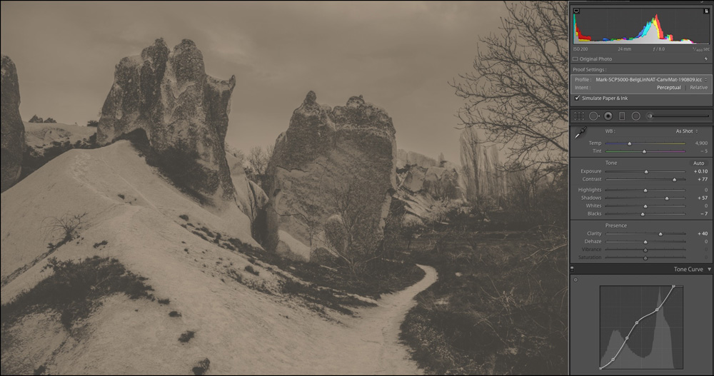
During the time that I was preparing my evaluation of the Belgian Linen product discussed above, Breathing Color informed that they were about to launch a new variant called “Belgian Linen Natural”, which as the name implies, has a coating that preserves the appearance and feel of the natural linen substrate. So, the printed side is beige, not white (Figure 19).
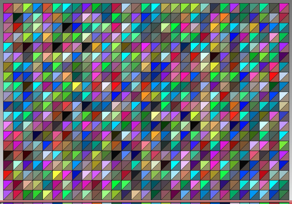
Breathing Color sent me some sample material to evaluate. Again, there being no OEM profile, I had to create my own profile for it (using the same Epson Canvas Matte media type for an Epson professional printer). If I were ever curious about what it would be like to profile sandpaper, this exercise probably served as a valid predictor. Joking aside, my real concern was about whether i1Profiler would be able to calculate a profile for it, given the huge differences between the file values of the patch set versus the values read by the spectrophotometer (Figure 20). In Figure 20, the upper triangle of each patch portrays the file value of the target, while the lower triangle portrays the value that the spectrophotometer reads from the target print. You will observe that for the most part, the differences are striking.
Fortunately, i1Profiler was able to compute a profile for this data-set. Having done so, I proceeded to undertake the usual profile inspection in ColorThink Pro. It is here where the first evidence of seriously challenging printing conditions show their face. The gamut volume is a tad above 44K (less than one-tenth that of the regular Belgian Linen – Figure 21), the White point is L*62 (normal would be in the range of 95~98) with a hue bias of a*4, b*12 (beige – like the product is!). Maximum Black for the profile is L*26, but more neutral at a*1, b*3 – just a bit warm.
So before going any further, we know that the media and the profile dictate an extremely narrow tonal and colour range. This being the case, any notion of printing accurate colours with this media should be largely discarded – it is to be used for effect only. Hence, the remainder of the analysis focuses on usage effects rather than printing accuracy. Even for this, it helps to understand the constraints of the media by running the profile evaluation targets to see what they yield compared with the regular product. Figure 22 provides a visual comparison of the natural versus regular media using the 48-patch evaluation target.
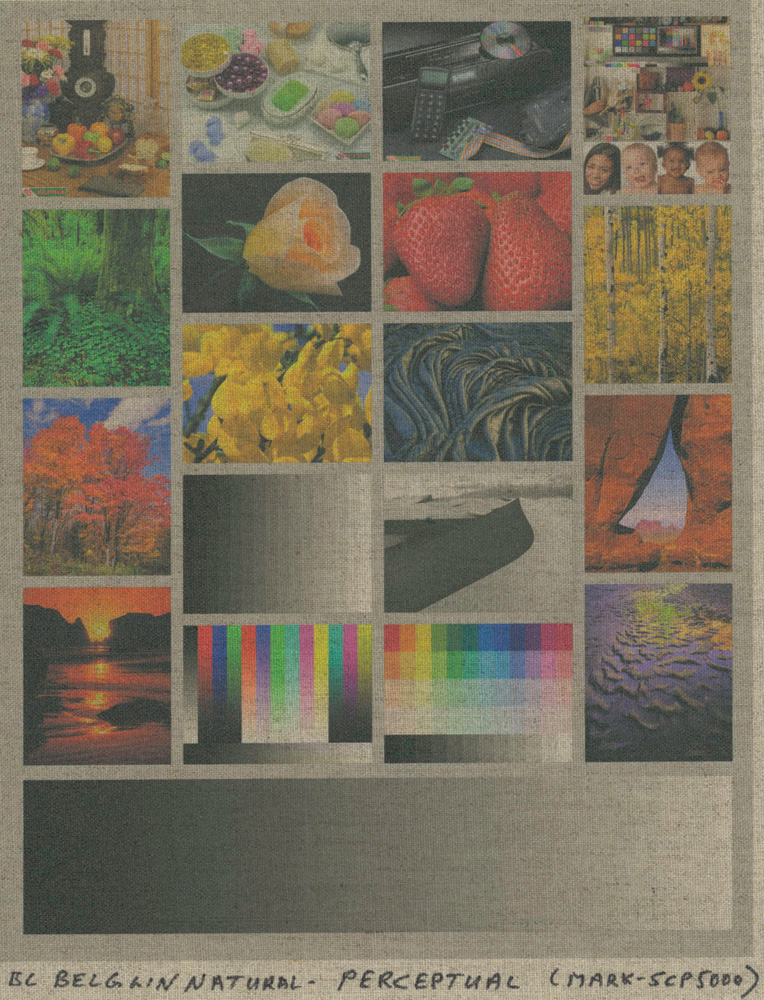
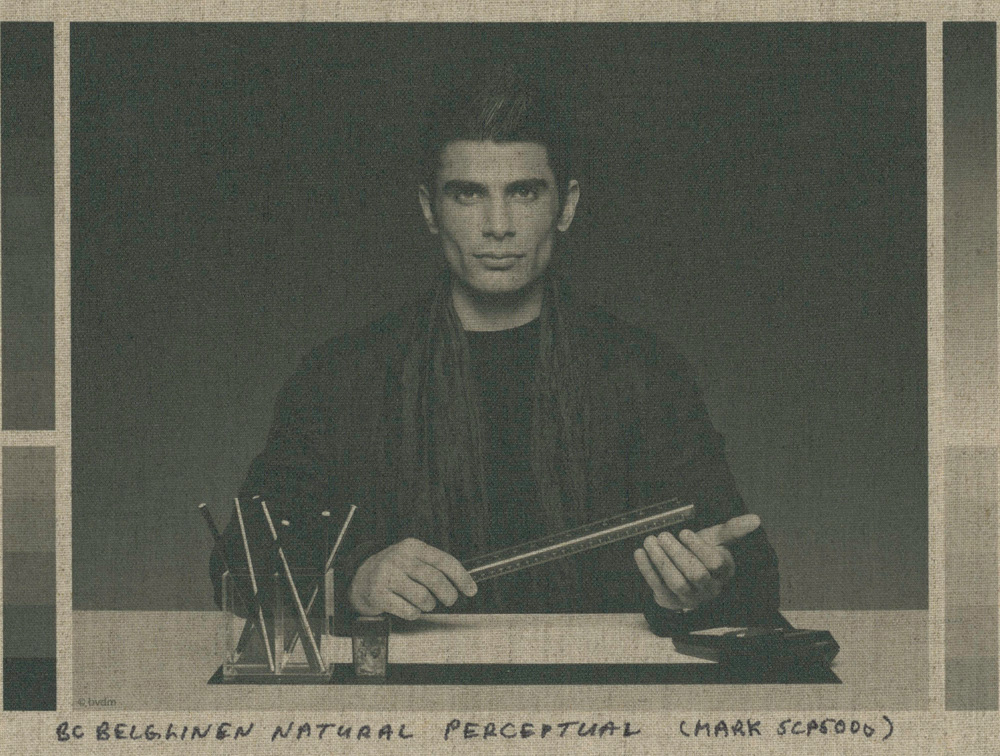
Confirmation of the kind of difficulty one should expect using this specialty product for normal colour photos appears in Figure 23 of the Atkinson target printed using the custom profile and Perceptual Rendering Intent (choice of Perceptual explained further below).
It would require a very special kind of photo with muted colours that could work well with this media, if one purposely wanted a very low-key, beige-toned result.
I then thought perhaps this media could work more easily with grayscale photos for which a high contrast range and vivid colour in the printed result is not needed to produce a pleasing visual effect. To start this evaluation, I printed the Roman 16 low-key grayscale image (of Figure 18), and the result looks like this (Figure 24).
By viewing this evaluation image under Relative Colorimetric and Perceptual Rendering Intents I determined that Perceptual works a bit better – the result is a trifle brighter allowing one to see more detail and to add some contrast without blocking dark tones.
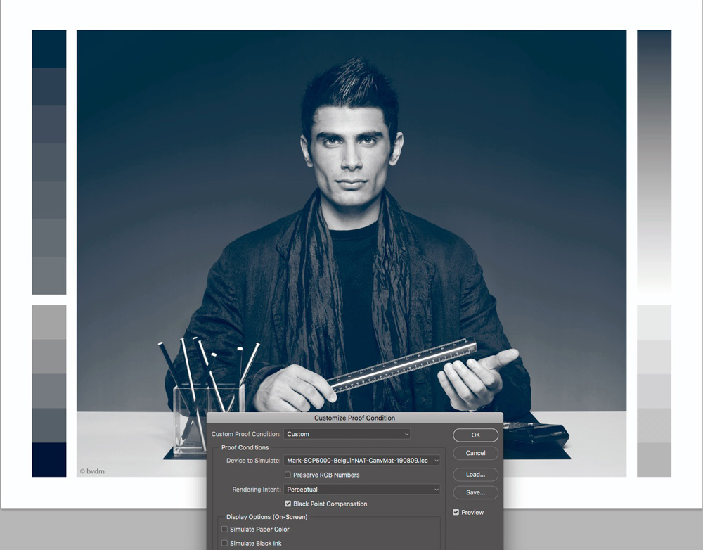
By the way, this soft-proofing exercise demonstrated the importance of soft-proofing testing for the correct Rendering Intent, and making sure that both “Simulate Paper Color” and “Simulate Black Ink” are active, otherwise the soft proof will NOT show what comes out of the printer. For example, if you were to de-activate these two conditions, the softproof will look like Figure 25, which is completely misleading.
The reason why the evaluation print in Figure 24 looks so flat/dull is that the contrast range of the paper is very low, meaning that good tonal separation is challenging. This shows analytically in Figures 26, 27, 28, for the shadow tones, mid-tones and the full scale respectively, from the grayscale patches printed in Perceptual Intent.
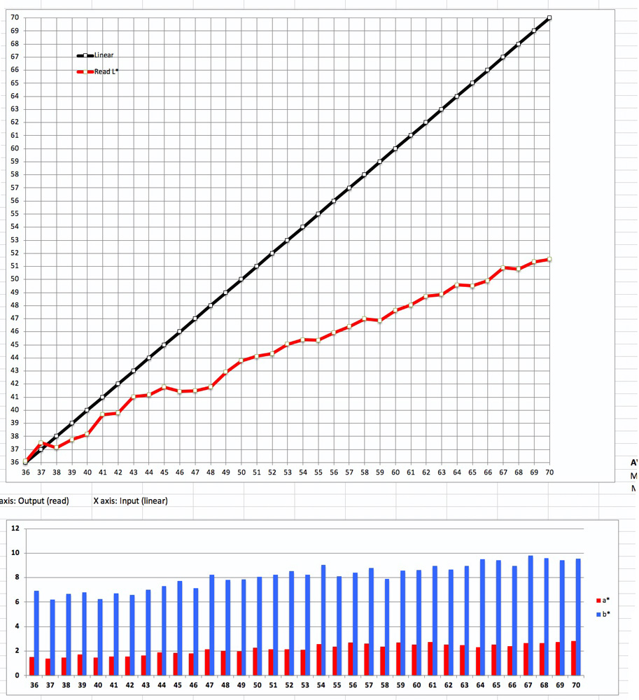
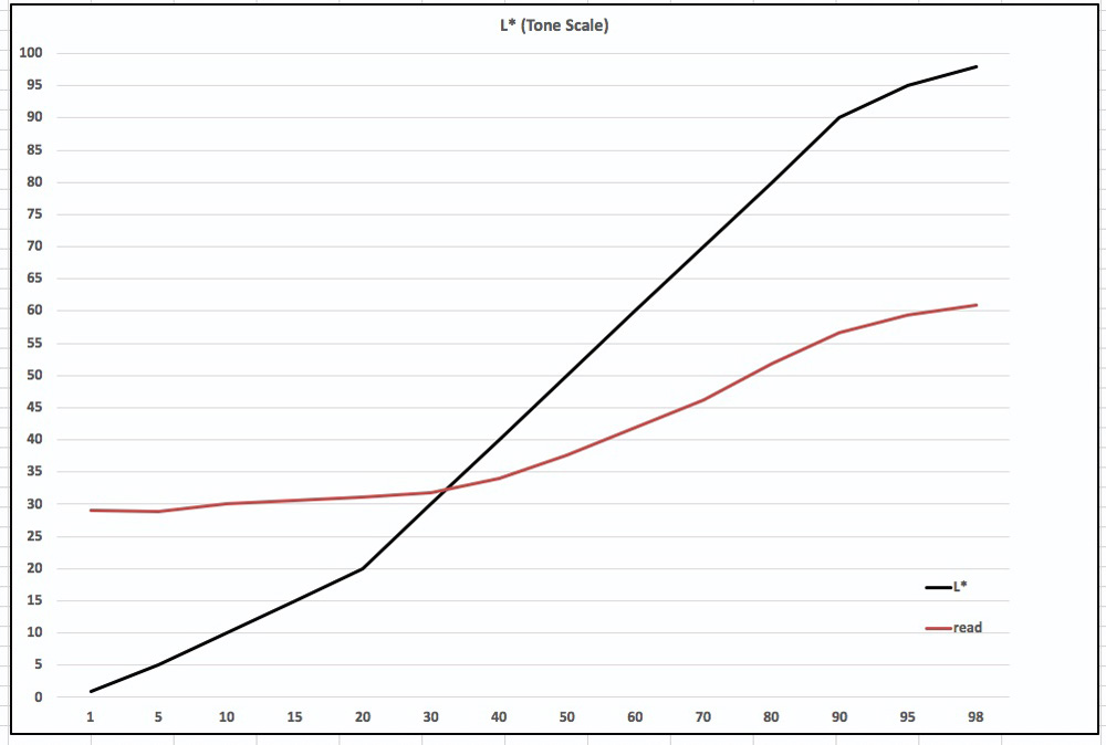
Starting with Figure 28 just above, the overall picture, looking at the red curve (output, numbers read from the vertical axis), you can see that about the first thirty levels are reproduced within a very narrow range around L*30, and from there onward between levels L*30 and L*98 never reaching beyond about L*60.
It was therefore pointless producing a detailed highlight graph, because that graph starts with output at L*71, which this media never attains. However, it is worthwhile looking at the Dark-tone and Mid-tone graphs of Figures 26 and 27 respectively (Relative R.I.).
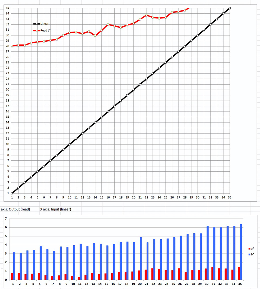
In Figure 26, you can see that L*1 in the test file maps to L*28 on paper (that is the maximum black), and L*28 in image file maps to L*34 on paper. This means that 28 tone levels are compressed into 6 output levels (34-28=6), which is quite a massive tonal compression.
The mid-tones (Figure 27) fare better. Level L*36 in the image file prints as Level 36, but Level L*70 only prints to about Level L*50. This means that 35 levels are compressed into 14 levels (50-36=14), which means that mid-tones are considerably less separated than they should be according to the file values.
This analysis informs that the choice of real-world grayscale images to print on this paper needs to be very mindful of the original tonal range of the photo and what one does to edit within that tonal range under softproof in order to optimize image appearance on this media. This is non-trivial – it took me the better part of three hours to come up with three photos that work not too badly with this media. The basic problem is that the usable tonal range is too small for there to be much that excites the eye. So, the challenge is to select good candidate photos and then adjust them to generate sufficient visual excitement to be interesting.
I found that the kind of the photographs needed to meet this challenge should have the following characteristics (my taste):
- Use simple subject matter with strong compositional lines and strong in-range contrast;
(Very low-key images don’t work – they come out looking dull and muddy.)
- Much of the tonal range should lie within the adjustment limits (L*28 to L*60);
- They should not contain much Black that will emerge looking uniformly muddy;
- Have highlights that can be darkened to maintain detail but still look like highlights;
- Have mid-tones “ribbed” with lighter tones that break them up (like marbled steak);
- Avoid photos with complex deep-shadow detail that needs to be maintained.
For optimizing such photographs to print satisfactorily on this media, the tone curve is the tool of choice – especially in Lightroom. But it needs to be adjusted under softproof ever so delicately, because with the tonal range being as limited as it is, curve adjustments can posterize all or portions of the photo quite easily, further impairing tone separation. Generally speaking, the curve movement strategy is to increase contrast, but to variable extents along the curve, depending on what it is doing to tone separation in specific areas of the photo. I provide below several examples comparing the “before” (Ilford Gold Fibre Silk) and the “after” (Belgian Linen Natural). Notice the curve adjustments. When you’ve done this well, the look and feel of the Belgian Linen Natural product is quite unique and “artsy” – appealing in its own way. That said, in general, a broader tonal range that still preserves the natural look of the substrate would be desirable.
The three above are comparisons of softproofs in Lightroom which convey the tonality, but not the texture of the media. I scanned most of photo “Figure 30-2” to try to capture the texture effect (Figure 32).
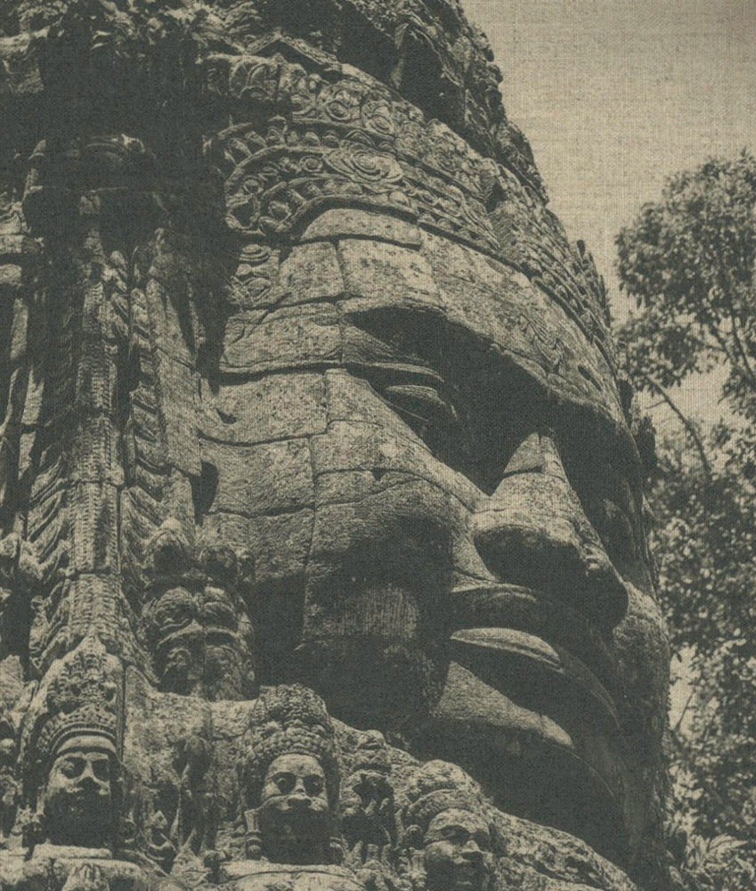
A closing comment on Belgian Linen Natural is that it does an excellent job of sustaining image detail (as does Belgian Linen regular). Whether, for example, looking at the fine textures and cracks in the stonework of Figure 32, or the very fine tree branches in the background of Figure 31-2, detail retention is fine.
Mark Segal
September 2019
Toronto, ON
Mark has been making photographs for the past seven decades and started adopting a digital workflow in 1999 first with scanning film, then going fully digital in 2004. He has worked with a considerable range of software, equipment, materials and techniques over the years, accumulated substantial experience as an author, educator and communicator in several fields, was a frequent contributor to the Luminous-Landscape website and now contributes frequently with in-depth articles on the PhotoPXL website. Mark has contributed over 75 articles to the two websites up to Q1-2024, with a particular emphasis on printers and papers, given his view that a photograph printed on paper remains the epitome of fine photography, as it has been from soon after the medium was invented and started gaining momentum in the 1830s/1840s. Mark developed a particular interest in film scanning and authored the ebook “Scanning Workflows with SilverFast 8, SilverFast HDR, Adobe Photoshop Lightroom and Adobe Photoshop” (please check our Store for availability). In his “other life” (the one that pays for the photography), Mark is a retiree from the World Bank Group and was a consultant in electric power development.