The Making of the Cactus TinType images
This is the story of how I started learning a way to really screw up my images in an artful and playful manner. It’s all about having fun…
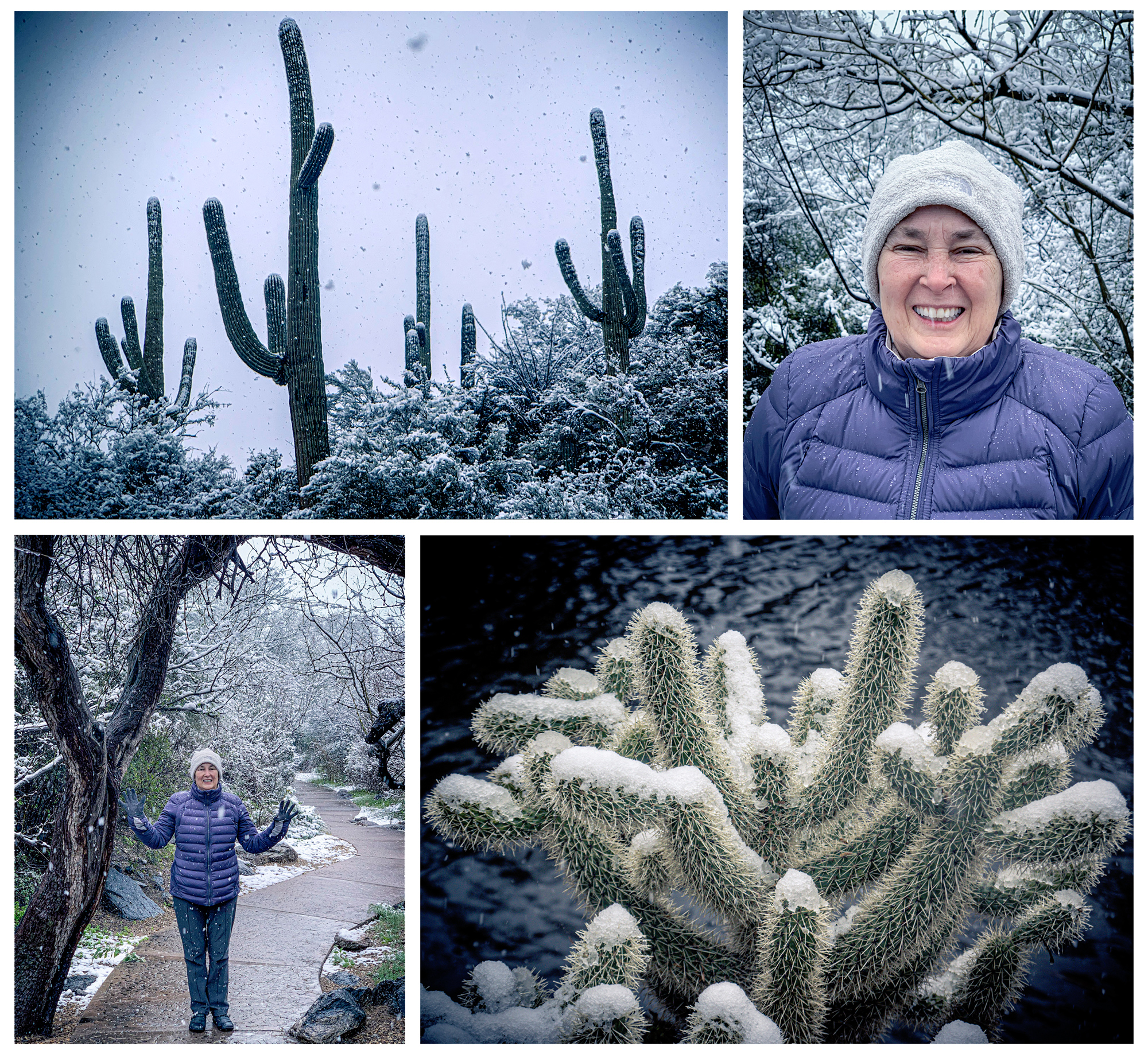
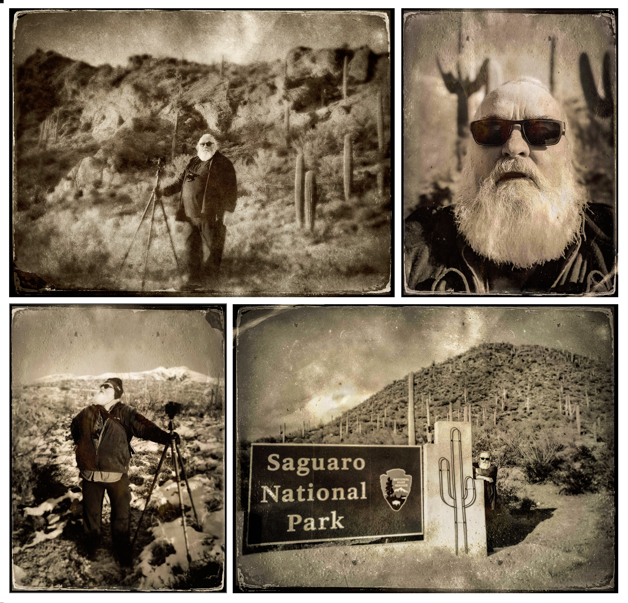
It seemed like a good idea at the time-to get away from the cold of Chicago on February 22, 2019, my birthday. My wife had suggested we go someplace warm for my birthday and we settled on either Saint Augustine, Florida or Tucson, Arizona. The average high for Tucson 69°F is on the 22nd while in Saint Augustine it’s 66°F so we went to Tucson…it snowed.
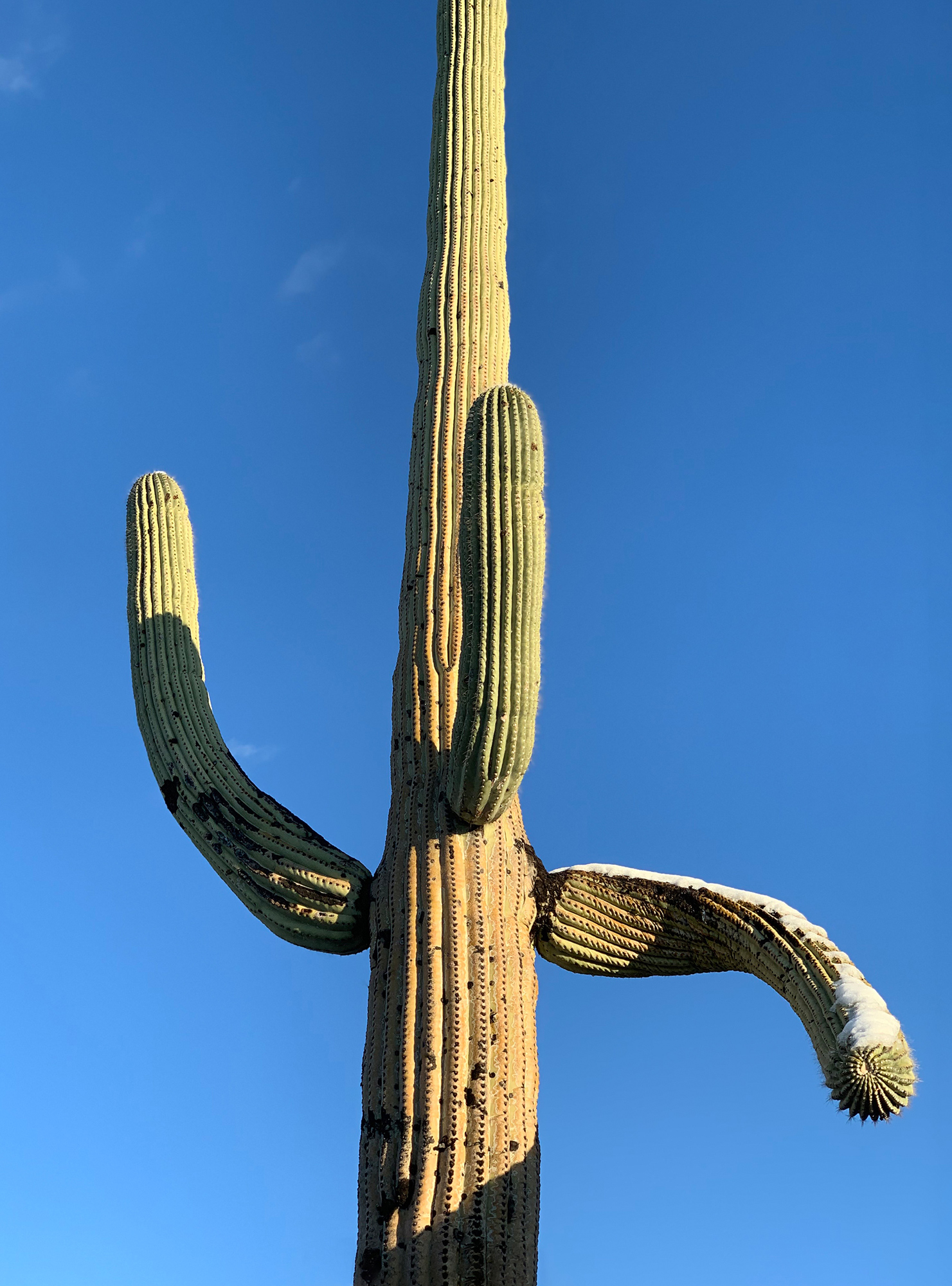
While I did bring my “big camera” (Nikon Z7) and my carry around camera (Sony DSC-RX100) the camera I used the most was my Apple iPhone XS. Not long before the trip down, I bought an iPhone app called TinType by Hipstamatic on the IOS Store. There’s something about the instant gratification of processing an iPhone shot into something “different” than a simple snapshot.
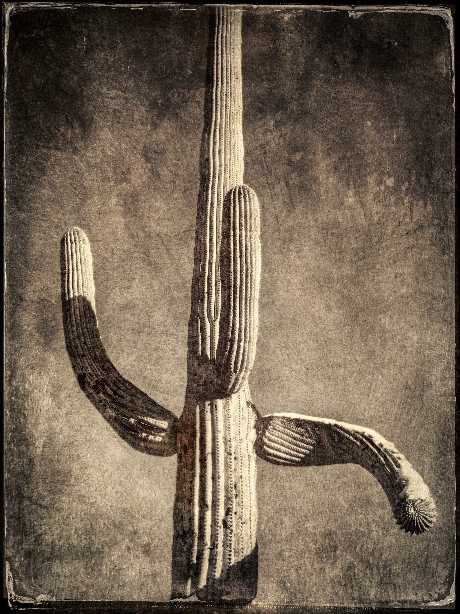
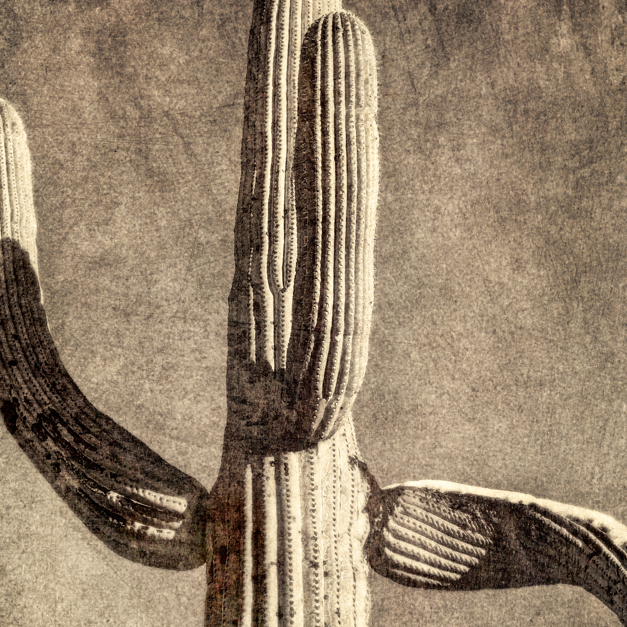
While wandering around the Tucson Botanical Gardens and driving through Saguaro National Park one can’t miss the striking presence and majesty of the giant saguaro cactus-the universal symbol of the American west and the TinType app was a perfect (I thought at the time) process for these wonderful living statues.
Now, I didn’t use the app to capture the images. I preferred using the native camera app to shoot and then using the TinType app for post-processing. The controls allow for a lot of post-processing adjustments, but I found it better to work on B&W copies while keeping the originals in color. I also found that it was difficult to find one single set of parameters that would be optimal from the standpoint of texture, color, and blurring. I ended up doing multiple processing and putting them together as layers in Photoshop-thus began my journey down this particular rabbit hole.
While working on the phone I browsed through my images on the TinType app and selected the image I wanted to work on. The app has the ability to modify the style (left icon shown below) the plate texture (2nd icon) the eyes (not applicable for cacti) and the depth of field blur. I usually only adjusted the style and plate parameters and used little, if any, blur.
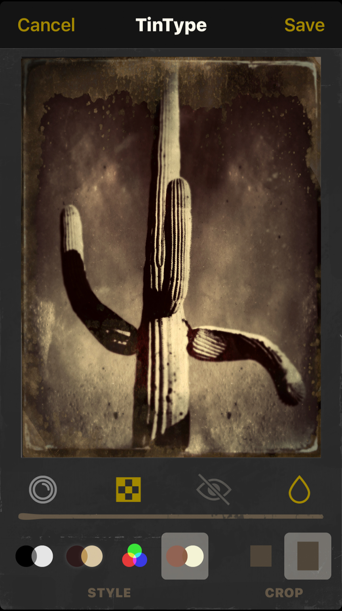
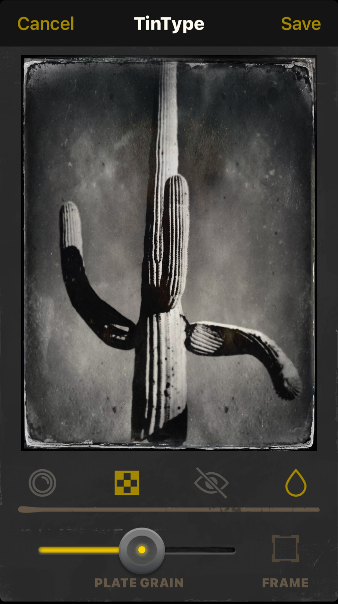
After processing, I used Lightroom to import both the original and processed versions of the images into my catalog. From there I opened the images into Photoshop for fine-tuning.
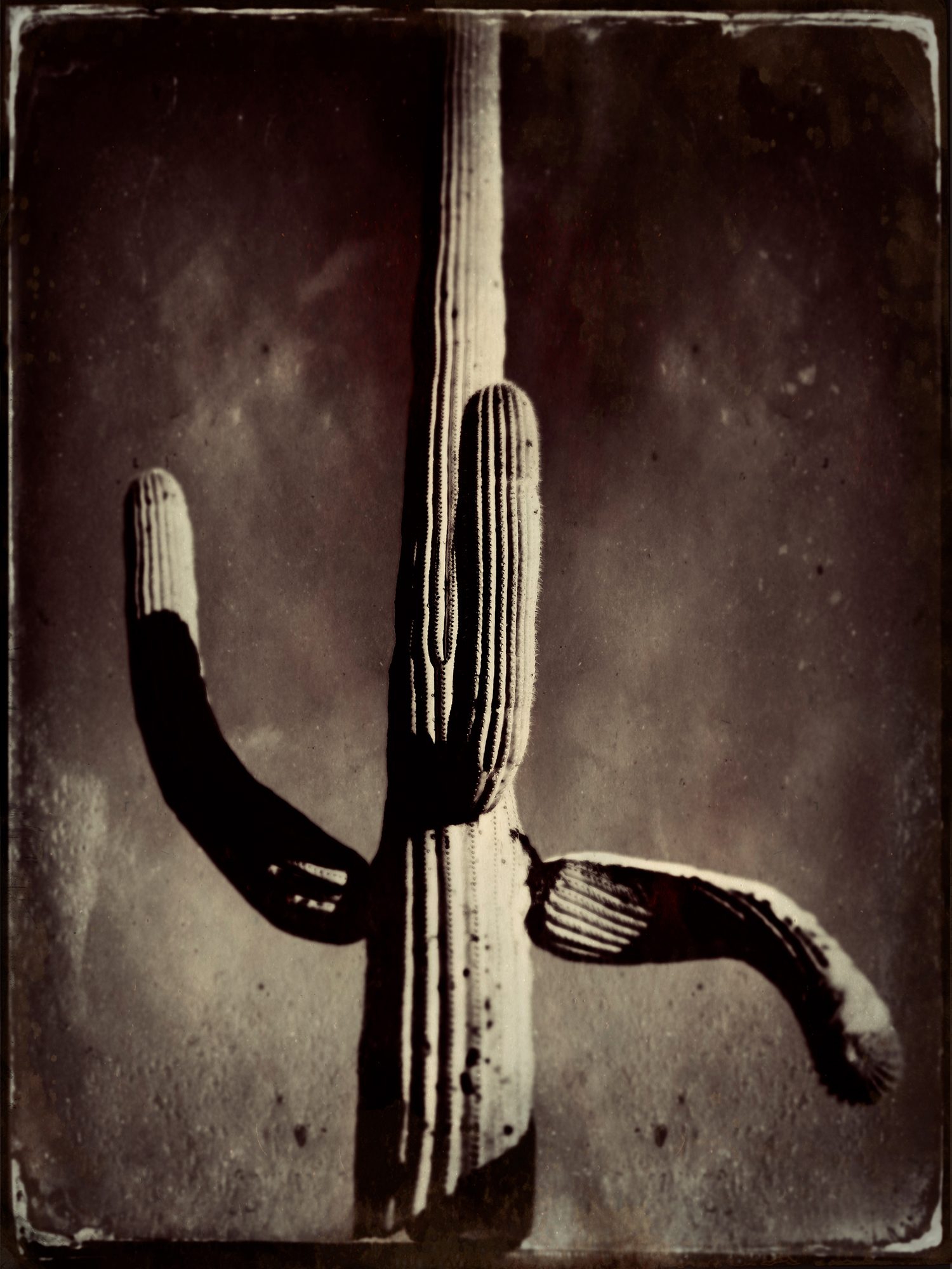
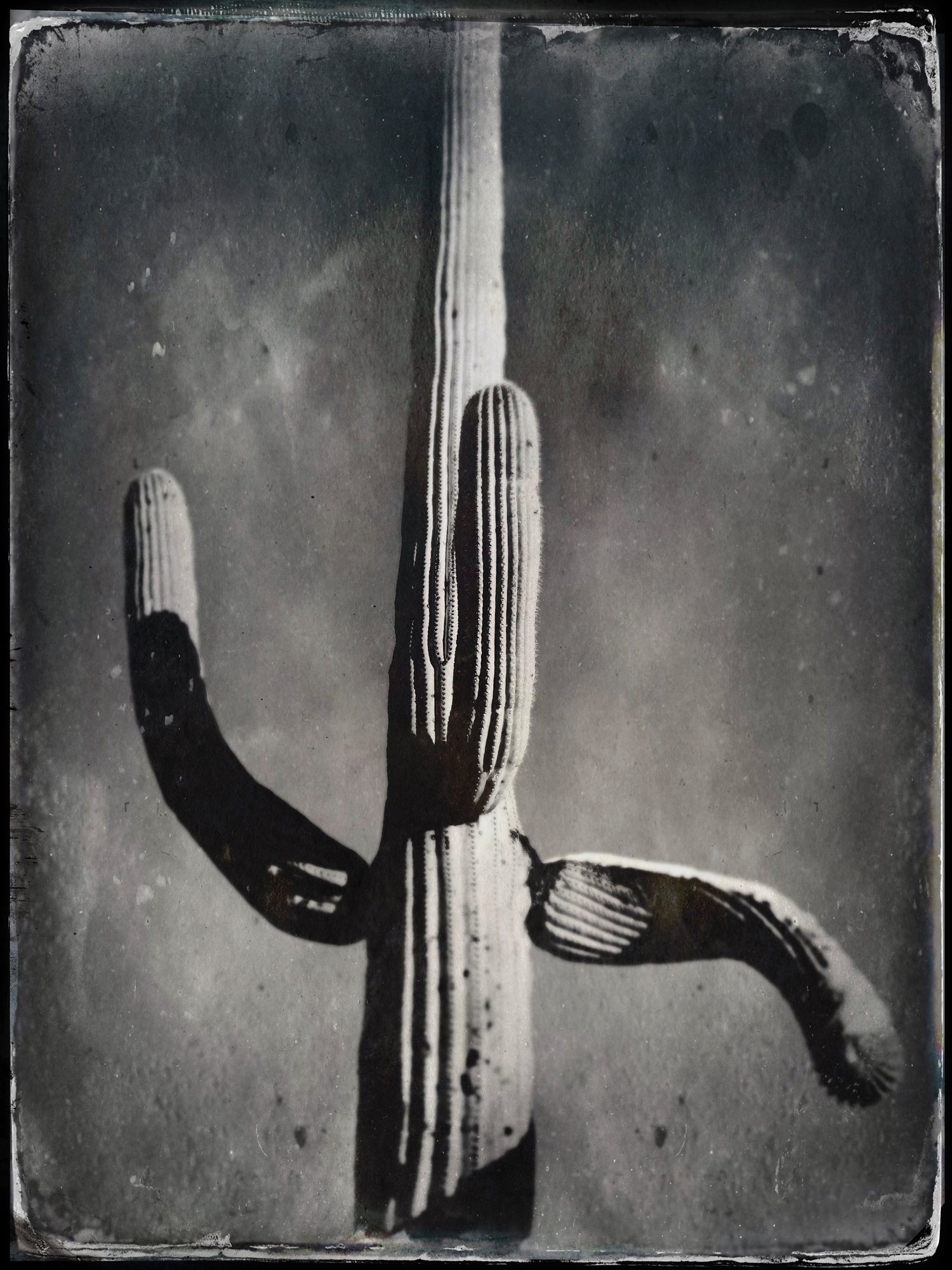

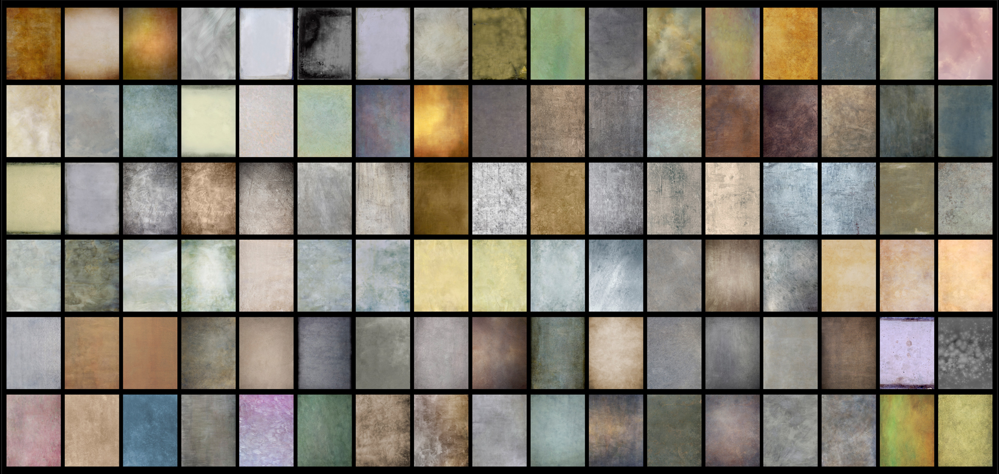
The problem I encountered was that the texture applied by the TinType app wasn’t locally controllable, meaning I could not add texture in one area while reducing it in another. I tried doing additional variations as layers in Photoshop but found that too limiting. The only solution was to add my own texture on top of the textures provided by the app. Yet another rabbit hole to go down-find a bunch of textures. I could just go out and shoot a bunch of textures-which I have done since starting this project. But I discovered a whole bunch of textures courtesy of photographer Tony Sweet.
Tony had a Facebook post mentioning Flypaper Textures so I went and bought some…and then bought some more and then even more textures. I now have over 750 textures and counting from Flypaper and it didn’t end there. I went looking on the internet and found a bunch of other sources and even started shooting my own textures. I now have a collection of over 5,000 textures, edges, and borders, including my recent rabbit hole of deckled edges, but that’s a story for another time.
There are several ways of using textures and they usually involve picking a different layer blending mode in Photoshop to more gently integrate the texture into the existing image. The most common mode is Soft Light. I could try to explain the math to you but Julieanne Kost has already done an excellent job of explaining all of the layer blending modes on her blog.
Here’s what she said about Soft Light:
“Soft Light mode – Darkens or lightens the colors, depending on the blend color. If the blend color (light source) is lighter than 50% gray, the image is lightened as if it were dodged. If the blend color is darker than 50% gray, the image is darkened as if it were burned in. Painting with pure black or white produces a distinctly darker or lighter area but does not result in pure black or white. It uses gamma adjustments to darken or lighten. The effect is similar to shining a diffused spotlight on the image.”
If that doesn’t get it across, try adding some texture in various blend modes yourself. Remember that I tend to advise starting at a 50% opacity which will allow you to increase or decrease the effect easily. Also remember that you can modify the effect locally with Layer Masks, but I didn’t use any masks for this image.
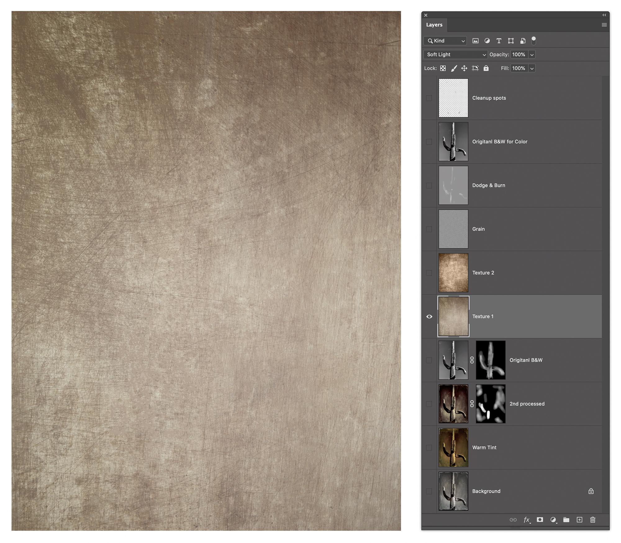

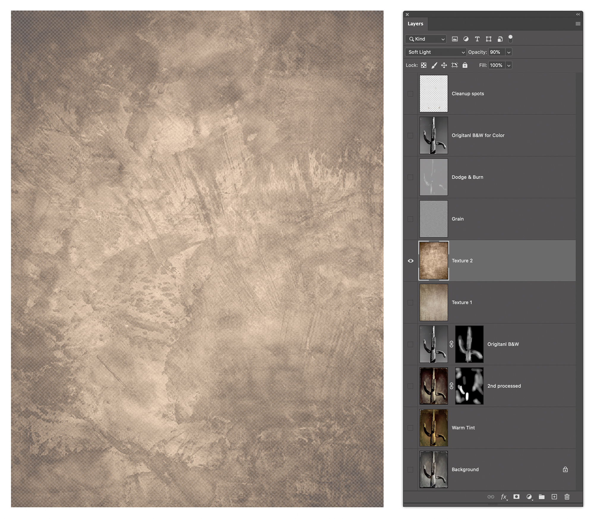
I added two additional texture layers; another Flypaper texture and a “grain layer” that added a subtle overall grain to the image.
Please remember if you are a Silver or Gold Member, you can click on an image to see it larger.
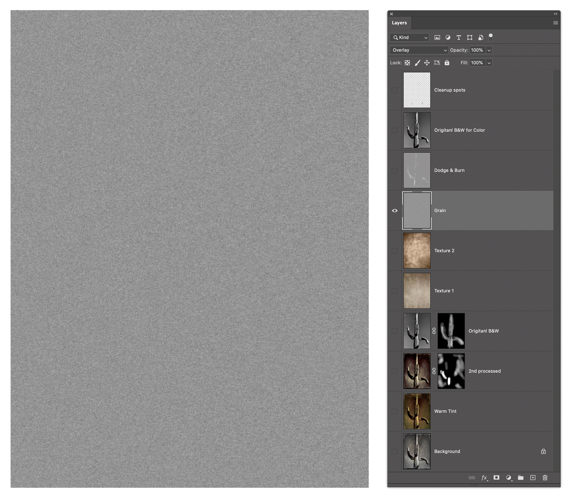
The grain layer is one of the effects I created in the product called PhotoKit from PixelGenius. It uses a layer filled with 50% grey and set to Overlay blend mode. At 50% grey, the layer is invisible. But if you lighten or darken any tones they become visible. The key here is to use the Add Noise filter at about 10% or so depending on your image resolution and then do a gentle Gaussian Blur at 1-3 pixels again based on resolution. If you need to, you can do a Levels command to strengthen the effect or reduce the opacity to make it less obvious. What does Overlay do? Let’s ask Julieanne:
“Overlay – Multiplies or screens a scaled version of the blend color into the base color based on whether the lower color is darker or lighter than 50% gray. Colors darker than 50% are multiplied, colors lighter are screened. Patterns or colors overlay the existing pixels while preserving the highlights and shadows of the base color. The base color is not replaced but is mixed with the blend color to reflect the lightness or darkness of the original color.”
Got it? Don’t know what Multiply or Screen do? Multiply darkens the base color by the blend color…it darkens the top by the layer below. Screen does the opposite; it lights by the base by the blend. That’s why at 50%, a layer set to Overlay is invisible. If the tone in the layer is lighter, it lightens, and it darkens if it’s darker.
In the case of grain making, I often do several passes of noise and blur and sometimes an Unsharp Mask. You’ll notice there’s another grey layer above the grain layer called Dodge & Burn. This is a grey layer again filled with 50% grey and Overlay blend mode. Using the Paintbrush set to a low opacity, I can paint white or black to either lighten or darken areas of the image. I got this technique from my friend and former PixelGenius partner R. Mac Holbert. He called it “Sculpting” because it allows you infinite control of lightening and darkening local areas of an image to bring out a greater appearance of dimensionality. The technique is very forgiving because is for ever screw up you can simply paint with a 50% grey to remove the effect.
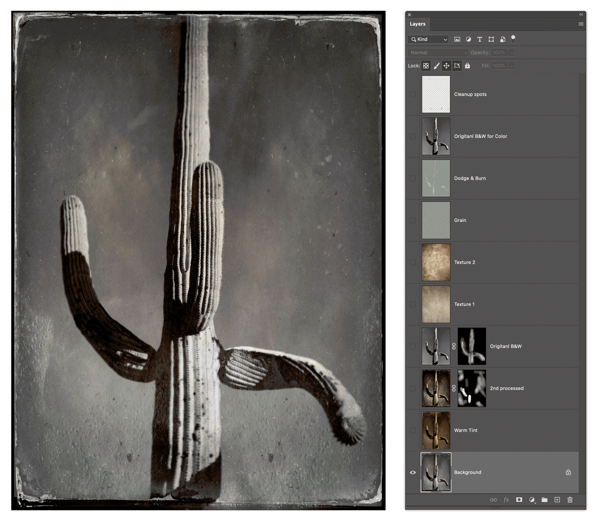
The final Photoshop layered file is shown in the figure below. There are two additional layers, a B&W copy of the original color image and a retouching layer on top. The B&W layer is set to a Color blend mode at 20% to help tame the colors of the combined layers. There’s also a top layer where I used the Spot Healing Brush tool and the Clone Stamp tool to eliminate some of the distracting marks and spots that came with the Tintype processed images and the two texture layers. I like spotting on a layer at the very top of the layer stack with the tool options set to Current and Below.
A GIFF Of The Process
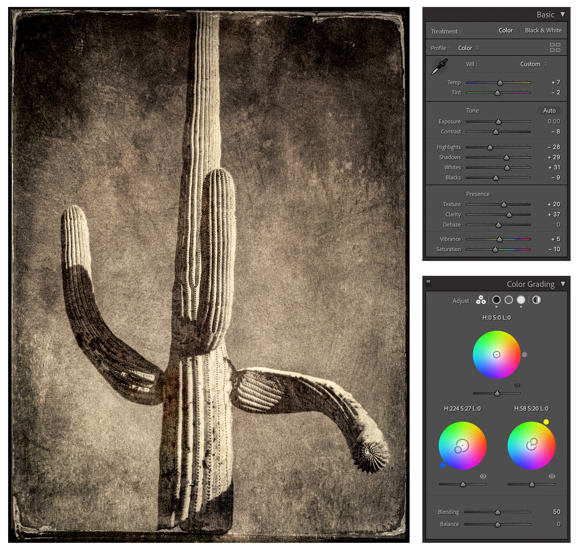
You might think I would be done at this point, but no, I saved the image file and added it back into my Lightroom catalog so I could do further tweaks in the Develop module. In particular, I wanted to Soft Proof the image based on the paper I was intending to print on (Epson Textured paper for the previous printing videos) and finessing the image using Lightroom’s toolset. When I do imaging work on my photographs-regardless of the project-I always start in Lightroom and if I edit in Photoshop the image ends up back in Lightroom.
I’ve received a bit of encouragement in several recent portfolio reviews-yes, even I can benefit from getting a critique from a competent reviewer. I recently had a portfolio review with Ann Jastrab, the Executive Director of the Center for Photographic Art in Carmel, CA. Reviews are only on Wednesdays and available to members only. The cost is $20. I used my review, done via Zoom, to review a body of work for consideration to an upcoming show. The reviews are run periodically so check the website to see availability. https://photography.org/event/portfolio-reviews/
I’m also pleased to mention that a folio of ten Cactus Tintype images was selected in the 2021 Rfotofolio Selections.
If you wish to see more of my Cactus Tintype images, they are available to view on my website. Prints are available for sale.
The Cactus Type Video
Just for yucks, I’ve done some tintype selfies:
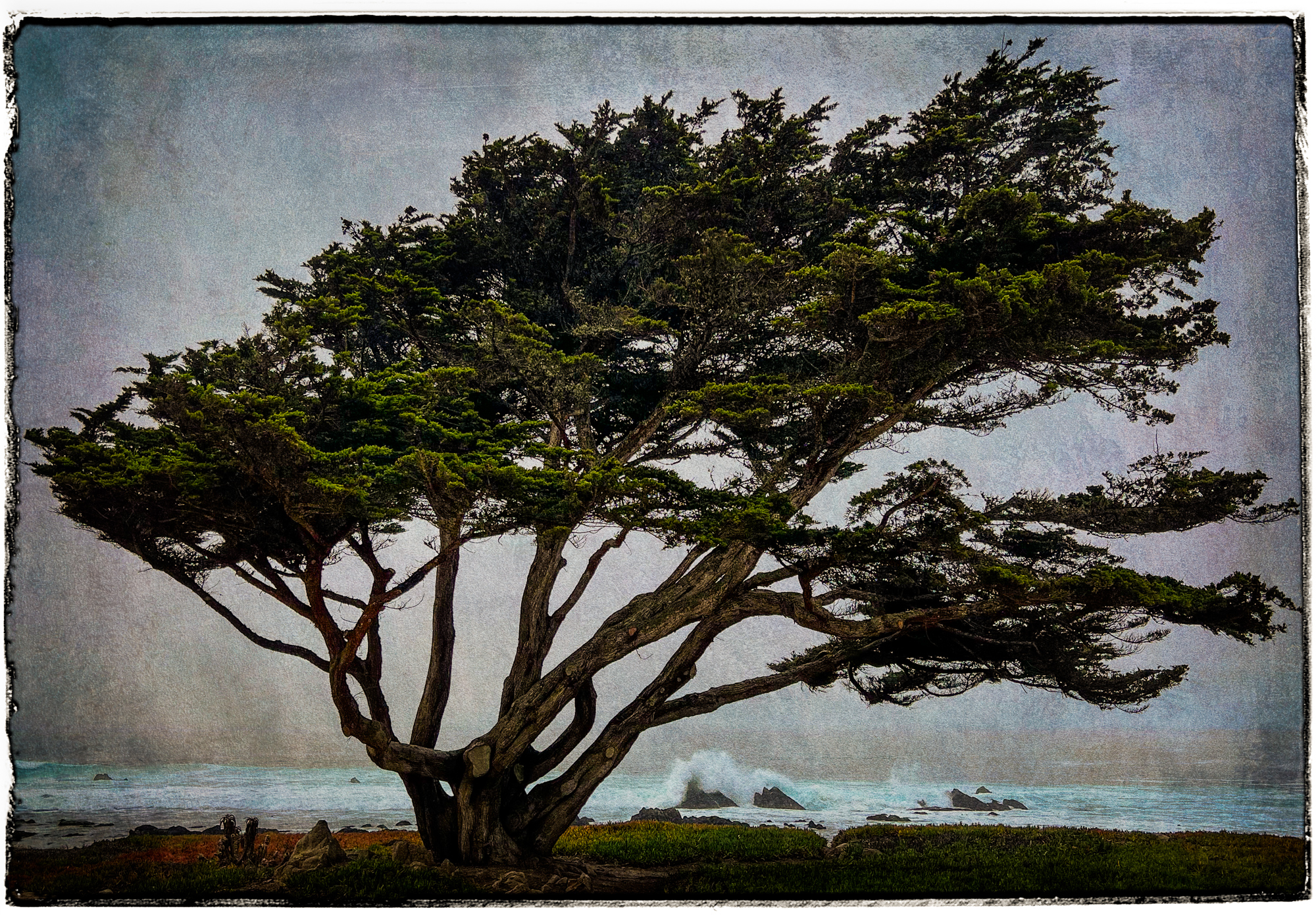
At the end of the video tutorial, I also showed some newer work where the texture and edges are evolving. Here are examples of images created during a recent trip to Monterey, Carmel, and Point Lobos in California. It was a trip taken for the purpose of attending a workshop given by Keron Psillas with special guest Elizabeth Opalenik. Additional info on Keron’s website.
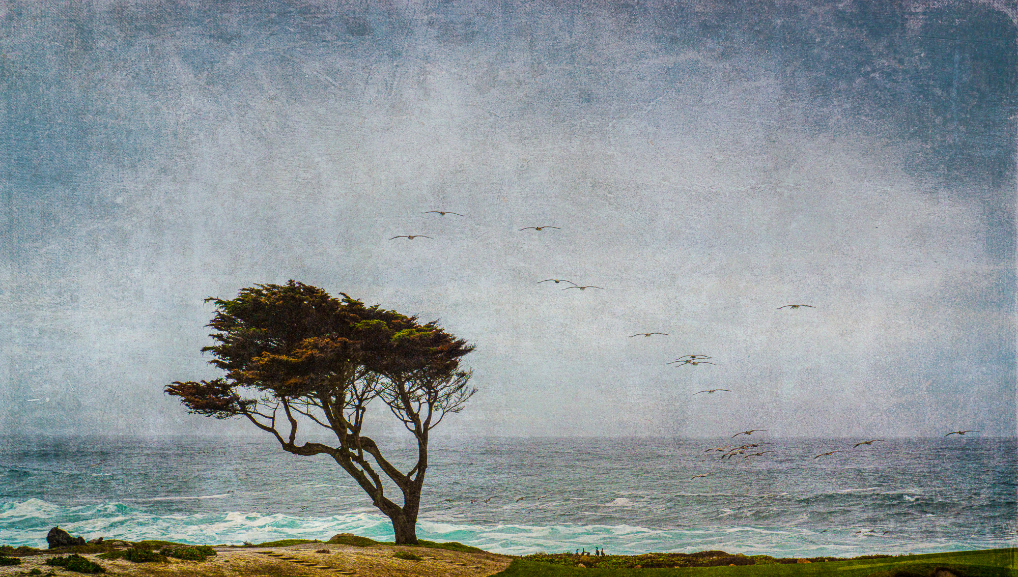
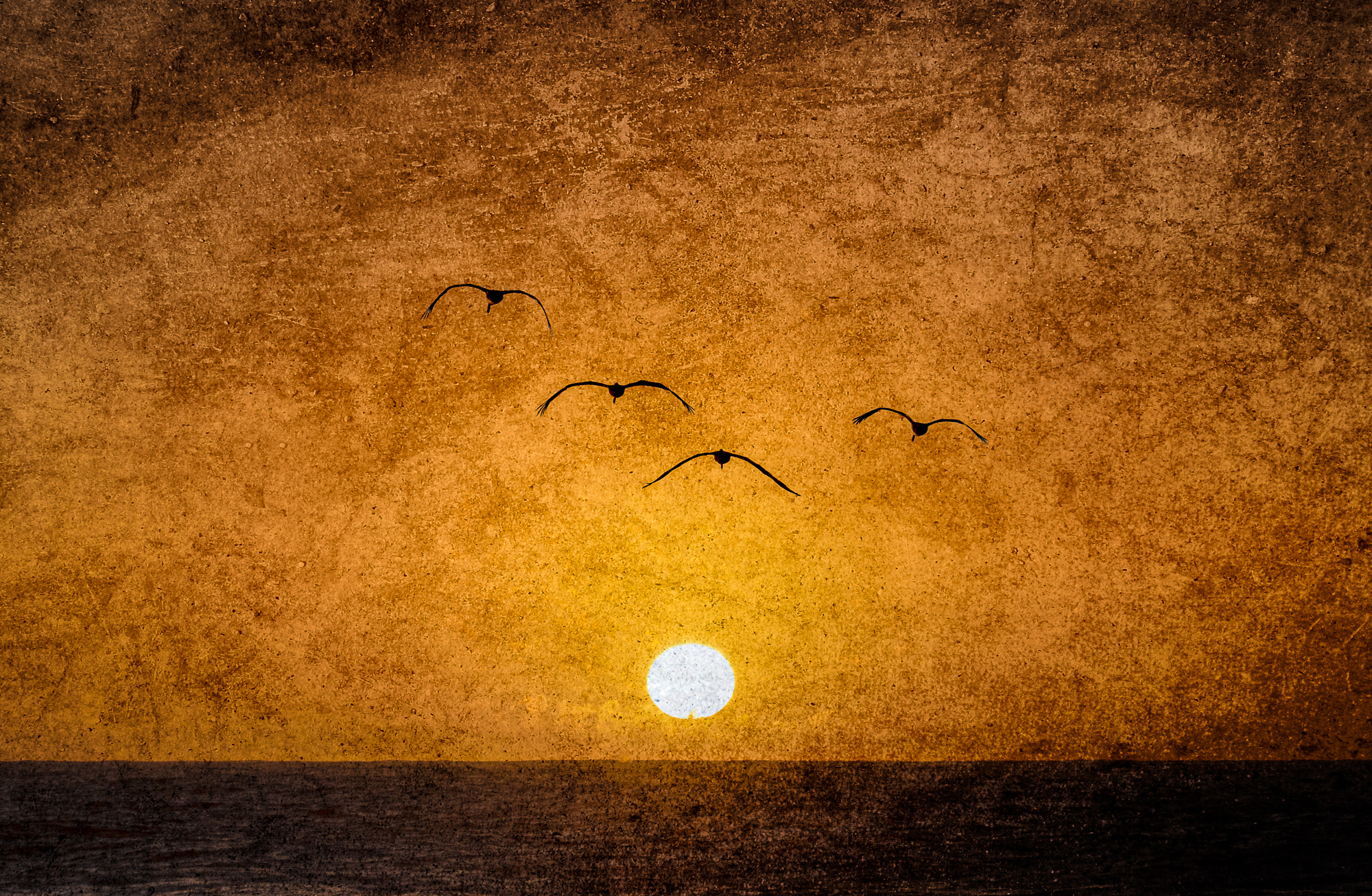
…ok, these birds were added to the shot-but I shot them at about the same time, just at a different zoom…
Jeff Schewe
April 2022
Chicago, Illinois
Jeff Schewe has been an award winning Advertising Photographer in Chicago for over 30 years. He is accomplished in tabletop, location, portraiture and particularly accomplished in computer imaging. Jeff shoots a variety of subject matter and likes to control as much of the production as possible. He does this by making his own models, designing and building his own sets, painting backgrounds and employing computer imaging. He has been doing his own imaging for almost 20 years in house on his high-end Macintosh systems. Jeff Schewe has been described as a Photoshop Guru’s Guru. He’s on the inside of the development and testing of Photoshop, Camera Raw and Lightroom and has helped guide and direct many features since Photoshop 4.0. Short of some of the Photoshop engineers, there’s probably not many people who knows Photoshop like Jeff. As an indication of his skills and knowledge of fine art printing, he has been named an Epson Stylus Pro. He is a past Apple Master of the Medium and has been inducted into the Photoshop Hall of Fame (2006).