Finding Drama in Architecture
For many years I taught a course called Humanities Through the Arts, an interdisciplinary fine arts course in the general education curriculum. In this course, I organized modules on music, painting, sculpture, drama, poetry, film, and architecture, and always strove to have students focus on aspects of method and design common to all the arts. My approach to architecture included comparing the creation of architecture to the painting process as architects utilize line, color, texture, shape, and value to achieve meaningful, concrete results. Architecture also functions as a spatial art like sculpture with one distinction. Sculpture occupies space; architecture occupies and creates space. It functions as a dynamic environment for human operation. Architecture is also a temporal art like music and drama. As a temporal art, architecture creates space that is experienced as tempo and harmony as one moves in, around, and through the spaces of a building.
I have always found architecture to be dramatic and musical. It creates rhythms and contrasts, even offering up surprises. Architecture is also the most functional of all of the arts. It’s very hard to imagine a building that does not have a function. No architect builds without a client funding the enterprise. Because their work connects so closely to our lives, architects create an expressive form that conveys meaning about the people who experience the building.
So why do I photograph architecture? A building’s dramatic form narrates a story, and I look to reveal this narrative in the buildings I photograph. Some structures are simply monumental forms—a monumentality that must be conveyed through the image. Other forms are mysterious. Their tales are present but elusive to our sensibilities. Something is hidden behind the facade, and contrast brings out the impact of the forms and their sensuality. Since structures are made to be used and provide context to people’s lives, I try to create an image that resonates with the narrative of human life.
Contrast is what drives classical narrative form. Aristotle noted that narrative has a beginning, middle, and end. He went on to define these terms in a somewhat sarcastic manner: the beginning is something that cannot have anything before but must have stuff after; the end is the other way around; and the middle, of course, has stuff before and after. But the essence of the form is how the parts function. The beginning establishes a norm; the middle introduces tension and conflict; and the end resolves the tension, restoring the norm. “Once upon a time” everything was “hunky-dory,” then shit happens. The conflicts create tension thus creating contrasts. In music, a form such as the blues does much the same. Comprised of three four-bar phrases, it follows the same pattern. The first four bars established the norm (the tonal center). The second four bars introduce the first degree of tension through the IV chord. The last phrase starts with the Dominant V chord creating the highest degree of tension and finally resolving back to the tonic (tonal center). The element of tension and release is the key to tonal music (maybe all music), and I find the same to be present in architecture. My role as artist/photographer is to find that tension/release through contrasts.
Modern and post-modern architecture offers significant opportunities for creating drama in the urban landscape. The irregular forms, extended shapes, and powerful rhythms present a visual structure that allows the artist a wide array of expressive options. Light and tone values still drive my choice in creating these dramatic forms.
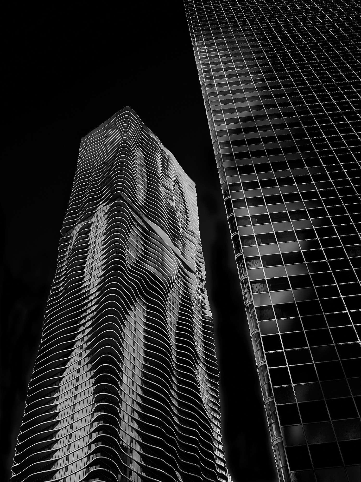
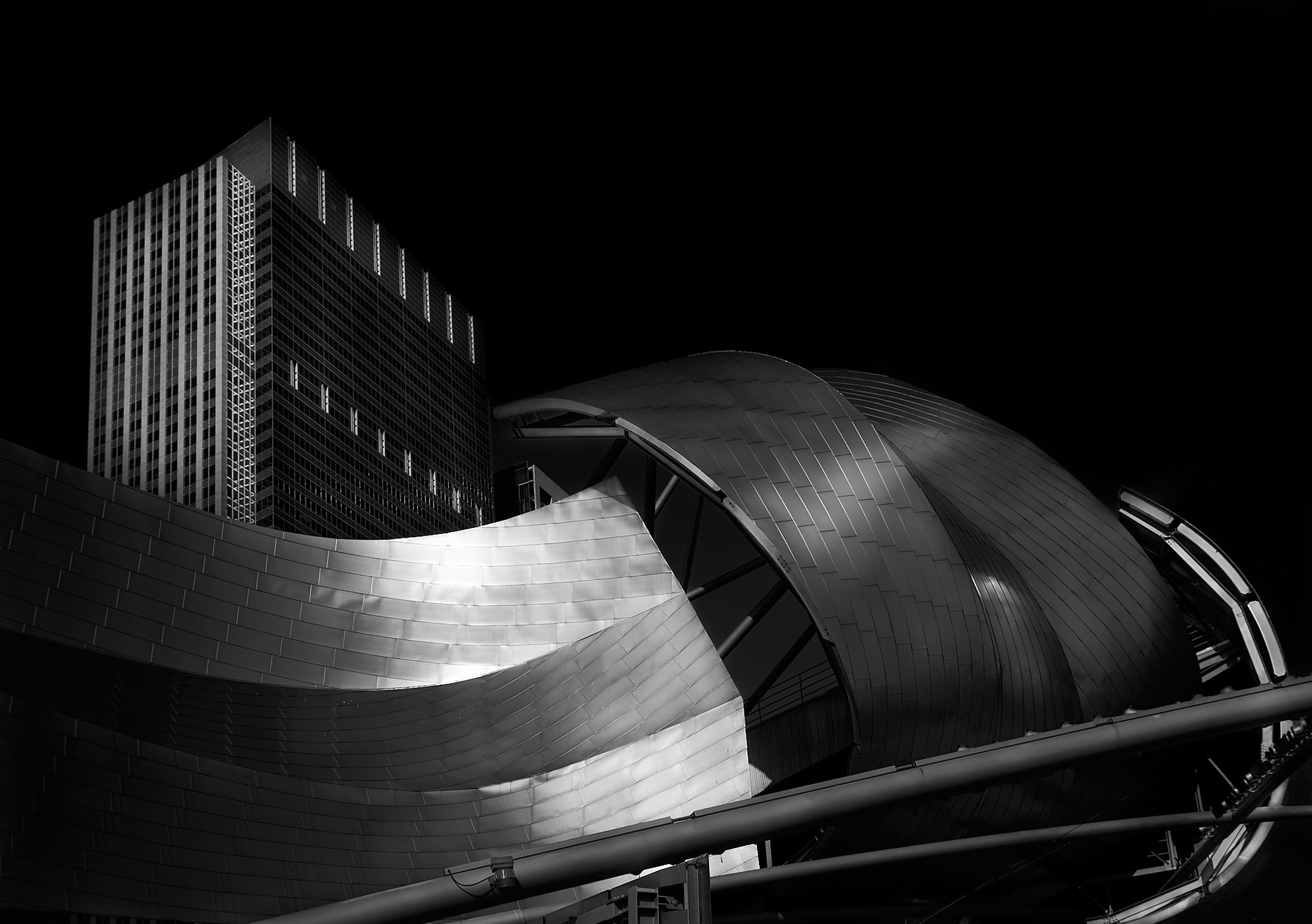
I photographed the Chicago building known as Aqua during one of my frequent trips to the windy city. Its organic form expresses the aesthetic of Post-Modernism and contrasts nicely with the more Modern, Bauhaus-influenced building beside it. On the same visit, I also found the Pritzker Pavilion designed by Frank Gehry to be a fertile subject. Its presence in Millennium Park complements other objects such as The Bean (Cloud Gate). I tried to emphasize the dramatic shapes and panels of the Pritzker by creating extreme contacts in post-processing the images.
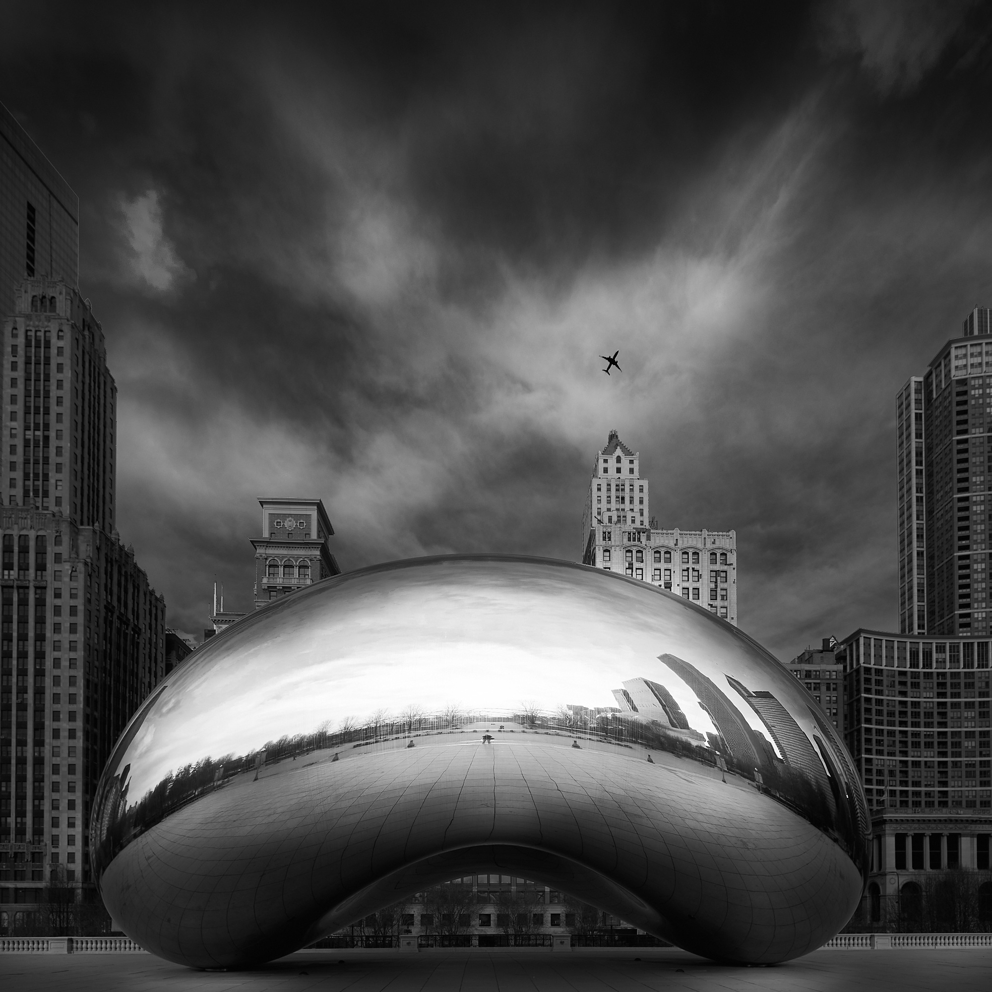
The sculpture, titled Cloud Gate by its creator, Anish Kapoor, has become known colloquially as The Bean. It is sited in Millennium Park in downtown Chicago. The reflective form is said to duplicate the reflective quality of liquid mercury. The distorted view that it reflects creates a dream-like expression within the urban context of the surrounding buildings. I was fortunate to capture the airliner rising into the sky from O’Hare Airport.
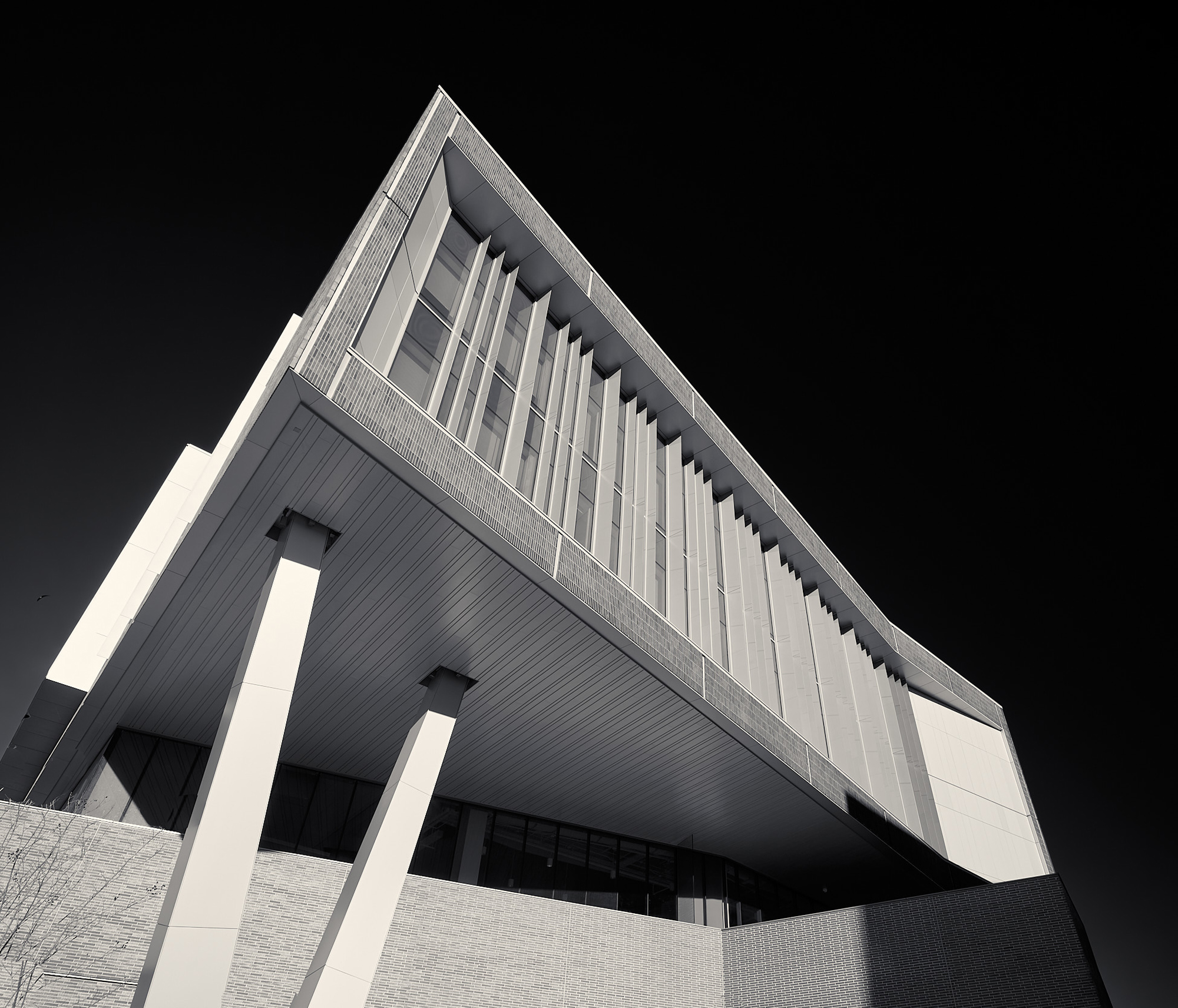
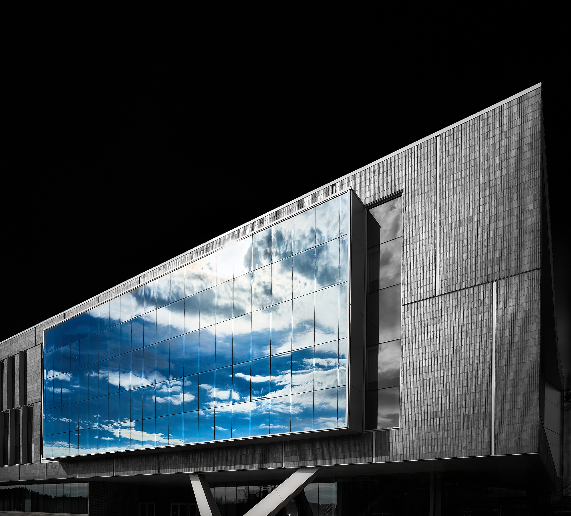
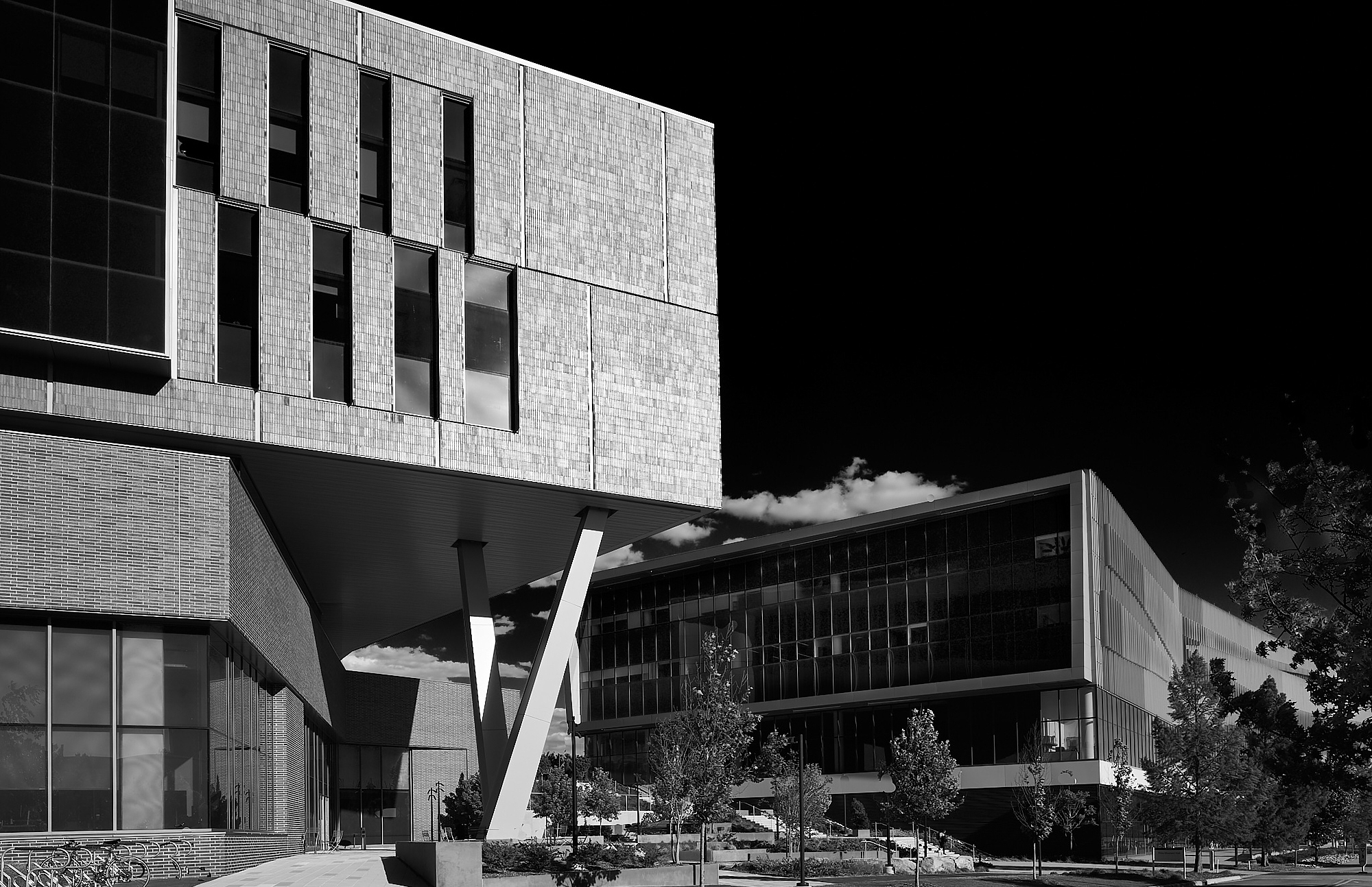
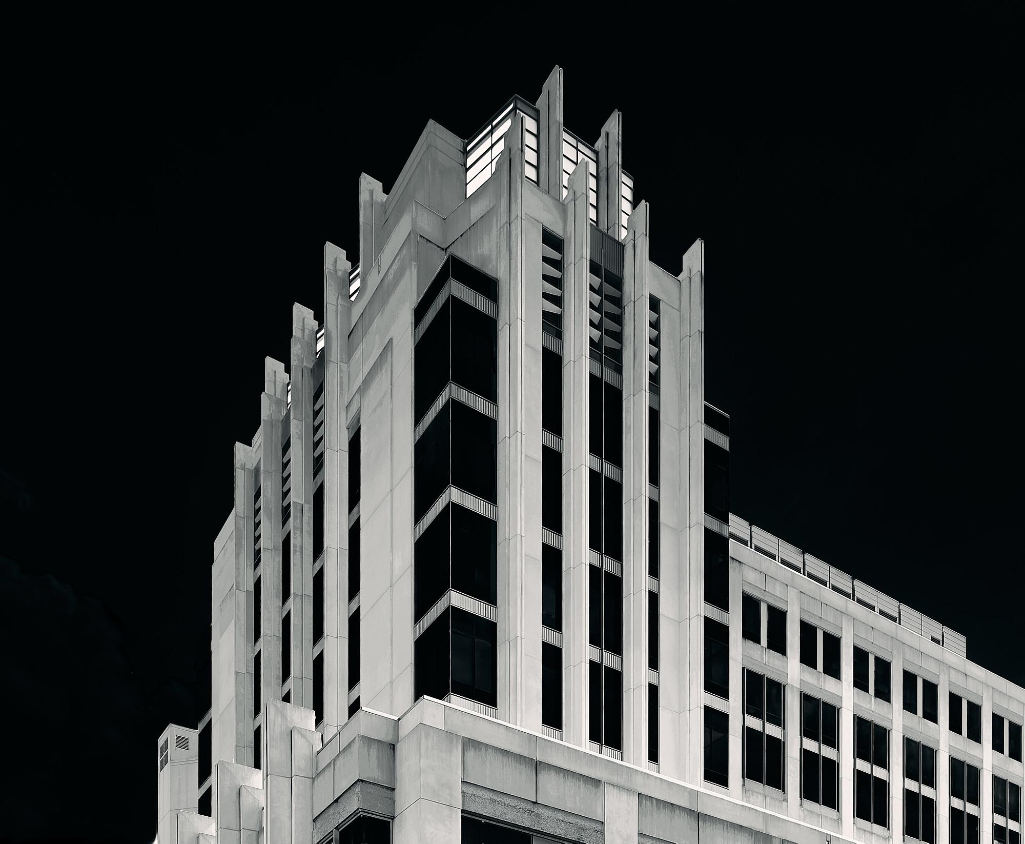
University campuses provide outstanding examples of contemporary architectural forms. The following two buildings are on the campus of North Carolina State University. The first is Fitts-Woolard Hall and the second is the James B. Hunt Jr. Library. Both were designed by the architectural/engineering firm ClarkNexsen. The abstract geometric forms of the structures become the primary focus of the photographs, creating a singular drama in partnership with the artists who created the original forms. The subjects found in these images are not necessarily famous. Many are quite ordinary. However, their monumentality remains within, and my attempt to draw out this form is the true subject of my photographs.
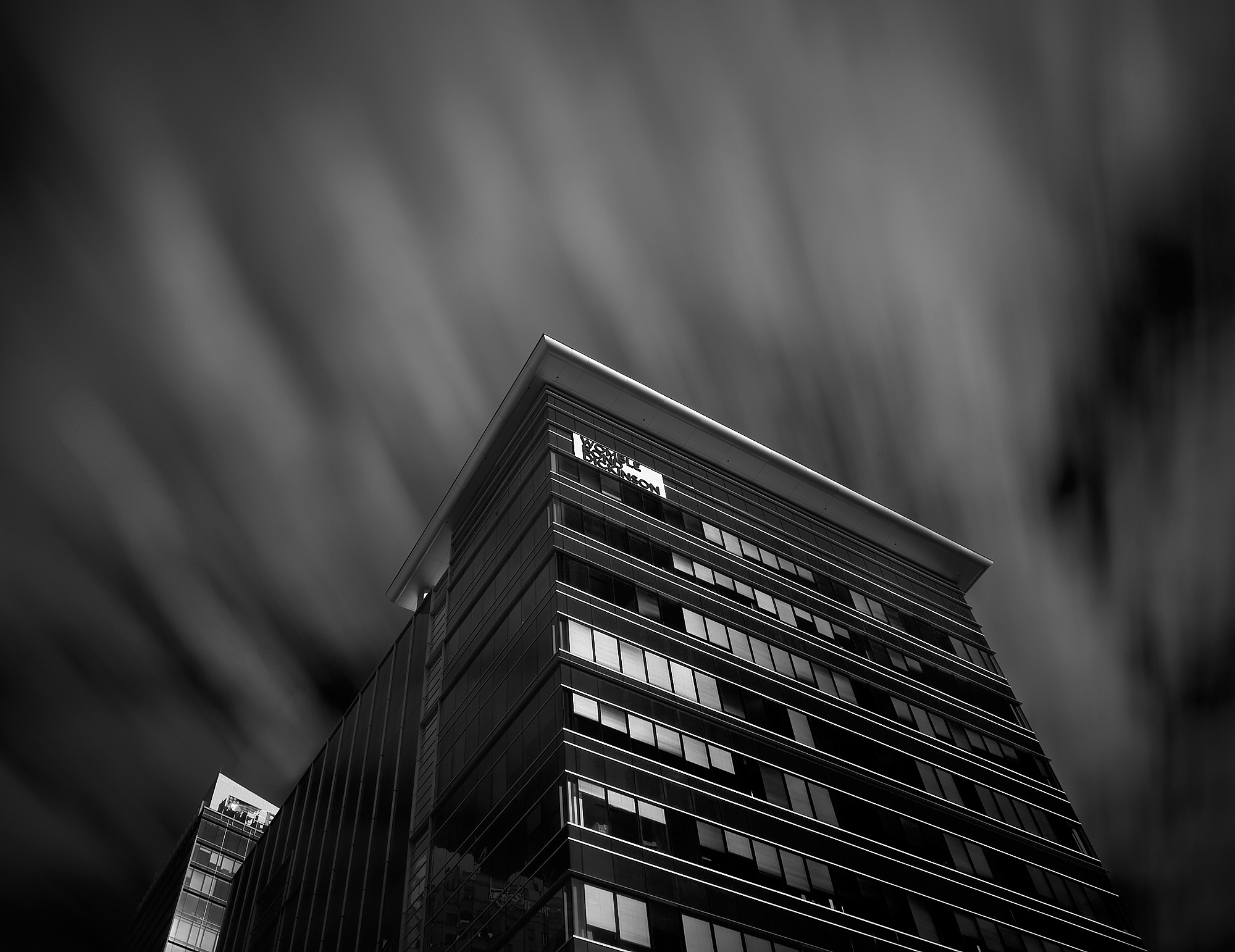
Nearby, in downtown Raleigh, I explored several very different buildings. Completed in 2015, the first structure is known as the Charter Square Building.
The second structure located in downtown Raleigh is the Wake County Justice Center.
It is followed by another building just west of downtown referred to as the Atrium.
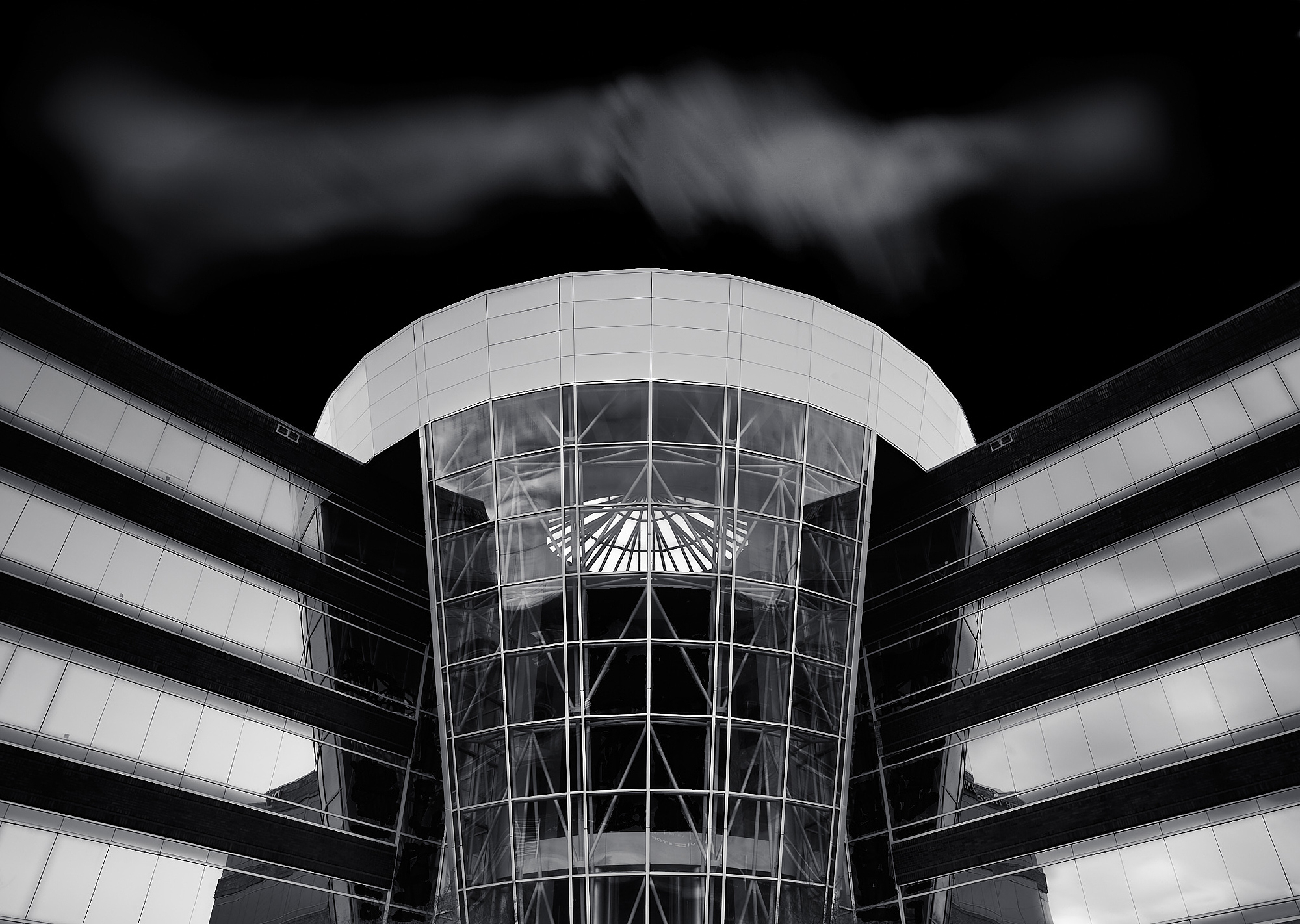
The preceding text answers the question WHY photograph architecture as fine art. Now I would like to turn my attention to the HOW. On site, I compose my images and consider how I want them to look in the final rendition. I frequently employ ND and ND Grad filters to control the light and lengthen the exposure. I always use a polarizer as well. Long exposures provide two elements: (1) blur the clouds and water and (2) eliminate moving people and vehicles. Since I frequently compose the shot above street level, the cloud movement in works such as the Charter Square Building above is my most important concern. Often I like to shoot on cloudless days since it makes darkening the sky a very easy task and a dark sky seems to appeal to my artistic sense.
I do not use Photoshop. I have been a fan of Capture One for the past eight years. I originally used Apple’s Aperture, but when it was cut adrift, I switched to C1. My initial reason to choose it over Adobe’s Lightroom was simply C1’s raison d’être as a RAW converter. I judged the way C1 converted the Sony files to be superior to what I saw in Adobe Camera Raw. After eight years, I’m sure the Adobe platforms have improved their algorithms, but C1 has also improved, adding features that make it very competitive against both LR and Photoshop. I also have Affinity Photo, which I use for stitching, HDR, and focus-stacking.
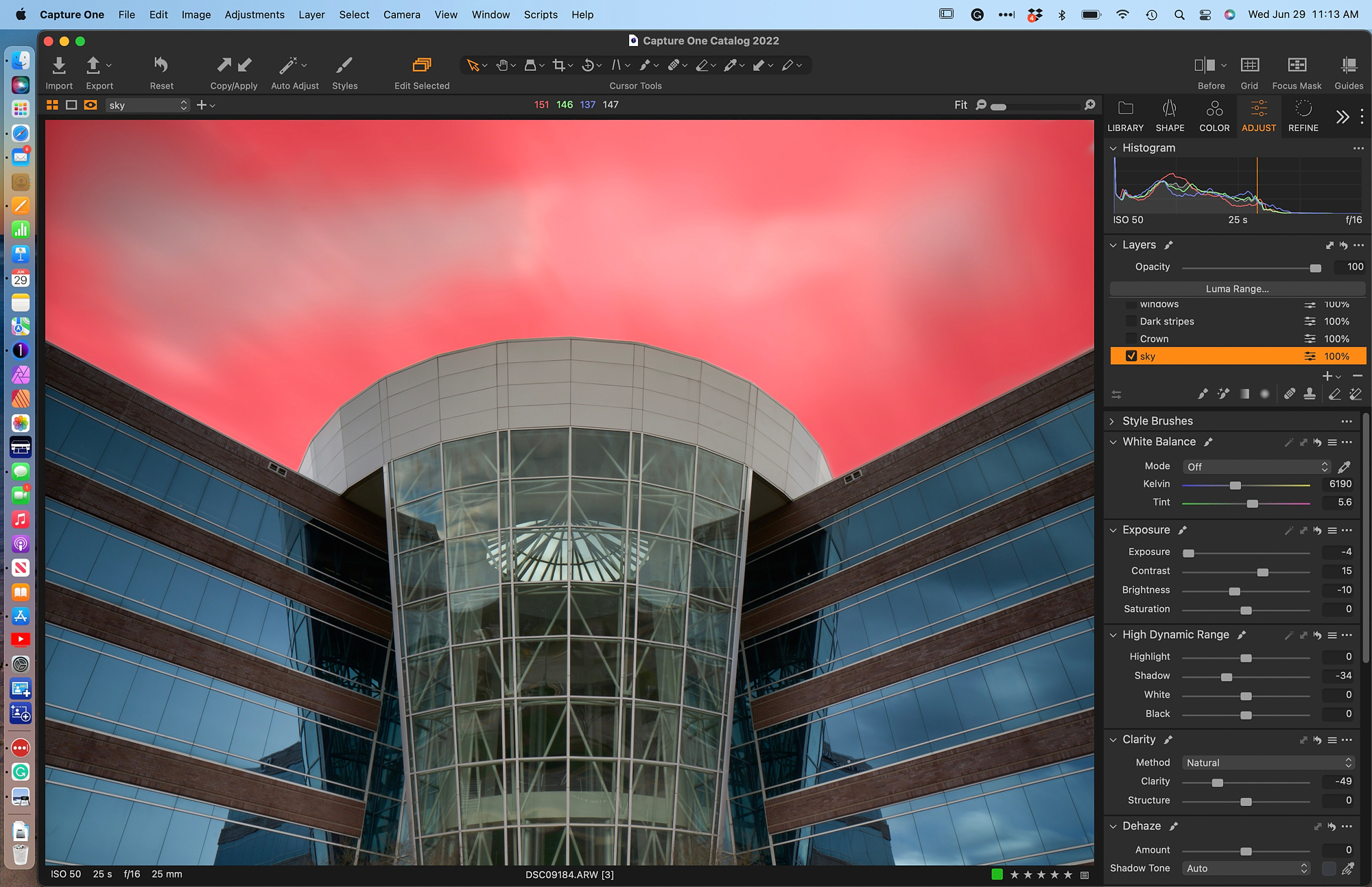
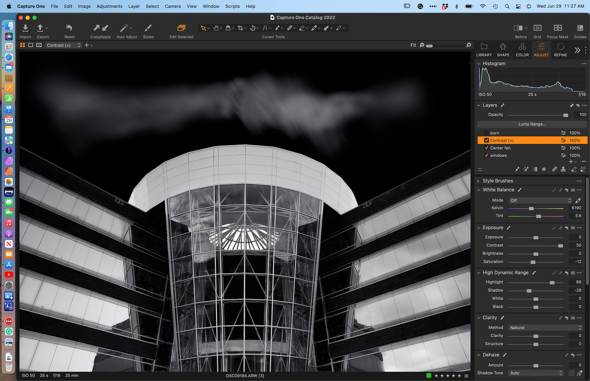
The following is my workflow for the Atrium shown above. The initial photo was taken with my Sony a7Rii and the Zeiss Batis 25mm f2. The 25-second exposure was at f16. Although the day was quite overcast, the long exposure provided cloud movement that despite the darkening of the sky in post remains effective. Here is the RAW file loaded into C1:
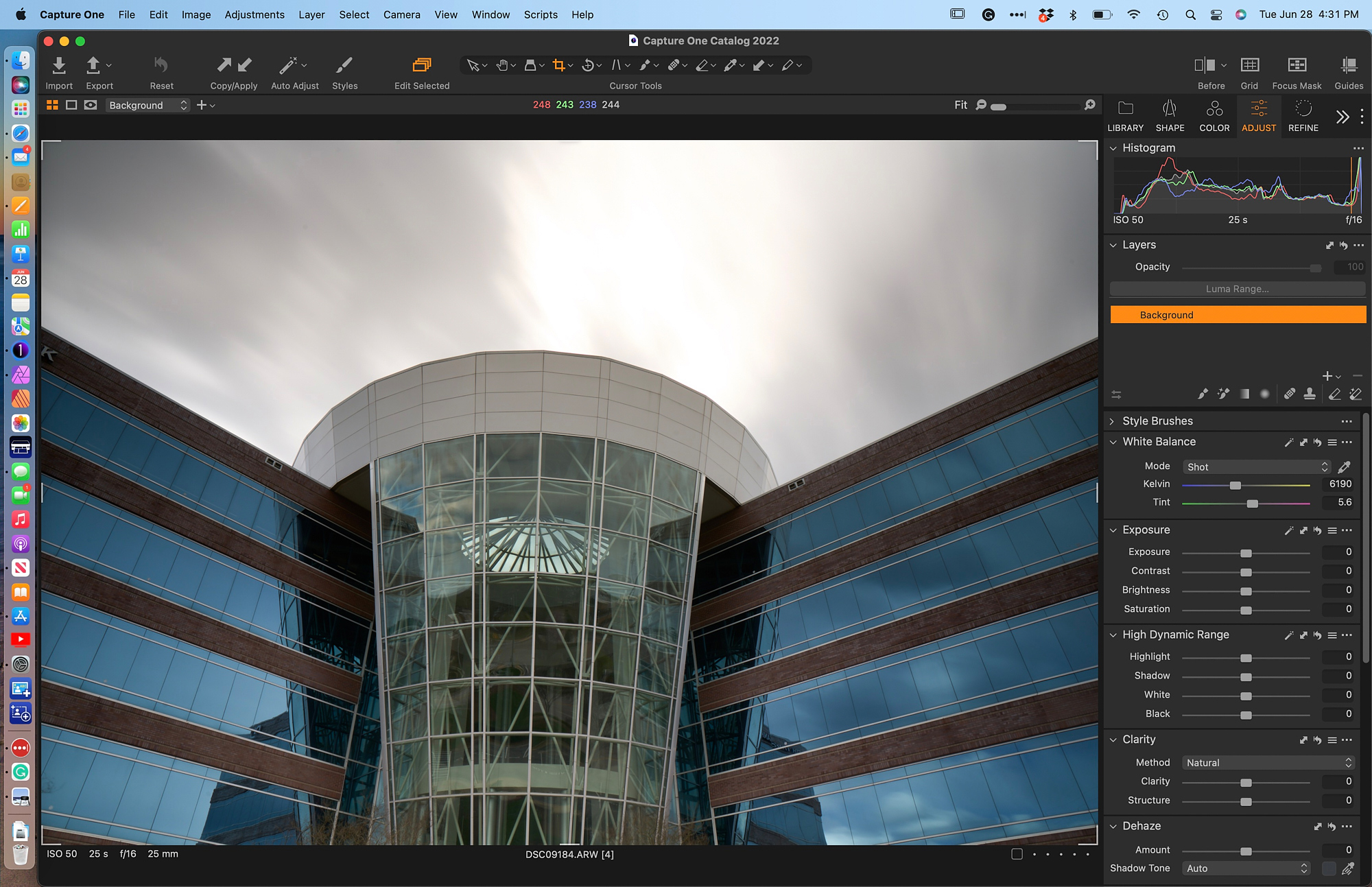
My first step was to correct the sloppy tripod positioning and to crop the image, creating an acceptable balance through symmetry. Not all images need to be symmetrical but this subject truly dictates the symmetrical approach. The Rotation tool offers a simple way to align the verticals by drawing a line along the centermost support in the glass atrium.
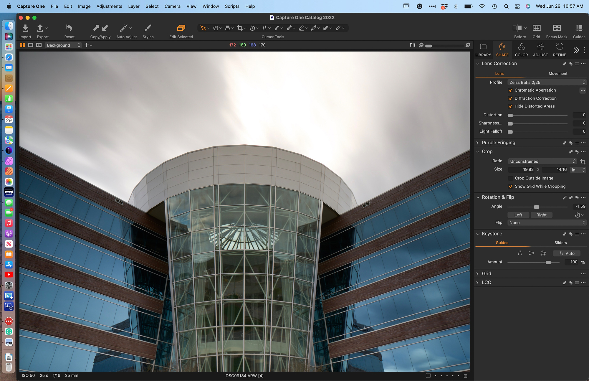
My attention always seems to turn to the sky in order to draw the atmosphere I want from the image. From here on, I place everything in Layers. The advantage of this approach lies in the fact that it allows me greater control and flexibility. Also, it is wise to label all Layers to make it easier to find what has been done. The Magic Brush in C1 has been a great time saver and is extremely accurate when used with the right settings. Tolerance and Refined Edge are kept low and Opacity is at 100%. The size of the brush does not matter so I keep it on the small side. After creating the full mask of the sky, I use the Erase Mask to open up areas to create the effect of a wispy cloud, which is accentuated by the burring of the long exposure.
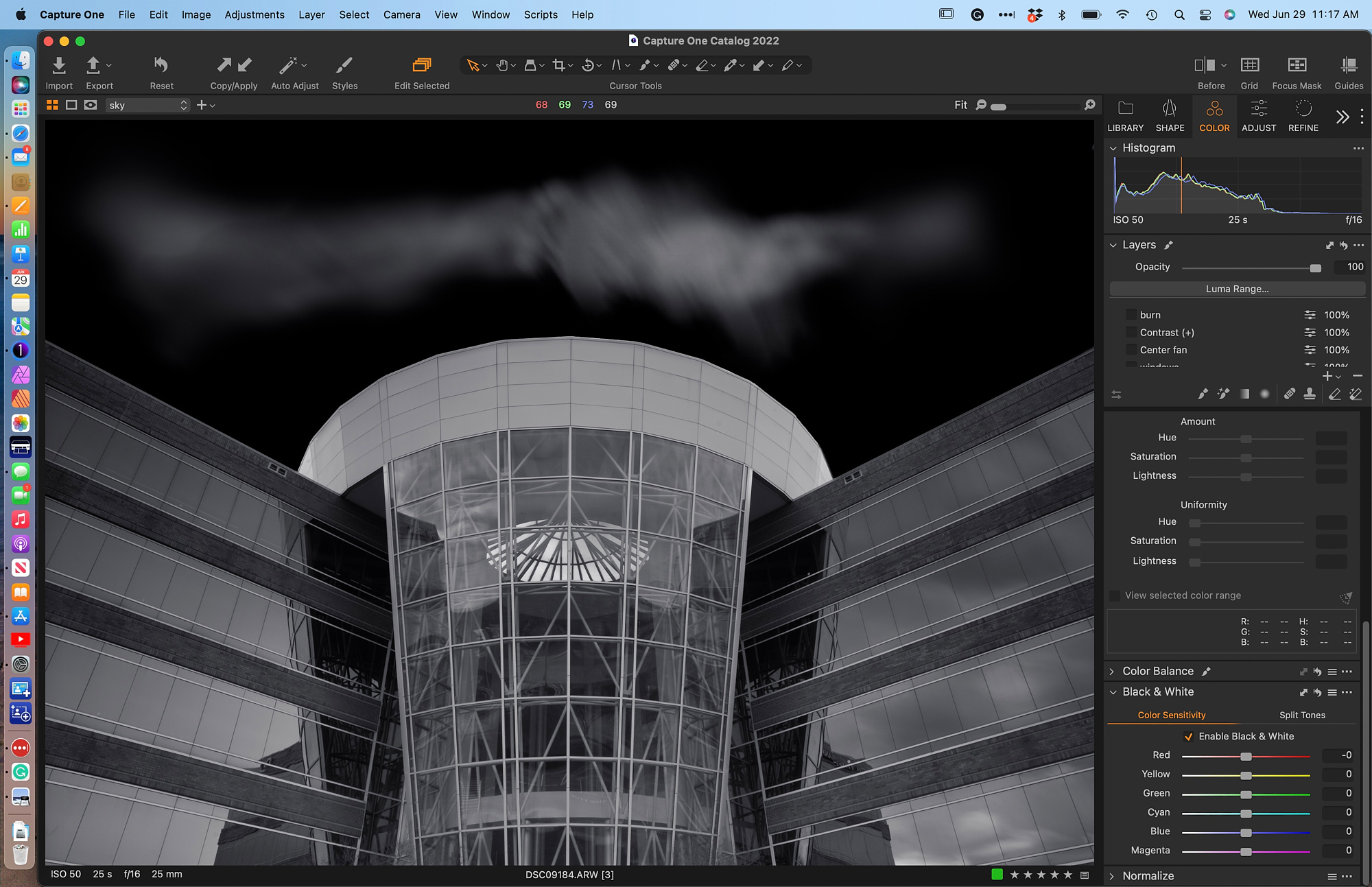
I also converted to Black & White at this point since the subject possesses no color of interest in my vision of the final image. I bring the blacks down to 0 as the contrasting blacks in the facade will be slightly higher (16-30).
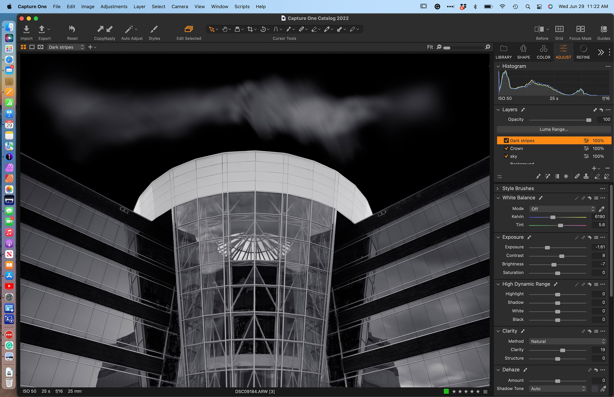
The building has a relatively low contrast, so my next several steps are essential to creating the strong contrasts that I see in my mind. The first area to receive attention is the crown above the glass atrium. Again the Magic Brush does an excellent job creating the initial mask.
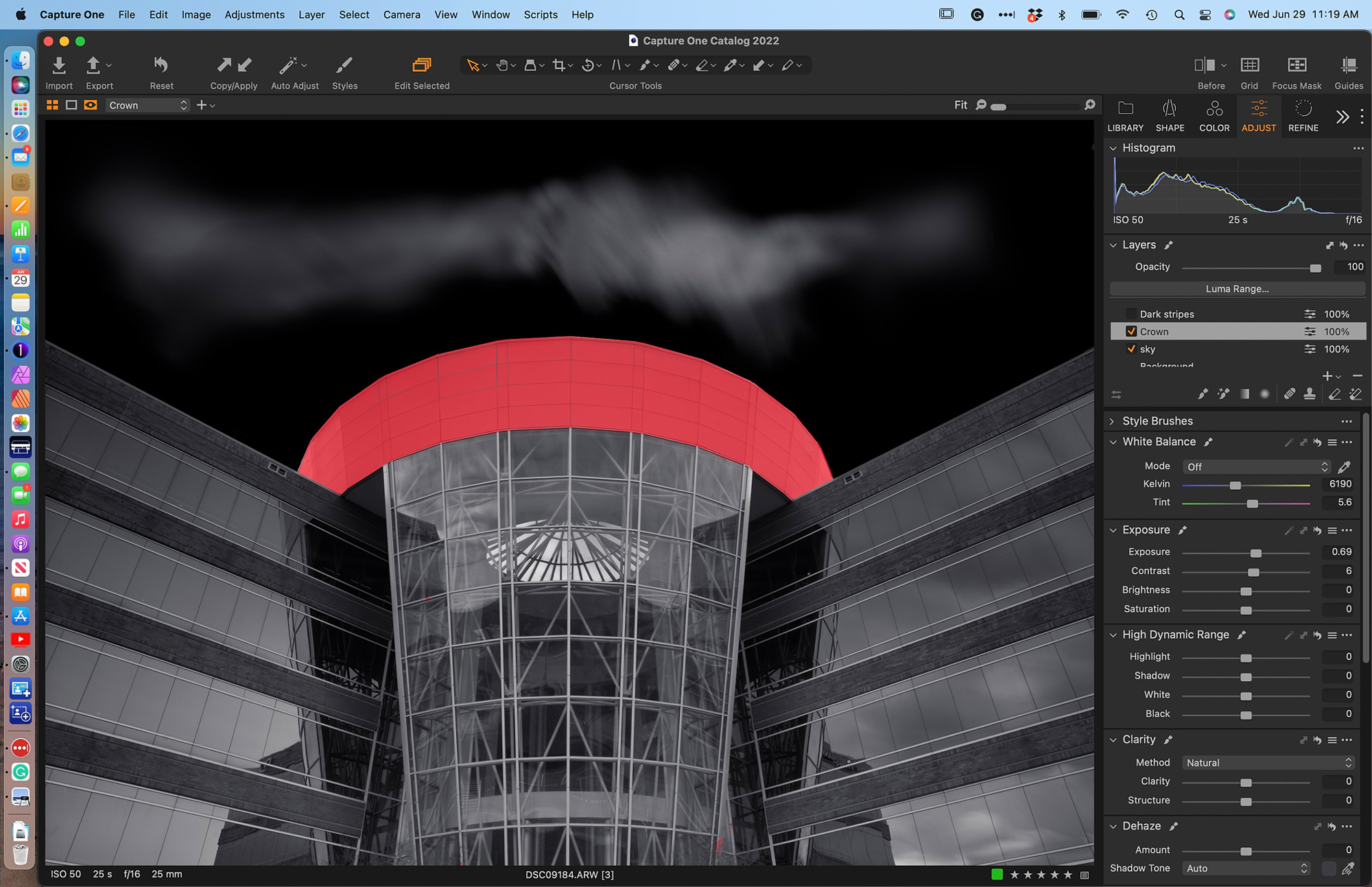
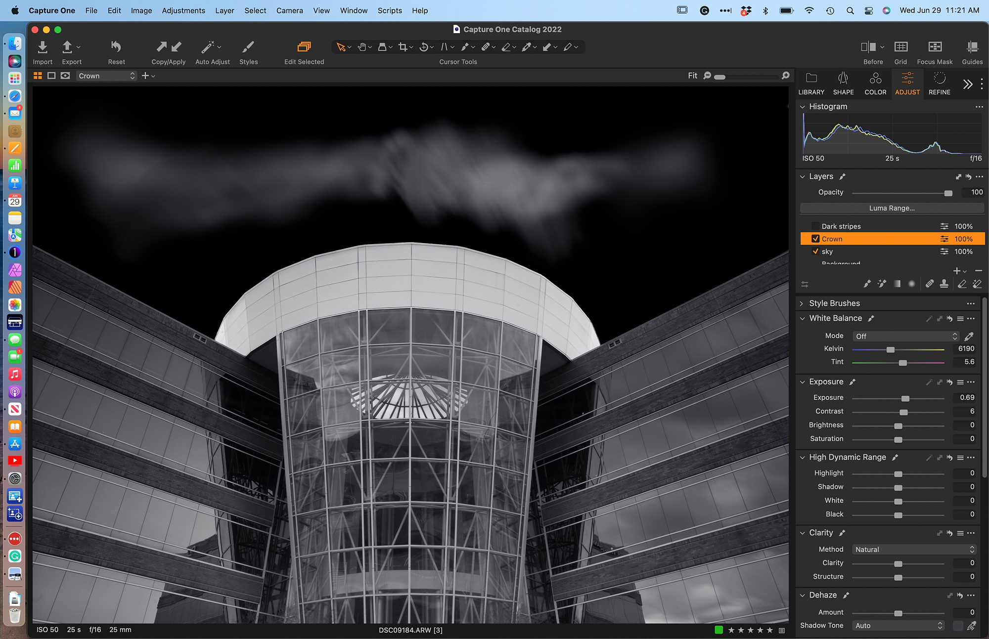
The small adjustments to Exposure and Contrast are more than adequate to brighten the crown yet stay lower than 200. Contrast between the diagonal striping bordering the fenestration is accomplished in two steps. The first relies on masking the dark stripes. I first used the Magic Brush but it was necessary to use the regular brush to fill areas and then erase some bleed-over. The resulting mask also fills part of the glass atrium. Both Exposure and Brightness were dropped in order to keep a balance and evenness to the tone. I also lost most of the rough texture, which I find contributes well to the overall effect of the final image
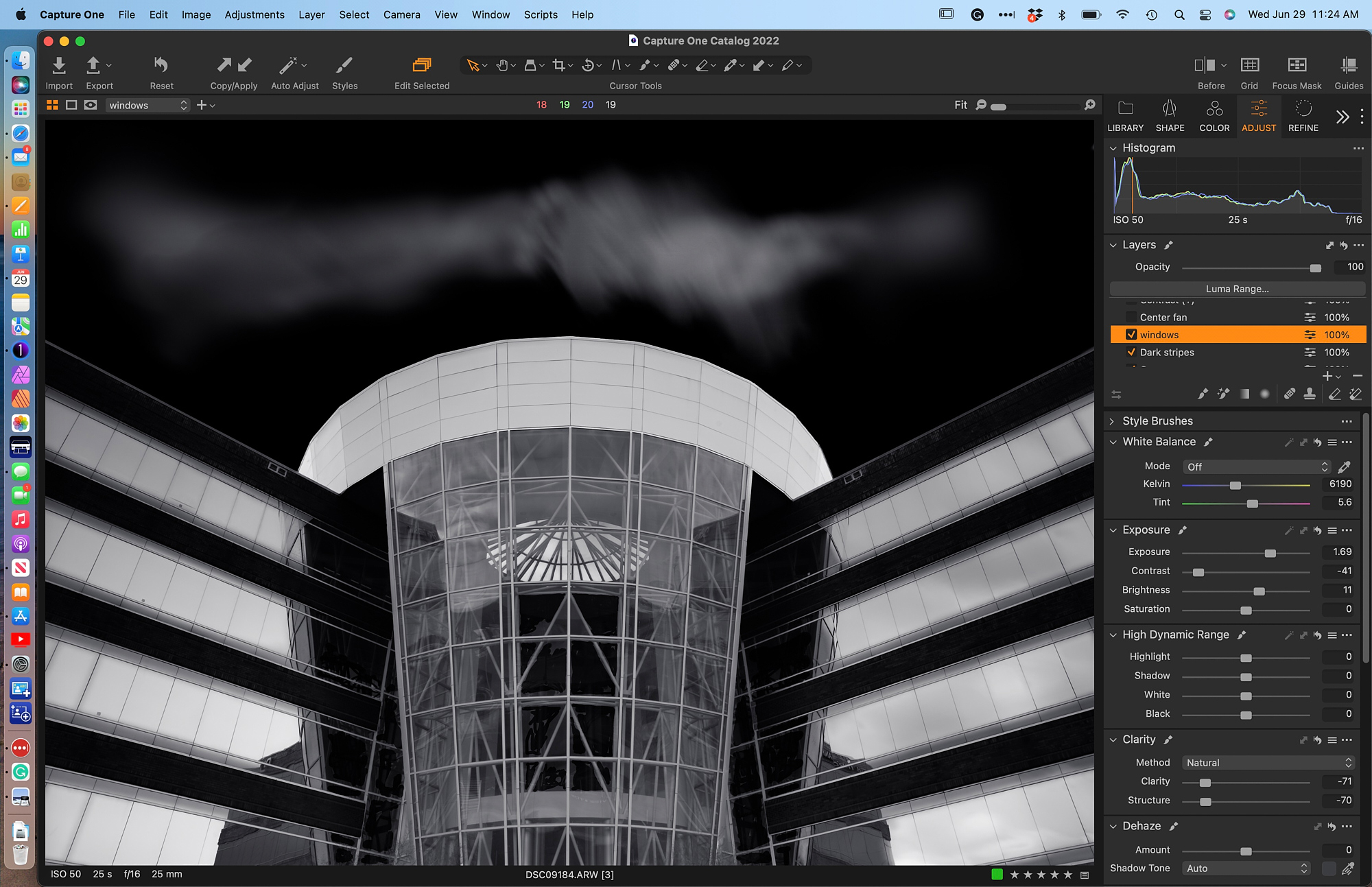
Likewise, the windows needed to have a more homogenous texture and brightness to contrast with the dark striations that I just adjusted. The Magic Brush is once again a great time saver and allows me to mask each panel; however, this step was probably the most complex and required a great deal of refinement using the regular brush. The smoothness in tone value is achieved by dropping the Contrast slider and boosting Exposure and Brightness. I also dropped Clarity and Structure to further refine the texture of the surface.
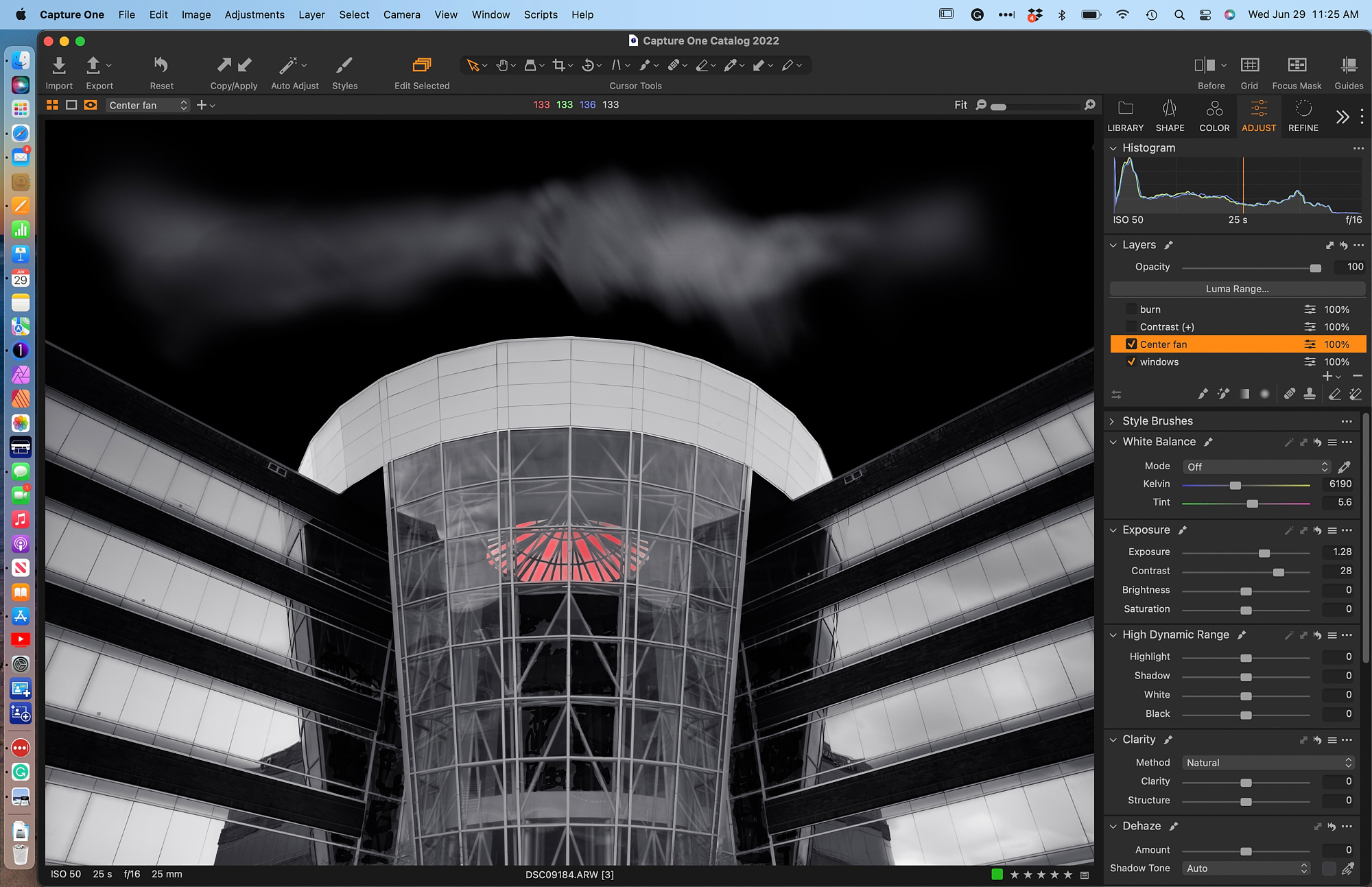
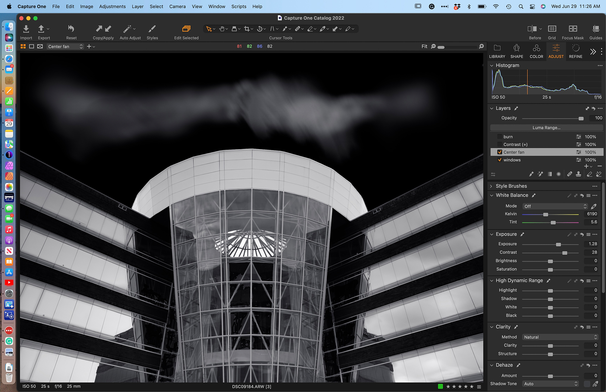
At this point, I felt the high-value fan shape in the center needed some brightening. A simple mask and adjustment brought out the interest in this shape.
I am pleased with these adjustments, but the central atrium seems dull in comparison to the wings. I created a layer from the Style Brushes to add contrast to the atrium.
Not all tools are used in every image. I did not find a need to employ a Heal Layer, for instance. I have often found C1’s Heal Layer to be somewhat problematic, especially after some heavy post-processing (darkening skies). I have found it useful to export the image to a .tif file and then import it back into C1. The Draw Healing Mask works perfectly on the .tif, and I make it the final step in the editing process.
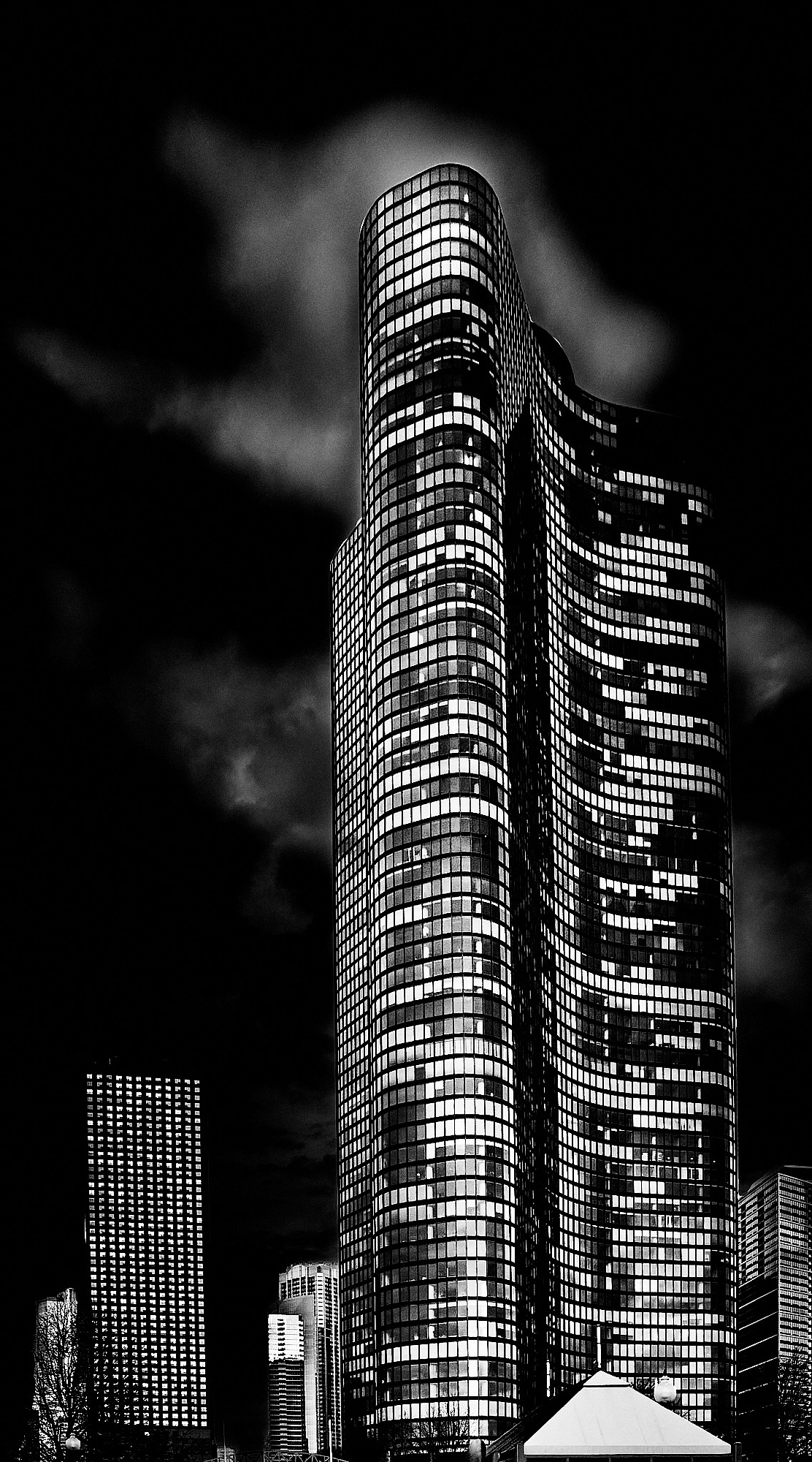
Another technique I frequently use is to create a filled layer and drop exposure/brightness down by about 1.5 stops. I then use the Erase Mask set to very low flow (2-4) to begin revealing the subject below the mask. With the flow set so low, it is very easy to control the impression of light. The tall apartment building called Lake Point in Chicago was shot in daylight on a fairly gray day. By dropping the overall exposure and then erasing selected areas, it was possible to create what appears to be a night scene.
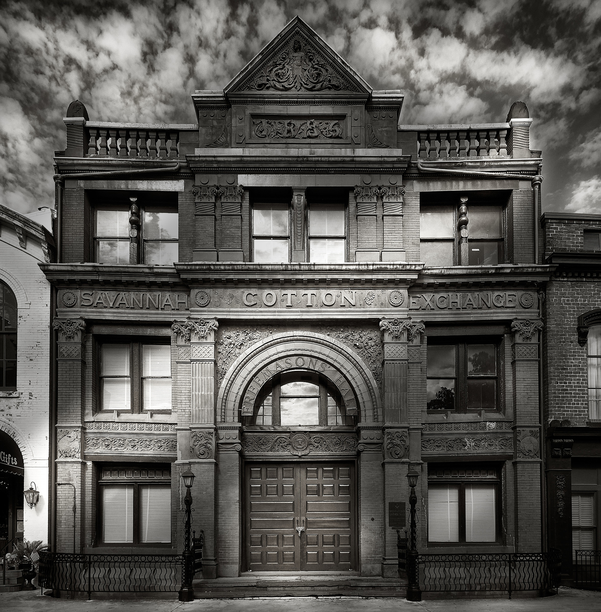
C1’s Radial Mask tool is another means to simulate light falling across surfaces (see Savannah Cotton Exchange, below). The flexibility of the tool to create elongated shapes of the masks and place them at diagonals allows for the introduction of light as a dynamic element in the composition.
The masking techniques available in C1 allow me to create the contrasts of light and shade emulating the chiaroscuro effects found in Baroque painting. The essence of the drama in these works by artists such as Caravaggio stems from the spatial placement of figures, the poses, and especially the contrasts of dark and light. The latter provides the means to create expressive photographs of architectural works.
Henry Q. Rinne
July 2022
Cary, NC
In 2018, Henry Rinne retired as Dean of the College of Fine Arts at Jacksonville University in Jacksonville, Florida, after a forty-year career in higher education. His interest in photography began when he watched prints emerge in the developer in his father’s dark room. Black & white has always been his primary focus in landscape, nature, and portraiture, but he loves to find dramatic colors in the landscape and has started experimenting with infrared. Rinne has exhibited in Arkansas, Tennessee, Florida, California, and North Carolina. His work has been published in books and magazines including Downbeat and Lenswork’s Our Magnificent Planet 2020 and 2021. He considers the wet darkroom to be a wonderful learning experience, but digital has supplanted any interest in “souping” film and having hypo-stained fingers. Web site: https://hrinnephotography.com