Finding Balance In Your Composition
First, let’s get things straight. Composition is the backbone of photography and is, in my opinion, the most important photographic element in creating amazing and potentially award-winning images.
Second, there are 10 key ingredients to mastering composition. That’s right, 10. And balance is one of these very important ingredients.
So, with all that in mind, let’s talk balance and help you find balance in your compositions.
Balance is about harmony. Balance in a composition is the art of arranging the juxtaposing elements in your image, and managing the visual weight, so no object or area dominates over the others. The individual parts work in harmony together to create a sense of the whole.
At its core, a balanced image just feels right. It’s aesthetically pleasing to the eye and humans have a natural desire to seek balance and equilibrium in their world.
On the flip side, if you want to make your viewer uncomfortable and evoke tension through your image, then an unbalanced image could be the way to go. An unbalanced image has an uneven visual weight, and as a result, can be a potent storytelling tool. However, for the purpose of this article, I’m going to assume you want to create an aesthetically pleasing composition and attract your viewer to your image.
So, let’s look at balance, and share the secrets to creating balance in your composition, starting with symmetry.
SYMMETRICAL vs UNSYMMETRICAL (or asymmetrical)
There are two core balance styles: symmetrical (or formal) and asymmetrical (informal).
Symmetrical balance is precisely what it says. Both sides of the frame have equal weight and appear symmetrical when split in half – either vertically, horizontally or diagonally. It’s the simplest and most obvious way to create balance in your image. Though a word of warning, unless symmetrical compositions are handled correctly, they can be pretty boring, and if they’re overused then symmetry can become cliché.
That said, let me assure you that your two halves don’t have to be perfectly and precisely identical to be symmetrical. Nature is never perfectly symmetrical. However, with the help of your favorite editing software, you can manufacture identical symmetry for the right story (great for urban and architectural photography).
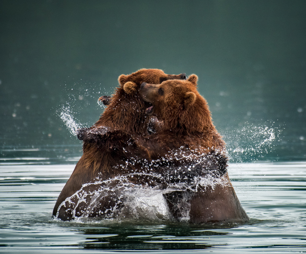
Going back to the topic of natural symmetry, the image below of the two brown bears showcases organic symmetry. The subject (the bears) are placed in the center of the image, and while each side of the frame isn’t identical, it possesses a figurative symmetry.
Traditionally, we’re told not to place our subject in the center of the frame when shooting wildlife or portraits. But that’s crap advice. Asymmetrical wildlife or portrait image can be very effective, as it reduces any visual distractions in the background and helps your viewer focus on your subject first.
A tip when shooting your symmetrical image; the positioning of your camera in relation to your subject is important. If your camera is too high or too low, the angle of the shot may weaken the symmetry in your image and not even Photoshop can save it.
And remember, while not all balanced photographs are symmetrical, all symmetrical photographs are balanced. And this leads us into the world of the asymmetrical.
Asymmetric balance occurs when you have unequal visual weight on either side of your image, but the unequal visual elements are artfully placed to balance each other. This may sound a little counter-intuitive, but asymmetrical compositions can feel more balanced than symmetrical images. That’s because the techniques used to create balance and harmony in an asymmetrical image are more subtle.
Personally, I love working with asymmetrical composition. It evokes a sense of movement, feels more energetic and encourages your viewer to spend more time with your image. If you want to me your asymmetrical composition work, there are six techniques you can use:
SIX TECHNIQUES FOR BALANCE
1. Color
Different colors hold different weights. A bright red car has a heavy visual weight, in contrast, a field of brown grass has lighter weight. You need to be conscious that bold, bright colors hold more visual weight as a rule, while soft and neutral colors are lighter. You can balance the heavy colors with relatively more light colors in your frame.
Another way you look at color balance is temperature. Warm colors (red, orange, yellow) are heavier, cold colors (blue, green, violet) are lighter. Balancing contrasting colors and color temperatures in your image can be very impactful. It looks impressive when you get the balance right.
I’d like to highlight that Lightroom, Photoshop, or your preferred editing software, are brilliant tools for helping you get the color balance right in your image.
If you don’t nail it while you’re shooting, don’t lose heart. Photoshop is your friend.
The rule: bold, bright & warm colors are visually heavy, subtle, neutral & cold colors are visually light.
2. TONE
Tonal balance comes down to the contrast between the lighter and darker areas in your image. Your dark areas are heavier. The light areas have lighter.
The way you use tonal balance depends entirely on the story you want to tell and the emotions you want to evoke. If you wish to create a peaceful and calming image, then generally you want to balance your composition with more light tones.
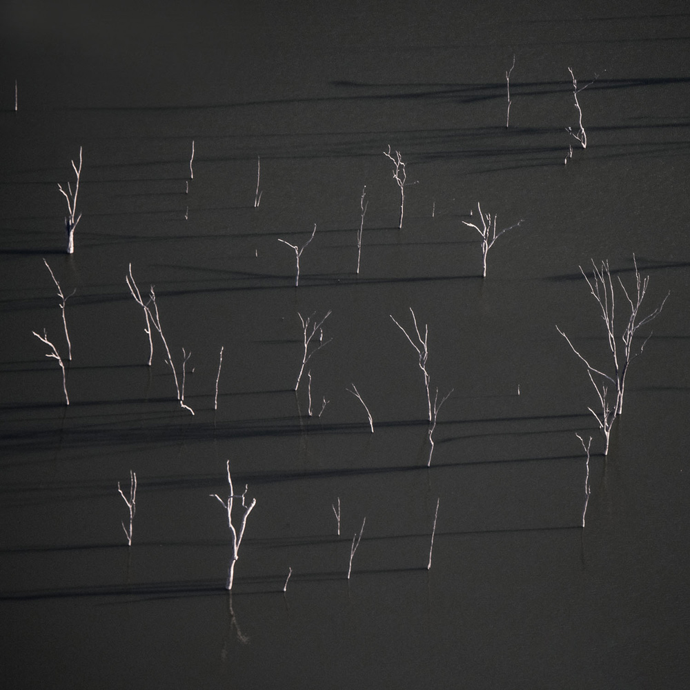
If you want to awaken emotions of drama and intensity, then use dark tones predominantly. Just like the image below. The dark grey background arouses feelings desolation and despair, balanced subtly with scarce white trees positioned strategically.
Shadows are also a powerful tonal tool for you. Shadows hold fantastic visual weight. Not to mention, they help to add depth and dimension to your composition.
It’s a good idea to convert your color images into black and white to see if the tones work. I also sometimes flip the image 180 degrees to get a different idea of balance within the image.
The rule: dark tones are visually heavy, light tones are visually light.
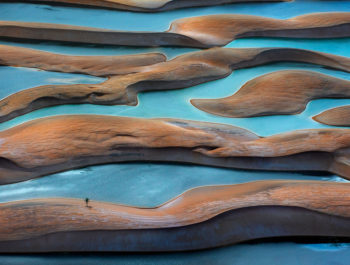
3. TEXTURE
What do I mean by textures? Well, textures are the details that visually describe how something physically feels.
You can use textures to impact your composition balance. Objects with strong textures appear three-dimensional and own more visual weight, making them heavier than objects and areas without texture.
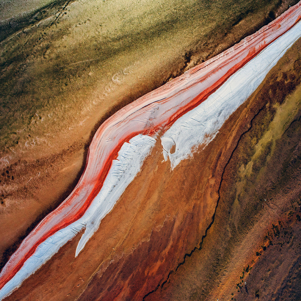
You’ll see in this image, the texture of the red salt formation has a lot of texture, and I’ve balanced with the smoother salt/sand formations on either side.
Texture can be an overlooked composition tool, and I encourage you to look for the textures of your subject and background when your shooting, and then playing with them during your processing.
The rule: highly textured objects are visually heavy, smooth objects are visually light.
4. SHAPE & SIZE
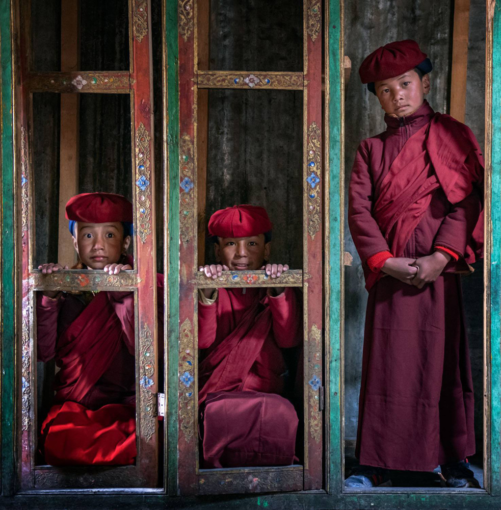
Managing the size of the shapes in your image is one of the most effective ways to balance an asymmetrical composition. Needless to say, the larger the size of the shape/object, the heavier the visual weight. You can balance a large shape on one side of the frame with a smaller one on the other side. While smaller shapes don’t hold the same weight equally, it will add visual interest and will still create a sense of balance with your viewer.
The quantity of shapes in your photograph will also impact balance. The greater the number, the greater the visual weight. Which means you can complement a large shape with multiple small ones.
To showcase this, I’ve included an image I took in India last year. The larger boy on the right side is balanced by the smaller boys squatting on the left. I also placed two boys in the frame to balance the single larger boy.
When playing with the size and placement of your shapes and objects, the rule-of-thirds can guide you.
The rule: large & multiple shapes are visually heavy, small & singular shapes are visually light.
5. SPACE & PLACEMENT
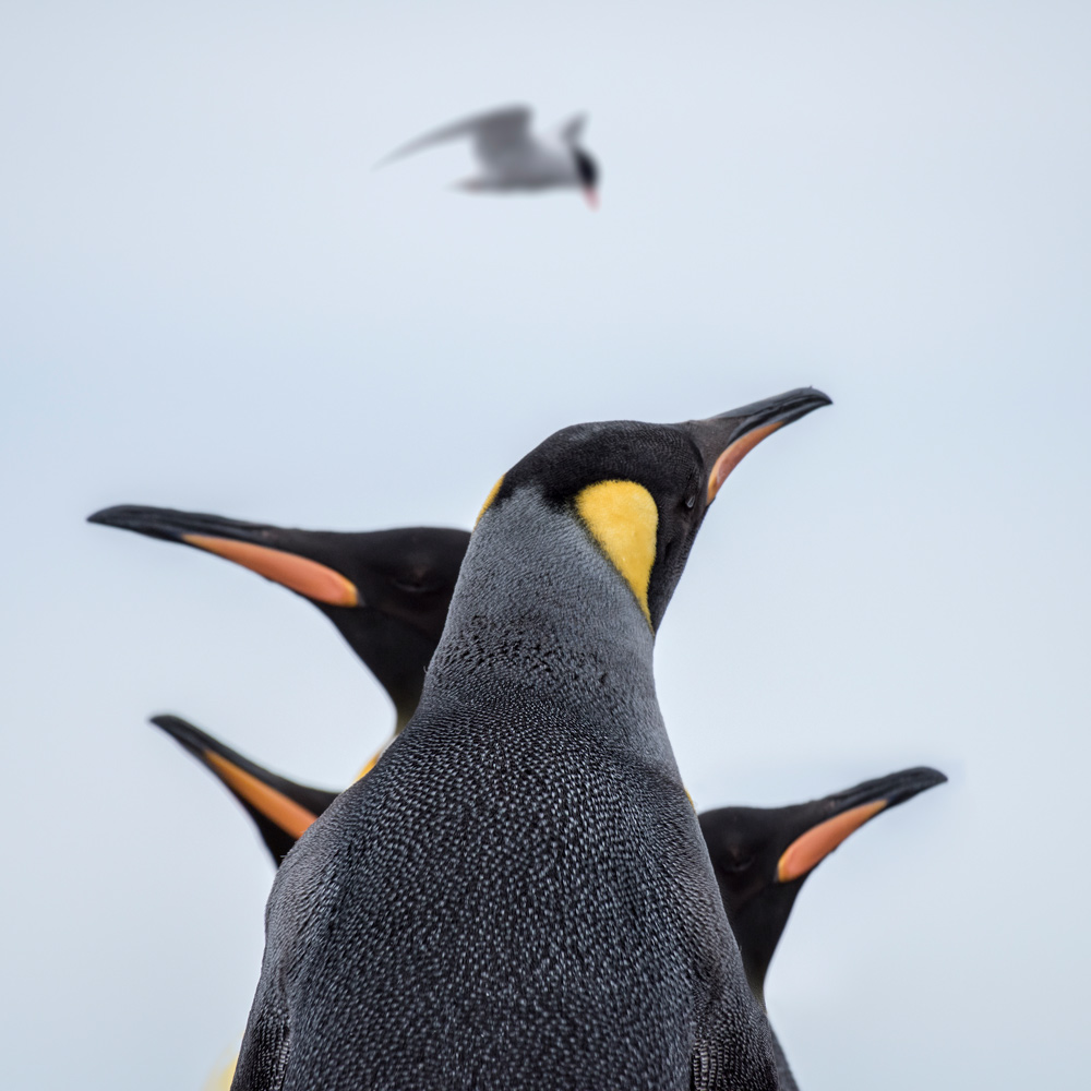
The space and placement of the elements in your frame impact the visual weight. The closer an element is to the foreground or edge of the frame, the heavier it is.
Analyzing the image from Antarctica, the large colony of penguins has been placed at the front of the image to intensify their weight and importance. Balancing the foreground with the smaller birds in the background.
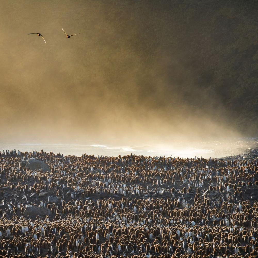
By the way, this image also demonstrates the quantity principle we touched on above. The larger quantity of penguins is asymmetrically balanced by the small flock of only two birds.
Now, let me share an important tip about space and placement in portrait and wildlife photography. Focus on the eyes! The brain is hardwired to look for faces and then eyes as quickly as possible in our environment. Once eye contact is made, your viewer will follow the gaze of your subject (we’re nosey like that).
This is important because the direction of the eyes and the placement of your subject in the frame impacts the overall balance. Ideally, you want to place your subject so they’re gazing into negative space of your image, making it “active space” and balancing the composition. If your subject is placed towards the edge of the frame and their eyes gaze off the edge, it just feels off. Awkward for the viewer.
The rule: objects in the foreground are visually heavy, objects in the background are visually light.
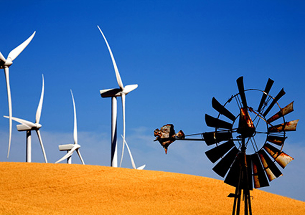
6. CONCEPTUAL
Conceptual balance is a philosophical and intellectual form of balance. Conceptual balance is all about balancing the contrasts of the world around us. Contrasting textures, contrasting subjects, contrasting meanings, or contrasting ideas such as old vs new, love vs hate, city vs nature.
For example, the image of the windmills demonstrates the contrasts of traditional vs modern energy. Standing side by side in the image they create conceptual balance.
I’d suggest if you’re still trying to master balance in your compositions, focus on the first five then tackle conceptual.
That’s it, the six techniques you can use to create balance in your composition.
ingredients to composition mastery I mentioned above, then I invite you to join a tribe of passionate photographers on what we call our “composition crusade”.
Learn more about me at IP Travel Photography,
Ignacio Palacios
November 2019
Sydney, NSW
When it comes to photography and travel, few can rival Ignacio Palacios’ experience, skill, and passion. A third-generation photographer, Ignacio has been honoured with over 100 prestigious photography prizes and awards from around the world and has travelled to over 90 countries in his 20 years career. It’s little wonder he’s developed a reputation as a leading photographer in the fields of travel, landscape, and nature photography. Born in Spain, Ignacio now calls Sydney Australia home – through his unmistakable Spanish spirit continues to influence his work and define his signature style. Combining his love of travel and photography has proved a powerful combination, and today Ignacio leads some of the world’s best photography tours to incredible destinations around the world. As an AIPP double Master of Photography, Ignacio shares his insight, experience, and technique with his clients to help them find their own success and joy on their photographic journey. “I hope that through my images and my tours, I can open people’s eyes to the incredible world we live in. I want to give my guests both travel and photographic experience. We are privileged to have such a beautiful planet and it’s our responsibility to respect, cherish and protect it.” Ignacio’s distinct, award-winning style can be defined by his mastery of composition, colour, and light. With his minimalistic style and unique ability to connect with his audience through storytelling. Through his images, Ignacio invites his audience to experience the subject not as how he captured, but how he experienced it, evoking an emotional connection between the viewer, subject and artist. Photography and travel will always be Ignacio’s passion, and he is dedicated to helping others ignite their passion too.