Creating Artistic Photographs – Variations on a Raw File
Art is an abstraction.
Paul Gauguin
1 – Introduction
At sunset light takes on a unique quality. The sun is low and its horizontal rays take on warm hues, the color spectrum filtered by the atmospheric layers hovering over the earth. At such times, when looking straight into the sun, I have a hard time seeing colors in the backlit landscape. If there are no clouds the sky is nearly white and the landscape beneath shrouded in deep shadows. To my eye, it appears grey, darkened by the necessity to squint and shield my eyes from the intense brightness.
I need to underexpose the raw capture to record a hint of color in the sky, making the image on the LCD screen look dark and featureless. At such times knowing which colors to select when rendering the image is challenging. In the field I have no specific idea, being immersed in experiencing and capturing the moment, making sure the composition is interesting and the exposure settings correct. It is only when I am back in the studio that I am able to make specific color choices. Because the image is nearly monochromatic no specific color palette is visible in the raw file. So I follow my intuition, selecting the color that attracts me most. Often, rather than emphasize color differences, I use a monochromatic color palette. However, this choice is more impulsive than final and after getting the image where I want it I go back to it a few days later to see if I want to make different color choices.
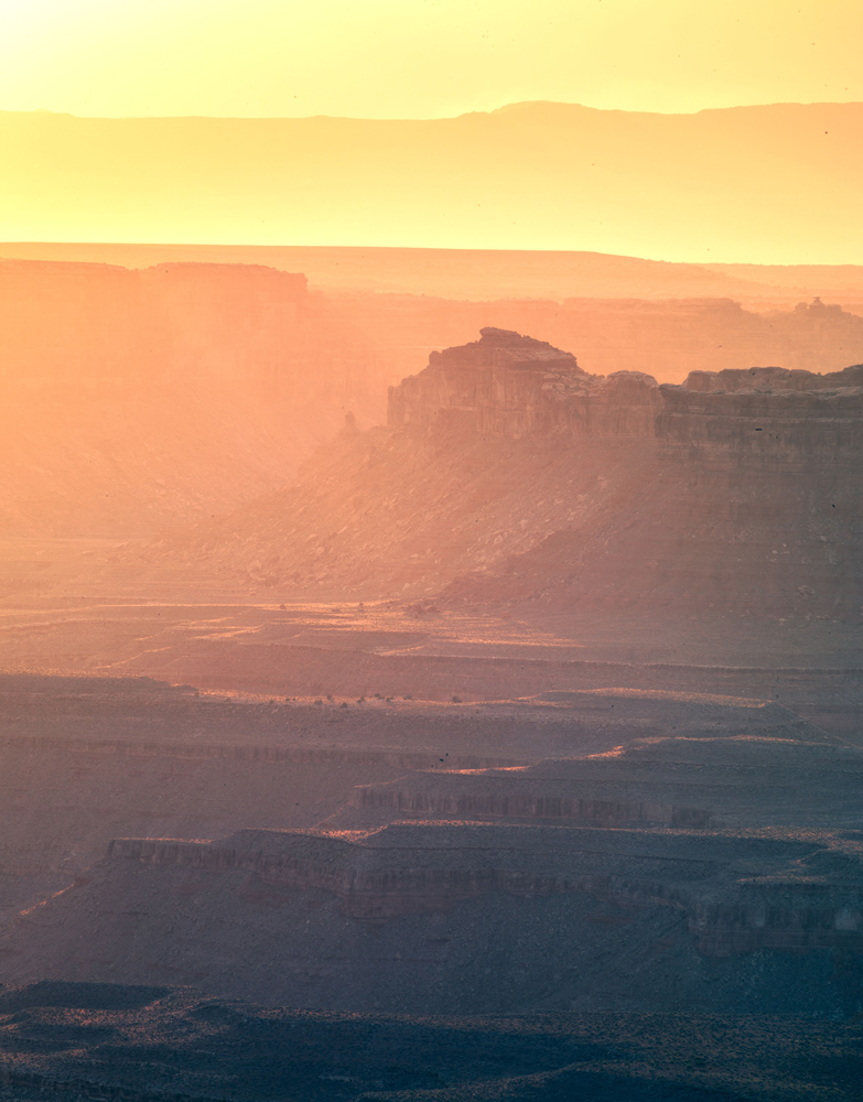
In this instance, I used a warm, moderately saturated yellow for my first rendering. When I completed the first image this color choice seemed appropriate. I found it to be pleasing. However, when looking at it again a few days later, I found it lacking in saturation. I also saw the color of this first rendering as more brown than yellow, a tonality that while aesthetic did not express the intensity of this particular sunset.
2 – About Color Variations
This is where color variations come in. When I work on images whose color is not well defined as the possible variations of color palettes are endless. This is the case for photographs of slot canyons, the most famous being Antelope Canyon, a location where color provides endless opportunities for creativity. However, slot canyons are not the only locations where color variations can be created. Any image offers the opportunity for variations, regardless of subject, location, light or other variables.
The images featured here are all variations of a single capture. The raw file is featured above so you can see where I started. The focus of this essay is to give you the reasons behind the choices I made for each variation. These choices are aesthetic. They address considerations of feeling and emotions regarding the impression I want each image to convey to my audience.
3 – Artistic Decisions
When creating artistic photographs, color balance is an artistic decision. Not bound to create a faithful or documentary representation, and not concerned with depicting ‘reality,’ I am free to alter the overall color of the original capture as I please. When I do my concern is not whether or not my photographs appear to represent reality. Rather my concern is whether or not my photographs show a subject or a scene that is believable. Believability, rather than reality, is my goal. I want the viewer to feel that what I am representing in my artistic images can happen. The fact that the scene as I show it in my images did not happen is of no importance to me. Did it happen? No. Can it happen? Yes. Having viewers give a positive answer to the second of these two questions is key to understanding my work.
4 – Meaningful Variations
When I create variations I look for meaningful differences. This means making changes that are significant and noticeable. There was a time when my variations were so minimal that I could not see the differences between one version and another. These differences were obvious to me when working on the file but disappeared when looking at the same file after a few days away from it. Those I showed it to were equally unable to see any differences. I had fallen into the trap of artistic perfection by making minor adjustments which seemed significant when I spent hours looking at the file on my monitor but which turned out to be irrelevant after my eyes were rested and I was able to take an objective look at the image. Remaining lucid when working on an image for extended periods of time is a challenge that can only be met through experience. Knowing how much is enough, or how little is too little, is not easy.
I learned that the only way to know if I went too far is by going too far. Only then can I see that I need to dial things back to get the look I am after. So I work towards pushing the image in directions I have not tried yet with the goal of going further than I intend to. I want to go too far because with digital nothing is changed forever if you keep the original raw file. Nothing is damaged, nothing is changed for good, and no one is hurt. Only pixels are altered and this only in the converted file. If I change my mind, or if I decide that this is not the way I want the image to look, I can try again by creating another conversion in Lightroom or a new version in Photoshop. Using the power that digital affords me is liberating. Errors, mistakes and artistic decisions are temporary. If they lead me onto a path I do not want to follow I can backtrack in seconds and return where I started from as if I never have gone there.
5 – Seven Image Variations
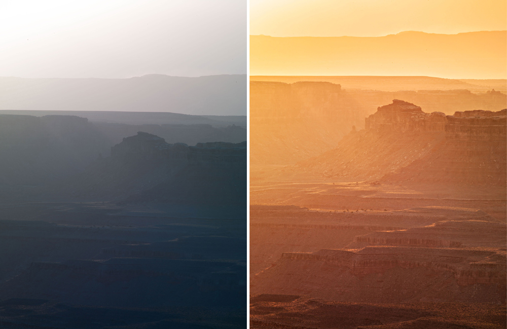
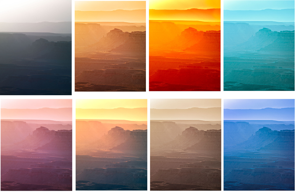
The raw capture
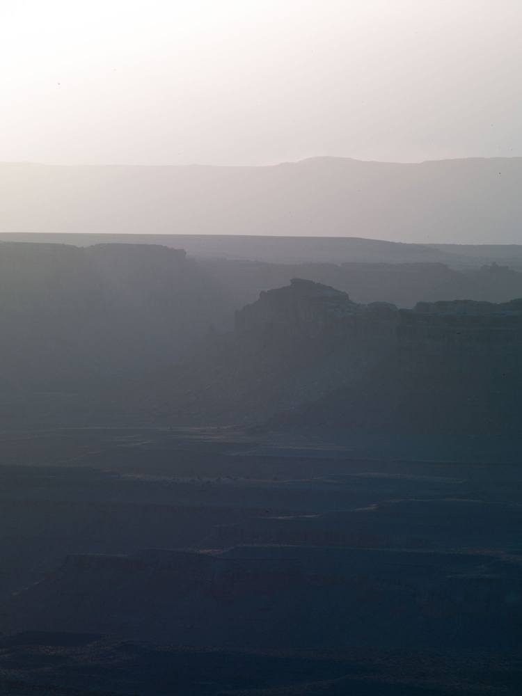
This is the raw image file as it looked when I imported it from the flashcard. It is grey, contrasty and uninteresting to look at. Only through experience could I tell there was potential in this image. And still, I had to work on the image to prove myself right, or wrong, as the case might be. Assumptions based on experience are not always correct. Neither are educated guesses.
Variation #1
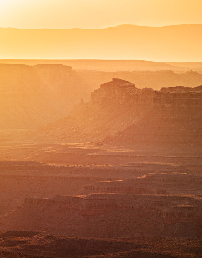
This is the first image I created from the raw file. This image was rendered in muted warm yellow tones. I wanted the color palette to be soft, without excessive emphasis on contrast. For this reason I did not set a true white or a true black point preferring to stay away from a full tonality range to keep contrast low in what is originally a high contrast scene. This is a backlit situation which if left uncontrolled would result in the highest level of contrast possible, all the way from pure white (the sky near the sun) to pure black (the dark shadowed area at the bottom of the image).
Variation #2
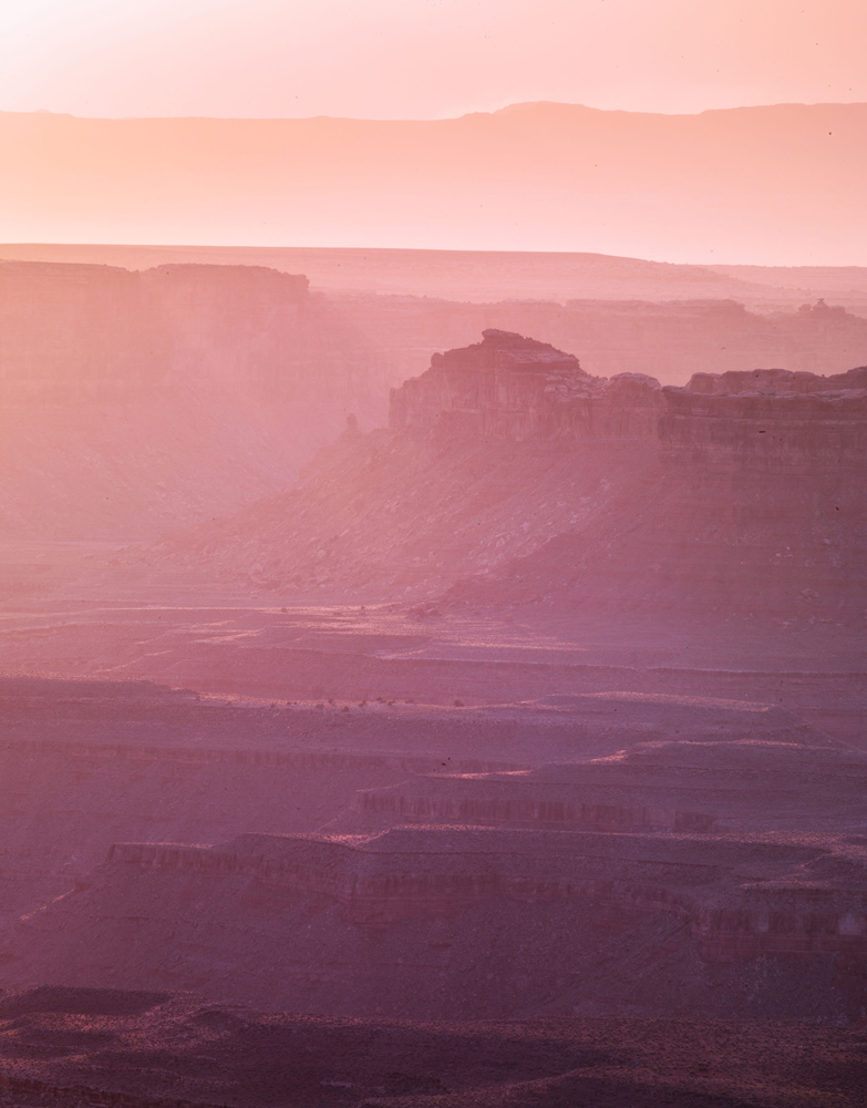
I created variation #2, as well as the other 6 variations, on the basis of variation #1. I did not go back to the raw file and adjust it differently. I changed the colors of #1 to create a variety of different color palettes.
Here I shifted the palette of the entire image to pink tones. This change was done to the entire color range of the image. My goal was to create a different monochromatic color harmony. For this reason I did not attempt to keep some of the yellows from Variation #1 because this would have resulted in a dual color harmony.
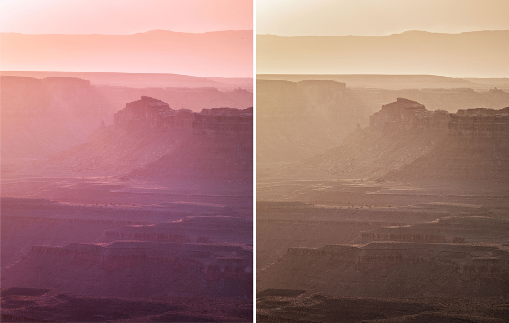
Variation #3
Here I took a different approach, this time separating the image into three horizontal color sections: yellow at the top, soft orange in the middle and muted blues at the bottom. Blue and yellow are opposite colors that are naturally harmonious when used together. To create a pleasing color balance I saturated the yellows but kept the saturation of the blues low. I tinted the tones in the middle of the image to orange because this gradual transition from one color to the other pleased my eye a lot better than a direct blue to yellow transition.
Variation #4
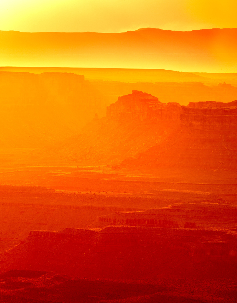
In variation #4 the color palette of the image was shifted to saturated reds and yellows. The level of saturation is so high that it makes variation #1 look muted. When looked at side-by-side the tones of #1 look brown, the warm yellows I originally saw in it giving the visual impression of having disappeared.
Variation #5
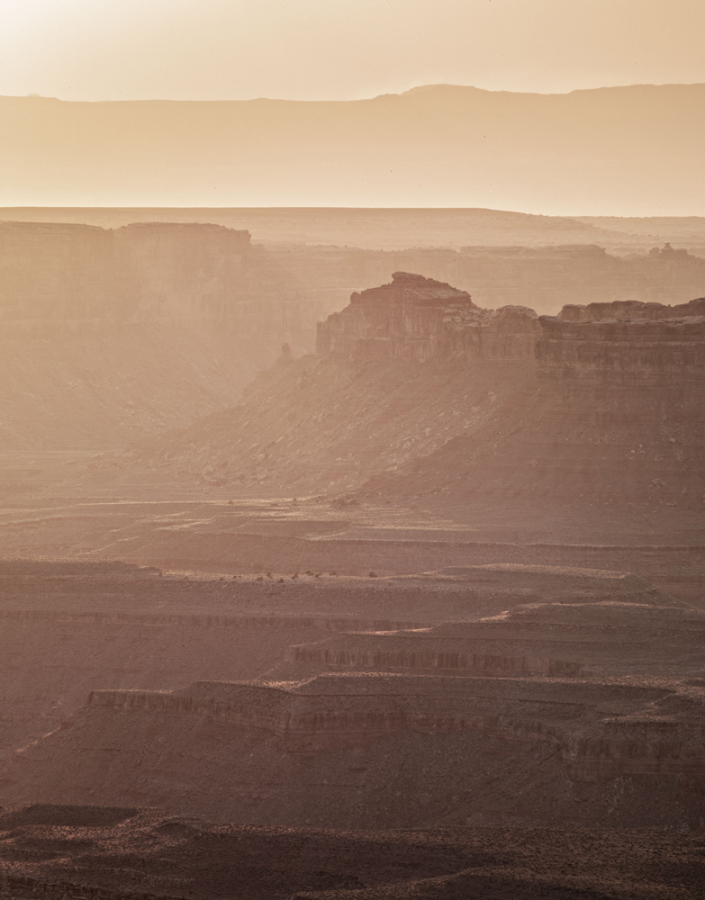
In this variation the original yellows of variation #1 were uniformly changed to brown tones. Unlike variations 3 and 4 no attempt was made to create a dual color harmony. I find this variation satisfying because while I had taken the decision to not create a black and white variation I still wanted a neutral color version. Desaturating the yellows and shifting them to brown by adding red achieved this goal.
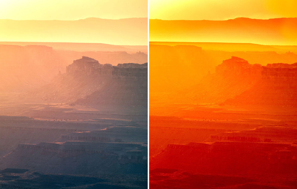
Variation #6
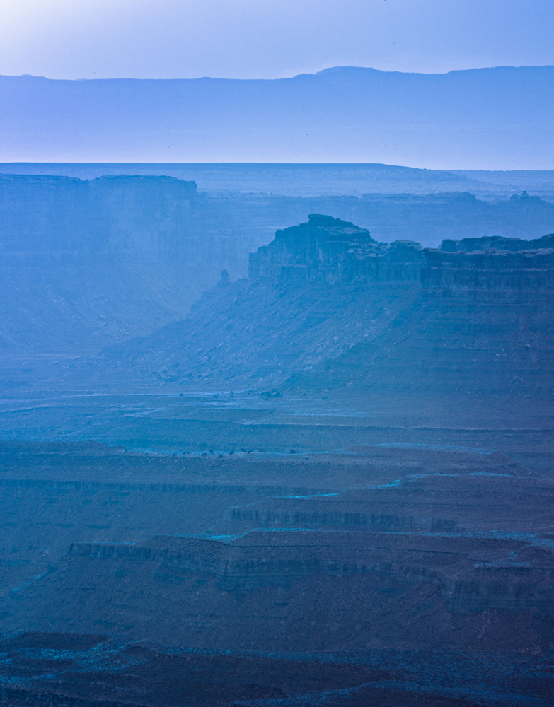
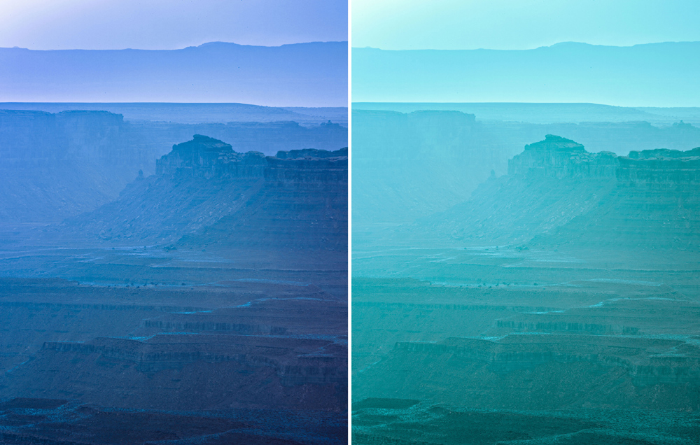
In variation #6 yellows were shifted to blue to create a monochromatic blue palette. I find blues peaceful and calming and they make me think of the ocean, a thought I find ironic since this is a photograph of a dry desert. However, the fact that this desert was once an ancient seabed and that we are looking at what is left of it reassured me that this rendition was legitimate.
Variation #7
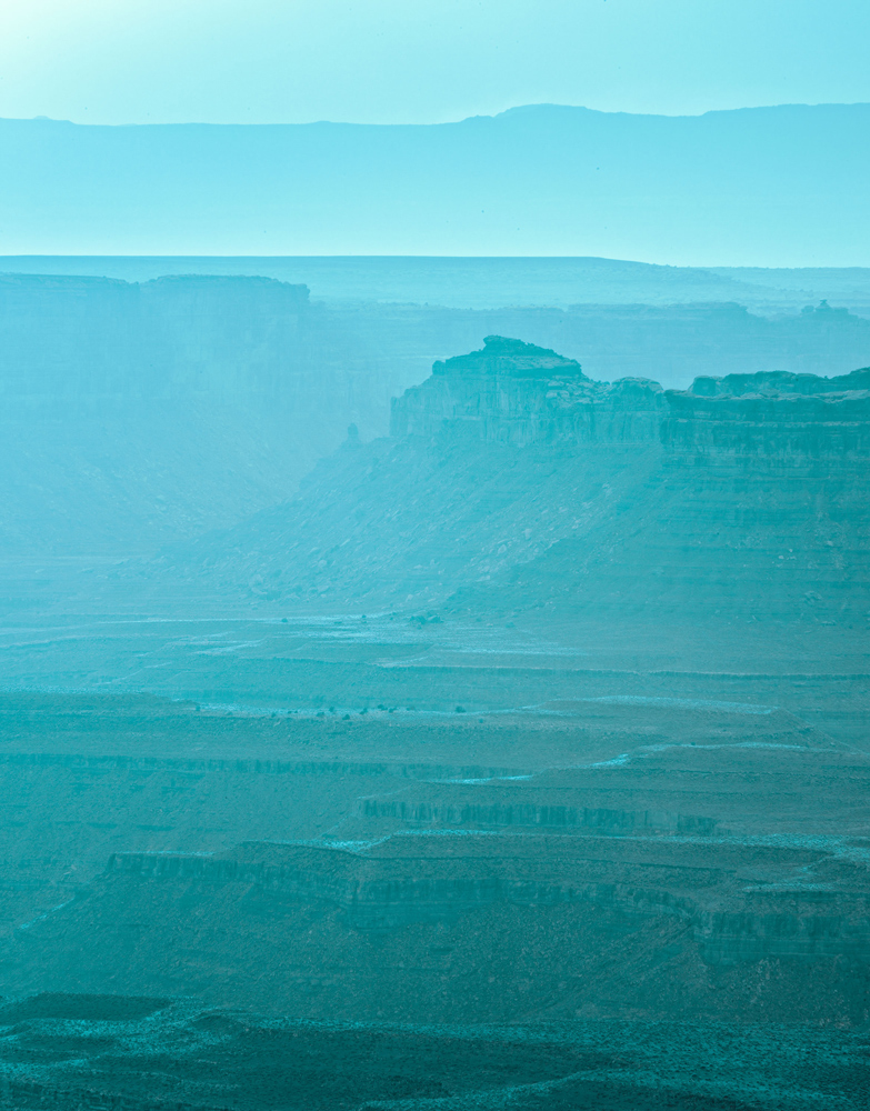
Here my goal was to create a turquoise color palette, or at least get as close to it as I could starting with yellow tones. This was quite challenging because while shifting yellow to green is easy, making green turquoise is challenging. It requires blue which was not present in the original variation. I could of course have gone back to the raw file but my decision to create all these variations on the basis of #1 prevented me from doing so. In the end I navigated this challenge successfully. While not the stereotypical turquoise color I find satisfaction in having turquoise stones in my collection that closely resemble the tones in this image.
6 – When to stop
Knowing when to stop is important. I stop when I get tired. I don’t try to push myself beyond that point. Working on an image while staying creative is exhausting. When I sense that my creativity dwindles and that to continue will result in meaningless images rather than expressive renditions I call it a day. There is the potential for more variations, however remaining true to creating meaningful changes means stopping when inspiration is gone. I either got something or I did not, but to continue working makes no sense. So I stop and return to the set of images I created after a day or two. Then I am able to see them anew, with fresh eyes. Usually one jumps at me right away and that is the one I will show. Sometimes several are interesting and I wait a few more days to decide which one to publish. On rare occasions I cannot make that decision and I present the images together, as a diptych or a triptych. So far I have not gone beyond three images presented together but the possibility is there for that to happen.
7 – Conclusion
I enjoy creating variations of an image. It is a lot of fun. For me each variation is a different take on a given subject. They represent different ways of looking at the landscape and different ways of expressing what I feel. Being able to express different moods and different emotions is liberating. I get to explore several ways of seeing one image instead of being limited to creating only one and I get to share several possibilities of seeing the same subject.
This approach is not always effective but when it works it is fun and liberating. It takes me away from a mono-centered look at a specific photograph and makes me enter a world of make believe, a world where the original subject, the ‘real’ color, the ‘actual’ color palette, no longer matter.
8 – About Alain Briot
You can find more information about our workshops, photographs, writings and tutorials as well as subscribe to our Free Monthly Newsletter on our website at http://www.beautiful-landscape.com. You will receive 40 free eBooks when you subscribe to my newsletter.
I create fine art photographs, teach workshops with Natalie and offer Mastery Tutorials on composition, image conversion, optimization, printing, business and marketing. I am the author of Mastering Landscape Photography, Mastering Photographic Composition, Creativity and Personal Style, Marketing Fine Art Photography and How Photographs are Sold. All 4 books are available in eBook format on our website. Free samplers are available so you can see the quality of these books for yourself.
9 – Workshops with Alain and Natalie Briot
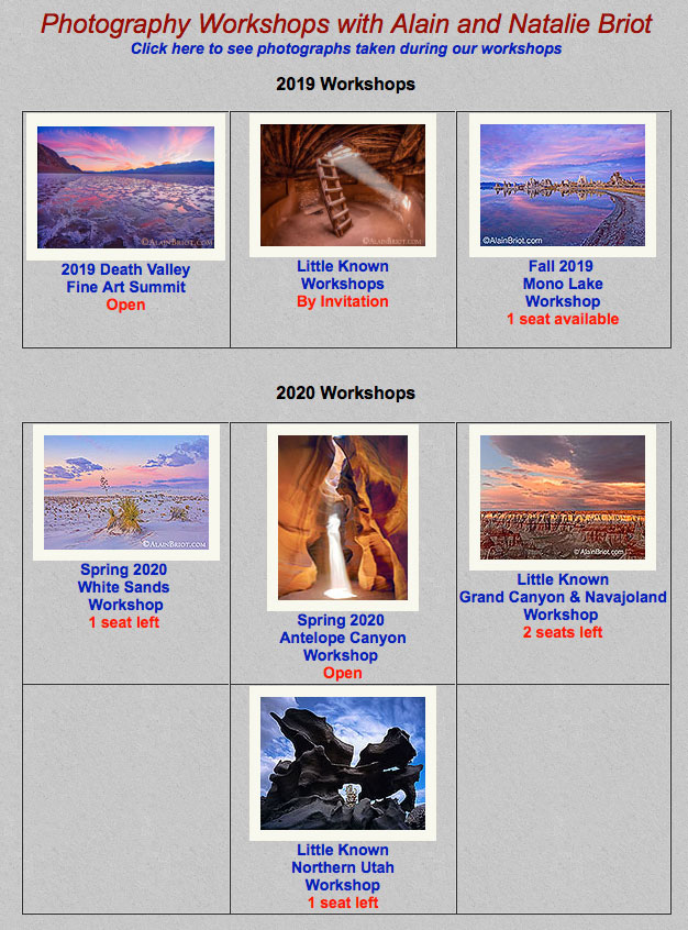
If you enjoyed this essay you will enjoy attending a workshop with us. I lead workshops with my wife Natalie to the most photogenic locations in the US Southwest. Our workshops focus on the artistic aspects of photography. While we do teach technique, we do so for the purpose of creating artistic photographs. Our goal is to help you create photographs that you will be proud of and that will be unique to you. The locations we photograph include Navajoland, Antelope Canyon, Monument Valley, Zion, the Grand Canyon and many others. Our workshops listing is available on our website.
Alain Briot
July 2019
Glendale, Arizona
Author of Mastering Landscape Photography,Mastering Composition, Creativity and Personal Style, Marketing Fine Art Photography, and How Photographs are Sold. http://www.beautiful-landscape.com [email protected]