
Home > Topics > The Art of Photography > Architecture > Revolutionary-era tavern door
Revolutionary-era tavern door
-
AuthorTopic: Revolutionary-era tavern door Read 457 Times
-
Architectureon: May 25, 2021 at 3:29 pm
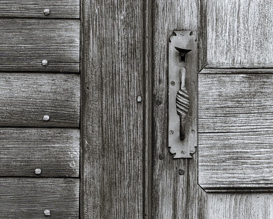
From the Minuteman Park, the route the British regulars took between Lexington and Concord MA on the first day of the American Revolution (April 19, 1775). C&C welcome, of course.
 Re: Revolutionary-era tavern doorReply #1 on: May 25, 2021 at 5:11 pm
I love this type of detail shot. Very well done. I like it in B&W too. Took the liberty of trying one of the built-in split-tone presets in C1.
-
This reply was modified 3 years, 2 months ago by
 Paul Sokal.
-
This reply was modified 3 years, 2 months ago by Paul Sokal.
Re: Revolutionary-era tavern doorReply #2 on: May 25, 2021 at 6:15 pmInteresting illustration of the relative merits of colour and of Black & White. I am uncertain of a definite preference since I like both renditions a great deal. But the two photographs ‘speak’ in quite different ways.
The colour image appeals strongly for its warmth and sense of history. I want to touch that handle and feel the wood. The sense of the craft that went into both wood and metal work is very strong.
The b&w version highlights the strong tones and firm geometry. The eye of the photographer is more readily apparent while the ‘history’ takes a back seat.
Both renditions are successful and would have a place on my walls.
Re: Revolutionary-era tavern doorReply #3 on: May 25, 2021 at 7:20 pmThanks for the comments, and Paul, thanks for doing the B&W conversion. I had meant to do one but hadn’t gotten to it yet. It’s a matter of taste, of course, but I prefer the color. I think the color adds a richness, and the color contrast provides additional differentiation that the tonal contrast doesn’t. E.g., look at the border between the metal plate and the wood to its left.
Re: Revolutionary-era tavern doorReply #4 on: May 25, 2021 at 9:11 pmI think Chris has summed it up well. I do like the color rendition though. I am partial to the tonality of the rust and brown tones. It’s just me. Nicely executed.
Kevin Raber
Owner and Publisher of photoPXLRe: Revolutionary-era tavern doorReply #5 on: May 28, 2021 at 4:24 amMy vote goes to the B&W, which I think brings out the grain more strongly. Perhaps some gentle warm toning might address the concerns of the advocates for the colour version.
Jeremy
Re: Revolutionary-era tavern doorReply #6 on: May 28, 2021 at 9:12 amIt’s a matter of taste, but for me, simply warming the B&W wouldn’t do the trick. What makes me prefer the color isn’t only warmth. It’s color contrast. Removing color removes interesting and appealling (well, interesting and appealling to me, anyway) detail by leaving tonal contrast but eliminating color contrast. Again, I’d point to the border between the ironwork and the wood to its left as one example. In the color version, the ironwork stands out strongly from the wood. In the B&W, less so. There are also interesting color contrasts within many of the pieces of wood. I actually processed the image to draw out color contrast more.
But that’s just my taste.
Re: Revolutionary-era tavern doorReply #7 on: May 28, 2021 at 3:25 pmI have to agree with Daniel,
in my mind, the colours are definitely beautiful and worth showing – they emphasize the material’s texture and its age. And whilst the B/W version has a very strong graphical quality, the colour seems to extracts some depth, the door handle almost looks three dimensional to me. A very well executed detail shot!
Frank
-
This reply was modified 3 years, 2 months ago by
-
AuthorPosts


- You must be logged in to reply to this topic.