


Home > Topics > Equipment & Techniques > Landscape & Nature Technique > Why BW
Why BW
-
AuthorTopic: Why BW Read 52782 Times
-
Why BWon: August 25, 2019 at 9:29 am
I’ll be the dissenting voice 🙂 For me, black and white can be great but it’s so limited – every image conveys an emotion in a narrow range. It’s either moody, or bleak, or intense, occasionally it can be relaxed; but I struggle to see B/W images that say happy, or cheerful, or beautiful, or even content. Colour matters, our emotions are colourful and removing colour for me usually means removing emotion. Sometimes that’s what I want, but often it’s not.
Re: Why BWReply #1 on: August 25, 2019 at 12:16 pmGood day, Jan-Peter – well, I agree the overwhelming majority of BW work does NOT represent a gleeful narrative, but must stop you in your tracks when you also include the statement BW images are not beautiful. I disagree that BW images fall within a narrow scope of interpretation.
From the late 19th Century and later as we went through the 60’s, the BW photograph represented an enormous volume of beauty: a representation of Pure Aesthetics, BW Fine Art Photography has no competition. This is exactly what Alfred Stieglitz (and other early pioneers of photography) brought to everyone’s attention from the very late 19th Century and into the first decade of the 20th Century: observing just the lines, curves, shadow and light, and without extensive negative or print manipulation, the BW photograph relies on 1. a great composition, and 2. the eye and brain to seek more deeply in forming an appreciation for the beauty exuded as a measure of pure aesthetics.
However, if you define beauty only from the standpoint a multi-color painted world can deliver, I suggest you are limiting your palette of cognitive tools, thus limiting your perceptions of beauty within a narrow field of view. This said, my words are only as an explanation for those who cherish BW photography and in no way am I trying to diminish the world of color (photography), which frankly, extracts overwhelming beauty, in all photography genres. And in many compositions it may be wrong to shoot BW film or convert a digital color file to BW, when it is obvious (on site or in post-production) a color rendering takes precedence of a BW alternative.
Gleeful BW Photography: maybe not so much. A quick word on maybe why we never see an overwhelming amount of glee when viewing BW photography: for the most part, we normally associate BW photography with Dramatic compositions, as this is the narrative of choice, more common than not, in BW Fine Art Photography. In this scope, we can easily image less gleeful subject matter being represented by the artist. I suggest its a matter of the volume, of the type of work, and not necessarily, the essence of BW (or the lack of color) in photography that provokes the conversation we are having here.
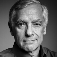
The attached Portraits: I clearly felt (realized) the color in Isla’s shot was integral to the overall composition and the emotion it exuded. BW rendering was not an option here. Alternatively, though the portrait of Shiloh is a similar soft rendering, the absence of color biased me to edit as a BW rendering. In my opinion, both convey an emotional value and similar degree of glee and beauty.
I hope we continue this interesting discourse. Thank you, Jan-Peter.
Kind regards,
Lance A. Lewin – Atlanta
Lance A. Lewin
Re: Why BWReply #2 on: August 25, 2019 at 1:56 pmSo all photographs taken before the advent of color film lacked glee? That sailor kissing the nurse in Eisenstadt’s classic image celebrating the end of WW2 was not gleeful?
I grew up shooting black and white and still prefer it to color. For me, it is usually a purer abstraction of what I am seeing, why I am taking the shot. In our busy world, I often find so many colors in my FOV that they are distractions from what I am trying to capture, so I make the image black and white. Images with fewer colors that are part of a graphic composition I keep in color. The work of Jay Maisel stands out to me in this regard.
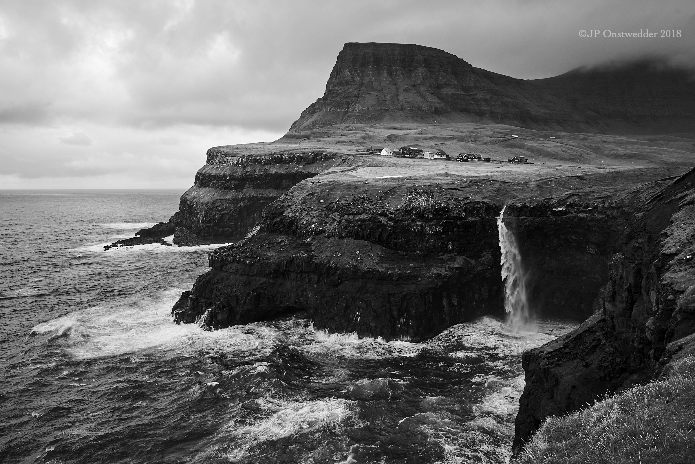
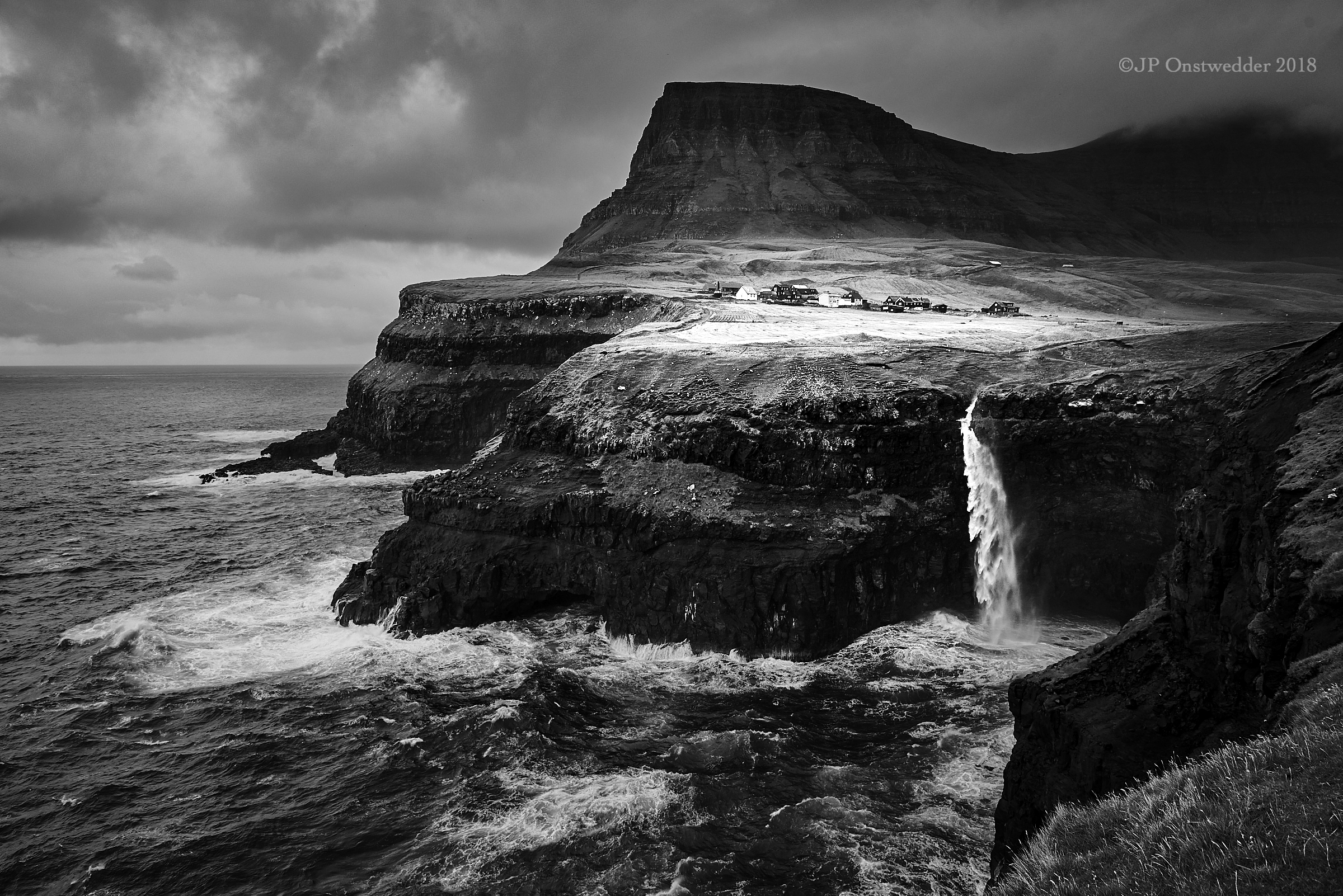
If I think about the things that make a photograph beautiful to me, like the DOF and how it may isolate a subject, how light defines shape through highlight and shadow, how it defines texture, how it creates drama, as in Kevin’s image from the Faroe Islands, these things have nothing to do with color. The color in an image for me must serve a specific purpose such as being a graphic element or maybe setting the mood, like golden light warming a portrait. I don’t find it important in many landscapes I shoot. We all know trees are green. But sometimes when a lake is that electric turquoise, it screams for color.
I guess different strokes for different folks.
Paul
-
This reply was modified 4 years, 7 months ago by
 Paul Sokal.
Re: Why BWReply #3 on: August 25, 2019 at 2:04 pmThank you for a thoughtful and civil reply! I probably should not have included beautiful in a list of emotions that black and white doesn’t, for me, invoke, so thank you for challenging that. I was also mostly thinking landscapes (since that’s the title of this particular forum) and I feel more strongly about the issue for landscapes than for portraits. Certainly both of your portraits are beautiful; for me they have quite a different feel.
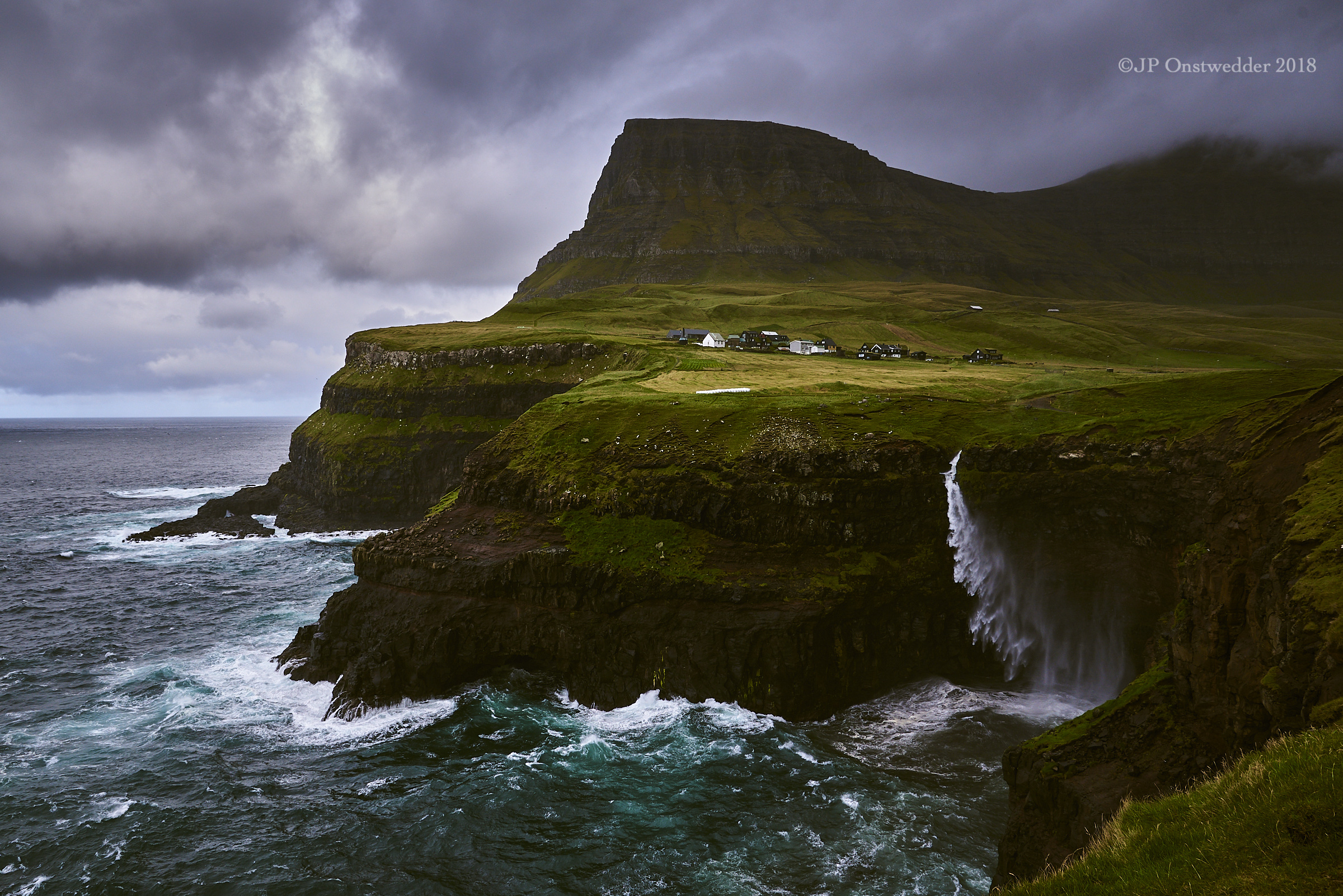
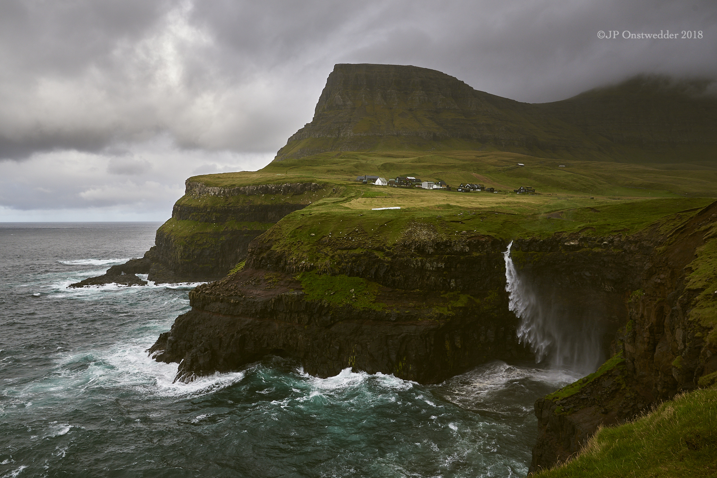
To illustrate the point about landscapes, let me go back to Kevin’s Faroe Island image. I’ve shot there as well, and I attach three shots of the same waterfall. The two colour images are different variants of the same original raw file, and I think the atmosphere or emotional response is different due to the different colours I’ve emphasised in post processing. Perhaps it’s my lack of skill or experience, but I can’t make two such different versions in black and white – a lower contrast image and a higher contrast image still create largely the same ‘feel’, unlike the colour image.
I’d love to hear your and everyone else’s reaction, though, as I know I’m in a (very small) minority!
Jan-Peter
 Re: Why BWReply #4 on: August 25, 2019 at 2:51 pm
So all photographs taken before the advent of color film lacked glee? That sailor kissing the nurse in Eisenstadt’s classic image celebrating the end of WW2 was not gleeful?
Hi Paul – well, I think what I said and what Jan-Peter eluded to was, a lot of BW represent more towards the dramatic than presenting outright Glee. In any case, I think everyone agrees BW renderings can promote as much Glee as their color counterparts, but we see less of them, as I commented above.
Jan-Peter, I like the BW version! Hands down! On another note, the color version which darkens the whole and leaves a smaller portion of the composition brighter, in my opinion, looses something: I like to see the detail in the bluff and the darkened version removes this detail and changes the scene. Alternatively, the bottom color version is nice. I may only Dodge the bluff and foreground area in photo and perhaps brighten up a bit more in comparison the village and base of mountain behind it. Just a thought.
Lance A. Lewin
Lance A. Lewin
Re: Why BWReply #5 on: August 25, 2019 at 5:09 pmJan-Peter,
I blatantly stole your wonderful B&W and messed with it to see if I could create an image with a different emotional response. I’ll let you be the judge and since I didn’t ask your permission I will now beg for your forgiveness. I will delete both versions of your image from my computer after uploading to this post. Promise. And now I have another location to add to my bucket list. Damn you :-).
Paul
 Re: Why BWReply #6 on: August 25, 2019 at 5:27 pm
Lance,
I think this is a gleeful B&W landscape. I can just imagine Willie toking in his tour bus, “On the road again…”
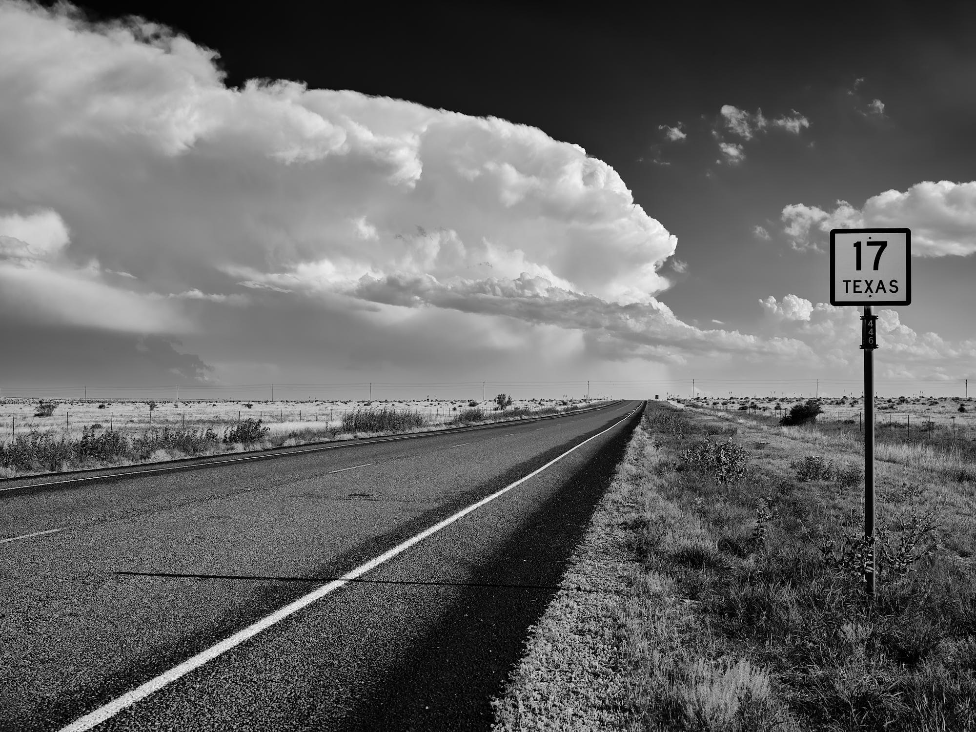
Paul
Re: Why BWReply #7 on: August 25, 2019 at 8:09 pmAbsolutely, Paul! I travel a lot across the Southeast and Midwest – love this part of the country your composition represents. Nicely done.
Lance A. Lewin
Lance A. Lewin
Re: Why BWReply #8 on: August 26, 2019 at 1:03 pmPaul: No worries about using my image – have fun with it and feel free to keep it if you want. And yes, you’ve definitely created a different feel to the image, and a very different image from my own colour version, with more tension between the light and dark areas. I suspect we’ll have to agree to disagree on which one is ‘better’ and consider it a matter of personal taste.
Your gleeful landscape is very nice and I can’t help wonder what a colour version would look like 🙂
If you ever get the chance to visit the Faroe Islands you’ll love it. It’s a bit of heaven for landscape photographers with quite easily accessible locations.
Lance: I agree with your views on the two colour images; the darker one is moodier but doesn’t work as well as the less extreme version (which is much closer to the way I remember the ‘reality’ of the moment). But for me, the two colour images have a wider range of feel than the two black and white ones. We, too, might have to agree to disagree on a matter of taste.
Both: I’d love to see and share more examples of images that explore the necessity, or not, of colour. Here is another Faroe Islands one from me.
Jan-Peter
Re: Why BWReply #9 on: August 26, 2019 at 2:30 pmWow. A thoughtful, uplifting and passionate discussion – among photographers!
Thanks, everyone!!
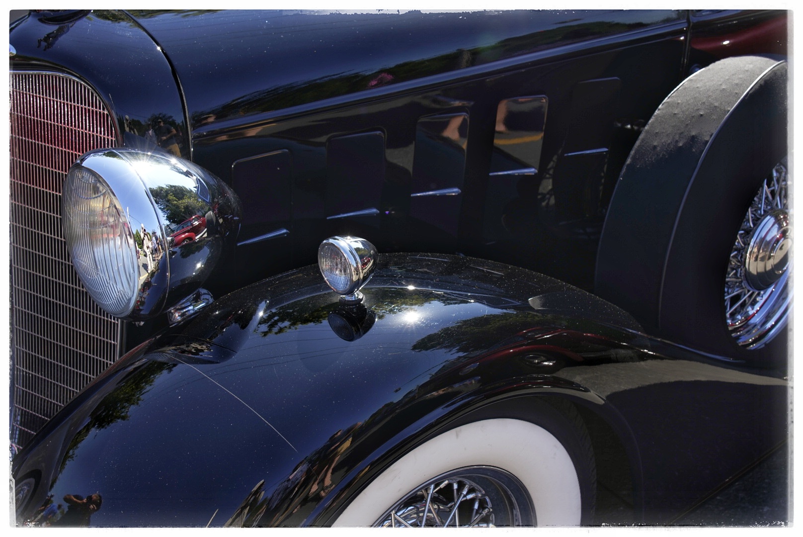
I considered moving this to grayscale as it is a black car after all, but I prefer the colour version here as the bits of red in the chrome, etc. add another element.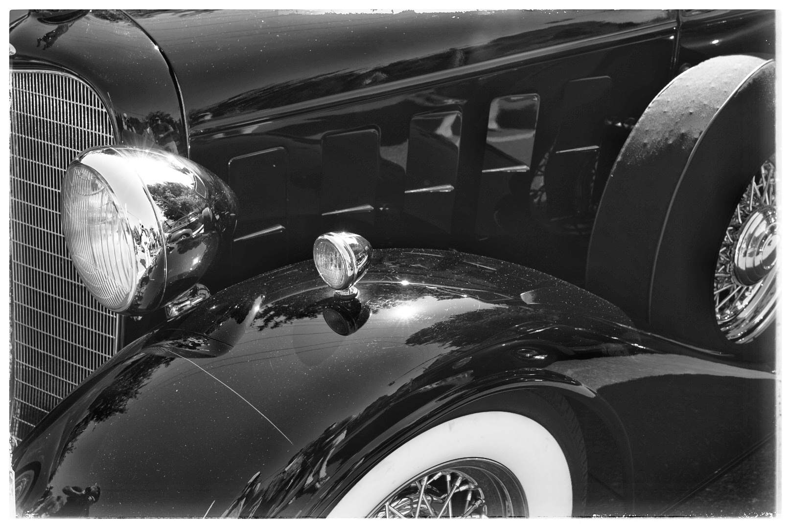
Gleeful? Perhaps the owner… Although if one looks closely there may be evidence of drool. ?
Mike.
_____
Mike Nelson Pedde
Victoria, BC
https://www.wolfnowl.com/Re: Why BWReply #10 on: August 26, 2019 at 5:17 pmHi Mike – yes, this is fun, and very insightful information from everyone, indeed. Neat photo – I’m a car guy, so I love these – anyway, this is definitely one of those shots that seem to work better in color – but, the more I study it, well, not so sure.
Lance A. Lewin
Lance A. Lewin
-
This reply was modified 4 years, 7 months ago by
 Lance Lewin.
Re: Why BWReply #11 on: August 26, 2019 at 8:30 pmSo beautiful. Thanks for Sharing it
-
This reply was modified 4 years, 7 months ago by
-
AuthorPosts


- You must be logged in to reply to this topic.